|
Technische
Angaben
-
106 S., 21x14,8 cm, Auflage: Print on Demand, keine weiteren Angaben vorhanden
Broschur
ZusatzInfos
-
Schwarz-Weiß-Drucke
NEU creates integral visual identies, appearances, brandings and communication strategies for print and web in various disciplines as editorial design, corporate design, web design and UX design, illustration, communication and marketing of towns. Unexpected, exciting, focused, convincing – NEU interacts between emotion and logic, art and culture, economy and design.
|
Titel
-
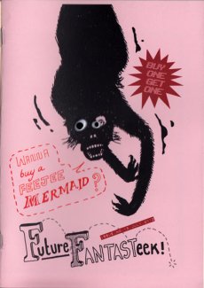
Future Fantasteek, Issue 13
Technische
Angaben
-
20 S., 21x15 cm, Auflage: 40, numeriert, signiert, keine weiteren Angaben vorhanden
Drahtheftung, Farbkopien auf verschiedene Papiere, 2 aufgeklebte Spielzeug-Augen auf Vorderseite, Rückseite mit Prägedruck
ZusatzInfos
-
Future Fantasteek! brings together a trichotomy of investigation. art-zines and independent publishing. artist as social commentator and drawing as a means of immediate visual communication. The series explores obdurate boundaries between journalism and authorial illustration using satire to reflect notions of ‘Britishness’. The series can be read as a sequence, from just prior to the ‘credit crunch’ through to the ‘age of austerity’. The series is independently published as a limited edition art-zine, with two issues per year. The approach is experimental, incremental and reflective focussing on both the microcosm and macrocosm of living in the UK. Visual humour is developed throughout as a vehicle for change, combining techniques such as pastiché, parody and socratic irony. Typography and images are juxtaposed to create new narrative possibilities. Language is explored using different ‘voices’ such as anecdotal, colloquial or profane. This text is then translated into drawn commentaries on etiquette, politics and advertising. The ‘anxiety of the individual’ is a running theme throughout the series with many reoccurring protagonists and antagonists soliloquizing their notions of ‘Das Unheimliche’. The series also explores changing technologies with regard to notions of ‘the book’ with online versions of Future Fantasteek! available via a blog and online PDF reader (issuu and .swf).
Text von der Webseite
|
Titel
-
Possible Content for 18 Pages - Volume II - A Set of Lines, A Stack of Paper
Technische
Angaben
-
[80] S., 29,7x21 cm, Auflage: 500, ISBN/ISSN 9783957632746
Broschur, mit zahlreichen Abbildungen, drei Bände in Banderole,
ZusatzInfos
-
"A Set of Lines, A Stack of Paper" is the second in a series of exhibitions and publication based on a wide-reaching research about writing with the title 'Possible Content for 18 Pages'. The original typewritten manuscript of Vilém Flusser's essay 'The Gesture of Writing' provides the thematic and formal-aesthetic foundation for reflecting the act of writing at the intersection of linguistic, visual, physical and spatial communication. 'To write,' says the philosopher about the basic requirements that should lead to a complete piece of writing, we need 'a blank surface, for instance a white leaf of paper, an instrument which contains a matter that contrasts with the whiteness of the paper, the letters of the alphabet, the convention which gives a meaning to the letters, 'orthography' = correct writing, the rules which order that language, what is called 'grammar', an idea to be expressed in a language, and a motive to express that idea'. Understanding the act of writing as a culturally embedded gesture, 'A Set of Lines, A Stack of Paper' covers artistic, literary, as well as curatorial and editorial fields of action and combines them. The book is published on the occasion of the correspondent exhibition at KARST, Plymouth (June 5 - July 5, 2015). The publication comprises an exhibition documentation with installation views and a curatorial statement. Furthermore, the author Maria Fusco situates the concept of the exhibition in an actual context of literature.
The participating visual artists expand the topic of the exhibition with artistic contributions especially made for the book.
Text von der Webseite
|
Titel
-
Possible Content for 18 Pages - Volume III - Lorem Ipsum Dolor Sit Amet
Technische
Angaben
-
[200] S., 29,7x21 cm, Auflage: 500, ISBN/ISSN 9783957633453
Fadenheftung, mit zahlreichen Abbildungen, drei Bände in Banderole, Anschreiben liegt bei,
ZusatzInfos
-
“Lorem Ipsum Dolor Sit Amet” is the third in a series of exhibitions and publication based on a wide-reaching research about writing with the title “Possible Content for 18 Pages”. The original typewritten manuscript of Vilém Flusser’s essay “The Gesture of Writing” provides the thematic and formal-aesthetic foundation for reflecting the act of writing at the intersection of linguistic, visual, physical and spatial communication.
“To write,” says the philosopher about the basic requirements that should lead to a complete piece of writing, we need “a blank surface, for instance a white leaf of paper, an instrument which contains a matter that contrasts with the whiteness of the paper, the letters of the alphabet, the convention which gives a meaning to the letters, ‘orthography’ = correct writing, the rules which order that language, what is called ‘grammar’, an idea to be expressed in a language, and a motive to express that idea”.
Understanding the act of writing as a culturally embedded gesture, “Lorem Ipsum Dolor Sit Amet” covers artistic, literary, as well as curatorial and editorial fields of action and combines them. The book is published on the occasion of the eponymous performance by Lois Bartel at the Akademie der Künste in Berlin (June 11, 2016) and contains a curatorial-editorial statement by Franz Thalmair. Furthermore, the artist Michalis Pichler and the professor for media theory and aesthetics Oliver Ruf situate the publication in an actual context of literature and criticism. The participating visual artists expand the topic of the research with artistic contributions especially made for „Lorem Ipsum Dolor Sit Amet“.
Text von der Webseite
|
Titel
-
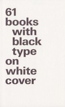
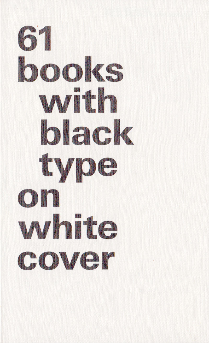
61 books with black type on white cover
Technische
Angaben
-
254 S., 17,7x10,8 cm, Auflage: 1.500, 2 Stück. keine weiteren Angaben vorhanden
Taschenbuch
ZusatzInfos
-
Begleitbuch zur Ausstellung bei Vitsoe 620 Reading Room vom 22.02.-01.03.2014 in der Türkenstraße 36 in München parallel zur Munich Creative Business Week. Druck: suhrkamp
|
Titel
-
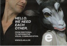
Hello. We need each other. - From emotional to informative visual communication.
Technische
Angaben
-
12 S., 7,4x10,5 cm, 2 Stück. keine weiteren Angaben vorhanden
Imageflyer, beidseitig bedruckt, leporelloartig gefaltet
|
Titel
-
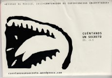
Cuéntanos Un Secreto Ed. -0.5 - Tell me a secret Ed.
Technische
Angaben
-
11,8x18 cm, Auflage: 80, numeriert, keine weiteren Angaben vorhanden
Sammelmappe mit 16 Arbeiten, ein Blatt gefaltet, Grafiken in Farbe, Textarbeiten in Schwarz-Weiß
ZusatzInfos
-
Edition zur gleichnamigen Ausstellung.
Tell me a secret is an sharing secret project between communities. The secrets – written experiences – are graphically depicted by participants during a visual communication workshop. At the end of the workshop participants are invited to anonymously shared their own secrets in order to feed the project flow. As well we collect the secrets within this website. The project considers as secrets both, the written stories and their graphical depiction. Tell me a secret project is an archive as well. The main point of the archive is to preserve the popular stories of anonymous people.
Text von der Webseite
|
Technische
Angaben
-
106 S., 21x14,8 cm, Auflage: Print on Demand, keine weiteren Angaben vorhanden
Broschur
ZusatzInfos
-
Schwarz-Weiß-Drucke, Nr. 024 aus der Reihe 100for10.
Alexander Branczyk, born 1959, studied visual communication at HfG Offenbach in Germany. From 1988 until 1994, he was project manager at Erik Spiekermann’s MetaDesign. Since 1994 Alexander is partner and managing director of xplicit Gesellschaft für visuelle Kommunikation mbH based in Frankfurt/Main and Berlin. In addition he is art director emeritus of the 1990s cult magazine “Frontpage” and founding member of the collaborative type’n’typo project Face2Face. Alexander Branczyk was from 2003 until 2005 professor for typography at the Bauhaus University Weimar and since 2012 at FH Dortmund, University of Applied Sciences and Arts.
|
Technische
Angaben
-
106 S., 21x14,8 cm, Auflage: Print on Demand, keine weiteren Angaben vorhanden
Broschur
ZusatzInfos
-
Schwarz-Weiß-Drucke
I am an illustrator, born in Berlin. Now I live and work in small and peaceful Saarbrücken, where I also studied visual communication and teach illustration classes. To draw twisted thoughts in the most simple way, is what I love most. I often draw for magazines, newspapers and musicians. And for fun, of course.
|
Technische
Angaben
-
106 S., 21x14,8 cm, Auflage: Print on Demand, keine weiteren Angaben vorhanden
Broschur
ZusatzInfos
-
Schwarz-Weiß-Drucke
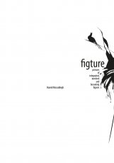
Iranian graphic designer Hamid Mosaddegh is painstaking in his approach to work. But the rewards are clear to see in his sensitive and highly expressive posters. Hamid mosaddegh graduated in visual communication from Faculty of fine arts, University of Tehran. He lives and works in Tehran.
|
Titel
-
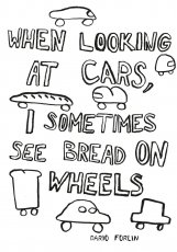
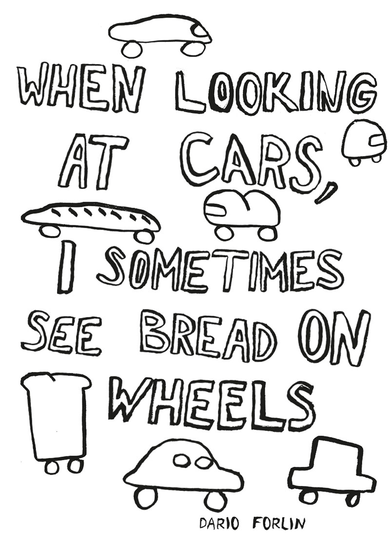
100for10 Nr. 082 - When looking at cars, I sometimes see bread on wheels
Technische
Angaben
-
106 S., 21x14,8 cm, Auflage: Print on Demand, 2 Stück. keine weiteren Angaben vorhanden
Broschur
ZusatzInfos
-
Schwarz-Weiß-Drucke
Dario Forlin studied Visual Communication in Bern, Switzerland and Illustration in Falmouth UK. He now lives in a small town in the eastern part of Switzerland and works in the field of Illustration. From time to time his work mixes with graphic design and typography. But if he can he draws. He selfpublishes his own zines, comics, and prints and has also a monthly zine called GAFFA which he publishes with some friends.
|
Titel
-
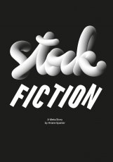
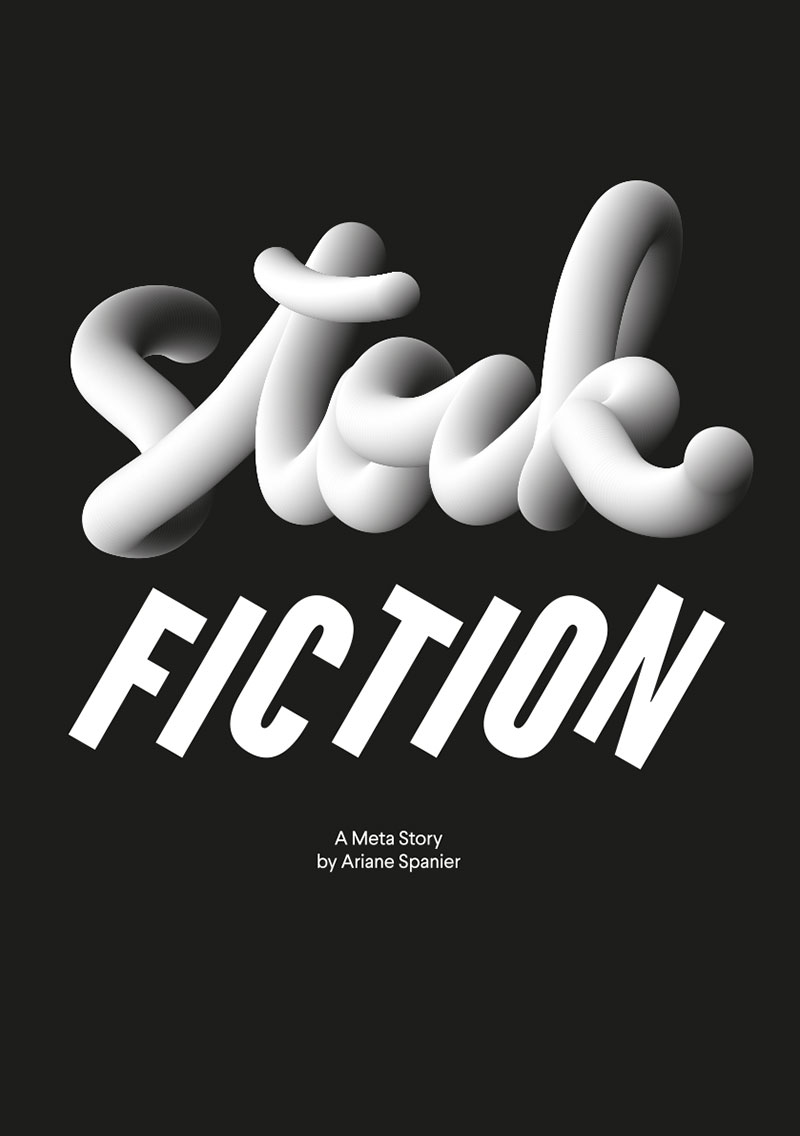
Stock fiction – A meta story
Technische
Angaben
-
106 S., 21x14,8 cm, Auflage: Print on Demand, keine weiteren Angaben vorhanden
Broschur
ZusatzInfos
-
Schwarz-Weiß-Drucke
Ariane Spanier was born in Weimar, Germany. She studied visual communication at the Art Academy Berlin-Weißensee. After that she went to New York to intern at Sagmeister Inc. and she opened her own design studio in Berlin in 2005. Many of Ariane Spanier’s clients have a cultural background such as galleries, artists, publishers and architects. The studio’s focus lies on the design of books, catalogues, posters, but also branding, animation, illustration and websites. Since 2006 she has been the creative director of Fukt, an annual magazine for contemporary drawing. Her playful approach to typography and image explores the perception of depth, gravity and weightlessness, revealing the underlying and hidden.
|
Technische
Angaben
-
106 S., 21x14,8 cm, Auflage: Print on Demand, keine weiteren Angaben vorhanden
Broschur
ZusatzInfos
-
Schwarz-Weiß-Drucke
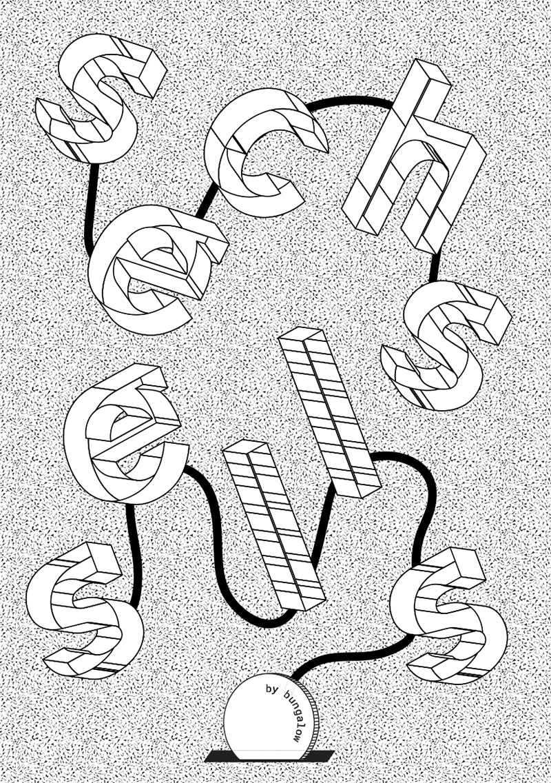
Hallow, we are bungalow, providing visual art for brands, companys and cultural projects. In 2012 the six of us — Alex, Markus, Niklas, Laura, Tim and Yvonne — started to study Communication Design at FH Würzburg. 4 years later we established bungalow kreativbüro. Our naming, inspired by architecture, symbolizes our flat hierarchy and creative working all together.
|
