Technische
Angaben
-
[20] S., 21x13 cm, Auflage: 500, 2 Stück. keine weiteren Angaben vorhanden
Drahtheftung, Laserkopie Schwarz-Weiß
ZusatzInfos
-
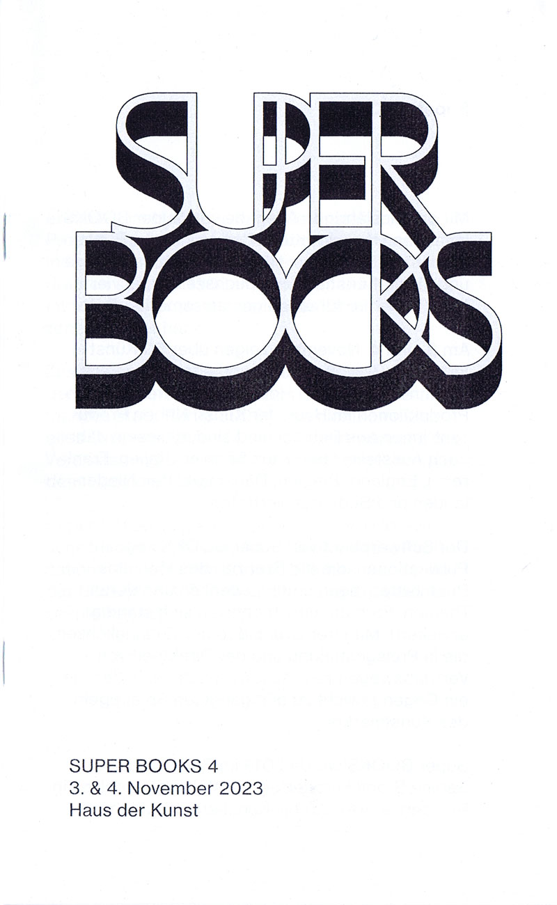
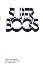
Mit der diesjährigen Ausgabe von Super BOOKS leitet das Haus der Kunst den Münchner Bücherherbst 2023 ein. Seit dem Auftakt im Jahr 2019 erhält die sehr lebendige und aktive Künstler*innenbuchszene zum vierten Mal die Fläche für einen gemeinsamen Auftritt.
Am 3. und 4. November zeigen über 50 Künstler*innen, Gestalter*innen und alternative Verleger*innen sowie drei Hochschulen ihre aktuellen Produktionen im Haus der Kunst. Neben Produzent*innen aus Deutschland sind in diesem Jahr auch Aussteller*innen aus Spanien, Italien, Frankreich, Österreich, England, Belgien, den Niederlanden und Südkorea vertreten. Die Teilnehmenden sehen sich in der Tradition der 1960er Jahre, als sich im Umfeld der postavantgardistischen Kunstszene neue Kommunikations- und Distributionsnetze bildeten. Ihre Produkte wie Künstler*innenbücher, Magazine oder Zines sind autonome Kunstwerke.
Der Schwerpunkt von Super BOOKS liegt auf Publikationen, die die Grenzen des Mediums Buch hinterfragen, neu denken und deren Themen, Formate und Techniken sich ständig erweitern. Mit ihrer Ethik der Zugänglichkeit, die in Preisgestaltung und der Direktheit von Vertriebswegen zum Ausdruck kommt, bilden sie ein Gegengewicht zu den gängigen Spielregeln des Kunstmarkts. ...
... Super BOOKS ist ein Kooperationsprojekt zwischen Haus der Kunst, AAP Archiv Künstlerpublikationen, Bayerischer Staatsbibliothek, Akademie der Bildenden Künste München und Kunsthochschule Kassel. Projektleitung: Sabine Brantl (Haus der Kunst)
Text von der Webseite
|
 
Technische
Angaben
-
[2] S., 9,8x21 cm, Auflage: 2.000, 2 Stück. keine weiteren Angaben vorhanden
Postkarte
ZusatzInfos
-
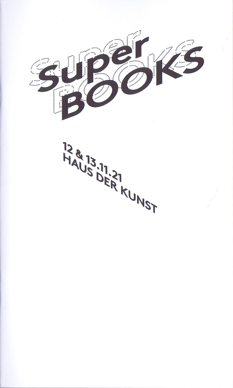
Messe für independent Künstlerpublikationen 12.-13.11.2021 im Haus der Kunst, München, mit radio 80000, das Internetradio. Südgalerie 1. Stock, Eintritt frei
Zum zweiten Mal seit dem Auftakt im Jahr 2019 zeigen über 50 Künstler*innen, Gestalter*innen und alternative Verleger*innen ihre Produktionen im Haus der Kunst. Damit erhält die in München sehr lebendige und aktive Künstlerbuchszene die Fläche für einen gemeinsamen Auftritt. Neben dem Schwerpunkt München sind diesmal auch Produzent*innen aus Österreich (Auslöser sowie Darja Shatalova und Kristian Ujhelji), der Schweiz (_957 Independent Art Magazine sowie GRRRR) und den Niederlanden (The Artist and the Others sowie Dutch Independent Art Book Publishers und Lula Valletta & HOK) vertreten. Tobi Huschka aus Köln stellt Bücher vom Kunsthaus Kat18 vor, einer inklusiven Kunstwerkstatt. Die Münchner piratInnenpresse, ein Verlag von Kindern und Jugendlichen, stellt Taschenbücher und Faltkarten her. Ihr üblicher Versammlungsort ist „die Kajüte unterm Dach der Seidl-Villa in Schwabing“. Iwalewabooks hat die jüngsten Entwicklungen in der zeitgenössischen Kultur Afrikas im Fokus.
Die Teilnehmenden sehen sich in der Tradition der 1960er-Jahre, als sich im Umfeld der postavantgardistischen Kunstszene neue Kommunikations- und Distributionsnetze bildeten. Ihre Produkte wie Künstlerbücher, Magazine oder Zines sind autonome Kunstwerke. Mit ihrer Ethik der Zugänglichkeit, die in Preisgestaltung und der Direktheit von Vertriebswegen zum Ausdruck kommt, bilden sie ein Gegengewicht zu den gängigen Spielregeln des Kunstmarkts.
Die Publikationen können direkt vor Ort gekauft werden.
Super BOOKS ist eine Kooperation mit AAP Archiv Künstlerpublikationen, Akademie der Bildenden Künste München und fructa space.
Kuratiert von Sabine Brantl mit Hubert Kretschmer, Martin Schmidl sowie Quirin Brunnmeier und Malte Wandel.
|
Technische
Angaben
-
[56] S., 21x12,5 cm, Auflage: 700, 2 Stück. keine weiteren Angaben vorhanden
Drahtheftung
ZusatzInfos
-
Katalog zur Künstlerbuchmesse Super BOOKS 2021 im Haus der Kunst 12.-13.11.2021 mit ca. 60 Aussteller*innen aus 4 Ländern
|
Technische
Angaben
-
2 S., 74x37,5 cm, 2 Stück. keine weiteren Angaben vorhanden
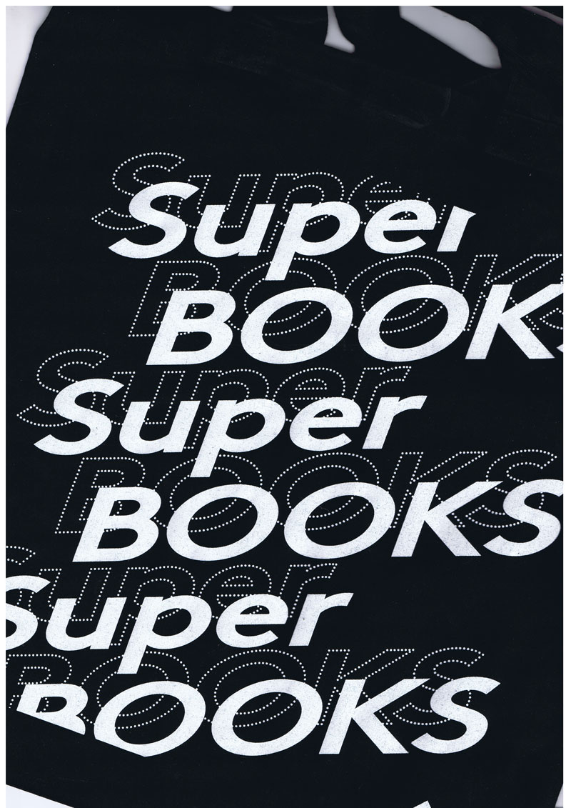
schwarze Stofftasche, auf einer Seite mit dem weißen Aufdruck des Messenamens Super BOOKS und dem Logo des Münchner Haus der Kunst
ZusatzInfos
-
Zum zweiten Mal seit dem Auftakt im Jahr 2019 zeigen über 50 Künstler*innen, Gestalter*innen und alternative Verleger*innen ihre Produktionen im Haus der Kunst. Damit erhält die in München sehr lebendige und aktive Künstlerbuchszene die Fläche für einen gemeinsamen Auftritt. Neben dem Schwerpunkt München sind diesmal auch Produzent*innen aus Österreich (Auslöser sowie Darja Shatalova und Kristian Ujhelji), der Schweiz (_957 Independent Art Magazine sowie GRRRR) und den Niederlanden (The Artist and the Others sowie Dutch Independent Art Book Publishers und Lula Valletta & HOK) vertreten. Tobi Huschka aus Köln stellt Bücher vom Kunsthaus Kat18 vor, einer inklusiven Kunstwerkstatt. Die Münchner piratInnenpresse, ein Verlag von Kindern und Jugendlichen, stellt Taschenbücher und Faltkarten her. Ihr üblicher Versammlungsort ist „die Kajüte unterm Dach der Seidl-Villa in Schwabing“. Iwalewabooks hat die jüngsten Entwicklungen in der zeitgenössischen Kultur Afrikas im Fokus. Die Teilnehmenden sehen sich in der Tradition der 1960er-Jahre, als sich im Umfeld der postavantgardistischen Kunstszene neue Kommunikations- und Distributionsnetze bildeten. Ihre Produkte wie Künstlerbücher, Magazine oder Zines sind autonome Kunstwerke. Mit ihrer Ethik der Zugänglichkeit, die in Preisgestaltung und der Direktheit von Vertriebswegen zum Ausdruck kommt, bilden sie ein Gegengewicht zu den gängigen Spielregeln des Kunstmarkts.
Super BOOKS ist eine Kooperation mit AAP Archiv Künstlerpublikationen, Akademie der Bildenden Künste München und fructa space.
Kuratiert von Sabine Brantl mit Hubert Kretschmer, Martin Schmidl
Text von der Webseite
|
Technische
Angaben
-
[2] S., 9,8x21 cm, 2 Stück. keine weiteren Angaben vorhanden
Postkarte
ZusatzInfos
-
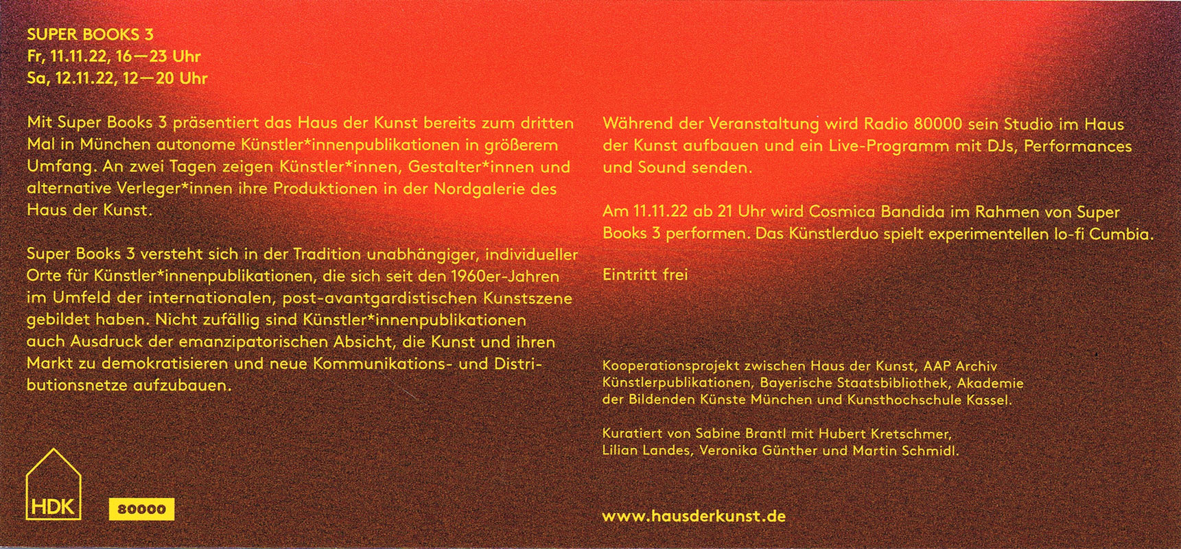
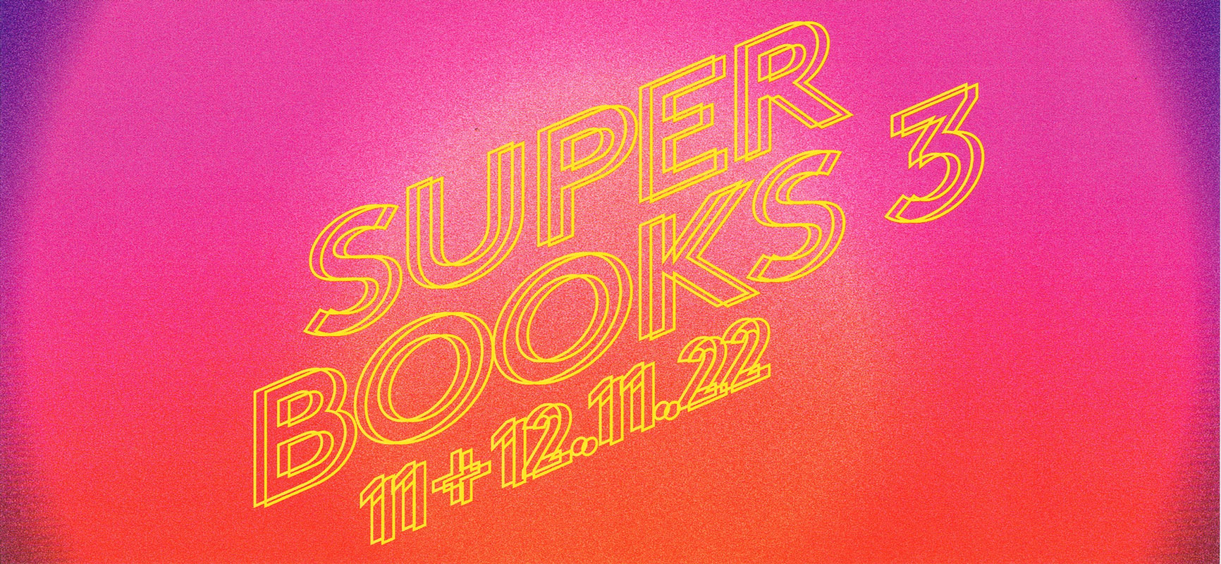
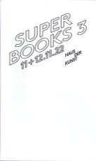
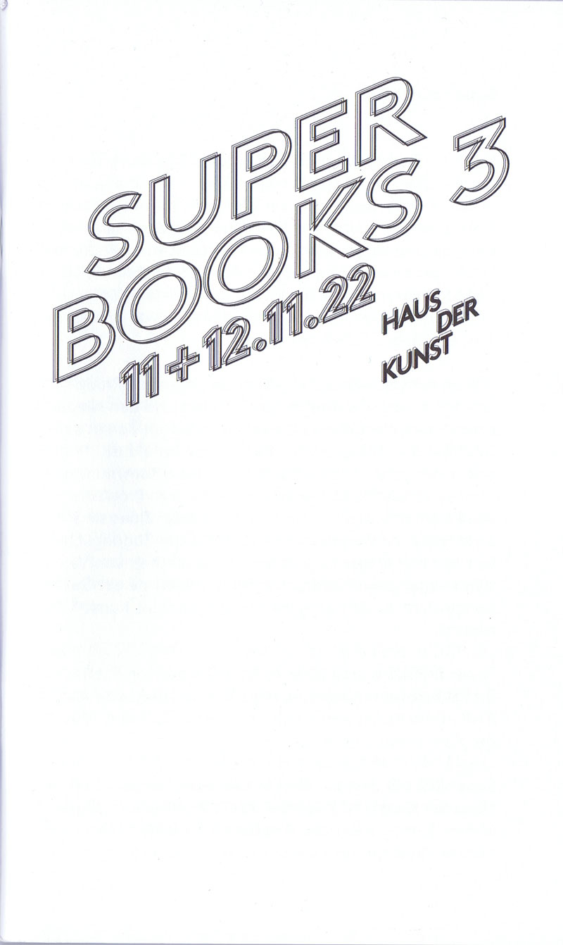
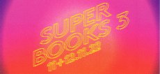
Messe für independent Künstlerpublikationen 11.-12.11.2022 im Haus der Kunst, München, mit radio 80000, das Internetradio, Eintritt frei
Im November wird das Haus der Kunst die dritte Ausgabe von Super BOOKS ausrichten. An zwei Tagen zeigen Künstler*innen, Gestalter*innen und alternative Verleger*innen ihre autonomen Produktionen. Super BOOKS wurde 2019 im Rahmen der von Sabine Brantl kuratierten Ausstellung „Archives in Residence: AAP Archiv Künstlerpublikationen“ erstmalig im Haus der Kunst veranstaltet. Das Projekt sieht sich in der Tradition unabhängiger, individueller Orte für Künstlerpublikationen, die sich seit den 1960er-Jahren im Umfeld der internationalen, post-avantgardistischen Kunstszene gebildet haben.
Aktionen
Carina Müller und Dominik Wendland bauen während der Messe vor Ort das Superbook, Jürgen O. Olbrich bietet mit seiner Bodeninstallation PaperPolice seine Objekte dem Publikum zur Mitnahme an.
Sound
Radio 80000 wird während der Veranstaltung sein Studio in der Nordgalerie des Haus der Kunst aufbauen und live ein Programm mit DJs, Performance und Sound senden.
Am 11.11.22 ab 21 Uhr wird Cosmica Bandida im Rahmen von Super Books 3 performen. Das Künstlerduo spielt experimentellen lo-fi Cumbia, begleitet von Visuals des Münchner Künstlers Merlin Stadler.
Super BOOKS wurde 2019 erstmalig im Haus der Kunst veranstaltet und ist ein Kooperationsprojekt zwischen Haus der Kunst, AAP Archiv Künstlerpublikationen, Bayerischer Staatsbibliothek, Akademie der Bildenden Künste München und Kunsthochschule Kassel.
Weitere Personen
ABC ( Artists? Books Cooperative)
|
Technische
Angaben
-
[68] S., 21x12,7 cm, Auflage: 700, 2 Stück. keine weiteren Angaben vorhanden
Drahtheftung
ZusatzInfos
-
Katalog zur Künstlerbuchmesse Super BOOKS 3, 2022 im Haus der Kunst 11.-12.11.2022 mit knapp 60 Aussteller*innen aus 4 Ländern
|
Technische
Angaben
-
[2] S., 14,8x10,85 cm, 2 Stück. keine weiteren Angaben vorhanden
Postkarte
ZusatzInfos
-
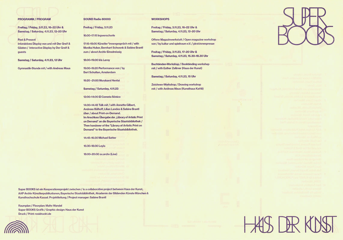
Mit der diesjährigen Ausgabe von Super BOOKS leitet das Haus der Kunst den Münchner Bücherherbst 2023 ein. Seit dem Auftakt im Jahr 2019 erhält die sehr lebendige und aktive Künstler*innenbuchszene zum vierten Mal die Fläche für einen gemeinsamen Auftritt.
Am 3. und 4. November zeigen über 50 Künstler*innen, Gestalter*innen und alternative Verleger*innen sowie drei Hochschulen ihre aktuellen Produktionen im Haus der Kunst. Neben Produzent*innen aus Deutschland sind in diesem Jahr auch Aussteller*innen aus Spanien, Italien, Frankreich, Österreich, England, Belgien, den Niederlanden und Südkorea vertreten. Die Teilnehmenden sehen sich in der Tradition der 1960er Jahre, als sich im Umfeld der postavantgardistischen Kunstszene neue Kommunikations- und Distributionsnetze bildeten. Ihre Produkte wie Künstler*innenbücher, Magazine oder Zines sind autonome Kunstwerke.
Der Schwerpunkt von Super BOOKS liegt auf Publikationen, die die Grenzen des Mediums Buch hinterfragen, neu denken und deren Themen, Formate und Techniken sich ständig erweitern. Mit ihrer Ethik der Zugänglichkeit, die in Preisgestaltung und der Direktheit von Vertriebswegen zum Ausdruck kommt, bilden sie ein Gegengewicht zu den gängigen Spielregeln des Kunstmarkts. ...
... Super BOOKS ist ein Kooperationsprojekt zwischen Haus der Kunst, AAP Archiv Künstlerpublikationen, Bayerischer Staatsbibliothek, Akademie der Bildenden Künste München und Kunsthochschule Kassel. Projektleitung: Sabine Brantl (Haus der Kunst)
Text von der Webseite
|
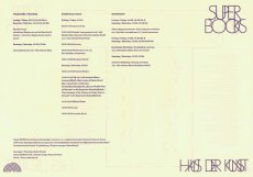
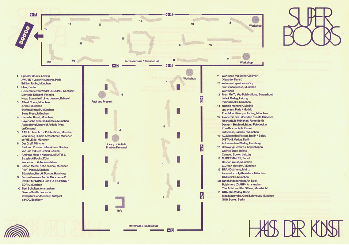
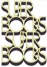
Titel
-
Super BOOKS 4 2023 Lageplan Programm
Technische
Angaben
-
[2] S., 29,7x42 cm, 2 Stück. keine weiteren Angaben vorhanden
Risodruck auf gelbem Papier
ZusatzInfos
-
Druck von rosidruckt.de, Raumplan von Malte Wandel.
Mit der diesjährigen Ausgabe von Super BOOKS leitet das Haus der Kunst den Münchner Bücherherbst 2023 ein. Seit dem Auftakt im Jahr 2019 erhält die sehr lebendige und aktive Künstler*innenbuchszene zum vierten Mal die Fläche für einen gemeinsamen Auftritt.
Am 3. und 4. November zeigen über 50 Künstler*innen, Gestalter*innen und alternative Verleger*innen sowie drei Hochschulen ihre aktuellen Produktionen im Haus der Kunst. Neben Produzent*innen aus Deutschland sind in diesem Jahr auch Aussteller*innen aus Spanien, Italien, Frankreich, Österreich, England, Belgien, den Niederlanden und Südkorea vertreten. Die Teilnehmenden sehen sich in der Tradition der 1960er Jahre, als sich im Umfeld der postavantgardistischen Kunstszene neue Kommunikations- und Distributionsnetze bildeten. Ihre Produkte wie Künstler*innenbücher, Magazine oder Zines sind autonome Kunstwerke.
Der Schwerpunkt von Super BOOKS liegt auf Publikationen, die die Grenzen des Mediums Buch hinterfragen, neu denken und deren Themen, Formate und Techniken sich ständig erweitern. Mit ihrer Ethik der Zugänglichkeit, die in Preisgestaltung und der Direktheit von Vertriebswegen zum Ausdruck kommt, bilden sie ein Gegengewicht zu den gängigen Spielregeln des Kunstmarkts. ...
... Super BOOKS ist ein Kooperationsprojekt zwischen Haus der Kunst, AAP Archiv Künstlerpublikationen, Bayerischer Staatsbibliothek, Akademie der Bildenden Künste München und Kunsthochschule Kassel. Projektleitung: Sabine Brantl (Haus der Kunst)
Text von der Webseite
|
Copyrighthinweis: Das Copyright für die abgebildeten Publikationen bleibt bei den jeweiligen Rechteinhabern (Autoren, Künstlern, Fotografen, Gestaltern, Publizisten). Die Abbildungen und Textzitate dienen der künstlerischen und wissenschaftlichen Recherche.
Hier werden Werke dokumentiert, die sonst nur schwer oder gar nicht zugänglich wären. Wer nicht damit einverstanden ist, dass sein Werk auf dieser Webseite gezeigt wird, kann die Abbildung umgehend durch mich löschen lassen.
Für wissenschaftliche Recherchen können die großen Abbildungen auf Antrag freigeschaltet werden.
Wenn Sie als Rechteinhaber möchten, dass Ihre Abbildungen bei Klick größer gezeigt werden (Höhe x Breite = ca. 800 x 1200 Px), dann melden Sie sich bitte bei mir: