Gesucht wurde Way%20Ruth, Medienart , Sortierung DatensatzNr., aufsteigend.
AAP Archive Artist Publications - Munich - www.artistbooks.de
 
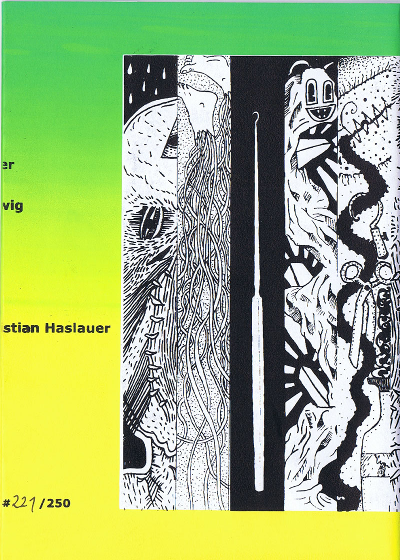
Verfasser
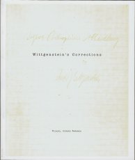
Titel
Ort Land
Verlag Jahr
Medium
Technische
Angaben
ZusatzInfos
Weitere
Personen
Sprache
Stichwort / Schlagwort
Geschenk von
TitelNummer
|
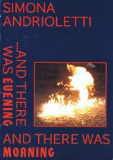
Verfasser
Titel
Ort Land
Verlag Jahr
Medium
Technische
Angaben
ZusatzInfos
Stichwort / Schlagwort
WEB Link
Geschenk von
TitelNummer
|
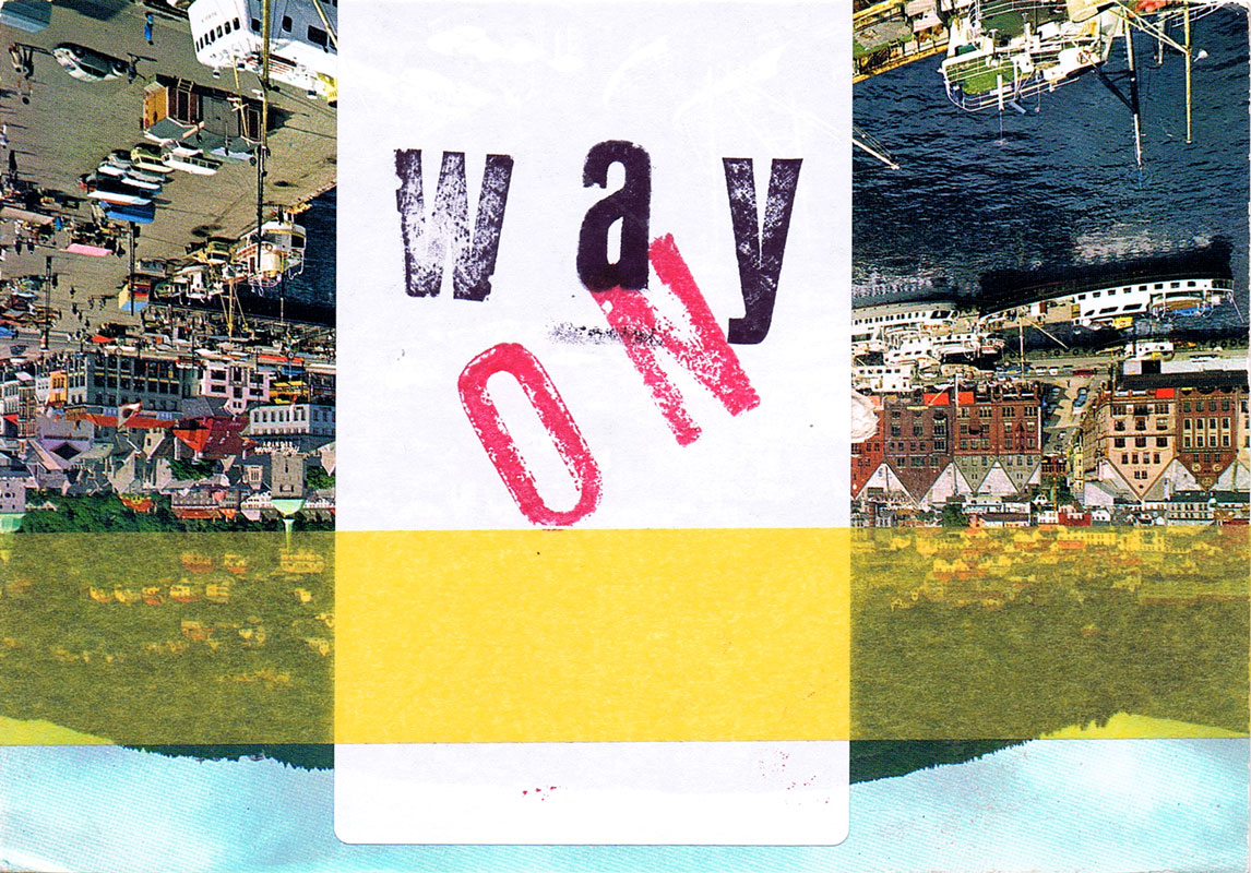
Verfasser
Titel
Ort Land
Verlag Jahr
Medium
Technische
Angaben
ZusatzInfos
Sprache
Stichwort / Schlagwort
Nachlass von Berengar Laurer
TitelNummer
|
Verfasser
Titel
Ort Land
Verlag Jahr
Medium
Technische
Angaben
Stichwort / Schlagwort
TitelNummer
|
Verfasser
Titel
Ort Land
Verlag Jahr
Medium
Technische
Angaben
ZusatzInfos
WEB Link
WEB Link
TitelNummer
|
Verfasser
Titel
Ort Land
Medium
Technische
Angaben
ZusatzInfos
WEB Link
TitelNummer
|
 
Verfasser
Titel
Verlag Jahr
Medium
Technische
Angaben
ZusatzInfos
WEB Link
TitelNummer
|
Verfasser
Titel
Ort Land
Verlag Jahr
Medium
Technische
Angaben
ZusatzInfos
Sprache
Stichwort / Schlagwort
WEB Link
TitelNummer
|
Verfasser
Titel
Ort Land
Medium
Technische
Angaben
ZusatzInfos
Weitere
Personen
Sprache
Stichwort / Schlagwort
WEB Link
Erworben bei Alexeij Sagerer
TitelNummer
|
 
Verfasser
Titel
Ort Land
Verlag Jahr
Medium
Technische
Angaben
ZusatzInfos
Weitere
Personen
Sponsoren
Stichwort / Schlagwort
WEB Link
Geschenk von
TitelNummer
|
Verfasser
Titel
Ort Land
Verlag Jahr
Medium
Technische
Angaben
ZusatzInfos
Weitere
Personen
Sponsoren
Stichwort / Schlagwort
WEB Link
Geschenk von
TitelNummer
|
Verfasser
Titel
Ort Land
Verlag Jahr
Medium
Technische
Angaben
ZusatzInfos
Weitere
Personen
Sponsoren
Stichwort / Schlagwort
WEB Link
Geschenk von
TitelNummer
|
 
Verfasser
Titel
Ort Land
Verlag Jahr
Medium
Technische
Angaben
ZusatzInfos
Weitere
Personen
Sponsoren
Stichwort / Schlagwort
WEB Link
Geschenk von
TitelNummer
|
Verfasser
Titel
Ort Land
Verlag Jahr
Medium
Technische
Angaben
ZusatzInfos
Weitere
Personen
Sponsoren
Stichwort / Schlagwort
WEB Link
Geschenk von
TitelNummer
|
Verfasser
Titel
Ort Land
Verlag Jahr
Medium
Technische
Angaben
ZusatzInfos
Weitere
Personen
Sprache
Stichwort / Schlagwort
WEB Link
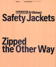
Erworben bei Hornbach
TitelNummer
|
Verfasser
Titel
Ort Land
Verlag Jahr
Medium
Technische
Angaben
ZusatzInfos
Weitere
Personen
Stichwort / Schlagwort
WEB Link
Geschenk von
TitelNummer
|
Verfasser
Titel
Ort Land
Verlag Jahr
Medium
Technische
Angaben
ZusatzInfos
Weitere
Personen
Sprache
Stichwort / Schlagwort
WEB Link
Geschenk von
TitelNummer
|
Verfasser
Titel
Ort Land
Verlag Jahr
Medium
Technische
Angaben
ZusatzInfos
Weitere
Personen
Sprache
Stichwort / Schlagwort
Erworben bei Eva Weinmayr
TitelNummer
|
Verfasser
Titel
Verlag Jahr
Medium
Technische
Angaben
ZusatzInfos
Weitere
Personen
Stichwort / Schlagwort
Geschenk von
TitelNummer
|
Verfasser
Titel
Verlag Jahr
Medium
Technische
Angaben
ZusatzInfos
Weitere
Personen
Stichwort / Schlagwort
WEB Link
Erworben bei múltiplos
TitelNummer
|
 
Verfasser
Titel
Ort Land
Verlag Jahr
Medium
Technische
Angaben
ZusatzInfos
Weitere
Personen
Sprache
WEB Link
Erworben bei art book cologne
TitelNummer
|
Verfasser
Titel
Ort Land
Medium
Technische
Angaben
ZusatzInfos
Weitere
Personen
Sprache
Stichwort / Schlagwort
Geschenk von
TitelNummer
|
 
Verfasser
Titel
Verlag Jahr
Medium
Technische
Angaben
ZusatzInfos
WEB Link
TitelNummer
|
 
Verfasser
Titel
Ort Land
Medium
Technische
Angaben
ZusatzInfos
TitelNummer
|
Verfasser
Titel
Ort Land
Verlag Jahr
Medium
Technische
Angaben
ZusatzInfos
Stichwort / Schlagwort
Erworben bei Ottenhausen Verlag
TitelNummer
|
Verfasser
Titel
Ort Land
Verlag Jahr
Medium
Technische
Angaben
Stichwort / Schlagwort
TitelNummer
|
Verfasser
Titel
Ort Land
Verlag Jahr
Medium
Technische
Angaben
Stichwort / Schlagwort
TitelNummer
|
Verfasser
Titel
Ort Land
Verlag Jahr
Medium
Technische
Angaben
Stichwort / Schlagwort
TitelNummer
|
Verfasser
Titel
Verlag Jahr
Medium
Technische
Angaben
Stichwort / Schlagwort
TitelNummer
|
Verfasser
Titel
Ort Land
Verlag Jahr
Medium
Technische
Angaben
Stichwort / Schlagwort
TitelNummer
|
Verfasser
Titel
Ort Land
Verlag Jahr
Medium
Technische
Angaben
Sprache
Stichwort / Schlagwort
TitelNummer
|
 
Verfasser
Titel
Ort Land
Verlag Jahr
Medium
Technische
Angaben
ZusatzInfos
Weitere
Personen
Sprache
Stichwort / Schlagwort
WEB Link
TitelNummer
|
Verfasser
Titel
Verlag Jahr
Medium
Technische
Angaben
Stichwort / Schlagwort
TitelNummer
|
 
Verfasser
Titel
Ort Land
Verlag Jahr
Medium
Technische
Angaben
Sprache
Stichwort / Schlagwort
WEB Link
TitelNummer
|
Verfasser
Titel
Ort Land
Medium
Technische
Angaben
ZusatzInfos
Stichwort / Schlagwort
WEB Link
TitelNummer
|
Verfasser
Titel
Ort Land
Medium
Technische
Angaben
ZusatzInfos
Stichwort / Schlagwort
WEB Link
TitelNummer
|
Verfasser
Titel
Ort Land
Medium
Technische
Angaben
ZusatzInfos
WEB Link
WEB Link
TitelNummer
|
 
Verfasser
Titel
Ort Land
Verlag Jahr
Medium
Technische
Angaben
ZusatzInfos
Stichwort / Schlagwort
WEB Link
TitelNummer
|
Verfasser
Titel
Verlag Jahr
Medium
Technische
Angaben
ZusatzInfos
WEB Link
Erworben bei The Photographers Gallery London
TitelNummer
|
 
Verfasser
Titel
Ort Land
Verlag Jahr
Medium
Technische
Angaben
ZusatzInfos
Erworben bei Gosh London
TitelNummer
|
Verfasser
Titel
Ort Land
Verlag Jahr
Medium
Technische
Angaben
ZusatzInfos
Stichwort / Schlagwort
Geschenk von
TitelNummer
|
 
Verfasser
Titel
Ort Land
Verlag Jahr
Medium
Technische
Angaben
ZusatzInfos
Weitere
Personen
Sprache
Stichwort / Schlagwort
TitelNummer
|
Verfasser
Titel
Verlag Jahr
Medium
Technische
Angaben
ZusatzInfos
Sprache
WEB Link
Erworben bei Motto Berlin
TitelNummer
|
Verfasser
Titel
Ort Land
Verlag Jahr
Medium
Technische
Angaben
ZusatzInfos
Weitere
Personen
Sprache
WEB Link
Erworben bei Buchhandlung Walther König München
TitelNummer
|
Verfasser
Titel
Ort Land
Verlag Jahr
Medium
Technische
Angaben
ZusatzInfos
Erworben bei múltiplos
TitelNummer
|
Verfasser
Titel
Medium
Technische
Angaben
ZusatzInfos
WEB Link
Erworben bei múltiplos
TitelNummer
|
 
Verfasser
Titel
Ort Land
Verlag Jahr
Medium
Technische
Angaben
ZusatzInfos
WEB Link
Erworben bei múltiplos
TitelNummer
|
Verfasser
Titel
Ort Land
Medium
Technische
Angaben
ZusatzInfos
Sprache
WEB Link
Erworben bei múltiplos
TitelNummer
|
 
Verfasser
Titel
Verlag Jahr
Medium
Technische
Angaben
ZusatzInfos
Sprache
WEB Link
Geschenk von
TitelNummer
|
Verfasser
Titel
Ort Land
Verlag Jahr
Medium
Technische
Angaben
ZusatzInfos
WEB Link
WEB Link
Geschenk von
TitelNummer
|
Verfasser
Titel
Verlag Jahr
Medium
Technische
Angaben
ZusatzInfos
Geschenk von
TitelNummer
|
Verfasser
Titel
Ort Land
Verlag Jahr
Medium
Technische
Angaben
ZusatzInfos
Sprache
Stichwort / Schlagwort
Geschenk von
TitelNummer
|
 
Verfasser
Titel
Ort Land
Verlag Jahr
Medium
Technische
Angaben
ZusatzInfos
Erworben bei Verlag der Buchhandlung Walther König
TitelNummer
|
Verfasser
Titel
Medium
Technische
Angaben
ZusatzInfos
Sprache
WEB Link
TitelNummer
|
Verfasser
Titel
Ort Land
Verlag Jahr
Medium
Technische
Angaben
ZusatzInfos
Stichwort / Schlagwort
Geschenk von
TitelNummer
|
Verfasser
Titel
Ort Land
Medium
Technische
Angaben
ZusatzInfos
Stichwort / Schlagwort
WEB Link
TitelNummer
|
Verfasser
Titel
Ort Land
Medium
Technische
Angaben
ZusatzInfos
Stichwort / Schlagwort
WEB Link
TitelNummer
|
Verfasser
Titel
Ort Land
Verlag Jahr
Medium
Technische
Angaben
ZusatzInfos
Weitere
Personen
Stichwort / Schlagwort
WEB Link
TitelNummer
|
Verfasser
Titel
Verlag Jahr
Medium
Technische
Angaben
ZusatzInfos
Weitere
Personen
Sprache
WEB Link
TitelNummer
|
Verfasser
Titel
Ort Land
Verlag Jahr
Medium
Technische
Angaben
ZusatzInfos
Sprache
Stichwort / Schlagwort
TitelNummer
|
Verfasser
Titel
Ort Land
Verlag Jahr
Medium
Technische
Angaben
ZusatzInfos
Stichwort / Schlagwort
WEB Link
TitelNummer
|
Verfasser
Titel
Ort Land
Verlag Jahr
Medium
Technische
Angaben
ZusatzInfos
Stichwort / Schlagwort
WEB Link
TitelNummer
|
Verfasser
Titel
Ort Land
Verlag Jahr
Medium
Technische
Angaben
ZusatzInfos
Weitere
Personen
Stichwort / Schlagwort
WEB Link
TitelNummer
|
Verfasser
Titel
Ort Land
Verlag Jahr
Medium
Technische
Angaben
ZusatzInfos
Stichwort / Schlagwort
WEB Link
Geschenk von
TitelNummer
|
Verfasser
Titel
Verlag Jahr
Medium
Technische
Angaben
ZusatzInfos
Stichwort / Schlagwort
WEB Link
TitelNummer
|
Verfasser
Titel
Ort Land
Verlag Jahr
Medium
Technische
Angaben
ZusatzInfos
Weitere
Personen
Stichwort / Schlagwort
Geschenk von
TitelNummer
|
 
Verfasser
Titel
Ort Land
Verlag Jahr
Medium
Technische
Angaben
ZusatzInfos
Weitere
Personen
WEB Link
Geschenk von
TitelNummer
|
Verfasser
Titel
Ort Land
Medium
Technische
Angaben
ZusatzInfos
Weitere
Personen
Sprache
Stichwort / Schlagwort
Erworben bei art book cologne
TitelNummer
|
Verfasser
Titel
Ort Land
Verlag Jahr
Medium
Technische
Angaben
ZusatzInfos
Sprache
Stichwort / Schlagwort
Geschenk von
TitelNummer
|
Verfasser
Titel
Ort Land
Verlag Jahr
Medium
Technische
Angaben
ZusatzInfos
Weitere
Personen
Stichwort / Schlagwort
Geschenk von
TitelNummer
|
   
Verfasser
Titel
Ort Land
Verlag Jahr
Medium
Technische
Angaben
ZusatzInfos
Weitere
Personen
Sprache
Stichwort / Schlagwort
Erworben bei Little Steidl
TitelNummer
|
Verfasser
Titel
Ort Land
Medium
Technische
Angaben
ZusatzInfos
Weitere
Personen
Sprache
Stichwort / Schlagwort
Erworben bei art book cologne
TitelNummer
|
Verfasser
Titel
Verlag Jahr
Medium
Technische
Angaben
ZusatzInfos
Weitere
Personen
Sprache
Stichwort / Schlagwort
WEB Link
Geschenk von
TitelNummer
|
 
Verfasser
Titel
Ort Land
Verlag Jahr
Medium
Technische
Angaben
ZusatzInfos
Weitere
Personen
Sprache
Stichwort / Schlagwort
WEB Link
Geschenk von
TitelNummer
|
 
Verfasser
Titel
Ort Land
Verlag Jahr
Medium
Technische
Angaben
ZusatzInfos
Sprache
Stichwort / Schlagwort
Erworben bei art book cologne
TitelNummer
|
 
Verfasser
Titel
Ort Land
Verlag Jahr
Medium
Technische
Angaben
ZusatzInfos
Sprache
Stichwort / Schlagwort
Geschenk von
Erworben bei Melville Brand Design
TitelNummer
|
Verfasser
Titel
Ort Land
Verlag Jahr
Medium
Technische
Angaben
ZusatzInfos
Sprache
Stichwort / Schlagwort
Geschenk von
Erworben bei Melville Brand Design
TitelNummer
|
Verfasser
Titel
Ort Land
Verlag Jahr
Medium
Technische
Angaben
ZusatzInfos
Weitere
Personen
Sprache
Stichwort / Schlagwort
WEB Link
Geschenk von
TitelNummer
|
Verfasser
Titel
Ort Land
Verlag Jahr
Medium
Technische
Angaben
ZusatzInfos
Sprache
Stichwort / Schlagwort
Geschenk von
Erworben bei Melville Brand Design
TitelNummer
|
Verfasser
Titel
Ort Land
Verlag Jahr
Medium
Technische
Angaben
ZusatzInfos
Sprache
Stichwort / Schlagwort
WEB Link
Geschenk von
Erworben bei Melville Brand Design
TitelNummer
|
Verfasser
Titel
Ort Land
Verlag Jahr
Medium
Technische
Angaben
ZusatzInfos
Sprache
Stichwort / Schlagwort
Geschenk von
Erworben bei Melville Brand Design
TitelNummer
|
 
Verfasser
Titel
Ort Land
Verlag Jahr
Medium
Technische
Angaben
ZusatzInfos
Weitere
Personen
Stichwort / Schlagwort
Geschenk von
TitelNummer
|
Verfasser
Titel
Ort Land
Verlag Jahr
Medium
Technische
Angaben
ZusatzInfos
Weitere
Personen
Sponsoren
Stichwort / Schlagwort
Erworben bei Motto Books
TitelNummer
|
Verfasser
Titel
Ort Land
Medium
Technische
Angaben
ZusatzInfos
Weitere
Personen
Stichwort / Schlagwort
Geschenk von
TitelNummer
|
 
Verfasser
Titel
Ort Land
Verlag Jahr
Medium
Technische
Angaben
ZusatzInfos
Weitere
Personen
Sprache
Stichwort / Schlagwort
WEB Link
TitelNummer
|
Verfasser
Titel
Ort Land
Verlag Jahr
Medium
Technische
Angaben
ZusatzInfos
Weitere
Personen
Sprache
Stichwort / Schlagwort
WEB Link
TitelNummer
|
Verfasser
Titel
Medium
Technische
Angaben
ZusatzInfos
Weitere
Personen
Sprache
Stichwort / Schlagwort
Erworben bei Aaron Fabian
TitelNummer
|
Verfasser
Titel
Ort Land
Verlag Jahr
Medium
Technische
Angaben
ZusatzInfos
Weitere
Personen
Sprache
Stichwort / Schlagwort
WEB Link
WEB Link
Geschenk von
TitelNummer
|
Verfasser
Titel
Ort Land
Verlag Jahr
Medium
Technische
Angaben
ZusatzInfos
Weitere
Personen
Sprache
WEB Link
Geschenk von
TitelNummer
|
 
Verfasser
Titel
Verlag Jahr
Medium
Technische
Angaben
ZusatzInfos
Weitere
Personen
Sprache
Stichwort / Schlagwort
Geschenk von
TitelNummer
|
 
Verfasser
Titel
Ort Land
Verlag Jahr
Medium
Technische
Angaben
ZusatzInfos
Weitere
Personen
Sprache
Stichwort / Schlagwort
WEB Link
Erworben bei Tate Modern
TitelNummer
|
Verfasser
Titel
Ort Land
Medium
Technische
Angaben
ZusatzInfos
Weitere
Personen
Sprache
Stichwort / Schlagwort
Erworben bei Sobicocoa
TitelNummer
|
Verfasser
Titel
Ort Land
Verlag Jahr
Medium
Technische
Angaben
ZusatzInfos
Weitere
Personen
Sprache
Stichwort / Schlagwort
TitelNummer
|
Verfasser
Titel
Verlag Jahr
Medium
Technische
Angaben
ZusatzInfos
Weitere
Personen
Sprache
Stichwort / Schlagwort
WEB Link
Geschenk von
TitelNummer
|
Verfasser
Titel
Ort Land
Verlag Jahr
Medium
Technische
Angaben
ZusatzInfos
Weitere
Personen
Sprache
Stichwort / Schlagwort
WEB Link
Geschenk von
TitelNummer
|
Verfasser
Titel
Ort Land
Verlag Jahr
Medium
Technische
Angaben
ZusatzInfos
Weitere
Personen
Sponsoren
Stichwort / Schlagwort
WEB Link
Geschenk von
TitelNummer
|
Verfasser
Titel
Ort Land
Verlag Jahr
Medium
Technische
Angaben
ZusatzInfos
Weitere
Personen
Stichwort / Schlagwort
WEB Link
Erworben bei department of volxvergnuegen
TitelNummer
|
Verfasser
Titel
Verlag Jahr
Medium
Technische
Angaben
ZusatzInfos
Weitere
Personen
Sprache
Stichwort / Schlagwort
Erworben bei múltiplos
TitelNummer
|
Verfasser
Titel
Medium
Technische
Angaben
ZusatzInfos
Sprache
Stichwort / Schlagwort
Erworben bei múltiplos
TitelNummer
|
Verfasser
Titel
Verlag Jahr
Medium
Technische
Angaben
ZusatzInfos
Weitere
Personen
Sprache
Stichwort / Schlagwort
Geschenk von
TitelNummer
|
Verfasser
Titel
Ort Land
Verlag Jahr
Medium
Technische
Angaben
ZusatzInfos
Weitere
Personen
Sprache
Stichwort / Schlagwort
Geschenk von
TitelNummer
|
Verfasser
Titel
Verlag Jahr
Medium
Technische
Angaben
ZusatzInfos
Weitere
Personen
Sprache
Stichwort / Schlagwort
Geschenk von
TitelNummer
|
Verfasser
Titel
Verlag Jahr
Medium
Technische
Angaben
ZusatzInfos
Weitere
Personen
Sprache
Stichwort / Schlagwort
WEB Link
Erworben bei TD Papeles
TitelNummer
|
Verfasser
Titel
Ort Land
Verlag Jahr
Medium
Technische
Angaben
ZusatzInfos
Weitere
Personen
Sprache
Stichwort / Schlagwort
Geschenk von
TitelNummer
|
Verfasser
Titel
Ort Land
Medium
Technische
Angaben
ZusatzInfos
Sprache
Stichwort / Schlagwort
Geschenk von
TitelNummer
|
Verfasser
Titel
Ort Land
Verlag Jahr
Medium
Technische
Angaben
WEB Link
Geschenk von
TitelNummer
|
Verfasser
Titel
Verlag Jahr
Medium
Technische
Angaben
ZusatzInfos
Weitere
Personen
Sprache
Stichwort / Schlagwort
Geschenk von
TitelNummer
|
Verfasser
Titel
Ort Land
Verlag Jahr
Medium
Technische
Angaben
ZusatzInfos
Stichwort / Schlagwort
Geschenk von
TitelNummer
|
 
Verfasser
Titel
Verlag Jahr
Medium
Technische
Angaben
Weitere
Personen
Sprache
Stichwort / Schlagwort
WEB Link
Geschenk von
TitelNummer
|
Verfasser
Titel
Ort Land
Medium
Technische
Angaben
ZusatzInfos
Weitere
Personen
Sprache
Stichwort / Schlagwort
WEB Link
Erworben bei art book cologne
TitelNummer
|
Verfasser
Titel
Ort Land
Verlag Jahr
Medium
Technische
Angaben
ZusatzInfos
Stichwort / Schlagwort
Erworben bei Atem Books
TitelNummer
|
Verfasser
Titel
Medium
Technische
Angaben
ZusatzInfos
Weitere
Personen
Stichwort / Schlagwort
WEB Link
Erworben bei Selfridges London
TitelNummer
|
Verfasser
Titel
Ort Land
Verlag Jahr
Medium
Technische
Angaben
ZusatzInfos
Sprache
Stichwort / Schlagwort
TitelNummer
|
Verfasser
Titel
Ort Land
Medium
Technische
Angaben
ZusatzInfos
Weitere
Personen
Sprache
Stichwort / Schlagwort
WEB Link
TitelNummer
|
Verfasser
Titel
Ort Land
Verlag Jahr
Medium
Technische
Angaben
ZusatzInfos
Weitere
Personen
Sprache
Stichwort / Schlagwort
WEB Link
TitelNummer
|
Verfasser
Titel
Ort Land
Verlag Jahr
Medium
Technische
Angaben
ZusatzInfos
Sprache
Stichwort / Schlagwort
Erworben bei Book Depository
TitelNummer
|
   
Verfasser
Titel
Ort Land
Verlag Jahr
Technische
Angaben
ZusatzInfos
Weitere
Personen
Sprache
Stichwort / Schlagwort
Geschenk von
TitelNummer
|
 
Verfasser
Titel
Ort Land
Verlag Jahr
Medium
Technische
Angaben
ZusatzInfos
Stichwort / Schlagwort
WEB Link
WEB Link
Erworben bei Paulina Nolte
TitelNummer
|
Verfasser
Titel
Ort Land
Verlag Jahr
Medium
Technische
Angaben
ZusatzInfos
Weitere
Personen
Sponsoren
Stichwort / Schlagwort
Geschenk von
TitelNummer
|
Copyrighthinweis: Das Copyright für die abgebildeten Publikationen bleibt bei den jeweiligen Rechteinhabern (Künstlern, Fotografen, Gestaltern, Publizisten). Die Abbildungen und Textzitate dienen der künstlerischen und wissenschaftlichen Recherche. Hier werden Werke dokumentiert, die sonst nur schwer oder gar nicht zugänglich wären. Wer nicht damit einverstanden ist, dass sein Werk auf dieser Webseite gezeigt wird, kann die Abbildung umgehend durch mich löschen lassen. Für wissenschaftliche Recherchen können die großen Abbildungen auf Antrag freigeschaltet werden.
Wenn Sie als Rechteinhaber möchten, dass Ihre Abbildungen bei Klick größer gezeigt werden (Höhe x Breite = ca. 800 x 1200 Px), dann melden Sie sich bitte bei mir:
Wenn Sie als Rechteinhaber möchten, dass Ihre Abbildungen bei Klick größer gezeigt werden (Höhe x Breite = ca. 800 x 1200 Px), dann melden Sie sich bitte bei mir: