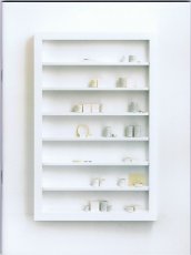
|
Technische
Angaben
-
[32] S., 26x22 cm, keine weiteren Angaben vorhanden
Softcover, Broschur
ZusatzInfos
-
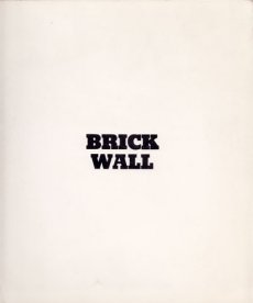
Brick Wall consists of sixteen, two-page prints that vary slightly in exposure. The piece surveys the repetition of form and texture to create a more complex whole, and exemplifies the utility of the camera to document processes and series, themes central to conceptual art.
Text von der Webseite
|
Technische
Angaben
-
13x13 cm, keine weiteren Angaben vorhanden
Musik-CD in gefalteter Papphülle mit Beiblatt in transparenter Kunststoffhülle, cover art: Stephane Leonard
ZusatzInfos
-
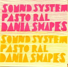
music by Daniel Lopatin aka Dania Shapes.
Soundsystem Pastoral was recorded by Daniel Lopatin aka Dania Shapes during the winter of 2004 using synthesizers, a first generation digital sequencer, and a freeware sound editor. It was remixed in 2006 for the release on naivsuper.
Celebrating the potential of amateurishness, decadence and romance in the realm of digital audio arts, Lopatin looks to marry the aesthetic sensibilities of experimental electronics with his allegiance to the classic 'beauty' in music. 'Glitch' is less a process for Lopatin -- rather it is an aesthetic impression which Lopatin emulates by hand. Pairing the residual effects of romantic, heart string melodies with steroidal, detailed, maximalist noise, Dania Shapes' audible bricolage is a tribute to both the beautiful and the broken all at once.
Working with simple tools such as handheld tape recorders, retro synthesizers, and a personal computer, Lopatin creates conceptual systems and processes to create a solo music that's beautiful and inventive, with interesting textures and unexpected sonic interventions. The music has a lush, ambient quality, but an edge as well. Throughout the CD, one finds a subtle use of repetition. The pieces are formally well-conceived and never contrived. The music is clearly indebted to heroes of electronica such as Christian Fennesz, William Basinski, and Brian Eno. and it has links to classic experimentalists such as David Tudor and David Behrman. Yet Lopatin maintains a more song-based musical position that results in an accessible product that will attract fans of ambient, post-rock, and experimental music
|
Technische
Angaben
-
240 ca. S., 12,5x10 cm, Auflage: 2.000, ISBN/ISSN 0894390139
Umschlag aus Karton mit Leinenstreifen, ca. 120 Seiten gestanzt
ZusatzInfos
-
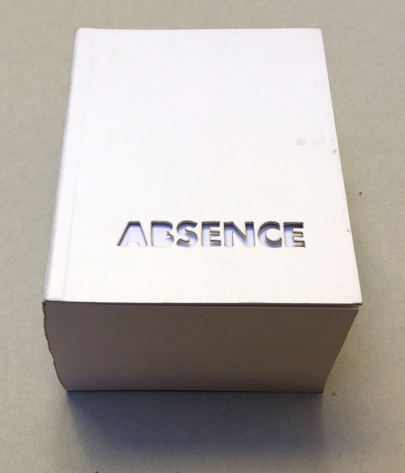
2004 winner of I.D. Magazine's Design Distinction award, Absence is the third book to come out of Printed Matter’s Publishing Program for Emerging Artists, a program made possible through the generous support of New York City's Department of Cultural Affairs, The Andy Warhol Foundation for the Visual Arts, the Elizabeth Firestone Graham Foundation, and the Heyday Foundation. The generosity of Whitney trustees Melva Bucksbaum and Raymond J. Learsy was instrumental to the Museum’s participation in the publication of this exciting new work.
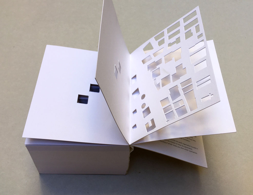
Both a book and a sculptural object, Absence is a memorial to the twin towers of the World Trade Center. Yoon, an architect and designer who is currently an Assistant Professor of Architecture at the Massachusetts Institute of Technology, chose not to produce a traditional design proposal for the World Trade Center Memorial Competition. Instead she created a non-architectural, non site-specific space of remembrance: a portable personal memorial in the form of book.
At almost two pounds, Absence has a considerable physical presence, but it is in every way the ghost of a presence, and it is this ghostliness that gives it its particular emotional weight. A solid white block of thick stock cardboard pages, the book’s only "text" consists of one pinhole and two identical squares die-cut into each of its one-hundred-and-twenty pages – one for each story of the towers including the antenna mast. These removed elements lead the reader floor by floor through the missing buildings towards the final page where the footprint of the entire site of the World Trade Center is die-cut into a delicate lattice of absent structures.
Of all of the proposed monuments and grand designs for the twin towers to emerge in the last two years, Absence is remarkable for its employment of an under-used strategy: restraint. The simplicity of Yoon’s materials and her use of repetition speak, without words, about unspeakable loss. Quiet, respectful, mournful, the book does not aim to represent the magnitude of the disaster. Instead it appeals to the vastness of the reader’s imagination and capacity to grieve. The human scale of her memorial operates on a personal level – it delivers the memory of lives lost into the reader’s hands. At the same time, as a scale model of a vanished architectural site, it operates on a larger cultural level by commemorating the site itself.
Text von der Webseite. Fotos Xenia Fumbarev
|
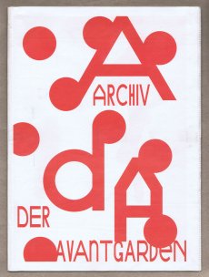
Titel
-
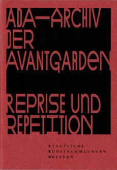
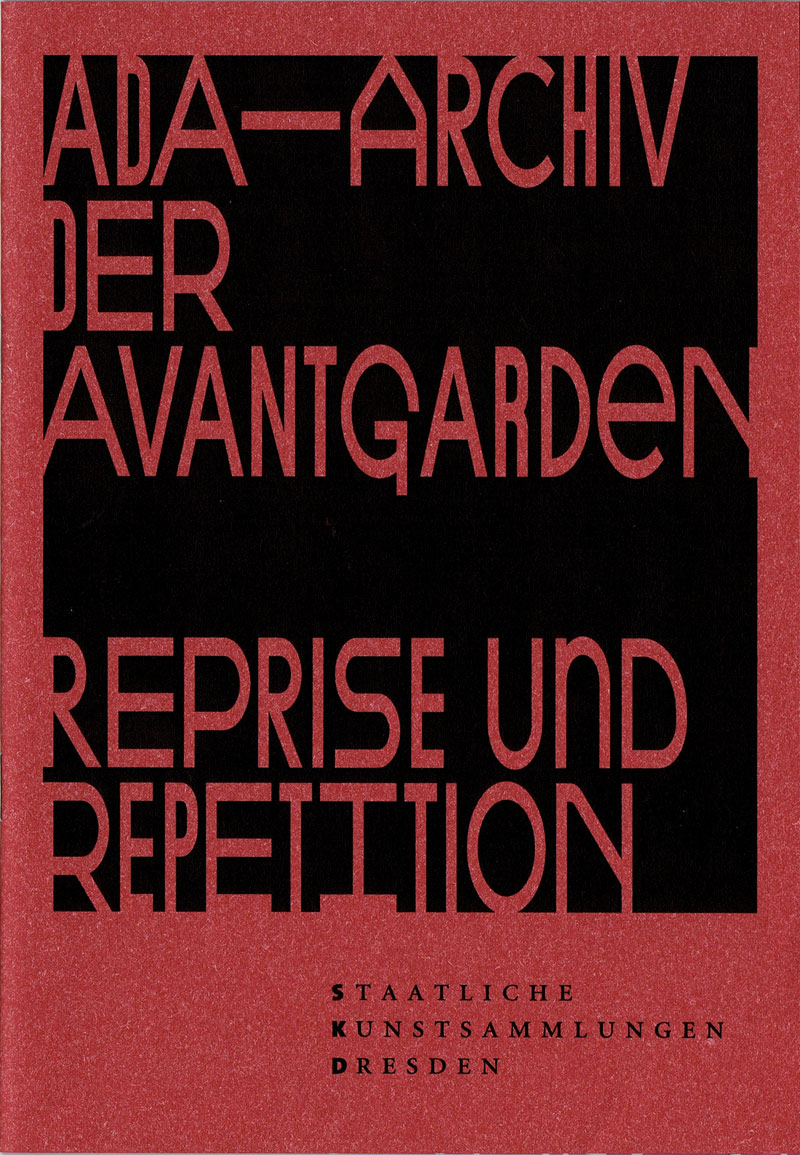
AdA - Archiv der Avantgarden - Reprise und Repetition
Technische
Angaben
-
48 S., 21x14,5 cm, keine weiteren Angaben vorhanden
Drahtheftung
ZusatzInfos
-
Erschienen zur Ausstellung System AdA: Reprise und Repetition ,in Japanisches Palais, 10.10.-04.11.2017.
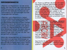
"Reprise und Repetition“ ist der erste Essay, den das Archiv der Avantgarden (AdA) präsentiert und der sich vorwiegend mit der Rolle des Archivs als Verwahrungsort für Erinnerungen aus der Vergangenheit befasst.
„Reprise“ und „Repetition“ haben unterschiedliche philosophische Bedeutungen, auch wenn die Begriffe oft als gleichbedeutend betrachtet werden. Repetition meint die Wiederholung von etwas, das bereits gesagt oder getan worden ist. Reprise bedeutet wörtlich eine Wiederaufnahme. In dieser Diskussion lauert eine große und eher unbequeme Frage: Was will man mit der Vergangenheit anfangen?
Vorträge und Gespräche u.a. mit Egidio Marzona, Tobia Bezzola, Bernd Dicke und Arbeiten von Bas Jan Ader, Alighiero Boetti, Robert Barry, Max Bill, Walter Benjamin, Guy Debord, Robert Filliou, Sol Lewitt und mehr
|
Titel
-
AdA - Archiv der Avantgarden - Reprise und Repetition
Technische
Angaben
-
[48] S., 35,5x25,8 cm, keine weiteren Angaben vorhanden
Blätter lose ineinander gelegt, Rotationsdruck auf Zeitungspapier
ZusatzInfos
-
Erschienen zur Ausstellung System AdA: Reprise und Repetition ,in Japanisches Palais, 10.10.-04.11.2017, gehört zum kleinen Programmheft dazu.
Nur farbige Grafiken ohne Text.
|
Titel
-
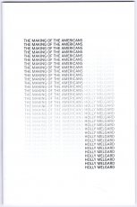
The Making Of The Americans
Technische
Angaben
-
36 S., 22,8x15,2 cm, Auflage: Print on Demand, ISBN/ISSN 580088985832
Drahtheftung, Softcover, Digitaldruck
ZusatzInfos
-
Now "there is no such thing as repetition" in The Making of Americans, because I deleted it. Herein, every word and punctuation mark is retained according to its first (and hence last) appearance in Gertrude Stein's 925-page edition of the book.
Text aus dem Vorwort des Heftes.
|
Titel
-
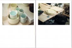
MONO.KULTUR #40 Edmund de Waal - W is for White
Technische
Angaben
-
44 S., 20x15 cm, ISBN/ISSN 18617085
Drahtheftung, auf verschiedenem Papier gedruckt
ZusatzInfos
-
Edmund de Waal is a potter. His pots, plates, and vessels are the result of craft and mastership, but they are also so much more than that: they are experiments in form and function, abstractions of thoughts on silence and space, on repetition and failure, on substance and fragility, on memory contained. Edmund de Waal is an artist. He arranges his objects in complex choreographies that are as mysterious as they are mesmerizing. Displayed in galleries and institutions worldwide, his considered installations play with architectural concerns, integrating ideas of space, light and obscurity. Edmund de Waal is a writer. Whether he sculpts with words or with clay, what Edmund de Waal works with are concepts, ideas, and desires. In a body of work that is at odds with our times and yet oddly successful, his writings and objects overlap and integrate each other in an attempt to understand and transcend our complex relationship with objects and our surroundings. In an interview with mono.kultur structured like an A-Z of notes and ideas, Edmund de Waal talked about his rules of attachment, the impossibility of repetition, and why ‘doubt’ is the most beautiful word. Visually, the issue takes inspiration from that most perfect of materials: porcelain. Printed entirely in double-sided splendour, the two finishings of the paper – shiny gloss and smooth matt – evoke the texture of ceramics before and after glazing.
Text von der Website.
|
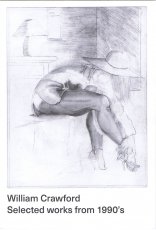
Titel
-
Selected works from 1990's
Technische
Angaben
-
[32] S., 19x13 cm, Auflage: 500, keine weiteren Angaben vorhanden
Drahtheftung, Schwarz-Weiss Offsetdruck
ZusatzInfos
-
The William Crawford Estate is owned and represented by Ampersand Gallery. William Crawford's drawings were discovered in an abandoned house in Oakland, California. His work brings to mind characteristics of prison drawings, an impression confirmed by the fact that several were made on the backs of prison roster sheets dated 1997. These printouts, however, were cut down the middle, so the exact prison from which they originate is unknown. But given their origin in the Bay Area and the fact that several drawings include San Francisco landmarks, it's possible that Crawford made the work in a California state prison. Other than this information drawn from the archive itself, nothing is known about Crawford's life. Indeed, we only know his name because he signed just a few of the drawings, either as Bill, William or WM Crawford. The archive appears to have consisted of several books, with individual drawings in sequences of 30 or more adding up to tell complex visual stories. Several include written captions or fragments of conversation between male and female characters. These sequences, however, have been broken up over the years and reach us now in a fragmentary and fascinating collection of hundreds of delicate pencil drawings. The work conveys the intense sense of sexual longing of a man with an urge to tell dynamic stories. The drawings, which resemble the eroticism of Eric Stanton, the exaggerated male anatomy of Tom of Finland or the ample breasts of a John Currin, show scantily dressed women, drug use, cuckolding and orgies. The details of his interiors, the hairdos and style of dress suggest that Crawford might have come of age in the late 70s or early 80s. A cast of recurring figures populate the drawings, notably one man with a short afro and a moustache who often figures at the center of events, presumably the artist William Crawford himself. Remarkably, given the number of drawings, there is little to no repetition in the work. Crawford’s inventive eye for sexual positions, facial expressions and gestures of hand and body was vast and masterful. Simple geometric details and architectural subtleties define the unusual settings where the action unfolds. We see rooms shown from unusual angles, features that are hinted at, erased or altogether omitted and articles of clothing that are drawn with obsessive precision. This singular and original drawing style compels us to immerse ourselves in the world William Crawford created, more dream than documentation, more fantasy than perversion. Crawford's drawings have been widely exhibited, notably at Galerie Susanne Zander (Cologne and Berlin), Zieher, Smith and Horton (New York), Freddy (Baltimore) and upcoming solo exhibitions at FARAGO (Los Angeles) and Richardson (New York). His work is also featured in the latest issue of Richardson Magazine and was included in "System and Vision" at David Zwirner, an exhibition organized in collaboration with Delmes & Zander. Reviewing it, The New Yorker wrote, "William Crawford's orgiastic illustrations on the backs of prison rosters haven an erotic intensity that rivals anything by Hans Bellmer or Pierre Klossowski."
Text von der Webseite
|
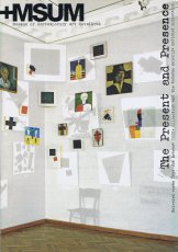
Titel
-
The Present and the Presence
Technische
Angaben
-
64 S., 21x14,7 cm, Auflage: 5.000, keine weiteren Angaben vorhanden
Drahtheftung
ZusatzInfos
-
Heft zur gleichnamigen Ausstellung, die am 26.11.2011 im +MSUM - Museum of Contemporary Art Metelkove in Ljubljana eröffnet wurde. Präsentiert wurden über 2000 Werke der Sammlungen von Arteast and der Moderna Galerija.
|
Titel
-
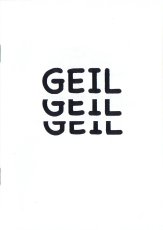
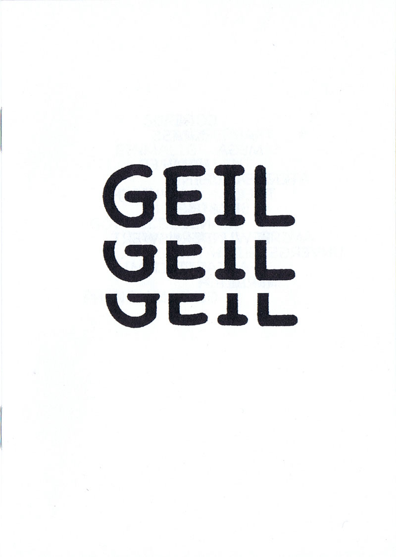
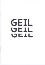
so-VIELE.de Heft 101 2024 - GEIL GEIL GEIL
Technische
Angaben
-
20 S., 14,8x10,5 cm, Auflage: 300, 2 Stück. ISBN/ISSN 9783689190255
Drahtheftung, Schwarz-Weiß-Druck
ZusatzInfos
-
Synonyme zum Wort GEIL, aus der Jugendsprache.
Das Heft ist ein kleiner „Katalog der Superlative“, zusammengestellt für junge Leute, um sie neben ihren Lieblingswörtern wie geil, mega, cool und krass zum Gebrauch vielfältiger Synonyme zu animieren.
Die Wiederholung des Wortes GEIL auf dem Cover verweist auf die Magie der Sprache. Am Anfang zieht die dreifache Repetition den Leser in den Bann. Am Ende der Lektüre lösen die vielen positiven Wörter einen Feelgood-Moment aus.
|
Titel
-
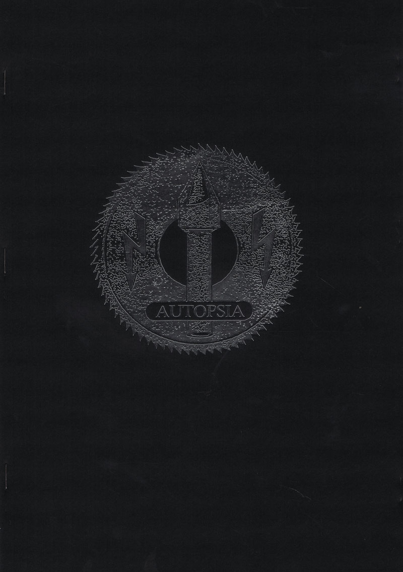
Autopsia - Ogledalo uništenja - Mirror of Destruction
Technische
Angaben
-
[52] S., 29,7x21 cm, Auflage: 800, ISBN/ISSN 9788671012775
Seitlich dreifach geklammert, Prägung mit Silberfolie, farbig bedruckt, erste Seite schwarzes Papier
ZusatzInfos
-
Begleitmaterial zur gleichnamigen Ausstellung von 11.03.-11.04.2010 im MoCAB Salon des Museums für moderne Kunst in Belgrad.
Autopsia ist ein europäisches Kunstprojekt, das sich mit Musik, Malerei, Grafik und Medienkunst beschäftigt. Das Projekt versteht sich als depersonalisierte Künstlergruppe, die nur wenige Informationen über sich der Öffentlichkeit preisgibt.
Entstanden sein soll Autopsia Ende der 1970er Jahre in London. Die Arbeit in Jugoslawien begann um 1980. Erstmals erwähnt wurde Autopsia in den jugoslawischen Fanzines Bank Rot und Prose Selavy. In dieser Zeit wurden etwa ein dutzend Kassetten veröffentlicht, von denen nur noch wenige bekannt sind. Seit 1990 ist der Sitz von Autopsia Prag. Die Gruppe betrachtet diese Stadt als spirituellen Mittelpunkt der Welt, als „Geistzentrale“.
Inhaltlich setzt sich Autopsia vor allem mit dem Thema „Tod“ in all seinen metaphorischen Bedeutungen auseinander. Als Hauptstilmittel dient die Repetition.
|
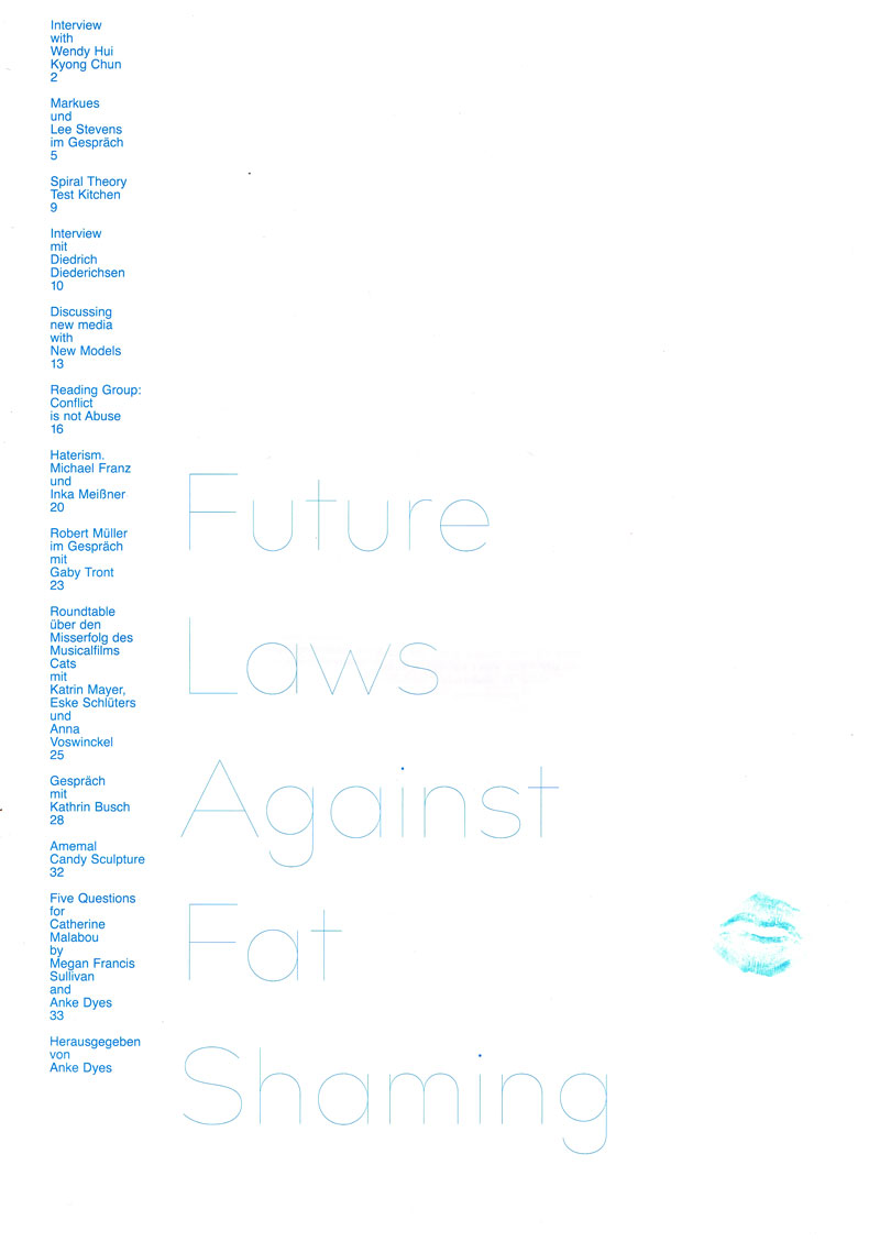
Titel
-
Future Laws Against Fat Shaming
Technische
Angaben
-
40 S., 42x29,7 cm, keine weiteren Angaben vorhanden
Drahtheftung, rückseitig metallicblaue gesprayte Flecken
ZusatzInfos
-
Future Laws Against Fat Shaming revolves around the question of what happens to the body on the Internet, in a public sphere where encounters increasingly take place digitally, online.
Between July and September 2020, in a series of interviews and discussions Anke Dyes explored this issue, dealing with concepts such as body positivity, cancelling, CGI, coming-out, fat activism, corporeality, laws, habits, haterism, intention, cats, conflicts, marginalization, micro-actions, narcissism, passivity, social media, statistics, surveillance, repetition, and the Internet’s age of inquisition.
Future Laws Against Fat Shaming dreht sich um die Frage, was mit dem Körper im Internet geschieht, in einer öffentlichen Sphäre, in der Begegnungen zunehmend digital, online stattfinden.
Zwischen Juli und September 2020 untersuchte Anke Dyes in einer Reihe von Interviews und Gesprächen diese Frage und befasste sich mit Begriffen wie Body Positivity, Cancelling, CGI, Coming-out, Fat Activism, Körperlichkeit, Gesetze, Gewohnheiten, Haterismus, Absicht, Katzen, Konflikte, Marginalisierung, Mikro-Aktionen, Narzissmus, Passivität, soziale Medien, Statistiken, Überwachung, Wiederholung und das Zeitalter der Inquisition im Internet.
Übersetzt mit DeepL
|
Technische
Angaben
-
200 S., 18,5x14,5 cm, ISBN/ISSN 978-3-446-16042-2
Fadenheftung mit Schutzumschlag.
ZusatzInfos
-
Mit diesem Bch werden die ersten beiden Gedichtbände von Paul Wühr, die lange vergriffen waren, noch einmal vorgelegt: Grüß Gott und Rede - zwei Bände einer intensiven Selbsterkundung."Es dreht sich darum, die ursprüngliche Unordnung wiederherzustellen" so Paul Wühr, "und Zweifel zu wecken an jeder gewaltsamen Aufteilung in>richtig< und >falsch<." Dem Klappentext entnommen.
|
Titel
-
Kastanienallee - Texte und Kommentare
Technische
Angaben
-
122 S., 20,2x14,6 cm, ISBN/ISSN 3-351-00346-3
Fadenheftung, Hardcover.
|
Titel
-
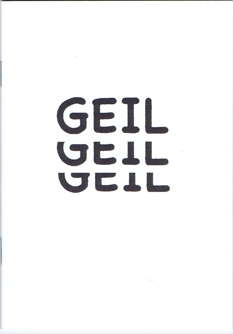
so-VIELE.de Heft 122 2025 - GEIL GEIL GEIL
Technische
Angaben
-
20 S., 14,8x10,5 cm, Auflage: 300, 2 Stück. ISBN/ISSN 978-3-68919-068-2
Drahtheftung, Schwarz-Weiß-Druck
ZusatzInfos
-
2. Auflage des Heftes 101 von 2024. Synonyme zum Wort GEIL, aus der Jugendsprache.
Das Heft ist ein kleiner „Katalog der Superlative“, zusammengestellt für junge Leute, um sie neben ihren Lieblingswörtern wie geil, mega, cool und krass zum Gebrauch vielfältiger Synonyme zu animieren.
Die Wiederholung des Wortes GEIL auf dem Cover verweist auf die Magie der Sprache. Am Anfang zieht die dreifache Repetition den Leser in den Bann. Am Ende der Lektüre lösen die vielen positiven Wörter einen Feelgood-Moment aus.
|