Gesucht wurde Radical Matters, Medienart , Sortierung DatensatzNr., aufsteigend.
Kein exaktes Ergebnis. Alternative Fundstellen: 32 Treffer
AAP Archive Artist Publications - Munich - www.artistbooks.de
 
Verfasser
Titel
Verlag Jahr
Ort Land
Medium
Technische
Angaben
Sprache
ZusatzInfos
WEB Link
Geschenk von
TitelNummer
|
 
Verfasser
Titel
Verlag Jahr
Ort Land
Medium
Technische
Angaben
WEB Link
TitelNummer
|
Verfasser
Titel
Verlag Jahr
Ort Land
Medium
Technische
Angaben
Sprache
ZusatzInfos
Schlagwort
WEB Link
TitelNummer
|
Verfasser
Titel
Verlag Jahr
Ort Land
Medium
Technische
Angaben
Sprache
ZusatzInfos
Weitere
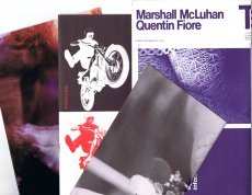
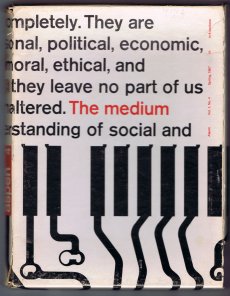
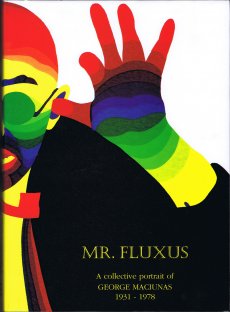
Personen Danny Lyon (Autor) Dick Higgins (Fluxus-Künstler - Autor - Verleger) Edgar Varèse (Komponist) Marshall McLuhan (Medientheorethiker) Quentin Fiore (Gestaltung)
Schlagwort
WEB Link
Erworben bei M + R Fricke
TitelNummer
|
Verfasser
Titel
Verlag Jahr
Ort Land
Medium
Technische
Angaben
ZusatzInfos
Weitere
Personen
Schlagwort
Geschenk von
TitelNummer
|
Verfasser
Titel
Verlag Jahr
Ort Land
Medium
Technische
Angaben
Sprache
ZusatzInfos
Weitere
Personen
Schlagwort
WEB Link
WEB Link
Geschenk von
TitelNummer
|
Verfasser
Titel
Verlag Jahr
Ort Land
Medium
Technische
Angaben
Sprache
ZusatzInfos
Weitere
Personen
Schlagwort
Erworben bei Stefan Brand
TitelNummer
|
Verfasser
Titel
Verlag Jahr
Ort Land
Medium
Technische
Angaben
ZusatzInfos
Weitere
Personen Temporary Art Platform (tap.)
Schlagwort
WEB Link
Geschenk von
TitelNummer
|
Verfasser
Titel
Verlag Jahr
Ort Land
Medium
Technische
Angaben
Sprache
ZusatzInfos
Weitere
Personen
Geschenk von
TitelNummer
|
Verfasser
Titel
Verlag Jahr
Ort Land
Medium
Technische
Angaben
ZusatzInfos
Weitere
Personen
Schlagwort
TitelNummer
|
Verfasser
Titel
Verlag Jahr
Ort Land
Medium
Technische
Angaben
Sprache
ZusatzInfos
Weitere
Personen
Schlagwort
WEB Link
Geschenk von
GND Permalink
TitelNummer
|
 
Verfasser
Titel
Verlag Jahr
Ort Land
Medium
Technische
Angaben
Sprache
Weitere
Personen
Schlagwort
Geschenk von
TitelNummer
|
 
Verfasser
Titel
Verlag Jahr
Ort Land
Medium
Technische
Angaben
Sprache
ZusatzInfos
WEB Link
WEB Link
Geschenk von
Erworben bei Call for Entry Slanted45
TitelNummer
|
Verfasser
Titel
Verlag Jahr
Ort Land
Medium
Technische
Angaben
ZusatzInfos
Weitere
Personen
Schlagwort
WEB Link
Nachlass von Berengar Laurer
TitelNummer
|
Verfasser
Titel
Verlag Jahr
Ort Land
Medium
Technische
Angaben
ZusatzInfos
Weitere
Personen
Schlagwort
TitelNummer
|
Verfasser
Titel
Verlag Jahr
Medium
Technische
Angaben
ZusatzInfos
Schlagwort
TitelNummer
|
 
Verfasser
Titel
Verlag Jahr
Medium
Technische
Angaben
ZusatzInfos
Schlagwort
TitelNummer
|
Verfasser
Titel
Verlag Jahr
Ort Land
Medium
Technische
Angaben
Sprache
ZusatzInfos
Schlagwort
TitelNummer
|
Verfasser
Titel
Verlag Jahr
Ort Land
Medium
Technische
Angaben
TitelNummer
|
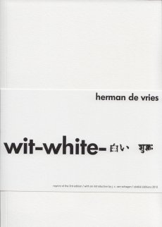 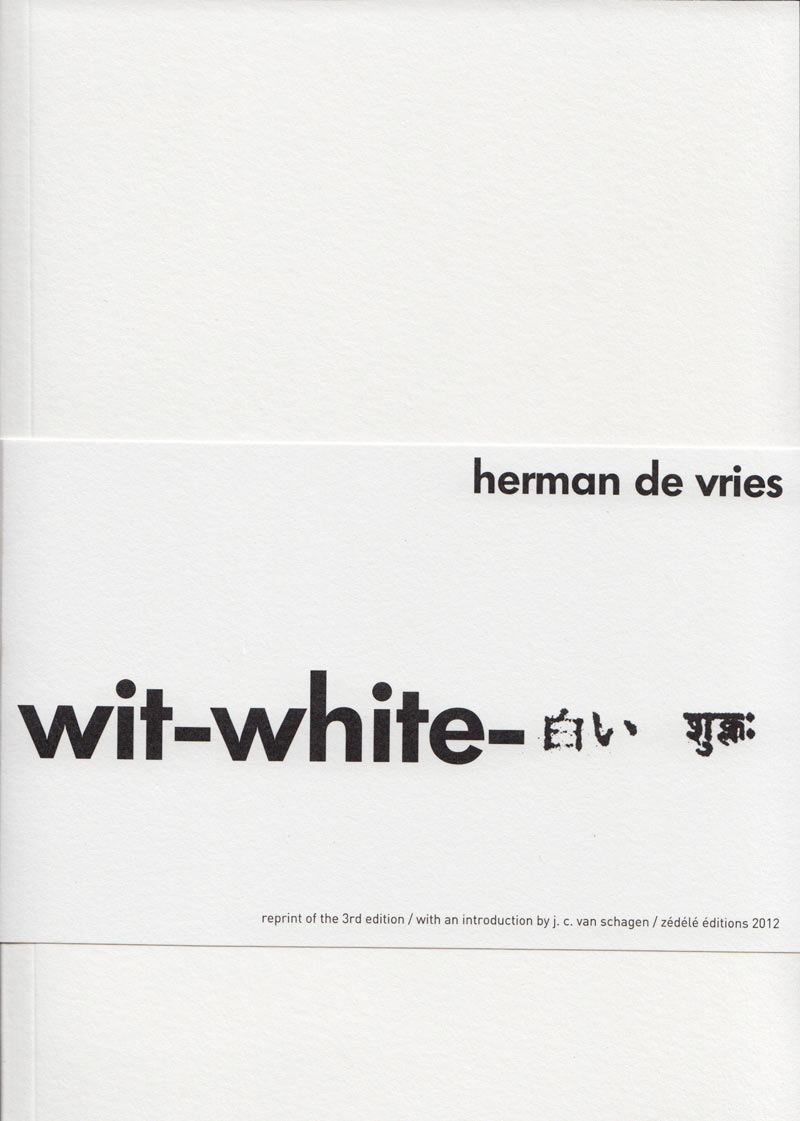
Verfasser
Titel
Verlag Jahr
Ort Land
Medium
Technische
Angaben
ZusatzInfos
Erworben bei Zédélé éditions
TitelNummer
|
 
Verfasser
Titel
Verlag Jahr
Ort Land
Medium
Technische
Angaben
ZusatzInfos
Geschenk von
TitelNummer
|
 
Verfasser
Titel
Ort Land
Medium
Technische
Angaben
Schlagwort
Erworben bei Verlag Fröhlich&Kaufmann
TitelNummer
|
Verfasser
Titel
Verlag Jahr
Medium
Technische
Angaben
ZusatzInfos
Erworben bei Booklyn
TitelNummer
|
Verfasser
Titel
Ort Land
Medium
Technische
Angaben
Sprache
ZusatzInfos
Weitere
Personen
Schlagwort
TitelNummer
|
Verfasser
Titel
Verlag Jahr
Ort Land
Medium
Technische
Angaben
Sprache
ZusatzInfos
Weitere
Personen
Erworben bei art book cologne
TitelNummer
|
Verfasser
Titel
Ort Land
Medium
Technische
Angaben
Sprache
ZusatzInfos
Weitere
Personen
Erworben bei art book cologne
TitelNummer
|
Verfasser
Titel
Verlag Jahr
Ort Land
Medium
Technische
Angaben
Sprache
ZusatzInfos
Weitere
Personen
Schlagwort
WEB Link
Geschenk von
TitelNummer
|
Verfasser
Titel
Verlag Jahr
Ort Land
Medium
Technische
Angaben
Sprache
ZusatzInfos
Weitere
Personen
Schlagwort
WEB Link
WEB Link
TitelNummer
|
Verfasser
Titel
Verlag Jahr
Ort Land
Medium
Technische
Angaben
Sprache
ZusatzInfos
Geschenk von
TitelNummer
|
Verfasser
Titel
Verlag Jahr
Ort Land
Medium
Technische
Angaben
Sprache
ZusatzInfos
Weitere
Personen
Schlagwort
Erworben bei Pennasilico Libri, Mailand
TitelNummer
|
Verfasser
Titel
Verlag Jahr
Ort Land
Medium
Technische
Angaben
Sprache
ZusatzInfos
Weitere
Personen
Schlagwort
WEB Link
Geschenk von
TitelNummer
|
 
Verfasser
Titel
Verlag Jahr
Ort Land
Medium
Technische
Angaben
Sprache
ZusatzInfos
Weitere
Personen
Schlagwort
WEB Link
Geschenk von
TitelNummer
|
Copyrighthinweis: Das Copyright für die abgebildeten Publikationen bleibt bei den jeweiligen Rechteinhabern (Autoren, Künstlern, Fotografen, Gestaltern, Publizisten). Die Abbildungen und Textzitate dienen der künstlerischen und wissenschaftlichen Recherche.
Hier werden Werke dokumentiert, die sonst nur schwer oder gar nicht zugänglich wären. Wer nicht damit einverstanden ist, dass sein Werk auf dieser Webseite gezeigt wird, kann die Abbildung umgehend durch mich löschen lassen.
Für wissenschaftliche Recherchen können die großen Abbildungen auf Antrag freigeschaltet werden.
Wenn Sie als Rechteinhaber möchten, dass Ihre Abbildungen bei Klick größer gezeigt werden (Höhe x Breite = ca. 800 x 1200 Px), dann melden Sie sich bitte bei mir: