|
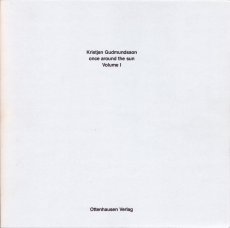
Titel
-
Once around the sun, Volume I + Volume II
Technische
Angaben
-
1448 S., 28x27x8,5 cm, Auflage: 100, signiert, ISBN/ISSN 3922760058
Broschur, Softcover, 2 Bücher in Schuber
ZusatzInfos
-
Volume one contains very many pages with incredibly many dots on each page. We are to understand that each of these dots represents one second of the time it takes the earth to once orbit the sun. The second volume contains again very many pages with each incredibly many parallel lines. The length of all those lines together represents the true distance covered by the earth each second on its way to orbit the sun.
2. Auflage
|
Technische
Angaben
-
keine weiteren Angaben vorhanden
|
Titel
-
Die Schönheit der Frauen. Female Beauty. Photographische Freilichtstudien. Studies in the open-air
Technische
Angaben
-
88 S., 27x21,2 cm, Auflage: 500, ISBN/ISSN 392883343X
Hardcover
|
Technische
Angaben
-
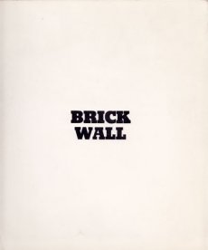
[32] S., 26x22 cm, keine weiteren Angaben vorhanden
Softcover, Broschur
ZusatzInfos
-
Brick Wall consists of sixteen, two-page prints that vary slightly in exposure. The piece surveys the repetition of form and texture to create a more complex whole, and exemplifies the utility of the camera to document processes and series, themes central to conceptual art.
Text von der Webseite
|
Titel
-
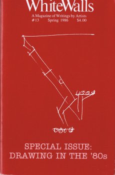
WhiteWalls #13 - a magazine of writings by artists - Drawing in the 80s
Technische
Angaben
-
96 S., 21,7x14 cm, ISBN/ISSN 01909835
Broschur
ZusatzInfos
-
A Magazine of Writing by Artists.
Founded in 1978 in Chicago by artist Buzz Spector and writers Reagan and Roberta Upshaw, Whitewalls began as a publication for artists working with language. For the most part Whitewalls is a straight-up sampler of artists' experimental projects for the page: each issue contains from half a dozen to several dozen artists employing text, image, and other notations in various combinations. While Whitewalls featured an international cast of emerging and established artists, it also provided a showcase for the Chicago area's experimental art community, including artists such as Jeane Dunning, Joseph Nechvatal, and Christopher Wool. Text von der Website
Mit Texten u. a. von Richard Artschwager, Andrea Blum, Christo, Mike Kelly, Lawrence Weiner, Mark Staff Brandl, Rosemary Mayer, Paolo Colombo, Joel Hubaut
|
Titel
-
Off to the Front in the Great Art War
Technische
Angaben
-
26x19,3 cm, keine weiteren Angaben vorhanden
|
Titel
-
Arbeiten / Travaux / Works 1971-1981
Technische
Angaben
-
21,5x30,5 cm, 2 Stück. ISBN/ISSN 3855620012
Einband aus Leinen, Hardcover mit Schutzumschlag
ZusatzInfos
-
Erschienen zu den Ausstellungen in der Kunsthalle Basel, ARC _ Musée d'Art Moderne de la Ville de Paris, Le Noveau Musée Villeurbanne, Frankfurter Kunstverein, in den Jahren 1982-1983
|
Titel
-
stars & stripes - new york garbage flag profile
Technische
Angaben
-
292 S., 21,4x15,2 cm, Auflage: 550, ISBN/ISSN 3865880940
Fadenheftung mit flexiblem Plastikeinband
ZusatzInfos
-
First this was was a series of ephemeral situations in public space in New York 2002–2003. They become comprehensible through the publication of a book. The New York Garbage Flag Profile presents Berlin-based artist Michalis Pichler’s six month long project in which he collected and documented discarded paper cups, plastic bags, pizza boxes, newspapers and other mass-produced materials emblazoned with the American Flag.
Photographed in the public waste baskets, gutters and snow drifts of New York where he found them, the individual items are catalogued on a facing page with uniformly formatted information about their location, the date of their collection, number of flags depicted, number of stars, number of stripes, etc. Each record also includes a full transcription of the text found on the item. The nearly three hundred color photographs in the book are organized into forensic pairs showing the collection site before and after the artist’s intervention. This clinical presentation however belies the artist’s gentle, almost reverent approach to his material-garbage, after all. (Rachel Bers)
Text von der Webseite
|
Technische
Angaben
-
192 S., 20x15 cm, ISBN/ISSN 9781564660923
softcover
ZusatzInfos
-
Charley is a contemporary art publication series edited by Maurizio Cattelan, Massimiliano Gioni and Ali Subotnick. A do-it-yourself magazine, Charley is an inclusive publication relying on assimilation, rather than on selection : Charley is a machine for redistribution, a mechanism for spreading and exploiting information, rumors, and communication. Like most information, it is partial, unstable, and untrustworthy. There are no hierarchies and no favorites in Charley : it flirts equally with celebrity and failure. Charley is a multiform creature, bound to transform with each issue. Charley is a pre-digested combine, with pages assembled from catalogues, brochures, press clips, postcards, and other visuals. But what is Charley really? Charley is a new publication on emerging artists. Prominent curators, writers, artists, and other arts professionals from around the world were asked to suggest up to 10 up-and-coming artists and/or submit materials on the artists for inclusion in Charley. 400 art makers from around the globe responded, and each of them is represented by one page of Charley
|
Titel
-
Every book hides another book / Every page holds another page / Some more leaves
Technische
Angaben
-
18x12x2 cm, Auflage: 30, numeriert, signiert, keine weiteren Angaben vorhanden
antiquarisches Buch, innen beschriftet, eingewickelt in bedrucktes Papier, Teil einer Intervention im Antiquariat Zipprich in München, im Rahmen der Veranstaltung "Die Grammatik des Buches"
|
Titel
-
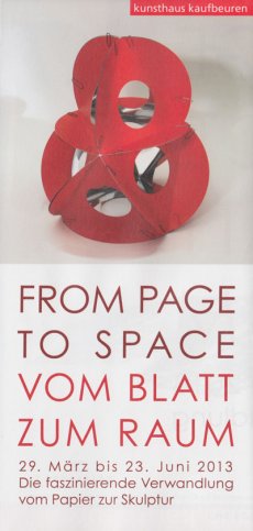
From Page to Space - Publizierte Papierskulpturen
Technische
Angaben
-
16x11,5 cm, keine weiteren Angaben vorhanden
Einladungskarte zur Ausstellung
|
Titel
-
From Page to Space - Published Paper Sculptures
Technische
Angaben
-
240 S., 15x15 cm, ISBN/ISSN 9783928761864
Broschur, 100 farbige Abbildungen
ZusatzInfos
-
Katalog zu einer Ausstellung im Studienzentrum für Künstlerpublikationen
|
Technische
Angaben
-
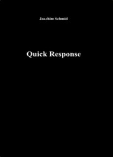
40 S., 20.5x12.5 cm, signiert, 2 Stück. keine weiteren Angaben vorhanden
Broschur
ZusatzInfos
-
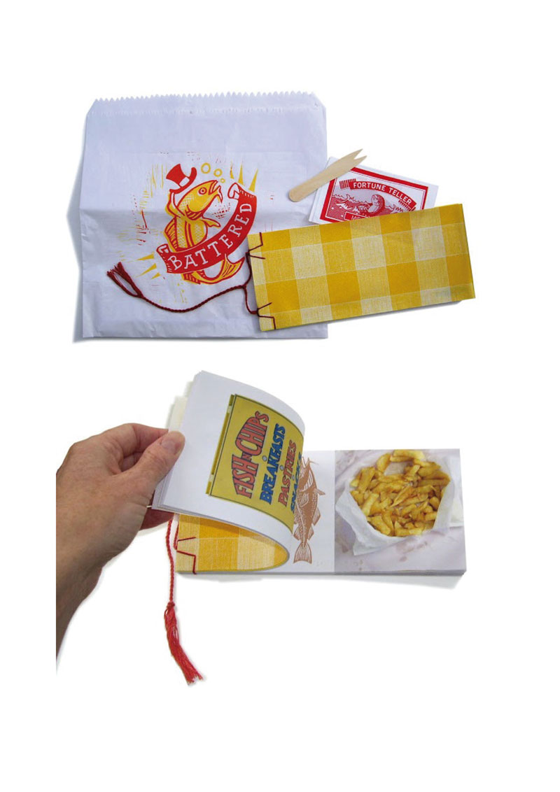
Quick Response is a hands-on introduction into the realm of QR code applications and demonstrates a way in which two-dimensional bar codes can be used to view images. People have to “read” this book by taking photos of each page using a cameraphone. The phone’s QR code reader will then decode the abstract image to reveal that each of them is an encoded URL for a photograph hosted on Flickr. The series of photos demonstrates the variety of modern commercial, artistic and subversive QR code applications. In addition, the book demonstrates a new way of appropriating other people’s photographs.
Text von der Website des Künstlers
|
Titel
-
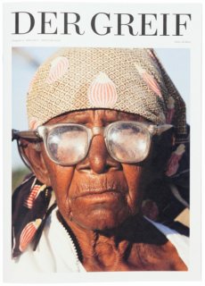
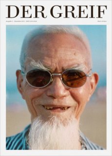
Der Greif Ausgabe 04 Juli 2011
Technische
Angaben
-
82 S., 35x25 cm, Auflage: 1.500, numeriert, 2 Stück. ISBN/ISSN 21914524
Drahtheftung
ZusatzInfos
-
The firth issue went through a redesign. Seems as if it was worth the effort, as Der Greif was honored with the reddot Design Award and the ADC Junior Award Silver. Besides that, the submissions are coming from all over the world. The page number was increased again, Der Greif show photography and poetry now on 84 pages. Altogether, the works of 80 photographers and 14 authors are published in the fourth issue.
Text von der Webseite.
|
Titel
-
Der Greif Ausgabe 05 Dezember 2011
Technische
Angaben
-
98 S., 35x25 cm, Auflage: 2.000, numeriert, 2 Stück. ISBN/ISSN 21914524
Drahtheftung
ZusatzInfos
-
550 photographers and authors from 41 countries submitted their works for the fifth issue. Responsive to the increased number and especially the outstanding quality of the submissions, the page number has now reached 100. In an exciting and intense curation and editing process, the works of 107 photographers and 22 authors were chosen and put into new combinations.
Text von der Webseite.
Was ist DER GREIF?
DER GREIF kuratiert Fotografien und Texte aus aller Welt. Jeder kann Arbeiten einreichen.
DER GREIF ist mobile Galerie und gleichzeitig Forum für die ausstellenden Künstler.
DER GREIF ist thematisch frei. Er lebt von der Kombination der eingesendeten Arbeiten.
DER GREIF steht einem Buch näher als einem herkömmlichen Magazin. Die Spannung der inszenierten Arbeiten wird nicht durch Werbung unterbrochen.
DER GREIF bildet und und konserviert eine zeitgenössische Vorstellung von Fotografie, Literatur und Ästhetik.
DER GREIF ist ein Experiment…
Wie funktioniert der Greif?
Fotografen und Autoren aus allen Teilen der Welt reichen über ein Upload-Formular auf der Magazin-Website bis zu 10 Arbeiten ein. Die Redaktion kuratiert die Einsendungen, kombiniert sie miteinander und stellt daraus neue Bild- und Textkompositionen zusammen. Demnach ist DER GREIF kein Portfolio-Magazin, sondern findet seinen Inhalt aus einer Fülle künstlerischer Arbeiten. Er lebt vom Vertrauen der Künstler in die sensible Kuration und Zusammenstellung durch die Redaktion des Magazins.
Warum gibt es den Greif?
Die Kuration und Gestaltung des Magazins ist ein intensiver Arbeitsprozess, die Intensität wird für den aufmerksamen Betrachter spürbar. DER GREIF ist somit ein Ruhepol in der täglichen Flut aus Bildern und Informationen. Er fordert zum genauen Betrachten, Verweilen, Nachdenken auf – er freut, schockiert, berührt, kurz: DER GREIF entfaltet sich erst voll durch die Emotionen und Gedanken der Betrachter. DER GREIF mäandert zwischen Märchenbuch, Ausstellungsraum und Reflexionsvorlage. Er steht in starker Verbindung zum Netz, bietet der Geschwindigkeit und der daraus resultierenden Oberflächlichkeit Kontra, vor allem durch einen entscheidenden Punkt: Er schafft Raum, der gefüllt werden darf mit eigenen Ideen, Perspektiven und Phantasien
|
Titel
-
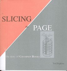
Slicing the Page - the story of Champion Books
Technische
Angaben
-
16x15 cm, keine weiteren Angaben vorhanden
geschnittener und gefalteter Bogen
|
Titel
-
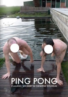
Ping Pong - a book of duels and duets
Technische
Angaben
-
204 S., 29,7x21 cm, ISBN/ISSN 9781908452146
ZusatzInfos
-
The artists Claudio Wichert & Clemens Wilhelm spend 90 days in a house to make a book. Each day they produce one page. Like in a match of ping-pong, each page is a reaction to the other artist's work from the day before. The two resulting storylines are presented in this book full of duels and duets. The media mix and only one thing is for certain: it's all or nothing.
Text von der Webseite
|
Technische
Angaben
-
176 S., 16,7x22,6 cm, ISBN/ISSN 2915173117
Hardcover
ZusatzInfos
-
zur Biennale Venedig 2005, französischer Pavillon
|
Titel
-
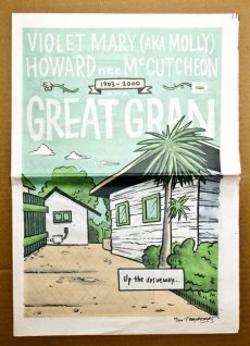
Great Gran - Violet Mary (Aka Molly) Howard nee McCutcheon
Technische
Angaben
-
12 S., 46,3x32 cm, Auflage: 100, numeriert, signiert, keine weiteren Angaben vorhanden
#92 in the series '200 People I Used To Know. Zeitung, Blätter lose ineinander gelegt
ZusatzInfos
-
Great Gran is a 12 page tribute comic to an amazing woman. Three colours, printed in tabloid newspaper format. Limited run of 100 copies, numbered and signed by the artist
|
Titel
-
Quart Heft für Kultur Tirol 20
Technische
Angaben
-
136 S., 30x24 cm, ISBN/ISSN 9783709970270
Originalbeilage von der Lichtkünstlerin Brigitte Kowanz, blaues Papier, geschnitten
ZusatzInfos
-
Das neue Quart ist an Lässigkeit kaum zu überbieten: Der Maler und Grafiker Jan Peter Tripp hat sich an die Gestaltung des Covers und einer Strecke im Innenteil gemacht. Zudem erzählt er von seinem Freund, dem Dichter W.G. Sebald. Büchner-Preisträger Walter Kappacher beschenkt Quart mit einem brandneuen Text, während Christoph W. Bauer einen Blick in sein neues Buch über jüdische Lebenswege gewährt. Weiters ließ sich Karl-Markus Gauß zum Interview bitten, Lydia Mischkulnig auf Landvermessung schicken und der Höhlenforscher Christoph Spöttl porträtieren.
Text von der Webseite
|
Titel
-
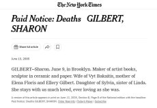
Paid Notice: Deaths GILBERT, SHARON
Technische
Angaben
-
keine weiteren Angaben vorhanden
Ausdruck nach Screnshot
ZusatzInfos
-
June 13, 2005
GILBERT--Sharon. June 9, in Brooklyn. Maker of artist books, sculptor in ceramic and paper. Wife of Vyt Bakaitis, mother of Elena Floris and Ellery Gilbert. Daughter of Sylvia, sister of Linda. She stays with us much loved, ever loving as she was.
A version of this article appears in print on June 13, 2005, Section B, Page 8 of the National edition with the headline: Paid Notice: Deaths GILBERT, SHARON.
Text von der Webseite
|
Titel
-
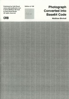
Photograph Converted into Base64 Code
Technische
Angaben
-
24 S., 20x14 cm, Auflage: 100, numeriert, keine weiteren Angaben vorhanden
Drahtheftung. Schwarz-Weiß-Digitaldruck
ZusatzInfos
-
This publication is part of the Tate Gallery special collection.
A photograph of a sculpture, made as part of an installation, converted into Base64 code. The code represents the image, and the sculpture yet is indecipherable. The code becomes an object on the page, a new language and text that cannot be read. Only the form can be read. The code is presented at a width of 72 characters using Courier. The width and font understood by the encoding software.
Text von der Webseite
|
Titel
-
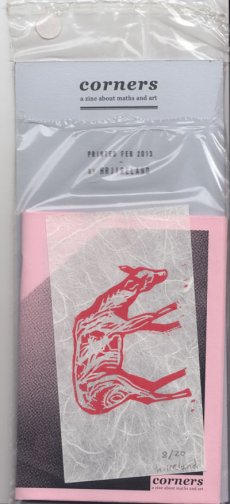
corners - a zine about maths and art
Technische
Angaben
-
32 S., 23x11 cm, Auflage: 20, numeriert, signiert, keine weiteren Angaben vorhanden
Heft aus rosa Papier, signierter Karton, (vermutlich Linolschnitt auf) Japanpapier, alles zusammen in transparenter Kunststoffhülle
ZusatzInfos
-
Finally finished the first personal project of the year. It's a zine and print package about a pretend statistical analysis I did to kill some time in 2010. It's taken me a couple of years to get round to collecting all the raw material I collected into this 32 page zine. I limited the run to 20 and I tried to make it as nice as possible. I'm pleased with it. In some ways it's the most complex personal project I've made in the real world...
Text von der Webseite
|
Titel
-
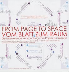
From Page to Space - Vom Blatt zum Raum - Die faszinierende Verwandlung vom Papier zur Skulptur
Technische
Angaben
-
84x59 cm, keine weiteren Angaben vorhanden
Plakat zur Ausstellung
|
Titel
-
From Page to Space - Vom Blatt zum Raum - Die faszinierende Verwandlung vom Papier zur Skulptur
Technische
Angaben
-
21x21 cm, keine weiteren Angaben vorhanden
Flyer zur Ausstellung, als Faltanweisung, inspiriert von "Breath" von Paul Ramirez Jonas
|
Titel
-
From Page to Space - Vom Blatt zum Raum - Die faszinierende Verwandlung vom Papier zur Skulptur
Technische
Angaben
-
21x10 cm, keine weiteren Angaben vorhanden
Flyer zur Ausstellung, gefaltetes Plakat mit dem Programm
|
Titel
-
From Page to Space - Vom Blatt zum Raum - Biographien der Künstler in alphabetischer Reihenfolge
Technische
Angaben
-
21 S., 31,5x24,6 cm, keine weiteren Angaben vorhanden
Laserdrucke in schwarzer Sammelmappe mit Aufkleber, für die Besucher er Ausstellung
|
Titel
-
Artist Music Journals Vol. 1 No. 03
Technische
Angaben
-
[24] S., 26,5x26,5 cm, Auflage: 1.000, numeriert, keine weiteren Angaben vorhanden
Drahtheftung, Heft in Pappschuber mit Aufkleber
ZusatzInfos
-
Artist Music Journal is an ongoing, limited edition small book series published by Sound Screen Design that focuses on the inseparable connection between music and art. Each release is limited to 1,000 copies, features a 24 page, saddle-stitched small book printed on thick stock and encased in a 10″., record jacket. The artists signature is replicated on a letterpressed sticker placed around the jacket opening, and hand numbered.
Daniel Higgs is a musician and artist from Baltimore, Maryland, who has been a contributor to the independent art and music community for nearly 3 decades. His artistic work ranges from musical records to books of poetry to visual collections of his drawing, painting and collage work
|
Titel
-
Artist Music Journals Vol. 1 No. 10 - Brian Roettinger & No Age
Technische
Angaben
-
[24] S., 26,5x26,5 cm, Auflage: 1.000, numeriert, keine weiteren Angaben vorhanden
Drahtheftung, in Heft eingelegt eine Schallplatte in Schutzumschlag, in Pappschuber mit Aufkleber. Einseitige 10" Schallplatte "Brian Roettinger w/ No Age", 45 UpM, Katalognr. SSD.10
ZusatzInfos
-
Edition 10 in the ongoing Artist Music Journals series features the work of the Los Angeles based designer, artist, musician and label owner Brian Roettinger, who operates the creative umbrella Hand Held Heart. Unlike any previous Artist Music Journal, this installment includes Brian's 24-page book as well as a one-sided 10" record, featuring a collaboration between Brian and No Age with three exclusive tracks!
Brian lives and works in Los Angeles primarily as a graphic designer. He received a BFA in graphic design from CalArts in 2004. His work encompasses design, publishing, writing and curating as well as running his own vinyl-only record label Hand Held Heart. In 2009 he was nominated for a Grammy for his design of the No Age Nouns album packaging. In 1999 he was providing bass duties for This Machine Kills. He is a part-time professor in the design department at CalArts, as well as a current designer in residency in the Design | Media Arts program at UCLA
|
Technische
Angaben
-
[44] S., 20,5x12,8 cm, Auflage: 500, numeriert, ISBN/ISSN 9782953792607
Fadenheftung, Leinenumschlag, Cover betitelt mit Aufkleber
ZusatzInfos
-
Dans « Today I wrote nothing » Natalie Czech se réfère à une page du journal de l’écrivain et poète d’avant garde russe Daniil Charms (1905-1942) auteur de nouvelles très courtes aussi absurdes qu’étranges, dans un style proche du surréalisme et du dadaïsme. Il est rapidement stigmatisé comme auteur « antisoviétique » du fait des multiples interprétations possibles de ses écrits. Il se tourne alors vers l’écriture de livres pour enfants. Il décède en 1942 lors du siège de Leningrad, dans un hôpital psychiatrique où il avait été interné de force par le pouvoir stalinien au motif de son « étrangeté ». Ses manuscrits seront publiés à l’Ouest au cours des années 60 et sous forme de samizdat en U.R.S.S.
Text von der Webseite
|
Titel
-
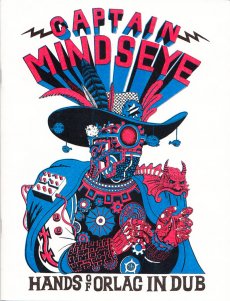
Captain Mindseye - Hands of Orlac in Dub
Technische
Angaben
-
[24] S., 25,4x19,4 cm, Auflage: 500, 2 Stück. keine weiteren Angaben vorhanden
Drahtheftung, Risographie
ZusatzInfos
-
Captain Mindseye is a 24 page collection of images detailing the adventures of Captain Mindseye, secret agent of the subconscious, and brings together documentation of recent excursions to inner and outer space by Will Sweeney
Text von der Webseite
|
Titel
-
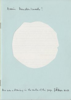
there was a drawing in the center of this page
Technische
Angaben
-
24 S., 21x15 cm, Auflage: 500, numeriert, keine weiteren Angaben vorhanden
Drahtheftung, Cover mit Ausstanzung
|
Titel
-
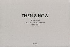
Then & Now - Hollywood Boulevard 1973-2004
Technische
Angaben
-
152 S., 44,7x32,5 cm, ISBN/ISSN 9783865211057
Hardcover, Leineneinband im Schuber,
ZusatzInfos
-
One of the most well-known of Ruscha's books from his early period is Every Building on The Sunset Strip, showing a famous stretch of real estate along Sunset Boulevard in Los Angeles, published in 1966. In July, 1973 he followed the same procedure while documenting Hollywood Boulevard.
Loading a continuous strip of 33 feet of Ilford FP-4 black & white 35mm film into his motor-drive Nikon F2 and then mounting it on a tripod in the bed of a pickup truck, he drove back and forth across the 12 miles of the street shooting, frame-by-frame, both the north and south sides of its entire length. The negatives were developed, contact sheets were made, and the materials were placed in storage.
Thirty years later, in 2003, a digital record of Hollywood Boulevard was created and it served as a reference guide for the traditional film/still documentary of 2004. For this shoot, the same type of camera equipment was used to re-photograph the street on 35mm color-negative film.
The resulting material of both shoots — 4500 black & white and 13,000 color images — have been scanned and digitally composed into four panoramics of the complete 12 miles. In THEN & NOW, the original 1973 North side view is shown along the top of the page and juxtaposed with its 2004 version underneath. Along the bottom of the page, you find the original 1973 South side view shown upside down, also juxtaposed with its 2004 version. The panoramics face each other and they are aligned.
Text von der Webseite
|
Technische
Angaben
-
352 S., 21x15 cm, ISBN/ISSN 9782915859416
Broschur mit Banderole, eingelegt ein Informationsblatt
ZusatzInfos
-
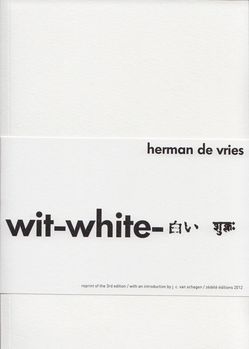
Originalausgabe erschienen bei Artists Press, Bern, 1980.
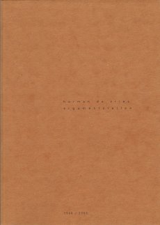
This book is the third and final version of the first artist’s book published in 1960 by herman de vries, who is currently the author of more than one hundred publications.
The story of this book dates back to 1960. Closely associated with the Zero Group, but also drawn to the buddhist concept of emptiness, herman de vries had just produced a series of white monochromes when he self-published a twenty-page booklet in Arnhem. It had no title, its cover was blank and its pages were unprinted. It contained nothing but a short final poem celebrating, in four languages, the superabundance of white: “wit is overdaad”. In 1962, this manifesto appeared in another version, now entitled wit: two hundred blank pages, four white collages by the artist and an introduction, itself completely blank, by the poet J. C. van Schagen, published in arnhem in only five copies by M. J. Israel. It was followed in 1967 by a second “revised” edition, wit weiss: two hundred and fifty blank pages, pocket-sized, in five hundred copies, published by Hansjörg Mayer in Stuttgart. The only printed elements were the artist’s name, the title and the publisher’s name on the cover, the word “introduction” and the name of its author on the very first page and a colophon on the final page. In 1980 the Artists Press in Berne published the “third revised edition”, in a larger format and with more pages. The original title wit was translated into english and japanese and into sanskrit with a word that means “white” in the sense of bright, pure, immaculate. The title itself does not appear on the book, which remains completely blank. It is printed with the paratext on a broad strip of paper in the form of a detachable publicity strip. The inside flap contains a brief statement initially dating back to the 1962 edition, stating that this book incorporates all aspects of reality. Of the five thousand copies advertised, only a hundred were published. It is this last edition, the most radical, which is republished here, the only addition being the french translation of the statement.
On 1 april 2012, herman de vries wrote of his book, insisting on the importance of the final comma:
white is white
0 = 0
no name
no idea
not even emptiness,
Text von der Webseite
|
Titel
-
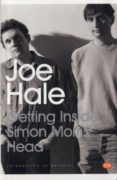
Getting Inside Simon Morris Head
Technische
Angaben
-
324 S., 19,8x12,8 cm, Auflage: 500, ISBN/ISSN 9781907468216
Softcover, Taschenbuch
ZusatzInfos
-
Getting Inside Simon Morris’ Head is a performative retyping of Simon Morris’ conceptual bookwork Getting Inside Jack Kerouac’s Head. Like Morris’ original performance of retyping the scroll edition of Jack Kerouac’s On the Road, Joe Hale’s project first appeared as a blog. At the rate of one page per day, like Morris retyping Kerouac before him, Hale retyped Morris’ entire book and in doing so re-retraces Kerouac’s famous adventure. Morris gave us all of Kerouac’s pages in reverse order: each blog post presented one page and the default settings of the blog platform organised his posts in reverse order, from the newest to the oldest. Now inverted again, as a double negative, Hale has restored the direction of travel to the story and produced a wholly (un)original new text. This first printed edition takes the imitative gesture to a new extreme. It features an introductory essay by poet Kenneth Goldsmith and reuses Morris’ paratext. From the cover design to the choice of paper, Hale tests the limits of conceptual extension.
Text von der Webseite
|
Titel
-
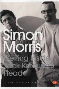
Getting Inside Jack Kerouac's Head
Technische
Angaben
-
324 S., 19,8x12,8 cm, Auflage: 500, signiert, ISBN/ISSN 9781907468025
Softcover, Taschenbuch
ZusatzInfos
-
Morris’ new bookwork, Getting Inside Jack Kerouac’s Head, is a performative retyping of the recently published original scroll edition of Jack Kerouac’s beat classic, On the Road. Morris’ project first appeared as an ongoing journey through the book, read and re-typed on a WordPress blog one page per day. This newly published codex version pours the content of that performative retyping back into the format of the paperback source book. It follows the default logic of a blog archive to put the last post, page at the start and stores the rest of the entries in reverse order. In other words, whereas Kerouac traveled from the East coast to the West coast, Morris crosses America from West to East.
Text von der Webseite
|
Technische
Angaben
-
90 S., 29,6x20,9 cm, Auflage: 400, ISBN/ISSN 9783868740097
Broschur. Mit Sticker auf dem Cover
ZusatzInfos
-
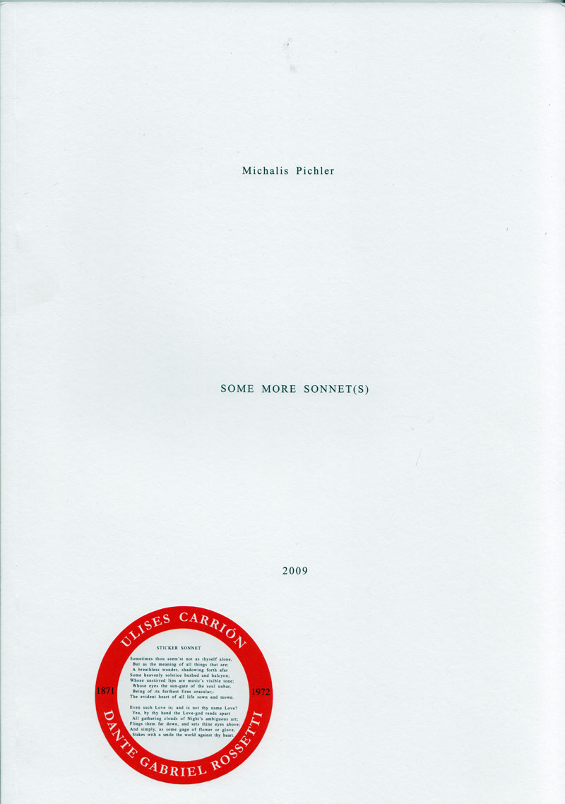
In 1972, Ulises Carrión produced his first artist's book "SONNET(S)" which consists of a 44 variations of a sonnet by Dante Gabriel Rosetti titled "Heart"s Compass".Using the langage like a material, Carrión writes Rossetti's poem over and over again on a typewriter, in slightly different versions. This book today is considered Carrión’s first “artists book”, where he still uses language, but quite differently.
In 2009 Michalis Pichler, in a similar approach but using a computer, probably word or open office, created 44 new variations and published a book titled "SOME MORE SONNET(S)". - On the last page of this book announced a multitude of OTHER SONNET(S), mostly imaginary.
Text von der Webseite
|
Technische
Angaben
-
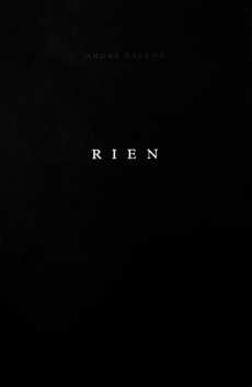
56 S., 37x24 cm, Auflage: 1.000, numeriert, signiert, ISBN/ISSN 9789899776302
Softcover, Klappbroschur
ZusatzInfos
-
Dark alleys, blocks of cement, tired naked bodies, strings that lead to nowhere, abandoned tubes. Rien, the new André Cepeda book, is an immersive experience. Page after page we are led into a void where all things seem to have lost their name, creating a restless and suspended time. More than looking at physical spaces, we feel as if in an endless present tense. There is Emptiness, but a desired one. Cepeda makes the beautiful more white than black large format photographs look spontaneous and free.
Text von der Webseite
|

Technische
Angaben
-
720 S., 21x15x4.5 cm, Auflage: Print on demand, keine weiteren Angaben vorhanden
Softcover, Schwarz-Druck auf Papiere, Titel und Autor in weißer Schrift auf dem Buchrücken. Gedruckt bei Lulu
ZusatzInfos
-
Ink used for digital printing is one of the most precious substances in the world. A single gallon of ink costs over four thousand dollars and this is one reason why digitally printed books are so expensive.
However, the price of a book is not calculated according to the amount of ink used in its production. For example, a Lulu book of blank pages costs an artist as much to produce as a book filled with text or large photographs. Furthermore, as the number of pages increases, the price of each page decreases. A book containing the maximum number of pages printed entirely in black ink therefore results in the lowest cost and maximum value for the artist.
Combining these two features, buyers of The Black Book can do so with the guarantee that they are getting the best possible value for their money.
Text von der Webseite
|
Titel
-
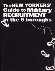
The New Yorkers Guide to Military Recruitment in the 5 Boroughs
Technische
Angaben
-
62 S., 14x10,8 cm, Auflage: 7.500, keine weiteren Angaben vorhanden
Broschur
ZusatzInfos
-
The New Yorkers' Guide to Military Recruitment is a free 64-page, pocket-sized book including everything a New Yorker needs to know about military recruitment and resources for counter-recruitment in NYC. The guide is copyleft and is available for download as a PDF as well as a printed 4x5" book. In spring and summer 2006, 7,500 copies will be distributed free-of-charge to students and others in danger of being recruited, their families, and concerned citizens in the New York metropolitan area.(Text von www.crguide.babyclaw.com)
|
Titel
-
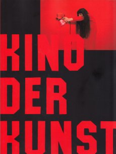
Kino der Kunst - Filmfestival für bildende Künstler
Technische
Angaben
-
80 S., 26.6x20 cm, keine weiteren Angaben vorhanden
Broschur. Programmheft zum Wettbewerb
ZusatzInfos
-
Vom 22.-26.04.2015 findet in München die zweite Edition von KINO DER KUNST statt, einer weltweit einmaligen Veranstaltung für Filme bildender Künstler, die das Kino weiterdenken und neue Formen der fiktiven Narration erkunden. KINO DER KUNST ist Ausstellung und Filmfestival zugleich, Vitrine aktuellster Kunstströmungen und internationaler Treffpunkt von Künstlern, Kuratoren und Publikum. Unter dem Motto „Science&Fiction“ widmet sich KINO DER KUNST dieses Mal neuesten Techniken der Narration in Filmen bildender Künstler, die deutlich machen, wie sehr technische Erfindungen und kreative Konzepte der Gegenwartskunst heute die kommerzielle Medienindustrie prägen.
Text von der Webseite
|
Technische
Angaben
-
352 S., 32x25,5 cm, ISBN/ISSN 9780500241493
Hardcover, Leinen bedruck mit HP Indigo 10000, mit Lesebändchen. Die Bilder auf dem Umschlag werden per Zufall aus 230 Bildern kombiniert
ZusatzInfos
-
Mit Texten von Steven Heller, John Maeda, Eugene S Flamm.
The beloved typewriter--its utilitarian beauty, the pleasing percussive action of striking its keys, the singularity of the impressed page--is enjoying a genuine renaissance across the creative industries. In this authoritative publication, the founders of the Sackner Archive of Visual and Concrete Poetry, the largest such collection in the world, apply their experience, mining the collection they have created over four decades to present examples produced by more than 200 of the world's finest typewriter artists. From the early ornamental works produced by secretaries in the late nineteenth century to more recent works that consider the unique position of the typewritten document in the digital age, there is an astonishing and delightful range of creativity in every artwork.
Text von der Webseite
|
Titel
-
Raw notes - documents and scripts of the performances: Stars, Moveyhouse, Massage, The Typewriter with annotations by the author
Technische
Angaben
-
289 S., 27,7x19 cm, ISBN/ISSN 0919616011
Klappbroschur
ZusatzInfos
-
In Raw Notes, Oldenburg has scrupulously collected all of the material relating to his performances. According to his specifications, the text in the book is typed rather then set and appears on only one side of the page. Examples of the original manuscript are reproduced in sixty-three script plates, including stage plans, scores, sketches for programs, and posters. More than two hundred annotations by the author expand the text
|
Titel
-
Book Arts Newsletter No. 103
Technische
Angaben
-
52 S., 29,7x21 cm, ISBN/ISSN 17549086
farbige Fotokopien nach PDF, Ausgabe März bis Mitte April 2016
ZusatzInfos
-
Artists cover page: Tim Mosely
|
Titel
-
Book Arts Newsletter No. 104
Technische
Angaben
-
52 S., 29,7x21 cm, ISBN/ISSN 17549086
farbige Fotokopien nach PDF, Ausgabe Mitte April bis Juni 2016
ZusatzInfos
-
Artists cover page: Dmitry Sayenko
|
Titel
-
the convincing victory - two stories on what really happened
Technische
Angaben
-
[12] S., 51x26 cm, keine weiteren Angaben vorhanden
Blätter, lose ineinander gelegt, Druck in ROT und SCHWARZ
ZusatzInfos
-
The Office for Anti-Propaganda was founded by Marina Naprushkina in 2007.
Started as an archive on political propaganda with the focus on Belarus the „The Office for Anti-Propaganda“ drifted to a political platform. In cooperation with activists and cultural makers Office lounges and supports political campaigns, social projects, organizes protest actions, and publishes underground newspapers.
The emphasis lies on projects which work outside the white cube and has social and political relevance. The 16-page newspaper-size novel illustrates the events which happened in Belarus during 2010 Presidential Elections. This is a story about the elections and, in particular, of the day and night of December 19, when the citizens’ peaceful demonstration against falsified elections was brutally suppressed by the police. The novel presents two views on the developments in parallel. The first one shows how the events are interpreted by the state regime and currently widely publicized by state-run newspapers and television. The other version was assembled from information presented by independent media, which for the most part can exist only in the Internet, i.e. blogs, oppositional websites, users’ comments, testimonies of victims and political activists.
Text von der Website
Mit Untzerstützung der Konrad Adenauer Stiftung und der Zeit-Stiftung Ebelin und Gerd Bucerius
|
Technische
Angaben
-
[48] S., 29,7x21 cm, Auflage: 1.250, ISBN/ISSN 9782914291170
Softcover, Fadengeheftet
ZusatzInfos
-
Arbeiten nach Wittgensteins Tractatus 2.0131.
Dans ce projet datant de 1968, herman de vries se réfère au Tractatus logico-philosophicus de Wittgenstein, et c'est la façon dont il le fait - surprenante et amusante - qui fonde l'idée de ce livre.
argumentstellen confronte l'expression quelque peu énigmatique du Tractatus au sens tangible des références que le discours wittgensteinien met en scène, à l'imaginaire qu'il mobilise. C'est ce travail du concret et du tangible, aussi " minimaliste " soit-il, qui met le lecteur sur la voie de la recherche du sens de l'énigme. " Avant de philosopher, il faut vivre ", dit Henri Bergson.
Dans la simplicité stupéfiante de son approche, le livre de de vries propose une piste nouvelle et originale pour relire Wittgenstein, et peut-être aussi pour confronter l'art à la pensée philosophique en général.
Ainsi, les 48 pages de ce livre affichent chacune un seul point, distribué dans l'espace vide de la page, preuve que "l'objet spatial doit se trouver dans un espace infini, le point spatial est une place pour un argument."
Text von der Webseite
|
Technische
Angaben
-
2 S., 57x73,2 cm, Auflage: 2.000, ISBN/ISSN 9782914291323
Ein Blatt, mehrfach gefaltet, beidseitig bedruckt
ZusatzInfos
-
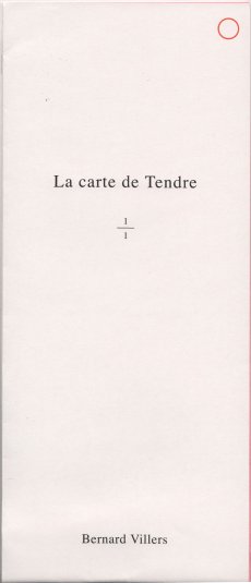
Ce livre de Bernard Villers affirme son sens par la forme même du pli : La Carte de Tendre. Le schéma qui explique l’ordre des plis est d’ailleurs imprimé à la dernière page de la carte pliée, et une partie du tirage laisse à ses futurs lecteurs le soin de lui conférer sa forme propre. « Tendre » est le nom d’un pays imaginé au XVIIe siècle , la Carte de Tendre est donc une représentation topographique et allégorique de la vie amoureuse, dont la première version date d’il y a plus de 300 ans.
La dernière, celle de Bernard Villers, est peut-être une nouvelle interprétation d’Et in Arcadia ego, on voit se croiser en elle deux séries de recherche développées par l’artiste depuis plus de trente ans, l’une construisant une poétique du pli, l’autre retrouvant l’esprit de ses premiers livres d’artiste qui prolongeaient la pratique picturale dans l’espace du livre. La carte proprement dite imaginée par Bernard Villers est en effet marquée d’une valeur poétique forte, mais purement picturale. Ce livre peut donc être lu comme une nouvelle topographie du bonheur en peinture.
Text von der Webseite
|
Technische
Angaben
-
[32] S., 21x14,5 cm, Auflage: 1.000, ISBN/ISSN 9782914291392
Fadengeheftet, Softcover, Offset-Druck
ZusatzInfos
-
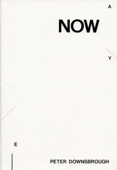
Reprint des Hefts der Ausstellung in Lódż,.
NOW was first published as part of my exhibition at the PWSSP (today the Wladyslaw Strzeminski Academy of Fine Arts and Design) in Lódż, Poland, from 6 - 22 June 1986. The book was printed by silkscreen at the school's print department, as access to offset was not possible at the time. The school censor allowed us to print 49 copies “for in-school use” with the obligatory inclusion of the colophon on page 3.
Text von der Webseite
|
Titel
-
L'inventaire des destructions
Technische
Angaben
-
[100] S., 19x13,4 cm, Auflage: 600, ISBN/ISSN 9782914291545
Softcover, Broschur,
ZusatzInfos
-
Les uns après les autres, défilent sur les pages de ce livre les artistes qui ont volontairement détruit leurs propres œuvres. Convoqués par des formules brèves et sobres, mais non sans commentaire discret de l'auteur, les quatre-vingt-dix-neuf cas de destructions interrogent la création dans ce qu'elle a d'essentiel: objet? processus? attitude à l'égard du monde? Le livre qui se veut lui-même vulnérable, sans couverture ni page de titre, consacre sa centième formule à sa propre présentation.
Text von der Webseite
|
Titel
-
Plus c’est facile, plus c’est beau : prolégomènes à la plus belle exposition du monde
Technische
Angaben
-
[96] S., 19x13,4 cm, Auflage: 1.000, ISBN/ISSN 9782914291712
Softcover, Broschur,
ZusatzInfos
-
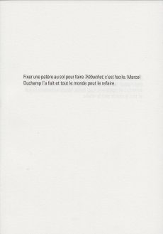
Plus c'est facile, plus c'est beau : prolégomènes à la plus belle exposition du monde se présente sous la forme de 89 courtes propositions à raison d'une par page. Chacune est construite sur le même modèle : la description technique d'une oeuvre célèbre d'art contemporain, suivie de l'affirmation de la facilité de reproduction du procédé. Par exemple : Renverser une tasse d'eau de mer sur le plancher, c'est facile. Lawrence Weiner l'a fait et tout le monde peut le refaire. En dressant un panorama neutre et objectif de dispositifs célèbres de la production artistique, Éric Watier désacralise la notion d'oeuvre d'art et met à jour les notions de reprise et de citation, particulièrement courantes dans l'art
contemporain.
"Plus c'est facile, plus c'est beau" est une phrase extraite d'une interview de Gil J Wolman menée par Michel Giroud et
publiée dans le catalogue de l'exposition Hors limites (Centre Pompidou, 1994-1995).
Text von der Webseite
|
Titel
-
B.L.A.D. NO. 04 - EAT ME!
Technische
Angaben
-
[60] S., 13,5x9,5 cm, Auflage: 300, ISBN/ISSN 09622873
Drahtheftung, Rückseite mit Silberprägung, eingelegter Aufkleber, in transparenter Kunststoffhülle mit beigelegtem Blatt, Aufkleber
ZusatzInfos
-
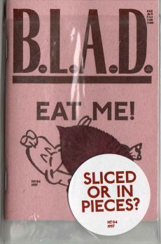
The food industry has provided us with some of the most funny, hilarious and absurd logos and illustrations to promote their products. The good thing, they are everywhere. And we collected a big bunch of them, some well known, but most of them not. In this 80 page extended issue of BLAD we give you our best finds, sliced and in pieces! The magazine also includes a text by Erlend Hammer. Hope you enjoy a nice meal after reading this issue.
Text von der Webseite
|
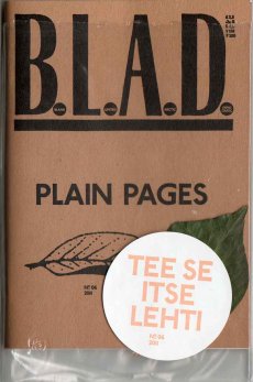
Titel
-
B.L.A.D. NO. 06 - PLAIN PAGES
Technische
Angaben
-
[64] S., 13,5x9,5 cm, Auflage: 250, ISBN/ISSN 09648973
Drahtheftung, leere Seiten, Rückseite mit Metallfolienprägung, in transparenter Kunststoffhülle mit beigelegtem Blatt, alle Seiten sind weiß
ZusatzInfos
-
Plain Pages is the name of our brand new release. A 52 page booklet of arctic white paper. In this edition the owner has the possibility to elaborate their own content. A 100% democratic booklet in other words. Tee se itse lehti. Released 2011.
Text von der Webseite
|
Titel
-
Book Arts Newsletter No. 105
Technische
Angaben
-
64 S., 29,7x21 cm, ISBN/ISSN 17549086
farbige Fotokopien nach PDF, Ausgabe July - August 2016
ZusatzInfos
-
Artists cover page: Rachel Marsh. Mit einem Artikel über das Künstlermagazin so-VIELE.de (S. 37)
|
Titel
-
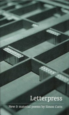
Letterpress - New & material poems by Simon Cutts
Technische
Angaben
-
132 S., 23,3x14,2 cm, ISBN/ISSN 9780956855978
Klappbroschur,
ZusatzInfos
-
As a visual artist, Simon Cutts is a poet, and as a poet he is a visual artist. This is no glib turn of phrase, but a lived reality insofar as he conceives how one artistic practice can show the ways of opening the other. For some time now he has insisted that the book is not merely (or simply) a vehicle for poetry, but is itself part of a poem’s form. He extends the idea of a poem being a field of dynamic action beyond the boundaries of the page so as to encompass the book as whole. To read Letterpress is to become a participant in its total and encompassing range. Text von der Webseite
|
Titel
-
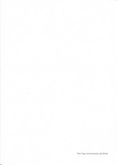
Possible Content for 18 Pages - Volume I - This Page Intentionally Left Blank
Technische
Angaben
-
[168] S., 29,7x21 cm, Auflage: 500, ISBN/ISSN 9783957631015
Broschur, mit zahlreichen Abbildungen, drei Bände in Banderole,
ZusatzInfos
-
Publikation zur Ausstellung: This Page Intentionally Left Blank im Akbank Art Centre, Istanbul, 19.03-17.05.2014
„This Page Intentionally Left Blank“ ist das erste einer Reihe von Ausstellungs- und Publikationsprojekten, die dem Akt des Schreibens an der Schnittstelle von sprachlicher, visueller, körperlicher und räumlicher Kommunikation nachgehen. Als Grundlage für das breit angelegte Rechercheprojekt mit dem Titel „Possible Content for 18 Pages“ dient Vilém Flussers Essay „Die Geste des Schreibens“, dessen mit Schreibmaschine getipptes Manuskript sich nicht nur als fotografische Reproduktion im Buch befindet, sondern das ebenso die Struktur der Recherche bestimmt.
Text von der Webseite
|
Titel
-
Artist Kunstmagazin No. 25
Technische
Angaben
-
60 S., 29,7x21 cm, ISBN/ISSN 09368930
Softcover, Broschur, Künstlerbeilage Postkarte von Ingold Airlines
ZusatzInfos
-
Mit Künstler-Portraits und ein Interview mit Jochen Gerz.
Artist Page
|
Titel
-
Artist Kunstmagazin No. 28
Technische
Angaben
-
60 S., 29,7x21 cm, ISBN/ISSN 09368930
Softcover, Broschur, Künstlerbeilage 3 Fotografien von Lukas Einsele
ZusatzInfos
-
Mit Künstler-Portraits über: Jeff Wall, Michael van Ofen, Peter Wüthrich, Raimund Kummer, WUNDERBAR und ein Interview mit Herbert Volkmann.
Artist Page
|
Titel
-
Artist Kunstmagazin No. 31
Technische
Angaben
-
60 S., 29,7x21 cm, ISBN/ISSN 09368930
Softcover, Broschur, Künstlerbeilage von Simone Westerwind
ZusatzInfos
-
Mit Künstler-Portraits über: Gerold Miller, Jane und Louise Wilson, Mariella Mosler, Michel Majerus, Thomas Bayrle, Thomas Rentmeister und ein Interview mit Carl Haenlein und Carsten Ahrens.
Artist Page
|
Titel
-
Artist Kunstmagazin No. 30
Technische
Angaben
-
60 S., 29,7x21 cm, ISBN/ISSN 09368930
Softcover, Broschur, Künstlerbeilage von Susi Pop
ZusatzInfos
-
Mit Künstler-Portraits und ein Interview mit neugerriemenschneider.
Artist Page
|
Titel
-
Artist Kunstmagazin No. 38
Technische
Angaben
-
60 S., 29,7x21 cm, ISBN/ISSN 09368930
Softcover, Broschur, Künstlerbeilage 4 Postkarten von Matten Vogel
ZusatzInfos
-
Mit Künstler-Portraits über: Corinne Wasmuth, Kai Althoff, Matti Braun, Rainer Splitt und ein Interview mit Otto Schweins.
Artist Page
|
Titel
-
Artist Kunstmagazin No. 33
Technische
Angaben
-
60 S., 29,7x21 cm, ISBN/ISSN 09368930
Softcover, Broschur, Künstlerbeilage Wandfries von Margret Eicher
ZusatzInfos
-
Mit Künstler-Portraits über: Boris Becker, Christiane Möbus, Franz Ackermann, Wolfgang Ellenrieder und ein Interview mit Stephan Schmidt-Wulffen.
Artist Page
|
Titel
-
Artist Kunstmagazin No. 34
Technische
Angaben
-
60 S., 29,7x21 cm, ISBN/ISSN 09368930
Softcover, Broschur, Künstlerbeilage Plakat von Korpys/Löffler
ZusatzInfos
-
Mit Künstler-Portraits über: Christian Jankowski, Dirk Skreber, Heimo Zobernig, Manfred Holtfrerich, Nikolaus List und ein Interview mit E. Schipper & M. Krome.
Artist Page
|
Titel
-
Artist Kunstmagazin No. 35
Technische
Angaben
-
60 S., 29,7x21 cm, ISBN/ISSN 09368930
Softcover, Broschur, Künstlerbeilage von Karin Hoerler
ZusatzInfos
-
Mit Künstler-Portraits über: Angela Bulloch, Beat Zoderer, Gregor Schneider, Johannes Spehr, Lois Renner, Olafur Eliasson und ein Interview mit Wilhelm Schürmann.
Artist Page
|
Titel
-
Artist Kunstmagazin No. 36
Technische
Angaben
-
60 S., 29,7x21 cm, ISBN/ISSN 09368930
Softcover, Broschur, Künstlerbeilage von Veronika Schumacher
ZusatzInfos
-
Mit Künstler-Portraits. Ein Interview mit B. Hammelehle & S. O. Ahrens.
Artist Page
|
Titel
-
Artist Kunstmagazin No. 37
Technische
Angaben
-
60 S., 29,7x21 cm, ISBN/ISSN 09368930
Softcover, Broschur, Künstlerbeilage Anziehpuppen von Johannes Spehr
ZusatzInfos
-
Mit Künstler-Portraits über: Elisabeth Peyton, Oliver Boberg, Peter Rösel, Stefan Hoderlein, Stefan Wissel und ein Interview mit Peter Pakesch.
Artist Page
|
Technische
Angaben
-
13,9x11 cm, keine weiteren Angaben vorhanden
Drahtheftung, Blatt mit teilnehmenden Künstler beigelegt,
|
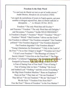
Titel
-
File Vol. 2, No. 4 - Mondu Nudo
Technische
Angaben
-
48 S., 35,5x27,5 cm, Auflage: 3.000, ISBN/ISSN 03152456
Drahtheftung
|
Titel
-
Book Arts Newsletter No. 111
Technische
Angaben
-
60 S., 29,7x21 cm, 2 Stück. ISBN/ISSN 17549086
farbige Fotokopien nach PDF, Ausgabe April-Juni 2017
ZusatzInfos
-
Artist's cover page: Bookishness
|
 
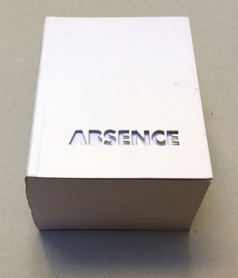
Technische
Angaben
-
240 ca. S., 12,5x10 cm, Auflage: 2.000, ISBN/ISSN 0894390139
Umschlag aus Karton mit Leinenstreifen, ca. 120 Seiten gestanzt
ZusatzInfos
-
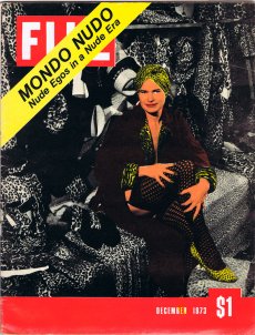
2004 winner of I.D. Magazine's Design Distinction award, Absence is the third book to come out of Printed Matter’s Publishing Program for Emerging Artists, a program made possible through the generous support of New York City's Department of Cultural Affairs, The Andy Warhol Foundation for the Visual Arts, the Elizabeth Firestone Graham Foundation, and the Heyday Foundation. The generosity of Whitney trustees Melva Bucksbaum and Raymond J. Learsy was instrumental to the Museum’s participation in the publication of this exciting new work.
Both a book and a sculptural object, Absence is a memorial to the twin towers of the World Trade Center. Yoon, an architect and designer who is currently an Assistant Professor of Architecture at the Massachusetts Institute of Technology, chose not to produce a traditional design proposal for the World Trade Center Memorial Competition. Instead she created a non-architectural, non site-specific space of remembrance: a portable personal memorial in the form of book.
At almost two pounds, Absence has a considerable physical presence, but it is in every way the ghost of a presence, and it is this ghostliness that gives it its particular emotional weight. A solid white block of thick stock cardboard pages, the book’s only "text" consists of one pinhole and two identical squares die-cut into each of its one-hundred-and-twenty pages – one for each story of the towers including the antenna mast. These removed elements lead the reader floor by floor through the missing buildings towards the final page where the footprint of the entire site of the World Trade Center is die-cut into a delicate lattice of absent structures.
Of all of the proposed monuments and grand designs for the twin towers to emerge in the last two years, Absence is remarkable for its employment of an under-used strategy: restraint. The simplicity of Yoon’s materials and her use of repetition speak, without words, about unspeakable loss. Quiet, respectful, mournful, the book does not aim to represent the magnitude of the disaster. Instead it appeals to the vastness of the reader’s imagination and capacity to grieve. The human scale of her memorial operates on a personal level – it delivers the memory of lives lost into the reader’s hands. At the same time, as a scale model of a vanished architectural site, it operates on a larger cultural level by commemorating the site itself.
Text von der Webseite. Fotos Xenia Fumbarev
|
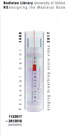
Titel
-
Redesigning the Medieval Book - Personal Carol 1400 - singing breathing score video 2017
Technische
Angaben
-
1 S., 21x10,5 cm, signiert, 2 Teile. keine weiteren Angaben vorhanden
Infokarte, rückseitig handschriftlicher Gruß. In Briefumschlag
ZusatzInfos
-
A workshop and competition for book artists at the Bodleian Library, Oxford. 01.12.2017-11.03.2018
The exhibition Designing English at the Bodleian Library 2017-18 will illustrate the layout of English literature in handwritten manuscripts and inscriptions across the Middle Ages, from Old English picture books to early Tudor plays and manuals for handling swans. It will trace the different spaces granted to English through the first thousand years, from stray notes scratched into Anglo-Saxon herbals or fragments of lost medieval songs in the margins, to masterpieces placed centre-page and framed by illustration and illuminated borders. it will cover both books and other objects, from grisly tombs to charms written on food.
Text aus dem exhibition summery
|
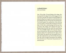
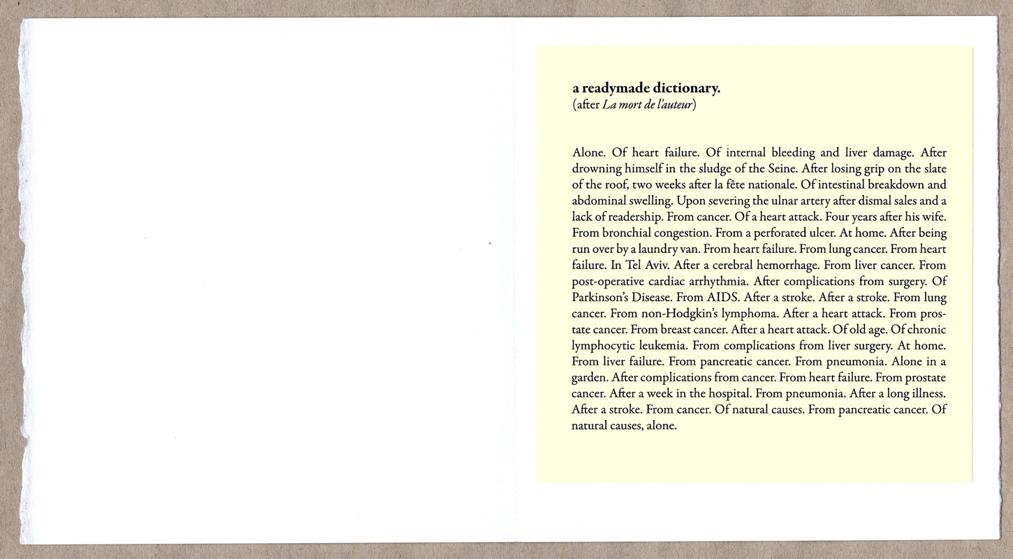
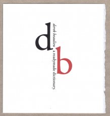
Titel
-
derek beaulieu - a readymade dictionary.
Technische
Angaben
-
[4] S., 15,2x14,4 cm, Auflage: 80, numeriert, keine weiteren Angaben vorhanden
Aufklappbares Einzelblatt aus Büttenpapier mit geschöpftem Rand und mit eingeklebter Seite
ZusatzInfos
-
derek beaulieu’s “a readymade dictionary.” marks fifty years since the publication of Roland Barthes’ La mort de l’auteur by cataloguing the deaths of fifty unidentified authors and artists, one per year. A single page, tipped into folded card. Published in a numbered edition of 80 copies.
Text von der Webseite.
|
Technische
Angaben
-
[334] S., 18,5x13,5 cm, ISBN/ISSN 9781851498857
Broschur mit aufklappbarem Cover und Bauchbinde, Fadenheftung, teils aufklappbare Seiten.
ZusatzInfos
-
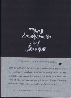
This award-winning contemporary art book is made completely from the perspective and language of bugs, from the front page to the final chapter, with no human writing and text, only the "writing" of bugs. Inspired by the marks left behind by a cicada walking across his sketchbook, contemporary artist Zhu Yingchun placed boards and "ink ponds" of dark-coloured vegetable juices in his garden for the bugs to crawl through. The resulting marks, were thousands of twisted characters, each with a charm of its own - the language of the bugs. The accompanying booklet explains the artist's concept and QR code links the reader to a video of the process.
"The bugs seem insignificant, but their strokes are beautiful," says Zhu Yingchun. "Art is not just those pieces hanging on walls and placed in exhibition halls. Everything in the world, including every life in nature, has the power to create beauty, and art is all around us.
Text von der Webseite.
|
Technische
Angaben
-
[32] S., 28,7x8,3 cm, ISBN/ISSN 9783943514940
Broschur, Softcover, in Papierbanderole
ZusatzInfos
-
Eleven Poems is a collection of 11 poems printed on single sheets that can be used as page markers to interrupt whatever else you are reading. Each poem is based on descriptions of natural phenomena, to talk about everyday situations of human social behavior. Valentina Jager’s work is primarily related to the world of actions approached via sculpture, written and spoken word, furniture design, and installation.
Text von der Website.
|
Technische
Angaben
-
76 S., 22x15,5 cm, ISBN/ISSN 9789491843754
Fadengeheftet, Softcover, Text auf Englisch
ZusatzInfos
-
This fiction, a collaboration between Kasper Andreasen and Louis Lüthi, takes as its starting point the painter Alexander Cozens’s publication A New Method of Assisting the Invention in Drawing Original Compositions of Landscape (1785). Set one morning in an empty gallery and told from the point of view of a young man who installs exhibitions for a living, The Preparator combines text and image in a series of compact, associative tableaus, each revolving around a landscape—or rather, the memory of a landscape: a title page, an eighteenth-century ink drawing, the network of cracks in a ceiling, a walk along the Rhine, a satellite photograph, Thomas Bernhard holding forth in a private garden, and others.
Text von der Website.
|
Technische
Angaben
-
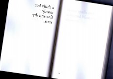
20 S., 19,5x13,5 cm, keine weiteren Angaben vorhanden
Drahtheftung
ZusatzInfos
-
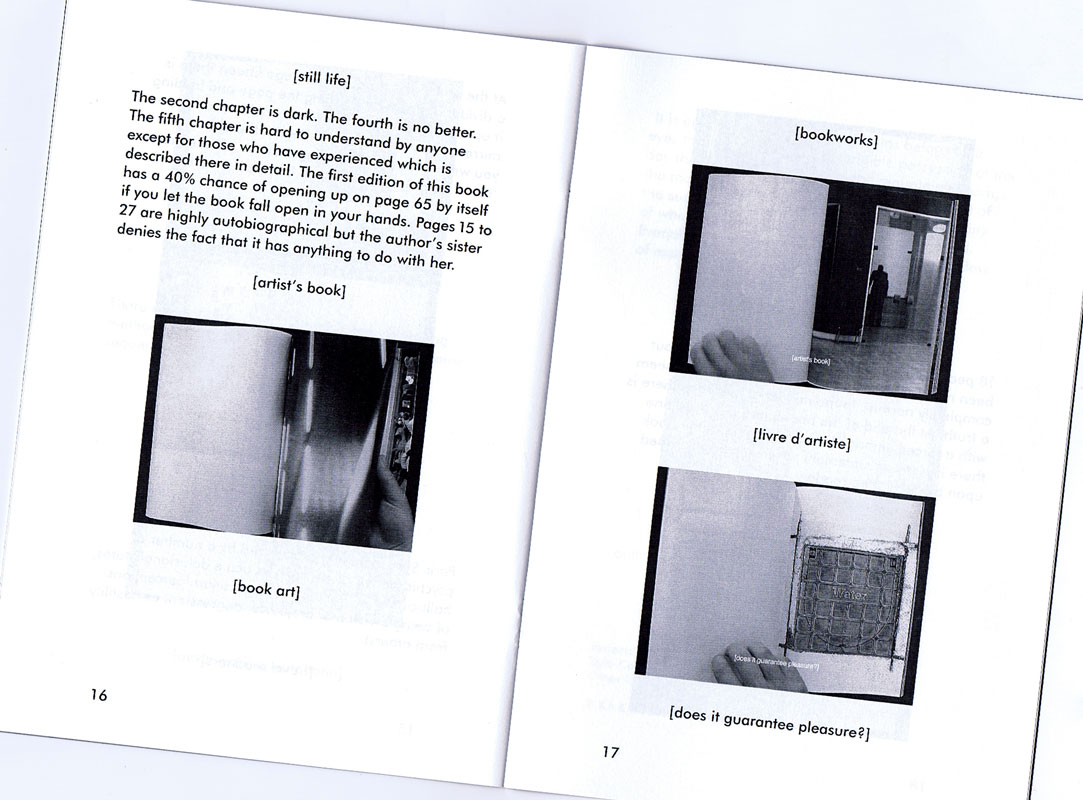
This small publication is an edited reprint of the essay ‘The Book in Intermediary Form’ written by Kasper Andreasen. It was originally published by Wintertuin, Nijmegen as part of a compilation about the future of the book. Turning the Page also contains a script for the audiovisual book Tomorrow, which is a collaborative work between Hanne Lippard and Kasper Andreasen reflecting on the status of the (photography) book in audiovisual form.
Text von der Website
|
Titel
-
Réplica feliz del edén - Johan Moritz Rugendas, El huaso y la lavendera, 1835
Technische
Angaben
-
[24] S., 27,5x21,6 cm, Auflage: 50, numeriert, keine weiteren Angaben vorhanden
geklammert, mit schwarzem Leinenstreifen, Farbkopien (Epson)
ZusatzInfos
-
Bezieht sich mit Bilddetails auf ein Gemälde von Johan Moritz Rugendas, El huaso y la lavendera, von 1835 aus dem Museo Nacional de Bellas Artes, 30x23 cm
Réplica feliz del edén es el primer zine de Naranja Ediciones creado por Sebastián Arancibia, Sebastián Barrante y la ilustradora chilena CamilaPaz. La edición nace a partir de nuestra participación en Estación Réplica, un espacio organizado por Sandra Marín de Estudio Repisa, creado especialmente para diseñar, editar e imprimir durante tres días en el hall del Museo Nacional de Bellas Artes. Este suceso editorial tuvo relación a la Bienal de Artes Mediales realizadas en el mismo museo y que, en el año 2017, trató el concepto de temblor.
Para este encargo Naranja Ediciones trabajó junto a la ilustradora CamilaPaz.
Text von der Webseite
Original getippt auf einer Olypia AEG Traveller.
|
Titel
-
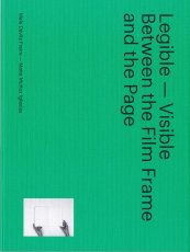
Legible – Visible - Between the Film Frame and the Page
Technische
Angaben
-
92 S., 24x18 cm, ISBN/ISSN 9788494423437
Broschur
ZusatzInfos
-
Katalog erschienen zur Ausstellung in Arts Santa Mònica, Barcelona, 06.04.-28.05.2017
Legible-Visible. Between the Film Frame and the Page explores the relationship between print publications and audio-visual documents, two of the most important media underpinning the social and cultural landscape of our time which also define the evolution of contemporary art in the 20th and 21st centuries.
The emergence of relatively inexpensive home video technologies in the 1970s brought with it an alternative model for the creation and diffusion of artist publications, and a prolific period of exploration, reflected in the work of Baldessari, Gilbert & George, Boltanski, Carrión, Rucha and Rosler, among others. The popularization of digital media at the beginning of the 21st century sparked a revolution in the systems of production of both audio-visuals and books, exemplified by a new generation of artists, such as McGeorge, Kentridge, Cine Quieto or Van Leijsen.
Mela Dávila proposes a theoretical and historical framework for works that the market long dismissed as secondary on account of their serial nature. This characteristic, together with the particular space of experience they generate, and the linearity and temporality common to both media, have opened up a range of new narrative (or anti-narrative) possibilities which have enabled artists to redefine contemporary art.
Starting from a detailed study of 24 double works, Maite Muñoz looks at how different artists have taken advantage of the permeability between publications and audio-visuals, in which ideas and strategies of narration and editing intrinsic to both mutually infect and enrich one another through the play of opposition, complementarity and dialectics.
Text von der Webseite
|
Technische
Angaben
-
[224] S., 23x15,2 cm, ISBN/ISSN 9781908452610
Paperback mit Klebebindung, Blätter rückseitig in Spiegelschrift bedruckt, so dass sie durch das dünne Papier lesbar sind.
ZusatzInfos
-
a non-complete and subjective collection of english weather forecasts- edited out of 28 random newspapers during 4 ifferent London visits betweem october 2012 and september 2013. read in those small excerpts, the english weather appears like poetry. this book is a twin. whereas weather forecast (1) shows the "weather poems" one after another, page by page, black on white, weather forecast (2) uses the book format differently: every "poem" is printed side-inverted on the backside of front page. due to transparency of the paper, the text can be read "through" the page. every "weather poem" also exists as fine hand letterpressed sheet in A4 format.
Text von der Webseite.
|
Technische
Angaben
-
[16] S., 16,5x11,5 cm, Auflage: 190, numeriert, signiert, keine weiteren Angaben vorhanden
Drahtheftung, Siebdruck, Cover beschnitten
ZusatzInfos
-
Abstract unique screen-printed zine. Each book is unique, each page is unique.
Text von der Webseite.
|
Titel
-
Capital of the 20th Century
Technische
Angaben
-
913 S., 27x19x5 cm, ISBN/ISSN 9781784781569
Hardcover, in Schuber,mit Metallfolie kaschiert, Prägedruck
ZusatzInfos
-
Acclaimed artist Kenneth Goldsmith’s thousand-page beautiful homage to New York City. Here is a kaleidoscopic assemblage and poetic history of New York: an unparalleled and original homage to the city, composed entirely of quotations. Drawn from a huge array of sources—histories, memoirs, newspaper articles, novels, government documents, emails—and organized into interpretive categories that reveal the philosophical architecture of the city, Capital is the ne plus ultra of books on the ultimate megalopolis.
It is also a book of experimental literature that transposes Walter Benjamin’s unfinished magnum opus of literary montage on the modern city, The Arcades Project, from 19th-century Paris to 20th-century New York, bringing the streets to life in categories such as “Sex,” “Commodity,” “Downtown,” “Subway,” and “Mapplethorpe.”
Capital is a book designed to fascinate and to fail—for can a megalopolis truly be written? Can a history, no matter how extensive, ever be comprehensive? Each reading of this book, and of New York, is a unique and impossible passage.
|
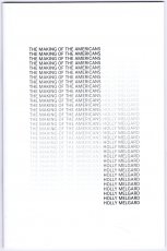
Titel
-
The Making Of The Americans
Technische
Angaben
-
36 S., 22,8x15,2 cm, Auflage: Print on Demand, ISBN/ISSN 580088985832
Drahtheftung, Softcover, Digitaldruck
ZusatzInfos
-
Now "there is no such thing as repetition" in The Making of Americans, because I deleted it. Herein, every word and punctuation mark is retained according to its first (and hence last) appearance in Gertrude Stein's 925-page edition of the book.
Text aus dem Vorwort des Heftes.
|

Technische
Angaben
-
40 S., 17,5x10,8 cm, Auflage: Print on Demand, ISBN/ISSN 9781471068560
Broschur
ZusatzInfos
-
Print on Demand technology allows to make a book without the intermediation of a publisher, setting autonomously size, amount of pages and price. Blank on Demand is an experiment that aims to probe the limits imposed by this production process. The two volumes constituting the project are produced through the self-publishing platform Lulu.com. The volumes’ formats correspond respectively to the maximum and minimum dimensions currently available for the print. similarly, page amount and price are set according to the limit values allowed by the platform. The two volumes are completely blank, except for the presence of the ISBN code. The experiment investigates the influence of the current technological context on the materiality of the book object.
Text von der Webseite
Dieses Büchlein ist das kleinste Produkt das LuLu anbietet. Das teuerte Blank on Demand von Silvio Lorusso & Giulia Ciliberto is in Hardcover, hat 740 Seiten und kostet den größtmöglichen Preis von 999.999,99 € (exkl. MwSt)
|
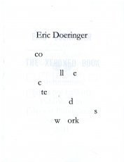
Technische
Angaben
-
66 S., 27,9x21,6 cm, Auflage: Print on Demand, keine weiteren Angaben vorhanden
Broschur, Digitaldruck, Umschlag glänzend laminiert. Schwarz-Weiß
ZusatzInfos
-
Collected Works compiles eight of my books into one convenient volume. The books are combined together, so that page one of Collected Works is a "sandwich" of the first page of all eight books, page two contains the second page of each book, page three the third page, etc. Collected Works reproduces Squares With Sides And Corners Torn Off, Some Los Angeles Apartments, Real Estate Opportunities, The Location of Lines, and Records in their entirety, plus excerpts from 60 Years Later, Arcs Circles & Grids, and The Xeroxed Book. - Eric Doeringer
Text von der Webseite
|
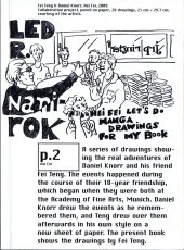
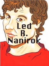
Titel
-
Daniel Knorr - Led R. Nanirok
Technische
Angaben
-
304 S., 18x13 cm, ISBN/ISSN 9783037640784
Broschur, Fadenheftung, Schutzumschlag
ZusatzInfos
-
Begleitpublikation zur Ausstellung "Daniel Knorr - Scherben bringen Glück" in der Kunsthalle Fridericianum Kassel, 07.12.2008-04.01.2009, und der Ausstellung "Daniel Knorr - Led R. Nanirok", Kunsthalle Basel, 20.09.–15.11.2009.
The book is the first monograph on Daniel Knorr, one of the most important Romanian artists of the younger generation. Designed by Ludovic Balland in close collaboration with the artist, the publication is produced as an independent project alongside with Knorr's comprehensive survey exhibition at Kunsthalle Basel.
Text von der Webseite
|
Technische
Angaben
-
416 S., 22,86x15,24 cm, Auflage: Print on Demand, keine weiteren Angaben vorhanden
Broschur
ZusatzInfos
-
This book was made by sending the entire text of Bret Easton Ellis' American Psycho between two GMail accounts page by page. We saved the relational ads for each page and added them back into the text as footnotes. In total, we collected over 800 relevant ads for the book. The constellations of footnoted ads throughout these pages retell the story of American Psycho in absence of the original text. This retelling reveals GMail's unpredictable insensitivity to violence, racism, and sex. It serves as a blurry portrait of an algorithm that exists in our everyday communication simultaneously forming a new portrait of the lead character, Patrick Bateman.
Text von der Webseite
|
Technische
Angaben
-
292 S., 23x17 cm, ISBN/ISSN 9783037645048
Broschur, Einband einfarbig rot bedruckt, Schutzumschlag vierfarbig, Vorsatz/Nachsatz blau, Abb. Schwar-Weiß, einzelne Farbseiten. Druck auf Munken Print White 1.5, DZA Druckerei zu Altenburg
ZusatzInfos
-
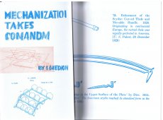
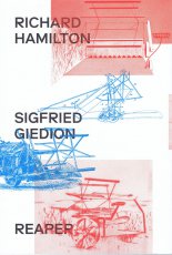
The starting point of this publication—and its eponymous exhibition held in Zurich in Spring 2017—is the conceptual encounter between English Pop art artist Richard Hamilton (1922–2011) and Swiss historian and critic of architecture Sigfried Giedion (1888–1968), famous for his landmark book "Space, Time, and Architecture," an influential history of modern architecture published in 1941.
In 1949 Richard Hamilton—then a member of the London-based Independent Group— realized the “Reaper” print series as a reaction to Giedion’s 1948 book “Mechanization Takes Command” in which he describes the mechanization of everyday life. Reproducing Hamilton’s complete “Reaper” series juxtaposed with selected examples of illustrations created by Giedion alongside many related illustrations, this publication brings together seven essays by renowned international scholars, all of whom question the relationships between visual arts, technology, science, and architecture. Among the many topics discussed are Hamilton’s early works and exhibition installation practice, postwar British biotechnology and architecture, “Hippie Modernism,” and the visual strategy of Giedion’s books.
Published on the occasion of the exhibition "Reaper. Richard Hamilton and Sigfried Giedion" at the Graphische Sammlung ETH Zürich (May 3–June 25 2017), a cooperation between Graphische Sammlung ETH Zürich, gta exhibitions, and gta archive.
Text von der Webseite
|
Titel
-
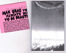
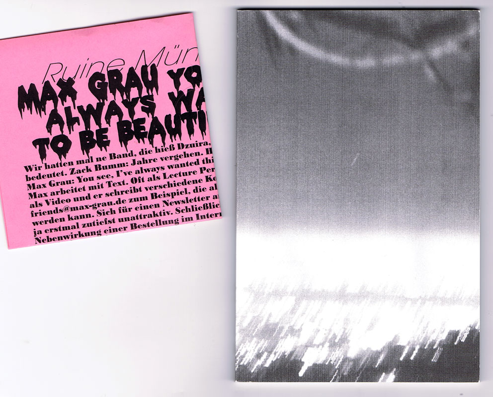
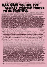
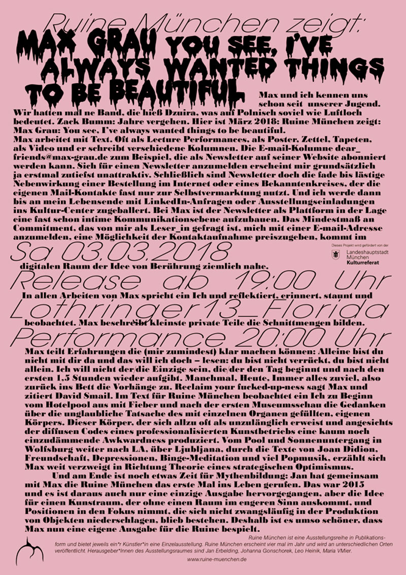
ruine 03 – You see I've Always Wanted Things To Be Beautiful
Technische
Angaben
-
84 S., 18,3x13 cm, Auflage: 70, numeriert, 3 Teile. ISBN/ISSN 9783947250103
Broschur, Schwarz-Weiß-Digitaldruck, beigelegt ein gefalteter Flyer, zusammen in gefaltetem Blatt A3 mit Prägedrucken
ZusatzInfos
-
Zum Release und zur performativen Lesung in der Lothringer 13 florida in München am 01.03.2018 um 20 Uhr.
Ruine München is happy to presents Max Grau's first artist book ever. In his words: "I’m really happy with how the book turned out. It looks and feels pretty. It has 84 pages and contains 53.260 characters (incl. spaces). There’s 25 images spread out over six chapters (which have names of varying length). The whole thing is titled after a line from a Frank O’Hara poem that I really like (although I’m not quite sure if I »get« it). There’s footnotes and page numbers and even a topic (optimism. Sort of). The text is written in English and the book is covered in a beautiful sleeve, designed by Maria (I think). It (the sleeve) contains a very flattering text (in German) about… uhm… me, written by the whole RUINE gang. Every issue is numbered and since there wasn’t a ton of money (why is there never an actual ton of money?), we only printed an edition of 70."
Text von der Webseite
|
Titel
-
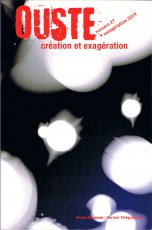
Ouste Nr. 27 - création et exagération - Conspiration 2019
Technische
Angaben
-
160 S., 18x12 cm, ISBN/ISSN 9791097146184
Broschur, Softcover, Postkarte mit Original Druck und persönlichen Grüßen von Andrew Maximilian Niss beigelegt
ZusatzInfos
-
Jährliche Anthologie. Publikation zum Festival der Poesie "Expoésie", bei dem die Zeitschrift OUESTE das Zusammentreffen von Lyrik und zeitgenössischer Kunst fördert. Diesesmal: Frische und Ikonoklasmus: lebendige Kreation, ohne Kurzatmigkeit oder Affektiertheit.
Text übersetzt von der Website.
|
Titel
-
OR #111 - Passover Banquet
Technische
Angaben
-
10 S., 21,8x14 cm, keine weiteren Angaben vorhanden
Drahtheftung, Heft von hinten, Rechts nach Links zu lesen
ZusatzInfos
-
The celebration of the Passover commemorates God's deliverance of Israel from the bondage of the Egyptians. The Seder meal (or Passover meal) refers to service of re-enactment of the ancient scriptural traditions. In the course of the meal scriptures and traditions are recited that proclaim God's continuing liberating power.
This Program Booklet reads from right page to left page, from back to front following Hebrew tradition.
Text aus dem Heft.
|
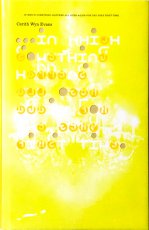
Titel
-
... in which something happens all over again for the veryfirst time
Technische
Angaben
-
200 S., 23,5x15 cm, ISBN/ISSN 3886451658
Hardcover mit Titel in Blindprägung, Schutzumschlag mit gestanzten Löchern
ZusatzInfos
-
Zur Ausstellung in Paris 09.06.-17.09.2006, im Lenbachhaus München 25.11.2006-25.02.2007, publiziert mit der Unterstützung durch White Cube London.
... Für den Kunstbau der Städtischen Galerie im Lenbachhaus hat Cerith Wyn Evans eine Choreographie von fünfzehn Chandeliers entwickelt, in der er die in unterschiedlichen Rhythmen blinkenden und unterschiedlichste Botschaften vermittelnden Kronleuchter zu einem illuminierenden Gesamtereignis verdichtet. Begleitet wird diese Ereignis von drei Neonschriftzügen des Künstlers sowie einer Komposition des Sounddesigners Florian Hecker, der in seiner Arbeit sprachliche Systeme in akustische Signale übersetzt. Die Münchner Präsentation im unterirdischen Kunstbau ist das "dunkle" Pendant zu einer "hellen" Ausstellung in den Tageslichträumen des Musee d�Art Moderne de la Ville de Paris, die im Frühsommer dieses Jahres stattfand. In Zusammenarbeit mit Paris ist ein von den Pariser Grafikern M/M gestalteter Katalog zur Ausstellung entstanden. ...
Text von der Webseite
|
Titel
-
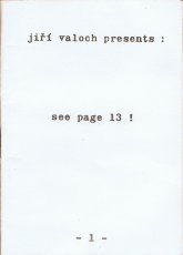
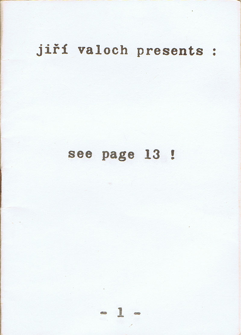
IAC. Ed. Nr. 29 - jiri valoch presents
Technische
Angaben
-
[20] S., 10,5x7,4 cm, 2 Stück. keine weiteren Angaben vorhanden
Drahtheftung, eine Ausgabe mit farbigem Cover, beidseitig gestempelt, in Briefumschlag, andere Ausgabe weiß mit Typografie
ZusatzInfos
-
das Mini-Action-Book wurde von Valoch 1969 konzipiert. Es fordert auf jeder Seite auf, eine andere Seite anzusehen, see page 13 ! usw.,
|
Titel
-
Book Arts Newsletter No. 125
Technische
Angaben
-
57 S., 29,7x21 cm, ISBN/ISSN 17549086
farbige Fotokopien nach PDF, Ausgabe Mitte April bis Juni 2019, Blätter lose ineinander gelegt
ZusatzInfos
-
Artists cover page: Jackie Batey
Mit einem Beitrag über die Archiv Galerie 2018/2019 Archives in Residence - AAP Archive Artist Publications, Seite 7, zu Super BOOKS im Haus der Kunst 10.-11.05.2019, Seiten 8 und 40,
|
Titel
-
Book Arts Newsletter No. 126
Technische
Angaben
-
46 S., 29,7x21 cm, ISBN/ISSN 17549086
farbige Fotokopien nach PDF, Ausgabe Juli - August 2019, Blätter lose ineinander gelegt
ZusatzInfos
-
Artists cover page: Mary V Marsh
Mit einem Beitrag über eine Ausstellung von Thomas Kapielski in der Weserburg Bremen, Buch-, Flach- und Krachwaren, bis 1.09.2019
|
Titel
-
Book Arts Newsletter No. 127
Technische
Angaben
-
57 S., 29,7x21 cm, ISBN/ISSN 17549086
farbige Fotokopien nach PDF, Ausgabe September - Oktober 2019, Blätter lose ineinander gelegt
ZusatzInfos
-
Artists cover page: Kurt Johannessen
|
Titel
-
Book Arts Newsletter No. 128
Technische
Angaben
-
63 S., 29,7x21 cm, ISBN/ISSN 17549086
farbige Fotokopien nach PDF, Ausgabe November 2019, Blätter lose ineinander gelegt
ZusatzInfos
-
Artists cover page: Tim Hopkins
|
Titel
-
Book Arts Newsletter No. 129
Technische
Angaben
-
44 S., 29,7x21 cm, ISBN/ISSN 17549086
farbige Fotokopien nach PDF, Ausgabe Dezember 2019, Blätter lose ineinander gelegt
ZusatzInfos
-
Artists cover page: Roelof Bakker
|
Titel
-
Book Arts Newsletter No. 130
Technische
Angaben
-
53 S., 29,7x21 cm, ISBN/ISSN 17549086
farbige Fotokopien nach PDF, Ausgabe Februar 2020, Blätter lose ineinander gelegt
ZusatzInfos
-
Artists cover page: Robbin Ami Silverberg
|
Titel
-
MOTHERBABYHOME - zimZalla 056
Technische
Angaben
-
796 S., 29,7x20,4 cm, signiert, ISBN/ISSN 9781907570179
Broschur
ZusatzInfos
-
The St Mary’s Mother and Baby Home was run by the Bon Secours Sisters on behalf of the Irish State to house unmarried mothers and their children. The location of the graves of 796 infants and children who died in the Home between 1926 and 1961 is unknown, though local knowledge, the research of local historian Catherine Corless, and recent excavations point to a field near the old site of the Home, as well as the likelihood that some children were illegally adopted. International media attention in 2014 led to the Irish government’s Commission of Investigation into Mother and Baby Homes, which is still underway.
MOTHERBABYHOME is a 796-page ‘report’ comprising conceptual and visual poetry. An excavation of voices, the poems are composed entirely of text taken from historical archives and contemporary sources related to the Home.
Text von der Webseite
|
Titel
-
Book Manifest - Books in reverse chronological order 2022-1986. With comments here and there.
Technische
Angaben
-
1000 S., 15x11x4 cm, ISBN/ISSN 9783753300917
Broschur, Klebebindung, Schutzumschlag, in Schachtel aus Karton versenkt
ZusatzInfos
-
3. erweiterte Auflage mit 600 farbigen Abbildungen, zur Ausstellung 03.02.-08.05.22 bei Allard Pierson der Universität von Amsterdam.
Die renommierte niederländische Designerin Irma Boom ist bekannt für ihre kühne und experimentelle Herangehensweise, mit der sie die Konventionen des traditionellen Buches sowohl in Bezug auf das Design als auch auf den gedruckten Inhalt in Frage stellt. Im "Book Manifest" (das 3. Buch der Reihe) präsentiert Irma Boom ihre Vision vom Wesen, von der Bedeutung und Relevanz des Buches. Grundlage hierzu waren intensive Nachforschungen, die Irma Boom zur Entwicklung des Buches in der Bibliothek des Vatikans angestellt hat. Die dabei gewonnenen Erkenntnisse teilt sie mit einer Auswahl von mehr als 350 von ihr gestalteten Büchern, in denen sie den Kontext und die Beziehung zum traditionallen Buch ausführlich erörtert. Mit diesem 1000seitigen, reich bebilderten Buch möchte Irma Boom die neue Generation von Designern inspirieren und zum Experimentieren anregen, um die Stellung des Buches für die Zukunft zu sichern. Die Bücher von Irma Boom befinden sich in der ständigen Sammlung des MoMA in New York und in den Sondersammlungen der Universität von Amsterdam: das Irma Boom Archiv.
World renowned Dutch designer Irma Boom is known for her bold experimental approach to her projects, often challenging the convention of traditional books in both physical design and printed content. In the book "Book Manifest" (the 3rd book in the series) Irma Boom presents her vision on the essence, meaning and relevance of the book. The basis for this book is formed by the in-depth research that Irma Boom carried out into the development of the book in the library of the Vatican. The knowledge she gained about this, and the inspiration it gave her, is shared with a selection of more than 350 books she designed, in which she extensively discusses the context and relationship with the old book. With this 1000-page, richly illustrated book, Irma Boom aims to inspire and encourage the new generation of designers to experiment, in order to ensure the book's position for the future. Boom's books in the permanent collection of MoMA in New York, and Special Collectons of the University of Amsterdam collect her complete oeuvre: the Irma Boom Archive.
Text von der Webseite des Verlages
|