|
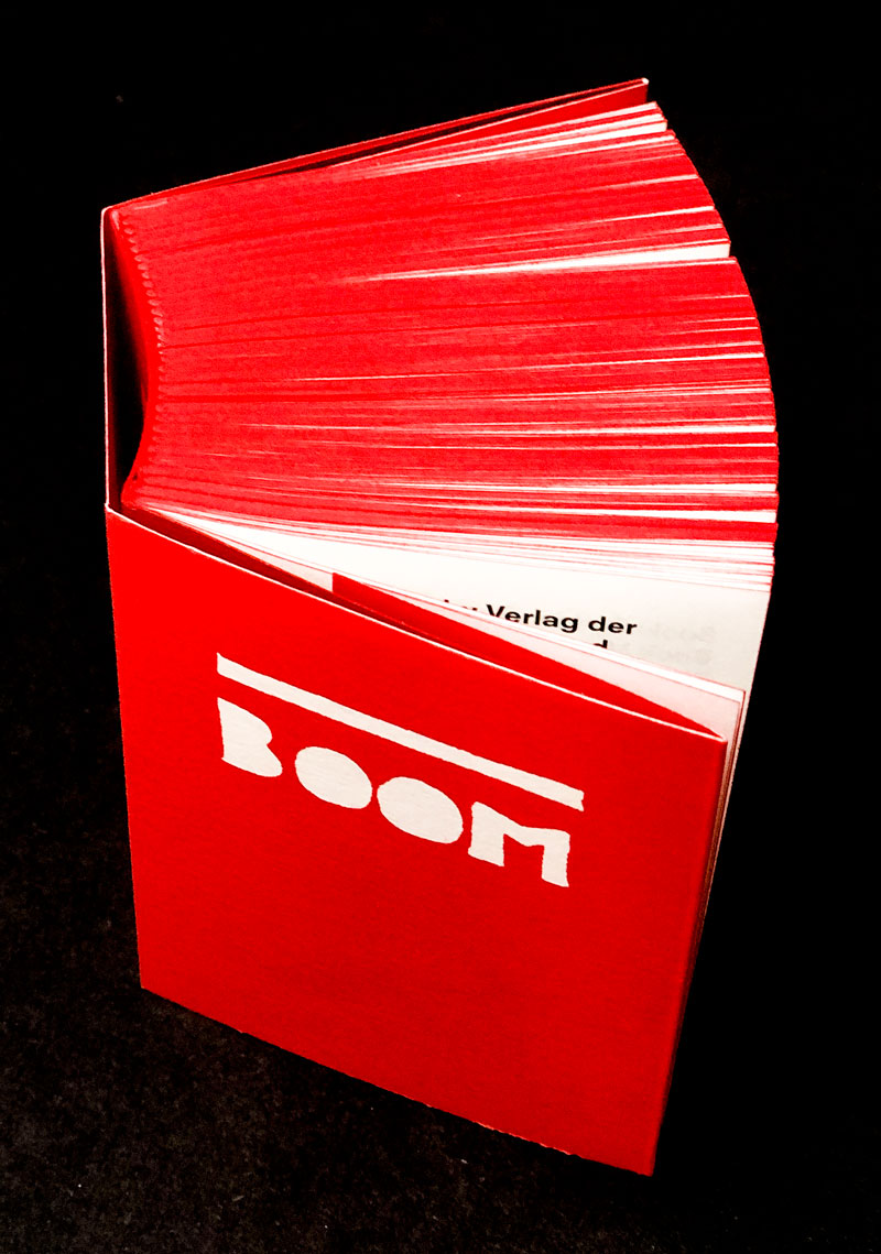
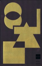
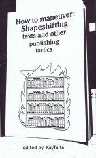
Titel
-
Book Manifest - Books in reverse chronological order 2022-1986. With comments here and there.
Technische
Angaben
-
1000 S., 15x11x4 cm, ISBN/ISSN 9783753300917
Broschur, Klebebindung, Schutzumschlag, in Schachtel aus Karton versenkt
ZusatzInfos
-
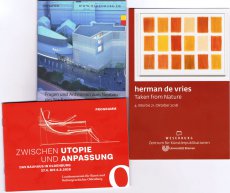
3. erweiterte Auflage mit 600 farbigen Abbildungen, zur Ausstellung 03.02.-08.05.22 bei Allard Pierson der Universität von Amsterdam.
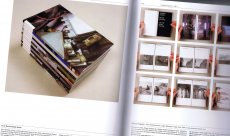
Die renommierte niederländische Designerin Irma Boom ist bekannt für ihre kühne und experimentelle Herangehensweise, mit der sie die Konventionen des traditionellen Buches sowohl in Bezug auf das Design als auch auf den gedruckten Inhalt in Frage stellt. Im "Book Manifest" (das 3. Buch der Reihe) präsentiert Irma Boom ihre Vision vom Wesen, von der Bedeutung und Relevanz des Buches. Grundlage hierzu waren intensive Nachforschungen, die Irma Boom zur Entwicklung des Buches in der Bibliothek des Vatikans angestellt hat. Die dabei gewonnenen Erkenntnisse teilt sie mit einer Auswahl von mehr als 350 von ihr gestalteten Büchern, in denen sie den Kontext und die Beziehung zum traditionallen Buch ausführlich erörtert. Mit diesem 1000seitigen, reich bebilderten Buch möchte Irma Boom die neue Generation von Designern inspirieren und zum Experimentieren anregen, um die Stellung des Buches für die Zukunft zu sichern. Die Bücher von Irma Boom befinden sich in der ständigen Sammlung des MoMA in New York und in den Sondersammlungen der Universität von Amsterdam: das Irma Boom Archiv.
World renowned Dutch designer Irma Boom is known for her bold experimental approach to her projects, often challenging the convention of traditional books in both physical design and printed content. In the book "Book Manifest" (the 3rd book in the series) Irma Boom presents her vision on the essence, meaning and relevance of the book. The basis for this book is formed by the in-depth research that Irma Boom carried out into the development of the book in the library of the Vatican. The knowledge she gained about this, and the inspiration it gave her, is shared with a selection of more than 350 books she designed, in which she extensively discusses the context and relationship with the old book. With this 1000-page, richly illustrated book, Irma Boom aims to inspire and encourage the new generation of designers to experiment, in order to ensure the book's position for the future. Boom's books in the permanent collection of MoMA in New York, and Special Collectons of the University of Amsterdam collect her complete oeuvre: the Irma Boom Archive.
Text von der Webseite des Verlages
|
Titel
-
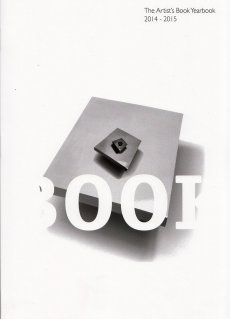
Artist's Book Yearbook 2020-2021
Technische
Angaben
-
236 S., 29,6x21 cm, ISBN/ISSN 9781906501181
Broschur, Softcover, design by Tom Sowden
ZusatzInfos
-
The ABYB is a biennial reference publication focusing on international activity in the field of book arts. It serves as a resource for artists, academics, students, collectors, librarians, dealers, publishers and researchers, in fact anyone interested in artists’ books!
The 2020-2021 issue will have essays, articles, and lots of useful information on: Artist’s Book Publishers & Presses; Bookshops for artists’ books; Artist’s Book Dealers; Artist’s Book Galleries & Centres; Collections, Libraries & Archives; Artist’s Book Fairs and Events; Book Arts Courses and Workshops; Design, Print & Bind; Print Studios; Journals and Magazines; New Reference Publications; Organisations, People, Projects and Societies. Artists list up to 3 of their recent book works.
Text von der Webseite
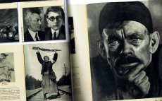
S. 49, Text und Fotos von Jürgen Wegner, A visit to Archive Artist Publications and its exhibition in the Haus der Kunst, München, Germany
S. 111, Collections, Libraries & Archives
|
Technische
Angaben
-
256 S., 29,8x24,6 cm, ISBN/ISSN 9780061995118
Hardcover mit Schutzumschlag.
ZusatzInfos
-
Organized so as to encourage creativity, serendipitous discovery, and inspiration, Layout Look Book 2 is an essential guide to layout design for both amateur and professional designers. The book includes techniques that can be used to enhance any layout, as well as insights into the factors that helped make each layout an effective piece. The styles covered in the volume range from traditional to cutting edge, and will enable any designer to become a more creative thinker and produce fantastic work. Layout Look Book 2 showcases outstanding work by more than fifty of the world's best design studios and professionals working in print design today.
Text von der Webseite.
|
Titel
-
The Big Book of Color in Design
Technische
Angaben
-
384 S., 28x21,6 cm, ISBN/ISSN 9780060748005
Broschur
ZusatzInfos
-
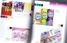
Erstauflage 2003.
"The Big Book of Color in Design" focuses on color as a tool to create moods and symbolic images.The book is categorized into 30 different sections, such as “classy,” “hot,” “regal,” or “corporate.” Each section features current graphic design projects that fit into these moods. For each of the featured projects, a “color chip” appears, with the CMYK formula for creating a similar tone. In all, hundreds of examples of use of color in brochures, ads, logos and other categories of graphic design appear in this breakthrough book.
Text von der Webseite.
|
Titel
-
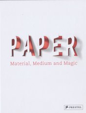
Paper - Material, Medium and Magic
Technische
Angaben
-
240 S., 27x21 cm, ISBN/ISSN 9783791383064
Fadenheftung, offener Rücken, Hardcover, verschiedene Papiere
ZusatzInfos
-
Wide-ranging and multi-faceted this intriguing and beautifully produced book will change the way you relate to paper in an increasingly “paperless” society.
While sheets of paper are disappearing from our homes and offices, the medium is experiencing a renaissance in the worlds of art, design, and architecture. Suddenly, paper is everywhere— but not only in the old familiar places or forms. This fascinating book looks at every aspect of paper: its history, composition, production, application, and trade. Beginning with the anatomy of paper and its earliest forms, this book looks at paper as a symbol of political and economic importance and as a carrier of ideas, from literature to art, design, and music. It looks at the different surfaces, opacities, weights and volumes of paper and how it is used for printing, typography, graphics, and maps as well as a vehicle for origami, architecture, and fashion. Sumptuously illustrated with photographs and drawings, this book includes a variety of papers for readers to examine and feel, highlighting the sensual aspects of this seemingly ordinary product. Engaging, entertaining, and informative, this book contains a wealth of useful and surprising information on every printed, colored, and textured page.
Text von der Webseite
Mit Literaturverzeichnis und Liste der Museum, die sich mit Papier/Buch befassen
|
Titel
-
Best Book Design from all over the World 2021
Technische
Angaben
-
468 S., 19x12,4 cm, Auflage: 1.500, 2 Stück. keine weiteren Angaben vorhanden
Klebebindung, Schutzumschlag mit Metallprägung, herausnehmbares Lesezeichen
ZusatzInfos
-
Katalog mit den Einreichungen, der Shortlist, der Gewinnerliste und der Juryliste des Wettbewerbs "Best Book Design from all over the World / Schönste Bücher aus aller Welt" aus dem Jahr 2021, ausgelobt von der stiftung buchkunst.
Der Wettbewerb »Best Book Design from all over the World / Schönste Bücher aus aller Welt« bietet die Möglichkeit internationale Entwicklungen und nationale Unterschiede in der Buchgestaltung zu beobachten und festzuhalten. Von den Einsendungen aus über 30 Ländern werden insgesamt 14 Werke von der internationalen Jury ausgezeichnet. Der internationale Austausch und die gegenseitige Anregung stehen dabei verstärkt im Vordergrund.
Text z.T. von der Webseite.
|
Titel
-
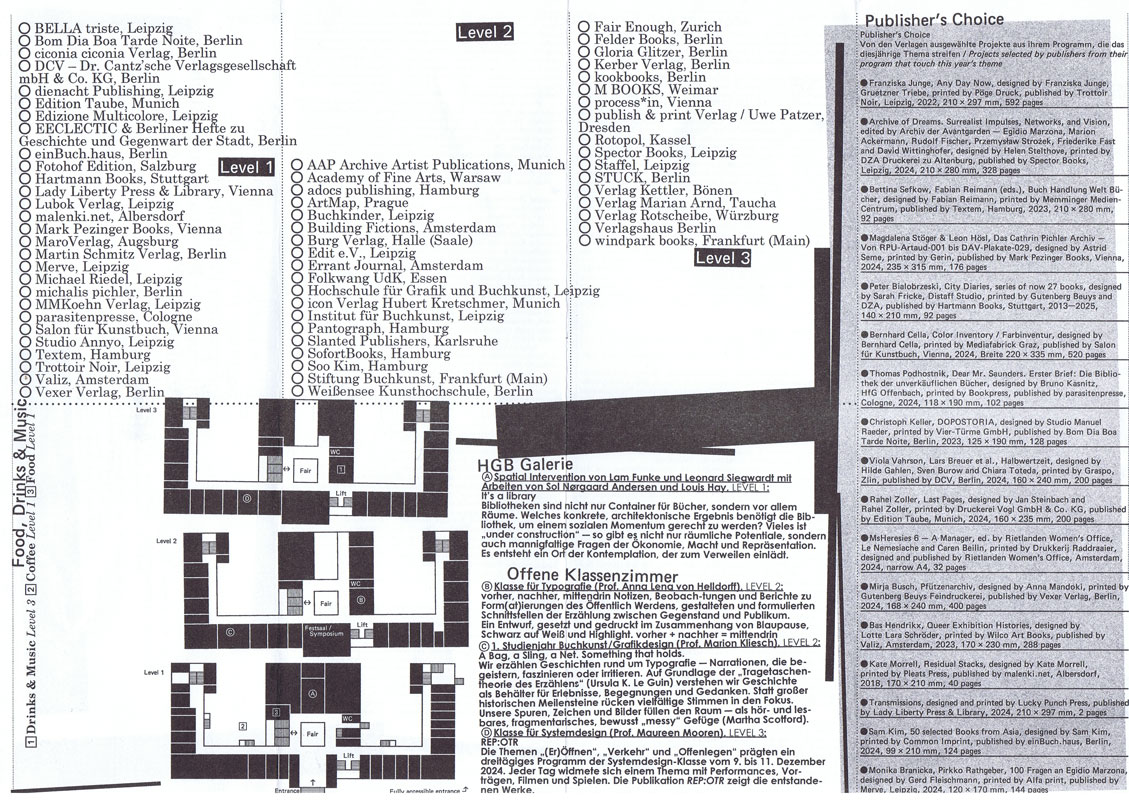
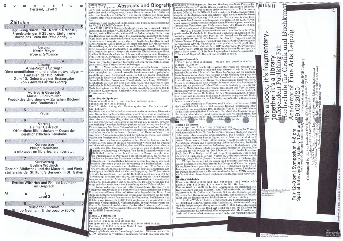
It's a book 2025 - Programm
Technische
Angaben
-
29,7x10,5 cm, keine weiteren Angaben vorhanden
Risodruck, Schwarz-Weiß, Flyer mit Zickzackfalz
ZusatzInfos
-
Die Independent Publishing Fair It’s a book, …, das jährliche Zusammenkommen von Publizierenden und unabhängigen Verlagsprojekten, findet 2025 zum fünfzehnten Mal statt. Sie ist Markt- und Tauschplatz von Publikationen verschiedenster Art wie auch von Ideen und Debatten und ist etabliert als ein offener Raum, der alle willkommen heißt.
Die ineinandergreifenden Bereiche der It’s a book, … – Buchmesse, Symposium, eine räumliche Intervention, grafische Gestaltung, Publikation und Website – wurden im Rahmen eines Projektseminars mit Studierenden der Hochschule für Grafik und Buchkunst Leipzig und in Kooperation mit dem Verein open book society e.V. entwickelt, ausgestaltet und organisiert.
Neben zahlreichen Verlagen aus dem In- und Ausland werden zum diesjährigen Symposium Maria L. Felixmüller, Katrin Mayer, Philipp Neumann, Raimar Oestreich, Anna-Sophie Springer und Eveline Wüthrich begrüßt.
Ein umfassender Reader mit Beiträgen von u.a. Gabriela Halac, Alessandro Ludovico, Abigail Reynolds, Yvonne Schürer und Eva Weinmayr lädt zur vertiefenden Lektüre und Nachlese ein.
Der Dreiklang It’s a book, it’s fragmentary, together it’s a library spricht das diesjährige Thema sehr konkret an und öffnet zugleich ein weites Feld: Bibliotheken werden als Orte für Bücher und als Räume für Menschen betrachtet.
In Bibliotheken sind Bücher und Menschen aufs Engste verbunden. So sind Architektur, Gestaltung und Ausstattung von Bedeutung, denn sie begrüßen, tragen und beherbergen Menschen wie Bücher gleichermaßen. Dies lässt auf die Formen und Formate von Bibliotheken blicken sowie auf Strukturen, die ihre Agency und den sozialen Raum, den sie bilden, prägen – ideengeschichtlich, als Konstellation und als Denkraum.
Bibliotheken sind vor allem auch Orte des Sammelns und Archivierens, des Organisierens und Teilens. Hier bilden einzelne Publikationen und ihre Inhalte zusammen ein größeres Wissensnetz. Ihre Vielstimmigkeit lässt neue Beziehungen und Assoziationsketten entstehen. Heute werden Bibliotheken zunehmend als dynamische Orte des Wissenstransfers neu gedacht. Denn Bibliotheken sind niemals nur architektonische und physische Räume, sondern immer auch kulturelle Konstrukte, die – historisch betrachtet – eng an hegemoniale Strukturen gekoppelt sind. Sowohl aus wissenschaftlichen wie auch aus künstlerischen Perspektiven wird dies kritisch hinterfragt und in vielen Initiativen und Projekten aufgebrochen.
Diese Entwicklungen sind eng mit Herausforderungen des digitalen Zeitalters verknüpft und digitale Bibliotheken, die Monopolisierung von Wissen und alternative anarchische, oft in den Schatten agierende Modelle bleiben weiterhin viel diskutierte Themen. Festhalten lässt sich, dass das totgesagte Buch seinen eigenen Untergang schon so oft überlebt hat, wie er verkündet wurde.
Text von der Website.
|
 
Technische
Angaben
-
240 ca. S., 12,5x10 cm, Auflage: 2.000, ISBN/ISSN 0894390139
Umschlag aus Karton mit Leinenstreifen, ca. 120 Seiten gestanzt
ZusatzInfos
-
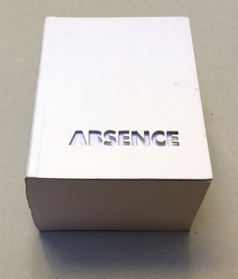
2004 winner of I.D. Magazine's Design Distinction award, Absence is the third book to come out of Printed Matter’s Publishing Program for Emerging Artists, a program made possible through the generous support of New York City's Department of Cultural Affairs, The Andy Warhol Foundation for the Visual Arts, the Elizabeth Firestone Graham Foundation, and the Heyday Foundation. The generosity of Whitney trustees Melva Bucksbaum and Raymond J. Learsy was instrumental to the Museum’s participation in the publication of this exciting new work.
Both a book and a sculptural object, Absence is a memorial to the twin towers of the World Trade Center. Yoon, an architect and designer who is currently an Assistant Professor of Architecture at the Massachusetts Institute of Technology, chose not to produce a traditional design proposal for the World Trade Center Memorial Competition. Instead she created a non-architectural, non site-specific space of remembrance: a portable personal memorial in the form of book.
At almost two pounds, Absence has a considerable physical presence, but it is in every way the ghost of a presence, and it is this ghostliness that gives it its particular emotional weight. A solid white block of thick stock cardboard pages, the book’s only "text" consists of one pinhole and two identical squares die-cut into each of its one-hundred-and-twenty pages – one for each story of the towers including the antenna mast. These removed elements lead the reader floor by floor through the missing buildings towards the final page where the footprint of the entire site of the World Trade Center is die-cut into a delicate lattice of absent structures.
Of all of the proposed monuments and grand designs for the twin towers to emerge in the last two years, Absence is remarkable for its employment of an under-used strategy: restraint. The simplicity of Yoon’s materials and her use of repetition speak, without words, about unspeakable loss. Quiet, respectful, mournful, the book does not aim to represent the magnitude of the disaster. Instead it appeals to the vastness of the reader’s imagination and capacity to grieve. The human scale of her memorial operates on a personal level – it delivers the memory of lives lost into the reader’s hands. At the same time, as a scale model of a vanished architectural site, it operates on a larger cultural level by commemorating the site itself.
Text von der Webseite. Fotos Xenia Fumbarev
|
Titel
-
Schönste Bücher aus aller Welt - Best Book Design from all over the World 2020
Technische
Angaben
-
[64] S., 20x15 cm, Auflage: 1.500, 2 Stück. keine weiteren Angaben vorhanden
Drahtheftung, farbig bedruckt
ZusatzInfos
-
Katalog mit den Gewinnern (Goldene Letter, Goldmedaille, Silbermedaille & Bronzemedaille), den Ehrendiplomen, sowie der Juryliste des Wettbewerbs "Best Book Design from all over the World / Schönste Bücher aus aller Welt" aus dem Jahr 2020, ausgelobt von der stiftung buchkunst.
Der Wettbewerb »Best Book Design from all over the World / Schönste Bücher aus aller Welt« bietet die Möglichkeit internationale Entwicklungen und nationale Unterschiede in der Buchgestaltung zu beobachten und festzuhalten. Von den Einsendungen aus über 30 Ländern werden insgesamt 14 Werke von der internationalen Jury ausgezeichnet. Der internationale Austausch und die gegenseitige Anregung stehen dabei verstärkt im Vordergrund.
Text z.T. von der Webseite.
|
Titel
-
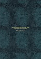
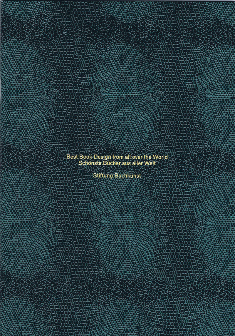
Best Book Design from all over the World - Schönste Bücher aus aller Welt 2019
Technische
Angaben
-
64 S., 30,8x21,5 cm, Auflage: 1.500, 2 Stück. keine weiteren Angaben vorhanden
Drahtheftung; innen mit Metallic-Druck in den Farben Gold, Silber und Bronze; Prägedruck in Schlangenmuster auf dem Umschlag, einmal in grüner und einmal in brauner Ausführung
ZusatzInfos
-
Katalog mit den Gewinnern (Goldene Letter, Goldmedaille, Silbermedaille & Bronzemedaille), den Ehrendiplomen, sowie der Juryliste des Wettbewerbs "Best Book Design from all over the World / Schönste Bücher aus aller Welt" aus dem Jahr 2019, ausgelobt von der stiftung buchkunst.
Der Wettbewerb »Best Book Design from all over the World / Schönste Bücher aus aller Welt« bietet die Möglichkeit internationale Entwicklungen und nationale Unterschiede in der Buchgestaltung zu beobachten und festzuhalten. Von den Einsendungen aus über 30 Ländern werden insgesamt 14 Werke von der internationalen Jury ausgezeichnet. Der internationale Austausch und die gegenseitige Anregung stehen dabei verstärkt im Vordergrund.
Text z.T. von der Webseite.
|
Titel
-
Best Book Design from all over the World 2017
Technische
Angaben
-
[96] S., 30,4x21,3 cm, Auflage: 2.000, keine weiteren Angaben vorhanden
Drahtheftung, eingeklebte Farbbilder, Kunststoff-Schutzumschlag
ZusatzInfos
-
Katalog mit den Einreichungen, den Gewinnern (Goldene Letter, Goldmedaille, Silbermedaille & Bronzemedaille), den Ehrendiplomen, sowie der Juryliste des Wettbewerbs "Best Book Design from all over the World / Schönste Bücher aus aller Welt" aus dem Jahr 2017, ausgelobt von der stiftung buchkunst.
Der Wettbewerb »Best Book Design from all over the World / Schönste Bücher aus aller Welt« bietet die Möglichkeit internationale Entwicklungen und nationale Unterschiede in der Buchgestaltung zu beobachten und festzuhalten. Von den Einsendungen aus über 30 Ländern werden insgesamt 14 Werke von der internationalen Jury ausgezeichnet. Der internationale Austausch und die gegenseitige Anregung stehen dabei verstärkt im Vordergrund.
Text z.T. von der Webseite.
|
Titel
-
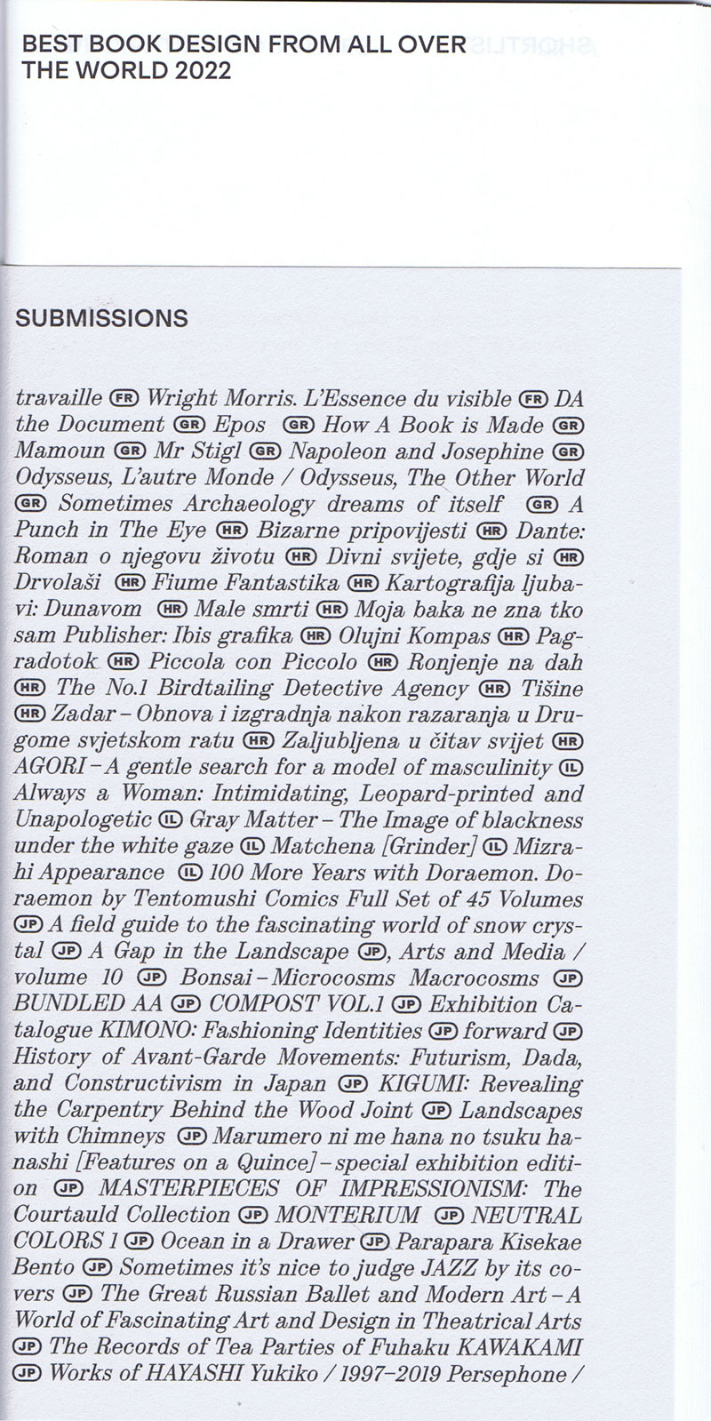
Best Book Design from all over the World 2022
Technische
Angaben
-
36 S., 20,9x10,7 cm, Auflage: 1.200, keine weiteren Angaben vorhanden
Drahtheftung, in sich gefaltet, Einband oben gekürzt, Schwarz-Weiß, in Briefumschlag mit Prägedruck und Aufkleber
ZusatzInfos
-
Katalog mit den Einreichungen, den Gewinnern (Goldene Letter, Goldmedaille, Silbermedaille & Bronzemedaille), den Ehrendiplomen, sowie der Juryliste des Wettbewerbs "Best Book Design from all over the World / Schönste Bücher aus aller Welt" aus dem Jahr 2022, ausgelobt von der stiftung buchkunst.
Der Wettbewerb »Best Book Design from all over the World / Schönste Bücher aus aller Welt« bietet die Möglichkeit internationale Entwicklungen und nationale Unterschiede in der Buchgestaltung zu beobachten und festzuhalten. Von den Einsendungen aus über 30 Ländern werden insgesamt 14 Werke von der internationalen Jury ausgezeichnet. Der internationale Austausch und die gegenseitige Anregung stehen dabei verstärkt im Vordergrund.
Text z.T. von der Webseite.
|
Titel
-
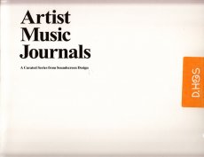
Artist Music Journals Vol. 1 No. 10 - Brian Roettinger & No Age
Technische
Angaben
-
[24] S., 26,5x26,5 cm, Auflage: 1.000, numeriert, keine weiteren Angaben vorhanden
Drahtheftung, in Heft eingelegt eine Schallplatte in Schutzumschlag, in Pappschuber mit Aufkleber. Einseitige 10" Schallplatte "Brian Roettinger w/ No Age", 45 UpM, Katalognr. SSD.10
ZusatzInfos
-
Edition 10 in the ongoing Artist Music Journals series features the work of the Los Angeles based designer, artist, musician and label owner Brian Roettinger, who operates the creative umbrella Hand Held Heart. Unlike any previous Artist Music Journal, this installment includes Brian's 24-page book as well as a one-sided 10" record, featuring a collaboration between Brian and No Age with three exclusive tracks!
Brian lives and works in Los Angeles primarily as a graphic designer. He received a BFA in graphic design from CalArts in 2004. His work encompasses design, publishing, writing and curating as well as running his own vinyl-only record label Hand Held Heart. In 2009 he was nominated for a Grammy for his design of the No Age Nouns album packaging. In 1999 he was providing bass duties for This Machine Kills. He is a part-time professor in the design department at CalArts, as well as a current designer in residency in the Design | Media Arts program at UCLA
|
Titel
-
Unshelfmarked - Reconceiving the artist's book
Technische
Angaben
-
180 S., 23,3x14,1 cm, ISBN/ISSN 9781910010068
Klappbroschur,
ZusatzInfos
-
Post-Deweyed, these works form an entirely new corpus, showcasing the artists’ book not as a by-product of the book per se, but both its antecedent and post-digital flowering, many salient twentieth-century features proleptically flickering here and there through time, its epigenetic influence finally come to permeate mainstream book design everywhere, the manifold traits and studio processes inherent to the artists’ book bursting from their stitched sheath, cheerfully pollinating the whole gamut of reading impedimenta and spaces.
Text von der Webseite
|
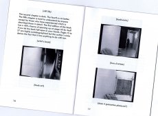
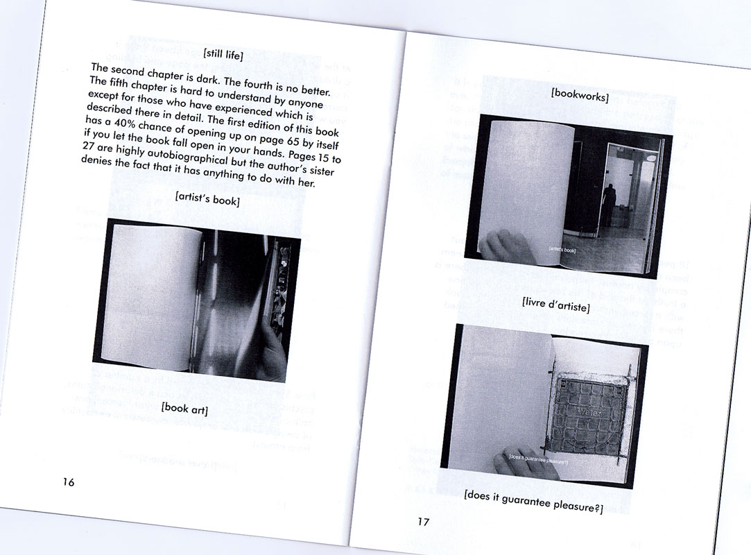
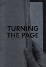
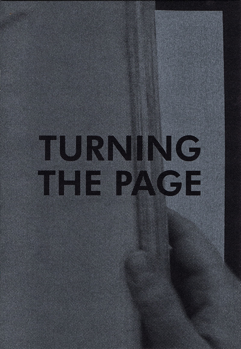
Technische
Angaben
-
20 S., 19,5x13,5 cm, keine weiteren Angaben vorhanden
Drahtheftung
ZusatzInfos
-
This small publication is an edited reprint of the essay ‘The Book in Intermediary Form’ written by Kasper Andreasen. It was originally published by Wintertuin, Nijmegen as part of a compilation about the future of the book. Turning the Page also contains a script for the audiovisual book Tomorrow, which is a collaborative work between Hanne Lippard and Kasper Andreasen reflecting on the status of the (photography) book in audiovisual form.
Text von der Website
|
Technische
Angaben
-
38 S., 12x12 cm, ISBN/ISSN 9788886250795
Broschur
ZusatzInfos
-
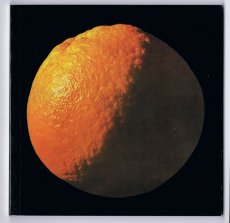
Good Design was published for the first time in 1963 by Scheiwiller Editore. It was then reprinted by Maurizio Corraini and Vanni Scheiwiller together in 1997 to celebrate Bruno Munari’s 90th birthday. In September 1998 it was added to the Corraini Edizioni catalogue. With its good-humoured look at natural shapes seen through the eyes of a designer, this hugely significant book is celebrating its 50th anniversary. An example of good design? An orange - “an almost perfect object where shape, function and use display total consistency”.
Text von der Webseite.
|
Technische
Angaben
-
256 S., 24x16 cm, 2 Stück. ISBN/ISSN 18676510
Klappbroschur. Verschiedene Papiere. Hinten eingelegt ein 48-seitiges Booklet mit Contemporary Typefaces, international und griechisch
ZusatzInfos
-
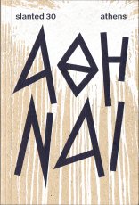
Im Herbst/Winter 2017/18 warf das Slanted Team einen Blick auf die zeitgenössische Designszene Athens. Die Ausgabe wird thematisch ergänzt durch Illustrationen, Fotografien, Interviews und Essays
|
Titel
-
You're my type - Programmbuch 2018
Technische
Angaben
-
20,5x13,5 cm, keine weiteren Angaben vorhanden
4 Bände in Schuber. Schuber geprägt in Gold und Schwarz, Rückseite mit Umkehr der Farben. einzelne Cover mit Reliefprägung, geometrische Formen, Farbschnitt schwarz. Einzelne Bände in Schweizer Broschur (Umschlag nur auf Rückseite angeklebt, Rücken mit Gewebestreifen eingefasst). Bd. 1 130 S., letzte Seite mit Kalender als Fold-Out. Bd. 2 160 S., Bd. 3 96 S., Bd. 4 Blindband, (Notizbuch), 72 S.
ZusatzInfos
-
The Typographic Society Munich is the largest organisation in Europe for typographers and people who are interested in typography and design. Since being founded in 1874 the designers’ club establishes a foundation for sophisticated and interdisciplinary thinking and dialogues among content and form, text and photo, tradition and innovation, design and technology. The tgm represents quality and education for the branch of communication and offers a huge accompanying training program. As Chairwoman of the club I curated several lectures in the last years, inviting design and typography celebrities.Throughout the years designers like Stefan Sagmeister, Mirko Borsche, Eike König, Mario Lombardo, Sascha Lobe, Fons Hickmann, Amir Kassaei or Kurt Weidemann to name a view, followed these invitations and appreciated the warm welcome of our community.
To show the wide range of offerings we traditionally create a yearbook. More over I tried to give the content based complexity of our proposal a clear and neat arrangement. Therefore the new release is a compilation of four different books, which should invite the reader to inform themselves, to browse, to experience and to participate. The first one exposes all the topics, facts and dates for the further education programs. Part two presents all the people and their stories who are involved in the club, who are on stage and behind the scenes. The third book is a journey into the past and also the future of tgm’s conferences, excursions and other specials. And finally there is room for the reader’s own ideas, experiences and criticism as a foundation for a future dialogue with tgm.
Every offer under the roof of tgm is a result of solidarity. It is a result of people and companies who are united by the common interest in typographic quality. This project has only been possible with the support of Kösel Druck GmbH & Co Kg, Geese Paper, mycolorserver and the collaboration with Boah Kim.
Text von der Webseite
|
Titel
-
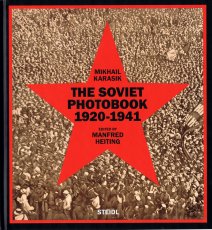
The Soviet Photobook 1920-1941
Technische
Angaben
-
644 S., 29,4x27,4x6 cm, ISBN/ISSN 9783958290310
Hardcover, in bedrucktem Karton.
ZusatzInfos
-
The Soviet Union was unique in its formidable and dynamic use of the illustrated book as a means of propaganda. Through the book, the U.S.S.R. articulated its totalitarian ideologies and expressed its absolute power in an unprecedented way—through avant-garde writing and radical artistic design that was in full flower during the 1920s and ’30s. No other country, nation, government or political system promoted itself more by attracting and employing acclaimed members of the avant-garde. Among them were writers like Semion Kirsanov, Vladimir Mayakovsky, Ilya Selvinsky, Sergei Tretyakov and Kornely Zelinsky. artistic designers like Gustav Klutsis, Valentina Kulagina, El Lissitzky, Sergei Senkin, Varvara Stepanova, Solomon Telingater and Nikolai Troshin. and photographers including Dmitry Debabov, Vladimir Griuntal, Boris Ignatovich, Alexander Khlebnikov, Yeleazar Langman, Alexander Rodchenko, Georgy Petrusov—not to mention many of the best printers and book binders.
The Soviet Photobook 1920–1941 presents 160 of the most stunning and elaborately produced photobooks from this period and includes more than 400 additional reference illustrations. The book also provides short biographies of the photobook contributors, some of whom are presented here for the first time.
Text von der Webseite.
|
Technische
Angaben
-
[32] S., 38x25 cm, Auflage: 200, keine weiteren Angaben vorhanden
Drahtheftung, Abbildungen von Zeichnungen auf hellem, schwarzen und farbigen Papier.
ZusatzInfos
-
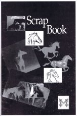
Scrap Book wurde im Rahmen von SCRAP B. veröffentlicht, einem Projekt von Maria Toumazou im Auftrag des Point Centre for Contemporary Art, das bei Moufflon Bookshop stattfand.
"In der Mitte des Hauptraums befindet sich Scrap Book, eine Sammlung neuer Bleistift- und Kohlezeichnungen, Kopien von Bildern der Connect the Dots-Zeichnungen, die Toumazou in Facebook- und Instagram-Anzeigen, Bannern, Plakatwänden und Wandmalereien in Nikosia gefunden hat. Die ersten Zeichnungen beginnen abstrakt und erinnern an Kritzeleien am Rande eines Buches, als Beruhigungsübung oder wenn man geistesabwesend in einen Tagtraum abschweift. Die Zeichnungen nehmen eine komplexere Form an und verbinden ein Paar Hände, die sich gegenseitig halten, die Büste einer Frau, ein Gesicht."
Text von Aristotelis Nikolas Mochloulis, gefunden auf der Webseite und übersetzt mithilfe von DeepL.
|
Titel
-
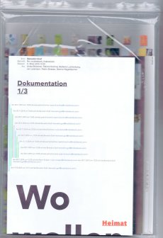
mobile book - Dokumentation
Technische
Angaben
-
40x26 cm, keine weiteren Angaben vorhanden
Buch mit japanischer Bindung, zwei mehrfach gefaltete Plakate (38,8x59,2 cm und 68,8x99,6 cm), in transparenter Kunststoffhülle
ZusatzInfos
-
Projektentwicklung mit Studenten der FH Dortmund, FB Design.
Designstudenten der FH Dortmund und des Dessau Department of Design beschäftigten sich mit den (Un)Möglichkeiten des mobilen Seins in Zeiten von lückenloser Vernetzung und permanenter Erreichbarkeit. ...
Wo bin ich, wenn ich reise? Wir waren mit einem mobilen Arbeitsplatz in einem umgebauten Transporter in Dessau und Dortmund unterwegs. Die Reisen haben wir mit den zur Verfügung stehenden mobilen Geräten und analog dokumentiert.
In den jeweiligen Orten fand über zwei Tage ein gemeinsamer Workshop statt. Hier ging es um spontanes Handeln und Improvisieren als ein Teil des mobilen Seins und um die Wahrnehmung des Ortes aus der Sicht eines Fremden oder auch Ortsansässigen. Die im Workshop entstandenen Hefte dokumentieren die subjektiven Wahrnehmungen des Ortes und zeigen den Einfluss der verwendeten mobilen, digitalen und analogen Geräte und Produktionsmittel auf die Gestaltung. Das Projekt wird hier mit Workshopergebnissen, Dokumentationsfilmen und einer zusammenfassenden Publikation mobile book präsentiert.
Die Publikation wurde mit dem E-Mail Programm gestaltet. Dies greift zum einen den Kerngedanken auf, mobiles Arbeiten medial abzubilden und zum anderen stellt es eine Untersuchung des Mediums auf visuelle Eigenheiten und den Einfluss auf die zu vermittelnden Inhalte dar. Das mobile book manifestiert sich in verschiedenen Medien: Wandbild, Buch, E-Mail.
Text von der Webseite
|

Technische
Angaben
-
136 S., 21,7x23,3 cm, 2 Stück. ISBN/ISSN 9783958296237
ein Teil offene Fadenheftung, ein Teil Drahtheftung, beide Softcover, Poster gefaltet (nicht zweifach vorhanden), in Pappschuber
ZusatzInfos
-
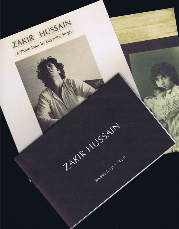
Die Ausgabe wurde von Singhs Original-Maquette gescannt und reproduziert all ihre "Unvollkommenheiten" und Eigenheiten, einschließlich ihrer mit Bleistift geschriebenen Notizen über die Konstruktion des Buches - ein Hinweis auf die einflussreiche Buchmacherin, die noch kommen wird. Der begleitende Essay von Shanay Jhaveri erörtert, wie Singh dazu kam, das Original zu "machen". Er bezieht sich auf ihre studentischen Notizen und untersucht, wie sie das Buch intuitiv zusammenstellte, von der Bearbeitung der Bilder bis zum Design, und legt damit den Grundstein für die Buchobjekte und Fotoarchitekturen ihrer späteren Praxis.
This edition is scanned from Singh’s original maquette and reproduces all its “imperfections” and idiosyncrasies including her pencilled notes about the book’s construction—indications of the influential bookmaker to come. Shanay Jhaveri’s accompanying essay discusses how Singh came to “make” the original, referring to her student notes and exploring how she intuitively assembled the book, from editing the images to design, setting the ground for the book objects and photo architectures of her later practice.
Text von der Webseite
Übersetzt mit Deepl
|
Technische
Angaben
-
21 S., 29,7x21 cm, keine weiteren Angaben vorhanden
21 Blätter, Laserdruck
ZusatzInfos
-
Emailverkehr und Listen der Buchauswahl für den Besuch der Bayerischen Staatsbibliothek, Handschriftenabteilung bei Frau Dr. Béatrice Hernad, sowie für den Besuch des Archive Artist Publications durch Studenten der new design university st. pölten, Studiengang contemporary book design
|
Titel
-
You will have everything you need
Technische
Angaben
-
106 S., 21x14,8 cm, Auflage: Print on Demand, keine weiteren Angaben vorhanden
Broschur
ZusatzInfos
-
Schwarz-Weiß-Drucke, Nr. 026 der Reihe 100for10.
Christopher is a graphic designer living and working in Atlanta. In 2014, he established Christowerks as a studio for graphic design. Before opening Christowerks, he worked at the studios of Laurie Rosenwald, Young Professionals and completed major work for Sony Music Entertainment. He has taught design at PI Art Center in Manhattan and his work has been featured in Print Magazine and The New York Art Book Fair 2014. He graduated in 2012 from The Creative Circus in Atlanta.
|
Technische
Angaben
-
106 S., 21x14,8 cm, Auflage: Print on Demand, keine weiteren Angaben vorhanden
Broschur
ZusatzInfos
-
Schwarz-Weiß-Drucke, Nr. 028 aus der Reohe 100for10.
Christopher is a graphic designer living and working in Atlanta. In 2014, he established Christowerks as a studio for graphic design. Before opening Christowerks, he worked at the studios of Laurie Rosenwald, Young Professionals and completed major work for Sony Music Entertainment. He has taught design at PI Art Center in Manhattan and his work has been featured in Print Magazine and The New York Art Book Fair 2014. He graduated in 2012 from The Creative Circus in Atlanta.
|
Technische
Angaben
-
106 S., 21x14,8 cm, Auflage: Print on Demand, keine weiteren Angaben vorhanden
Broschur
ZusatzInfos
-
Schwarz-Weiß-Drucke
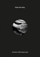
C100 is a creative studio working for global brands, small businesses and private projects. It is headed by Christian Hundertmark who founded the studio in 2003. Specialised in delivering inventive and precise visual solutions C100 Studio implements each project with enthusiasm, dedicated hands and a individual style which is evident in the diverse output. Over the years C100 Studio’s work was published in many books and magazines. French publishing house Pyramyd released an edition in their ‘Design & Designers’ book series. From 2007-2011 C100 Studio was European correspondent for Hong Kong based IdN design magazine.
|
Titel
-
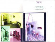
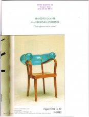
MONO.KULTUR #32 Martino Gamper - All Channels Personal
Technische
Angaben
-
56 S., 20x15 cm, ISBN/ISSN 18617085
Drei Hefte in verschiedener Größe broschiert, mit Drahtheftung
ZusatzInfos
-
Martino Gamper is the kind of product designer we all have been waiting for: Brimming with ideas, energy and humour, his designs are disarmingly irreverent and irresistibly fun, and unlike anything one will see in the puristic galleries of contemporary design. Crossing over from studying sculpture to completing an MA in product design at the prestigious Royal College of Art under Ron Arad, Gamper has had little time to worry over the theoretical do’s and don’t’s of his profession – instead, he has followed a simple rule of learning by doing, meaning: the more you do, the more you learn. With mono.kultur, Martino Gamper talked about his idea of fun, why a chair is the ultimate challenge and what design has in common with cooking. Visually, the issue is bursting with references and ideas, reclaiming image material from left and right, while unveiling the structure of a book with three booklets of different sizes all lovingly assembled into one – and manually at that, which makes for some rough edges or rather what we like to call extra personality.
Text von der Website.
|
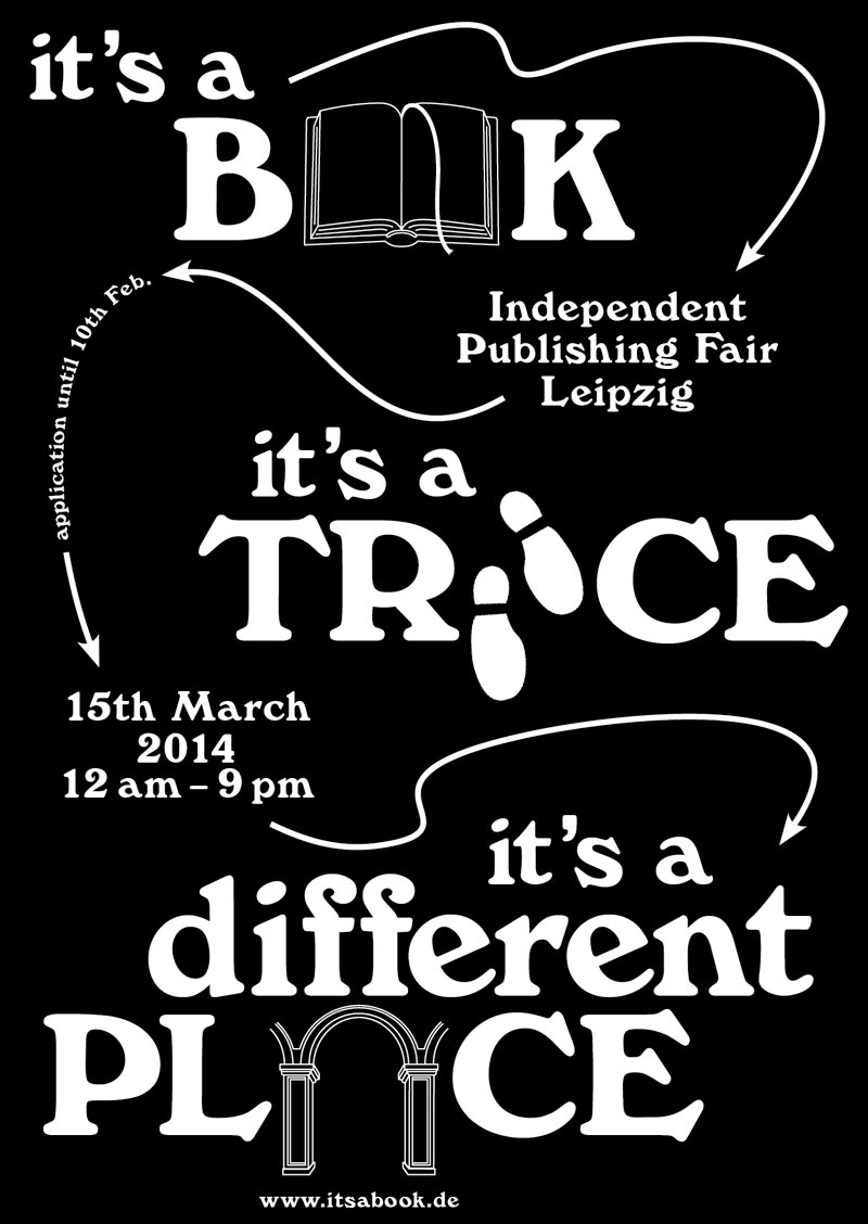
Titel
-
Is's a Book - It's a Talk - It's s a Smalltalk
Technische
Angaben
-
7 S., 29,7x21 cm, keine weiteren Angaben vorhanden
Schwarz-Weiß-Laserdruck nach Webseite, Drahtheftung
ZusatzInfos
-
Independent Publishing Fair Leipzig, 15th of March 2014
Event: "It’s a Book…” is an independent publishing fair taking place on 15th of March 2014 at the Academy of Visual Arts Leipzig, in correspondence to the Leipzig Book Fair. Entrepreneurs of the international independent publishing-scene are looking forward to meeting interested visitors and exchanging books and ideas.
Organisation: students of the graphic design department, Academy of Visual Arts, Leipzig.
|
Titel
-
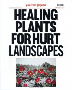
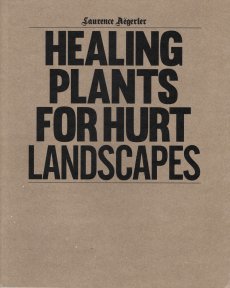
Healing Plants For Hurt Landscapes
Technische
Angaben
-
[56] S., 36,6x30 cm, Auflage: 1.050, signiert, ISBN/ISSN 9789081460606
Mappe mit einem Heft (Drahtheftung, signiert)
ZusatzInfos
-
This artist’s book is the result of Herbarium Cataplasma, a twofold community art project that Laurence Aëgerter developed at the invitation of the city of Leeuwarden in Friesland, the Netherlands. Aëgerter led a careful reconstruction of the plan of the medicinal garden of the medieval Abbey of Saint Gall on an unused plot of land in Leeuwarden, which was once part of a convent. This project was realized in collaboration with the local residents. Aëgerter also invited the residents for a symbolical healing ritual of destroyed landscapes. She selected 100 images by searching the web for photographs of disasters created by nature and man throughout the world.
Participants were invited to treat the photographs of destroyed landscapes with the medicinal plants from their newly built garden, with appropriate herbal therapies (e.g. cannabis for anxiety relief or ginger against pain from burns). As the source images were mainly used as news photographs, Aëgerter’s book relates to a newspaper design.
The research, proces and results of Herbarium Cataplasma are gathered on the blog Herbarium Cataplasma
Text von der Webseite.
|
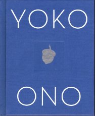
Technische
Angaben
-
[216] S., 16x13,4 cm, ISBN/ISSN 9781616203771
Hardcover, Prägedruck
ZusatzInfos
-
A version of this book was published in installments on the Internet during 1996 and 1997.
It’s nearly 50 years ago that my book of conceptual instructions Grapefruit was first published. In these pages I’m picking up where I left off. Now it's being published in book form. I'm riding a time machine that's going back to the old ways! Great! I added my dot drawings to give you further brainwork. I’m just planting the seeds. Have fun.
Text aus dem Buch.
|
Titel
-
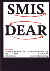
SMIS DEAR - Miss Read - The Berlin Art Book Fair 2019 - Conceptual Poetics Day
Technische
Angaben
-
82 S., 24x17 cm, Auflage: 2.000, 2 Stück. 4 Teile. ISBN/ISSN 9783868741056
Broschur. Mit eingelegtem Programm des Conceptual Poetics Day, von Natalie Czech, Ausstellerverzeichnis und -plan, Postkarte.
ZusatzInfos
-
zur Veranstaltung vom 03.-05.05.2019 im Haus der Kulturen der Welt. Gestaltung des Kataloges Moritz Grünke. MISS READ: The Berlin Art Book Fair 2019 will take place on May 3th to 5th at Haus der Kulturen der Welt and will bring together a wide selection of publishers, art periodicals and artists/authors (267+ exhibitors for 2018). In conjunction, the seventh Conceptual Poetics Day will explore the imaginary border between visual art and literature. Founded in 2009, MISS READ is Europe’s major Art Book Festival, dedicated to community-building and creating a public meeting place for discourse around artists’ books, conceptual publications and publishing as practice.
Text von der Webseite
|
Titel
-
Artist Music Journals Vol. 1 No. 03
Technische
Angaben
-
[24] S., 26,5x26,5 cm, Auflage: 1.000, numeriert, keine weiteren Angaben vorhanden
Drahtheftung, Heft in Pappschuber mit Aufkleber
ZusatzInfos
-
Artist Music Journal is an ongoing, limited edition small book series published by Sound Screen Design that focuses on the inseparable connection between music and art. Each release is limited to 1,000 copies, features a 24 page, saddle-stitched small book printed on thick stock and encased in a 10″., record jacket. The artists signature is replicated on a letterpressed sticker placed around the jacket opening, and hand numbered.
Daniel Higgs is a musician and artist from Baltimore, Maryland, who has been a contributor to the independent art and music community for nearly 3 decades. His artistic work ranges from musical records to books of poetry to visual collections of his drawing, painting and collage work
|
Titel
-
Artist's Book Yearbook 2014-2015
Technische
Angaben
-
296 S., 29,6x20,8 cm, ISBN/ISSN 9781906501075
Softcover, design by Tom Sowden
ZusatzInfos
-
Over 600 artist’s book listings from 207 national and international artists. Reference listings of: collections, libraries, archives, bookshops, galleries, centres, design print & bind, publishers, dealers, presses, studios, competitions, fairs, festivals and exhibitions, journals, reference books, organisations, societies, websites, academic projects, touring programmes and courses.
Text von der Webseite
|
Technische
Angaben
-
106 S., 21x14,8 cm, Auflage: Print on Demand, keine weiteren Angaben vorhanden
Broschur
ZusatzInfos
-
Schwarz-Weiß-Drucke, Nr. 024 aus der Reihe 100for10.
Alexander Branczyk, born 1959, studied visual communication at HfG Offenbach in Germany. From 1988 until 1994, he was project manager at Erik Spiekermann’s MetaDesign. Since 1994 Alexander is partner and managing director of xplicit Gesellschaft für visuelle Kommunikation mbH based in Frankfurt/Main and Berlin. In addition he is art director emeritus of the 1990s cult magazine “Frontpage” and founding member of the collaborative type’n’typo project Face2Face. Alexander Branczyk was from 2003 until 2005 professor for typography at the Bauhaus University Weimar and since 2012 at FH Dortmund, University of Applied Sciences and Arts.
|
Technische
Angaben
-
[70] S., 28x21,7 cm, ISBN/ISSN 9780996282215
Klebebindung
ZusatzInfos
-
CURRENT RESIDENT, a collaborative book by Kenny Komer and Marysia Gacek, comprises solely of computer generated imagery inspired by interior design catalogues and magazines. Based on interiors seen in Architectural Digest and Ikea catalogues, the book depicts a fictional, contemporary residence mimicking current tendencies to replace photography with 3D modeling computer software producing photo realistic images. Views of the apartment are generated via computer algorithms with the same techniques used in the advertising industry. A reader is invited to take a tour of the space while a number of mysterious activities unravel before her/his eyes.
Kenny Komer (b.1984) is an interdisciplinary multimedia artist who lives and works in Brooklyn, NY. He received a BFA from the School of Art, Cooper Union, New York, NY in 2006. He has exhibited at galleries in New York (Gavin Brown's enterprise, Rush Arts Gallery, Carriage House Center and White Box Gallery) and Tokyo, Japan (Motus Fort). Komer is a founding member of the guerrilla street-art collective, Concerned New Yorkers, whose work has been featured in the New York Times, New York Magazine, the Brooklyn Rail, the Village Voice, CNN, and the Daily Telegraph.
CURRENT RESIDENT, ein gemeinsames Buch von Kenny Komer und Marysia Gacek, besteht ausschließlich aus computergenerierten Bildern, die von Katalogen und Zeitschriften für Innenarchitektur inspiriert sind. Auf der Grundlage von Inneneinrichtungen aus Katalogen von Architectural Digest und Ikea zeigt das Buch eine fiktive, zeitgenössische Wohnung, die die aktuelle Tendenz nachahmt, Fotografien durch 3D-Modellierungssoftware zu ersetzen, die fotorealistische Bilder erzeugt. Die Ansichten der Wohnung werden mit Hilfe von Computeralgorithmen generiert, die auf denselben Techniken beruhen, die auch in der Werbeindustrie verwendet werden. Der Leser wird eingeladen, einen Rundgang durch den Raum zu machen, während sich vor seinen Augen eine Reihe mysteriöser Aktivitäten entfalten. Kenny Komer (geb. 1984) ist ein interdisziplinärer Multimedia-Künstler, der in Brooklyn, NY, lebt und arbeitet. Er erhielt 2006 einen BFA von der School of Art, Cooper Union, New York, NY. Er hat in Galerien in New York (Gavin Brown's Enterprise, Rush Arts Gallery, Carriage House Center und White Box Gallery) und Tokio, Japan (Motus Fort) ausgestellt. Komer ist Gründungsmitglied des Guerilla-Straßenkunstkollektivs Concerned New Yorkers, dessen Arbeiten in der New York Times, dem New York Magazine, dem Brooklyn Rail, der Village Voice, CNN und dem Daily Telegraph veröffentlicht wurden. Text von der Webseite
Text von der Webseite, übersetzt mit DeepL
|
Technische
Angaben
-
[32] S., 28,7x8,3 cm, ISBN/ISSN 9783943514940
Broschur, Softcover, in Papierbanderole
ZusatzInfos
-
Eleven Poems is a collection of 11 poems printed on single sheets that can be used as page markers to interrupt whatever else you are reading. Each poem is based on descriptions of natural phenomena, to talk about everyday situations of human social behavior. Valentina Jager’s work is primarily related to the world of actions approached via sculpture, written and spoken word, furniture design, and installation.
Text von der Website.
|
Technische
Angaben
-
406 S., 17,3x12 cm, ISBN/ISSN 9783037784792
Klappbroschur.
ZusatzInfos
-
Retrospektive zu Camper-Schuhen, anlässlich des 40. Firmenjubiläums mit philosophischen, soziologischen, kulturhistorischen Perspektiven auf den Schuh.
What is a “walking society”? A society that is in motion, that is setting out for somewhere. And what connects the individuals in this society with the ground they stand on? It’s their shoes of course. The focus here is on a very special shoe: the Camper shoe. It has gone through considerable changes since its early days, when it was cobbled together by Mallorcan peasants from a piece of car tire and a scrap of fabric. What remains is the philosophy embraced by the Spanish family business, that innovative shoes produced according to the highest standards should not only be comfortable but should also offer their wearers the greatest possible freedom of movement.
The book tells the story of the Camper brand while at the same time unfurling a range of related themes, from the anatomy of the foot to the cultural history of the shoe. All of which leads to a visual exploration of our “walking society.”
Text von der Webseite.
|
Titel
-
Para-Plattformen - die Raumpolitik des Rechtspopulismus
Technische
Angaben
-
230 S., 17x12 cm, ISBN/ISSN 9783962730260
Broschur
ZusatzInfos
-
Texte von Benjamin H. Bratton, Hannes Grassegger, Mahmoud Keshavarz, Angela Nagle, Nina Power, Patricia Reed, Konrad Renner, Slavs & Tatars, Jonas Staal, Hito Steyerl, Wolfgang Tillmans, Stephan Trüby, Christina Varvia (Forensic Architecture). Cover von Liam Gillick.
Rechtspopulismus ist keine neue Erscheinung. Seine Formen und Vorgehensweisen befinden sich jedoch im stetigen Wandel und erobern ständig neue Räume. Rechtspopulistisches, völkisch-autoritäres Gedankengut grassiert vermehrt durch virtuelle, soziale und materielle Landschaften, durchquert Institutionen, Netzwerke und Plattformen und annektiert so gesellschaftliche Felder. Die ideologische Verankerung des Rechtspopulismus im sozialen Raum wird in diesem Band in territorialen Kategorien gedacht. Design und Material werden auf ihre politischen Implikationen hin untersucht, und aus verschiedensten Winkeln reflektiert, um Strategien zu entwickeln, die auf die rechte Raumpolitik reagieren. Die Analyse baut auf drei Fallstudien auf, die sich mit neu entstandenen Räumen des Rechtspopulismus befassen und auf einem von Markus Miessen organisierten Symposium des Design Festivals Göteborg präsentiert wurden.
Text von der Webseite
|
Technische
Angaben
-
288 S., 31x26,2 cm, ISBN/ISSN 9780500517635
Hardcover mit Schutzumschlag
ZusatzInfos
-
Hipgnosis created some of the most innovative and surreal cover art of the 1960s, 70s, and early 80s for the biggest names of the era—Pink Floyd, Led Zeppelin, Wings, Yes, Genesis, 10cc, Peter Gabriel, Bad Company, Syd Barrett, and Black Sabbath, to name just a few.
The sublime prism cover for Pink Floyd’s The Dark Side of the Moon continues to be one of the most pervasive images in all popular culture. Hipgnosis’s highly conceptual approach and graphic appeal earned them five Grammy nominations for cover design, and they profoundly influenced not only the history of music, but also all other creative fields from advertising to fashion.
Hipgnosis Portraits explores an endless stream of creative ideas in two sections. Part I, "Imagination," tells the story behind the artwork from germination through to the final sleeve design, supported by a wide array of archival materials. Part II, "Realization," contains beautiful and extremely photographic portraits of the musicians the agency counted as clients. Several of these images were taken but not used for projects and have remained buried in archives ever since.
The book is filled with playful, abstract compositions from a remarkably prolific collective that redefined the possibilities of concept-driven art and design.
Text von der Webseite artbooksonline.eu
|
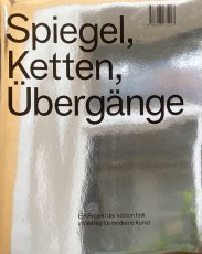
Titel
-
Spiegel, Ketten, Übergänge / Mirrors, Chains, Transitions
Technische
Angaben
-
152 S., 30x22,5 cm, ISBN/ISSN 9783903131217
Ringbindung mit Kartonumschlag aus Chromolux, metallic, dreiteilig, Schwarz-Weiß Abbildung. Farbige Transparentpapiere, beigelegt ein Brief von Till Velten
ZusatzInfos
-
This monograph is the first to bring together four different projects by Till Velten, not to mention reflections of these in texts by authors and art historians. This type of reflection is likewise evidenced in the graphic design of the volume, as well as in the title and the new sculptural work of the “chains”, which can be found at the center of the book. Velten replaces images with conversations through which he thus creates new, fluid portraits of his subject matter. In the process, he steps into the role of director of a never-ending documentary recording. The notion of the conversation as a sketch of the world provides those involved with an active part, and Velten therefor sees himself as a “sculptor of conversations”. It is as though he gives his collaborators his questions so that they may address themselves. The core issue of the work then becomes recognizing oneself in the other and translating human inner worlds into art.
Die vorliegende Monografie versammelt erstmals vier verschiedene Projekte von Till Velten sowie deren Reflexion in Texten von Autoren und Kunsthistorikern. Diese Art der Reflexion zeigt sich auch in der grafischen Gestaltung des Bandes sowie im Titel und in der neuen skulpturalen Arbeit der „Ketten“, die im Zentrum des Buches zu finden ist. Velten ersetzt Bilder durch Gespräche und schafft so neue, fließende Porträts seines Themas. Dabei schlüpft er in die Rolle des Regisseurs einer nicht enden wollenden dokumentarischen Aufzeichnung. Die Idee des Gesprächs als Skizze der Welt gibt den Beteiligten eine aktive Rolle, und Velten versteht sich daher als „Bildhauer von Gesprächen“. Es ist, als gäbe er seinen Mitarbeitern seine Fragen mit auf den Weg, damit sie sich mit ihnen auseinandersetzen können. Sich selbst im Anderen zu erkennen und menschliche Innenwelten in Kunst zu übersetzen, wird so zum Kernthema der Arbeit.
Text von der Website, übersetzt mit DeepL
|
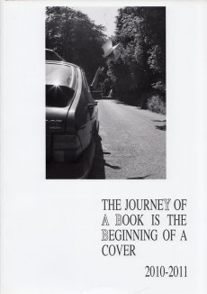
Titel
-
Artist's Book Yearbook 2010-2011 - the journey of a book is the beginning of a cover
Technische
Angaben
-
260 S., 29,7x21 cm, ISBN/ISSN 9781906501020
Softcover, design by Tom Sowden
|
 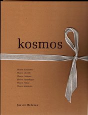
Technische
Angaben
-
37x28,6 cm, Auflage: 1.500, 7 Teile. ISBN/ISSN 9783944630014
Sammelmappe aus Karton mit Leinenband und sechs Heften (Fadenheftung) in unterschiedlichen Formaten, jeweils mit einem Buchstaben bedruckt.
ZusatzInfos
-
Jan von Holleben has constructed a kosmos of six planets with little more than a box of props, a team of willing humans, some clippings from the garden, and his camera. Click, click, click and strange things happen, right before the camera, with no digital manipulation: Ghosts flash through the Berlin cityscape. Plants cast shadows on the sky. Many places gather in the same place at once. The monsters imitate the flowers (or is it the other way around?). Each planet is an optical riddle. The only clues are visual. No answers are provided. This is a book for intrepid discoverers.
Note: the inventor of these planets avoids all references to god and to the cosmos. His kosmos is spelled with a K and is something quite different.
Text von der Webseite.
Eizeltitel: Planeta Symmatrius, Planeta Visumbra, Planeta Microidi, Planeta Florala, Planeta Phantafulgeo, Planeta Isolametro
|
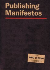
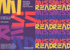
Technische
Angaben
-
292 S., 24x17 cm, ISBN/ISSN 9783868741049
Broschur, Schwarz-Weiß-Illustrationen
ZusatzInfos
-
Miss Read: The Berlin Art Book Fair is celebrating the 10th year of its existence by bringing together 263 exhibitors and with the publishing of an anthology called »Publishing Manifestos«. »Publishing Manifestos« features key texts of critical engagement with publishing from protagonists of the field. The book also features a comprehensive WHO IS WHO of publishers, as they showed up in 10 years Miss Read, with 600 separate entries, as well as information about activities of Miss Read since its inception in 2009. Text von der Webseite
Mit Eintrag Archive Artist Publications, S. 225
|
Technische
Angaben
-
[490] S., 32x24 cm, Auflage: 700, ISBN/ISSN 9782940524464
Broschur
ZusatzInfos
-
This book aims to collect and present a comprehensive overview of the work of Ruth Wolf-Rehfeldt. It is the result of a long and intense immersion into her archive, and intends to establish the importance of this unique artist – who did not have much recognition in the past – not only to the present day, but also to the precise political context and time to which she and her work belong.
The book presents her typewritings series, all produced between the early 1970s (some of the earliest works are dated 1972) and 1989.
Mail Art was her way to be in contact with the world outside the GDR, otherwise impossible to reach. After the fall of the Berlin Wall and the Reunification, the artist stopped producing any art: She felt her involvement was no longer “needed”.
At the beginning of 2015 we started to archive Ruth Wolf- Rehfeldt’s work, discovering little by little an enormous and fascinating body of work, composed by more classic poetry, simple typewriting texts, visual poetry, concrete poetry, and abstraction.
Text von der Webseite
|
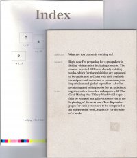
Titel
-
All That Gold Mining Was Thirsty Work - What you are currently working on? - Alle Kinder suchen Nuggets, außer heinrich - dem ist das peinlich
Technische
Angaben
-
100 S., 23,3x16,5 cm, Auflage: 500, keine weiteren Angaben vorhanden
Broschur, Softcover, mit mehrfach gefaltetem, beidseitig bedrucktem Poster
ZusatzInfos
-
Artist’s book – ten disposable pages for each person are composed as an independent work, explicitly for the sake of a book.
Text von der Website.
|
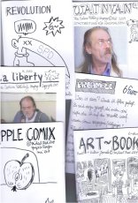
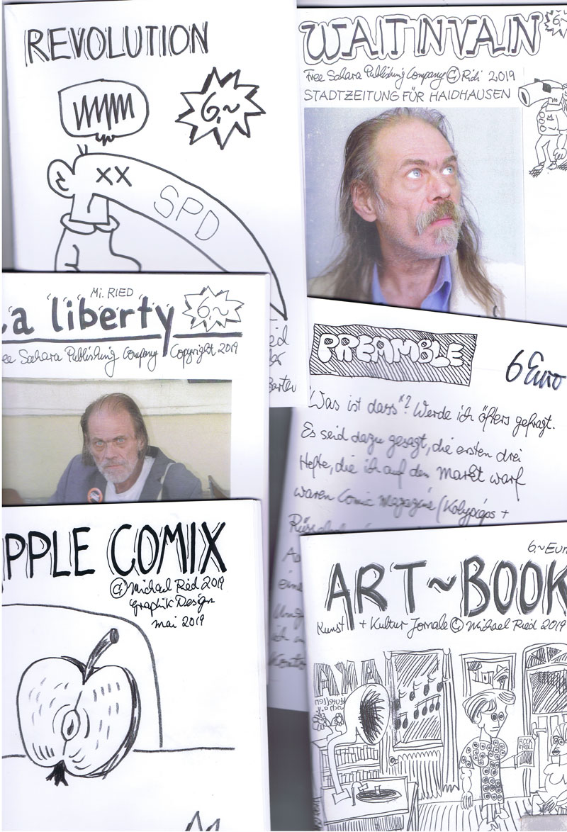
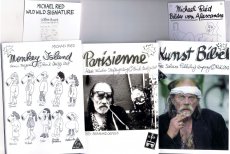
Titel
-
Michael Ried - Konvolut 2019 - Apple Comix, La liberty, Revolution, Art Book, Wait in Vain, Preamble
Technische
Angaben
-
[26] S., 21x14,8 cm, Auflage: 150 ca., 10 Teile. keine weiteren Angaben vorhanden
Sechs Hefte, Drahtheftung, Digitaldruck (Copy), 4 Postkarten eingelegt
ZusatzInfos
-
Hefte: Apple Comix, La liberty, Revolution, Art Book, Wait in Vain, Preamble
|
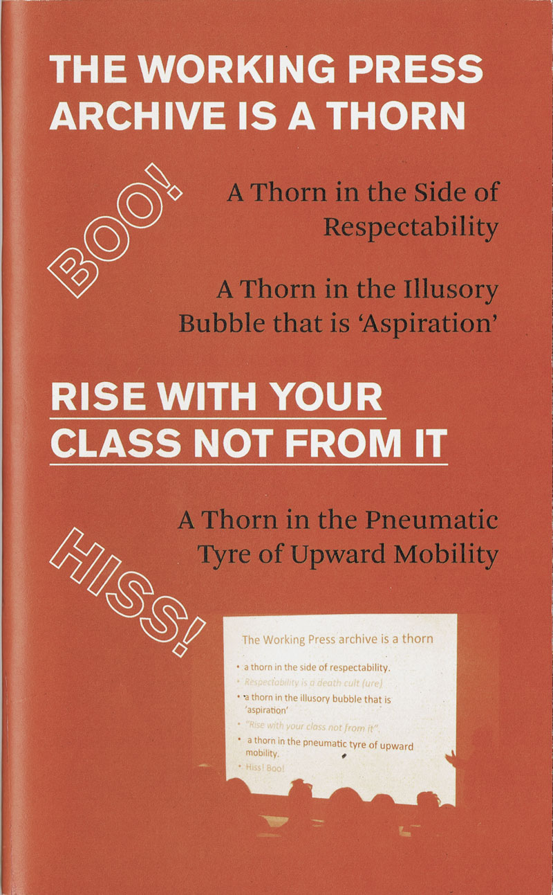
Titel
-
RISE WITH YOUR CLASS NOT FROM IT
Technische
Angaben
-
82 S., 20,2x12,3 cm, Auflage: 200, ISBN/ISSN 9780957682870
Blätter lose mit Gummiband zusammen gehalten
ZusatzInfos
-
The fruit of a collaboration with artist/activist/creator of the Working Press archive Stefan Szczelkun and keeper archivist Rebekah Taylor.
Rise with your class not from it represents a lasting trace of and a vehicle for the Working Press project whose archive is now housed in UCA library special collections in Farnham. It highlights some important works by working-class artists while providing a valuable resource for anybody interested in working with archive material.
Working Press is a collective publishing imprint, which had the subtitle books by and about Working Class Artists, 1986-1996. Working Press includes the first computer generated comic (Harwood), the first book by Micheline Mason (disability and inclusion artist), and the first book about Greenham Common Yellowgate (Beth Junor).
Text von der Webseite
|
Titel
-
Miss Read - The Berlin Art Book Fair 2024
Technische
Angaben
-
4 S., 28,6x20,1 cm, 4 Teile. keine weiteren Angaben vorhanden
Eine Postkarte (14,9x10,5) und zwei Lesezeichen/Flyer (14,7x5), sowie Schwarz-Weiß bedruckter DIN A4-Bogen, einfach gefaltet
ZusatzInfos
-
Werbematerial der Miss Read Berlin und des Conceptual Poetics Day. Die Buchmesse fand vom 11.10.-13.10.2024 im Haus der Kulturen in Berlin statt. Der Conceptual Poetics Day fand am 12.10.2024 Das diesjährige Design der Miss Read stammt von der mexikanischen Künstlerin Maira Fragoso Peña, das des Conceptual Poetics Day von Adrian Piper.
|
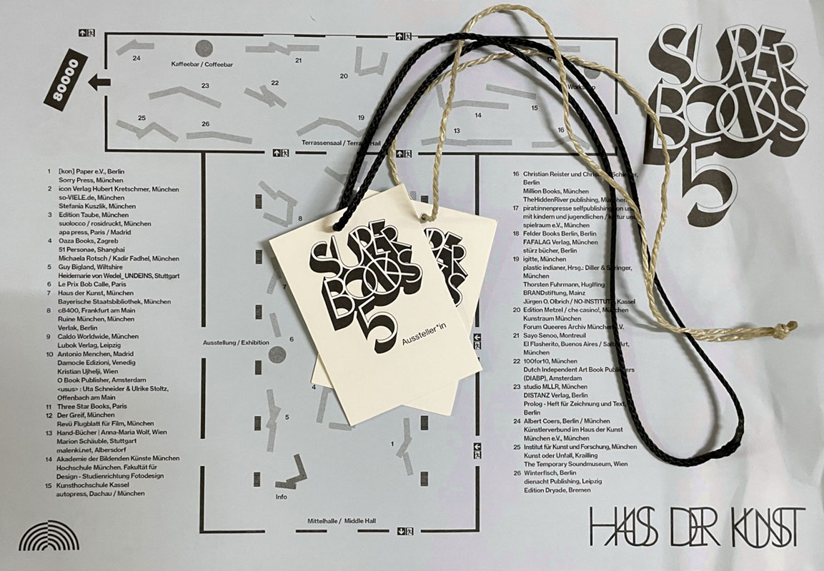
Titel
-
Super BOOKS 5 2024 - Konvolut
Technische
Angaben
-
[20] S., 31x27 cm, Auflage: 500, 20 Teile. keine weiteren Angaben vorhanden
3 Programmhefte, Drahtheftung, Laserkopie Schwarz-Weiß.
2 Austeller*in-Kärtchen, 1 beschriftet mit "icon" & "Hubert Kretschmer", 2 mit schwarzem Band versehen.
3 Team-Kärtchen, 1 beschriftet mit "MaRiNa", 1 beschriftet mit "Christoph", 2 mit Paketband versehen.
2 Stofftaschen, beschriftet mit "SUPER BOOKS 5".
5 Raumpläne, blaues Papier.
5 Flyer.
ZusatzInfos
-
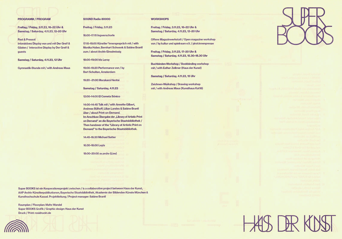
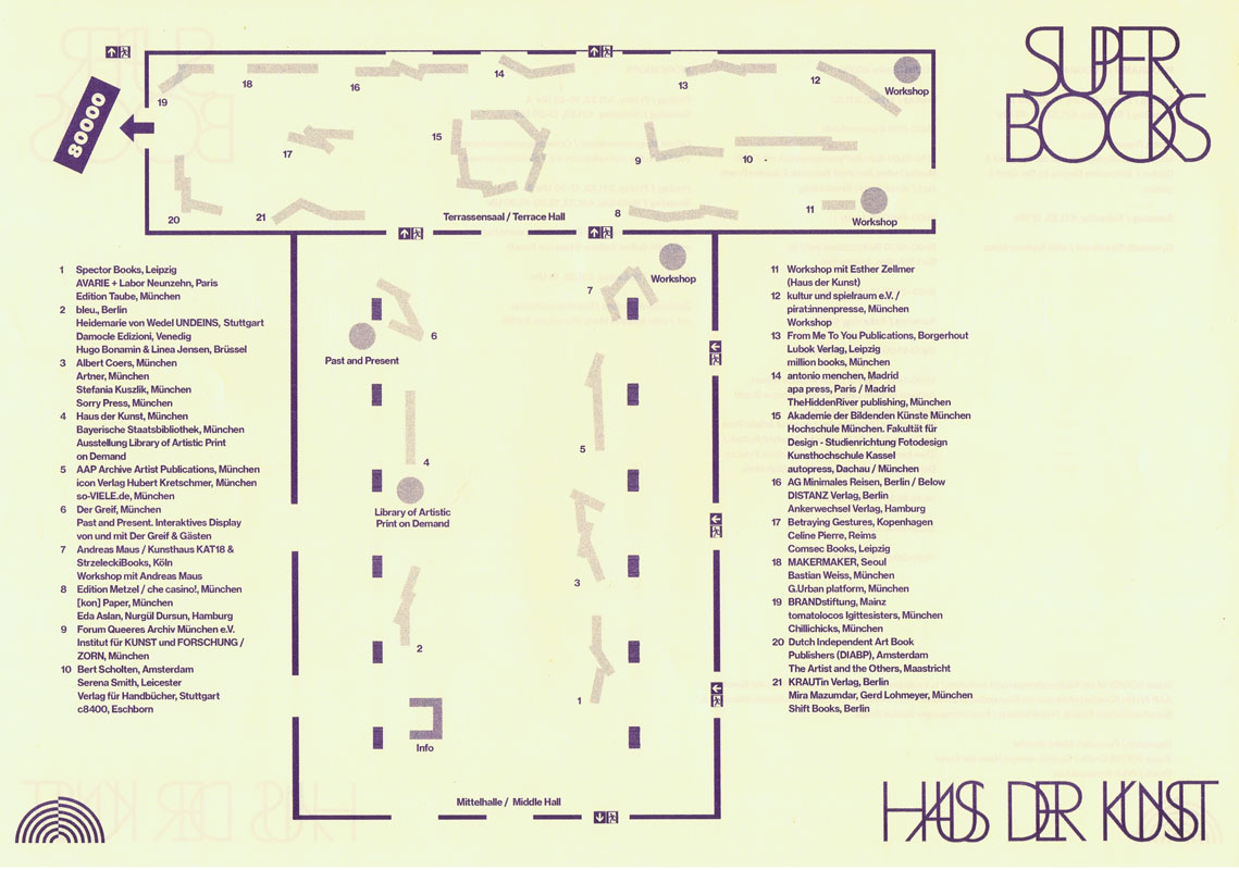
Am 02. & 03.11.24 richtet das Haus der Kunst die fünfte Ausgabe von Super BOOKS aus. Die jährlich veranstaltete, unabhängige Messe der Künstler*innenbuchszene bringt fast 70 Künstler*innen, Gestalter*innen und alternative Verleger*innen sowie Institutionen und Hochschulen zusammen, um ihre jeweils neuesten Produktionen zu präsentieren.
Der Schwerpunkt von Super BOOKS liegt auf Publikationen, die die Grenzen des Mediums Buch hinterfragen, neu denken und deren Themen, Formate und Techniken sich ständig erweitern. Mit ihrer Ethik der Zugänglichkeit, die in der Preisgestaltung und der Direktheit von Vertriebswegen zum Ausdruck kommt, bilden alternative Publizist*innen ein Gegengewicht zur herkömmlichen Verlagsbranche und ihren gängigen Spielregeln.
Super BOOKS wurde 2019 im Rahmen der Ausstellung „Archives in Residence: AAP Archiv Künstlerpublikationen“ im Haus der Kunst initiiert und hat sich seither zu einem wichtigen Forum für die unabhängige Kunstverlagslandschaft entwickelt. Das große Publikumsinteresse der vergangenen Jahre zeigt, wie sehr die Veranstaltung auch die breite Öffentlichkeit anspricht und zur lebendigen Auseinandersetzung mit Künstler*innenpublikationen inspiriert. Projektleitung: Sabine Brantl (Haus der Kunst)
Text von der Webseite
|
 
Technische
Angaben
-
[2] S., 9,8x21 cm, Auflage: 2.000, 2 Stück. keine weiteren Angaben vorhanden
Postkarte
ZusatzInfos
-
Messe für independent Künstlerpublikationen 12.-13.11.2021 im Haus der Kunst, München, mit radio 80000, das Internetradio. Südgalerie 1. Stock, Eintritt frei
Zum zweiten Mal seit dem Auftakt im Jahr 2019 zeigen über 50 Künstler*innen, Gestalter*innen und alternative Verleger*innen ihre Produktionen im Haus der Kunst. Damit erhält die in München sehr lebendige und aktive Künstlerbuchszene die Fläche für einen gemeinsamen Auftritt. Neben dem Schwerpunkt München sind diesmal auch Produzent*innen aus Österreich (Auslöser sowie Darja Shatalova und Kristian Ujhelji), der Schweiz (_957 Independent Art Magazine sowie GRRRR) und den Niederlanden (The Artist and the Others sowie Dutch Independent Art Book Publishers und Lula Valletta & HOK) vertreten. Tobi Huschka aus Köln stellt Bücher vom Kunsthaus Kat18 vor, einer inklusiven Kunstwerkstatt. Die Münchner piratInnenpresse, ein Verlag von Kindern und Jugendlichen, stellt Taschenbücher und Faltkarten her. Ihr üblicher Versammlungsort ist „die Kajüte unterm Dach der Seidl-Villa in Schwabing“. Iwalewabooks hat die jüngsten Entwicklungen in der zeitgenössischen Kultur Afrikas im Fokus.
Die Teilnehmenden sehen sich in der Tradition der 1960er-Jahre, als sich im Umfeld der postavantgardistischen Kunstszene neue Kommunikations- und Distributionsnetze bildeten. Ihre Produkte wie Künstlerbücher, Magazine oder Zines sind autonome Kunstwerke. Mit ihrer Ethik der Zugänglichkeit, die in Preisgestaltung und der Direktheit von Vertriebswegen zum Ausdruck kommt, bilden sie ein Gegengewicht zu den gängigen Spielregeln des Kunstmarkts.
Die Publikationen können direkt vor Ort gekauft werden.
Super BOOKS ist eine Kooperation mit AAP Archiv Künstlerpublikationen, Akademie der Bildenden Künste München und fructa space.
Kuratiert von Sabine Brantl mit Hubert Kretschmer, Martin Schmidl sowie Quirin Brunnmeier und Malte Wandel.
|
Technische
Angaben
-
[180] S., 15x10,5 cm, 2 Stück. keine weiteren Angaben vorhanden
Softcover, Umschlag hinten Klappbroschur, Grundriss/Floorplan mit Liste der Aussteller hintere Umschlagklappe, mit eingelegter Quittung
ZusatzInfos
-
Art Book Fair Berlin 19.-21.10.2018, Hamburger Bahnhof - Museum für Gegenwart
|
Titel
-
First Issue - Self-Publishing Book Fair for Design and Art
Technische
Angaben
-
2 S., 29,7x21 cm, keine weiteren Angaben vorhanden
Pressetext zur Veranstaltung
|
Titel
-
GLOBAL DESIGN - Es ist an der Zeit - The Time is Nigh
Technische
Angaben
-
19x14,2 cm, Auflage: 3.000, ISBN/ISSN 14307936
Klappbroschur, einige Innenseiten ausklappbar
ZusatzInfos
-
Über Tassilo von Grolman Design. Instant Time Book 15
|
Titel
-
Kitty & Joy Fortune Favours Future - Jitti & Koy Morph Edition
Technische
Angaben
-
110 S., 21,5x14 cm, Auflage: Print on Demand, keine weiteren Angaben vorhanden
Broschur
ZusatzInfos
-
Nummer 8 der Editionsreihe "100 for 10" von Reflektor M in Kooperation mit melville brand design
|
Technische
Angaben
-
[232] S., 34x22,7 cm, Auflage: 2.000, ISBN/ISSN 9781910164983
Broschur, jede Seite randabfallend bebildert
ZusatzInfos
-
Nothing but Clouds were the words used by the research commission in Andrey Tarkovsky’s 1972 film Solaris to deny video evidence suggesting traces of alien life on the planet. Taking this disclaimer as its title, this meditative book by Kristina Jurotschkin brings together images from her photographic archive made in various places across Europe over numerous years. Jurotschkin’s alienating views of everyday spaces examine the fabric of our social reality and propose an archaeological survey of our future.
Text von der Webseite
|

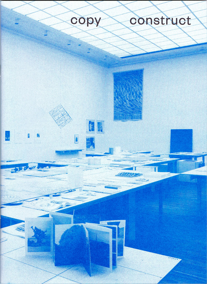
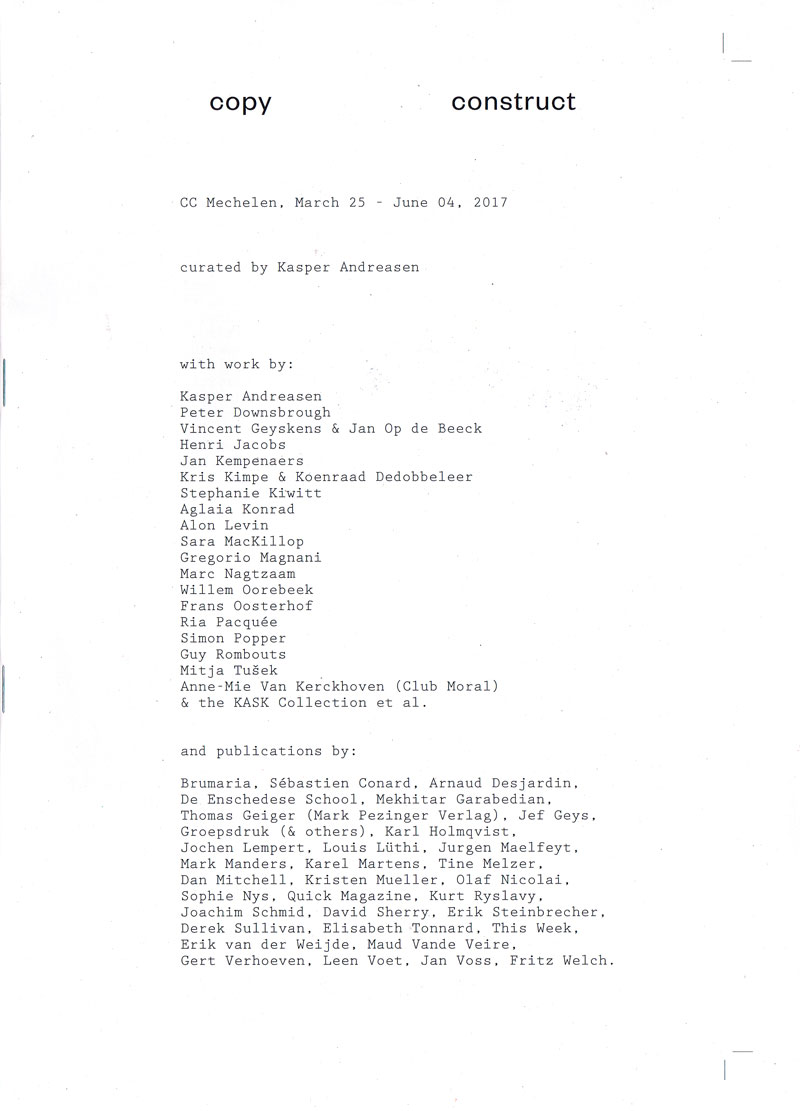
Technische
Angaben
-
66 S., 27,3x20 cm, Auflage: 500, ISBN/ISSN 9789491843945
Drahtheftung, beigelegt der Ausstellungsplan und handschriftliches Anschreiben
ZusatzInfos
-
The exhibition Copy Construct departs from different artistic practices and specific works by artists that are based on reproduction or copy. The selected works are inherent to the production of printed matter or artist’s books. This implies that different artistic media such as painting, drawing, photography, video, sculpture, and graphic design can manifest themselves through graphical problematics and their meanings. Alongside the 25 works of the artists, a little less than 300 books from the KASK collection (School of Arts, Ghent) and private collections from Belgium and England are displayed in the exhibition. The exhibition architecture is designed by Kris Kimpe and Koenraad Dedobbeleer and is accompanied by a publication, designed by Joris Dockx, which includes a bibliography of the exhibited books, different contributions by the artists, an interview with a book collector, etc.
Pressetext
|
Technische
Angaben
-
114 S., 24x15,7 cm, ISBN/ISSN 9789491819490
Fadengeheftet, Hardcover, mit signiertem Exlibris in Pergaminumschlag
ZusatzInfos
-
A true gift is intimate. It is a carrier of meaning that involves the capacity to amuse, delight, and identify empathically with our recipient’s desires. This exceptional book by New York-based conceptual artist Barbara Bloom, entitled Gifts, explores the nature of gifts in relation to aspects such as wrapping, covering and uncovering, pleasure, and generosity.
A passionate collector of ornamental paper from all over the world, Bloom has studied the history and aesthetics of gift-wrapping in detail. In Gifts, she tries to blur the conventional distinction between art and life, whilst offering new insights on notions of concealment and revelation. ‘Can the box be an artwork? Can the wrapping be the gift?’ – she questions her readers.
Text von der Website.
|
Technische
Angaben
-
106 S., 21x14,8 cm, Auflage: Print on Demand, keine weiteren Angaben vorhanden
Broschur
ZusatzInfos
-
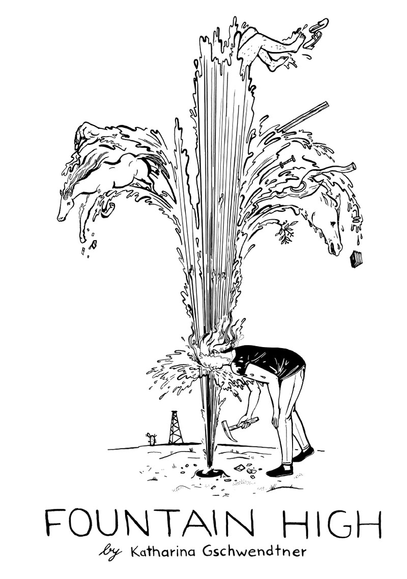
Schwarz-Weiß-Drucke, Nr. 004 aus der Reihe 100for10.
Katharina Gschwendtner is an illustrator from Hamburg and co-publisher of spring magazine for illustration between art and comic. She works for several international publisher and agencies. Her beautiful book she dreams of horses (Michael Weins, Katharina Gschwendtner, Mairisch Verlag) just got published.
|

Technische
Angaben
-
106 S., Auflage: Print on Demand, keine weiteren Angaben vorhanden
Broschur
ZusatzInfos
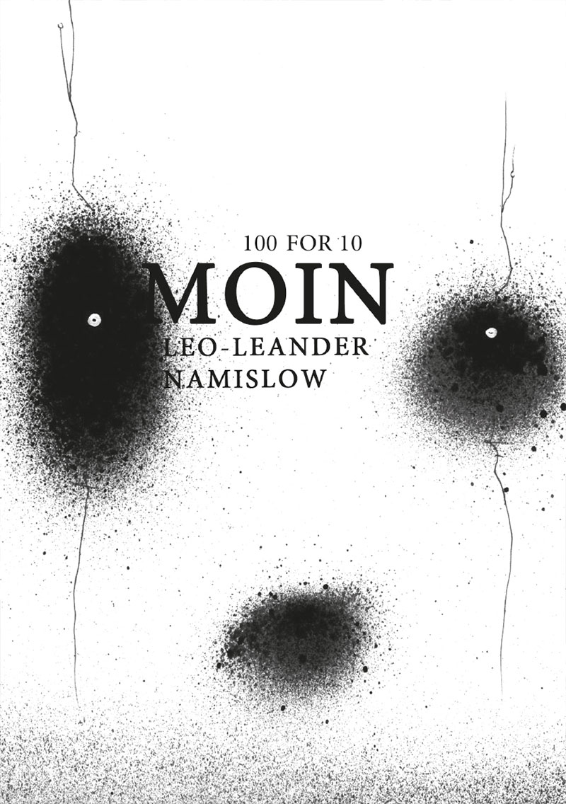
-
Schwarz-Weiß-Drucke, Nr. 010 aus der Reihe 100for10.
Leo-Leander Namislow, born in 1983 in Essen, lives and works as a freelance artist in Essen. Growing up in a rural environment in Rhineland-Palatinate, he started to creatively engage with his surroundings early on. After his training
as a stonemason, Leo worked for an animation company in Frankfurt. When he moved back to Essen in 2007 he eventually started living off his creative output. Since then he has had several solo exhibitions and took part in
many group shows in a variety of institutions such as the Kunstverein Essen-Werden. His works fascinate by opening up new fantastic worlds to the viewer on the one hand and by proving of a large multiplicity of techniques on the other hand. This book gives an insight into a sample, mainly comprised of black and white works, of a much larger, colourful and ever increasing artistic universe.
|
Technische
Angaben
-
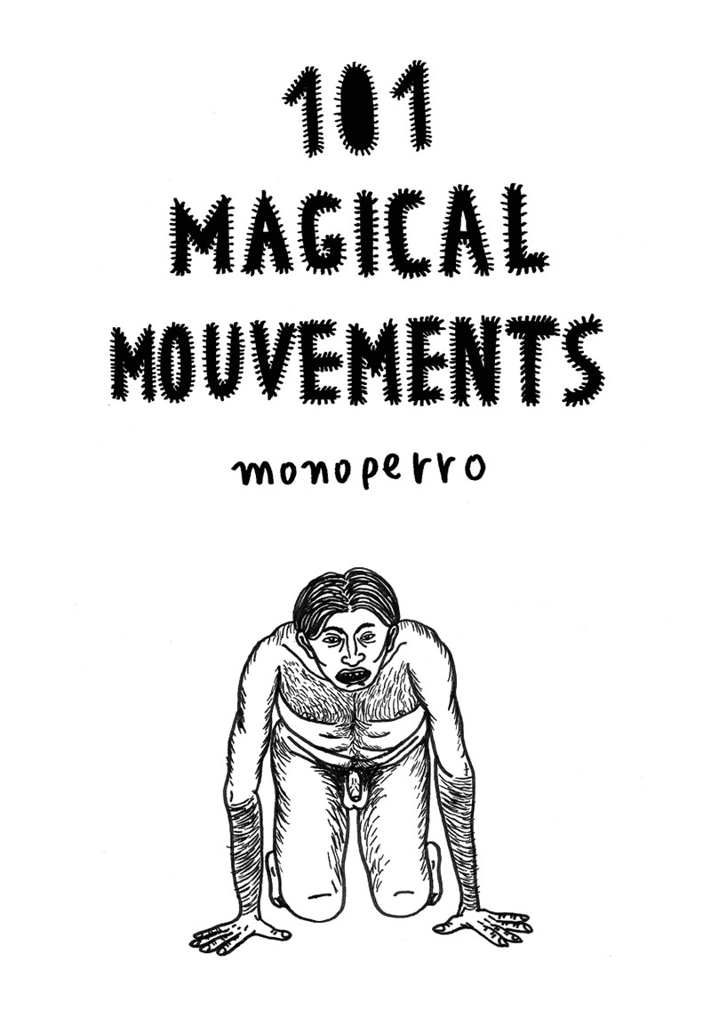
106 S., 21x14,8 cm, Auflage: Print on Demand, keine weiteren Angaben vorhanden
Broschur
ZusatzInfos
-
Schwarz-Weiß-Drucke
monoperro is a self-taught artist as he has no academic education in art. In addition to being an illustrator, he is a writer, and, as an important part of his artistic activity, he performs Tarot readings created by him called Tarot del Espejo (Tarot of the Mirror). He also offers artistic and vital services such as workshops and talks, under the name ‘Ultralkymia’. In 2015 he published his first book ‘Gran Fin’ (in the publishing house jekyll and jill (jekyllandjill.com). He also has another publication ‘Dibujo Mágico’ which is a guide to the practice of drawing as self-knowledge. You can follow his daily activity on his instagram account: @monoperro
|
Titel
-
Coffee, socks and dark matter
Technische
Angaben
-
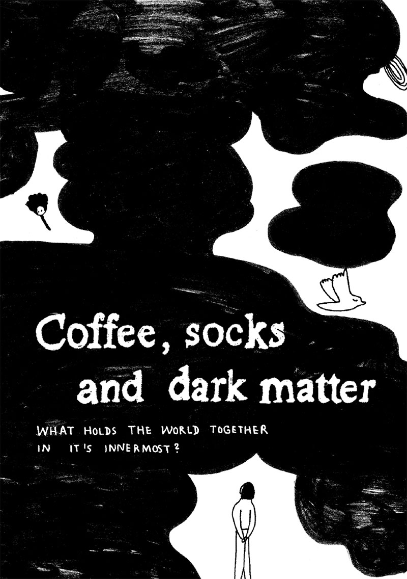
106 S., 21x14,8 cm, Auflage: Print on Demand, keine weiteren Angaben vorhanden
Broschur
ZusatzInfos
-
Schwarz-Weiß-Drucke
Coffee, socks and dark matter: three answers to a question the author is wondering about since a long time. It is the question which made Faust sign a pact with the devil and which motivated Heisenberg to do research on quantum physics: What holds the world together in it‘s innermost? This book contains a lot of different answers, no matter if they are based on scientific recognition or personal experience. It is all about the world and it‘s wonderful and strange elements.
|
Technische
Angaben
-
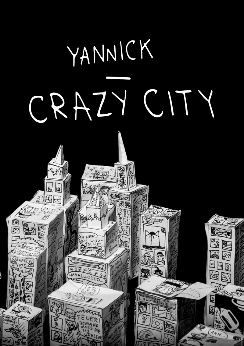
106 S., 21x14,8 cm, Auflage: Print on Demand, keine weiteren Angaben vorhanden
Broschur
ZusatzInfos
-
Schwarz-Weiß-Drucke
Born 2005, Yannick won his first art contest at the age of 2 in New Zealand. That’s where he lived until he moved to Munich, Germany with his family. Drawing is his passion. He illustrated a children’s book, published quite a few of his drawings in magazines and creates constantly. The preferred equipment he uses is a black fineliner. His Crazy City reflects a pessimistic German City. It should rise awareness of social miseries.
|
Technische
Angaben
-
106 S., 21x14,8 cm, Auflage: Print on Demand, keine weiteren Angaben vorhanden
Broschur
ZusatzInfos
-
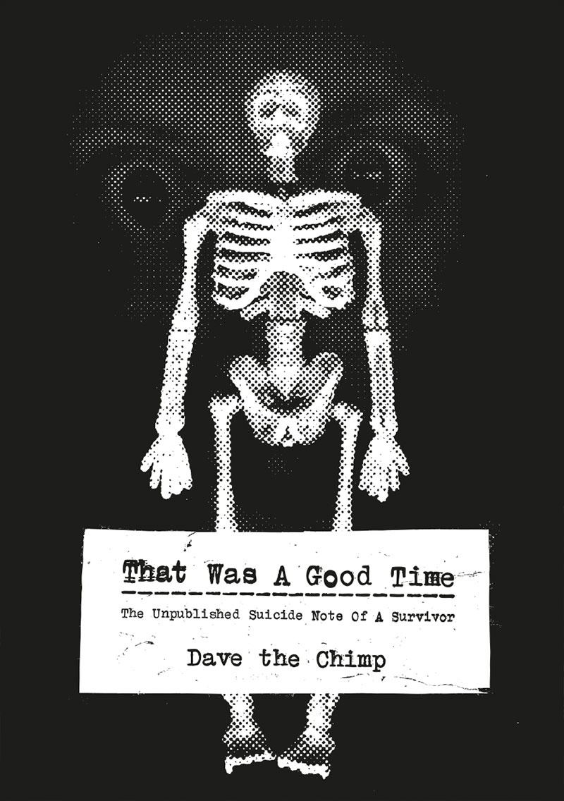
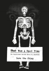
Schwarz-Weiß-Drucke
Dave the Chimp has been riding skateboards since the mid 1980’s, painting on found wood and making fanzines since the mid 1990’s, and working in the streets since 1998. He still does all these things, as well as exhibiting his art in galleries and museums world wide, working as an illustrator for a variety of clients, directing pop videos, compiling books, and curating exhibitions. Dave has exhibited alongside the leading names in the urban art scene, including Banksy, Blu, Miss Van, Swoon, Os Gemeos, Shepard Fairey, Space Invader, and Zevs. He was the first UK artist to have his own artist model shoe created by Vans, and a book of his work (Part Of Rebellion 2 – Dave the Chimp) was published by Publikat in 2009. In 2011 he built his first concrete skateable sculpture “Papa und Ich” outside of the Bethanien, Berlin, and the wooden “friendship bowl” in the Awanganda Gallery, Wroclaw, Poland. He has since built the “Papa und Ich Speilplatz” skatepark in Milan, and the “Troll Bridge Ramp” at La Condition Publique, Roubaix, France. He is currently focused on change, encouraging exploration, protest culture and positive vibrations, with his “Human Bean” characters as the medium through which to go on this adventure.
|
Titel
-
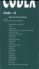
Code-X – Paper, Ink, Pixel and Screen
Technische
Angaben
-
276 S., 24,3x14 cm, Auflage: 500, ISBN/ISSN 9780957682832
Klappbroschur, mit ausklappbaren Seiten
ZusatzInfos
-
Code X brings together a selection of personal histories of the current ‘transforming’ and ‘expanding’ of the book medium with the aim to challenge the very notion of what it could be(come) in today’s complex information era.
The design of Code—X within codex form represents a playful and daring twist of ink imitating pixel to render composition and design. The content is seen as a continuous scroll, cropped where screen meets paper edge. We celebrate both camps by highlighting dichotomies of edge to scroll, sequence to time and image to place.
Text von der Webseite
|
Technische
Angaben
-
10 S., 33,5x19,5 cm, keine weiteren Angaben vorhanden
Leporello
ZusatzInfos
-
Wolfgang Scheppe lebt und lehrt als politischer Philosoph in der Schweiz und in Venedig. Er leitet das Arsenale Institute for Politics of Representation in Venedig und ist Autor umfangreicher Forschungsvorhaben, die in Buchprojekte und internationale Ausstellungen mündeten. Darunter ist das umfangreiche Standardwerk zur globalisierten Stadt, Migropolis (2009). 2010 gestaltete er im britischen Pavillon der Architekturbiennale in Venedig eine Ausstellung, die sich mit John Ruskins politischer Ökonomie der Stadt befasste und im selben Jahr unter dem Titel Done.Book publiziert wurde. Zwischen 2014 und 2016 konzipierte er eine Reihe großer Theorieinstallationen für die staatlichen Kunstsammlungen Dresden. Sie befassten sich mit der Wissenschaftskritik der Ethnologie und des musealen Zeigens. Die Reihe wurde mit dem Projekt Die Vermessung des Unmenschen abgeschlossen, einer grundlegenden Forschung zur Kritik der Geschichte der rassistischen Anthropologie und pseudowissenschaftlicher Rechtfertigungen des Topos der “Rasse”. Zuletzt stellte er in Zürich sein Vorhaben zur Kritik des zeitgenössischen ideellen Konsums unter dem Namen Die Heilige Ware aus und war mit dem Leitartikel an einer Ausstellung in Paris zum Urbanismus der Exklusion beteiligt. Er publiziert regelmäßig Grundlagenessays zur Raumpolitik in ARCH+. Seine Ausstellungen waren unter anderem in New York, Rom, Paris, Venedig, Berlin, München, Dresden und Zürich zu sehen. Text von der Website
|
Titel
-
Tiny Porn – A series of 10 cute situations
Technische
Angaben
-
12x12 cm, 3 Teile. keine weiteren Angaben vorhanden
drei Leporellos, zwei davon noch verpackt in silberner Folienhülle mit Postkarte, A5 Karte mit Spiegelfolie signiert, schwarze Visitenkarte mit Prägung
ZusatzInfos
-
Ein Projekt von Funs Kurstjens, das sich mit der Wahrnehmung von Formen beschäftigt. Die Grundidee ist eine Passage aus Ovids Metamorphosen:
'Nothing keeps its own form, and Nature, the renewer of things, refreshes one shape from another. Believe me, nothing dies in the universe as a whole, but it varies and changes its aspect, and what we call 'being born' is a beginning to be, of something other, than what was before, ...´ (Ovid, Metamorphoses, Book XV, Pythagpras)
|
Technische
Angaben
-
20x20 cm, Auflage: 69, signiert, 3 Teile. keine weiteren Angaben vorhanden
Risographie auf rosa Papier, Passepartout verpackt in Folie
ZusatzInfos
-
Ein Projekt von Funs Kurstjens, das sich mit der Wahrnehmung von Formen beschäftigt. Die Grundidee ist eine Passage aus Ovids Metamorphosen:
'Nothing keeps its own form, and Nature, the renewer of things, refreshes one shape from another. Believe me, nothing dies in the universe as a whole, but it varies and changes its aspect, and what we call 'being born' is a beginning to be, of something other, than what was before, ...´ (Ovid, Metamorphoses, Book XV, Pythagpras)
Nichts behält seine eigene Form, und die Natur, die Erneuerin der Dinge, erneuert eine Form aus der anderen. Glaubt mir, nichts stirbt im Universum als Ganzes, aber es variiert und verändert sein Aussehen, und was wir 'geboren werden' nennen, ist ein Beginn des Seins, von etwas anderem, als das, was vorher war, ...'
Übersetzt mit Hilfe von DeepL
|
Titel
-
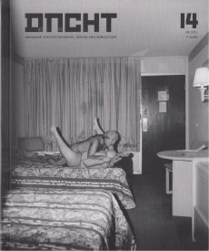
dncht #14 - Magazin für Fotografie, Gestaltung und Subkultur
Technische
Angaben
-
126 S., 18x15 cm, Auflage: 1.000, numeriert, ISBN/ISSN 18681506
ZusatzInfos
-
... featuring, among others Asger Carlsen’s “Wrong” series (also the cover story), and more photography by Chinese photographer Ren Hang, by Palíndromo Mészáros, Julia Sonntag, Scott Typaldos, “unlikely” objects by Giuseppe Colarusso, a design Portfolio by Sfia Brajal, photo book reviews, …
|
Titel
-
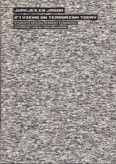
Jurkjes en Jason - 27 views on terrorism today
Technische
Angaben
-
[64] S., 24x17 cm, Auflage: 700, ISBN/ISSN 9789078454182
ZusatzInfos
-
Students of the Eindhoven Design Academy, Faculty of Man and Communication, have worked on a project about the representation of terrorism under the guidance of designer and teacher Annelys de Vet. In collaboration with Freek Lomme, director of Eindhoven based presentation-institution and publishing company Onomatopee, a book and exposition became the result of this.
Text von der Webseite
|
Titel
-
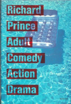
Adult Comedy Action Drama
Technische
Angaben
-
240 S., 29,5x20 cm, ISBN/ISSN 1881616363
Hardcover Leineneinband mit Schutzumschlag, eingelegte Bestellkarte
ZusatzInfos
-
Book title is drawn from the various genres found in video stores. Many sources list Adult Comedy Action Drama as one of the best books by Richard Prince
|
Titel
-
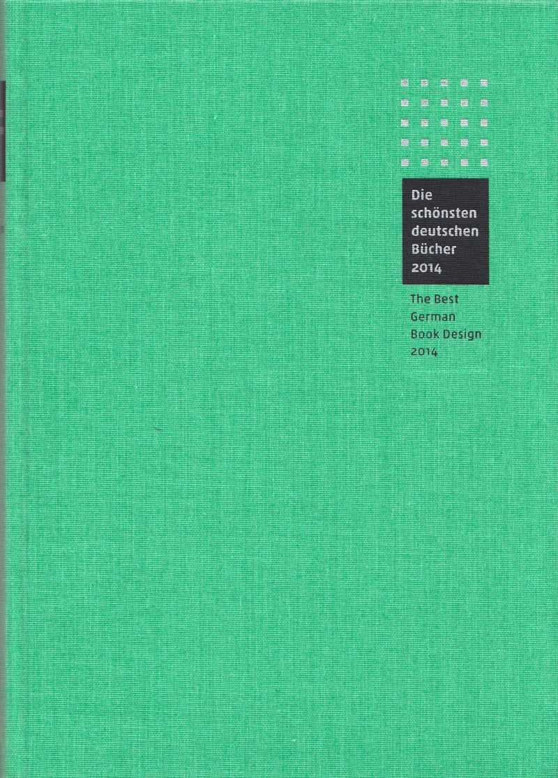
Die schönsten deutschen Bücher 2014 / The Best German Book Design 2014
Technische
Angaben
-
304 S., 24,3x17,7 cm, ISBN/ISSN 9783981429138
Hardcover mit Leinen, 2 Lesebändchen
|
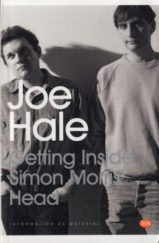
Titel
-
Getting Inside Simon Morris Head
Technische
Angaben
-
324 S., 19,8x12,8 cm, Auflage: 500, ISBN/ISSN 9781907468216
Softcover, Taschenbuch
ZusatzInfos
-
Getting Inside Simon Morris’ Head is a performative retyping of Simon Morris’ conceptual bookwork Getting Inside Jack Kerouac’s Head. Like Morris’ original performance of retyping the scroll edition of Jack Kerouac’s On the Road, Joe Hale’s project first appeared as a blog. At the rate of one page per day, like Morris retyping Kerouac before him, Hale retyped Morris’ entire book and in doing so re-retraces Kerouac’s famous adventure. Morris gave us all of Kerouac’s pages in reverse order: each blog post presented one page and the default settings of the blog platform organised his posts in reverse order, from the newest to the oldest. Now inverted again, as a double negative, Hale has restored the direction of travel to the story and produced a wholly (un)original new text. This first printed edition takes the imitative gesture to a new extreme. It features an introductory essay by poet Kenneth Goldsmith and reuses Morris’ paratext. From the cover design to the choice of paper, Hale tests the limits of conceptual extension.
Text von der Webseite
|
Titel
-
Artist's Book Yearbook 2012-2013
Technische
Angaben
-
256 S., 29,7x21 cm, ISBN/ISSN 9781906501068
Softcover, design by Tom Sowden
ZusatzInfos
-
Mit einem Beitrag von Reinhard Grüner (S. 71 ff)
|
Titel
-
Artist's Book Yearbook 2006-2007
Technische
Angaben
-
180 S., 29,7x21 cm, ISBN/ISSN 0954381092
Softcover, cover design Tom Sowden
|
Technische
Angaben
-
[140] S., 16.5x12 cm, ISBN/ISSN 9789899661004
Schweizer Broschur
ZusatzInfos
-
The Impossuível talks were held at the Navio Vazio, in the city of Porto, between 29.04.-08.05. 2010. A group of artists, designers, curators and art & design critics were invited to share with the public a choice of books from their own private libraries. The texts collected in this book are the reflections that took shape in these encounters
Text von der Webseite
|
Titel
-
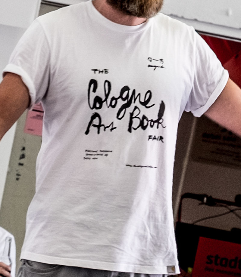
The Cologne Art Book Fair 2015
Technische
Angaben
-
21x15 cm, keine weiteren Angaben vorhanden
T-Shirt , einseitig schwarzbedruckt
ZusatzInfos
-
T-Shirt zur Messe. Produziert von carhartt, Größe L. Design von Hamed Eshrat. Träger (Tim)
|
Titel
-
Schönste Bücher aus aller Welt / Best Book Design from all over the World
Technische
Angaben
-
2 S., 12x23 cm, keine weiteren Angaben vorhanden
Karton, Prägedruck
ZusatzInfos
-
Werbepostkarte mit Informationen zur Stiftung Buchkunst auf der Leipziger Buchmesse (17.02.-20.03.2016). Gestaltung: Sandra Doeller
|
Titel
-
Artist's Book Yearbook 2016-2017
Technische
Angaben
-
268 S., 29,6x21 cm, ISBN/ISSN 9781906501105
Broschur, Softcover, design by Tom Sowden
ZusatzInfos
-
International listings of artists’ books activity includes: collections, courses, dealers, publishers, galleries, centres, bookshops, libraries, artist-led projects, organisations, societies, print studios, fairs, festivals and competitions.
In the Artists’ Books Listings section you can also find 537 examples of new artists’ books, with information about their work sent in by 182 artists in the following countries: Australia, Belgium, Canada, Chile, China, Denmark, France, Germany, India, Ireland, Italy, Japan, Norway, Poland, Russia, South Africa, Spain, Sweden, The Netherlands, the UK and the USA.
Text von der Webseite
|
Technische
Angaben
-
[32] S., 21x14,5 cm, Auflage: 1.000, ISBN/ISSN 9782914291392
Fadengeheftet, Softcover, Offset-Druck
ZusatzInfos
-
Reprint des Hefts der Ausstellung in Lódż,.
NOW was first published as part of my exhibition at the PWSSP (today the Wladyslaw Strzeminski Academy of Fine Arts and Design) in Lódż, Poland, from 6 - 22 June 1986. The book was printed by silkscreen at the school's print department, as access to offset was not possible at the time. The school censor allowed us to print 49 copies “for in-school use” with the obligatory inclusion of the colophon on page 3.
Text von der Webseite
|
Titel
-
Animal of The State, Fiction through Reality
Technische
Angaben
-
218 S., 22x16,5 cm, Auflage: 1.000, 2 Stück. ISBN/ISSN 9783932934360
Klebebindung, Umschlag mit Prägung, eingelegte Kunstpostkarte
ZusatzInfos
-
The publication “Animal of The State, Fiction through Reality” reflects on the process of the Survival Kit’s three-year existence. Individually and collectively written texts by the participants intertwine with guest contributions by companions who have been involved in the experiment in various ways. This book considers itself to a lesser extent as documentation of this experiment’s history but rather as a medium of visualisation of the mutual learning process.
The educational and artistic research program Survival Kit was funded by the German Academic Exchange Service DAAD through the programme “Partnerships with Greek Institutions of Higher Education 2014 – 2016”.
Text von der Webseite
Design: Stefanie Hammann, Maria von Mier
|

Technische
Angaben
-
64 S., 29,7x21 cm, keine weiteren Angaben vorhanden
Drahtheftung, unbeschnitten, beigelegt der Ausstellungsplan und handschriftliches Anschreiben
ZusatzInfos
-
The exhibition Copy Construct departs from different artistic practices and specific works by artists that are based on reproduction or copy. The selected works are inherent to the production of printed matter or artist’s books. This implies that different artistic media such as painting, drawing, photography, video, sculpture, and graphic design can manifest themselves through graphical problematics and their meanings. Alongside the 25 works of the artists, a little less than 300 books from the KASK collection (School of Arts, Ghent) and private collections from Belgium and England are displayed in the exhibition. The exhibition architecture is designed by Kris Kimpe and Koenraad Dedobbeleer and is accompanied by a publication, designed by Joris Dockx, which includes a bibliography of the exhibited books, different contributions by the artists, an interview with a book collector, etc.
Pressetext
|
Titel
-
Aspen - The Magazine in a Box Vol. 1 No. 04
Technische
Angaben
-
31x23,6x1,5 cm, keine weiteren Angaben vorhanden
Kassette mit zwei gefalteten Einzelblättern, beidseitig bedruckt, eins davon Werbemappe mit Werbeheftchen für Gordon's und Newsletter der Something Else Press, drei Poster, drei Hefte mit Drahtheftung und eine Schallplatte.
ZusatzInfos
-
Ausgabe gestaltet von Quentin Fiore. Ausgabe besteht aus 9 Teilen: 1. Box, 2. "The Medium Is the Massage" Poster-sized mosaic of pages from The Medium Is the Massage by McLuhan and Quentin Fiore, 3. "The TV Generation" Poster of a color photo taken at the Tribal Stomp at San Francisco's Avalon Ballroom, 4. "Diary: How to Improve the World (You Will Only Make Matters Worse)" Random observations by John Cage, 5. "The Electronics of Music" Essay on electronic music by Faubion Bowers and Daniel Kunin, 6. Phonograph recording. A Recorded Sampler of Electronic Music. Side A: In Memoriam of Edgar Varèse, by Mario Davidovsky. Side B: Horn, by Gordon Mumma, 7. "The Braille Trail" Bob Lewis and Alfred Etter describe a nature trail for the blind, 8. "Psycles" Excerpts from The Bikeriders, Danny Lyon' book about the Chicago Outlaws motorcycle club. Prefaced by a meditation on motorcycling by Bob Chamberlain, 9. Mappe mit Werbung mit einem Werbeheft für Gordon's und Newsletter der Something Else Press (Something Else Newsletter Volume 1, Number 6: May, 1967), weitere Werbehefte der Originalausgabe fehlen.
|
Technische
Angaben
-
29,2x22 cm, ISBN/ISSN 9781907946615
Broschur, Softcover
ZusatzInfos
-
In this his latest artist book, Ethridge conflates a rich array of photographic tropes, combining personal documentary images made in western Palm Beach County, his mother’s childhood home, with surreal collage works, and a series discarded from a Chanel fashion shoot. These are interwoven with what appears to be a carefully directed scene depicting a teeth-white Durango SUV sinking into and then being retrieved from a canal. The clash of visual styles, histories and meaning establish a flatline of dissonance underscored by the touchline admonition of the neon title - SACRIFICE YOUR BODY.
Text von der Webseite
|
Technische
Angaben
-
256 S., 16,7x10,3x3,3 cm, 8 Teile. ISBN/ISSN 9782365680127
8 Büchlein in Schuber, Fadenheftung, Beiblatt
ZusatzInfos
-
1. Auflage
The author discusses the impasses and shortcomings of translation, this “approximation of discourse that produces a new discourse” and he opposes the notion of displacement, a phenomenon born of globalization: if people and objects are moved, so it will for language. Using the example of the inffuence of advertising, information flow and the effects of networking, Kenneth Goldsmith shows the obsolescence of the act of translation and reflects on the idea of movement. Movement is the new reality which tends to impose its standard upsets linguistic structures, social and political worlds, and profoundly changes our cultural practices.
Following Theory – a sum of 500 texts printed and assembled in the form of a ream of paper –, Against Translation is the second book of Kenneth Goldsmith published by Jean Boite Éditions.
Text von der Webseite
|
Titel
-
HOW TO DISAPPEAR IN AMERICA
Technische
Angaben
-
96 S., 18,7x12,8 cm, ISBN/ISSN 9780981546803
Hardcover mit Schutzumschlag, Schrift: New Baskerville
ZusatzInfos
-
1. Ausgabe.
Published as a catalogue for Seth Price's 2008 exhibition at Friedrich Petzel Gallery, "How to Disappear in America" alludes to 1960s countercultural handbooks providing instructions for dropping out of mainstream society. Price's book, which consists exclusively of information found on the internet, includes advice for using current technology and focuses on the practical concerns of evading capture by law enforcement.
Text von der Webseite
|
Titel
-
Documentation of a Population
Technische
Angaben
-
[48] S., 23,519,7 cm, Auflage: 500, keine weiteren Angaben vorhanden
Broschur, Softcover, schwarzer Kartoneinband, mit Schreiben von Kasper Andreasen
|
Technische
Angaben
-
[48] S., 27,8x20,2 cm, Auflage: 25, numeriert, keine weiteren Angaben vorhanden
Drahtheftung, Softcover, Risographie, zwei Seiten aus Pergaminpapier
ZusatzInfos
-
Bonjour! en goedemorgen! Having made an indefinite amount of trips from Brussels to Gent every academic year, and while barely having any time to spare whilst hurrying to and from the station, I have time and again managed to stop for an eat on the move. Eat on the Move compiles one year of receipts from the railway station's bakery and includes an original croissant bag as end pages.
Text von der Website.
|
Technische
Angaben
-
[156] S., 28,6x22 cm, ISBN/ISSN 9783869303222
Hardcover mit Leineneinband und Bauchbinde.
ZusatzInfos
-
1974 reist der junge Fotograf Timm Rautert nach Pennsylvania, USA um die zu fotografieren, die sich eigentlich nicht fotografieren lassen: Die Amish, eine täuferisch-protestantische Glaubensgemeinschaft. Vier Jahre später fährt er wieder nach Amerika, diesmal zu den Hutterern. Er will mehr erfahren über diese frühchristlichen Gemeinschaften, die streng nach den zehn Geboten leben und das Bilderverbot der Bibel so weit auslegen, dass selbst ein Ausweis ohne Foto auskommen muss.
Dieses Buch vereint zum ersten Mal die beiden für das spätere Werk Timm Rauterts entscheidenden Serien.
Text von der Webseite
|
Titel
-
Another scale of architecture
Technische
Angaben
-
308 S., 18,6x12,7 cm, ISBN/ISSN 9784861522840
Broschur.
ZusatzInfos
-
Anlässlich der gleichnamigen Ausstellung im Toyota Municipal Museum of Art, 18.09.-26.12.2010.
In 2009, Junya Ishigami’s workshop design for the Kanagawa Institute of Technology won Japan’s top architecture award: the Architectural Institute of Japan Prize. This book offers more proof of Ishigami’s precocious talent. Plans, designs, photographs, models and writings from various projects illustrate Ishigami’s stated aim to “embody in architecture that which has never been embodied before.” An essay by historian Taro Igarashi assesses Ishigami’s importance and success, including his Golden Lion award at the 12th International Architecture Biennale.
Text von der Webseite.
|
Titel
-
Daniel Knorr - Led R. Nanirok
Technische
Angaben
-
304 S., 18x13 cm, ISBN/ISSN 9783037640784
Broschur, Fadenheftung, Schutzumschlag
ZusatzInfos
-
Begleitpublikation zur Ausstellung "Daniel Knorr - Scherben bringen Glück" in der Kunsthalle Fridericianum Kassel, 07.12.2008-04.01.2009, und der Ausstellung "Daniel Knorr - Led R. Nanirok", Kunsthalle Basel, 20.09.–15.11.2009.
The book is the first monograph on Daniel Knorr, one of the most important Romanian artists of the younger generation. Designed by Ludovic Balland in close collaboration with the artist, the publication is produced as an independent project alongside with Knorr's comprehensive survey exhibition at Kunsthalle Basel.
Text von der Webseite
|
Titel
-
Wallace Berman - Support the Revolution
Technische
Angaben
-
184 S., 24,5x17 cm, ISBN/ISSN 9080096830
Hardcover, Einband rotes Leinen, Schutzumschlag
ZusatzInfos
-
Erschienen anlässlich der Ausstellung Im ICA, Amsterdam, 1993. Mit Biographie. Tosh Berman mit Text ist Sohn von Wallace Berman. Vertrieb durch Distributed Art Pub
|
Technische
Angaben
-
[66] S., 20,5x14,2 cm, keine weiteren Angaben vorhanden
Broschur im Schuber, Schuber unbedruckt. Farbfotos ganzseitig, auf gegenüberliegenden Seiten. Titel "Microrayon" auf Umschlag vorne in kyrillischen, hinten in lateinischen Buchstaben.
ZusatzInfos
-
Fotos vom Alltag und Markt sind gegenübergestellt/abgewechselt mit Fotos von zwei jungen Frauen. Text Impressum: "All photographs taken in Volgograd, 2005-2007. Book design by Achim Riechers. In order of appearene: Maria Vartanjan and Olga Kasjanova. Copyricht 2008 by Rinata Kajumova [sic] and Achim Riechers." Rayon bedeutet "Quartier, Viertel"
|
Technische
Angaben
-
76 S., 23x16 cm, ISBN/ISSN 9783943514865
Broschur, Einband Chromkarton
ZusatzInfos
-
This book is published on the occasion of the project Dandilands at Troodos, Cyprus, August 2014 to October 2015. This publication is the unfolding of the first part of Dandilands, an art project in collaboration with visual artists, Marc Bijl, Mustafa Hulusi, Mahony, Jumana Manna, Michelle Padeli, Liliana Porter, Kevin Schmidt, Socratis Socratous, Kostis Velonis, and Carla Zaccagnini, which took place between autumn of 2014-15. A random audience could walk along a circular trail of 7km through a rocky path overlooking wild trees with a view beyond the forest and over the island of Cyprus, and come into contact with a standing sign exhibiting the artists’ work. A sign as both site and object. a place of intention and image. a setting of the social.
Text von der Webseite
|
Titel
-
Michael Ried - Konvolut 2018
Technische
Angaben
-
21x14,8 cm, 20 Teile. keine weiteren Angaben vorhanden
Acht Hefte, Drahtheftung, 12 Postkarten
ZusatzInfos
-
Hefte: Art-Book, Rebels Heart, Franziska, Hold me When I'm Die, Monkey Island, Parisienne, KunstBibel, Lehrbuch für Künstler & Grafiker.
Postkarte zur Vernissage wild wild Signatuure bei AKA e.v., 07.02.2018, sowie zur Ausstellung Bilder von Alexandra, la buvette Haidhausen, 06.10.-31.11.2018.
|
Titel
-
Tokyo Seven - seven photographers curated by renna okubo
Technische
Angaben
-
[144] S., 24x16 cm, keine weiteren Angaben vorhanden
Broschur, Klappcover
ZusatzInfos
-
Sieben Ansichten auf/von Tokyo von sieben renommierten Fotografen. Vom Stillen zum Wilden, vom Bevölkerten zur Einsamkeit, von der Geradlinigkeit zum Chaos. Tokyo in all seinen Facetten, eingefangen in diesem Buch.
|
Titel
-
Under the Radar Underground Zines and Self-Publications 1965 – 1975
Technische
Angaben
-
368 S., 33,5x24,5 cm, ISBN/ISSN 9783959050326
Spiralbindung, mit zahlreichen Abbildungen, Textseiten im kleineren Format
ZusatzInfos
-
2. Auflage. Ausstellungskatalog. Zentrum für Künstlerpublikationen, Weserburg Bremen, 30.10.2015-14.02.2016, Bremen.
The mid-1960s witnessed a boom in underground and selfpublished works. Hectographs, mimeographs, and offset printing not only allowed for the production of small, lowcost print runs but also promote a unique aesthetic: using wild mock-ups, »messianic amateurs« combined typescript aesthetics, handwriting, scribbled drawings, assemblages of collaged visuals, porn photos, snapshots, and comic
strips. The typography consciously frees itself, in parallel to a liberalization of linguistic and visual forms of expression in the name of a new »sensibility«.
This book (which appears in conjunction with an exhibition at the Weserburg in Bremen) is the first to present the underground and self-published works that came out of West Germany in such depth, while also showing the internationalcontext in which they emerged: not as an anecdotal history but as an attempt to tap into the aesthetic cosmos of a Do-It-Yourself rebellion, one that also challenges us to take a new look at the current boom in »independent publishing«, the risograph aesthetic, and so on.
Text von der Webseite.
Das Design wurde in Zusammenarbeit mit Studenten der HfK Bremen entwickelt
|
Titel
-
Michael Ried - Konvolut 2020
Technische
Angaben
-
21x14,8 cm, 9 Teile. keine weiteren Angaben vorhanden
Neun Hefte, Drahtheftung
ZusatzInfos
-
Hefte mit den Titeln FLASH, METAL FIFE, POP-ART, METAL FOUR, POP-ART APRIL, METAL SIX, METAL THREE, COMIC STRIP 2020, ART BOOK
Hefte von Anfang 2020 bis Juli 2020
|
Titel
-
Andy Warhol - SEVEN ILLUSTRATED BOOKS 1952-1959
Technische
Angaben
-
284 S., 53x37x7 cm, 10 Teile. ISBN/ISSN 9783836562096
Portfolio, Sammelmappe mit 7 Faksimiles und 56-seitigem Begleitheft (Drahtheftung), in einem Karton mit Tragegriff
1. Buch "A Gold Book by Andy Warhol", Hardcover Pappband mit goldenem Bezug / 2. Buch "LOVE IS A PINK CAKE by corkie + andy", Broschur mit transparentem Schutzumschlag mit Aufkleber / 3. Buch "a is an alphabet by corkie & andy", Broschur mit transparentem Schutzumschlag mit / 4. Buch "25 Cats name Sam and one Blue Pussy", bezogener Pappband, Hardcover / 5. Buch "A La Recherche de Shoe Perdu", bezogener Pappband, Hardcover / 6. Buch "In the Bottom of my garden by andy Warhol", bezogener Pappband, Hardcover / 7. Buch "Wild Raspberries by andy Warhol and suzie Frankfurt", bezogener Pappband, Hardcover
ZusatzInfos
-
Andy Warhols handgefertigte Portfolios, die er zu seiner Zeit als Gebrauchsgrafiker in Kleinstauflage schuf, um potenzielle Kunden und Freunde damit zu beschenken, sind heute begehrte Sammlerstücke. Voller Kreativität und Witz, lassen sie an der Schnittstelle von Gebrauchsgrafik und Kunst bereits die charakteristische Handschrift des späteren Stars der Pop-Art erkennen. Dieses Portfolio enthält Nachdrucke aller sieben Bücher, die so getreu wie möglich im ursprünglichen Format und auf dem ursprünglichen Papier reproduziert wurden, sowie ein erklärendes Begleitheft.
Im New York der Fünfzigerjahre, bevor er zu einem der bekanntesten Künstler des 20. Jahrhunderts wurde, war Andy Warhol ein geschätzter und erfolgreicher Gebrauchsgrafiker. In dieser Zeit schuf er, um Kunden zu gewinnen, Kontakte zu pflegen und Freundschaften aufzubauen, sieben handgefertigte Bücher mit eigenen Zeichnungen und skurrilen Texten, die u. a. sein Faible für Katzen, Essen, Schuhe, hübsche Jungs und hinreißende Mädchen verrieten.
Die in Kleinstauflage erstellten Bücher sind heute unerschwingliche Sammlerstücke. TASCHENs Reprint von sieben dieser Bücher im Portfolio gleicht Warhols Originalen im Detail, bis hin zu Format und Papier. Mit Titeln wie Love Is a Pink Cake, 25 Cats Named Sam und À la recherche du shoe perdu offenbaren die Bände Warhols vollendete Zeichenkunst, seine grenzenlose Kreativität und seinen mit zahlreichen Anspielungen gespickten Humor.
Die Bücher sind ein reizvolles Spiel mit Stilen und Gattungen, aber auch mit Design, Materialien und Formaten. Das Steindruckalbum A Is for Alphabet widmet jedem Buchstaben des Alphabets eine eigene Seite, während die Illustrationen von holprigen Dreizeilern über merkwürdige Begegnungen zwischen Mensch und Tier begleitet werden. In the Bottom of My Garden ist Warhols Version eines Kinderbuchs und zugleich ein Bekenntnis zur homoerotischen Liebe. Bei Wild Raspberries hingegen parodiert er mit einem Füllhorn abenteuerlicher Rezepte ein Kochbuch.
Dieses farbenfrohe Portfolio wird von einem 56-seitigen Begleitband im XL-Format ergänzt, in dem Warhols Illustrationen erläutert werden. Mit selten gesehenen Fotografien des Künstlers und Bildern seiner kommerziellen Auftragsarbeiten ordnet er Warhols Kunst aus den fünfziger Jahren in einen größeren Zusammenhang ein und bietet Einblicke in seine frühe schöpferische Vorgehensweise. ...
Diese wenig bekannten, aber sehr begehrten Frühwerke Warhols wirken heute noch ebenso anregend und originell wie in den seligen Zeiten der 1950er. Mit einem einführenden Essay der Warhol-Expertin Nina Schleif sowie zeitgenössischen Bildern und Fotos von Warhol zeigt dieser sorgfältige Nachdruck Warhol in dem Moment, in dem aus dem Gebrauchsgrafiker ein Künstler wird. ...
Text von der Website
|
Technische
Angaben
-
80 S., 26,7x20 cm, Auflage: 550, ISBN/ISSN 9782940672059
Fadenheftung, Softcover, Schutzumschlag
ZusatzInfos
-
... Der kartografische Fries zeigt eine fiktive Karte Münchens, für die der Künstler historische Karten aus dem Bestand der Bayerischen Staatsbibliothek zur Grundlage nahm. Der Titel Topographia Nova verweist auf den künstlerischen Prozess, mit dem Andreasen dieses Kartenmaterial zu etwas dezidiert Neuem verarbeitete: Skizzenhafte Landschaften wurden als Radierungen ausgeführt, diese durch Bleistiftzeichnungen ergänzt, anschließend alles digitalisiert. Andreasen vergrößerte das entstandene Bild und druckte es auf Gewebestruktur. Elemente sind zu erkennen: einzelne Zacken vielleicht, die an mittelalterliche Stadtmauern erinnern, oder die Form von der Theresienwiese – aber sonst? Was wir wahrnehmen, ist das Verschmelzen alter und neuer grafischer Schaffensprozesse. ...
Text vom Blog der Bayerischen Staatsbibliothek
|
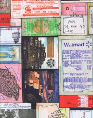 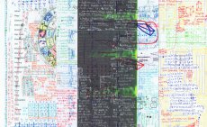
Technische
Angaben
-
[20] S., 27,4x21,6 cm, Auflage: 14, numeriert, signiert, 2 Teile. keine weiteren Angaben vorhanden
handgefertigte Mappe mit 8 Din A 4 Bögen beidseitig bedruckt, Offsetdruck, beiliegend handgeschriebene Postkarte von Darja an Gabriele Weitenauer bezugnehmend auf ihr Treffen in Darjas Atelier am 23. April 2022 in Wien. Darja Shatalova stellte am 21.04.2022 im mumok ihre Künstlerbücher vor.
ZusatzInfos
-
Das Design der Mappe besteht aus aufbewahrten Tickets, Rechnungen, Eintrittskarten der von Darja gemachten Reise durch u. a. Mexiko. Die Innenblätter - 300g Papier - zeigen Zeichnungen, Ausdrucke, Worte, Scribbles, zusammengefügt zu einem visuellen Tagebuch, ein individuelles Archiv.
Aus einem Interview, 2020, mit Dr. Simone Moser, Leiterin der Bibliothek des mumok vienna
"... SM: Wo entstehen Deine Künstlerbücher und welche Technik wendest Du an? Wie sieht das Produzieren und Publizieren in Deiner Praxis aus?
DS: Jedes Künstlerbuch beginnt mit der Aufzeichnung auf oftmals separaten Blättern, die bereits bestimmtes visuelles Material enthalten, wie ein Probedruck oder eine frühere Notation. Die neuen Gedanken fügen sich in das Format der Seite zum Bestehenden hinzu, es gleicht dem Prozess von Wissensgenerierung, wo frühere Erfahrungen in Relation zu den aktuellen gesetzt werden. Durch die Technik der visuellen Collage entstehen über mehrere Etappen der Aufzeichnung immer wieder interessante Zusammenhänge, die wiederum neue Denkprozesse anstoßen. Einzelne Seiten werden dann von mir im Atelier zu Büchern gebunden, die ein Unikat darstellen. Dieses wird wiederum gescannt und anschließend in Auflage gedruckt, wobei es Unterschiede gibt zwischen handgebundenen und teilweise handschriftlich ergänzten Büchern oder rein maschinell gefertigten Exemplaren. ..."
|
Titel
-
How to maneuver: Shapeshifting - texts and other publishing tactics
Technische
Angaben
-
336 S., 23x14,3 cm, ISBN/ISSN 9789948344643
Klappbroschur, 2. Auflage
ZusatzInfos
-
Dieses Buch erschien im Rahmen der Ausstellung "How to maneuver: Shapeshifting texts and other publising tactics" in Abu Dhabi im Warehouse421 vom 10.12.2019-16.02.2020.
Publizieren ist der Akt des Öffentlichmachens. Es ist nicht auf bestimmte Produzenten, Produktionssprachen, geheiligte Vertriebswege und privilegierte Leser beschränkt. Dies ist kein Verlagswesen, wie wir es kennen. In der arabischen Welt gibt es eine wachsende Zahl von Buchmessen und Kunstbuchmessen. Diese beiden Arten von öffentlichen Plattformen laufen parallel zueinander und repräsentieren unterschiedliche, wenn nicht sogar gegensätzliche Ökonomien des kulturellen Kapitals, Systeme der Repräsentation von Subjekten und Subjektivitäten sowie Strategien der Begegnung und des Gesprächs mit einem Publikum. Diese Ausstellung entstand aus dem Bedürfnis heraus, die Grenzen zu hinterfragen, die das Verlagswesen vom unabhängigen Verlagswesen oder die Mainstream-Kulturproduktion von der alternativen Kulturproduktion trennen. Der Raum, der diese verschiedenen Regime von Autorschaft, Verlagswesen und Leserschaft trennt, ist auch der Raum, in dem diese Unterschiede manövriert werden können - in dem Grenzen kreativ in Frage gestellt und verfestigte Praktiken dazu verleitet werden, in verschiedenen Sprachen zu sprechen. Dies ist der Raum, in dem sich diese Ausstellung bewegt. How to maneuver folgt den Spuren ausgewählter künstlerischer und verlegerischer Praktiken und der Räume, die sie zu schaffen versuchen. Die präsentierten Werke bieten eine reiche Vielfalt an historischen und zeitgenössischen Reflexionen über die Sprachen und Formate, die von der dominanten Verlagsindustrie an den Rand gedrängt werden - die brüskierten Genres, die geächteten Themen, die beunruhigenden Subjektivitäten, das Exzessive, das Minimale, das Unrentable und das Unergründliche. Durch die Ausstellung, ihre Kunstwerke, Publikationen und strukturellen Interventionen erhalten wir einen Einblick in einige der kulturellen Räume und Agenturen, die durch unabhängige künstlerische und verlegerische Praktiken zurückgewonnen werden. (Quelle: salonfürkunstbuch)
|
Technische
Angaben
-
[2] S., 10x21 cm, keine weiteren Angaben vorhanden
Schwarz-Weiß, einseitig bedruckt
ZusatzInfos
-
Visitenkarte der stiftung buchkunst inklusive Kontaktdaten.
Seit über 50 Jahren fördert die Stiftung Buchkunst das vorbildlich gestaltete Gebrauchsbuch und verschafft ihm durch drei bedeutende Wettbewerbe – »Die Schönsten Deutschen Bücher«, »Förderpreis für junge Buchgestaltung« sowie »Best Book Design from all over the World / Schönste Bücher aus aller Welt« ein viel beachtetes Forum. Die Ergebnisse dieser Designwettbewerbe setzen Orientierungspunkte und verfolgen neue Entwicklungen. Sie dienen als Impulse für herausragende Gestaltung und beispielhafte Verarbeitung.
Text von der Webseite.
|
Titel
-
Raw notes - documents and scripts of the performances: Stars, Moveyhouse, Massage, The Typewriter with annotations by the author
Technische
Angaben
-
289 S., 27,7x19 cm, ISBN/ISSN 0919616011
Klappbroschur
ZusatzInfos
-
In Raw Notes, Oldenburg has scrupulously collected all of the material relating to his performances. According to his specifications, the text in the book is typed rather then set and appears on only one side of the page. Examples of the original manuscript are reproduced in sixty-three script plates, including stage plans, scores, sketches for programs, and posters. More than two hundred annotations by the author expand the text
|
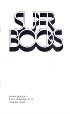
Technische
Angaben
-
[20] S., 21x13 cm, Auflage: 500, 2 Stück. keine weiteren Angaben vorhanden
Drahtheftung, Laserkopie Schwarz-Weiß
ZusatzInfos
-
Mit der diesjährigen Ausgabe von Super BOOKS leitet das Haus der Kunst den Münchner Bücherherbst 2023 ein. Seit dem Auftakt im Jahr 2019 erhält die sehr lebendige und aktive Künstler*innenbuchszene zum vierten Mal die Fläche für einen gemeinsamen Auftritt.
Am 3. und 4. November zeigen über 50 Künstler*innen, Gestalter*innen und alternative Verleger*innen sowie drei Hochschulen ihre aktuellen Produktionen im Haus der Kunst. Neben Produzent*innen aus Deutschland sind in diesem Jahr auch Aussteller*innen aus Spanien, Italien, Frankreich, Österreich, England, Belgien, den Niederlanden und Südkorea vertreten. Die Teilnehmenden sehen sich in der Tradition der 1960er Jahre, als sich im Umfeld der postavantgardistischen Kunstszene neue Kommunikations- und Distributionsnetze bildeten. Ihre Produkte wie Künstler*innenbücher, Magazine oder Zines sind autonome Kunstwerke.
Der Schwerpunkt von Super BOOKS liegt auf Publikationen, die die Grenzen des Mediums Buch hinterfragen, neu denken und deren Themen, Formate und Techniken sich ständig erweitern. Mit ihrer Ethik der Zugänglichkeit, die in Preisgestaltung und der Direktheit von Vertriebswegen zum Ausdruck kommt, bilden sie ein Gegengewicht zu den gängigen Spielregeln des Kunstmarkts. ...
... Super BOOKS ist ein Kooperationsprojekt zwischen Haus der Kunst, AAP Archiv Künstlerpublikationen, Bayerischer Staatsbibliothek, Akademie der Bildenden Künste München und Kunsthochschule Kassel. Projektleitung: Sabine Brantl (Haus der Kunst)
Text von der Webseite
|
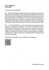 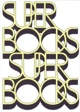
Technische
Angaben
-
[2] S., 14,8x10,85 cm, 2 Stück. keine weiteren Angaben vorhanden
Postkarte
ZusatzInfos
-
Mit der diesjährigen Ausgabe von Super BOOKS leitet das Haus der Kunst den Münchner Bücherherbst 2023 ein. Seit dem Auftakt im Jahr 2019 erhält die sehr lebendige und aktive Künstler*innenbuchszene zum vierten Mal die Fläche für einen gemeinsamen Auftritt.
Am 3. und 4. November zeigen über 50 Künstler*innen, Gestalter*innen und alternative Verleger*innen sowie drei Hochschulen ihre aktuellen Produktionen im Haus der Kunst. Neben Produzent*innen aus Deutschland sind in diesem Jahr auch Aussteller*innen aus Spanien, Italien, Frankreich, Österreich, England, Belgien, den Niederlanden und Südkorea vertreten. Die Teilnehmenden sehen sich in der Tradition der 1960er Jahre, als sich im Umfeld der postavantgardistischen Kunstszene neue Kommunikations- und Distributionsnetze bildeten. Ihre Produkte wie Künstler*innenbücher, Magazine oder Zines sind autonome Kunstwerke.
Der Schwerpunkt von Super BOOKS liegt auf Publikationen, die die Grenzen des Mediums Buch hinterfragen, neu denken und deren Themen, Formate und Techniken sich ständig erweitern. Mit ihrer Ethik der Zugänglichkeit, die in Preisgestaltung und der Direktheit von Vertriebswegen zum Ausdruck kommt, bilden sie ein Gegengewicht zu den gängigen Spielregeln des Kunstmarkts. ...
... Super BOOKS ist ein Kooperationsprojekt zwischen Haus der Kunst, AAP Archiv Künstlerpublikationen, Bayerischer Staatsbibliothek, Akademie der Bildenden Künste München und Kunsthochschule Kassel. Projektleitung: Sabine Brantl (Haus der Kunst)
Text von der Webseite
|
Titel
-
Super BOOKS 4 2023 Lageplan Programm
Technische
Angaben
-
[2] S., 29,7x42 cm, 2 Stück. keine weiteren Angaben vorhanden
Risodruck auf gelbem Papier
ZusatzInfos
-
Druck von rosidruckt.de, Raumplan von Malte Wandel.
Mit der diesjährigen Ausgabe von Super BOOKS leitet das Haus der Kunst den Münchner Bücherherbst 2023 ein. Seit dem Auftakt im Jahr 2019 erhält die sehr lebendige und aktive Künstler*innenbuchszene zum vierten Mal die Fläche für einen gemeinsamen Auftritt.
Am 3. und 4. November zeigen über 50 Künstler*innen, Gestalter*innen und alternative Verleger*innen sowie drei Hochschulen ihre aktuellen Produktionen im Haus der Kunst. Neben Produzent*innen aus Deutschland sind in diesem Jahr auch Aussteller*innen aus Spanien, Italien, Frankreich, Österreich, England, Belgien, den Niederlanden und Südkorea vertreten. Die Teilnehmenden sehen sich in der Tradition der 1960er Jahre, als sich im Umfeld der postavantgardistischen Kunstszene neue Kommunikations- und Distributionsnetze bildeten. Ihre Produkte wie Künstler*innenbücher, Magazine oder Zines sind autonome Kunstwerke.
Der Schwerpunkt von Super BOOKS liegt auf Publikationen, die die Grenzen des Mediums Buch hinterfragen, neu denken und deren Themen, Formate und Techniken sich ständig erweitern. Mit ihrer Ethik der Zugänglichkeit, die in Preisgestaltung und der Direktheit von Vertriebswegen zum Ausdruck kommt, bilden sie ein Gegengewicht zu den gängigen Spielregeln des Kunstmarkts. ...
... Super BOOKS ist ein Kooperationsprojekt zwischen Haus der Kunst, AAP Archiv Künstlerpublikationen, Bayerischer Staatsbibliothek, Akademie der Bildenden Künste München und Kunsthochschule Kassel. Projektleitung: Sabine Brantl (Haus der Kunst)
Text von der Webseite
|
Technische
Angaben
-
[48] S., 26,5x18 cm, Auflage: 150, numeriert, signiert, 4 Teile. ISBN/ISSN 9783897705326
Broschur, mattes ungestrichenes Papier, mit einglegtem losen Blatt mit Text von Markus Mascher. Mit eingelegten Postkarten: Einladungskarte zur Austellung DIN lang, zwei weitere A6: Einladungskarte Ausstellung "Flächenfeld", Galerie Rupert Pfab, Düsseldorf, 06.07.-11.08.2018) und Einladungskarte Vortrag im Rahmen der Vortragsreihe "Zwischenlandung", Museum Ostwall im Dortmunder U, 30.06.2016
ZusatzInfos
-
Erscheint anlässlich der Ausstellung offensichtlich nicht offensichtlich, Leopold-Hoesch-Museum Papiermuseum Düren, 30.08.-11.11.2018. Das Künstlerbuch dokumentiert als lockere Bilderfolge das Werden einer Ausstellung im Museumsraum. In wechselnden Positionierungen gruppieren sich die Bilder in möglichen Nachbarschaften und klären das Verhältnis von Wand und Bild. Dass alle Bilder auf einem Kontinuum von Fragen basieren, zeigt sich in einem großen Tableau, dem die Idee des Gesamtbildes zugrundeliegt.
Text von der Webseite
|
Titel
-
Museum Oldenburg und Weserburg - Konvolut
Technische
Angaben
-
18x12 cm, 5 Teile. keine weiteren Angaben vorhanden
Zwei Hefte, drahtgeheftet, ein Blatt, gefaltet, ein Flyer, eine Postkarte mit persönlichem Schreiben
ZusatzInfos
-
Programm zu "Das Bauhaus in Oldenburg. Zwischen Utopie und Anpassung" 27.04.-04.08.2019. Herman de Vries - Taken from Nature, 04.05.-21.10.2018, Weserburg. Keep in Touch ! Artists' Mail in Contemporary Art. Fragen und Antworten zum Neubau des Stadtmuseums Oldenburg.
|