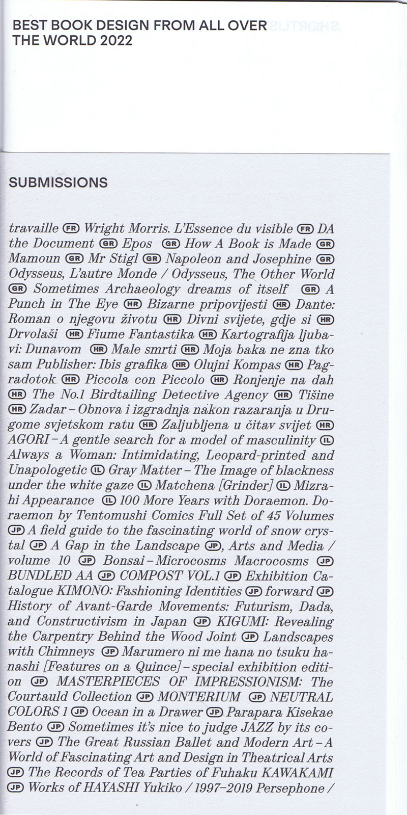
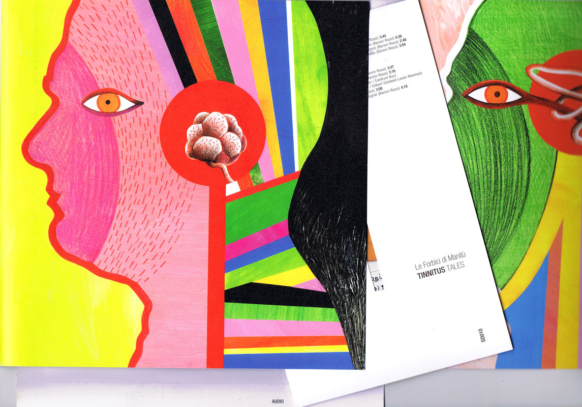
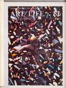
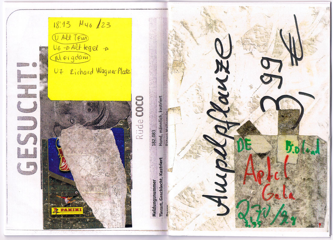
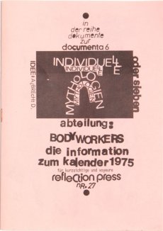
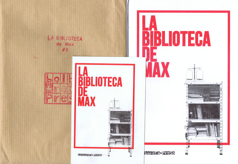
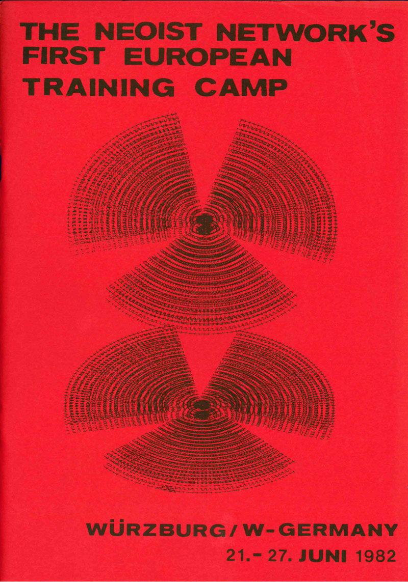
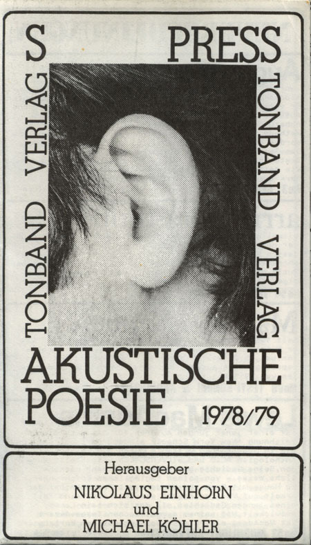
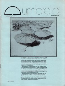
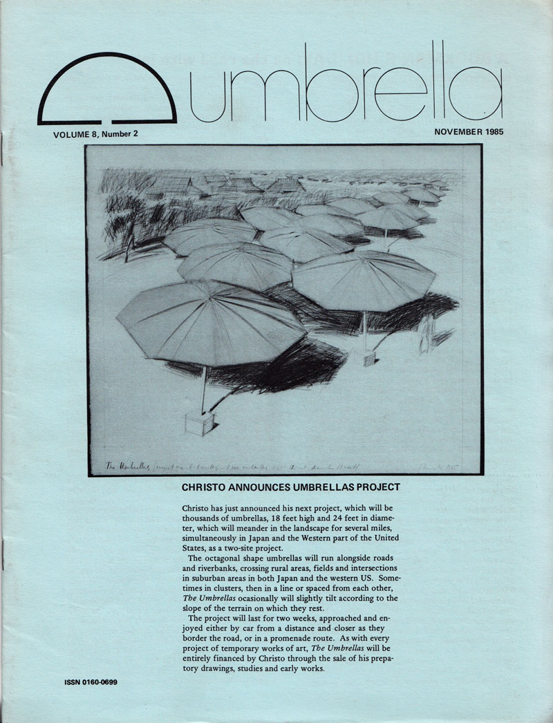
|
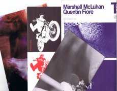
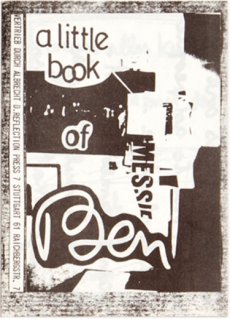
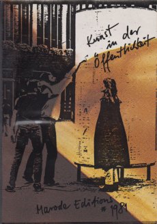
Technische
Angaben
-
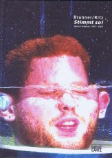
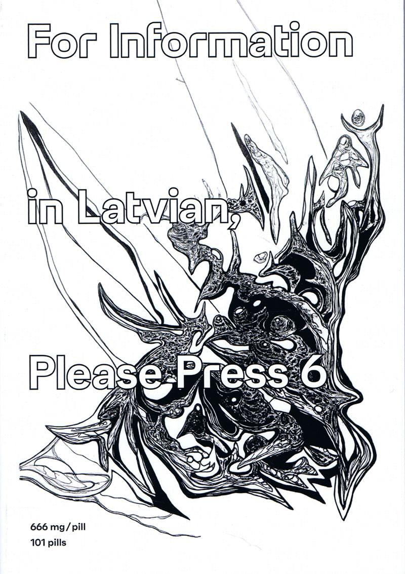
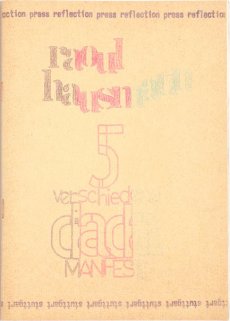
[24] S., 14,8x10,5 cm, keine weiteren Angaben vorhanden
Drahtheftung
ZusatzInfos
-
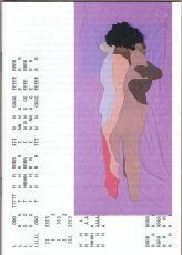
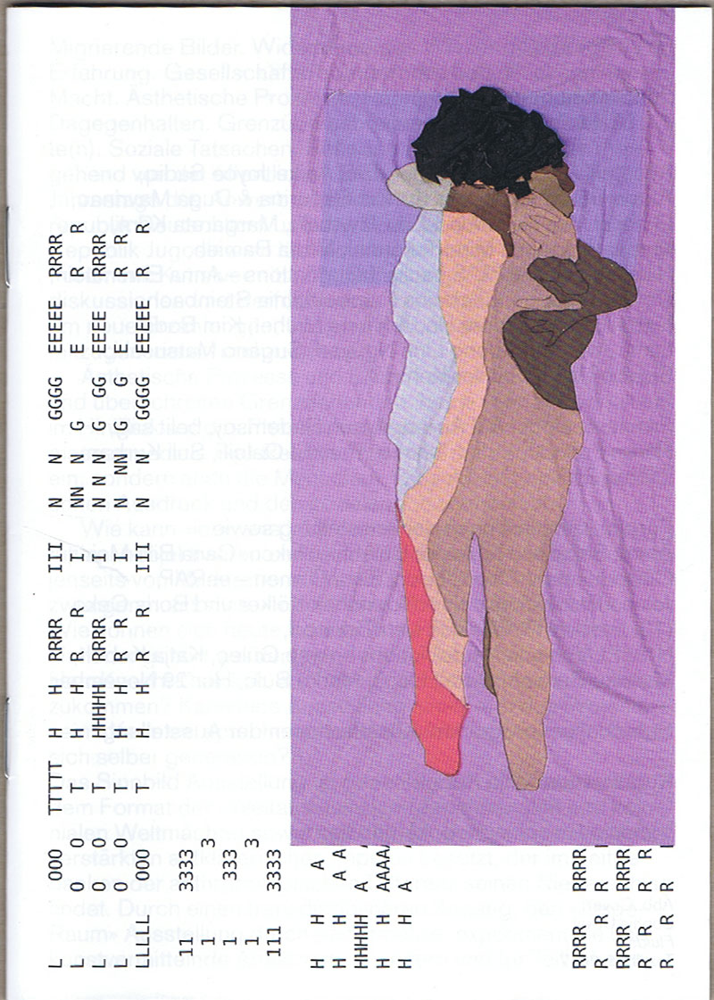
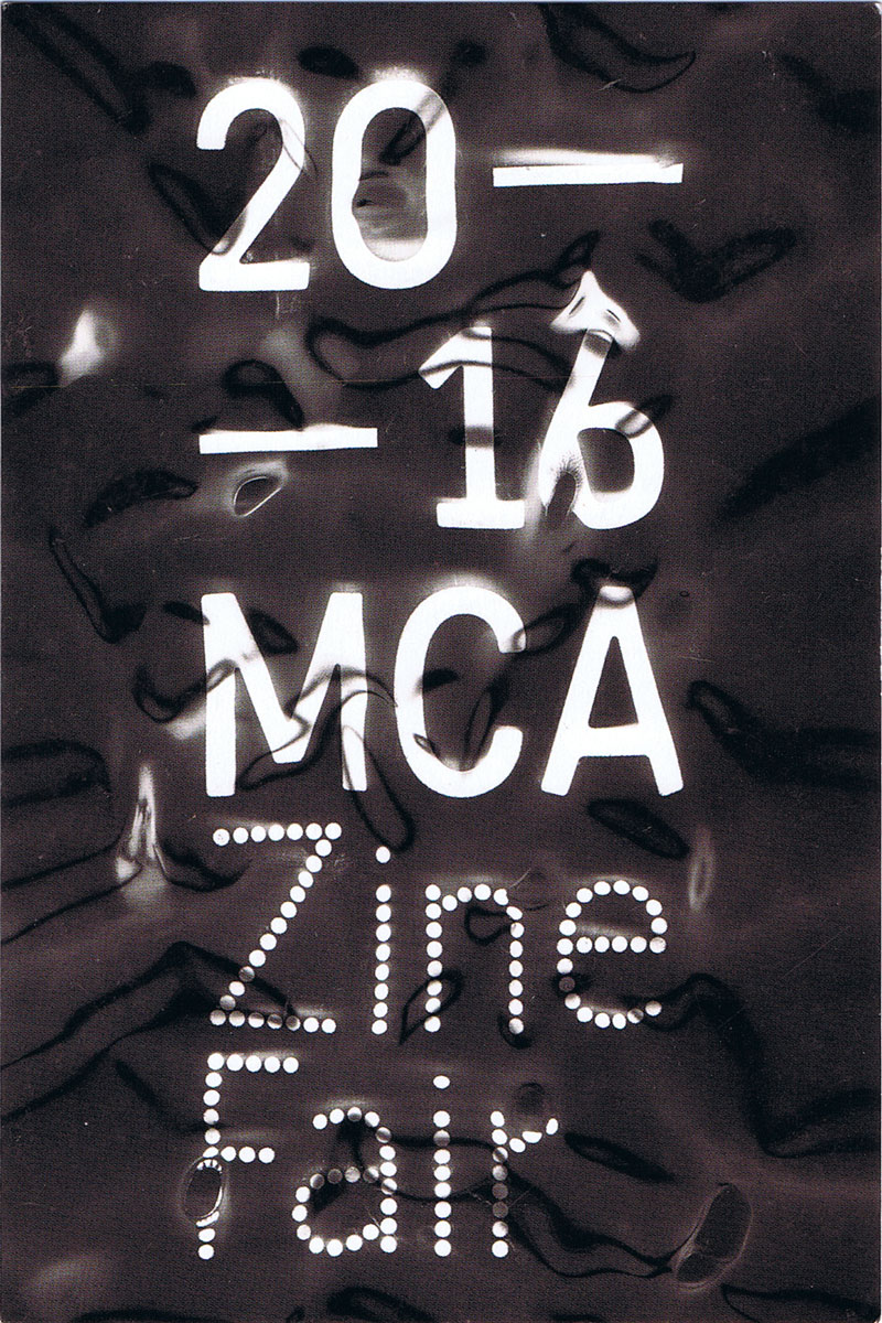
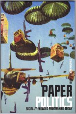
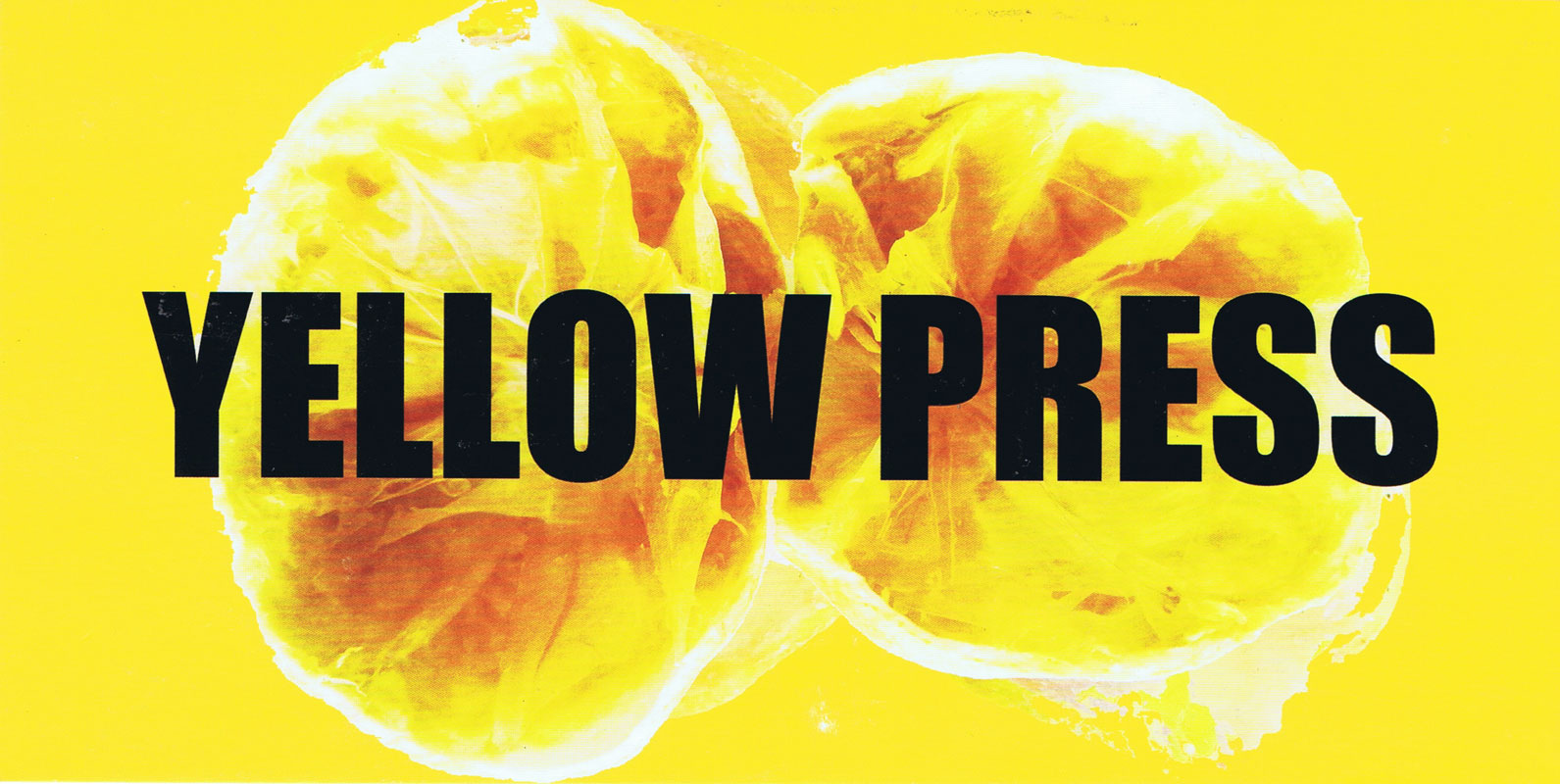
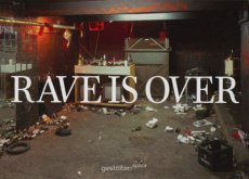
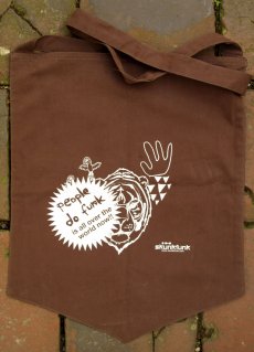
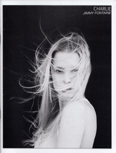
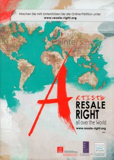
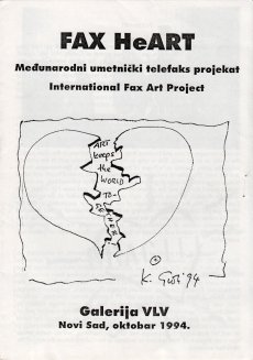
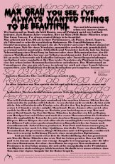
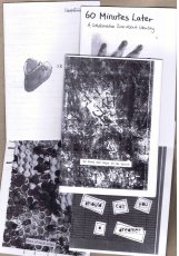
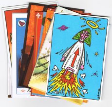
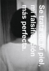
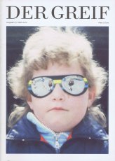
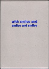
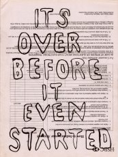
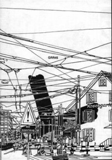
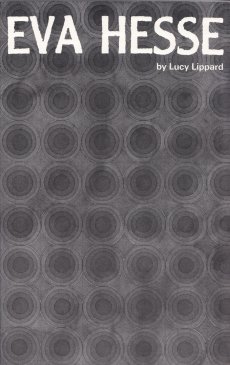
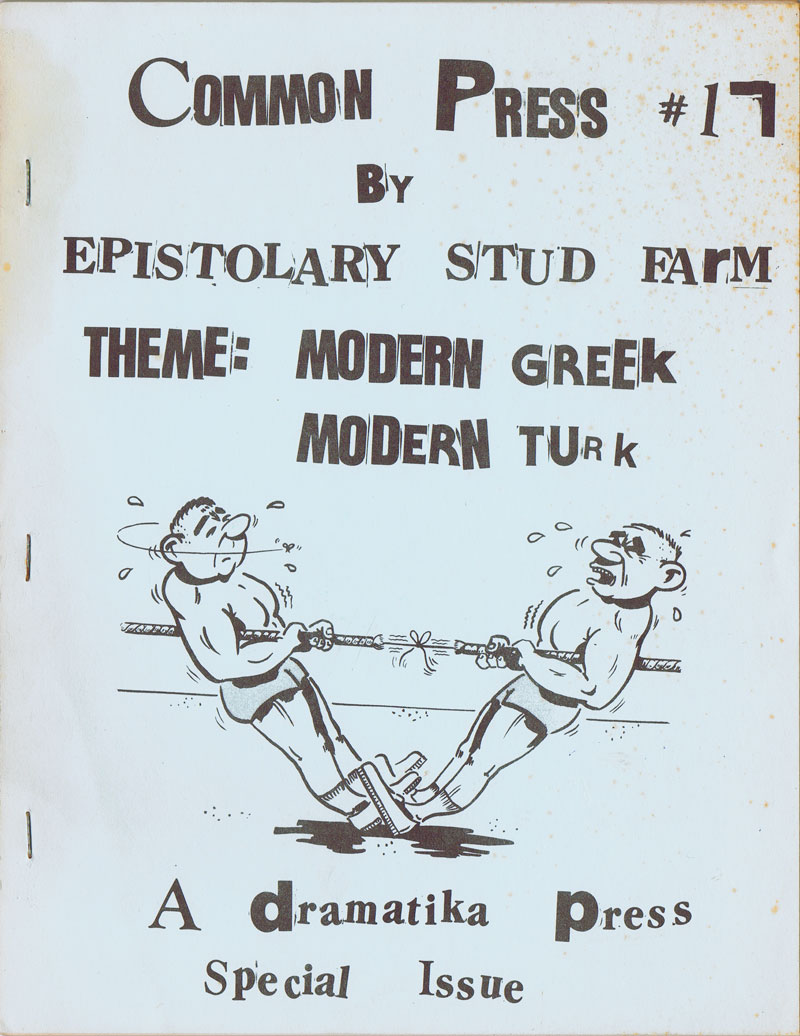
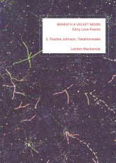
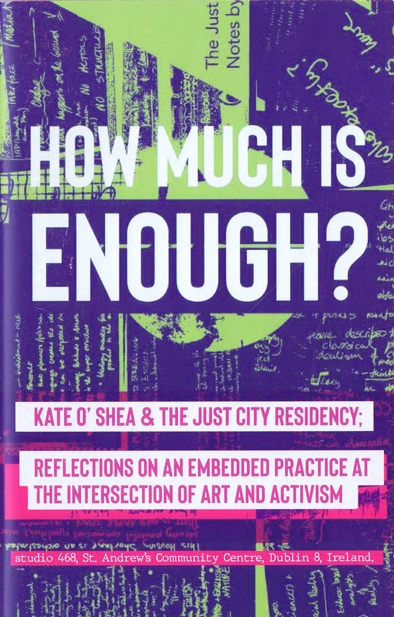
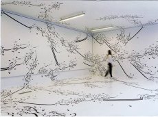
Heft zur Ausstellung "no stop non stop", 26.09.–11.11.2018, in der Lothringer13 Halle.
Migrierende Bilder. Widerständiges Wissen. Vielfältige Erfahrung. Gesellschaftsverändernde Kraft. Rückschläge. Macht. Ästhetische Prozesse. Räume. Kämpfe um Rechte. Dagegenhalten. Grenzüberschreitung. Erlebte Geschichte(n). Soziale Tatsachen. Reflexion. Recht auf Rechte.
Ausgehend von der öffentlichen Erinnerung anlässlich des 50. Jahrestags des Anwerberabkommens zwischen der Bundesrepublik Deutschland und der Sozialistischen Föderativen Republik Jugoslawien lädt no stop non stop mit Ausstellung, Forum mit Kunstvermittlung, Screenings, Talks, Podiumsdiskussionen und Performances in die Lothringer13 Halle, um neue Erzählungen, Imaginarien und solidarische Bilder mitzugenerieren und zu erleben.
Text von der Webseite.
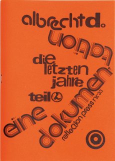
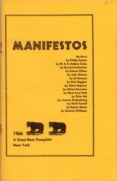
|
Titel
-
go.stop.act! Die Kunst des kreativen Straßenprotests
Technische
Angaben
-
14,9x14,7 cm, keine weiteren Angaben vorhanden
Flyer zum Buch
|
Titel
-
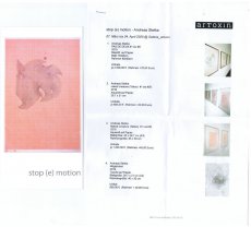
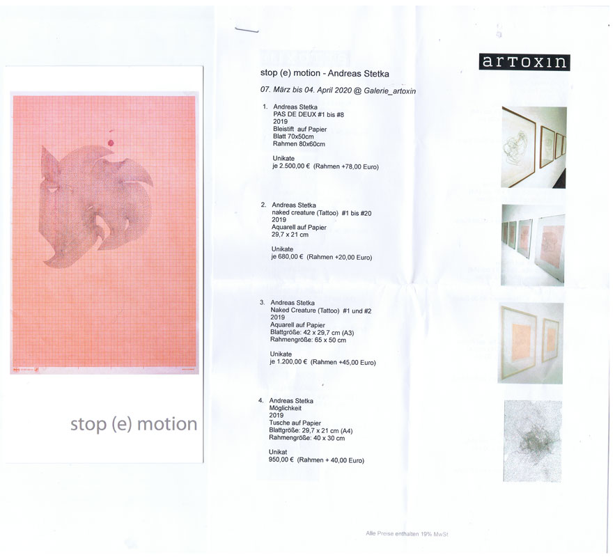
stop (e) motion. Zeichnung und Video
Technische
Angaben
-
10,5x21 cm, 2 Teile. keine weiteren Angaben vorhanden
Einladungskarte DIN lang, Werkliste mit 3 DIN A4 Blättern, geklammert
ZusatzInfos
-
Einladungskarte und Werkliste zur Ausstellung in der Galerie artoxin, 07.03.-04.04.2020.
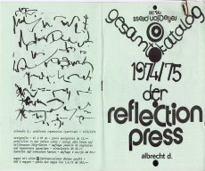
|
Technische
Angaben
-
19x13,5 cm, Auflage: 3, numeriert, signiert, keine weiteren Angaben vorhanden
beklebte und signierte DVD in Hülle
ZusatzInfos
-
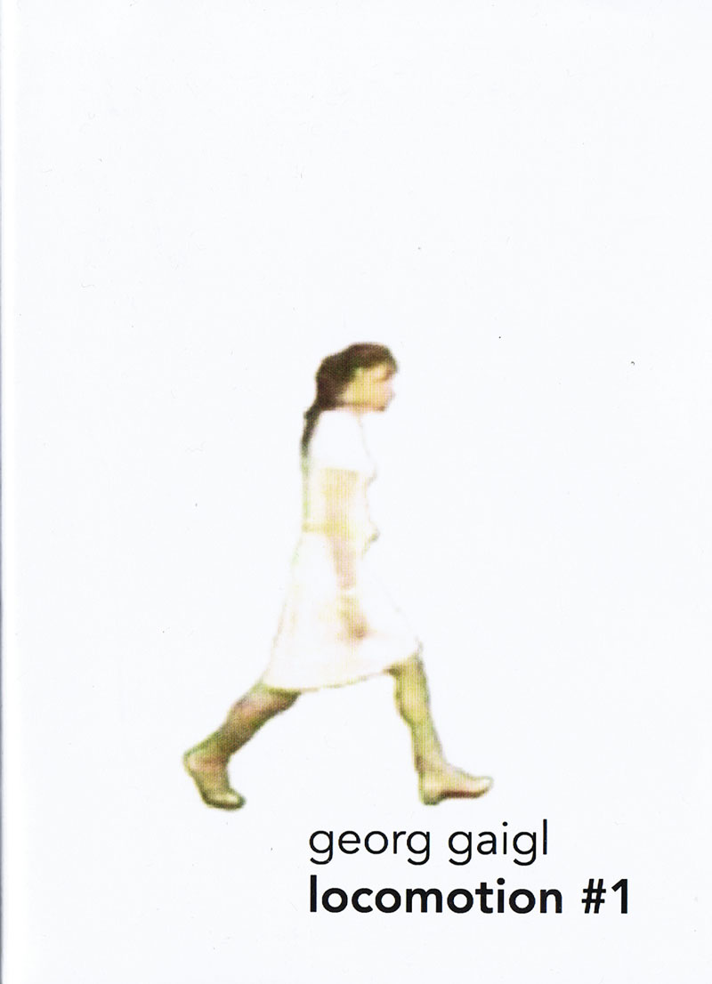
„Locomotion“ (locomotion #1) ist angelehnt an die Chronofotografie von Eadweard Muybridge. Statt der Fotografien verwendet Georg Gaigl Videostills als Vorlagen für seine Bewegungsabläufe: Alle Einzelbilder werden aus Filmzusammenhängen entnommen, bearbeitet und wieder „re-animiert“. Die Darstellung der Bewegungsabläufe ist ähnlich einem Stop-Motion-Film, bei dem Bild für Bild neu erstellt wird (ca. 7 Bilder pro Sekunde). Hauptdarsteller sind Personen, die aus beliebigen Filmsequenzen stammen, von dessen Umgebung sie getrennt und ausgestanzt wurden. In der Zusammenführung von kleinen Bewegungsepisoden erhalten die einzelnen Protagonisten eine neue Bedeutung in ihrem Tun. Der poetische Charakter manifestiert sich dabei in Andeutungen von Geräuschen und Wörtern. Spielzeit 10 Minuten
Text von der DVD Hülle
|
Technische
Angaben
-
19x13,5 cm, Auflage: 3, numeriert, signiert, keine weiteren Angaben vorhanden
2 beklebte und signierte DVDs in Hülle, Informationsblatt eingelegt
ZusatzInfos
-
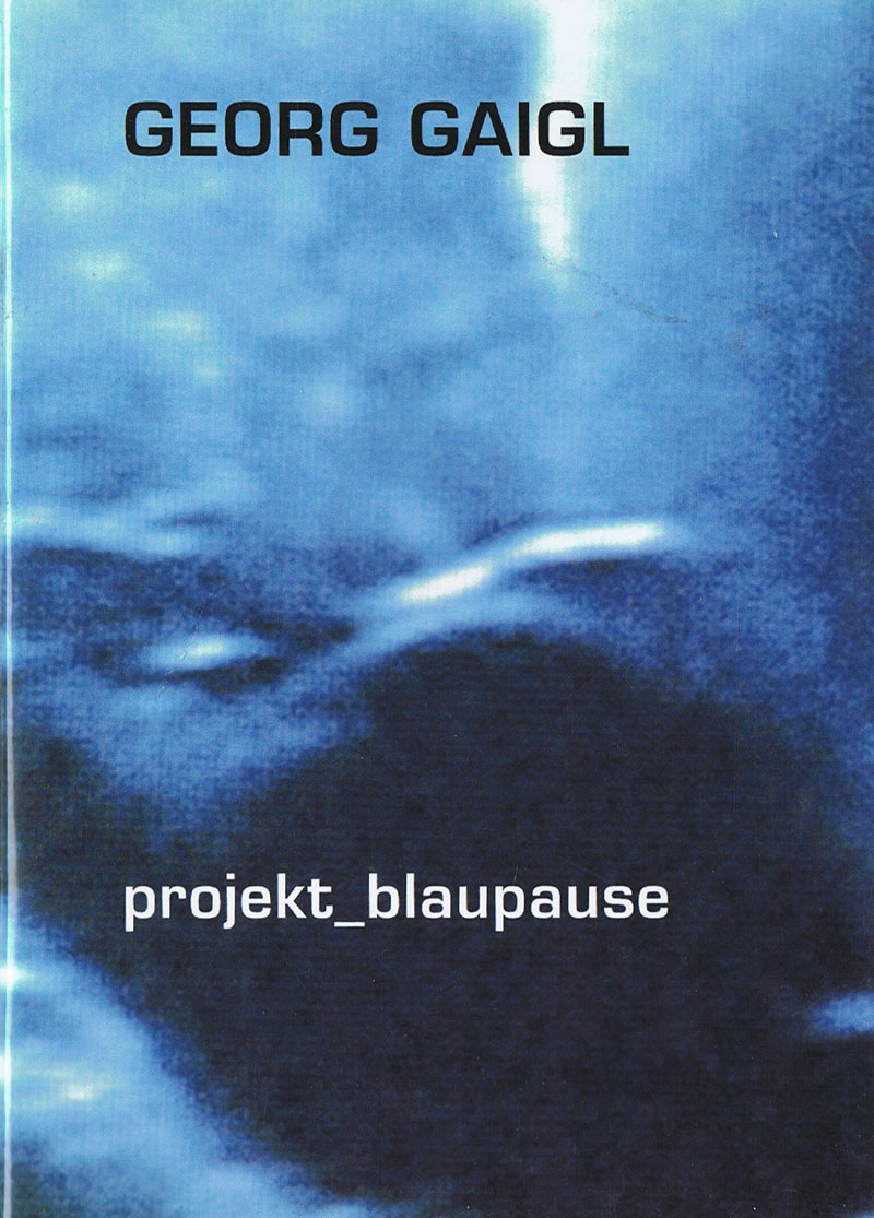
Das blaupause-Projekt startete am 21.September 2001 und endete am 22.September 2002. Bei dem Projekt versuchte Gaigl anhand von Snapshots Zwischenwelten aus filmischen Bewegungsabläufen herauszufiltern. Jeden Tag fotografierte er ca 100 Bilder vom laufenden Schwarz-Weiß TV Gerät ab, zu beliebiger Zeit, in unterschiedlichen Kanälen. Die so gewonnen Fotos setzte er zu einer Stop-Motion-Animation zusammen. Die Laufgeschwindigkeit beträgt ca. 5 Bilder pro Sekunde. Mehr als 90 Minuten Film sind dabei entstanden.
Für den Sound verwendete Gaigl eine Software, die die Bilddateien der blaupause in Töne verwandelte, um die metaphysische Wirkung der Bilder zu unterstützen. Spielzeit 105 Minuten
Text von der Webseite
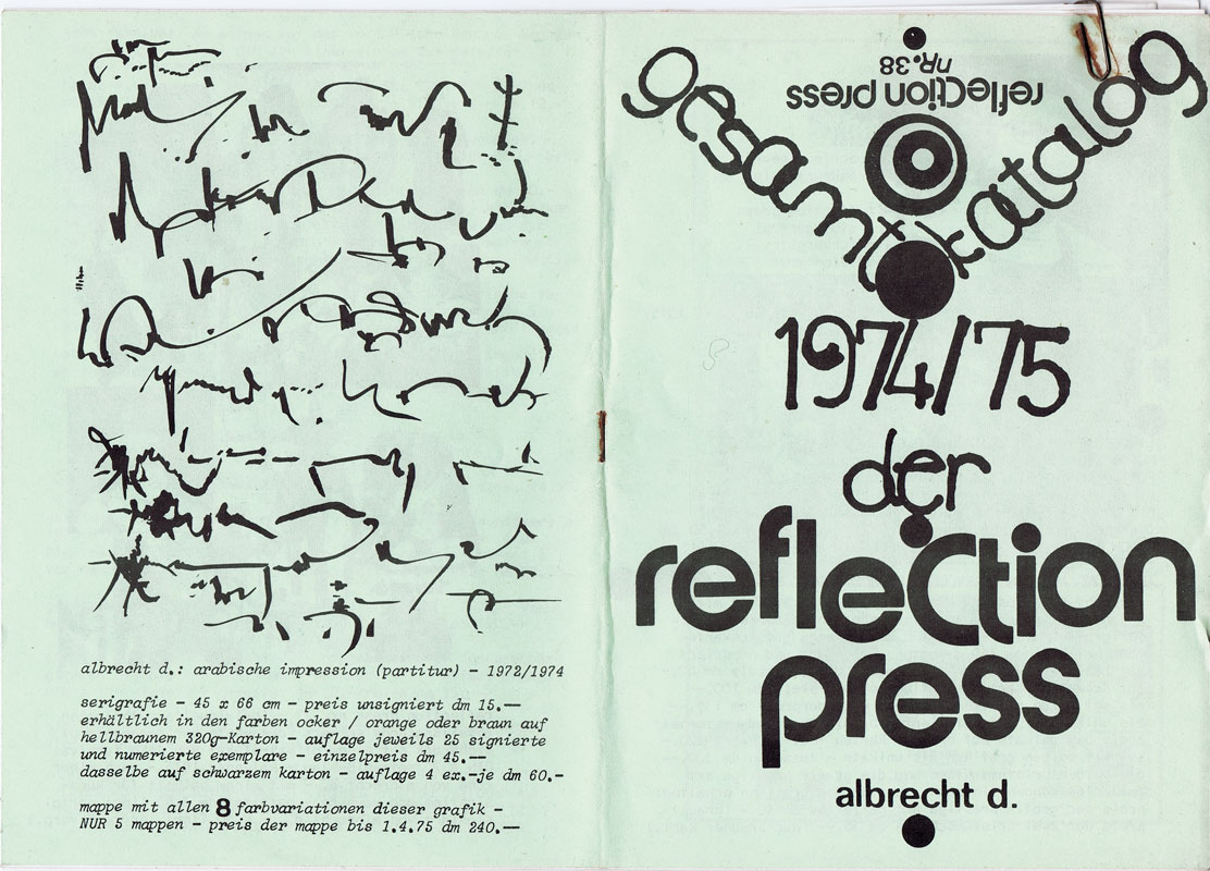
|
Technische
Angaben
-
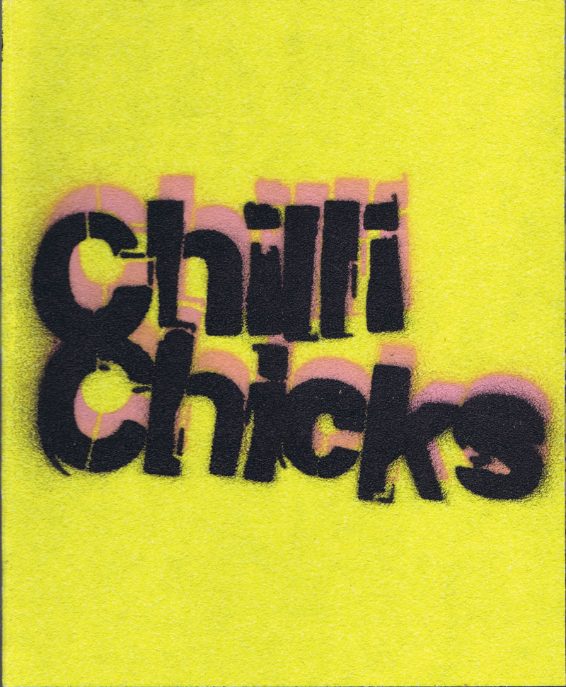
524 S., 28x23x5 cm, Auflage: 150, numeriert, ISBN/ISSN 978-3-946803-26-3
Digitaldruck, Einband (Unikate) mit Stencil/Pochoir auf Schleifpapier (Entwurf A.L. Capelletti), Fadenheftung, offener Rücken mit bestempelten Bändchen in Kisten mit Pochoir/Stencil, diverse farbige Papiere unterschiedlicher Grammatur und Sonderpapiere u.a. Kohlepapiere, Transparentpapier, Löschpapier, Seidenpapier leoprint, goldenes Tonpapier, Neon Papier und verschiedene Materialien wie Schleifpapier und Baufolie, 575 Abbildungen und Links zu 5 Filmen (Stop motion und Videoskizzen), 2300 Gramm. 100 nummerierte Exemplare plus 50 e.a.
ZusatzInfos
-
Andrea Lesjak - Idee und künstlerische Projektleitung Chillichicks. Antonio Luca Capelletti – Buchgestaltung und Produktionsleitung.
Sommer 2013. In einem Wohnheim für obdachlose Frauen werden Farben angerührt.
Es wird gemalt, gedruckt, fotografiert und collagiert. Hochglanzmagazine werden zerschnitten, Trickfilme aus schier endlosen Fotoserien montiert und über das Leben und die Kunst diskutiert.
Für die Frauen geht es darum, einen Zugang zur eigenen Kreativität zu finden und über die visuellen Erlebnisse, etwas über sich und die Kunst zu erfahren. In spielerischem Umgang mit dem Material entwickeln sie eigene Methoden, um sich persönlich bedeutsamen, auch unbequemen Fragestellungen anzunähern und dafür visuelle Formulierungen zu finden.
Nach mehreren Ausstellungsprojekten entwickelt sich auch außerhalb des Wohnheims eine kontinuierliche Zusammenarbeit der Gruppe, der sich akademisch ausgebildete Künstler*innen anschließen. Sie beschäftigen sich in ihren Arbeiten mit ähnlichen Inhalten und interessieren sich für den inspirierenden Austausch und einen authentischen Umgang mit Kunst - fern der Regeln des Marktes und des etablierten Ausstellungsbetriebs. Es wird von Kunst in Museen und auf den Straßen erzählt, über den Zusammenhang von christlicher Ikonographie und Werbung nachgedacht und Wahrnehmungskonventionen in Frage gestellt.
Vor allem geht es um unmittelbare Kommunikation, um freie Improvisation, um Experimentieren statt Funktionieren! So schreiten doppelköpfige Wesen selbstbewusst über die Bildfläche, zeichnen sich Fleisch fressende Monster – in Tüll und fremde Körperteile gekleidet – selbst neue Gesichter oder warten insektenartige Monsterfrauen triefend auf ihre Beute im Spinnennetz. Es geht um Träume, „Männerträume“, um Rollenklischees von Mann und Frau und die Erforschung eigener Identitäten. Es geht um Vorstellungen von Schönheit und die Wirkungsweise von Bildern, um sehen und gesehen werden.
Immer geschieht dies im Ansinnen, Ungewohntes wieder zu entdecken und obskuren Geistern mutig entgegenzutreten, etwa wenn rumpflose Wesen mit riesigen Augäpfeln auf Fingerspitzen und Pfennigabsätzen in brennenden Wüsten umherwandern und füllige Körper – befreit vom Ballast der Statussymbole und dem Korsett gängiger Schönheitsideale - schwerelos über die Erde schweben.
Wie der schwangere Bauch eines Glitzermonsters verspricht: „Something BIG is coming“. Nach vielen Jahren der Zusammenarbeit an unterschiedlichsten Orten erscheint ein umfangreiches Künstlerbuch, das einen lebendigen Einblick in die Werkstatt des Kollektivs gewährt. Mehr als eine bloße Dokumentation soll es auch als Plattform für die Kommunikation mit den Leser*innen dienen. Verschiedenste Papiere und Materialien bieten Raum für eigene Projektionen und laden ein, Gewissheiten zu überdenken und in der Berührung sichtbare Spuren im Buch zu hinterlassen – mit der Hoffnung, dass sich dieser inspirierende Austausch von Menschen über gesellschaftliche Konventionen und Grenzen verschiedener Lebenskontexte hinweg weiter etabliert.
Mit künstlerischen Beiträgen von Antonio Luca Capelletti, Ruth Detzer, Cora Kalch, Elke Lehmann, Andrea Lesjak, Sophie Lloyd, Theresa Maierhofer, H.N., N.M., S.M., F.Ö., L.T., V.W., Zoro Babel, Nikolai Leicher, uva.
Texte von Andrea Lesjak und A.L. Capelletti und Briefbeiträge von Patricia Drück, Marion Bierling, Luzia Beisiegel, Charlotte Troll, Maria Dennerlöhr, Stephanie Müller, Sandra Anderiasch, Monika Schmidt, Urte Ehlers, Iris Dankemeyer, Zoro Babel, Klaus Erika Dietl, Olga Mannheimer, Mona Feyrer, Miriam Noa, Elke Wagner.
Weitere beteiligte Personen:
Gedruckt von Robert Schäfer (JVA Landsberg) und gebunden von der Handbuchbinderei Wiedemann. Dazu handgebundene Exemplare der Buchbinderei der LHM Stadtkanzlei Rathaus. Lektorat von Ludger Derenthal. Fotografische Reproduktionen von, Lesjak, Zoro Babel. Übersetzungen von Meredith Barth, Patrick Drislane, Kurt Holz, Sophie Lloyd, Sarah Ernst Jank und Simone Gänsheimer, Kilian Blees Payet, Courtenay Smith. Filmvertonungen Musik- und Videoschnitt von Zoro Babel, Bettina Lang, Nikolai Leicher.
Darum geht es hier
Kunst im Kontext / Experimentelle Kunst / Outreach / Öffnung der Museen / Kulturelle Bildung / Kollaborative Kunstprojekte / KOLLABS / Künstler*innenkollektiv / Feministische Kunst / Frauenprojekt / Frauen in sozialen Schwierigkeiten / gesellschaftliches Potential von Kunst / Kuns und soziale Arbeit / Frauenwohnheim / Obdachlosigkeit / Tagesstruktur / Kunstworkshop / Kunsttherapie / Inklusion / Demokratisierung des Ästhetischen / Diversifizierung gesellschaftlicher Realitäten / Outsider-Art / Diözesanmuseum Freising / Erweiterte aktuelle Kunstbegriffe / Evangelischer Beratungsdienst für Frauen / Seidlvilla / Lenbachhaus / Ursulinenkloster Landshut / S. P. A.C. E / Collage / Malerei / Trickfilm / Stop Motion / Videoskizze / Selbstbildnis / Foto-Portraits / Portrait / Übermalung / Monotypie / Fotocollage / Ölzeichnung / Masken / Modellieren / Performance / Identitätsfragen / Wahrnehmungskonventionen / Konstrukte von Weiblichkeit / Schönheitsbegriffe / Rollenklischees von Mann und Frau / Forum für experimentelle Aktionen - Lenbachhaus / Christliches Frauenbild / Gnadenbild / Selbstwahrnehmung / Selbstfindung / Feministische Kunst / sehen und gesehen werden / Spiel mit Projektionsflächen
|
Technische
Angaben
-
100 S., 28,5x21 cm, Auflage: 600, ISBN/ISSN 9789077459911
Broschur
ZusatzInfos
-
Writing Over is a drawing atlas which focuses on the relationship between the gestures of drawing, writing and map-making. The book serves as companion volume to the installation Writing Over, which was shown in 2012 at Netwerk in Aalst. The drawings which are partly derived from a personal and collective history are rendered in different types of landscapes and maps. These are accompanied by an ‘Atlas Archive’. a study of surfaces used in this cartographic process – sketches, stamps, media images, engraving plates, notations – and a short story by Louis Lüthi, entitled Unalaska Alaska.
Text von der Webseite
|
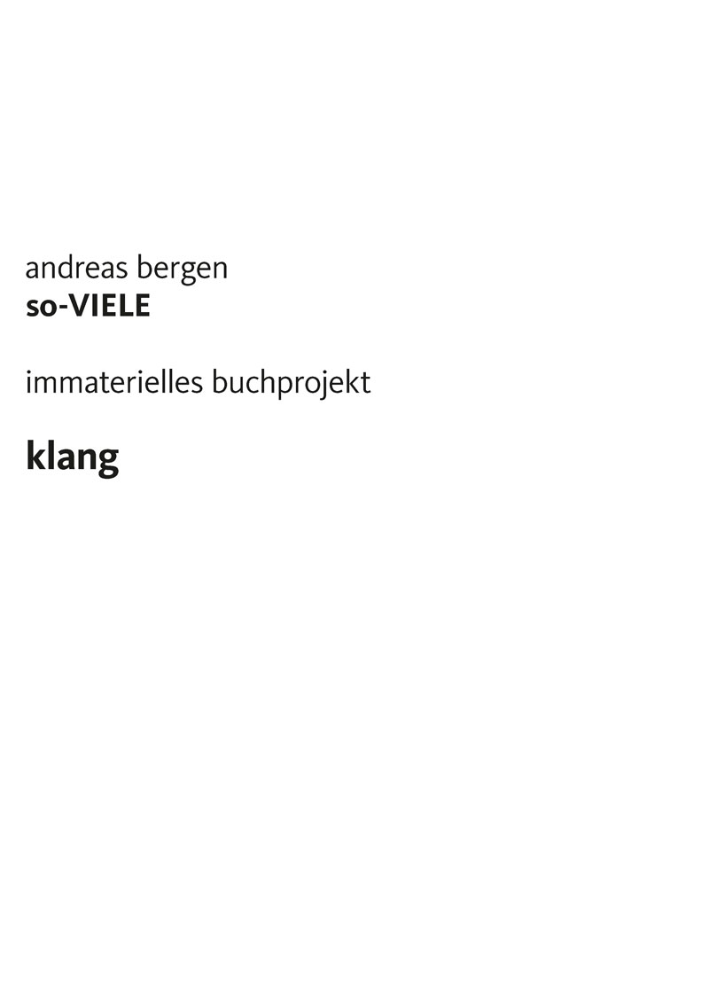
Titel
-
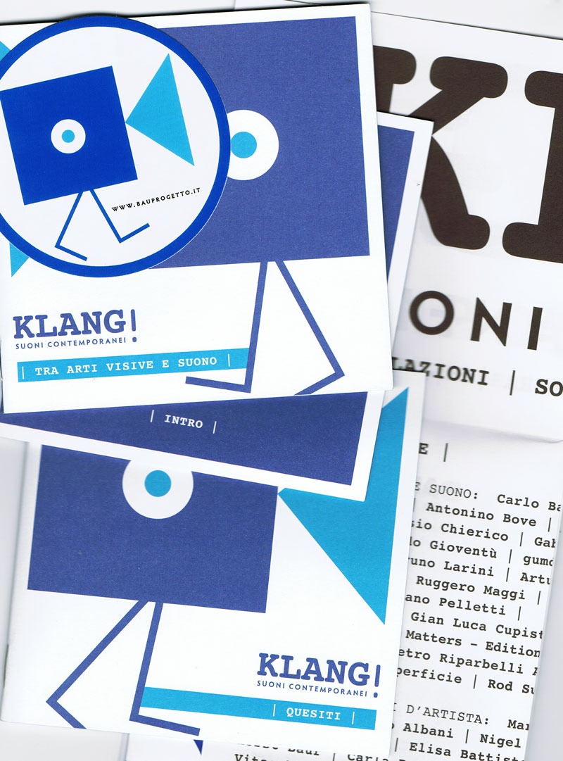
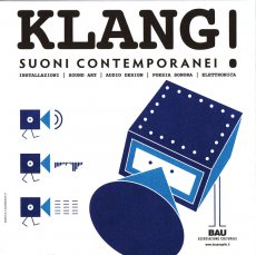
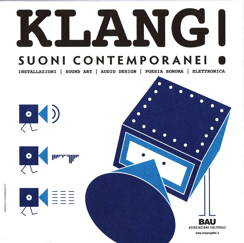
KLANG! SUONI CONTEMPORANEI
Technische
Angaben
-
13,5x13,5 cm, Auflage: 1.000, 7 Teile. keine weiteren Angaben vorhanden
CD Box ohne CD, 3 Booklets, 1 gefaltetes Plakat, 1 Aufkleber in Kartonbox, 3 Seiten Pressematerial
ZusatzInfos
-
The catalogue from Pezzini Editore consisting of three illustrated booklets, a poster, a sticker, [a cd and a dvd] in original die-cut box designed by Gumdesign, documents the sound based Multimedia Festival curated by Vittore Baroni and BAU at the historical Villa Paolina in Viareggio on 7-8-9 August 2009. The exhibition included installations and audio art works from 20 international artists, plus the collective project Bzzzoing! with musical instruments created by over 60 authors. In the course of the three days, audiovisual works of over 40 authors have been projected and over 20 poets, artists and musicians performed at the villa. In the centenary of futurism, a singular and rich overview of the many interferences between sound and image, paying tribute in the logo to Luigi Russolo’s Noise Machines.
Text von der Webseite
Catalogue of Klang! exhibition/sound art festival held at Villa Paolina, Viareggio, Italy, august 7-9 2009, comprising sound installations, exhibition and performances of invented musical instruments, and performances by visual artists, sound poets and electronic musicians.
Cardboard box published in 500 copies freely distributed during the festival days, including 3 booklets, a sticker and a poster; 300 copies were later produced with additional cd + dvd documentation of the festival.
Text von discogs Webseite
|
Titel
-
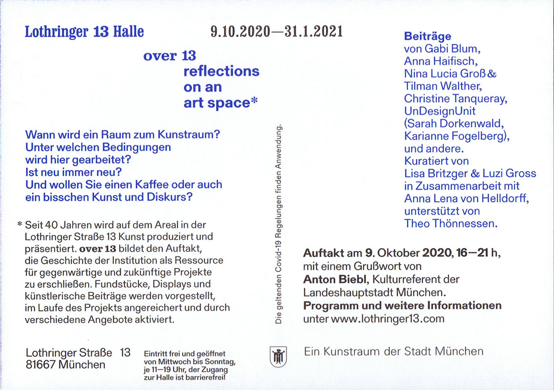
over 13 reflections on an art space
Technische
Angaben
-
2 S., 14,8x10,5 cm, 2 Stück. keine weiteren Angaben vorhanden
Einladungskarte
ZusatzInfos
-
10.10.2020-31.01.2021 Ausstellung und Recherche.
Wann wird ein Raum zum Kunstraum? Unter welchen Bedingungen wird hier gearbeitet? Ist neu immer neu? Und wie klingt eine ehemalige Montagehalle?
Seit 40 Jahren wird auf dem Areal in der Lothringer Straße 13 Kunst produziert und präsentiert. Im Laufe der Zeit wurden die Atelier- und Ausstellungsflächen immer wieder durch Umbauten und Umnutzungen neu strukturiert. Neben unzähligen Ausstellungen entstanden temporäre Projekträume, Aktionsräume, Medienlabore und Archive. Over 13 – reflections on an art space geht verschiedenen spezifischen wie symptomatischen Spuren vor Ort nach und bildet den Auftakt, die Geschichte der Institution als Ressource für gegenwärtige und zukünftige Projekte zu erschließen. Im Zentrum stehen dabei künstlerische Perspektiven, die sich subjektiv, spekulativ und kollaborativ der Lothringer 13 Halle und ihren Erzählungen nähern.
Zum Auftakt am 9. Oktober werden Fundstücke, Displays und künstlerische Beiträge vorgestellt, die im Laufe des Projektes weiter bearbeitet, mit Material angereichert und durch verschiedene Angebote aktiviert werden. ...
Text von der Webseite
|
Titel
-
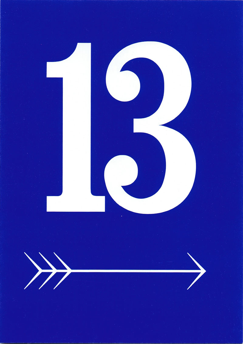
over 13 reflections on an art space - Raumplan
Technische
Angaben
-
2 S., 29,7x21 cm, keine weiteren Angaben vorhanden
Schwarz-Weiß-Fotokopie
ZusatzInfos
-
10.10.2020-31.01.2021 Ausstellung und Recherche. Raumplan und Infotext.
Wann wird ein Raum zum Kunstraum? Unter welchen Bedingungen wird hier gearbeitet? Ist neu immer neu? Und wie klingt eine ehemalige Montagehalle?
Seit 40 Jahren wird auf dem Areal in der Lothringer Straße 13 Kunst produziert und präsentiert. Im Laufe der Zeit wurden die Atelier- und Ausstellungsflächen immer wieder durch Umbauten und Umnutzungen neu strukturiert. Neben unzähligen Ausstellungen entstanden temporäre Projekträume, Aktionsräume, Medienlabore und Archive. Over 13 – reflections on an art space geht verschiedenen spezifischen wie symptomatischen Spuren vor Ort nach und bildet den Auftakt, die Geschichte der Institution als Ressource für gegenwärtige und zukünftige Projekte zu erschließen. Im Zentrum stehen dabei künstlerische Perspektiven, die sich subjektiv, spekulativ und kollaborativ der Lothringer 13 Halle und ihren Erzählungen nähern.
Zum Auftakt am 9. Oktober werden Fundstücke, Displays und künstlerische Beiträge vorgestellt, die im Laufe des Projektes weiter bearbeitet, mit Material angereichert und durch verschiedene Angebote aktiviert werden. ...
Text von der Webseite
|
Titel
-
Best Book Design from all over the World 2021
Technische
Angaben
-
468 S., 19x12,4 cm, Auflage: 1.500, 2 Stück. keine weiteren Angaben vorhanden
Klebebindung, Schutzumschlag mit Metallprägung, herausnehmbares Lesezeichen
ZusatzInfos
-
Katalog mit den Einreichungen, der Shortlist, der Gewinnerliste und der Juryliste des Wettbewerbs "Best Book Design from all over the World / Schönste Bücher aus aller Welt" aus dem Jahr 2021, ausgelobt von der stiftung buchkunst.
Der Wettbewerb »Best Book Design from all over the World / Schönste Bücher aus aller Welt« bietet die Möglichkeit internationale Entwicklungen und nationale Unterschiede in der Buchgestaltung zu beobachten und festzuhalten. Von den Einsendungen aus über 30 Ländern werden insgesamt 14 Werke von der internationalen Jury ausgezeichnet. Der internationale Austausch und die gegenseitige Anregung stehen dabei verstärkt im Vordergrund.
Text z.T. von der Webseite.
|
Titel
-
Schönste Bücher aus aller Welt - Best Book Design from all over the World 2020
Technische
Angaben
-
[64] S., 20x15 cm, Auflage: 1.500, 2 Stück. keine weiteren Angaben vorhanden
Drahtheftung, farbig bedruckt
ZusatzInfos
-
Katalog mit den Gewinnern (Goldene Letter, Goldmedaille, Silbermedaille & Bronzemedaille), den Ehrendiplomen, sowie der Juryliste des Wettbewerbs "Best Book Design from all over the World / Schönste Bücher aus aller Welt" aus dem Jahr 2020, ausgelobt von der stiftung buchkunst.
Der Wettbewerb »Best Book Design from all over the World / Schönste Bücher aus aller Welt« bietet die Möglichkeit internationale Entwicklungen und nationale Unterschiede in der Buchgestaltung zu beobachten und festzuhalten. Von den Einsendungen aus über 30 Ländern werden insgesamt 14 Werke von der internationalen Jury ausgezeichnet. Der internationale Austausch und die gegenseitige Anregung stehen dabei verstärkt im Vordergrund.
Text z.T. von der Webseite.
|
Titel
-
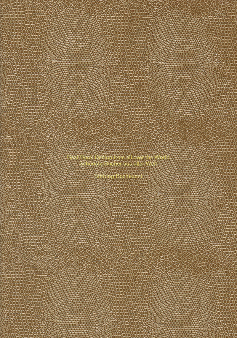
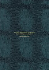
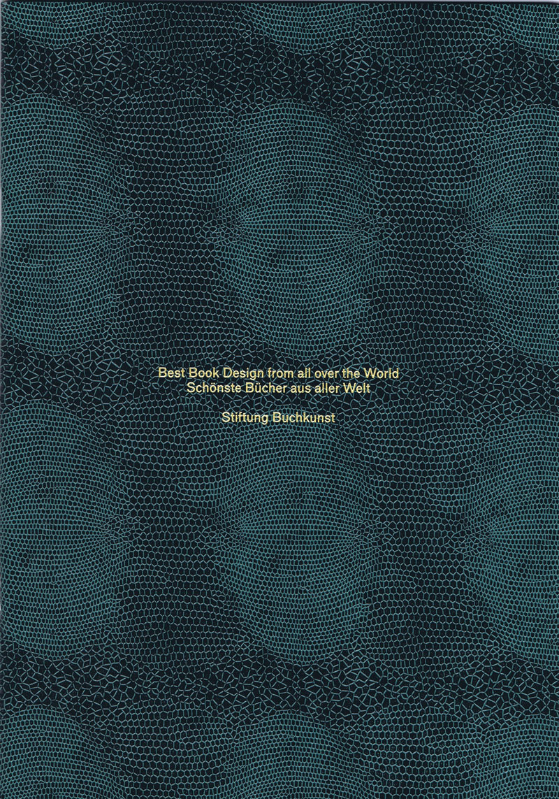
Best Book Design from all over the World - Schönste Bücher aus aller Welt 2019
Technische
Angaben
-
64 S., 30,8x21,5 cm, Auflage: 1.500, 2 Stück. keine weiteren Angaben vorhanden
Drahtheftung; innen mit Metallic-Druck in den Farben Gold, Silber und Bronze; Prägedruck in Schlangenmuster auf dem Umschlag, einmal in grüner und einmal in brauner Ausführung
ZusatzInfos
-
Katalog mit den Gewinnern (Goldene Letter, Goldmedaille, Silbermedaille & Bronzemedaille), den Ehrendiplomen, sowie der Juryliste des Wettbewerbs "Best Book Design from all over the World / Schönste Bücher aus aller Welt" aus dem Jahr 2019, ausgelobt von der stiftung buchkunst.
Der Wettbewerb »Best Book Design from all over the World / Schönste Bücher aus aller Welt« bietet die Möglichkeit internationale Entwicklungen und nationale Unterschiede in der Buchgestaltung zu beobachten und festzuhalten. Von den Einsendungen aus über 30 Ländern werden insgesamt 14 Werke von der internationalen Jury ausgezeichnet. Der internationale Austausch und die gegenseitige Anregung stehen dabei verstärkt im Vordergrund.
Text z.T. von der Webseite.
|
Titel
-
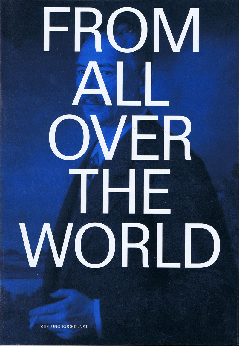
Best Book Design from all over the World 2017
Technische
Angaben
-
[96] S., 30,4x21,3 cm, Auflage: 2.000, keine weiteren Angaben vorhanden
Drahtheftung, eingeklebte Farbbilder, Kunststoff-Schutzumschlag
ZusatzInfos
-
Katalog mit den Einreichungen, den Gewinnern (Goldene Letter, Goldmedaille, Silbermedaille & Bronzemedaille), den Ehrendiplomen, sowie der Juryliste des Wettbewerbs "Best Book Design from all over the World / Schönste Bücher aus aller Welt" aus dem Jahr 2017, ausgelobt von der stiftung buchkunst.
Der Wettbewerb »Best Book Design from all over the World / Schönste Bücher aus aller Welt« bietet die Möglichkeit internationale Entwicklungen und nationale Unterschiede in der Buchgestaltung zu beobachten und festzuhalten. Von den Einsendungen aus über 30 Ländern werden insgesamt 14 Werke von der internationalen Jury ausgezeichnet. Der internationale Austausch und die gegenseitige Anregung stehen dabei verstärkt im Vordergrund.
Text z.T. von der Webseite.
|
Titel
-
Best Book Design from all over the World 2022
Technische
Angaben
-
36 S., 20,9x10,7 cm, Auflage: 1.200, keine weiteren Angaben vorhanden
Drahtheftung, in sich gefaltet, Einband oben gekürzt, Schwarz-Weiß, in Briefumschlag mit Prägedruck und Aufkleber
ZusatzInfos
-
Katalog mit den Einreichungen, den Gewinnern (Goldene Letter, Goldmedaille, Silbermedaille & Bronzemedaille), den Ehrendiplomen, sowie der Juryliste des Wettbewerbs "Best Book Design from all over the World / Schönste Bücher aus aller Welt" aus dem Jahr 2022, ausgelobt von der stiftung buchkunst.
Der Wettbewerb »Best Book Design from all over the World / Schönste Bücher aus aller Welt« bietet die Möglichkeit internationale Entwicklungen und nationale Unterschiede in der Buchgestaltung zu beobachten und festzuhalten. Von den Einsendungen aus über 30 Ländern werden insgesamt 14 Werke von der internationalen Jury ausgezeichnet. Der internationale Austausch und die gegenseitige Anregung stehen dabei verstärkt im Vordergrund.
Text z.T. von der Webseite.
|
Titel
-
Artist Books for a Global World
Technische
Angaben
-
96 S., 33,7x22,6 cm, ISBN/ISSN 978-3-775717373
Hardcover
ZusatzInfos
-
Edited by Chapin Library of Williams College, Williamstown, texts by Robert L. Volz, Wayne G. Hammond.
The books from the Kaldewey Press are important documents of contemporary bookmaking that have been featured in exhibitions all over the world. Since the 1985 founding of his handpress, which Gunnar A. Kaldewey set up in Poestenkill, in upstate New York, over sixty unique artist books have been produced in cooperation with artists such as Jonathan Lasker, Mischa Kuball, or Richard Tuttle. Among the authors are famous names such as Samuel Beckett, Paul Celan, Marguerite Duras, and James Joyce. Published in small limited editions, the books are produced according to the highest level of craftsmanship. Kaldewey does the typesetting and prints the books, sometimes making the paper himself, too. The bookbinding is done by renowned workshops such as Christian Zwang's in Hamburg, or Jean de Gonet's in Paris.
This bibliophilic book is a catalogue raisonné of the books published to date by the press
|
Titel
-
Something Else Press - An Annotated Bibliography
Technische
Angaben
-
88 S., 19,5x22,2 cm, Auflage: 500, 2 Stück. keine weiteren Angaben vorhanden
Softcover, Broschur
ZusatzInfos
-
Dick Higgins, Ein Something Else Manifest
Der 1964 von dem Künstler, Verleger und Theoretiker Dick Higgins gegründete Verlag Something Else Press war einer der ersten amerikanischen Verlage, die sich der Veröffentlichung von Künstlerbüchern widmeten. Der Verlag entstand in einer Zeit intensiver Fluxus-Aktivitäten in New York, als Higgins bei John Cage an der New School for Social Research studierte und eng mit dem Fluxus-Aushängeschild George Maciunas zusammenarbeitete.
In Higgins' Press fanden die Leser einen neuen Raum für das, was ihr Gründer als "intermediale" Werke bezeichnete - Werke, die zwischen verschiedenen Medien angesiedelt waren oder diese übersprangen. Konkrete, visuelle und vorgefundene Poesie, Mail Art, Theaterstücke, Gedichte und Opern, bewusstseinsverändernde Verse, die wie ein Gebetbuch gebunden sind, Poesie-Prosa, die auch als "Sciart" bezeichnet wird, und Romane, die "wie ein Kupferstich aussehen". Diese Werke waren ebenso medien-, format- und fächerübergreifend wie ihre Schöpfer (z. B. der Künstler, Schriftsteller, Philosoph und Wissenschaftler Bern Porter). Es waren, in den Worten von Higgins, "Dinge, die einfach nicht in Ordnung waren, die aber, wie mir schien, ihr Publikum brauchten, die in unserer Welt natürlich erschienen".
Zu den publizierten Künstlern gehören unter anderem John Giorno, Dick Higgins, Alison Knowles, Jackson Mac Low, Bern Porter, Daniel Spoerri, Gertrude Stein, Emmett Williams.
Die Something Else Press war ein von 1964 bis 1974 ursprünglich in Chelsea (Manhattan), New York beheimateter Avantgarde-Verlag für Künstlerbücher, insbesondere des Fluxus. Verlagsgründer war der Künstler Dick Higgins (1938–1998).
Higgins gründete, nachdem es in dieser Zeit mit dem Fluxus-Gründer George Maciunas wegen Verzögerungen einer Buchpublikation zu einem Bruch gekommen war, den Verlag 1964 und veröffentlichte als erste Publikation einen Band mit eigenen Werken (Jefferson's Birthday und Postface).[1] Der Verlag veröffentlichte viele wichtige Texte und Werke von George Brecht (Grundlagentext zum Zufall in der Kunst von 1957), Robert Filliou, Daniel Spoerri (Topographie des Zufalls, in Übersetzung), Alison Knowles, Emmett Williams sowie Dutzende von Vorreitern und Vertretern der Avantgarde wie Richard Huelsenbeck (Dada Almanach), Gertrude Stein (mit amerikanischen Erstveröffentlichungen), John Cage oder Bern Porter.
Die Something Else Press war einer der ersten Herausgeber in den Vereinigten Staaten von Konkreter Poesie und anderen Werken von Fluxus-Künstlern in den 1960er Jahren, wobei die zusammen mit der Edition Hansjörg Mayer, Stuttgart, 1967 von Emmett Williams veröffentlichte Anthology of Concrete Poetry als eine der ersten Übersichten für diese neue Kunstform auch in Deutschland nachhaltiges Interesse fand.
Das Verlagsprogramm zeigte die enge Verbindung zwischen der europäischen und amerikanischen Fluxus-Bewegung in den frühen Jahren. Higgins prägte Mitte der 1960er Jahre den Begriff „Poetry Intermedia“, der dann im Weiteren als Intermedialität Beachtung fand. Die Kombination von hoher Qualität bei vermarktbaren Formaten für eine größere Verbreitung schuf ein Gegengewicht zu den noch, z. B. von Maciunas und anderen, in Handarbeit hergestellten Künstlerbüchern und Buchobjekten als Original, Unikat oder in Kleinstauflagen. Die Strategie war, Bücher mit progressivem Inhalt jedoch mit konventionellem Aussehen zu veröffentlichen, so dass diese auch in normalen Buchhandlungen platziert werden konnten.
In den späten 1960er Jahren arbeiteten für die Something Else Press Künstler wie Emmett Williams, Chefredakteur für die Jahre 1966 bis 1970, Alison Knowles, der Dichter Larry Freifeld, die irisch-amerikanische Schriftstellerin Mary Flanagan und der Maler Ronnie Landfield.
Der Fluxus-Künstler Ken Friedman fungierte als General Manager für Higgins in New York und Kalifornien in den Jahren 1970 und 1971. Während Higgins Haupteigentümer und Verleger blieb, dienten andere als Herausgeber, einschließlich Emmett Williams und Jan Herman. Herman übernahm die Aufgabe im Jahr 1973 und hatte sie bis zur Aufgabe des Verlages ein Jahr später inne. Ursprünglicher Verlagssitz war Chelsea (Impressum: New York, später auch Middelton), der in den 1970er Jahren in das nördlichere Glover (Vermont) (Impressum: West Glover, später Barton) verlegt wurde.
In dem zehnjährigen Bestehen des Verlages veröffentlichte dieser etwas über 60 Werke und 20 Broschüren der Reihe „Great Bear Pamphlet“, Karten, Poster, Newsletter und Ähnliches, die heute noch in Kunstbuch- oder Fluxus-Ausstellungen gezeigt werden. Die ursprünglich als Künstlerbücher vorwiegend von Privatsammlern beachteten Werke fanden durch Schenkungen Eingang in öffentliche Sammlungen, so dass heute eine kunst-, literatur- und musikwissenschaftliche Erschließung möglich ist.
Text aus Wikipedia
|
Technische
Angaben
-
keine weiteren Angaben vorhanden
S Press Nr. 55
|
Titel
-
_957 Independent Art Magazine #00A C-OVER
Technische
Angaben
-
[16] S., 29,5x21 cm, ISBN/ISSN 2296-3057
Drahtheftung, Digitaldruck Schwarz-Weiß, Poster eingelegt, Digitaldruck 4c
ZusatzInfos
-
In 00A sind auf jeder Seite nur Pluszeichen zu sehen. Auf dem zugehörigen Poster sind vereinzelte PLuszeichen, sowie einige Bilder, Fotografien und Memes von denen die Künstler nicht bekannt sind. Diese Ausgabe kam während der Corona-Pandemie raus und war vorerst nur online verfügbar.
|
Technische
Angaben
-
27 Teile. keine weiteren Angaben vorhanden
Diverse Andrucke, Plakate und unbeschnittene Papiere, Makulaturen, handbeschriebenes Packpapier
ZusatzInfos
-
Gefunden auf der documenta 15 Mitte August 2022, Druckerzeugnisse zum Mitnehmen auf Paletten vor der Druckerei.
lumbung Press ist ein Projekt der lumbung member, lumbung-Künstler*innen und des Künstlerischen Teams der documenta fifteen. Im Kern besteht es aus einer kollektiv betriebenen Offsetdruckerei in der documenta Halle, ihren Druckerzeugnissen und den begleitenden Veranstaltungen.Die Idee ist es, einen direkten Fluss von Information durch die unvermittelte Weitergabe von Bildern und Erzählungen zu erzeugen. Die Bearbeitung und Übersetzung außerhalb der Logik der jeweiligen künstlerischen Absicht soll dabei möglichst vermieden werden. lumbung Press startete im Juni 2022 und entwickelt sich im Laufe der documenta fifteen zu einem kollaborativen Raum. ...
Text von der Webseite und soweit die Theorie
|
Titel
-
Druck Druck Druck - Druck Gemeinschaften aus Berlin und darüber hinaus
Technische
Angaben
-
110 S., 24x17 cm, ISBN/ISSN 978-3-944141-25-1
Broschur
ZusatzInfos
-
Die Ausstellung Druck Druck Druck bringt die Druckwerkstatt in die Galerie und schafft Raum für unabhängige Print-Gemeinschaften aus Berlin und darüber hinaus, 13.04.-14.08.2019. Die interdisziplinäre, multi-formatige Ausstellung erforscht wie Druckmethoden verwendet werden können, um radikale Ziele in der Kunst, der Bildung und der Gemeinschaft zu erreichen, kuratiert von Nina Prader und John Z. Komurki.
Neben u.a. dem Mimeographen, ist der Risograph ein Fokus der Ausstellung und versammelt künstlerische Positionen aus ganz Berlin, die den Risographen verwenden. Die größte Ausstellung zu Kunstwerken, die den Risographen feiern seit dem Risofest Berlin 2017. Eine zunehmend beliebte Methode für das unabhängige, künstlerische Drucken und Verlegen.
Text von der Webseite
|
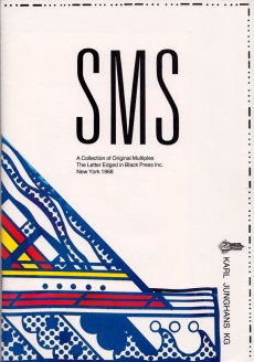
Titel
-
SMS - Shit Must Stop, A Collection of Original Multiples - The Letter Edged in Black Press Inc. - New York 1968
Technische
Angaben
-
29,8x20,6 cm, keine weiteren Angaben vorhanden
Drahtheftung, Rückseite beklebt, Einladungskarte und Anschreiben eingelegt, eingeklebte Originalfotos
ZusatzInfos
-
Katalog zur Ausstellung vom 16.06-22.07.1989
|
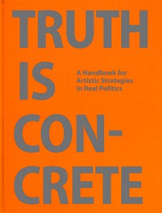
Titel
-
Truth is Concrete - A Handbook for Artistic Strategies in Real Politics
Technische
Angaben
-
336 S., 22x16 cm, ISBN/ISSN 978-3-943365849
Hardcover, Leinen, 2 Lesebändchen
ZusatzInfos
-
Herausgeber: steirischer herbst. Mitherausgeber Anne Faucheret, Veronica Kaup-Hasler, Kira Kirsch, Andreas R. Peternell, Johanna Rainer.
Essays von Stephen Duncombe und Steve Lambert, Alanna Lockward, Florian Malzacher, Chantal Mouffe, Gerald Raunig, Jonas Staal.
|
Titel
-
Security - Partition - mobile f 1-u.zip 2-u.zip stop
Technische
Angaben
-
[12] S., 21x14,8 cm, Auflage: Print on Demand, keine weiteren Angaben vorhanden
Drahtheftung, Softcover, Digitaldruck
|
Technische
Angaben
-
50 ca. S., 13x30 cm, ISBN/ISSN 9780953306107
ZusatzInfos
-
Produced for following exhibitions at the Archtectural Association PhotoLibrary, London, and the Urbanissue Gallery, Berlin.
Over a period of twenty-eight minutes and thirty-eight seconds, the artists photographed pedestrians with a camera "adapted so that it had an open slot of one millimetre as its aperture. Behind this the film is run in a single exposure over a set time, that is at a set speed, usually about fifteen to forty seconds. the camera is still, only the film moves. How should one describe the results?" asks Mark Cousins in the essay included in this paperback book of unusual black and white photographs. 29 June 2009 (printedmatter.org)
|
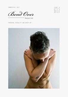
Titel
-
Bend Over Magazine Issue 6
Technische
Angaben
-
64 S., 21x14,8 cm, keine weiteren Angaben vorhanden
Magazin für feminism, sexuality and queer art
|
Technische
Angaben
-
90 S., 29,6x20,9 cm, Auflage: 400, ISBN/ISSN 978-3-868740097
Broschur. Mit Sticker auf dem Cover
ZusatzInfos
-
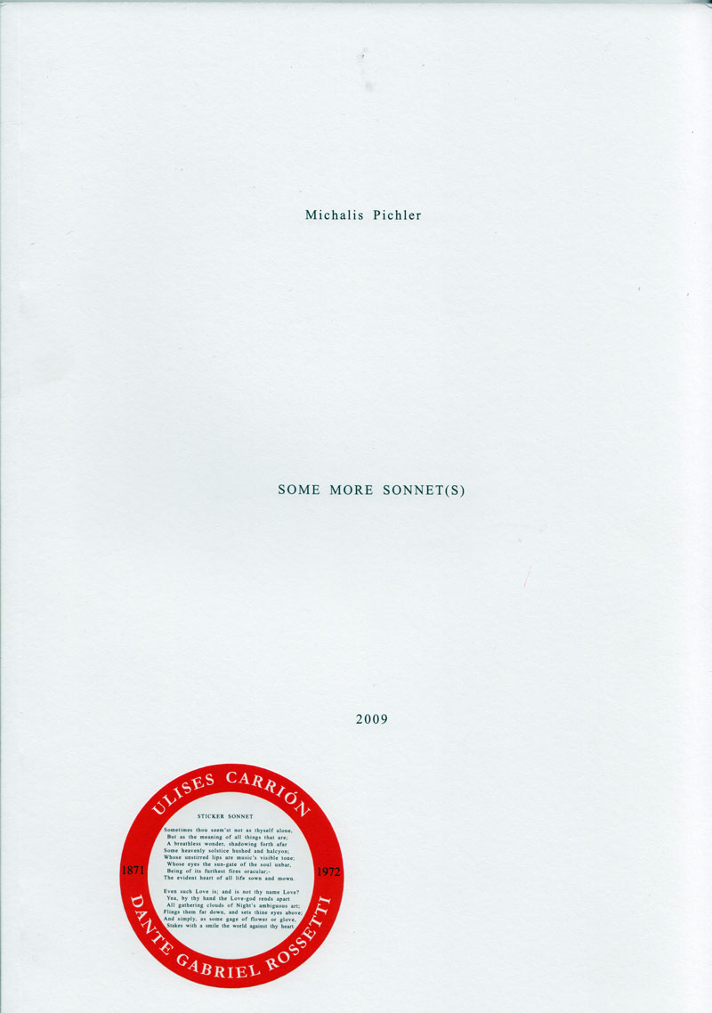
In 1972, Ulises Carrión produced his first artist's book "SONNET(S)" which consists of a 44 variations of a sonnet by Dante Gabriel Rosetti titled "Heart"s Compass".Using the langage like a material, Carrión writes Rossetti's poem over and over again on a typewriter, in slightly different versions. This book today is considered Carrión’s first “artists book”, where he still uses language, but quite differently.
In 2009 Michalis Pichler, in a similar approach but using a computer, probably word or open office, created 44 new variations and published a book titled "SOME MORE SONNET(S)". - On the last page of this book announced a multitude of OTHER SONNET(S), mostly imaginary.
Text von der Webseite
|
Titel
-
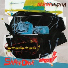
Murena Murena - Game Over
Technische
Angaben
-
2 S., 9,8x9,8 cm, keine weiteren Angaben vorhanden
Flyer
ZusatzInfos
-
Artwork von Boban Andjelkovic. Murena Murena aka Daniel Murena, Tagar, Dizzy Errol und Albert Pöschl zum Release ihres neuen Albums Shame Over
|
Titel
-
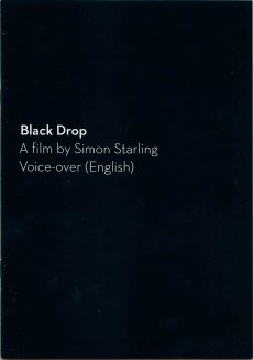
Black Drop - Ein Film von Simon Starling, Voice-over (deutsch) / A film by Simon Starling, Voice-over (Englisch)
Technische
Angaben
-
20 S., 21x14,8 cm, Auflage: 500, 2 Stück. keine weiteren Angaben vorhanden
Drahtheftung, Wendeheft
ZusatzInfos
-
Heft zum Film "Black Drop" von Simon Starling. Der Film bildet eine zentrale Arbeit in der Ausstellung "As with all bright constellations" vom 23.06.-18.10.2016 in der Lothringer13 Halle. Off-Kommentar auf deutsch und Englisch im Heft abgedruckt.
Black Drop (2012) verknüpft auf vielschichtige Weise das Ereignis der seltenen Venuspassage und astronomische Historie mit der Entstehung und Ära des analogen Filmbildes, des Kinos
|
Titel
-
Books on Fire - the documentation of the Renegade Library
Technische
Angaben
-
72 S., 13,8x21,5 cm, keine weiteren Angaben vorhanden
Drahtheftung, farbiger Einband, Exlibris und braune Papiertüte mit Einstecker eingeklebt
ZusatzInfos
-
Katalog und Lieferverzeichnis zur Ausstellung in der Art Gallery of Southwestern Manitoba, 02.07.-21.08.1998.
Renegade Library was a major mail art project that challenged artists in the networks to collaboratively use postal systems to produce and circulate books, zines, book-objects, artists books, multiples and more. Over 700 artists participated, and over 500 artists books were produced.
Text von der Website
|
Titel
-
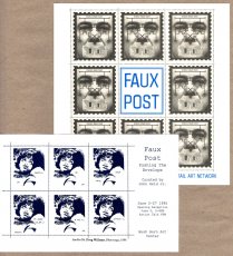
Faux Post - Artists' Postage Stamps from the International Mail Art Network
Technische
Angaben
-
6 S., 21,5x21 cm, keine weiteren Angaben vorhanden
Info-Heft, Flyer beigelegt, bedruckt mit Künstlerbriefmarken
ZusatzInfos
-
Faux Post features the work of over fifty historical and contemporary figures from over twenty countries. Many different media are represented includig: painting, rubber stamps, color photocopies, engravings, computer manipulated images, photography, hand-made paper, offset lithography, collage and found materials. The exhibition is drawn from the Modern Realism Archive (Dallas, Texas) of curator John Held Jr.
|
Technische
Angaben
-
[148] S., 32,6x25,4 cm, ISBN/ISSN 3865211224
Hardcover mit Leineneinband und Prägedruck.
ZusatzInfos
-
Anlässlich der gleichnamigen Ausstellung von Paulo Nozolino im Museu de Arte Contemporanea de Serralves, Porto, 07.05.-10.07.2005.
Paulo Nozolino only makes black and white photographs and they are dominated by an impossible darkness that seems impenetrable to light. The photographs were made all over the world - notably in countries of the Arab world - but in the majority of cases it would be difficult to attribute a specific location to them.
Photographs from Auschwitz are the decisive exception. Auschwitz appears as the absolute place and time that orientates everything else. In thirty years of a career as a photographer, Nozolino has constantly intensified his tragic vision of reality: this is visualised in pictures that originate from his own biography and travels. in pictures of men, women and children. in pictures of birth, love making and death.
This publication assembles for the first time photographs from Nozolino's different projects over the years, to form a new narrative, untold until now: the narrative of beginning and ending, and at the same time the narrative of his life's work.
Text von der Webseite
|
Technische
Angaben
-
323 S., 36,4x26x3,5 cm, keine weiteren Angaben vorhanden
Ota-Bindung mit aufklappbarem Schutzumschlag
ZusatzInfos
-
Katalog zur gleichnamigen Ausstellung in der Fondadtion Cartier pour l'Art Contemporain, Paris, 30.03.-10.06.2018.
In Freeing Architecture, Ishigami elaborates upon his most recent research into function, form, scale and the environment in architecture, thereby revealing his vision for the future of the field. Through over 40 models, as well as numerous films and drawings, the exhibition presents twenty projects from their genesis to the complex process of their realization. Far from being tools prior to construction, the models assembled in the exhibition were made specifically for the occasion. As viewers contemplate these hand-crafted works, assembled in the architect’s studio over the course of one year, one can see the many steps and the painstaking work that led to the development of their final form. All different in terms of their material, size and level of detail, they offer a glimpse of the slow maturation process, necessary for the creation of Ishigami’s architectural works. Works infused by a poetics that is achieved as much through experimentation, as it is by theory, knowledge, and technology.
Text von der Webseite
|
Technische
Angaben
-
[2] S., 17x12,2 cm, keine weiteren Angaben vorhanden
Postkarte, beidseitig bedruckt
ZusatzInfos
-
Einladungskarte zur Ausstellung Written Room in der Galerie Karin Sachs vom 15.09.-27.10.2018.
The Persian script is turned into an ornament. Covering the white walls of the museums, the characters serve Forouhar as “paper” for her own text. The room becomes a “written room”. Whereas the white walls of the gallery room are raised to a universal norm and an unmarked instance, the Oriental ornament stands for difference or the deviating.
The writing is also strange, if not alien, because it is illegible for Western visitors – as an “incomprehensible” text it becomes a pure ornament. In defying attempts by Western visitors to assign its meaning, the script remains locked into its irreducible pictorial graphicness and indissoluble representation. The meaning cannot be grasped. at best, the inscribed ping-pong balls, which cover the base of the installation, can be grasped in the tactual sense. The legibility is made even more difficult by the movement of the ping-pong balls, which due to their spherical form also offer no stable vertical or horizontal reading axes. they form new patterns over and over again, are always in motion, and become incoherently disjointed.
Even if one has a command of Persian, the characters prove to be nothing more than word fragments and syllables, which are not subject to a linear order. The script ornamentation covers the whole room. Viewers entering the rooms are surrounded by patterns, forcing them to give up their sovereign, distanced standpoint.
Text von der Website der Künstlerin.
|
Titel
-
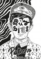
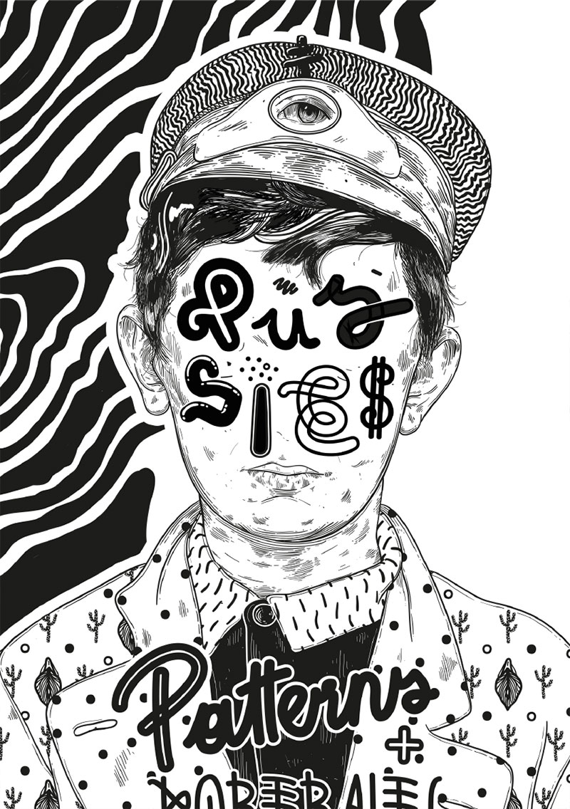
Pussies, Patterns and Portraits
Technische
Angaben
-
106 S., 21x14,8 cm, Auflage: Print on Demand, keine weiteren Angaben vorhanden
Broschur
ZusatzInfos
-
Schwarz-Weiß-Drucke, Nr. 011 aus der Reihe 100for10.
David Leitner is a painter and illustrator based in Vienna. Over the last years he has worked with and for various brands and agencies, such as Jung von Matt, Absolut Vodka, Makava, Faux Fox etc. His work has been shown in group and solo shows all over Europe.
|
Titel
-
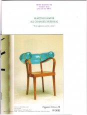
MONO.KULTUR #32 Martino Gamper - All Channels Personal
Technische
Angaben
-
56 S., 20x15 cm, ISBN/ISSN 18617085
Drei Hefte in verschiedener Größe broschiert, mit Drahtheftung
ZusatzInfos
-
Martino Gamper is the kind of product designer we all have been waiting for: Brimming with ideas, energy and humour, his designs are disarmingly irreverent and irresistibly fun, and unlike anything one will see in the puristic galleries of contemporary design. Crossing over from studying sculpture to completing an MA in product design at the prestigious Royal College of Art under Ron Arad, Gamper has had little time to worry over the theoretical do’s and don’t’s of his profession – instead, he has followed a simple rule of learning by doing, meaning: the more you do, the more you learn. With mono.kultur, Martino Gamper talked about his idea of fun, why a chair is the ultimate challenge and what design has in common with cooking. Visually, the issue is bursting with references and ideas, reclaiming image material from left and right, while unveiling the structure of a book with three booklets of different sizes all lovingly assembled into one – and manually at that, which makes for some rough edges or rather what we like to call extra personality.
Text von der Website.
|
Titel
-
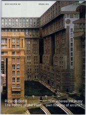
MONO.KULTUR #36 Ricardo Bofill - The Future of the Past
Technische
Angaben
-
48 S., 20x15 cm, ISBN/ISSN 18617085
Drahtheftung, gedruckt auf verschiedenen Papieren
ZusatzInfos
-
where to begin with an architect as over the top as Ricardo Bofill, notorious since the 1970s for his vast city-like housing estates that look like surreal experiments in crossbreeding desert caves with Star Wars. an architect who has designed over 1000 projects in the space of five decades, from perfume bottles to city plans, and pretty much everything in between. who has worked in a style – or a hundred styles – that is as unique as it is impossible to describe. who founded a leftist collective that would eventually end up building airport terminals. whose life reads somewhat like a fairytale itself, taking us from fascist Spain under Franco’s rule to the celebrity frenzy of our modern times, with the Bofill clan holding a somewhat unique position among Spanish tabloids? To add any more is to inevitably leave out too much. With mono.kultur, Ricardo Bofill talked about fifty years of architecture, the vagaries of ambition and how Modernism killed the city. Visually, the issue offers a disorienting journey of architectural splendour with plenty of previously unpublished images from the archives of Ricardo Bofill (as well as the odd film still of naked bodies). Using partial high gloss varnish throughout, it is a pleasing juxtaposition of the natural and the artificial, the intellectual and the sexual, the disciplined and the decadent.
Text von der Website.
|
Technische
Angaben
-
20,3x25 cm, Auflage: 10, numeriert, signiert, keine weiteren Angaben vorhanden
Originalarbeit
ZusatzInfos
-
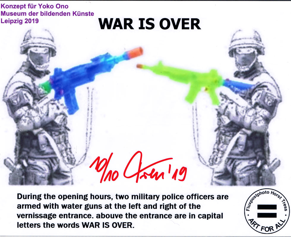
Konzept für Yoko Ono, Museum der bildenden Künste Leipzig 2019: During the opening hours, two military police officers are armed with water guns at the left and right of the vernissage entrance. abouve the entrance are in capital letters the words WAR IS OVER.
Text vom Bild
|
Technische
Angaben
-
256 S., 24x16 cm, ISBN/ISSN 18676510
Klappbroschur. Cover zum Teil drucklackiert. Verschiedene Papiere.
ZusatzInfos
-
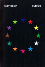
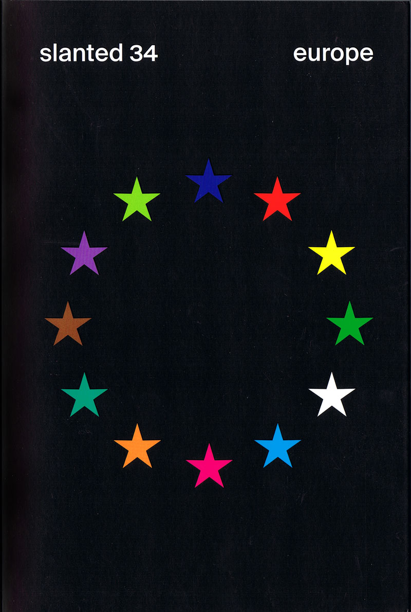
Last year, Slanted editor in chief Lars Harmsen visited the Venice Biennale with his students from the Dortmund University of Applied Sciences and Arts, together with students from universities in ltaly, Spain, and Turkey. They worked on the theme Behind the Scene-with the aim of directing the observer's gaze to "the foreign" and "the other," to better define one's own positions, and to breakdown prejudices. ...
For this issue, we invited over 300 designers, authors, and activists from all over Europe. As Jonny Leya (Traumnovelle) says, we "really don't
want to imagine a Europe divided again, even if it's the direction being taken everywhere ... So let's try to be more involved."
Textauszug vom Klappentext
|
Titel
-
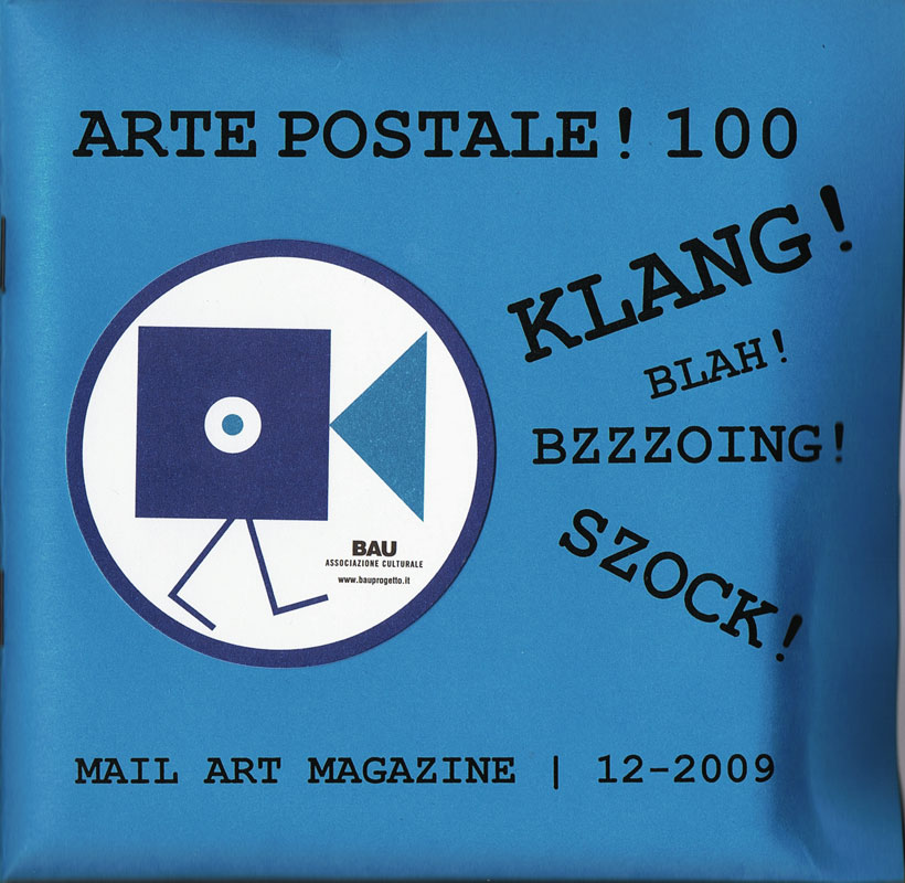
Arte Postale! 100 - Klang! Blah! Bzzzoing! Szock!
Technische
Angaben
-
36 S., 14,5x15 cm, Auflage: 100, keine weiteren Angaben vorhanden
Drahtheftung, im Umschlag vorne 3 Booklets und 1 gefaltetes Poster (Klang! Suoni Contemporeani) in Einschubtasche, rückseitig eine selbstgebrannte und -gestempelte Multimedia CD, Heftseiten Schwarz-Weiss Kopien mit 4 eingeklebten Farbbildern, auf dem Cover das Klang! Logo ebenfalls aufgeklebt
ZusatzInfos
-
ARTE POSTALE! (1979-2009)
One of the best known and probably the most long-live mail art magazine on the planet, Arte Postale! has assembled original works or published materials by hundreds of international networkers. The project is considered concluded with issue n.100 (december 2009).
Text von mailartprojects.blogspot.com
When, just over twenty, I was assembling the first issue of the magazine Arte Postale!, joining with brass rings a dozen of sheets printed in one hundred copies on pink paper, I would never have imagined that thirty years later I would have been still busy putting together with scissors and glue the very same publication. Instead, this issue n. 100, intentionally produced in the homemade cut-and-paste style typical of mail art, even shares the musical theme with that first experiment, in which I already rubberstamped and glued leaflats on the pages or I stapled on them a piece of magnetic tape.
Introduction by Vittore Baroni
Issue no. 100 of Vittore Baroni's Arte Postale! magazine dedicated to the Klang! exhibition/sonic arts festival held in Viareggio, Italy, august 7-9 2009.
36 pp. booklet with attached cd-r, published in 100 copies (standard edition, in the AAP) plus 100 copies with additional plastic pouch including 30 original cd-size works by 30 artists (Joel S. Cohen, David Dellafiora, Mike Dickau, Carol Stetser, Ruggero Maggi, Emilio Morandi, Jan-Willem Doornenbal, Ever Arts, Luc Fierens, Richard Kostelanetz, Jurgen O. Olbrich, Gianni Simone, Rod Summers, Bruno Cassaglia, Ruggero Maggi, Serse Luigetti, etc.
Among them comes a CD mini-album by Jarmo Sermilä: Mechanical Partnership, a complimentary copy of the official Jase 2000 release - see Jarmo Sermilä - Mechanical Partnership.
Text von discogs Webseite
Audio
1. Mike Dickau - Arte Postale!: Pax Vobiscum (2’54”)
2. Günther Ruch - Musica 123456 (2’09”)
3. Reid Wood - Future Sound (0’27”)
4. Krell - Bzzzoing! (5’00”)
5. Franco Piri Focardi - Concerto Per Bozuffo (3’41”)
6. Jan Willem Doornenbal - Lake Crocodile (2’16”)
7. Bruno De Angelis - 100: Game Over! (4’ 30”)
8. Joel Cohen - Last Song Reverse (2’17”)
Tempo Totale | Total Time: 23’54”
|
Technische
Angaben
-
140 S., 25x21,4 cm, ISBN/ISSN 978-1-907840104
Gelochte Seiten mit Musterbeutelklammern zusammen gehalten, in Klappumschlag, mit 18 roten Punkten beklebt. Innen teils andere Papiere
ZusatzInfos
-
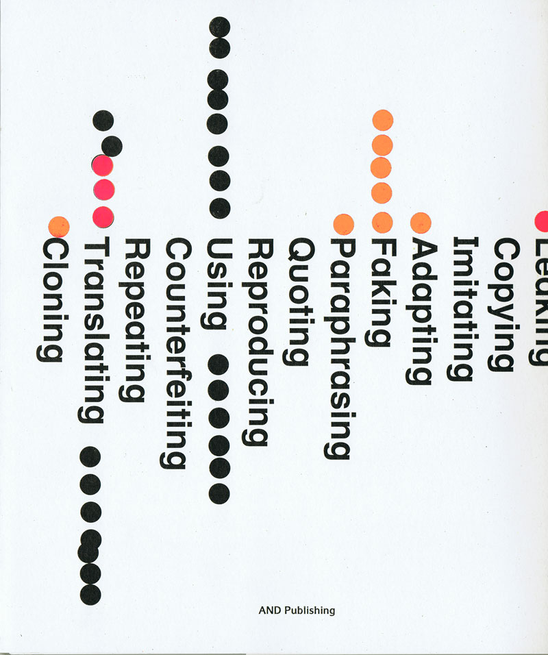
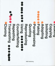
The Piracy Project is an international publishing and exhibition project exploring the philosophical, legal and practical implications of book piracy and creative modes of reproduction. Through research and an international call for submissions, the Project has gathered a collection of more than 150 modified, appropriated and copied books from all over the world. The collection, which is catalogued online, is the starting point for talks and work groups around the concept of originality, the notion of authorship and politics of copyright. The Piracy Project is not about stealing or forgery. It is about creating a platform to innovatively explore the spectrum of copying, re-editing, translating, paraphrasing, imitating, re-organising, manipulating of already existing works. Here creativity and originality sit not in the borrowed material itself, but in the way it is handled. The Piracy Project is an collaboration between AND Publishing and Andrea Francke. The Piracy Project The Piracy Project is an international publishing and exhibition project exploring the philosophical, legal and practical implications of book piracy and creative modes of reproduction. Through research and an international call for submissions, the Project has gathered a collection of more than 150 modified, appropriated and copied books from all over the world. The collection, which is catalogued online, is the starting point for talks and work groups around the concept of originality, the notion of authorship and politics of copyright. The Piracy Project is not about stealing or forgery. It is about creating a platform to innovatively explore the spectrum of copying, re-editing, translating, paraphrasing, imitating, re-organising, manipulating of already existing works. Here creativity and originality sit not in the borrowed material itself, but in the way it is handled. The Piracy Project is an collaboration between AND Publishing and Andrea Francke.
Text von der Webseite
|
Titel
-
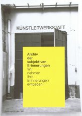
Archiv der subjektiven Erinerungen
Technische
Angaben
-
2 S., 21x14,8 cm, 2 Stück. keine weiteren Angaben vorhanden
Infokarte
ZusatzInfos
-
Teil der Ausstellung over 13 reflections on an art space 10.10.2020-31.01.2021 in der Lothringer 13 Halle, mit Präsentation von Archivmaterialien und einem Empfangsbüro, zum Abgeben persönlicher Erinnerungsstücke zur Lothringer 13
|
Technische
Angaben
-
31x31 cm, keine weiteren Angaben vorhanden
LP in weißer Schutzhülle in farbig bedruckter Papphülle
ZusatzInfos
-
12" Vinyl Compilation Album. Unveröffentlichte und exklusive Songs der besten Münchner Punkbands des Jahres 2001.
Diese Idee wurde später wieder aufgegriffen mit der Sampler-Reihe 'M-Punks United' 2006 und 2007.
Text von der Website
|
Technische
Angaben
-
[64] S., 24x16 cm, ISBN/ISSN 978-3-86930-791-6
Broschur, Klebebindung
ZusatzInfos
-
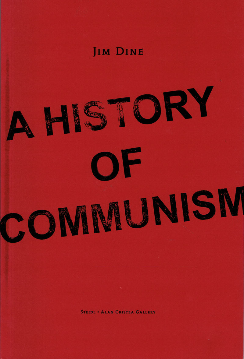
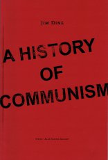
"This “history” came about because my friends, Sarah Dudley and Ulie Kuhle, litho printers in Berlin, were given about 100 litho stones from a former Socialist art academy in what was the D.D.R. The stones all had images on them drawn by forty years of students under the oppressive regime. I asked them to reactivate the stones and print them on Zerkall Paper 450 g/m². Most images I chose of the 100 were able to have life breathed into them. We had finally forty-five images. They editioned the lithographs and then sent them to us in Walla Walla, Washington. I drew and ground and bit copper plates to go over them. I wanted a black view of the image and a sense of Berlin in the East as I knew it when the horrible wall was still up. The etchers who came to work with me every summer over two and a half years have coaxed the exact mood I wanted out of the plates." Jim Dine
"Diese "Geschichte" entstand, weil meine Freunde Sarah Dudley und Ulie Kuhle, Lithograph in Berlin, etwa 100 Lithosteine aus einer ehemaligen sozialistischen Kunstakademie in der ehemaligen DDR erhielten. Auf den Steinen befanden sich Bilder, die vierzig Jahre lang von Studenten unter dem Unterdrückungsregime gezeichnet wurden. Ich bat sie, die Steine zu reaktivieren und sie auf Zerkall-Papier 450 g/m² zu drucken. Den meisten der 100 Bilder, die ich auswählte, konnte ich Leben einhauchen. Wir hatten schließlich fünfundvierzig Bilder. Sie gaben die Lithografien in einer Auflage heraus und schickten sie dann zu uns nach Walla Walla, Washington. Ich habe gezeichnet, geschliffen und Kupferplatten gefertigt, um sie immer wieder nachzuzeichnen. Ich wollte eine schwarze Ansicht des Bildes und ein Gefühl von Berlin im Osten, wie ich es kannte, als die schreckliche Mauer noch stand. Die Ätzer, die zweieinhalb Jahre lang jeden Sommer mit mir gearbeitet haben, haben den Platten genau die Stimmung entlockt, die ich wollte." Jim Dine
Text aus dem Buch
|
Titel
-
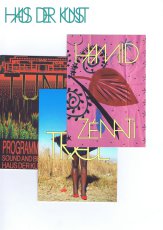
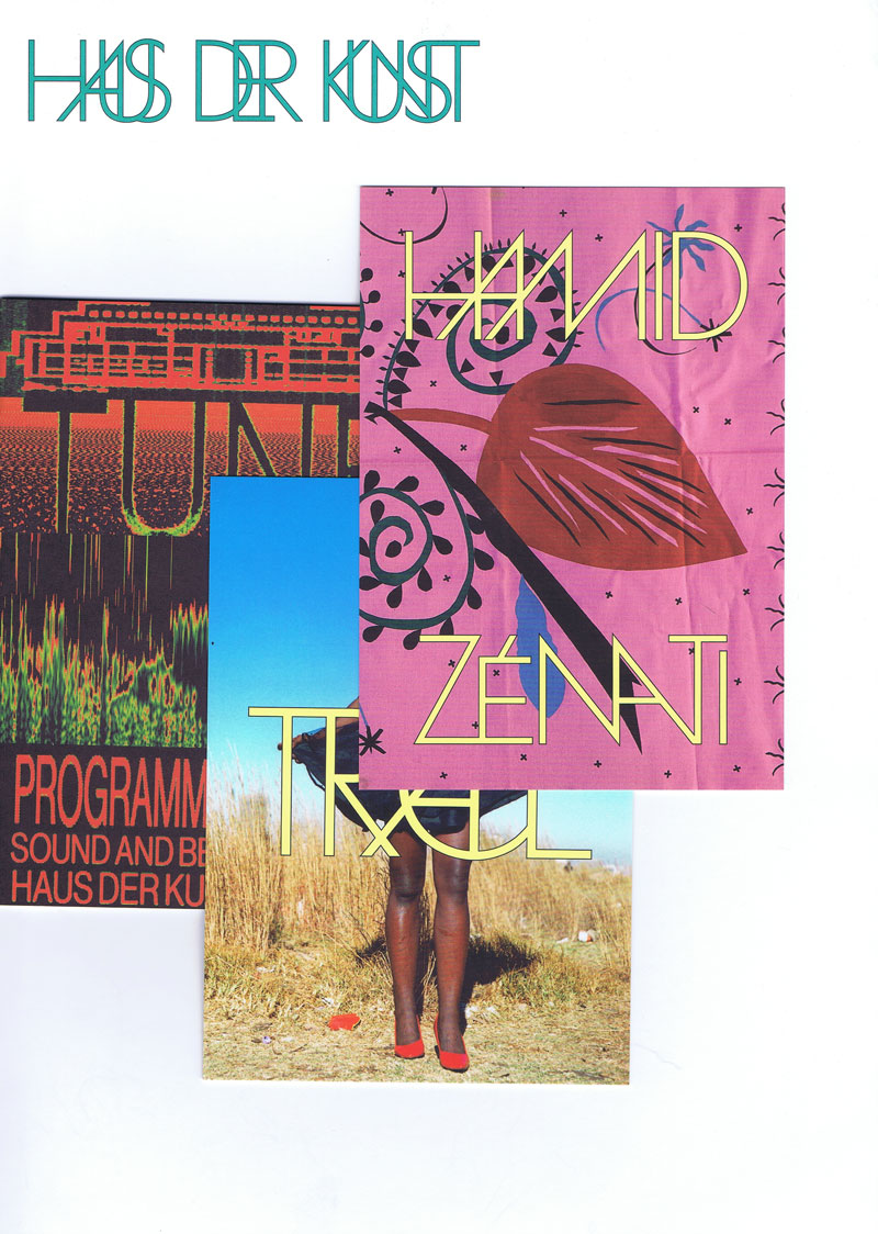
Pressemappe zu Tune, Trace und Hamid Zénati
Technische
Angaben
-
30,5x22 cm, keine weiteren Angaben vorhanden
Mappe mit geklammerten Pressetexten, geklammerte Image Sheets, Flyer, Visitenkarte, Programmheft
ZusatzInfos
-
Pressemappe zur Ausstellung "Trace", Fotografie und Video aus der The Walther Collection vom 14.04.-23.07.2023 und zur Ausstellung Hamid Zénati "All-Over" vom 16.03.-23.07.2023 sowie das Programmheft "Tune" von Februar bis Mai 2023 zu den Musikprojekten des Haus der Kunst, München.
|
Technische
Angaben
-
20x12 cm, 3 Teile. keine weiteren Angaben vorhanden
Zine und Karten verpackt in einer Hülle für Videokasette
ZusatzInfos
-
An experimental body of work conducted over ten days that explores themes of femininity, intimacy, nudity, eroticism, beauty, and body image through self-portrait photography as a medium of expression and a creatively printed zine as its format.
The visuals capture the beauty and sensuality of femininity, intertwining the author’s personal interpretation of the sensory experience of her body and the sensitivity of her mind with a critique of societal perspectives over the last hundred years. These perspectives, though influenced by ethical progress, have often ridiculed and degraded the essence of femininity, reducing it to trivial, denaturalized, or even grotesque aspects.
The black-and-white veil symbolizes the timelessness of the theme, while the zine’s format mimics a vintage erotic videotape, complete with "bonus visuals" reminiscent of retro collectible postcards. This design evokes the commodification of a natural human characteristic and critiques the enduring, market-driven objectification of femininity.
|
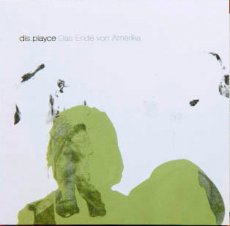
Titel
-
NASU 10 - Das Ende von Amerika
Technische
Angaben
-
13x13 cm, keine weiteren Angaben vorhanden
Musik-CD in Papphülle und transparenter Kunststoffhülle, cover art: Stephane Leonard & Martin Eichhorn
ZusatzInfos
-
recorded in 2006, mastered at ICEM in 2007.
We are very proud to announce our 10th release !!! and what makes it even better is that it´s a new dis.playce album!
The EP is called ´Das Ende von Amerika´ (The End of America) and it´s dis.playce´s second release on naivsuper. The title refers to the book ´Amerika´ by Franz Kafka and should not be interpretated in the wrong way)
´Amerika´, also known as ´Der Verschollene´ or ´The Man Who Disappeared´, was the incomplete first novel by Franz Kafka, published posthumously in 1927.
The story describes the bizarre wanderings of a sixteen-year-old European emigrant named Karl Rossmann in the United States, who was forced to go to New York to escape the scandal of his seduction by a housemaid.
Hope originates when something else is absent and holes need to be filled again. The purpose of hope is to make itself vanish again and to reach a state of mind where Utopia or the promised land of North America won´t be needed anymore.
Kafka puts his hero Karl Rossmann over and over again in situations where he is lacking something only to discover that he is lacking even more. The spiral of hope, disappointment and reproaches seems to be endless. With ´Amerika´ Kafka finishes a series of America-fiction from the 19. Century which glorified the United States as the land of boundless possibilities. For Kafka America is not the solution of our problems anymore, it is almost like a second Europe - a land where the problems stay the same.
´Das Ende von Amerika´ is one 24 minute piece published on high quality CDRs
|
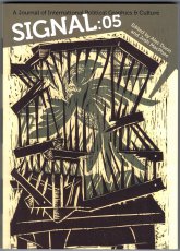
Technische
Angaben
-
180 S., 17,8x12,8 cm, ISBN/ISSN 9781629631561
Broschur
ZusatzInfos
-
Highlights of the fifth volume of Signal include: The Club de Grabado de Montevideo: Georgia Phillips-Amos unearths printmaking under dictatorship, Three Print Collectives: Alec Dunn interviews Friends of Ibn Firnas, A3BC, and the Pangrok Sulap collective, Survival by Sharing—Printing over Profit: Josh MacPhee interviews Paul Werner about the history of New York City's Come!Unity Press, The Pyramid's Reign: Analyzing an enduring symbol of capitalism with Eric Triantafillou, Empty Forms—Occupied Homes: Marc Herbst looks at the intersection between movement design and the struggle for housing in Barcelona, Discs of the Gun: A trip through music and militancy in postwar Italy by Josh MacPhee
Text von der Website.
|
Titel
-
Anonymous Press No. 15766 - Various Small Dicks
Technische
Angaben
-
12 S., 20,3x13,4 cm, keine weiteren Angaben vorhanden
Drahtheftung, Schwarz-Weiß-Laserdrucke, Umschlag aus farbigem Papier
ZusatzInfos
-
Das Konzept:
1. Anonymous Press (Α,–Π,) is a self-sufficient publishing platform.
2. Every publication by Α,–Π, is a byproduct of an individual and a database, i.e. Google Image Search.
3. Human author defines the topic, the content and the form is generated from the most relevant images found online.
4. Each publication is added to a public library.
5. Every item in the library can be printed on-demand and is available to everyone for a small fee covering shipping and production costs.
6. Publications are sorted in a chronological order.
7. Α–Π does not own, nor is responsible for the content generated by its users.
Text von der Webseite
|
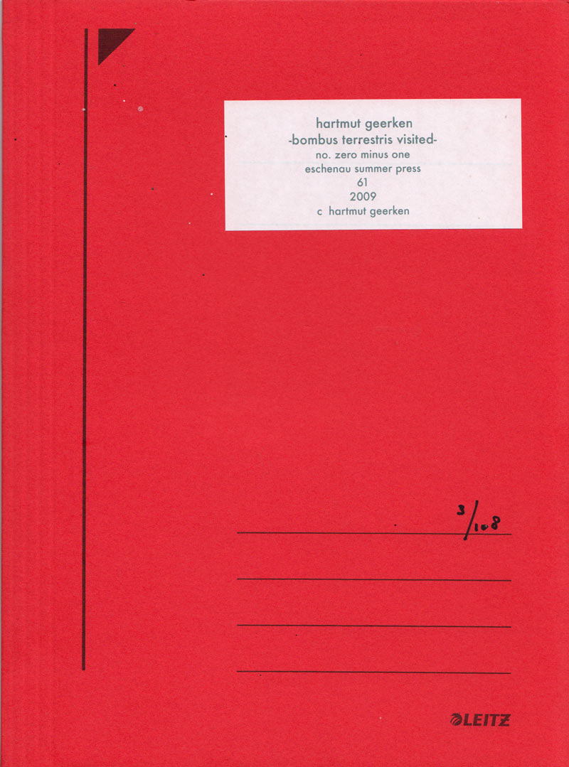
Titel
-
bombus terrestris visited no. zero minus one
Technische
Angaben
-
24,8x18,6 cm, Auflage: 108, numeriert, signiert, keine weiteren Angaben vorhanden
Partitur, gefaltet & Audio-CD in rotem Sammelhefter
ZusatzInfos
-
eschenau summer press 61. The eschenau summer press & temporary travelling press publications,
herman de vries publisher
|
Titel
-
Punk Press - Rebel Rock in the Underground Press 1968-1980
Technische
Angaben
-
240 S., 34x22,5 cm, ISBN/ISSN 978-1-419706292
Broschur mit Klappumschlag
ZusatzInfos
-
Punk was born on the East Coast in the late 1960s, later crossing the Atlantic and exploding in London and Paris. This dynamic countermovement churned out heaps of professional magazines and photocopied, hand-stapled fanzines, all expressing ideas on music, art, and current events. By creating its own press, the punk movement secured its place in the history of 20th-century culture. Featuring collages, cutouts, and handcrafted typography, Punk Press compiles the stunning graphics created by these publications, spanning from the East Village to East London to the Left Bank. With unforgettable images of punk’s greatest bands—the Ramones, the Sex Pistols, the Clash, the Dead Kennedys, Iggy Pop, and more—this is a captivating look at some of music’s most fascinating personalities and greatest talents.
Text von der Webseite
|
Titel
-
AAP Archiv Künstlerpublikationen / Archive Artist Publications - Haus der Kunst, Archiv Galerie 2018-2019, Archives in Residence - Vitrine 2 Künstlerpublikationen mit Münchenbezug
Technische
Angaben
-
[2] S., 29,7x42 cm, Auflage: 300, 2 Stück. keine weiteren Angaben vorhanden
Techn. Angaben, Infoblatt zur Wandpräsentation und zur 2. Vitrinenausstellung mit Künstlerpublikationen mit Münchenbezug
ZusatzInfos
-
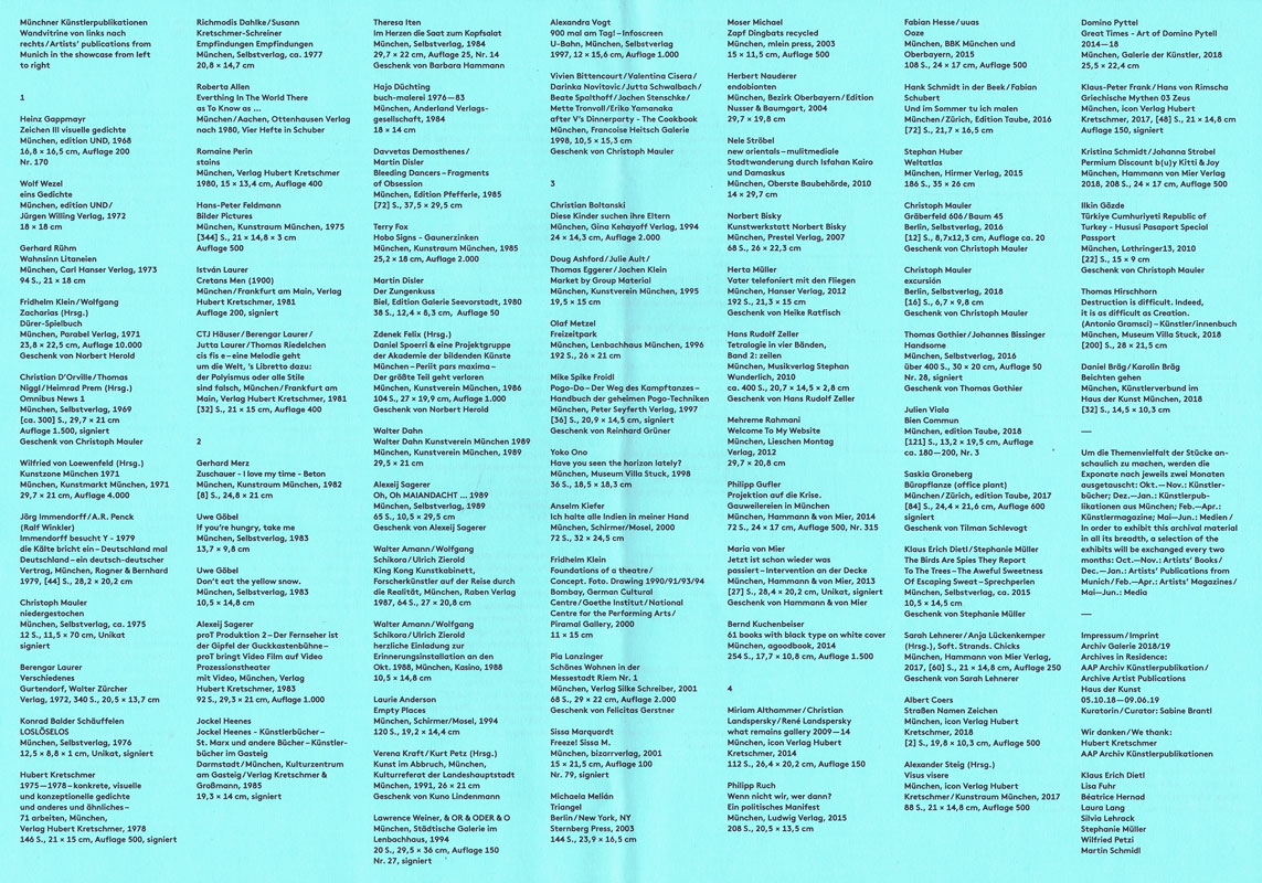
Listen der Titel zur Vitrine 2, Münchner Künstlerpublikationen, Ausstellung in der Archiv Galerie im Haus der Kunst, ab 18.12.2018, 76 Titel aus den Jahren 1968-2018, kuratiert von Sabine Brantl.
Bücher aus den Verlagen agoodbook, Anderland Verlagsgesellschaft, BBK München und Oberbayern, bizarrverlag, Carl Hanser Verlag, Edition Galerie Seevorstadt, Edition Nusser & Baumgart, Edition Taube, edition UND, Francoise Heitsch Galerie, Galerie der Künstler, Gina Kehayoff Verlag, Goethe Institut, Hammann & von Mier, Hammann von Mier Verlag, Hanser Verlag, Hirmer Verlag, icon Verlag Hubert Kretschmer, Jürgen Willing Verlag, Kasino, Kulturreferat der Landeshauptstadt München, Kulturzentrum am Gasteig, Künstlerverbund im Haus der Kunst München, Kunstraum München, Kunstverein München, Lenbachhaus München, Lothringer13, Ludwig Verlag, mlein press, Museum Villa Stuck, Musikverlag Stephan Wunderlich, National Centre for the Performing Arts, Oberste Baubehörde, Ottenhausen Verlag, Parabel Verlag, Peter Seyferth Verlag, Piramal Gallery, Prestel Verlag, Raben Verlag, Rogner & Bernhard, Schirmer/Mosel, Selbstverlag, Städtische Galerie im Lenbachhaus, Sternberg Press, Verlag Hubert Kretschmer, Verlag Kretschmer & Großmann, Verlag Silke Schreiber, Walter Zürcher Verlag
|
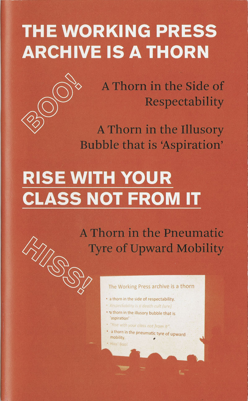
Titel
-
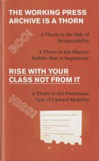
RISE WITH YOUR CLASS NOT FROM IT
Technische
Angaben
-
82 S., 20,2x12,3 cm, Auflage: 200, ISBN/ISSN 9780957682870
Blätter lose mit Gummiband zusammen gehalten
ZusatzInfos
-
The fruit of a collaboration with artist/activist/creator of the Working Press archive Stefan Szczelkun and keeper archivist Rebekah Taylor.
Rise with your class not from it represents a lasting trace of and a vehicle for the Working Press project whose archive is now housed in UCA library special collections in Farnham. It highlights some important works by working-class artists while providing a valuable resource for anybody interested in working with archive material.
Working Press is a collective publishing imprint, which had the subtitle books by and about Working Class Artists, 1986-1996. Working Press includes the first computer generated comic (Harwood), the first book by Micheline Mason (disability and inclusion artist), and the first book about Greenham Common Yellowgate (Beth Junor).
Text von der Webseite
|
Technische
Angaben
-
38 S., 21x15 cm, ISBN/ISSN 978-1-9990860-1-5
Offene Fadenheftung, Schutzumschlag, Soft Cover
ZusatzInfos
-
In the Fall of 2018, the Small Walker Press invited poet Adam Dickinson and artist Lorène Bourgeois to walk through a former landfill (1976-2001), the Glenridge Quarry Naturalization Site. Located on the Niagara Escarpment, overlooking the City of St. Catharines, Ontario, it functions today as a public recreation area.
Im Herbst 2018 lud die Small Walker Press den Dichter Adam Dickinson und die Künstlerin Lorène Bourgeois zu einem Spaziergang durch eine ehemalige Mülldeponie (1976-2001), die Glenridge Quarry Naturalization Site, ein. Sie befindet sich am Niagara Escarpment mit Blick auf die Stadt St. Catharines, Ontario, und dient heute als öffentliches Erholungsgebiet.
|
Technische
Angaben
-
143 S., 21x20,5 cm, 2 Stück. keine weiteren Angaben vorhanden
ZusatzInfos
-
Katalog zu einer Künstlerbuchausstellung in Rouen
|
Titel
-
Livres d'Artistes 1970 - 1980
Technische
Angaben
-
61 S., 30x21,3 cm, 2 Stück. keine weiteren Angaben vorhanden
61 Einzelblätter in Pappschachtel, auf Außenseite gestempelte Betitelung, auf Innenseite des Deckels Stempel von Non-Stop Following Call Atelier Editions, Anschreiben von Gisela Werner, Goethe-Institut, beigelegt
ZusatzInfos
-
Katalog zur Wanderausstellung 1981/1982 in verschiedenen Städten Frankreichs
|
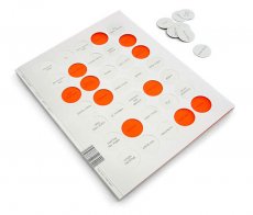
Titel
-
SPECTOR cut+paste Heft #3 stop!...reading at this point!
Technische
Angaben
-
168 S., 29,7x23,5 cm, ISBN/ISSN 16174550
Druck auf Zeitungspapier, mit farbigem KlappUmschlag, mit gestanzten Punkten
|
Technische
Angaben
-
keine weiteren Angaben vorhanden
|
Titel
-
Slanted #18 Signage / Orientation
Technische
Angaben
-
164 S., 32x24 cm, ISBN/ISSN 18676510
Klappbroschur, verschiedene Papiere
ZusatzInfos
-
Das Heft beschäftigt sich mit dem Hoch und Runter, dem Links und Rechts, dem Stop & Go, dem Kiss+Ride und vielem mehr. Es geht um außergewöhnliche Leit- und Orientierungssysteme, deren Komplexität und die dafür eingesetzten Schriften.
Text von der Webseite
|
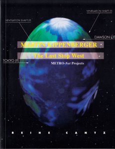
Titel
-
The Last Stop West - METRO-Net Projects
Technische
Angaben
-
92 S., 20x15,5 cm, ISBN/ISSN 3893225064
Paperback. Herausgegeben von Peter Noever
ZusatzInfos
-
MAK Center for Art an Architecture, 10.07-11.10.1998
Mit Texten von Peter Noever, Steven Prina, Norman M. Klein, Robert Ohrt und Franz West und Hans Weigand sowie einem Interview von Jutta Koether mit Martin Kippenberger
|
Titel
-
War starts here - let's stop it here!
Technische
Angaben
-
16 S., 23,7x33 cm, keine weiteren Angaben vorhanden
Plakat zum Camp, einmal gefaltet
|
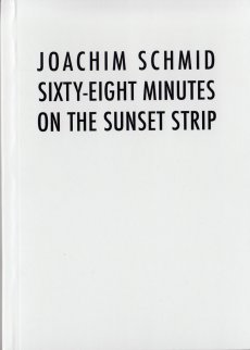
Titel
-
Sixty-Eight Minutes on the Sunset Strip
Technische
Angaben
-
80 S., 14,8x10,5 cm, Auflage: 100, keine weiteren Angaben vorhanden
Softcover, in Versandtasche
ZusatzInfos
-
On March 26th, 2014 I set out to explore the Sunset Strip. Coming from the south, I arrived at the western end of the strip at 2:58 pm. Traffic moved very slowly past buildings, apartments, real estate opportunities, parking lots, a gasoline station, and a few palm trees. It took sixty-eight minutes of stop and go traffic before I arrived at the eastern end of the strip. The reason for slow traffic was a small fire
|
Titel
-
Being Evil Knievel Issue No. 2
Technische
Angaben
-
36 S., 21x14,8 cm, ISBN/ISSN 978-3-865882509
Drahtheftung
ZusatzInfos
-
As time doesn't stop, we are proud to devote this second edition of BEK to EVIL's newest project: his alter-ego SUPER A. EVIL will be in Langenhagen (Germany) in March and April to give us guys an insight into his personal well being. SUPER A of course, is just one little facet, but as you will hopefully discover, a more than eye-popping one. Therefore we are especially happy to feature both an extensive interview with EVIL KNIEVEL on his alter-ego and a mind-blowing photo story of SUPER A himself. Also we are introducing a new column at the end of the mag that tries to show a wider perspective of our so beloved EVIL KNIEVEL." (Peter Hush)
Mit Textbeiträgen von Peter Hush und Andy Reid sowie einem Interview mit Evil Knievel von Ken T. Evans.
Text von der Webseite
|
Titel
-
Kraftvoller Wiedergänger seiner Zeit - Warum applaudiert ihr nicht?: Vier Jahre nach dem Tod von Norbert Klassen würdigt ein Buch das Schaffen des Berner Performance-Künstlers und setzt es in einen kunsthistorischen Zusammenhang.
Technische
Angaben
-
42x29,7 cm, 2 Stück. keine weiteren Angaben vorhanden
Laserkopie und Computerausdruck eines Zeitungsartikel zu Norbert Klassen
ZusatzInfos
-
Artikel in der kleine Bund, Samstag 28.11.2015 S.31 zu Norbert Klassen (verstorben 2011 in Bern) und ein Buch über ihn von René Magana, Marcel Bleuler und Gabriel Flückiger
|
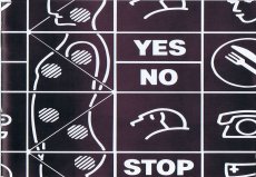
Titel
-
DREI - Bilder, Installationen und Performance - Yes No Stop
Technische
Angaben
-
[12] S., 12x12 cm, keine weiteren Angaben vorhanden
Drahtheftung
ZusatzInfos
-
Anlässlich der Ausstellung von Gudrun Barenbrock, Anna Homler und Miike Koppler im Kulturzentrum Altes Rathaus, Würselen, 08.-31.10.1993
|
Technische
Angaben
-
4 S., 21x14,9 cm, 2 Stück. keine weiteren Angaben vorhanden
Einladungsflyer, beiliegend ein beidseitig bedrucktes Informationsschreiben zur Ausstellung
ZusatzInfos
-
zur Ausstellung vom 21.05.-04.06.2016 im Neo Toum - Neoterismoi Toumazou, Nikosia, Zypern.
He was dancing steadily. He could see the backs of people’s heads moving in the darkness and was aware of the shifting spaces between their bodies. He did not register the music except as a sort of vibration. He felt as if he was dancing in perfect silence. He saw the already dim room growing ever darker around him. He became less conscious of his surroundings and more aware of himself. His introspection grew but his body was now moving automatically, softly cycling through a short loop of set motions. He noticed dust under his feet, and soon the realisation reached him that he was slowly wearing a shallow hole in the wooden floor. His body was locked in an efficient cycle. Before too long he was six inches below floor level, his head parallel with some of the shorter dancers. Yet he could not stop. Gradually he sank deeper into the ground until his face was level with people’s waists. No one noticed, below the eye level of the crowd, he was almost invisible. Presently his eyes came level with the soles of dancing shoes. He could see shards of coloured light flashing through a forest of legs casting jagged shapes across the floor. There were points where soft reflected light shone through looming figures like sunlight into a clearing. Eventually he was entirely submerged. He could look up through the hole and see foreshortened bodies moving above him oblivious to his plight. Still his feet moved, wearing away damp, pungent earth. The vibrations from the music lessened until the dull thump of the kick drum was all that he could feel. When it stopped he realised he too was still, and looking up he saw the sphere of light was gone.
Text von der Webseite
|
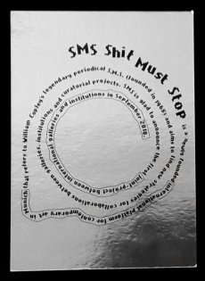
Titel
-
SMS - Shit Must Stop is a newley founded international platform for contemporary art in Munich that ...
Technische
Angaben
-
2 S., 14,8x10,5 cm, keine weiteren Angaben vorhanden
Werbepostkarte, metallic Oberfläche (Chromolux)
|
Titel
-
Door Nederlandse Ogen - Through Dutch Eyes
Technische
Angaben
-
10,5x14,8 cm, keine weiteren Angaben vorhanden
Postkarte
|
Titel
-
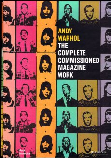
The Trip - Andy Warhol's Plastic Fantastic Cross-Country Adventure
Technische
Angaben
-
324 S., 24x14 cm, ISBN/ISSN 978-1-476703510
Hardcover, fadengeheftet, mit Schutzumschlag
ZusatzInfos
-
From the author of Strapless and Guest of Honor, a book about a little-known road trip Andy Warhol took from New York to LA in 1963, and how that journey—and the numerous artists and celebrities he encountered—profoundly influenced his life and art.
In 1963, up-and-coming artist Andy Warhol took a road trip across America. What began as a madcap, drug-fueled romp became a journey that took Warhol on a kaleidoscopic adventure from New York City, across the vast American heartland, all the way to Hollywood and back.
With locations ranging from a Texas panhandle truck stop to a Beverly Hills mansion, from the beaches of Santa Monica to a Photomat booth in Albuquerque, The Trip captures Warhol’s interactions with Dennis Hopper, Peter Fonda, Marcel Duchamp, Elizabeth Taylor, Elvis Presley, and Frank Sinatra. Along the way he also met rednecks, beach bums, underground filmmakers, artists, poets, socialites, and newly minted hippies, and they each left an indelible mark on his psyche.
In The Trip, Andy Warhol’s speeding Ford Falcon is our time machine, transporting us from the last vestiges of the sleepy Eisenhower epoch to the true beginning of the explosive, exciting ’60s. Through in-depth, original research, Deborah Davis sheds new light on one of the most enduring figures in the art world and captures a fascinating moment in 1960s America—with Warhol at its center.
Text von der Webseite
|
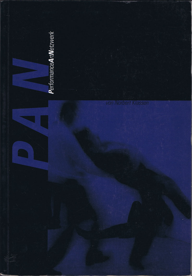
Titel
-
PerformanceArtNetzwerk von Norbert Klassen
Technische
Angaben
-
184 S., 22,6x16 cm, ISBN/ISSN 3716508284
Broschur
ZusatzInfos
-
Performance Art Netzwerk ist eine 13 Monate dauernde Performance von Norbert Klassen, STOP.P.T., die von März 1989 bis März 1990 in der Galerie Lydia Megert (Bern) stattgefunden hat.
|
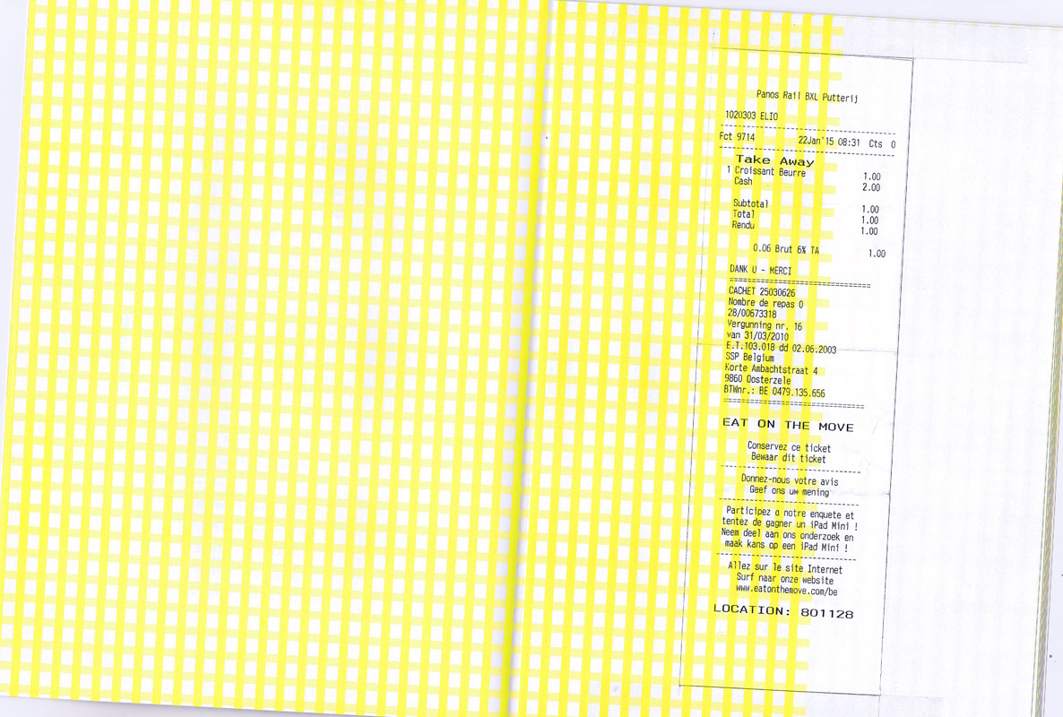
Technische
Angaben
-
[48] S., 27,8x20,2 cm, Auflage: 25, numeriert, keine weiteren Angaben vorhanden
Drahtheftung, Softcover, Risographie, zwei Seiten aus Pergaminpapier
ZusatzInfos
-
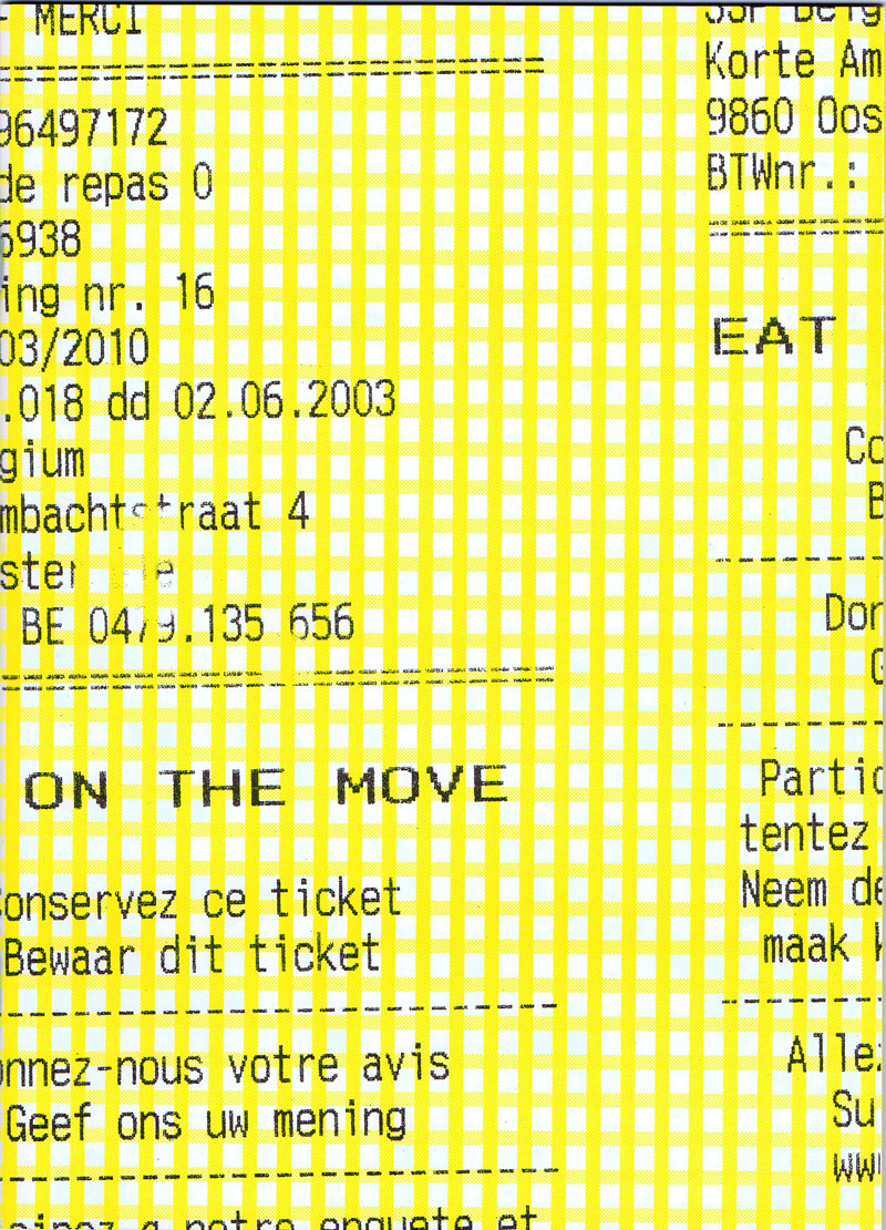
Bonjour! en goedemorgen! Having made an indefinite amount of trips from Brussels to Gent every academic year, and while barely having any time to spare whilst hurrying to and from the station, I have time and again managed to stop for an eat on the move. Eat on the Move compiles one year of receipts from the railway station's bakery and includes an original croissant bag as end pages.
Text von der Website.
|
Technische
Angaben
-
42x29,7 cm, keine weiteren Angaben vorhanden
Plakat, mit handschriftlicher Notiz
ZusatzInfos
-
Fridays For Future Deutschland fordert die Regierungen auf Kommunal- Landes- und Bundesebene auf, die Klimakrise als solche zu benennen und sofortige Handlungsinitiative auf allen Ebenen zu ergreifen. Wir als Fridays For Future Deutschland sind eine überparteiliche Bewegung gleichgesinnter Klimaaktivist*innen und solidarisieren uns mit allen, die sich friedlich für unsere Forderungen einsetzen.
Text von der Website.
|
Titel
-
Fotofolge Nr. 68, Das gute Alte & die Fotografie
Technische
Angaben
-
48 S., 17,6x13,5 cm, Auflage: 200, keine weiteren Angaben vorhanden
Drahtheftung, Risographie in Blau
ZusatzInfos
-
Das gute Alte & die Fotografie, 23.06.-01.07.2012 im D21 Kunstraum, Leipzig, als Satellit des F/Stop Festivals für Fotografie 2012.
|
Technische
Angaben
-
31,3x32 cm, keine weiteren Angaben vorhanden
Schallplatte in Schallplattenhülle
ZusatzInfos
-
Vinyl LP mit deutschen Hits aus dem Jahre 1982. Polystar war ein Compilation-Label der Deutsche Grammophon Gesellschaft.
|
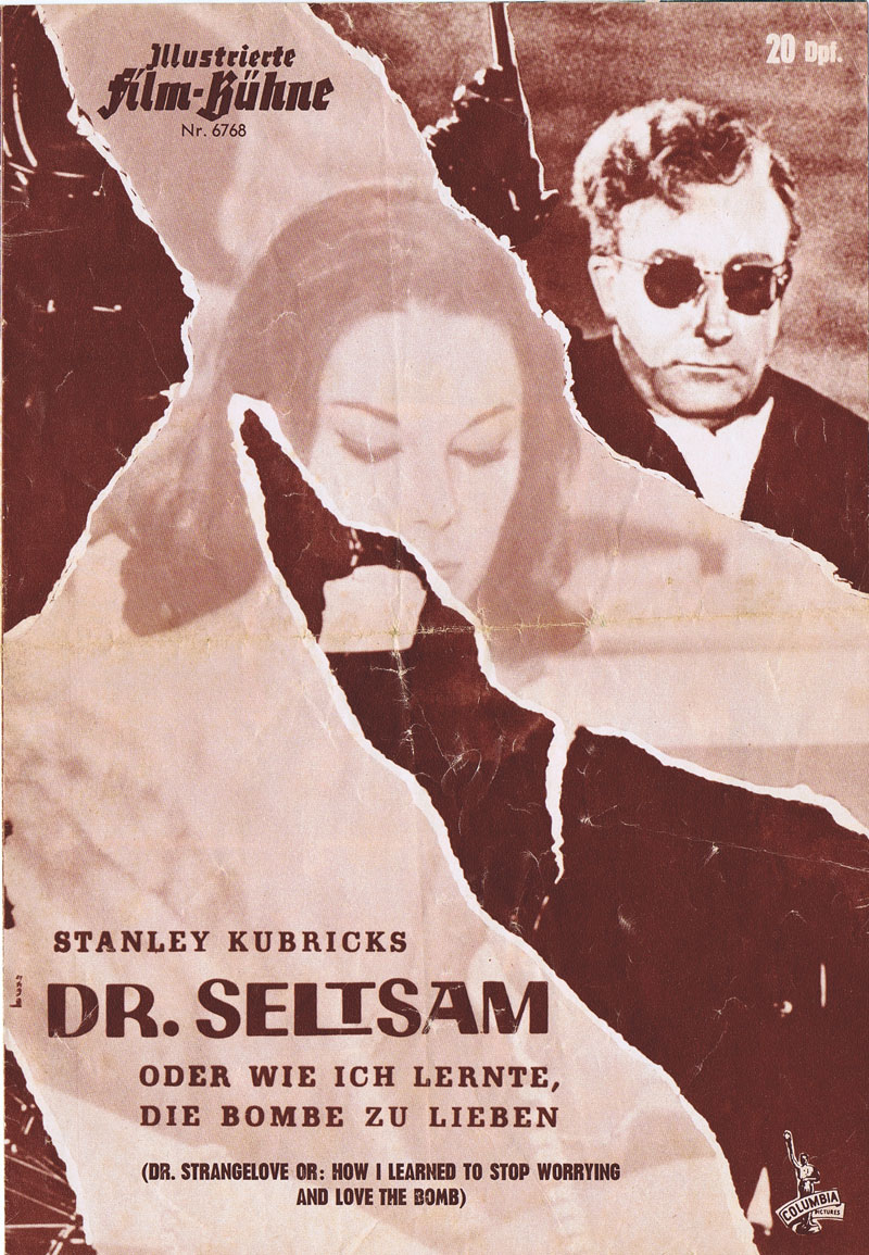
Titel
-
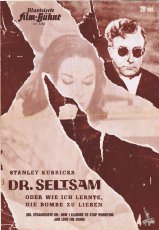
Illustrierte Film-Bühne Nr. 6768 - Dr. Seltsam
Technische
Angaben
-
[8] S., 26,6x18,4 cm, keine weiteren Angaben vorhanden
gefaltetes Blatt, außen monochrom braunrot, innen blaugrau gedruckt
ZusatzInfos
-
Die Originalversion des Films erschien 1964. Originaltitel: Dr. Strangelove or: How I Learned to Stop Worrying and Love the Bomb
|
Titel
-
Stop&Shop - Choppy Prices Scorching Deals
Technische
Angaben
-
[4] S., 38,1x29 cm, keine weiteren Angaben vorhanden
gefaltetes Blatt als Zeitung
ZusatzInfos
-
Aus dem Booklyn-Archiv. Fake Lebensmittel-Sonderangebots-Blatt, sarkastischer Kommentar zu Fleischhunger und Umweltzerstörung
|
Technische
Angaben
-
[40] S., 21x14,7 cm, keine weiteren Angaben vorhanden
Drahtheftung
ZusatzInfos
-
Publikation erschien zur NON-STOP-KINO Installation im Kunstverein München, 02.-03.06.2018.
|
Technische
Angaben
-
11,4x16,1 cm, Auflage: Unikat, keine weiteren Angaben vorhanden
Postkarte, bestempelt, Briefmarke, Collage
|
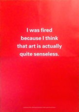
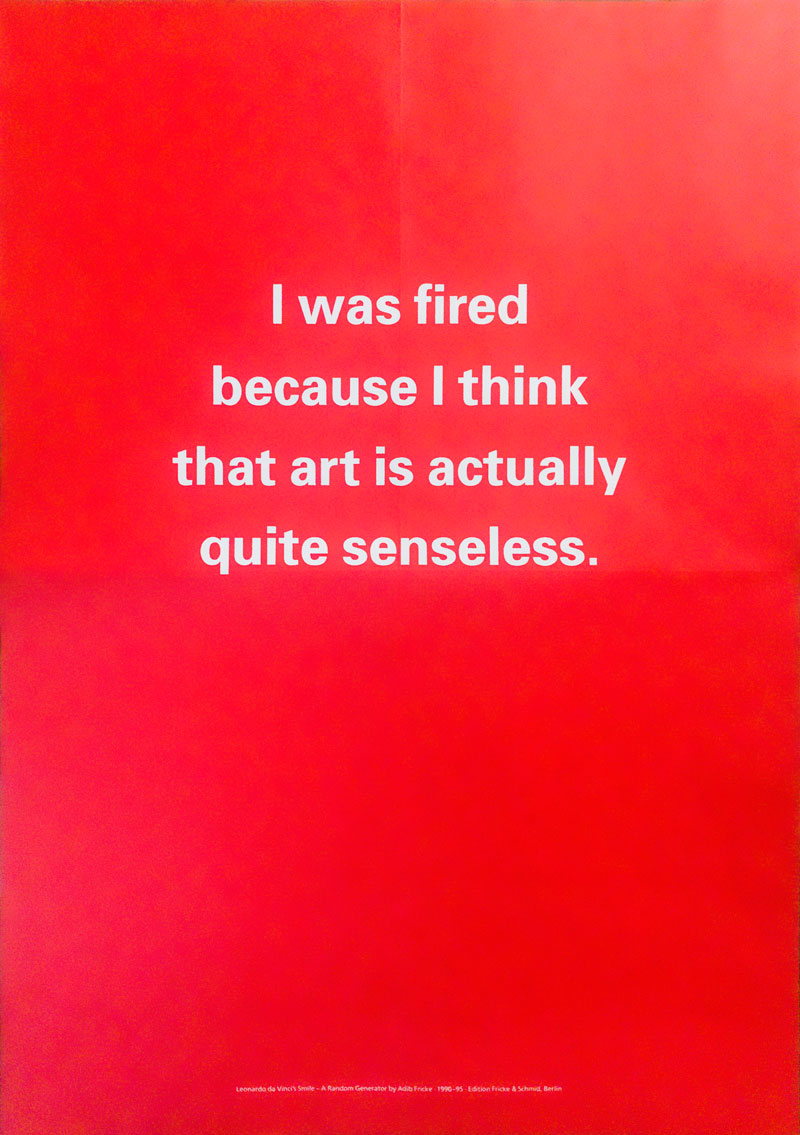
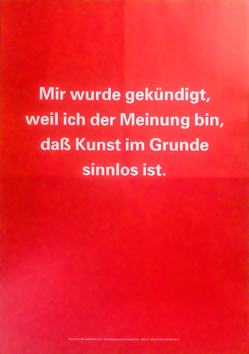
Titel
-
Mir wurde gekündigt, weil ich der Meinung bin, daß Kunst im Grunde sinnlos ist.
Technische
Angaben
-
1 S., 59x42 cm, 3 Teile. keine weiteren Angaben vorhanden
3 Plakate mit "Mir wurde gekündigt, weil ich der Meinung bin, daß Kunst im Grunde sinnlos ist." in deutsch, englisch und französischer Sprache, beiliegend Postkarte mit persönlicher Widmung
ZusatzInfos
-
Ein Zufallsgenerator, der Sätze zur bildenden Kunst erzeugt, 1989
Installation für zwei Rechner
The Artists Beautiful Language, Galerie Anselm Dreher, Berlin 1992
Die Orte der Kunst, Sprengel Museum, Hannover 1994
»Mir wurde gekündigt, weil ich der Meinung bin, dass Kunst im Grunde sinnlos ist.«, »Meine Recherchen haben ergeben, dass Joseph Beuys doch nicht so gut war.«, »Wenn Sie sich als Kunstkenner ausgeben wollen, erzählen Sie ruhig, dass die Telefonbilder von Moholy-Nagy latent auch erotische Probleme thematisieren.«, »Ist es wahr, dass Marcel Duchamp an seinen Fingernägeln kaute?«, »Fein, dass Daniel Buren vom Marketing viel Ahnung hat.«, »Irgendwie glaube ich, dass Fontainbleau gerne Bouillabaisse aß.«, »Schon meine Großmutter hat immer gesagt, dass Emil Nolde über die immanente Wahrheit seiner eigenen Bilder gestolpert sei.« ...
»Das Lächeln des Leonardo da Vinci«, entstanden 1989, konnte in der ersten Fassung ca. 7 Millionen deutschsprachige Sätze zur bildenden Kunst zufällig erzeugen. Die zweite Fassung des Zufallsgenerators (1990–91), produzierte jeweils ca. 30 Millionen deutsch- oder englischsprachige Kommentare non-stop. Als Installation für zwei Rechner wurde »Das Lächeln ...« ausgestellt und war zugleich als Diskettenversion für die heimische Satzproduktion erhältlich.
Text von der Website
|
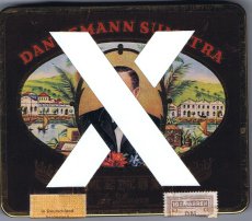
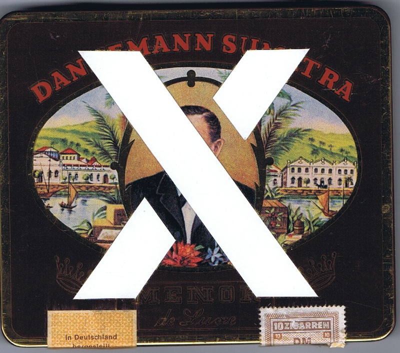
Technische
Angaben
-
11,8x12,7 cm, keine weiteren Angaben vorhanden
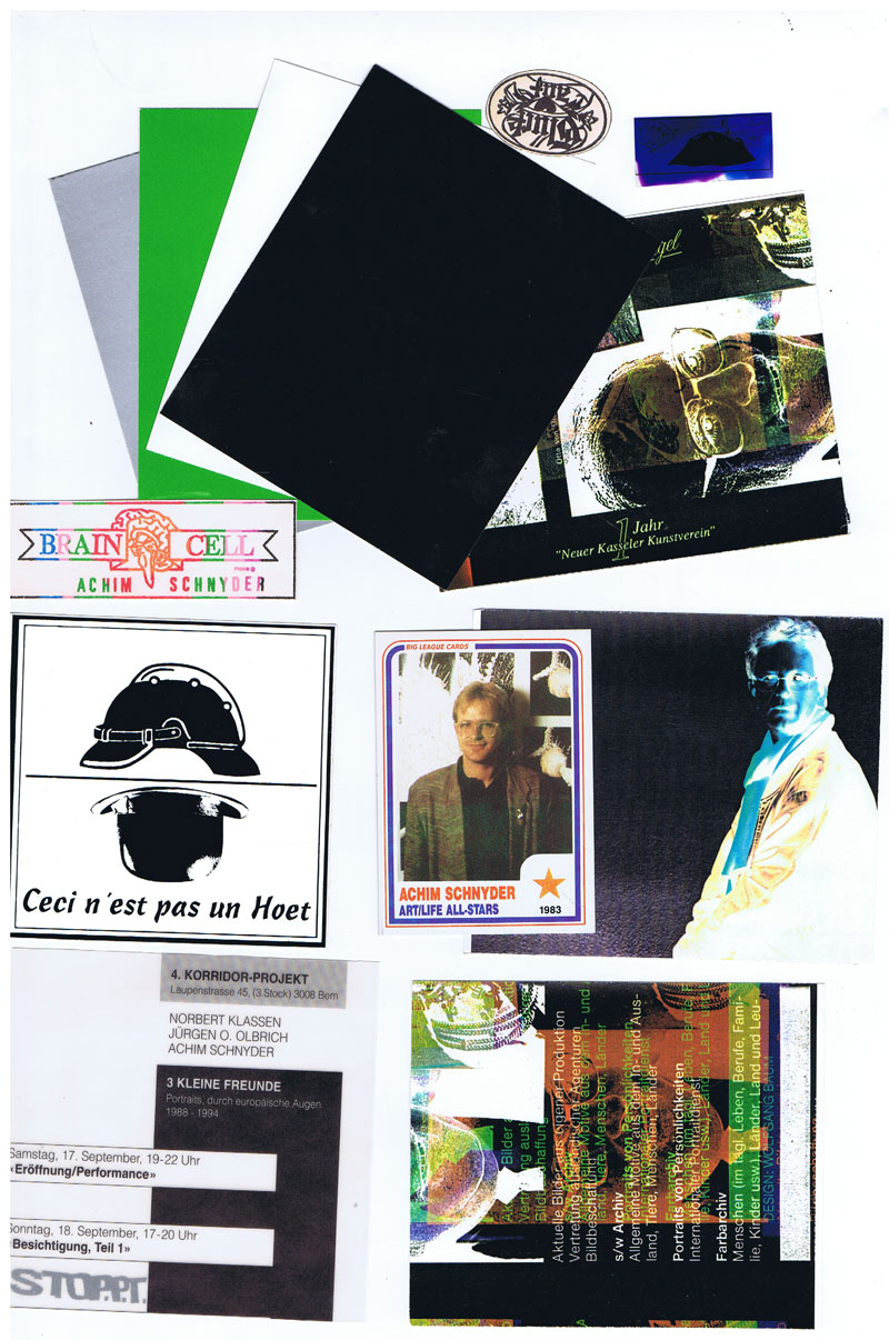
Zigarillo-Blechdose, beklebt mit X, 3 Aufkleber, farbige Xerox-Kopien zu "1 Jahr Neuer Kasseler Kunstverein" , verschiedene Größen, 3 monochrome Papierkarten, 1 Sammelkarte mit Porträt von Achim Schnyder
ZusatzInfos
-
Schachtel erschien im Rahmen des 4. Korridor-Projekts, Laupenstr. 45 in Bern, Eröffnung 17.09-18.09.1994
|
Titel
-
Postwert - Postage - Installation
Technische
Angaben
-
62 S., 14,5x10,3 cm, keine weiteren Angaben vorhanden
Broschur
ZusatzInfos
-
Postgebührenheft, perforiert
|
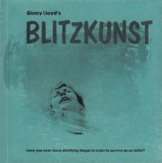
Titel
-
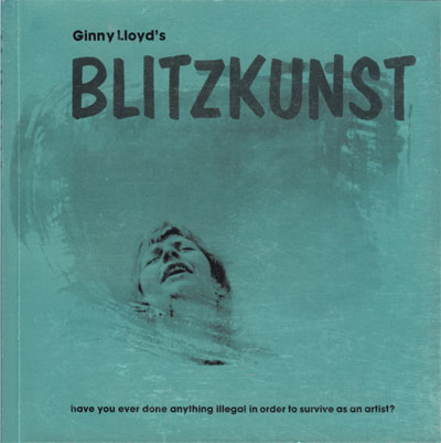
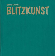
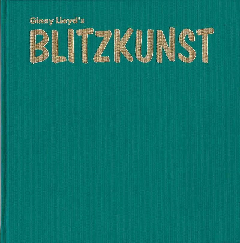
Blitzkunst - or have you ever done anything illegal in order to survive as an artist ?
Technische
Angaben
-
[120] S., 20,2x20 cm, Auflage: 500, ISBN/ISSN 978-3-923205-349
Broschur, Chromolux-Umschlag. Interviews mit 54 internationalen MailArt-Künstlern. Fotografien und Fragebogen
ZusatzInfos
-
Mit Texten von Carl Loeffler, Judith A. Hoffberg und Hal Fischer.
BLITZKUNST, Have you ever done anything illegal in order to survive as an artist ?
Ginny Lloyd porträtiert und befragt 54 internationale MailArt-Künstler.
BLITZKUNST, ein von Ginny Lloyd herausgegebener Fotoband, ist eine außergewöhnliche Auseinandersetzung mit den kreativen Pionieren unserer Gegenwart. Kern des Buches ist die Dokumentation zeitgenössischer Künstler, deren Arbeitsweise sich von dem unterscheidet, was gemeinhin als etablierte Kunst betrachtet wird. Diese internationale Dokumentation hat die Form manipulierter Portraits experimenteller Künstler der Gegenwart und enthält zugleich einen soziologisch orientierten Fragebogen, der darauf abzielt, die persönliche, innerlich-instinktive Erfahrung zeitgenössischen Kunstschaffens zu untersuchen. Die meisten der porträtierten Künstler bemühen sich einerseits darum, mit neuen Materialien zu experimentieren, andererseits sind sie von dem Wunsch bestimmt, die Funktion der Kunst in der Gesellschaft zu untersuchen. Solche Künstler arbeiten am äußersten Rand der Kunstszene, indem Sie Medien benutzen, die normalerweise nicht der bildenden Kunst zugeordnet werden. Es handelt sich unter anderem um Mail Art, Künstlerbriefmarken, Stempel, Publikationen, Kopierkunst, Performance, Video- und Audiokunst, um Archiv- und Museumsprojekte sowie um Projekte der Selbsthistorifikation.
Ginny Lloyds Arbeit ist die Reaktion auf die umfassenden Veränderungen, die die Gesellschaft international während der kommenden Jahrzehnte erleben wird - Veränderungen hervorgerufen durch neue Technologien, globale Interaktion und die Neuorientierung der Arbeiter in der folge des unvermeidlichen Niedergangs des Industrialismus im Westen. Innerhalb dieses Veränderungsprozesses werden neue Rollen und Materialien dem Künstler verfügbar werden und zu neuen Definitionen und Anwendungen der kreativen Haltung führen. (Carl Loeffler)
Ginny Lloyd zeigt hier in diesem Buch erstmals Künstler, die sich selbst kaum persönlich getroffen haben. Sie agieren weltweit durch postalische Medien und halten sich mit ihrer Person weitgehend im Hintergrund, in einigen Ländern auch im Untergrund. Ginny Lloyd hat sie besucht und auf ihre besondere Art fotografisch porträtiert und gewährt uns so einen seltenen Einblick in eine bis dahin ziemlich unbekannte Seite der aktuellen Kunst.
|
Titel
-
Blitzkunst - or have you ever done anything illegal in order to survive as an artist ?
Technische
Angaben
-
[120] S., 20,2x20 cm, Auflage: 500, 2 Stück. ISBN/ISSN 978-3-923205-332
Hardcover. Leinen, Titel Goldprägung.
ZusatzInfos
-
Schwarz-Weiß-Fotografien und Fragebogen. Ginny Lloyd porträtiert und befragt 54 internationale MailArt-Künstler. Mit Texten von Carl Loeffler, Judith A. Hoffberg und Hal Fischer.
|
Technische
Angaben
-
19x26,5x1,5 cm, ISBN/ISSN 0969074514
Eingelegtes Kärtchen
ZusatzInfos
-
Epigraph: Eyes half-closed. Nothing as strong as solace. Do the themes still connect? A Venus day is longer than a Venus year, the National Geographic Society says. A selection was assembled from more than 2000 photographs taken over an eight month period the year before last. Erect walking became necessary when female pre-hominids lost their estrus cycle. The street runs below the window which is above the cinema. Everything in place. Nothing is ever forgotten, only displaced. The planet spins on its axis once every 243 Earth days and orbits the Sun every 224.7 Earth days. Pyramids have always been. What you once thought still holds. The man who invented the first lighthouse perished in his own primitive model. "It was a totally whimsical point. It's inarguable of course. The evidence is all around. The facts are there."
Text von der Webseite
|
Titel
-
Anthology of Concrete Poetry
Technische
Angaben
-
346 S., 24x16,2 cm, keine weiteren Angaben vorhanden
Hardcover mit Schutzumschlag.
ZusatzInfos
-
Originally published in 1967, it was the first comprehensive American anthology focusing on the international movement of Concrete Poetry, which began in the early 50s, taking shape in parallel form in Brazil, Sweden, Iceland, Germany and Austria.
Sourcing from seventy-seven poets from twenty countries, this anthology of over 300 selections of concrete poetry stands out in its scope in part from being assembled by Emmett Williams, a founder of this poetic movement. The international array of languages is supplemented by clear-cut explanations and translations. The typographical poems impart an engagingly mysterious insight into the inner workings of language through the intersection of its sonic and graphic components.
Text von der Website.
Ursprünglich 1967 veröffentlicht, war es die erste umfassende amerikanische Anthologie, die sich mit der internationalen Bewegung der Konkreten Poesie befasste, die in den frühen 50er Jahren begann und parallel dazu in Brasilien, Schweden, Island, Deutschland und Österreich Gestalt annahm.
Diese Anthologie mit über 300 ausgewählten Werken der Konkreten Poesie, die von siebenundsiebzig Dichtern aus zwanzig Ländern verfasst wurden, zeichnet sich durch ihren Umfang aus, auch weil sie von Emmett Williams, einem der Begründer dieser poetischen Bewegung, zusammengestellt wurde. Die internationale Sprachenvielfalt wird durch anschauliche Erläuterungen und Übersetzungen ergänzt. Die typografischen Gedichte vermitteln einen faszinierend rätselhaften Einblick in das Innenleben der Sprache durch das Zusammentreffen ihrer klanglichen und grafischen Komponenten.
Übersetzt mit www.DeepL.com/Translator (kostenlose Version)
|
ZusatzInfos
-
Addenda: Just between you and me. There was no other. Who does our past belong to tonight? We understand at last. And while we slept, we vanished. The walls of the world fell in on us. We claimed always to abide by terms. Shattered mirrors and sliding panels. Always. Except when we choose not to. One must keep alert to all possibilities. The old Indian pearl diver clambered onto the dock, grinning and shaking the water from our body. At night we could hear our mind ticking like some cheap alarm clock. Radio broadcasts played on tribal feelings. Our voice trailed off. Truth was delay. A heavy splash followed many ripples. Food, batteries and water-purifying chemicals arrived over the week-end.
Text von der Webseite
|
Titel
-
Various Small Books - Referencing Various Small Books by Ed Ruscha
Technische
Angaben
-
288 S., 23,6x15,8 cm, ISBN/ISSN 9780262018777
Hardcover Leinen
ZusatzInfos
-
In the 1960s and 1970s, the artist Ed Ruscha created a series of small photo-conceptual artist’s books, among them Twentysix Gas Stations, Various Small Fires, Every Building on the Sunset Strip, Thirtyfour Parking Lots, Real Estate Opportunities, and A Few Palm Trees. Featuring mundane subjects photographed prosaically, with idiosyncratically deadpan titles, these “small books” were sought after, collected, and loved by Ruscha’s fans and fellow artists. Over the past thirty years, close to 100 other small books that appropriated or paid homage to Ruscha’s have appeared throughout the world. This book collects ninety-one of these projects, showcasing the cover and sample layouts from each along with a description of the work. It also includes selections from Ruscha’s books and an appendix listing all known Ruscha book tributes.
Text von der Webseite
|
Titel
-
APES Alternative Periodicals Exhibiting Services
Technische
Angaben
-
[12] S., 29x19,2 cm, keine weiteren Angaben vorhanden
Exhibit Catalog. Directory to over 30 alternative magazines, newspapers, and newsletters. Blätter lose zusammengelegt
|
Titel
-
Artist's Book Yearbook 2014-2015
Technische
Angaben
-
296 S., 29,6x20,8 cm, ISBN/ISSN 978-1-906501075
Softcover, design by Tom Sowden
ZusatzInfos
-
Over 600 artist’s book listings from 207 national and international artists. Reference listings of: collections, libraries, archives, bookshops, galleries, centres, design print & bind, publishers, dealers, presses, studios, competitions, fairs, festivals and exhibitions, journals, reference books, organisations, societies, websites, academic projects, touring programmes and courses.
Text von der Webseite
|
Technische
Angaben
-
2 S., 15x10 cm, keine weiteren Angaben vorhanden
Postkarte,
ZusatzInfos
-
Fyler anlässlich der Zine Fair im Museum of Contemporary Art, Sydney, 11.-12.06.2016. MCA Zine Fair is an annual festival featuring hundreds of zinesters, distros, independent presses, and artists. Showcasing over 100 creators of zines, small press and comics from across the country the festival also includes creative workshops dedicated to making, swapping and selling
Text von der Webseite
|
Titel
-
Tinnitus Tales - le Forbici di Manitù and Friends (SD010)
Technische
Angaben
-
27x28,5 cm, keine weiteren Angaben vorhanden
Plattenhülle, gestanzt mit 3 einklappbaren Teilen, beiliegend gestanzte Pappschlaufe mit handbeschrifteter DVD, Infoblatt zur Edition
ZusatzInfos
-
What do Martin Luther and Pete Townshend, Ozzie Osbourne and Oscar Wilde, Ludwig Van Beethoven and Star Trek’s Dr. Spock have in common? They all painfully suffered from tinnitus, a permanent hiss heard in one or both ears. The condition affects a large percentage of the world population (5-10%) and represents a real “occupational illness” for musicians and rock fans. On the subject, surprisingly, an inexplicable silence is observed by the music press and industry. At the current state of medical research, there is no effective cure for chronic tinnitus and the unpleasant humming can only get worse if you do not protect the ears properly.
In the works for nearly five years, the triple concept album Tinnitus Tales (a 10" vinyl record and two CDs) conceived by Le Forbici di Manitù (i.e. Manitù Rossi and Vittore Baroni, the second long suffering from tinnitus) with the collaboration of over fifty guest musicians, bands and international visual artists, breaks the veil of silence with a series of songs that address the topic blending humor and empathy. The songs are inspired by well-known cases of people suffering from tinnitus, such as Andy Partridge of XTC or Bono and The Edge of U2. To make this "educational audio project" a more collective effort, several old and new friends - many of them with tinnitus problems - were invited to record their own versions of the songs by Le Forbici di Manitù or to contribute original compositions on the subject (included in the CD 1 Songs).
Text von der Webseite
|
Technische
Angaben
-
15x10,5 cm, keine weiteren Angaben vorhanden
Softcover, Broschur
ZusatzInfos
-
Publikation zur New York Art Book Fair 2017. Printed Matter presents the twelfth annual NY Art Book Fair, from September 22 to 24, 2017, at MoMA PS1, Long Island City, Queens. Free and open to the public, the NY Art Book Fair is the world’s premier event for artists’ books, catalogs, monographs, periodicals, and zines. The 2017 NY Art Book Fair will feature over 370 booksellers, antiquarians, artists, institutions and independent publishers from twenty-eight countries. This year’s NY Art Book Fair will include an ever-growing variety of exhibitors - from zinesters in (XE)ROX & PAPER + SCISSORS and the Small Press Dome representing publishing at its most innovative and affordable, to rare and antiquarian dealers offering out-of-print books and ephemera from art and artist book history, plus the NYABF-classic Friendly Fire, focused on the intersections of art and activism. NYABF17 will host an array of programming and special events, including: The Classroom, a curated engagement of informal conversations, workshops, readings, and other artist-led interventions, for the eighth year running, as well as The Contemporary Artists’ Book Conference (CABC), in its tenth year, featuring two full days of conversation on emerging practices and issues within art-book culture.
Text von der Website.
|
Technische
Angaben
-
146 S., 17,8x12,8 cm, ISBN/ISSN 9781604860917
Broschur
ZusatzInfos
-
Signal is an ongoing book series dedicated to documenting and sharing compelling graphics, art projects, and cultural movements of international resistance and liberation struggles. Artists and cultural workers have been at the center of upheavals and revolts the world over, from the painters and poets in the Paris Commune to the poster makers and street theatre performers of the recent Occupy movement. Signal will bring these artists and their work to a new audience, digging deep through our common history to unearth their images and stories. Signal 01 includes: The Future of Xicana Printmaking: Alec Dunn and Josh MacPhee interview the Taller Tupac Amaru (Favianna Rodriguez, Melanie Cervantes, and Jesus Barraza), The Adventures of Red Rat: Alec Dunn interviews Johannes van de Weert, Hard Travelin’: A photo essay with IMPEACH, Early 20th-Century Anarchist Imprints, Mexico 68: The Graphic Production of a Movement: Santiago Armengod interviews Felipe Hernandez Moreno, Adventure Playgrounds: A photo essay, Designing Anarchy: Dan Poyner interviews Rufus Segar.
Text von der Website.
|
Titel
-
Paper Politics - Socially Engaged Printmaking Today
Technische
Angaben
-
164 S., 22,8x15,3 cm, ISBN/ISSN 9781604860900
Broschur
ZusatzInfos
-
Paper Politics: Socially Engaged Printmaking Today is a major collection of contemporary politically and socially engaged printmaking. This full-color book showcases print art that uses themes of social justice and global equity to engage community members in political conversation. Based on an art exhibition that has traveled to a dozen cities in North America, Paper Politics features artwork by over 200 international artists. an eclectic collection of work by both activist and non-activist printmakers who have felt the need to respond to the monumental trends and events of our times.
Text von der Website.
|
Titel
-
When your phone doesn't ring, it'll be me
Technische
Angaben
-
182 S., 20,8x13,9 cm, ISBN/ISSN 0871136341
Broschur, Taschenbuch, Cover mit geprägter Schrift
ZusatzInfos
-
In When Your Phone Doesn't Ring, It'll Be Me, which critics say is her best yet, Heimel reveals her secrets - which turn out to be our own. She croons over sweatpants. She finds the secret cause of romantic obsession. She hates Rush Limbaugh. She finds the hilarity in feminism. She shops for a new city for us to live in, away from Bible-thumping homophobes but near some trees. She finds romantic tranquility and gets bored. And her love affair with dogs gets to the point where we may have to perform an intervention.
|
Technische
Angaben
-
19,5x12,5 cm, keine weiteren Angaben vorhanden
Verlagsprogramm
|
Titel
-
Anonymous Press No. 16240 - Whooshes
Technische
Angaben
-
12 S., 20,3x13,4 cm, keine weiteren Angaben vorhanden
Drahtheftung, Schwarz-Weiß-Laserdrucke, Umschlag aus farbigem Papier
|
Titel
-
Anonymous Press No. 16255 - So Viele
Technische
Angaben
-
12 S., 20,3x13,4 cm, keine weiteren Angaben vorhanden
Drahtheftung, Schwarz-Weiß-Laserdrucke, Umschlag aus farbigem Papier
|
Titel
-
Anonymous Press No. 16256 - Seismographics
Technische
Angaben
-
12 S., 20,3x13,4 cm, keine weiteren Angaben vorhanden
Drahtheftung, Schwarz-Weiß-Laserdrucke, Umschlag aus farbigem Papier
|
Titel
-
Anonymous Press No. 16254 - Nacht Wachen
Technische
Angaben
-
12 S., 20,3x13,4 cm, keine weiteren Angaben vorhanden
Drahtheftung, Schwarz-Weiß-Laserdrucke, Umschlag aus farbigem Papier
|
Titel
-
reflection press, Nr. 30 - günter saree: letzte arbeiten
Technische
Angaben
-
60 S., 21,5x15 cm, 2 Stück. keine weiteren Angaben vorhanden
Drahtheftung, verschiedene Papiere, mit eingehefteten Informationen zur reflection press und gefaltete Presseberichten
ZusatzInfos
-
aus verschiedenen Papieren von Günter Saree (Briefe, Konzepte, Zeitungsartikel über Aktionen und Nachrufe, Skizzen und Notizen) von Albrecht D. bearbeitet
|
Titel
-
Aspen - The Magazine in a Box Vol. 1 No. 04
Technische
Angaben
-
31x23,6x1,5 cm, keine weiteren Angaben vorhanden
Kassette mit zwei gefalteten Einzelblättern, beidseitig bedruckt, eins davon Werbemappe mit Werbeheftchen für Gordon's und Newsletter der Something Else Press, drei Poster, drei Hefte mit Drahtheftung und eine Schallplatte.
ZusatzInfos
-
Ausgabe gestaltet von Quentin Fiore. Ausgabe besteht aus 9 Teilen: 1. Box, 2. "The Medium Is the Massage" Poster-sized mosaic of pages from The Medium Is the Massage by McLuhan and Quentin Fiore, 3. "The TV Generation" Poster of a color photo taken at the Tribal Stomp at San Francisco's Avalon Ballroom, 4. "Diary: How to Improve the World (You Will Only Make Matters Worse)" Random observations by John Cage, 5. "The Electronics of Music" Essay on electronic music by Faubion Bowers and Daniel Kunin, 6. Phonograph recording. A Recorded Sampler of Electronic Music. Side A: In Memoriam of Edgar Varèse, by Mario Davidovsky. Side B: Horn, by Gordon Mumma, 7. "The Braille Trail" Bob Lewis and Alfred Etter describe a nature trail for the blind, 8. "Psycles" Excerpts from The Bikeriders, Danny Lyon' book about the Chicago Outlaws motorcycle club. Prefaced by a meditation on motorcycling by Bob Chamberlain, 9. Mappe mit Werbung mit einem Werbeheft für Gordon's und Newsletter der Something Else Press (Something Else Newsletter Volume 1, Number 6: May, 1967), weitere Werbehefte der Originalausgabe fehlen.
|
Titel
-
Logan Elm Press Books 1993-94
Technische
Angaben
-
16,5x11 cm, 2 Stück. keine weiteren Angaben vorhanden
Fünf Postkarten, ein Rücksendeumschlag und ein Flyer mehrfach gefaltet in Kartonmappe
ZusatzInfos
-
Lieferprogramm Logan Elm Press & Papermill 1993-1994
|
Technische
Angaben
-
2 S., 29,7x21 cm, keine weiteren Angaben vorhanden
Schwarz-Weiß Laserausdrucke nach Webseite
ZusatzInfos
-
Tape-Mag.com is a Non-Profit Online-Archive & Information-Database for Audio-Tape-Culture (Cassettes/Tapes/Reels) and 20th Century Art- & Music-related Small-Press Publications, Magazine-Culture.
This Archive-Database focuses on the following styles/genres.
- Mid 70's to late 90's Industrial, Experimental, Free Improvisation, Post- Punk, New Wave, Minimal, Synth, Ambient and further musical directions of the DIY-Cassette-Culture.
- early 50's to late 90's Sound Art, Sound Poetry, Text-Sound-Compositions, Poesie Sonore, Verbosonics, Lingual Music, Music Concrete, Audio Art plus related printed Mail Art, Concrete Poetry, Visual Poetry, Lettrisme, Fluxus
Here you are able to browse and research thousands of releases, find further information about the Artists, the Organisations, Press & Label-People behind the scene and/or the published Small Print, Magazines, Information-sheets and Artists-Manifests that all defined a very exciting culture and era. Most of the releases listed here were only released in very limited amount and are hard to find these days but they had without any doubt their important role in the development of contemporary audio & sound-art and music-history. These protagonists of a DIY (Do-It-Yourself)-Culture-Movement in which everybody can be an artist, label, distributor and press-editor or organisation deserves a comprehensive overview in a broader context with all its connections and a framework. With this Database the collected, provided and connected Information can become knowledge. Knowledge that Media in Internet-Age can hardly supply with the current Information Overload.
Text von der Webseite
|
Technische
Angaben
-
[24] S., 18,5x12,7 cm, Auflage: 300, numeriert, signiert, keine weiteren Angaben vorhanden
Broschur mit Schutzumschlag
ZusatzInfos
-
Wahrscheinlich steht das "PG" im Titel für Percy Grainger, der zu Beginn - als einziges Foto - das Buch mit dem Bilduntertitel "Percy Grainger shoe-cleaning in Melbourne - 1926/7" eröffnet. (Grainger lebte von 1882 bis 1961 und war Pianist.)
Auf der letzten Seite befindet sich die mit Bleistift geschriebene Widmung: To Trollo & Irene all the best Simon Frankfurter Bookfair 1981. (Gemeint sind Wolfhard und Irene Ottenhausen)
Simon Cutts ist Schriftsteller, Künstler, Designer und Verleger. Er ist Autor vieler Gedichtbände (darunter Quelques Pianos und Seepages von Jargon Society) und von unzähligen Künstlerbüchern und ephemerer Druckwerke. Mitte der siebziger Jahre gründete er Coracle Press in London. Eine Sammlung seiner Vorträge und Schriften über das Verlegen von Kleinpressen und Künstlerbüchern ist in Some Forms of Availability zusammengefasst, das 2007 von Granary Books und RGAP veröffentlicht wurde.
|
Titel
-
UNIpress das Studentenmagazin
Technische
Angaben
-
18 S., 21x14,8 cm, 4 Teile. keine weiteren Angaben vorhanden
Drahtheftung, beiliegend lose Blätter zu Werbeeinschaltungen und Rechnung
ZusatzInfos
-
Broschüre zur Vorstellung des Medienvereins UNI-Press und des Studentenmagazins UNI-press mit Redaktionskonzept, Produktion, Finanzierung und Projekte.
|

Technische
Angaben
-
10,5x21 cm, Auflage: 1.000, keine weiteren Angaben vorhanden
ZusatzInfos
-
Einladungskarte Ausstellung in der Galerie ep.contemporary, Berlin, 26.08.–19.09.2021.
"Klatsch, Tratsch und manipulativer Journalismus: Zum Ergötzen der LeserInnen quetscht sie ihre Opfer aus wie Zitronen – das sind Assoziationen, die Yellow Press als Titel einer Ausstellung weckt.
Begreift man die Farbe Gelb aus der psychologischen oder soziokulturellen Perspektive, sind ihr verschiedene, teils sogar konträre Bedeutungen zugeschrieben. Sie steht für Licht, Freude und Wohlbefinden, Geduld und Weisheit – aber auch für das Gegenteil: Neid, Geiz und Missgunst. Gelb ist die Farbe sowohl der Geächteten als auch der Geachteten: Gelb war der Stern zur Ausgrenzung der Juden; gelb waren die Gewänder, mit denen sich chinesische Kaiser schmückten.
„Das Auge wird erfreut, das Herz ausgedehnt, das Gemüt erheitert; eine unmittelbare Wärme scheint uns anzuwehen“, schreibt Johann Wolfgang von Goethe in seiner Farbenlehre. In der Bildenden Kunst symbolisiert sie die Ewigkeit: Gelb ist die Farbe mit der größten Strahlkraft.
Text: Ophelia Beckmann
Gleichzeitig präsentieren wir in unseren Räumen:
EP.CONTEMPORARY EDITION # 0.1
Mit Arbeiten von Ophelia Beckmann, Angela Bröhan, Albert Coers, Matthias Hagemann, georgia Krawiec, Uschi Krempel, Celia Mehnert, Martina Reichelt, Jens Schünemann, Sabine Wild."
Text von der Webseite
|
Titel
-
PSPY - Portuguese Small Press Yearbook 2015
Technische
Angaben
-
110 S., 28x21 cm, Auflage: 200, keine weiteren Angaben vorhanden
Broschur
ZusatzInfos
-
Portuguese Small Press Yearbook ist gestaltet von verschiedenen Künstler*innen, wobei es größtenteils aus Text besteht. Es wurde bis 2019 einmal im Jahr veröffentlicht und ist eine Zusammenfassung der in diesem Jahr erschienen Publikationen jener Künstler*innen. Hierbei handelt es sich um die dritte Ausgabe.
|
Technische
Angaben
-
48 S., 21,5x15,3 cm, ISBN/ISSN 978-1-9990860-4-6
Klebebindung
ZusatzInfos
-
Künstler*innenpublikation aus der Invisibility Reihe der The Small Walker Press mit digitalen Zeichnungen von Donna Szöke und Texten von Gary Barwin.
|
Titel
-
Super BOOKS 5 2024 - Konvolut
Technische
Angaben
-
[20] S., 31x27 cm, Auflage: 500, 20 Teile. keine weiteren Angaben vorhanden
3 Programmhefte, Drahtheftung, Laserkopie Schwarz-Weiß.
2 Austeller*in-Kärtchen, 1 beschriftet mit "icon" & "Hubert Kretschmer", 2 mit schwarzem Band versehen.
3 Team-Kärtchen, 1 beschriftet mit "MaRiNa", 1 beschriftet mit "Christoph", 2 mit Paketband versehen.
2 Stofftaschen, beschriftet mit "SUPER BOOKS 5".
5 Raumpläne, blaues Papier.
5 Flyer.
ZusatzInfos
-
Am 02. & 03.11.24 richtet das Haus der Kunst die fünfte Ausgabe von Super BOOKS aus. Die jährlich veranstaltete, unabhängige Messe der Künstler*innenbuchszene bringt fast 70 Künstler*innen, Gestalter*innen und alternative Verleger*innen sowie Institutionen und Hochschulen zusammen, um ihre jeweils neuesten Produktionen zu präsentieren.
Der Schwerpunkt von Super BOOKS liegt auf Publikationen, die die Grenzen des Mediums Buch hinterfragen, neu denken und deren Themen, Formate und Techniken sich ständig erweitern. Mit ihrer Ethik der Zugänglichkeit, die in der Preisgestaltung und der Direktheit von Vertriebswegen zum Ausdruck kommt, bilden alternative Publizist*innen ein Gegengewicht zur herkömmlichen Verlagsbranche und ihren gängigen Spielregeln.
Super BOOKS wurde 2019 im Rahmen der Ausstellung „Archives in Residence: AAP Archiv Künstlerpublikationen“ im Haus der Kunst initiiert und hat sich seither zu einem wichtigen Forum für die unabhängige Kunstverlagslandschaft entwickelt. Das große Publikumsinteresse der vergangenen Jahre zeigt, wie sehr die Veranstaltung auch die breite Öffentlichkeit anspricht und zur lebendigen Auseinandersetzung mit Künstler*innenpublikationen inspiriert. Projektleitung: Sabine Brantl (Haus der Kunst)
Text von der Webseite
|
Titel
-
Art/Life Volume 02, Number 09
Technische
Angaben
-
[92] S., 28,3x22 cm, Auflage: 125, numeriert, signiert, keine weiteren Angaben vorhanden
Einzelblätter in Klemmschiene. Originalarbeiten, verschiedene Papiere und Techniken, Blätter signiert, gestempelt bemalt und beklebt
ZusatzInfos
-
Originating as a conceptual exchange among artists, Art/Life Magazine, was one of the longest continually published artists’ periodicals of the 20th century, presenting a diverse array of art during its 25-year history. Art/Life founder Joe Cardella had asked artists to submit and mail original artworks from all over the world to be compiled into limited edition magazines. As a way to increase accessibility to contemporary art practice, Art/Life documented the lives of the artists, their thoughts, emotions, and creative processes through the transition from industrial to digital art practice. The magazine’s legacy can be seen at MoMa, the Guggenheim, Getty, and LACMA, portraying a global consciousness and collaboration between distanced networks of contemporary artists.
Text von der Webseite
|
Titel
-
Kulchur Piece # 5, come on over to the dark side
Technische
Angaben
-
2 Stück. keine weiteren Angaben vorhanden
|
Titel
-
boekwerk tevens catalogus van & over Diederick van Kleef
Technische
Angaben
-
62 S., 21x23,2 cm, Auflage: 250, signiert, 2 Stück. keine weiteren Angaben vorhanden
Cover aus Hartpappe mit Siebdruck, verschiedene Papiere, handschriftliche Vermerke im Buch, ein Exemplar mit Widmung für Jockel Heenes
ZusatzInfos
-
zu einer Ausstellung im Gemeente Museum Arhem
|
Titel
-
Art Metropole Catalogue 1994, Number 17
Technische
Angaben
-
90 S., 28x21,5 cm, 2 Stück. keine weiteren Angaben vorhanden
Drahtheftung,
ZusatzInfos
-
Lieferprogramm. Art Metropole is an artist directed non-profit organization specializing in materials related to the avant-garde practice, particularly multiple format and media-related works. Art Metropole operates a bookshop and mail order operation which stocks artists' books, exhibition catalogues, critical writings, audio works, videotapes and multiples. Both current and out-of-print titles are available offering an in-depht source of international contemporary art over the last twenty years.
Text aus dem Heft
|
Technische
Angaben
-
13,2x21,5 cm, 2 Stück. keine weiteren Angaben vorhanden
Drahtheftung
ZusatzInfos
-
Lieferprogramm. Distributor for an international inventory of over 1,100 titles. records an periodicals as well as artists' books, 7 Lispenard Street, New York N.Y. 10013
|
Titel
-
Der Greif Ausgabe 04 Juli 2011
Technische
Angaben
-
82 S., 35x25 cm, Auflage: 1.500, numeriert, 2 Stück. ISBN/ISSN 21914524
Drahtheftung
ZusatzInfos
-
The firth issue went through a redesign. Seems as if it was worth the effort, as Der Greif was honored with the reddot Design Award and the ADC Junior Award Silver. Besides that, the submissions are coming from all over the world. The page number was increased again, Der Greif show photography and poetry now on 84 pages. Altogether, the works of 80 photographers and 14 authors are published in the fourth issue.
Text von der Webseite.
|
Technische
Angaben
-
15x10 cm, keine weiteren Angaben vorhanden
Postkarte zur Ausstellung
|
Titel
-
Sunsets Over Water Turned Upside Down
Technische
Angaben
-
12 S., 21x14,8 cm, Auflage: 50, numeriert, keine weiteren Angaben vorhanden
Drahtheftung, Schwarz-Weiß-Laserdruck, Zine
|
Titel
-
Unpublished - Best unseen photography - Issue no. 01
Technische
Angaben
-
40 S., 29,7x21 cm, keine weiteren Angaben vorhanden
Lose Blätter ineinander gelegt, Farbkopien nach PDF
ZusatzInfos
-
A simple and straightforward layout, an awesome format, no advertising, 500 hand numbered copies and a free and selected distribution. Unpublished is a democratic and exchange place where photography meets the public, without any filter. Unpublished gathers the best unpublished images of young photographers from all over the world, selected not only for their aesthetic value, but through a careful analysis of the cultural context, the artistic and human paths.
A large project that ends each edition of Unpublished with a group exhibition in which it will be possible to buy at affordable prices the original and signed prints of the published works, donated and assessed by the authors themselves. No art dealers, no galleries and outside the market logic. Unpublished is a "call for freedom", a pure and direct line that connects the artist and his work with the outside world. And vice versa.
Von der Webseite
|
Technische
Angaben
-
128 S., 25x21 cm, ISBN/ISSN 1901033678
ZusatzInfos
-
Over the last 20 years, performance artist André Stitt has presented hundreds of performances - or 'akshuns' - which are invariably violent and cathartic, involving self-abuse, tantrums and exoreisms. His references are wide, ranging from urban alienation to alternative religions. Small Time Life presents Andre Stitt's incredible work with images from the artist's archive, a history of his work and a series of conversations between the artist and Roddy Hunter (formerly Senior Lecturer in Visual Performance at Dartington College of Arts)
|
Titel
-
OZON International Winter 2012-13 Shelter issue
Technische
Angaben
-
29x23 cm, ISBN/ISSN 17923085
ZusatzInfos
-
OZON Magazine is an urban fashion magazine that has had a stable and significant reputation as an independent publication since 1996. OZON is a different form of fashion periodical that focuses on urban youth culture, modern fashion, art and music.
The new international issue of OZON is devoted to our personal shelters all over the universe. You will gaze at beautiful pictures and read beautiful minds in search of tranquility and introspection. We discover forgotten places and wonder whether our shelters look alike.
Interviews with: Anders Petersen, George Pitts, Steven Tai, Wes Lang, Martin Stranka, Phoebe English and more. Photography by Alena Jascanka, Yorgos Mavropoulos, Sonia Szóstak, Rita Lino, Nikolas Ventourakis, Hayley Louisa Brown, Sophie Van Der Perre, Winter Vandenbrink.
Text von der Webseite
|
Titel
-
people do funk is all over the world now!!
Technische
Angaben
-
33,5x36,5x0,3 cm, keine weiteren Angaben vorhanden
Stofftragetasche, Siebdruck auf beiden Seiten in unterschiedlichen Farben, Boden spitz genäht,
ZusatzInfos
-
Auf der Vorderseite ein Druck von www.skunkfunk.com, auf der Rückseite ein Druck von www.silenci.info
|
Titel
-
Twentysix Gasoline Stations
Technische
Angaben
-
36 S., 17,8x14 cm, Auflage: 550, ISBN/ISSN 9780894390449
in Schutzumschlag aus Transparentpapier
ZusatzInfos
-
The same building photographed all over different locations in Brandenburg, Thuringen, Sachsen-Anhalt and Mecklenburg-Vorpommern.
"The eccentric stations were the first ones I threw out" is written on a photographed piece of paper, at the end of the book. Ed Ruscha had published a book under the same title and outer appearance in 1963.
Text von der Webseite
|
Titel
-
Some where over the Rainbow
Technische
Angaben
-
[16] S., 21x14,7 cm, Auflage: 10, numeriert, 2 Stück. keine weiteren Angaben vorhanden
Drahtheftung, auf letzter Seite innen vom Verlag gestempelt, verschiedenfarbiges Papier, handnummeriert
ZusatzInfos
-
Heft mit Schwarz-Weiß Kopien von verschiedenen Farben. Dass es sich um Farben handelt, wird lediglich durch die Bildunterschrift klar, die den Farbcode enthalten. Die Codes stammen aus der Behr-Farbsammlung, ein Hersteller von Farben.
|
Titel
-
Artist Music Journals Vol. 1 No. 09 - Seripop
Technische
Angaben
-
[24] S., 26,5x26,5 cm, Auflage: 1.000, numeriert, keine weiteren Angaben vorhanden
Drahtheftung, Heft in Pappschuber mit Aufkleber
ZusatzInfos
-
Edition 09 in the ongoing Artist Music Journals series features the work of the Montreal based artists and musicians Chloe Lum and Yannick Desranleau, known as Seripop. Known for their original illustration and design work, as well as their longstanding tenure as founders and members of the musical outfit Aids Wolf, Seripop have a broad following around the globe. For their AMJ, Seripop compiled years of original gig poster work, the first collection of its kind for the studio, which has made thousands of prints over the years.
About Seripop: Yannick Desranleau and Chloe Lum are visual artists and musicians who started collaborating in 2002 under the nom de guerre Seripop. Based in Montreal, Seripop has earned international attention for its stylistically distinct, silkscreened street posters. In 2005, Lum and Desranleau began experimenting with sculptural print installations which merge notions of city politics and visual perception. The duo has been speaking and exhibiting their work at various art institutions including Baltic Centre for Contemporary Art in Gateshead, England, Peacock Visual Arts in Aberdeen, Scotland, and the University of North Texas, Denton, USA. In addition to Seripop, Lum and Desranleau play in AIDS Wolf, a noise-rock band and Hamborghinni, a drums and electronics project.
Text von der Webseite
|
Titel
-
BOLO 2 - Dreams are indispensable
Technische
Angaben
-
[100] S., 20,5x17 cm, keine weiteren Angaben vorhanden
ZusatzInfos
-
BOLO 2 includes the work of 45 contributors from all over the world.
Text von der Webseite
|
Technische
Angaben
-
[56] S., 40x30 cm, keine weiteren Angaben vorhanden
Drahtheftung
|
Technische
Angaben
-
[32] S., 40x30 cm, keine weiteren Angaben vorhanden
Drahtheftung
|
Titel
-
NACH BILDENDE KUNST / AFTER FINE ART Works presented in the German Language / Arbeiten vorgestellt im deutschsprachigen Raum
Technische
Angaben
-
200 S., 24,1x16,7 cm, ISBN/ISSN 978-3-775729796
Broschur
ZusatzInfos
-
Edited by Gabriele Wix, By Gabriele Wix, graphic design by Lawrence Weiner, Anja Lutz.
Most of his oeuvre, which comprises more than a thousand language-related works, has already been presented in the German-speaking world—some of it either translated by Weiner himself or conceived using German as a basis. Featuring over 350 works, this is the first list of the English/German works. The artist assumed responsibility for the typography and cover design, as if the publication were one of his own works. Accompanying text and visual documents shed light on the creative process, in-situ installations, and Weiner’s way to work with text.
Text von der Webseite
|
Titel
-
Preston Bus Station Up and Over
Technische
Angaben
-
[28] S., 19,9x14 cm, Auflage: 150, keine weiteren Angaben vorhanden
Drahtheftung
|
Titel
-
Counter-Print Issue #10 Bookshop Ephemera / New Work
Technische
Angaben
-
56 S., 40,2x29 cm, ISBN/ISSN 20442726
eine Ausgabe bestehend aus 2 Zeitungen, Blätter lose zusammengelegt
ZusatzInfos
-
Paper #01 focuses on the art and design of bookshop ephemera, while Paper #02, entitled `New Work´, offers a snap shot of some of the best work we've had sent to us from the design community over the past quarter.
Text von der Webseite
|
Titel
-
READ Number 19 All over hell's half acre - Was uns bewegte
Technische
Angaben
-
48 S., 35x25,8 cm, Auflage: 15.000, keine weiteren Angaben vorhanden
Blätter lose ineinander gelegt
|
Technische
Angaben
-
32 S., 22,6x16 cm, ISBN/ISSN 978-3-905714685
Broschur, first Edition, von Vitsoe Bookswap München
ZusatzInfos
-
Blueberry Express is a collection of images from New York based, Japanese artist Misaki Kawai. The book features Kawai's larger scale paintings, sculptural installations and snapshots of her working in her New York studio over the past two years.
Text von der Webseite
|
Technische
Angaben
-
36 S., 28x21,2 cm, Auflage: 100, keine weiteren Angaben vorhanden
Drahtheftung
ZusatzInfos
-
Charlie is a look into the life of New York model Charlie Paille. A beautiful and intimate portrait shot over the course of ten months.
|
Technische
Angaben
-
17x17 cm, keine weiteren Angaben vorhanden
Broschiert
ZusatzInfos
-
Dark Matter is a dialogue of images between Mishka Henner, Jean Keller, Jonathan Lewis and Andreas Schmidt. Produced over a period of three weeks between late August and early September 2011, the artists took turns to send each other single photographs by email, each one a response to the previous image, creating a continuous and meandering photographic exchange.
Auszug des Klappentexts
|
Titel
-
II : NA-EN-DE-NA-EN-DE-NA-WI-DA : II - Times
Technische
Angaben
-
48 S., 29,7x21 cm, signiert, 2 Stück. keine weiteren Angaben vorhanden
Schwarz-Weiß-Fotokopien, Blätter lose ineinander gelegt. Mit Widmung
ZusatzInfos
-
Magazin zur performativen Installation vom 04.-10.07.2013 auf der Schaustelle der Pinakothek der Moderne, München.
Over a period of four days Gabi Blum and Anna McCarthy transformed the Schaustelle of the Pinakothek der Moderne into a tumultous, superseding and constantly en loop build-up to the end of the world, acted out by a conglomerate of artists, supernumeraries, lost folk and been-there and done-thats.
Text von der Webseite
|

Technische
Angaben
-
720 S., 21x15x4.5 cm, Auflage: Print on demand, keine weiteren Angaben vorhanden
Softcover, Schwarz-Druck auf Papiere, Titel und Autor in weißer Schrift auf dem Buchrücken. Gedruckt bei Lulu
ZusatzInfos
-
Ink used for digital printing is one of the most precious substances in the world. A single gallon of ink costs over four thousand dollars and this is one reason why digitally printed books are so expensive.
However, the price of a book is not calculated according to the amount of ink used in its production. For example, a Lulu book of blank pages costs an artist as much to produce as a book filled with text or large photographs. Furthermore, as the number of pages increases, the price of each page decreases. A book containing the maximum number of pages printed entirely in black ink therefore results in the lowest cost and maximum value for the artist.
Combining these two features, buyers of The Black Book can do so with the guarantee that they are getting the best possible value for their money.
Text von der Webseite
|
Titel
-
FOEN 5 - When the music's over
Technische
Angaben
-
24 S., 14,8x21 cm, Auflage: 100, signiert, keine weiteren Angaben vorhanden
Drahtheftung, mit zwei beigelegten Fotografien, 1x signiert. Farblaserkopien
|
Titel
-
Artists Resale Right all over the World
Technische
Angaben
-
21x15 cm, keine weiteren Angaben vorhanden
mehrfach gefaltetes Blatt, beidseitig bedruckt, Rückseite Plakat (84x60 cm)
ZusatzInfos
-
Informationsflyer über eine Online-Petition zum Folgerecht für Künstler als Urheber der bildenden Kunst. Mit Statements verschiedener Künstler, u. a. Thomas Demand, Frank Stella, Rune Mields, Karin Sander und Thomas Rentmeister. Initiiert durch die Künstlerverbände CISAC, EVA und GESAC
|
Titel
-
Tush - Beauty All Over 04/2007
Technische
Angaben
-
284 S., 28,5x22,5 cm, keine weiteren Angaben vorhanden
Softcover, Broschur, Rückseite fehlt
ZusatzInfos
-
im Heft sind mehrere Seiten beschnitten bzw herausgerissen
|
Titel
-
SIX HANDS AND A CHEESE SANDWICH
Technische
Angaben
-
[20] S., 18x14 cm, Auflage: 3.000, ISBN/ISSN 978-3-868740080
Drahtheftung
ZusatzInfos
-
Ruscha der Fischotter aka: Printed Matter And Other Visible Things On Paper Not Necessarily Meant To Be Viewed As After Ruscha aka: One Hundred Views Of One Hundred Views Of Mount Fuji, If Someone Says So aka: SIX HANDS AND A CHEESE SANDWICH is a book about books, a catalogue and an art/bookwork in its own right.
Content: By now the appropriation and paraphrasing of Ed Ruscha constitutes a genre of its own. The first were 1968 Bruce Nauman with 'Burning Small Fires' and 1971 'Ed Ruscha' (actually Joel Fisher) with 'Six Hands and a Cheese Sandwich', with further appropriations or hommages over the decades, and in the last years it almost became fashionable, the evidence is massive.
Text von der Webseite
|
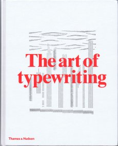
Technische
Angaben
-
352 S., 32x25,5 cm, ISBN/ISSN 9780500241493
Hardcover, Leinen bedruck mit HP Indigo 10000, mit Lesebändchen. Die Bilder auf dem Umschlag werden per Zufall aus 230 Bildern kombiniert
ZusatzInfos
-
Mit Texten von Steven Heller, John Maeda, Eugene S Flamm.
The beloved typewriter--its utilitarian beauty, the pleasing percussive action of striking its keys, the singularity of the impressed page--is enjoying a genuine renaissance across the creative industries. In this authoritative publication, the founders of the Sackner Archive of Visual and Concrete Poetry, the largest such collection in the world, apply their experience, mining the collection they have created over four decades to present examples produced by more than 200 of the world's finest typewriter artists. From the early ornamental works produced by secretaries in the late nineteenth century to more recent works that consider the unique position of the typewritten document in the digital age, there is an astonishing and delightful range of creativity in every artwork.
Text von der Webseite
|
Titel
-
Have you been Duchamp'd? parts 1, 2 and 3
Technische
Angaben
-
[58] S., 29,1x23,3 cm, Auflage: 100, signiert, keine weiteren Angaben vorhanden
29 Blätter in Karton, aufgeklebter Titel, Niete, Stempel, Bindfadenverschluss
ZusatzInfos
-
Meditating on language and symbol, Sutherlands three-part bookwork evolves from a predominant use of text over image to the reverse. (e-artexte)
|
Technische
Angaben
-
158 S., 29,3x23 cm, ISBN/ISSN 9780976164197
Broschur, diverse Papiere, teilweise zum Ausklappen, mit eingelegter CD und eingestecktem Heft von Kay Rosen
ZusatzInfos
-
As usual, the magazine contains a multidisciplinary mix of contemporary artists’ projects, critical writing, creative nonfiction, visual essays, and a themed CD of brand-new music. Some highlights include projects by Kay Rosen, Charlie White, and Sarah Malakoff, and a deconstruction of crossword-puzzle science by New York Times crossword genius David Quarfoot, as well as new installments in the magazine's regular series.
For our 9th CD, “Dreams,” readers submitted transcripts of their dreams, which were then passed along to musicians, each of whom picked one to serve as the basis for a song. The 11 musical acts, including White Whale, Ida, Dirty Projectors, Califone, and Paavoharju, chose from over 100 submissions. Transcripts of the selected dreams appear in Esopus 9 alongside five illustrations by New York–based artist Daniel Gordon.
Text von der Webseite
|
Titel
-
Schönste Bücher aus aller Welt / Best Book Design from all over the World
Technische
Angaben
-
2 S., 12x23 cm, keine weiteren Angaben vorhanden
Karton, Prägedruck
ZusatzInfos
-
Werbepostkarte mit Informationen zur Stiftung Buchkunst auf der Leipziger Buchmesse (17.02.-20.03.2016). Gestaltung: Sandra Doeller
|
Titel
-
Esopus 20 Special Collections
Technische
Angaben
-
29,3x23 cm, ISBN/ISSN 9780981574592
Schuber mit 14 Heften (Drahtheftung) und einer Mappe, diverse eingeklebte, teils gefaltete Blätter oder beigelegte Blätter auf diversen Papieren, einlegte CD in Schutzhülle,
ZusatzInfos
-
Jubiläumsausgabe zum 10-jährigen Bestehen.
With this 20th issue of Esopus, we celebrate our 10th anniversary. We couldn’t think of a better way to commemorate this milestone than by producing a special issue filled with archival material. To us, archives reflect a purity of purpose—on the part of both those who originally crafted their contents and those who have since collected and cared for them—that perfectly complements our mission over the past decade: to present unfiltered perspectives on creative expression in all of its forms.
Text von der Webseite
|
Technische
Angaben
-
108 S., 13,5x20,4 cm, Auflage: 25, numeriert, keine weiteren Angaben vorhanden
Broschur. Offset, Fotokopie, Cover Siebdruck
ZusatzInfos
-
Accounted For, 2006 collects 54 train receipts in order to document, in chronological order, the trips a railway traveller took in 2006. The blue-and-white pattern found on Belgian Railways tickets is printed offset over photocopies of one year’s worth of travel expenses (the individual receipts record the date and destination of each trip), thus giving the impression of continuous movement. Accounted For, 2006 was printed in downtown Lima, Peru in 2009, some three years after the train trips actually took place.
Text von der Webseite
|
Technische
Angaben
-
14 S., 29x13,6 cm, Auflage: 300, keine weiteren Angaben vorhanden
Kunststoff-Heftstreifen, Siebdruck. Einzelblätter und gefaltetes Plakat
ZusatzInfos
-
DIY is a timeline of the history of the space occupied by W139. In the form of reportage, replete with interviews, maps, and images from the archive, it takes as its starting point the renovation of the gallery space that was proposed in 2003 and from there reflects on the architecture of the building itself and its changing role within the city of Amsterdam over the years. DIY takes the ostensible form of a calendar and in its design and production embodies the do-it-yourself ethos that is so characteristic of W139. A fold-out map shows where a series of art objects were buried during a performance held before the previous renovation, in 1991.
Text von der Webseite
|
Titel
-
Colors Magazine No. 67 - Aids/HIV
Technische
Angaben
-
116 S., 28,5x23 cm, keine weiteren Angaben vorhanden
Broschur
ZusatzInfos
-
Twelve years after the first AIDS issue, an update on the evolution of the problem and its new geography, with a focus on both personal stories and general issues. On the cover the portrait of Nyameka J. Matiayana, one of over three million people who died of AIDS-related causes in 2005. Text von der Website
|
Technische
Angaben
-
282 S., 27x22,5 cm, ISBN/ISSN 3865211259
Hardcover, fadengeheftet, mit Schutzumschlag
ZusatzInfos
-
Fazal Sheikh made his first trip to the holy Indian city of Vrindavan in 2003. Each year thousands of women make their way there to join the community of widows who spend their days in the temples, worshipping their god Krishna, and preparing for death. Over the next three years, Fazal Sheikh became accepted by the widows, who agreed to sit for their portraits and talked to him about their lives. Their stories revealed how powerless some of the women had been under the strictures of traditional Hindu law. They were victims of enforced marriage, physical violence, sexual abuse and neglect. Some had been evicted from the family home once their children were married. Others had left of their own accord. As Fazal Sheikh discovered, what the women find in Vrindavan is not just religious solace, but in the sisterhood of other widows they find companionship and support. In his portraits their faces are suffused with calm – in some cases they already seem to have reached a half-life, somewhere between this world and the next – and their religious faith, in many ways the source of their past troubles, finally brings them peace. This project was published as Moksha
Text von Website
|
Technische
Angaben
-
[64] S., 30,5x22,5 cm, Auflage: 200, 2 Stück. ISBN/ISSN 9780996282222
Softcover, Drahtheftung,
ZusatzInfos
-
Kelli Sims' It's Michael is a collection of drawings and watercolors created by the artist over a span of one week in March 2015. The book offers a glimpse into the artist's unique process of digesting reality. A certain urgency and rawness is evident in depicting a disorienting range of Sims' subject matters. In her works on paper, a pen or a brush cast a net extracting brief moments of clarity from the sea of daily observations, free association, dreams, and the internet. It is the first time Kelli Sims' work is displayed in a form of a book, adding to her diverse practice ranging from video, performance to painting and sculpture.
Kelli Sims (b. 1984, Monroe, Louisiana) received her MFA from the Glasgow School of Art in 2014 after studying at the University of Louisiana and the School of the Museum of Fine Arts in Boston. Recent exhibitions include Prehistoric Loom, Yada Shimin Gallery, Nagoya, Japan, Prehistoric Loom, No Toilet, Soeul, South Korea, Dear Green, ZK/U, Center for Art and Urbanistics, Berlin. How Many Shades Would an Artist Pack for Holidays?, Neoterismoi Toumazou and Aλ,áς, Nicosia, Cyprus.
Supported by the Glasgow School of Art as part of the Glasgow Master Series 2014.
Text von der Webseite
|
Titel
-
FAX HeART - International Fax Art Project
Technische
Angaben
-
[12] S., 21x14,8 cm, keine weiteren Angaben vorhanden
Blätter gefaltet, lose ineinander gelegt,
ZusatzInfos
-
Begleitheft zum Projekt. The idea to initiate the FAX HeART project had been conceived during the total blockade of Serbia by the whole world community, when even cultural relations with us, i.e. exchange of art works, exhibitions and publications, were bannend. Our desire had been to break through the blockade by telefax and make contact with as many artists from all over the world as possible. The effects and results of this campaign were splendid. As scheduled, on October 20, 1994, between 5 and 9 o'clock p.m. more than a hundred faxes arrived from various parts of the world.
Text aus dem Heft.
|
Titel
-
Back from Venice - Feindliche Übernahme von BP
Technische
Angaben
-
2 S., 14,8x10,4 cm, signiert, keine weiteren Angaben vorhanden
Postkarte, eine rückseitig gestempelt, mit Widmung und signiert
ZusatzInfos
-
Ein Künstler übernimmt einen Ölkonzern über den Müll, den letzterer in die Meere goß! Er sammelt Teer und Ölschmutz von der Küste und erstellt rohe Ölmalereien. Der Verkauf finanziert den Ankauf weiterer Aktien des grünen Ölgiganten. Sie kaufen Kunst und Ruppe Koselleck BP!
Text von der Webseite
|
Titel
-
Olafur Eliasson - Sonne statt Regen
Technische
Angaben
-
96 S., 23x37 cm, ISBN/ISSN 3775712593
Hardcover, fadengeheftet
ZusatzInfos
-
Buch erschienen anlässlich der Ausstellung "Sonne statt Regen" von Olafur Eliasson im Kunstbau der Städtischen Galerie im Lenbachhaus, 08.03.-15.06.2003. Olafur Eliasson beschäftigt sich seit Anfang der neunziger Jahre mit kognitiven und physikalischen Phänomenen, wie man sie aus der Natur und den Naturwissenschaften kennt. Mit technisch sehr aufwändigen Apparaten oder auch bestechend einfachen Mitteln wie Wasser oder Licht stellt er künstliche Landschaften und Wahrnehmungsmomente her, die natürliche Phänomene (wieder) erlebbar oder sichtbar machen. Ihre stark atmosphärische, aber gänzlich konstruierte Qualität macht dabei schmerzlich bewusst, wie weit unsere moderne Zivilisation von unmittelbarer Erfahrung entfernt ist und stellt die Annahme von Authentizität im Bereich der Wahrnehmung in Frage. Dieses in Zusammenarbeit mit dem Künstler großzügig gestaltete »Over-Size«-Buch versammelt eine Serie von Landschaftsfotografien Eliassons aus seiner isländischen Heimat, die sich mit den Grenzen und Konventionen unserer herkömmlichen Landschaftserfahrung beschäftigen. Sie verdeutlichen, dass unsere Wahrnehmung von Natur entscheidend von kulturellen Einflüssen, Erinnerungen und Erwartungen geprägt ist. Zum Künstler: Olafur Eliasson *1967 in Kopenhagen. 1989-1995 Studium an der Königlich Dänischen Kunstakademie, Kopenhagen. Zahlreiche Ausstellungen weltweit, darunter auch im Solomon R. Guggenheim Museum und im Whitney Museum of Art, New York, 1999 Teilnahme an der Biennale Venedig. Lebt und arbeitet in Kopenhagen und Berlin.
Text von der Webseite
|
Titel
-
Reflektor M Digest #12 - Landscape Chart
Technische
Angaben
-
[106] S., 21,5x14 cm, keine weiteren Angaben vorhanden
Broschur
ZusatzInfos
-
On a full Moon there must be thousands, maybe millions of photos of the night sky being sent by smart phones. The busy Moon moves much faster around the world these day. At the end of 19th century, N (a student of English literature, who would become very well known as an author of many great works), found himself in London. Since the 17th century, the Edo government had prohibited international trade and travel except with China and Holland for over 200 years. It was only when Matthew C. Perry came to Uraga in 1853 and succeeded with his negotiations, what Japan's new history of forgeign affairs began. Gradually the English language was introduced into the intellectual elite, and a few members were sent overseas to learn the language in order to respond to the needs of the new age. N was one of them.
Text von der Webseite
|
Titel
-
Stickers. From the first international sticker awards
Technische
Angaben
-
[324] S., 13x21 cm, 3 Teile. ISBN/ISSN 9783899551518
Broschur, beiliegend 2 Bögen mit Stickers, Aufklebern
ZusatzInfos
-
Stickers have become an essential element of contemporary street art used by the most underground of artists. With stickers, anyone can plant their flag, gain notoriety, recognition and attain instant coverage while the action itself is inconspicuous. This book documents the best submissions from the first international sticker awards which have been established to record this constantly evolving movement.
Low-tech and prepared in advance, stickers are made from a multitude of materials and techniques from hand, photocopies, posters and wheat pastes to walls. From drainpipes and crosswalk boxes to street signs and walls, stickers can be found almost anywhere at eye level on public surfaces blending into and becoming part of the streets. Motifs vary from scribbles and characters to intricate figurative images, often personal logos or tags functioning as trademarks. Stickers have created a revolution in communication – proving to be effective tools in establishing dialog, inspiring reaction and feature messages that are subversive, fun and often cryptic.
This extensive volume presents over 800 examples from around the world and includes 2 pages of award winning real stickers for the reader’s enjoyment.
Text von der Webseite
Sticker aus Asien, Israel, Latein- und Süd-Amerika, Nordamerika, Europa
|
Technische
Angaben
-
[168] S., 33,5x26,8 cm, ISBN/ISSN 3865211925
Hardcover mit Leineneinband und geprägtem Cover.
ZusatzInfos
-
Thirty years ago Bailey decided he wanted to do something un-cast, un-posed and organic. Finally realised over the last three years, Bailey’s Democracy represents the culmination of this vision. Studio visitors were asked if they would agree to be photographed naked. Abandoning issues of framing, composition, backdrop and lighting, each volunteer (mostly strangers and non-celebrities) was treated in exactly the same way. No digital manipulation was applied. This is what Bailey calls his “imposed democracy’. These are naked people – old, young, model perfect, ordinary looking. Naked not nude as Bailey is keen to emphasise. Nude photography is all about the photographer and what he brings to the shot – lighting, prejudices and aesthetics. In contrast naked photography is only about the subject. These are undirected, un-cast images where the sitters chose their own pose.
Text von faggionato.com
|
Titel
-
TRANSART - A Journey Into Aural Space Vol. 1
Technische
Angaben
-
[166] S., 24,1x16 cm, ISBN/ISSN 9788890981784
Klebebindung mit offenem Rücken, silberner Risodruck gedruckt auf schwarzem Papier, in Umschlag aus Luftpolsterfolie und Aufkleber.
ZusatzInfos
-
Commissioned on the occasion of the 15th anniversary of the contemporary music, performance and art festival Transart, the book takes the festival’s archive as a starting point to read its chronicles. Printed in silver on black paper, Transart becomes a journey into a shining galaxy that constitutes its own narrative. The innumerous locations spread over a vast territory, from industrial buildings to turbine halls, animal auction houses to parking lots, concert halls to museums, as well as natural landscapes, become stellar constellations that are temporarily inhabited by artists, musicians and performers.
Text von der Webseite.
|
Technische
Angaben
-
[232] S., 34x22,7 cm, Auflage: 2.000, ISBN/ISSN 978-1-910164983
Broschur, jede Seite randabfallend bebildert
ZusatzInfos
-
Nothing but Clouds were the words used by the research commission in Andrey Tarkovsky’s 1972 film Solaris to deny video evidence suggesting traces of alien life on the planet. Taking this disclaimer as its title, this meditative book by Kristina Jurotschkin brings together images from her photographic archive made in various places across Europe over numerous years. Jurotschkin’s alienating views of everyday spaces examine the fabric of our social reality and propose an archaeological survey of our future.
Text von der Webseite
|
Titel
-
Andy Warhol - the complete commissioned magazine work 1948 - 1987
Technische
Angaben
-
407 S., 39x27,5x5 cm, ISBN/ISSN 978-3-791349923
Hardcover, Fadenheftung, in Schuber
ZusatzInfos
-
This gorgeously illustrated deluxe volume shows the full range of Warhol’s work for magazines—which will surprise even his most ardent fans—and includes cover art, editorial illustration, and ad work.
Beginning with the cover of a 1948 issue of Carnegie Tech’s student magazine, Cano, and ending with a 1987 issue of Jet Society International, this stunning book explores, for the very first time, the full story of Warhol’s collaborations with some of the most influential publications of the 20th century, including Harper’s Bazaar, Vogue, Time, TV Guide, Vanity Fair, and Playboy. Generously illustrated with images of the magazine layouts, this landmark publication collects more than 400 issues, revealing the artist’s full range of styles while also charting his artistic development over the decades. From charming drawings of shoes, hats, flowers, and cats to iconic illustrations of cars and cosmetics, from glitzy celebrity portraits to sexy pinups made with collaged Polaroids, this catalogue raisonné sheds new light on the influence of the media and consumerism on contemporary art (and vice versa) even as it offers a unique perspective on Warhol’s deep and lifelong connection to popular culture.
Text von der Webseite
|
Titel
-
Der Komfort-Kuppel-Komplex
Technische
Angaben
-
[44] S., 14,8x10,5 cm, 2 Stück. keine weiteren Angaben vorhanden
Drahtheftung
ZusatzInfos
-
Dies ist eine Themenausstellung! Aus aktuellem Anlass gehen wir nicht der Frage nach, wie sich ein „Aufbäumen Europas“ ausnehmen würde und was nach diesem hochenergetischen Akt geschehen soll, sondern wir bauen mit Hilfe des Philosophen Slavoj Žižek eine Versuchsanordnung: Er entwarf vor einiger Zeit das Bild einer „Kuppel“, in deren Inneren die Gewinner der Globalisierung agieren. Damit folgt er einer Idee seines Kollegen Peter Sloterdijk, der Idee vom „Weltinnenraum des Kapitals“. Sloterdijk hat verschiedene, recht konkrete Vorstellungen der architektonischen Ausformung dieses Innenraums. Er spricht zum Beispiel von „Kristallpalästen“, einem „Treibhaus ohne fester Außenhaut“, einem „Weltpalast“, einem „Geflecht aus Korridoren des Komforts“. Žižek konzentriert sich auf das Bild der Kuppel. Es mag einem dabei der transparente „Dome over Manhattan“ (ca. 1960) des Visionärs Buckminster Fuller in den Sinn kommen. Jedoch müsste man sich das Gebilde ins Immense vergrößert vorstellen, wie es gläsern die gesamte westliche Welt überspannt. Unter dieser Haube treiben zum Teil skurrile, zumeist beängstigende Gewächse aus. Heute gerade mal für ein, zwei Generationen Selbstverständliches wird einfach so in Frage gestellt, und Themen des linksliberalen Kampfes frech gekapert und gegen die eigentlichen Urheber gewendet. Wie reagieren? Was tun? Sich seiner Geschichten bewusst werden, erstmal: Wer sind wir? Wo ist das Licht? Wo die Luft und der Boden? Bleiben wir unter Glas, oder hat jemand den Schlüssel?
Die assoziative Ausstellung will den Versuch machen, den Komfort-Kuppel-Komplex ein wenig zu beschreiben und zeigt anhand von historischen Artefakten und Exponaten aus Kunst, Film und Design unterschiedlichste Facetten unserer Glaskuppelexistenz.
kuratiert von Swantje Grundler und Thomas Mayfried
Text von der Website.
|
Technische
Angaben
-
[32] S., 28x21 cm, ISBN/ISSN 978-3-943514292
Drahtheftung, Schwarz-weiß Illustrationen
ZusatzInfos
-
The Coloring Book by Dr. Lakra is the first BOM DIA KINDER book, a new series of children books made by artists. Dr. Lakra is a Mexican artist living in Oaxaca, Mexico. The images compiled inside this coloring book come from various references, inspirations, as well as drafts for the tattoos that Dr. Lakra has made, or wishes he’d made over the years. This is an insight into the world of Dr. Lakra, where many of the interests present in his work collide. ancient mythologies, punk rock fanzines, classic tattoo designs, popular culture icons, Japanese monsters, animal illustrations etc.
Text von der Website.
|
Technische
Angaben
-
59,5x42 cm, keine weiteren Angaben vorhanden
Plakat gestempelt.
ZusatzInfos
-
Plakat zum Performance-Programm im Projektraum Supportico Lopez, Berlin, 27.,28. & 29.04.2018. Eine Zusammenarbeit der Performance-Agency und des Archivio Conz.
Archivio Conz houses artworks, documents, editions and personal belongings collected and catalyzed by Francesco Conz (Cittadella 1935-Verona 2010) over the course of more than 30 years. More than a collector, he worked closely with artists from the mail artistic Avant-garde movements of his time -Fluxus, Concret Poetry, Actionism and Letterism. He left an archive of more than three thousand items.
Text von der Webseite.
|
Titel
-
The I.S.C.A. Quarterly Volume 14 Number 4 - 11th annual bookworks issue
Technische
Angaben
-
21,8x24,8x6 cm, Auflage: 100, signiert, 86 Teile. keine weiteren Angaben vorhanden
Konvolut mit 17 Heften (Drahtheftung, geklammert, Fadenheftung, genäht), ein Bogen mit 42 Künstlerbiefmarken mit unterschiedlichen Motiven, 8 Einzelblätter, ein Papiertütchen mit Karten, 8 Leporellos/selbstgemachte Zines. Zwei eigene Konvolute: 8 Miniheften in transparenter Plastiktüte und Leporello in Papiertüte, mit Plastikklammern verschlossen und beklebt.
Alles nummeriert und meist signiert, teils beklebt, bestempelt, mit angeheftete Objekten o.a. Alles in beklebtem Karton.
ZusatzInfos
-
The International Society of Copier Artists (I.S.C.A) was a non-profit group founded by Louise Neaderland in 1981, intended to promote the work of copier artists and to advocate for the recognition of copier art as a legitimate form. The group is best known for producing The I.S.C.A Quarterly as well as for coordinating exhibitions of xerographic artwork, and the distribution of "The I.S.C.A Newsletter". Women made up the majority of society's membership.
The I.S.C.A. Quarterly was published from 1982-2003. Typically, issues were produced in limited editions of 200 copies, with an average of 45 pages of original copier art supplied by I.S.C.A. members. Over the years the form of the Quarterly mutated from a collection of unbound pages to a spiral bound journal with an Annual Bookworks Edition composed of a box of books made by I.S.C.A. members. The work produced for the Quarterly ranged widely in focus from social and political issues to personal and emotional themes. The final issue (Volume 21, #4) was published in June 2003.
Text von Wikipedia
|
Technische
Angaben
-
114 S., 24x15,7 cm, ISBN/ISSN 9789491819490
Fadengeheftet, Hardcover, mit signiertem Exlibris in Pergaminumschlag
ZusatzInfos
-
A true gift is intimate. It is a carrier of meaning that involves the capacity to amuse, delight, and identify empathically with our recipient’s desires. This exceptional book by New York-based conceptual artist Barbara Bloom, entitled Gifts, explores the nature of gifts in relation to aspects such as wrapping, covering and uncovering, pleasure, and generosity.
A passionate collector of ornamental paper from all over the world, Bloom has studied the history and aesthetics of gift-wrapping in detail. In Gifts, she tries to blur the conventional distinction between art and life, whilst offering new insights on notions of concealment and revelation. ‘Can the box be an artwork? Can the wrapping be the gift?’ – she questions her readers.
Text von der Website.
|
Titel
-
Mini Zine - Early 80's San Fransisco, USA
Technische
Angaben
-
[32] S., 15x11,2 cm, Auflage: 125, keine weiteren Angaben vorhanden
Drahtheftung, zweifarbiger Siebdruck, Infotext auf Flyer, mehrfach gefaltet und eingelegt
ZusatzInfos
-
This is a small selection from the Tom Law collection which is now in the collection of Stanford Libraries. The whole collection features over 1400 hand bills from San Fransisco's 80's music scene from bands like Flipper, Sonic Youth, Dead Kennedys, Sun Ra, The Dicks, Hüsker Dü, Grateful Dead and many more. This zine is printed in different colours, therefore there is no copy like the other. What you see here is just an example of the colours. A small story about the collection is also included.
Text von der Website.
|
Technische
Angaben
-
416 S., 22,86x15,24 cm, Auflage: Print on Demand, keine weiteren Angaben vorhanden
Broschur
ZusatzInfos
-
This book was made by sending the entire text of Bret Easton Ellis' American Psycho between two GMail accounts page by page. We saved the relational ads for each page and added them back into the text as footnotes. In total, we collected over 800 relevant ads for the book. The constellations of footnoted ads throughout these pages retell the story of American Psycho in absence of the original text. This retelling reveals GMail's unpredictable insensitivity to violence, racism, and sex. It serves as a blurry portrait of an algorithm that exists in our everyday communication simultaneously forming a new portrait of the lead character, Patrick Bateman.
Text von der Webseite
|
Technische
Angaben
-
106 S., 21x14,8 cm, Auflage: Print on Demand, keine weiteren Angaben vorhanden
Broschur
ZusatzInfos
-
Schwarz-Weiß-Drucke, Nr. 032 aus der Reihe 100for10.
I’m a young illustrator currently moored on the Thames in my houseboat. Working from my home studio I like to draw in a variety of mediums, more recently focusing on vector graphics. I enjoy the fast paced nature of vectors, which allows me to capture vivid ideas in a hopefully bold, interesting and thought provoking manner. Working regardless of brief I like to continue to produce a body of work to satisfy my creative habits. This has led to sharing daily drawings online via Instagram, which is a great platform to discover and meet other creatives. I have had the honour of working with some fantastic individuals over the past year, which I try to share online via my website. This September I plan to go to Central Saint Martins to further my studies, devote my time to and produce more art! I’m looking forward to all that this opportunity has to offer.
|
Technische
Angaben
-
106 S., 21x14,8 cm, Auflage: Print on Demand, keine weiteren Angaben vorhanden
Broschur
ZusatzInfos
-
Schwarz-Weiß-Drucke, Nr 038 aus der Reihe 100for10.
75 g/m² started as a black and white photocopy exhibition. The project was initiated by Maycec, a photographer, self-publisher and graphic designer who draws inspiration from alternative culture and her personal life. She is co-founder of Vesselroom Project and Atelier29. The first 75 g/m² exhibition took place in Berlin in 2014 with Maycec alongside Vonverhille and Damien Sayer whom both grew up in the suburbs of Paris. Vonverhille started in the graffiti scene in the 90s. He diversified his means of expression and explored photography and experimental electronic music. He now lives in Berlin where he founded Erratum galerie. Damien Sayer has photographed his family, friends and encounters over the course of five years. His small format pictures remain simple documentary pages, simple facts or portraits recorded on a sheet of paper. Alizee Lenox joined the exhibitions 75 g/m2 part II and part III. She is a poet DeepLy influenced by Pop Culture mostly because you cannot not be influenced by a soft machine that creates so many idols you can hate and worship at the same time. She is currently working on her first chapbook manuscript.
|
Technische
Angaben
-
106 S., 21x14,8 cm, Auflage: Print on Demand, keine weiteren Angaben vorhanden
Broschur
ZusatzInfos
-
Schwarz-Weiß-Drucke, Nr. 047 aus der Reihe 100for10
Louis-César is an illustrator living in Nantes (France). He considers himself as a doodler spending his time drawing monsters, weird people and nonsense scenes on his sketchbooks. He works with indie publishers, small presses and zines all over europe.
Text von der Webseite.
|
Titel
-
Hin und Weg, Carried away
Technische
Angaben
-
106 S., 21x14,8 cm, Auflage: Print on Demand, keine weiteren Angaben vorhanden
Broschur
ZusatzInfos
-
Schwarz-Weiß-Drucke
Stanislaus Müller-Härlin works as a freelance artist and lecturer. His drawings and sketches are usually brief notations that can make changing series over the years. They focus on social, political and social issues as well as memories, reports about traveling or show all sorts of trials and tribulations. Another artistic focus are installed, in which graphics, light and space combine.
|
Technische
Angaben
-
106 S., 21x14,8 cm, Auflage: Print on Demand, keine weiteren Angaben vorhanden
Broschur
ZusatzInfos
-
Schwarz-Weiß-Drucke
C100 is a creative studio working for global brands, small businesses and private projects. It is headed by Christian Hundertmark who founded the studio in 2003. Specialised in delivering inventive and precise visual solutions C100 Studio implements each project with enthusiasm, dedicated hands and a individual style which is evident in the diverse output. Over the years C100 Studio’s work was published in many books and magazines. French publishing house Pyramyd released an edition in their ‘Design & Designers’ book series. From 2007-2011 C100 Studio was European correspondent for Hong Kong based IdN design magazine.
|
Technische
Angaben
-
29,7x21 cm, keine weiteren Angaben vorhanden
Ein loses Blatt, einseitig bedruckt
ZusatzInfos
-
A zine talk, workshop by Luke from Sticky. 05.04.2005, city library Melbourne.
Sticky Institute is a shop and resource devoted entirely to zines. We sell zines on behalf of zinemakers, and since opening in 2001 have stocked over 12,000 zine titles.
|
Technische
Angaben
-
keine weiteren Angaben vorhanden
|
Technische
Angaben
-
76 S., 23x16 cm, ISBN/ISSN 978-3-943514865
Broschur, Einband Chromkarton
ZusatzInfos
-
This book is published on the occasion of the project Dandilands at Troodos, Cyprus, August 2014 to October 2015. This publication is the unfolding of the first part of Dandilands, an art project in collaboration with visual artists, Marc Bijl, Mustafa Hulusi, Mahony, Jumana Manna, Michelle Padeli, Liliana Porter, Kevin Schmidt, Socratis Socratous, Kostis Velonis, and Carla Zaccagnini, which took place between autumn of 2014-15. A random audience could walk along a circular trail of 7km through a rocky path overlooking wild trees with a view beyond the forest and over the island of Cyprus, and come into contact with a standing sign exhibiting the artists’ work. A sign as both site and object. a place of intention and image. a setting of the social.
Text von der Webseite
|
Titel
-
You're my type - Programmbuch 2018
Technische
Angaben
-
20,5x13,5 cm, keine weiteren Angaben vorhanden
4 Bände in Schuber. Schuber geprägt in Gold und Schwarz, Rückseite mit Umkehr der Farben. einzelne Cover mit Reliefprägung, geometrische Formen, Farbschnitt schwarz. Einzelne Bände in Schweizer Broschur (Umschlag nur auf Rückseite angeklebt, Rücken mit Gewebestreifen eingefasst). Bd. 1 130 S., letzte Seite mit Kalender als Fold-Out. Bd. 2 160 S., Bd. 3 96 S., Bd. 4 Blindband, (Notizbuch), 72 S.
ZusatzInfos
-
The Typographic Society Munich is the largest organisation in Europe for typographers and people who are interested in typography and design. Since being founded in 1874 the designers’ club establishes a foundation for sophisticated and interdisciplinary thinking and dialogues among content and form, text and photo, tradition and innovation, design and technology. The tgm represents quality and education for the branch of communication and offers a huge accompanying training program. As Chairwoman of the club I curated several lectures in the last years, inviting design and typography celebrities.Throughout the years designers like Stefan Sagmeister, Mirko Borsche, Eike König, Mario Lombardo, Sascha Lobe, Fons Hickmann, Amir Kassaei or Kurt Weidemann to name a view, followed these invitations and appreciated the warm welcome of our community.
To show the wide range of offerings we traditionally create a yearbook. More over I tried to give the content based complexity of our proposal a clear and neat arrangement. Therefore the new release is a compilation of four different books, which should invite the reader to inform themselves, to browse, to experience and to participate. The first one exposes all the topics, facts and dates for the further education programs. Part two presents all the people and their stories who are involved in the club, who are on stage and behind the scenes. The third book is a journey into the past and also the future of tgm’s conferences, excursions and other specials. And finally there is room for the reader’s own ideas, experiences and criticism as a foundation for a future dialogue with tgm.
Every offer under the roof of tgm is a result of solidarity. It is a result of people and companies who are united by the common interest in typographic quality. This project has only been possible with the support of Kösel Druck GmbH & Co Kg, Geese Paper, mycolorserver and the collaboration with Boah Kim.
Text von der Webseite
|
Titel
-
Selected works from 1990's
Technische
Angaben
-
[32] S., 19x13 cm, Auflage: 500, keine weiteren Angaben vorhanden
Drahtheftung, Schwarz-Weiss Offsetdruck
ZusatzInfos
-
The William Crawford Estate is owned and represented by Ampersand Gallery. William Crawford's drawings were discovered in an abandoned house in Oakland, California. His work brings to mind characteristics of prison drawings, an impression confirmed by the fact that several were made on the backs of prison roster sheets dated 1997. These printouts, however, were cut down the middle, so the exact prison from which they originate is unknown. But given their origin in the Bay Area and the fact that several drawings include San Francisco landmarks, it's possible that Crawford made the work in a California state prison. Other than this information drawn from the archive itself, nothing is known about Crawford's life. Indeed, we only know his name because he signed just a few of the drawings, either as Bill, William or WM Crawford. The archive appears to have consisted of several books, with individual drawings in sequences of 30 or more adding up to tell complex visual stories. Several include written captions or fragments of conversation between male and female characters. These sequences, however, have been broken up over the years and reach us now in a fragmentary and fascinating collection of hundreds of delicate pencil drawings. The work conveys the intense sense of sexual longing of a man with an urge to tell dynamic stories. The drawings, which resemble the eroticism of Eric Stanton, the exaggerated male anatomy of Tom of Finland or the ample breasts of a John Currin, show scantily dressed women, drug use, cuckolding and orgies. The details of his interiors, the hairdos and style of dress suggest that Crawford might have come of age in the late 70s or early 80s. A cast of recurring figures populate the drawings, notably one man with a short afro and a moustache who often figures at the center of events, presumably the artist William Crawford himself. Remarkably, given the number of drawings, there is little to no repetition in the work. Crawford’s inventive eye for sexual positions, facial expressions and gestures of hand and body was vast and masterful. Simple geometric details and architectural subtleties define the unusual settings where the action unfolds. We see rooms shown from unusual angles, features that are hinted at, erased or altogether omitted and articles of clothing that are drawn with obsessive precision. This singular and original drawing style compels us to immerse ourselves in the world William Crawford created, more dream than documentation, more fantasy than perversion. Crawford's drawings have been widely exhibited, notably at Galerie Susanne Zander (Cologne and Berlin), Zieher, Smith and Horton (New York), Freddy (Baltimore) and upcoming solo exhibitions at FARAGO (Los Angeles) and Richardson (New York). His work is also featured in the latest issue of Richardson Magazine and was included in "System and Vision" at David Zwirner, an exhibition organized in collaboration with Delmes & Zander. Reviewing it, The New Yorker wrote, "William Crawford's orgiastic illustrations on the backs of prison rosters haven an erotic intensity that rivals anything by Hans Bellmer or Pierre Klossowski."
Text von der Webseite
|
Titel
-
Asphaltbibliotheque Berlin
Technische
Angaben
-
[32] S., 21x14,8 cm, Auflage: 20, numeriert, signiert, keine weiteren Angaben vorhanden
Drahtheftung, mit bedruckter CD in Papierhülle
ZusatzInfos
-
CDr mit Fieldrecordings (roll over berlin)
|
Technische
Angaben
-
14,8x10,5 cm, keine weiteren Angaben vorhanden
A 4 Blatt, doppelseitig bedruckt, gefaltet auf A6, mittig geheftet, so dass es nicht ganz aufgefaltet werden kann.
ZusatzInfos
-
Since 1974, Luna Bisonte Prods has published a wide variety of experimental, avant-garde, audio, and visual literature in a wide variety of formats by artists from all over the world. Among the authors and artists published are such major and emerging figures as Ivan Argüelles, Sheila E. Murphy, Jim Leftwich, Andrew Topel, Carlos M. Luis, Scott Helmes, Jake Berry, John M. Bennett, Susan Smith Nash, Al Ackerman, Bob Heman, Richard Kostelanetz, Charles Henri Ford, Dick Higgins, Robin Crozier, and many many others.
Text von der Webseite
|
Titel
-
Andy Warhol's Children's Book
Technische
Angaben
-
[12] S., 17,914 cm, ISBN/ISSN 3905173042
Leinenrücken, 6 Tafeln aus Hartpappe mit abgerundeten Ecken
ZusatzInfos
-
Motive, clockwork panda drummer, parrot, mechanical terrier, moon explorer (Roboter), roll over mouse, Roli Zoli (rollerfahrender Clown), Tomate, Affe, Space Ship, Fisch, tomate
|
Technische
Angaben
-
80 S., 23,6x16,5 cm, Auflage: 1.000, keine weiteren Angaben vorhanden
Drahtheftung, Schwarz-Weiss Offsetdruck
ZusatzInfos
-
Does anyone remember Plastic Bertrand? They thought he’d be unforgettable. And do you remember when the word plastic had a positive ring to it? In a scene from Mad Men a child is running around with a plastic bag over his head and his mother doesn’t bat an eyelash. It was the sixties. But even then, usage of the word could be confusing: plastic bomb, plastic surgery, plastic sculpture. Let us build an imaginary bridge between Henry Moore and rubbery explosives. Naturally, I’m building mine out of plastic. I can’t imagine it any other way. Plastic is the pre-manufactured utopia of the past. Plastic is the present. Plastic Bertrand is sure to make a comeback soon. Ça plane pour moi. Text von der Webseite.
|
Titel
-
ruine 03 – You see I've Always Wanted Things To Be Beautiful
Technische
Angaben
-
84 S., 18,3x13 cm, Auflage: 70, numeriert, 3 Teile. ISBN/ISSN 978-3-947250103
Broschur, Schwarz-Weiß-Digitaldruck, beigelegt ein gefalteter Flyer, zusammen in gefaltetem Blatt A3 mit Prägedrucken
ZusatzInfos
-
Zum Release und zur performativen Lesung in der Lothringer 13 florida in München am 01.03.2018 um 20 Uhr.
Ruine München is happy to presents Max Grau's first artist book ever. In his words: "I’m really happy with how the book turned out. It looks and feels pretty. It has 84 pages and contains 53.260 characters (incl. spaces). There’s 25 images spread out over six chapters (which have names of varying length). The whole thing is titled after a line from a Frank O’Hara poem that I really like (although I’m not quite sure if I »get« it). There’s footnotes and page numbers and even a topic (optimism. Sort of). The text is written in English and the book is covered in a beautiful sleeve, designed by Maria (I think). It (the sleeve) contains a very flattering text (in German) about… uhm… me, written by the whole RUINE gang. Every issue is numbered and since there wasn’t a ton of money (why is there never an actual ton of money?), we only printed an edition of 70."
Text von der Webseite
|
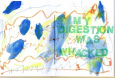 
Technische
Angaben
-
[42] S., 28,9x22,2 cm, Auflage: 200, numeriert, signiert, keine weiteren Angaben vorhanden
Fadenheftung, sechsfarbiger Risographie, letzte Seite ausklappbar
ZusatzInfos
-
Rage, Heal, Root, Grow is a celebration of the chaos and complexity of life and one person’s process of adapting to it. Johnson’s postpartum years were challenging. She was fearful of what she saw happening—that she was disappearing as her male partner was becoming more visible. She struggled to find the time and space necessary to heal her body, and to reconcile the intense inequity of a child-rearing partnership when one partner (her) was nursing. A unique postpartum tale that refuses the female body as its central character. In its place: that body’s voice, and the bespoke flotsam of daily life.
Rage, Heal, Root, Grow was created on a shared Risograph duplicator over many months while Johnson’s child slept in a stroller nearby. She scanned and printed drawings they had made together with markers, watercolors, crayons, pencils, and lots of stamps into symphonic six-color prints. A narrative text describes her experience of raging, healing, rooting herself, and subsequently growing in a new direction.
|
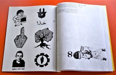 
Technische
Angaben
-
[50] S., 28x21,5 cm, Auflage: 100 ca., signiert, keine weiteren Angaben vorhanden
geklammerte Fotokopien, ein Blatt als Sticker eingebunden. Kopiert im August 2019
ZusatzInfos
-
... If you know me at all, then you know I like to operate where I see vacuums in the culture. Zine El-Arab came about precisely for that reason. This was 2011, a time of great revolutionary upheaval that started in Tunisia, spilled over into Egypt, and kind of spread from there not just in the region but halfway across the world.
By late 2011, there was really no denying the ripples of change pulsating through Cairo. It was evident on the streets, in music, conversations, at art galleries, on television, it was everywhere. But I was growing frustrated that there didn’t seem to be any regular publication that featured the voices of dissent that were otherwise all around you. It felt like there was a rift between everyday voices and what was being published, and how cool would it be if there were at least one? Especially if it were a crude one. ...
... Die Formel war scheinbar ganz einfach. Das Titelbild (von mir erstellt) wurde auf Social Media veröffentlicht und lud Mitwirkende aus dem arabischsprachigen Raum ein, darauf entweder mit Text oder Bild zu antworten (nur S/W). Entsprechende Einreichungen werden ausgewählt und zu einem digitalen Zine zusammengestellt, der als PDF mit detaillierten Anweisungen für Druck und Montage hochgeladen wird. Die Idee war, nicht nur den Inhalt, sondern auch die physische Produktion des Zine zu dezentralisieren, wodurch Mitwirkende und Leser ihre eigenen Kopien drucken und organisch unter ihren Gemeinschaften verbreiten konnten. In Wirklichkeit hatten beide Ausgaben ihre "Launchparties", Ausgabe eins in Makan in Jordanien und Ausgabe zwei in der Townhouse Gallery in Kairo, was bedeutete, dass für jeden Start etwa 100 Exemplare gedruckt und zusammengestellt werden mussten.
Eine Sache, die ich tun wollte, war, die Tatsache zu nutzen, dass jedes Exemplar technisch individuell gedruckt und gebunden wurde. So gab es beispielsweise für die Ausgabe #1 Anweisungen, den Blutfleck manuell auf das Cover zu malen, und im Inneren befand sich eine Seite (mit mehreren Bildern verziert), die für den Druck auf Klebepapier bestimmt war, auf der die Leser ausschneiden und als Aufkleber verwenden konnten.
Es sollte beachtet werden, dass es im Namen der Zine ein kleines Wortspiel gibt. Das Wort "zine" in arabischer Sprache ist die gleiche genaue Schreibweise wie das Wort "zain", was in etwa "das Beste" bedeutet. So schlägt Zine El-Arab nicht nur "die Zine des Arabers" vor, sondern wird gleichzeitig als "das Beste vom Araber" gelesen. ...
Übersetzt mit DeepL
Text von der Webseite
Foto Innenteil von Ganzeer
|
Technische
Angaben
-
[2] S., 29x20,5 cm, keine weiteren Angaben vorhanden
Roter Druck auf gelbem Papier
ZusatzInfos
-
Fingierte Einladung von McDonalds zur Teilnahme an Einsendungen, mit Preisen wie einer Fahrt nach Brasilien, um zu sehen "how McDonalds is shaping the future of this impoverished beef producing country" und nach Rom, "Hear the Pope speak on why poor people al over the world are in good hands."
|
Titel
-
DAS TREFFEN DREIER PUNKTE - Kapitel 1
Technische
Angaben
-
[48] S., 19x12,3 cm, keine weiteren Angaben vorhanden
Gefaltete Einzelblätter, mit Gummiband gebunden.
ZusatzInfos
-
Katalog zur Ausstellung DAS TREFFEN DREIER PUNKTE, 01.-31.07.2019, Berlin, im Rahmen von INTERIORS TO BEING.
INTERIORS TO BEING takes visitors and invited artists into an intimate encounter within the homes, gardens and streets of Berlin as well as the lives of strangers.
Text von der Webseite.
INTERIORS TO BEING spans time and space as a collective happening through the cityscape of Berlin. Six curators from Berlin have developed formats around the specifics of the work of a total of 51 artists and curators. The chosen formats range from traditional exhibitions, walks, salons and discussions to gatherings and performances.
The project unfolds over the course of the month of July in six chapters that flow into one another, occasionally overlapping. INTERIORS TO BEING expands radically outwards, realizing half of its projects in Berlin’s public space.
The city of Berlin is a partner of INTERIORS TO BEING as any curator or participating artists in the program would be. The cityscape functions anthropomorphically–with the city’s growth and continual change impacting the way artists move within it. INTERIORS TO BEING internalizes these changes through the framework of its community. All contributors to INTERIORS TO BEING are part of the extensive creative network of PICTURE BERLIN (founded in 2009, a not-for-profit artist initiated hybrid residency/art academy), which is a community made up of more than two hundred international artists and curators, two-thirds of whom are based in Berlin.
The red thread running through all events is the dérive, a term devised by Situationist Guy Debord to describe an aimless wandering through different urban environments that leads to the development of a psycho-geographical awareness. This concept beautifully sums up the way INTERIORS TO BEING works as a project in the city of Berlin.
Text von der Webseite.
|
Titel
-
HIDDEN TREASURES - Katipel 2
Technische
Angaben
-
[40] S., 19x12,3 cm, keine weiteren Angaben vorhanden
Gefaltete Einzelblätter, mit Gummiband gebunden, Wendeheft.
ZusatzInfos
-
Katalog zur Ausstellung HIDDEN TREASURES, 03.,07.,13.07.2019, Berlin, im Rahmen von INTERIORS TO BEING.
INTERIORS TO BEING takes visitors and invited artists into an intimate encounter within the homes, gardens and streets of Berlin as well as the lives of strangers.
INTERIORS TO BEING spans time and space as a collective happening through the cityscape of Berlin. Six curators from Berlin have developed formats around the specifics of the work of a total of 51 artists and curators. The chosen formats range from traditional exhibitions, walks, salons and discussions to gatherings and performances.
The project unfolds over the course of the month of July in six chapters that flow into one another, occasionally overlapping. INTERIORS TO BEING expands radically outwards, realizing half of its projects in Berlin’s public space.
The city of Berlin is a partner of INTERIORS TO BEING as any curator or participating artists in the program would be. The cityscape functions anthropomorphically–with the city’s growth and continual change impacting the way artists move within it. INTERIORS TO BEING internalizes these changes through the framework of its community. All contributors to INTERIORS TO BEING are part of the extensive creative network of PICTURE BERLIN (founded in 2009, a not-for-profit artist initiated hybrid residency/art academy), which is a community made up of more than two hundred international artists and curators, two-thirds of whom are based in Berlin.
The red thread running through all events is the dérive, a term devised by Situationist Guy Debord to describe an aimless wandering through different urban environments that leads to the development of a psycho-geographical awareness. This concept beautifully sums up the way INTERIORS TO BEING works as a project in the city of Berlin.
Text von Der Webseite.
|
Titel
-
THE MIDDLE STUFF - Kapitel 4
Technische
Angaben
-
[36] S., 19x12,3 cm, keine weiteren Angaben vorhanden
Gefaltete Einzelblätter, mit Gummiband zusammengehalten, Wendeheft.
ZusatzInfos
-
Katalog zur Ausstellung THE MIDDLE STUFF, 05.-12.07.2019, Berlin, im Rahmen von INTERIORS TO BEING.
INTERIORS TO BEING takes visitors and invited artists into an intimate encounter within the homes, gardens and streets of Berlin as well as the lives of strangers.
INTERIORS TO BEING spans time and space as a collective happening through the cityscape of Berlin. Six curators from Berlin have developed formats around the specifics of the work of a total of 51 artists and curators. The chosen formats range from traditional exhibitions, walks, salons and discussions to gatherings and performances.
The project unfolds over the course of the month of July in six chapters that flow into one another, occasionally overlapping. INTERIORS TO BEING expands radically outwards, realizing half of its projects in Berlin’s public space.
The city of Berlin is a partner of INTERIORS TO BEING as any curator or participating artists in the program would be. The cityscape functions anthropomorphically–with the city’s growth and continual change impacting the way artists move within it. INTERIORS TO BEING internalizes these changes through the framework of its community. All contributors to INTERIORS TO BEING are part of the extensive creative network of PICTURE BERLIN (founded in 2009, a not-for-profit artist initiated hybrid residency/art academy), which is a community made up of more than two hundred international artists and curators, two-thirds of whom are based in Berlin.
The red thread running through all events is the dérive, a term devised by Situationist Guy Debord to describe an aimless wandering through different urban environments that leads to the development of a psycho-geographical awareness. This concept beautifully sums up the way INTERIORS TO BEING works as a project in the city of Berlin.
Text von der Webseite.
|
Technische
Angaben
-
[64] S., 19x12,3 cm, keine weiteren Angaben vorhanden
Gefaltete Einzelblätter, mit Gummiband zusammengehalten, Wendeheft.
ZusatzInfos
-
Katalog zur Ausstellung HOSTING, 02.-31.07.2019, Berlin, im Rahmen von INTERIORS TO BEING.
INTERIORS TO BEING takes visitors and invited artists into an intimate encounter within the homes, gardens and streets of Berlin as well as the lives of strangers.
INTERIORS TO BEING spans time and space as a collective happening through the cityscape of Berlin. Six curators from Berlin have developed formats around the specifics of the work of a total of 51 artists and curators. The chosen formats range from traditional exhibitions, walks, salons and discussions to gatherings and performances.
The project unfolds over the course of the month of July in six chapters that flow into one another, occasionally overlapping. INTERIORS TO BEING expands radically outwards, realizing half of its projects in Berlin’s public space.
The city of Berlin is a partner of INTERIORS TO BEING as any curator or participating artists in the program would be. The cityscape functions anthropomorphically–with the city’s growth and continual change impacting the way artists move within it. INTERIORS TO BEING internalizes these changes through the framework of its community. All contributors to INTERIORS TO BEING are part of the extensive creative network of PICTURE BERLIN (founded in 2009, a not-for-profit artist initiated hybrid residency/art academy), which is a community made up of more than two hundred international artists and curators, two-thirds of whom are based in Berlin.
The red thread running through all events is the dérive, a term devised by Situationist Guy Debord to describe an aimless wandering through different urban environments that leads to the development of a psycho-geographical awareness. This concept beautifully sums up the way INTERIORS TO BEING works as a project in the city of Berlin.
Text von der Webseite.
|
Titel
-
RAUMANEIGNUNG - Kapitel 6
Technische
Angaben
-
[64] S., 19x12,3 cm, keine weiteren Angaben vorhanden
Gefaltete Einzelblätter, mit Gummiband zusammengehalten, Wendeheft.
ZusatzInfos
-
Katalog zur Ausstellung RAUMANEIGNUNG, 19.-31.07.2019, Berlin, im Rahmen von INTERIORS TO BEING.
INTERIORS TO BEING takes visitors and invited artists into an intimate encounter within the homes, gardens and streets of Berlin as well as the lives of strangers.
INTERIORS TO BEING spans time and space as a collective happening through the cityscape of Berlin. Six curators from Berlin have developed formats around the specifics of the work of a total of 51 artists and curators. The chosen formats range from traditional exhibitions, walks, salons and discussions to gatherings and performances.
The project unfolds over the course of the month of July in six chapters that flow into one another, occasionally overlapping. INTERIORS TO BEING expands radically outwards, realizing half of its projects in Berlin’s public space.
The city of Berlin is a partner of INTERIORS TO BEING as any curator or participating artists in the program would be. The cityscape functions anthropomorphically–with the city’s growth and continual change impacting the way artists move within it. INTERIORS TO BEING internalizes these changes through the framework of its community. All contributors to INTERIORS TO BEING are part of the extensive creative network of PICTURE BERLIN (founded in 2009, a not-for-profit artist initiated hybrid residency/art academy), which is a community made up of more than two hundred international artists and curators, two-thirds of whom are based in Berlin.
The red thread running through all events is the dérive, a term devised by Situationist Guy Debord to describe an aimless wandering through different urban environments that leads to the development of a psycho-geographical awareness. This concept beautifully sums up the way INTERIORS TO BEING works as a project in the city of Berlin.
Text von der Webseite.
|
Technische
Angaben
-
[2] S., 10,5x14,7 cm, Auflage: Unikat, signiert, keine weiteren Angaben vorhanden
Postkarte, Collage, Stempeldrucke, handschriftlicher Text
|
Titel
-
no one should call you a dreamer / 60 Minutes Later - A Collaborative Zine about Identity / ok werner / We Need Our Days To Be Quiet / days of each other,
Technische
Angaben
-
[20-36] S., 21x14,8 cm, 5 Teile. keine weiteren Angaben vorhanden
Drahtheftung, Schwarz-Weiß-Fotokopien
ZusatzInfos
-
"Ok Werner" is a handmade fanzine made in collaboration with my brother, Glasgow-based musician Brian McEwan about our favourite filmmaker, Werner Herzog.
The zine was made over a period of 4 days in late July 2012 at my house in Yorkshire on a self appointed 'Herzog holiday' and contains our personal and collaborative responses to Herzog and his films via interviews, quotes, images and writing.
"We Need Our Days To Be Quiet" is a sketchbook in zine format, containing collected drawing and collage, text and photography and thoughts, reading and findings from summer 2012.
Text von der Webseite
|
Titel
-
How to Art Book Fair (Expanded Edition)
Technische
Angaben
-
[36] S., 21,7x14,2 cm, Auflage: 600, keine weiteren Angaben vorhanden
Drahtheftung, Risographie, Aufkleber beigelegt, in Folienumschlag
ZusatzInfos
-
How to art book fair features advice on how to plan, participate, and succeed in an art book or zine fest. This second expanded edition features sections on pricing, selling, table layout, being a good tablemate, talking to fair organizers, trading, and more. With extra advice from over 15 art book fair experts, this book will guide you through everything you need to table at an art book fair.
Text von der Webseite.
|
Titel
-
Designprojekt_Schichtwechsel Künstlerbuch_WS 2019/20
Technische
Angaben
-
42x29,7 cm, keine weiteren Angaben vorhanden
Inkjetausdruck nach PDF
ZusatzInfos
-
Das Designprojekt »Schichtwechsel« ist eine Doppelveranstaltung, ein »cross over«. Zwischen zwei Disziplinen, zwei Dozenten, zwei Gruppen, zwei Herangehensweisen, zwei Betrachtungen. Künstlerisches Gestalten einerseits und Buchgestaltung andererseits – in zwei ineinandergreifenden Seminaren, jeweils Donnerstagsvormittags. Unser gemeinsames Projektthema wird die Gestaltung und Produktion eines/Ihres Künstlerbuches sein, in einer Auflage von drei Exemplaren, gestaltet und produziert jeweils in Zweierteams. ...
Text vom Infoblatt
Zum Besuch der Studentengruppen am 24.10.2019 im AAP Archive Artist Publications
|
Titel
-
... in which something happens all over again for the veryfirst time
Technische
Angaben
-
200 S., 23,5x15 cm, ISBN/ISSN 3886451658
Hardcover mit Titel in Blindprägung, Schutzumschlag mit gestanzten Löchern
ZusatzInfos
-
Zur Ausstellung in Paris 09.06.-17.09.2006, im Lenbachhaus München 25.11.2006-25.02.2007, publiziert mit der Unterstützung durch White Cube London.
... Für den Kunstbau der Städtischen Galerie im Lenbachhaus hat Cerith Wyn Evans eine Choreographie von fünfzehn Chandeliers entwickelt, in der er die in unterschiedlichen Rhythmen blinkenden und unterschiedlichste Botschaften vermittelnden Kronleuchter zu einem illuminierenden Gesamtereignis verdichtet. Begleitet wird diese Ereignis von drei Neonschriftzügen des Künstlers sowie einer Komposition des Sounddesigners Florian Hecker, der in seiner Arbeit sprachliche Systeme in akustische Signale übersetzt. Die Münchner Präsentation im unterirdischen Kunstbau ist das "dunkle" Pendant zu einer "hellen" Ausstellung in den Tageslichträumen des Musee d�Art Moderne de la Ville de Paris, die im Frühsommer dieses Jahres stattfand. In Zusammenarbeit mit Paris ist ein von den Pariser Grafikern M/M gestalteter Katalog zur Ausstellung entstanden. ...
Text von der Webseite
|
Titel
-
Books and editions - The world is very large.
Technische
Angaben
-
14,8x21 cm, 3 Teile. keine weiteren Angaben vorhanden
Drahtheftung, Preisliste und Visitenkarte
ZusatzInfos
-
Elisabeth Tonnard is a Dutch artist and poet working in artists’ books, photography and literature.
She has published over forty books that are exhibited widely and held in numerous private and public collections including the Centre Pompidou, Columbia University, Getty Museum, Kunstbibliothek Berlin, MoMA Library, New York Public Library, Tate Library and the Walker Art Center. Much of her work involves responding to existing books, texts and images, reworking them into new (visual) literature. The works range in scale and method from a book that is completely invisible to a book that is a swimming pool. A catalogue of books is available here.
Text von der Webseite
|
Technische
Angaben
-
[8] S., 14,8x10,5 cm, 2 Stück. keine weiteren Angaben vorhanden
Drahtheftung
ZusatzInfos
-
Infoheft zur Ausstellung in der Tate Modern, London, 17.10.2019-09.02.2020.
The visionary artist who embraced mass media and new technology.
Nam June Paik’s experimental, innovative, yet playful work has had a profound influence on today’s art and culture. He pioneered the use of TV and video in art and coined the phrase electronic superhighway to predict the future of communication in the internet age.
This major exhibition is a mesmerising riot of sights and sounds. It brings together over 200 works from throughout his five-decade career – from robots made from old TV screens, to his innovative video works and all-encompassing room-sized installations such as the dazzling Sistine Chapel 1993....
Text von der Webseite
|
Titel
-
How to shoplift books - Steal the book while the sun rises over the horizon.
Technische
Angaben
-
[84] S., 15,5x10,5 cm, Auflage: 1.000, ISBN/ISSN 978-3-945900208
Broschur
ZusatzInfos
-
2. Auflage. This artists’ book by David Horvitz is a guide on how to steal books. It details 80 ways in which one can steal a book, from the very practical, to the witty, imaginative, and romantic.
This publication originated in 2012 as a conversation in The Classroom at Printed Matter's NY Art Book Fair.
Text aus dem Buch und von der Webseite.
|
Titel
-
To Be Determined - According to the Situation
Technische
Angaben
-
184 S., 24x16,5 cm, ISBN/ISSN 978 88 6749 351 7
Broschur mit Klappen; Einband mit aufgeprägtem Foto, Papier Einband mit textilähnlicher Struktur, Vorsatz/Nachsatz bedruckt mit Foto schwarzweiß, innen verschiedene Papiersorten für Fotos, Texte und Zeichnungen. Druck: Tipografia Valdostana
ZusatzInfos
-
Erscheint zur Ausstellung im S.M.A.K., Gent, Belgien,11.03-04.06.2017.
"Welcome to the world of Dirk Zoete. Because that’s what his work is: a conceived universe. The way someone leaning over a table makes a plan and imagines the world. While technology takes us into several intangible dimensions with virtual reality and other applications, Zoete makes us believe the world is still flat. Everything seems to have only a front and a back. As if we still believed that the earth is just a disk, and we can fall off. Zoete’s drawings are clumsy, intermittent, naive, adventurous, simple. It’s like a child’s imagination, depicting in a heap what you otherwise cannot fit on a piece of paper." Philippe Van Cauteren. Published in occasion of his first major solo exhibition in a Belgian museum, To be determined. According to the situation, held at S.M.A.K. in Gent in 2017, this catalogue explores Dirk Zoete’s peculiar practice. Enriched by essays and texts by Philippe Van Cauteren, Stephan Berg, Koen Peeters and Ann Hoste, the book is a journey through the artist’s process—who, starting from a drawing, generates models, sculptures, architectural constructions, photos, films. An all-encompassing approach that makes the Belgian’s work outstand as a natural successor of the German Bauhaus and Russian Constructivism, but with a more human touch.
The catalogue features a wide selection of images, presenting the many different stages of transformation of a drawing into a three-dimensional piece, and the hybrid nature of the exhibition set-up, a mix of a museum show and an artist’s studio, both essential characteristics of Zoete’s art."
Text von der Webseite
|
Titel
-
When the Saints - il lato spirituale di FUN
Technische
Angaben
-
10,8x7,3 cm, keine weiteren Angaben vorhanden
weisse Faltschachtel, golden bedruckt, darin ein einfarbig violett gedrucktes 16 seitiges Booklet (drahtgeheftet) und 36 beidseitig farbig bedruckte Karten 10,5x7
ZusatzInfos
-
a colour box set with 36 alternative saints of the FUNtastic Nations by international authors (Giacon, Ruijters, Zattera, Chiarotto, Staffa, King, Echaurren, Biancuzzi, etc.) plus 16 pp booklet.
F.U.N. (Funtastic United Nations) is an independent and supranational organization that intends to stimulate a cooperation amongst all kinds of imaginary countries and worlds, coordinating meetings, publications, exhibitions and events. We offer our skills and resources to create a bridge between creative and funtastic geographical entities, representing numberless and mutable virtual countries, multiethnical and transgender, where the passports, postage stamps and banknotes are real but not the wars.
F.U.N.’s vocation to interact in an horizontal “networking” attitude with local and distant, real and imaginary situations, to create unexpected interferences between art and daily life, is a strategy aimed at preserving the biodiversity of cultures and encouraging an eco-friendly, free and open participation to the creative experience. F.U.N. is the logic evolution of over twenty years of networking activities in the fields of mail art, of independent music (The Great Complotto, Le Forbici di Manitù), of collective multimedia projects (Trax), of multiple names (Lieutenant Murnau, Mind Invaders, Luther Blissett), of imaginary worlds and characters (Stickerman-Stickerland) and of counter-cultural documentation (various fanzines, AAA Editions).
Text von der Webseite
|
Titel
-
KATHARINA GROSSE HOLEY RESIDUE
Technische
Angaben
-
[32] S., 34x26 cm, ISBN/ISSN 9073501687
Broschur, Cover gelasert, Klappumschlag, aufklappbare Einzelseiten
ZusatzInfos
-
Publikation erschien anlässlich der Ausstellung Holey Residue van Katharina Grosse in De Appel, Amsterdam, 11.02.-26.03.2006.
|
Titel
-
Cinefán No. 1 - Solo existo en primera persona
Technische
Angaben
-
[32] S., 21,3x14,9 cm, Auflage: 100, numeriert, 2 Stück. keine weiteren Angaben vorhanden
Drahtheftung, Schwarz-Weiss Digitaldruck. In einem Heft ist das Impressum handschriftlich mit Silberstift geschrieben.
ZusatzInfos
-
Ein Film-Fanzine, bei dem Blow-ups von Filmstills mit "voice-over" Texten kombiniert werden.
|
Titel
-
Cinefán No. 2 - Se trata de tu piel, mi falsificación más perfecta
Technische
Angaben
-
[28] S., 21,3x14,9 cm, Auflage: 100, 2 Stück. keine weiteren Angaben vorhanden
Drahtheftung, Schwarz-Weiss Digitaldruck
ZusatzInfos
-
Ein Film-Fanzine, bei dem Blow-ups von Filmstills mit "voice-over" Texten kombiniert werden.
|
Titel
-
Cinefán No. 3 - Elapsed time
Technische
Angaben
-
[28] S., 21,3x14,9 cm, Auflage: 100, keine weiteren Angaben vorhanden
Drahtheftung, Schwarz-Weiss Digitaldruck
ZusatzInfos
-
Ein Film-Fanzine, bei dem Blow-ups von Filmstills mit "voice-over" Texten kombiniert werden.
|
Titel
-
Punk in München - Betamax-Aufzeichnungen
Technische
Angaben
-
17,3x11,3 cm, 17 Teile. keine weiteren Angaben vorhanden
Betamax-Bänder in Kunststoffhüllen/Kasetten mit diversen Videoaufnahmen (halbzoll Magnetbandsystem von Sony zur Aufzeichnung von analogen Video- und Audiosignalen aus den 70er Jahren)
ZusatzInfos
-
13 Bänder sind mit Aufklebern versehen. Darauf eine Nummerierung von 1-13
1. United Balls 4.10 Band 1
2. United Balls 4.10.05 Band 2
3. United Balls Band 3
4. J. Evers 5.10. Seppi
5. 75D Sigi + Seppi 5.10.
6. Interview Katz & Besen div. Münchenb.
7. Freizeit 81 Texte Roderich Interview
8. Roderich 6.10. Interview
9. Katz & Olli Stadtrundfahrt
10. Freizeit 81 + Ian M Teil 1 Interview 77
11. F 81 15.1.06
12. F 81 15.01.06 Band 2
13. 2 Songs Bach
4 Bänder sind nicht nummeriert
Kopier Musik, Dachau Zugabe A+P Konzert 4.12.04
Punk fill
Punk Key
voice over Punk in Muc Er 10:00:00:00-10:01:44:21, Sie 10:02:00:00-10:04:39:04
|
Titel
-
An Abecedary of a Certain Time in Digital Media
Technische
Angaben
-
[32] S., 14,8x10,5 cm, keine weiteren Angaben vorhanden
Drahtheftung
ZusatzInfos
-
Heft mit einem "fotografischen Alphabet" bestehend Schwarz-Weiß Bildern, die bei der Buchstabensuche als erstes Ergebnis bei Google Bildern erschienen sind.
"Nowadays the alphabet, like other cultural paradigms and communication evolutions, hosts a new series of menaings. The digital era, despite it being liked by some and not by others, has arrived and not only that, but is there to stay. The following document tries to be an object of reflection, and the same time, a file for the posterity, as this precise digital era raises doubts about the sustainability of our culture over time that is to come, and the intangibility of it. With this document we capture the past in order to project it into the future. Based on a series of temporary parameters (pictures uploaded in the last 24 hours) and a format (black and white photography, medium size) we extract the following pictures to create the photographic alphabet of Google Images. This confirms the initial concept; the documentation which is exhibited here never again belonged to the momentary alphabet on the 3th of December in the present year, so we manage to capture the present (already the past as you read these precise words) and we leave it physically alive in the future, making the common belief of printing as old fashioned and didgital as actual lose its sense, finding the way to make contemporary, in other words, tangible or visible today, something which doesn't exist on the web anymore."
Text aus dem Heft
|
Titel
-
Kruzefix - Kreizkruzefix, 30 Top-Hits der Singles 1998-2002
Technische
Angaben
-
20 S., 14,2x12,4 cm, keine weiteren Angaben vorhanden
CD in Hartplastikhülle mit 20-seitigem Beiheft mit Kruzefix-Historie, Konzertberichten von den Festivals und vielen, meist unveröffentlichten Fotos
ZusatzInfos
-
Das Kruzefix ist was zum Lesen. Ein Fanzine, oder nur ein ‘Zine ohne Fan, ein Heft eben. Das Kruzefix ist aber auch was zum Anhören, denn dem Zine liegt immer auch eine Vinyl-Single bei, auf die viele klasse Songs draufgepackt sind - einmal waren es sogar acht Stücke auf einer Single! Bei diesen Stücken handelt es sich zum Großteil um unveröffentlichte Songs, die teilweise auch bis heute nirgendwo anders erschienen sind. Viele Bands konnten auf den Kruzefix-Singles erstmals eins ihrer Stücke verewiglichen, manche haben sogar überhaupt keine anderen Veröffentlichungen vorzuweisen. Da das Kruzefix immer konsequent anti-kommerziell und unabhängig war und ist, ist auch die Auswahl der teilnehmenden Bands immer rein subjektiv gewesen - hier kann sich keiner “einkaufen”, es gibt keine “Teilnahmegebühr” oder “Unkostenbeteiligung”. Drauf kommt, was uns gefällt und was dazupaßt zur je-weiligen Ausgabe des Heftes. Anfangs gehörte es zum Konzept des Kruzefix, insbesonders die Münchner Punkrockszene zu unterstützen, daher sind auf den ersten Singles ausschließlich Münchner Bands zu hören. Im Laufe der Jahre und spätestens seit der Idee, die “Punk Over Munich”-Samplerreihe mit aktuellen Münchner Punkbands zu starten, erweiterte sich der Rahmen des Ganzen. Auf den jeweils zum Erscheinen des neuen Heftes stattfindenden “Kruzefix-Festivals” spielen nunmehr neben Münchner Bands auch viele gute auswärtige, teilweise sogar ausländische Gruppen. Alle unterstützen unsere Idee und unser Konzept, unser Heft und unsere vielen anderen Projekte. Viele Bands schreiben ihre Lieder eigens für die Veröffentlichung auf der Kruzefix-Single, passend zum Motto der jeweiligen Ausgabe! Nun haben wir eine kleine Auswahl der auf den Single-Beilagen erschienenen Songs getroffen, um einen CD-Sampler zusammenzustellen. Weil es immer wieder Leute gibt, die jammern, sie hätten keinen Plattenspieler mehr zuhause. Weil es schade wäre, diese wirklich tollen Stücke in Vergessenheit geraten zu lassen. Weil Musik auf CD einfach eine breitere Öffentlichkeit erreicht - ganz gleich, ob uns das als Vinyl-Liebhaber nun paßt oder nicht... Weil wir allen teilnehmenden Bands auf diese Art und Weise mal Dankeschön sagen wollten für ihre Unterstützung.
Aus dem Vorwort des Booklets zur CD
|
Technische
Angaben
-
16,2x11,3 cm, ISBN/ISSN 9788890981722
Leporello mit 20 abtrennbaren Postkarten, transparenter Schutzumschlag, handschriftliche Notiz von Nicoló
ZusatzInfos
-
1. Auflage. La Laguna di Venezia is Nicolò Degiorgis’ tribute to the Venetian lagoon and its horizons. Bound as an origami booklet, a collection of twenty-two postcards portrays the farthest removed areas of Venice, home to uninhabited islands, small watercrafts, piers, harbours and fishing infrastructures. Spread over 118 small islands and founded in the fifth century, present-day Venice is endangered by past industrial developments and an ever-increasing tourism.
Text von der Verlagsseite
|
Titel
-
A Book Made Over Very Long Distances
Technische
Angaben
-
20,5x14,3 cm, Auflage: Unikat, signiert, keine weiteren Angaben vorhanden
Notizbuch mit Karopapier und eingebundenem Löschpapier, mit Originalcollagen, Stempeldrucken, handschriftlichen Vermerken und Cut Outs. Umschlag mit Collage, Stempeldruck und manueller Kennzeichnung als Nummer 4. Eingelegt diverse Blätter
ZusatzInfos
-
Ein Buch (Nr. 4), das zwischen 1976 und 1984 an Künstler in aller Welt verschickt wurde.
|
Technische
Angaben
-
21x14,8 cm, keine weiteren Angaben vorhanden
Drahtheftung, Schwarz-Weiß Kopien
|
Titel
-
die Lothringer - der Tatzelwurm die Pause the shell the hell die 13
Technische
Angaben
-
21,5x15 cm, 3 Teile. keine weiteren Angaben vorhanden
Drahtheftung, 2 Blätter lose beigelegt
ZusatzInfos
-
Die Lothringer (der Tatzelwurm, die Pause, the shell, the hell, die dreizehn) entstanden im Rahmen eines Arbeitstreffens von Anna Haifsch, Anna Lena von Helldorff und Heike Geißler. Eingeladen von der Lothringer 13 Halle, beschäftigten sie sich mit den Themen Kollaboration, Bündnis, Präsenz, Öffentlichkeit, Service, Dienst und Leistung, Gastfreundschaft, Solidarität, Austausch, Verstehen und Verständlichkeit. Als Input wurden Einsendungen von Besucher*innen herangezogen, die ihre Vorstellungen einer Figur für die Lothringer 13 Halle beschrieben sowie Erzählungen der Kuratorinnen darüber, wie diese ihre Arbeit in der Lothringer 13 Halle wahrnehmen.
Text von der Website
|
Technische
Angaben
-
[16] S., 21x14,8 cm, keine weiteren Angaben vorhanden
Drahtheftung, Schwarz-Weiß Kopien
|
Titel
-
Prolog 20 - Heft für Zeichnung und Text - Absage
Technische
Angaben
-
62 S., 29,7x21 cm, Auflage: 500, keine weiteren Angaben vorhanden
Drahtheftung
ZusatzInfos
-
Prolog - Heft für Zeichnung und Text erscheint seit 2007 als nicht-kommerzielles Kunstprojekt in Form einer Zeitschrift. Aus den Heften entstehen Ausstellungen, Lesungen, der Salon tz-p, Kooperationen und...
Text von der Webseite
|
Titel
-
Kort Over Københaven - Maps for Copenhagen
Technische
Angaben
-
148 S., 21x15,5 cm, ISBN/ISSN 9788799805006
Lose, einfach gefaltete Din A4 Bögen, mit Gummiband zusammengehalten. Zwei Postkarten eingelegt.
ZusatzInfos
-
Das Projekt wurde von der Künstlerin Maj Horn und der Forscherin Signe Rom initiiert. Die zwei untersuchten im Zeitraum von 2021-2014 den öffentlichen Raum Kopenhagens und versuchten einen Stadtplan zu erstellen, die Aspekte wie Sprache, Kultur und soziale Milieus integriert. Vieles entstand im Dialog mit Geflüchteten und Menschen mit Migrationshintergrund und deren Eindruck von Kopenhagen, wie sie mit der Stadt interagieren und wie sie sich bewegen.
|
Titel
-
Mini Zine - Early 80's San Fransisco, USA - Part.1
Technische
Angaben
-
[32] S., 15x11,2 cm, Auflage: 125, 2 Stück. keine weiteren Angaben vorhanden
Drahtheftung, zweifarbiger Siebdruck auf 170g Papier, mittig eingebundener gefalteter Flyer auf orangenem Papier
ZusatzInfos
-
Zweite Edition. Die erste erschien 2018 als ein einzelnes Heft und ist ebenfalls im AAP archiviert. Manche der Motive wiederholen sich, andere sind neu.
This is a small selection from the Tom Law collection which is now in the collection of Stanford Libraries. The whole collection features over 1400 hand bills from San Fransisco's 80's music scene from bands like Flipper, Sonic Youth, Dead Kennedys, Sun Ra, The Dicks, Hüsker Dü, Grateful Dead and many more. This zine is printed in different colours, therefore there is no copy like the other. What you see here is just an example of the colours. A small story about the collection is also included.
Text von der Website
|
Titel
-
Mini Zine - Early 80's San Fransisco, USA - Part.2
Technische
Angaben
-
[32] S., 15x11,2 cm, Auflage: 125, 2 Stück. keine weiteren Angaben vorhanden
Drahtheftung, zweifarbiger Siebdruck auf 170g Papier, in verschiedenen Farben gedruckt
ZusatzInfos
-
Zweite Edition. Die erste erschien 2018 als ein einzelnes Heft und ist ebenfalls im AAP archiviert. Manche der Motive wiederholen sich, andere sind neu.
This is a small selection from the Tom Law collection which is now in the collection of Stanford Libraries. The whole collection features over 1400 hand bills from San Fransisco's 80's music scene from bands like Flipper, Sonic Youth, Dead Kennedys, Sun Ra, The Dicks, Hüsker Dü, Greatfull Dead and many more. This zine is printed in different colours, therefor there is no copy like the other.
Text von der Website
|
Titel
-
Der Greif Ausgabe 03 März 2010
Technische
Angaben
-
68 S., 35x25 cm, Auflage: 1.000, keine weiteren Angaben vorhanden
Drahtheftung
ZusatzInfos
-
Published in March 2010, the third issue shows photographs and texts from 62 photographers and 10 authors coming from all over Europe. A presentation at Lodz Filmschool causes numerous exciting submissions from polish photographers. The page number increases to 64, due to increasing demand and growing quality of the content.
Text von der Webseite
|
Technische
Angaben
-
14,8x10,6 cm, keine weiteren Angaben vorhanden
Drahtheftung, Programmheft
ZusatzInfos
-
Zur Veranstaltung 08.09.-09.10.2022 in München
VARIOUS OTHERS is the international format of the Munich art scene. Its most ambitious players—galleries, artist-run spaces, and institutions—invite you to get to know the city’s most important art venues in all their diversity. In collaboration with international partners, VARIOUS OTHERS offers artists, collectors, curators, gallery owners, and art enthusiasts from all over the world contemporary art of the highest quality and relevance.
With its splendid kick-off during the second weekend of September, VARIOUS OTHERS heralds the start of the fall art season and is a fixed event in the international art calendar. With its up-to-date, varied, and high-quality program of exhibitions and events, VARIOUS OTHERS promotes the visibility of Munich as a vibrant art city.
Through our partnership concept—galleries and artist-run spaces invite partners to jointly realize exhibitions—we strengthen international exchange and collaboration and share those values with our guests and partners. During four rich weeks, we invite our guests and friends to experience great sites of contemporary art in Munich and get to know the artists who work here—and thus discover new things. ...
Text von der Webseite
|
Technische
Angaben
-
[52] S., 29,8x21 cm, Auflage: 500, keine weiteren Angaben vorhanden
Blätter lose ineinander gelegt
ZusatzInfos
-
erscheint von NeMe Arts Centre anlässlich der Ausstellung THROUGH THE ROADBLOCKS von 24.11.-17.12.2012 at the Evagoras Lanitis Centre in Limassol als Teil der Installation Destination is never a place
|
Titel
-
Nobody knows the full story about these things
Technische
Angaben
-
[52] S., 29,8x21 cm, Auflage: 500, keine weiteren Angaben vorhanden
Blätter lose ineinander gelegt
ZusatzInfos
-
Erscheint von NeMe Arts Centre anlässlich der Ausstellung THROUGH THE ROADBLOCKS von 24.11.-17.12.2012 at the Evagoras Lanitis Centre in Limassol als Teil der Installation Destination is never a place
|
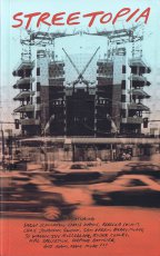
Technische
Angaben
-
322 S., 20,3x12,7 cm, ISBN/ISSN 9780692424285
Broschur
ZusatzInfos
-
Das Buch erschien im Rahmen der gleichnamigen Ausstellung "Streetopia" (2012) die in der Luggage Store Gallery in San Francisco eröffnet wurde und sich gegen ein geplantes Bauprojekt und damit gegen die Gentrifizierung der Stadt richtete.
After San Francisco’s new mayor announced imminent plans to “clean up” downtown with a new corporate “dot com corridor” and arts district - featuring the new headquarters of Twitter and Burning Man - curators Erick Lyle, Chris Johanson, and Kal Spelletich brought over one hundred artists and activists together with neighbourhood residents fearing displacement to consider Utopian aspirations and to plot alternate futures for the city. Opening in May 2012 at the Luggage Store Gallery, the resulting exhibition Streetopia was a massive anti-gentrification art fair that took place in venues throughout the city. For five weeks, Streetopia featured daily free talks, performances, and skillshares while operating a free community kitchen out of the gallery.
This book brings together all of the art and ephemera from the now-infamous show - featuring work by SWOON, Barry McGee, Emory Douglas, Monica Canilao, Rigo 23, Xara Thustra, Ryder Cooley, and many more. Using the format of an exhibition catalog as a jumping off point, the book also includes essays and interviews with key participants that consider the effectiveness of Streetopia’s projects while offering a deeper rumination on the continuing search for community - and for Utopia - in today’s increasingly homogeneous and gentrified neo-liberal cities in an era of unprecedented wealth disparity.
Text von der Website
|
Titel
-
Boxenbuch - WSASAS - With smiles and smiles and smiles
Technische
Angaben
-
58 S., 45x33,5x4 cm, Auflage: 3, numeriert, signiert, 110 Teile. keine weiteren Angaben vorhanden
Kartonschachtel mit individuell gestalteten Blättern, auf verschiedenen Materialien in verschiedenen Größen und mit div. Techniken, Schallplattenfragment. Schachteldeckel geprägt.
ZusatzInfos
-
Boxenbücher – das sind Text- und Bildeditionen in Form loser Blattsammlungen. In Stülpkartons verpackt, erscheinen die Boxenbücher in signierten und streng limitierten Auflagen. In jeder einzelnen Box befinden sich zwischen fünfzig bis zu über einhundert Seiten, die sowohl handgearbeitet, collagiert, gestempelt, beklebt, gerissen, besprüht sowie gedruckt oder kopiert sind. Jede Box wird damit ein Original mit dem gleichen, leicht variierenden Inhalt.
Tobias Premper vermengt in seinen Boxenbüchern altgriechische, romantische und postmoderne sowie humorvolle und absurde Aspekte miteinander. Dabei im Mittelpunkt: Die Natur, in all ihren Erscheinungsformen. Das Innenleben in guten und schlechten Zeiten. Gefühl und Mitgefühl, anderen und sich selbst gegenüber. Liebe, Hass und Schmerz. Verlust und Freundschaft. Und Melancholie – aber von der Art, die nicht niederdrückt, sondern aufsteigen lässt, die Schwingen verleiht. Immer mit dabei: die unvergleichliche Freude des Schaffens und Um- und Neusortierens.
Tobias Premper glaubt an die Heilkraft bild-textlicher Poesie gegen die hässlichen Gesichter der Welt in ihren digitalen und effizienzgetriebenen Hamsterrädern. Bei jedem einzelnen Blatt stellt er sich die Frage: Gilt das bedruckte, beschriebene Papier noch etwas? Oder ist es sogar relevanter als jemals zuvor? Das Material seiner Boxenbücher bietet Betrachtenden die Möglichkeit, selbst herauszufinden, wieweit sie sich darauf einlassen können, welche eigenen Bezüge sie herstellen können, was für sie authentisch ist oder inwieweit sie doch nur seit der Kindheit konditioniert worden sind auf ein ichbezogenenes Dasein, das alles andere gleichgültig abprallen lässt und das unfähig geworden ist zu Liebe, Einsamkeit, Verlangen oder Angst.
Ausweg oder Game Over? Emilia Bungalo über Tobias Prempers Boxenbücher in „A brief glimpse at our darlings”, 2023, Berlin
Text von der Webseite
|
Technische
Angaben
-
[2] S., 10x21 cm, keine weiteren Angaben vorhanden
Schwarz-Weiß, einseitig bedruckt
ZusatzInfos
-
Visitenkarte der stiftung buchkunst inklusive Kontaktdaten.
Seit über 50 Jahren fördert die Stiftung Buchkunst das vorbildlich gestaltete Gebrauchsbuch und verschafft ihm durch drei bedeutende Wettbewerbe – »Die Schönsten Deutschen Bücher«, »Förderpreis für junge Buchgestaltung« sowie »Best Book Design from all over the World / Schönste Bücher aus aller Welt« ein viel beachtetes Forum. Die Ergebnisse dieser Designwettbewerbe setzen Orientierungspunkte und verfolgen neue Entwicklungen. Sie dienen als Impulse für herausragende Gestaltung und beispielhafte Verarbeitung.
Text von der Webseite.
|
Technische
Angaben
-
110 S., 24,7x17,5 cm, 2 Stück. ISBN/ISSN 9783775715812
Fadenheftung
ZusatzInfos
-
Buch über die beiden Künstler Johannes Brunner (Bildhauer) und Raimund Ritz (Musiker), die seit den 1990er Jahren zusammen arbeiten und Cross-Over-Arbeiten zwischen Musik, bildender Kunst, Theater und Film schaffen. Das Buch versammelt und dokumentiert die Arbeiten des Duos von 1990-2005. Es entstand in Zusammenarbeit mit dem Kunstverein Göppingen.
|
Titel
-
Big Cameleon Is Watching Over You - collage-coversation after September 11
Technische
Angaben
-
14,5x10,5 cm, Auflage: 80, numeriert, signiert, keine weiteren Angaben vorhanden
Postkarte mit Collage, die sich mit den Anschlägen vom 11. September 2001 und den Folgen davon auseinandersetzt.
|
Technische
Angaben
-
272 S., 29,5x21,1 cm, Auflage: 666, keine weiteren Angaben vorhanden
Broschur
ZusatzInfos
-
Abitur Zeitung des Jahrgangs 2000 - 130 Schüler*innen - des Carl-Orff-Gymnasiums in München.
|
Titel
-
so-VIELE.de Heft 105 2024 - meer
Technische
Angaben
-
8 S., 14,8x10,5 cm, Auflage: 300, 2 Stück. ISBN/ISSN 978-3-68919-030-9
Vertikaler Doppelparallelfalz
ZusatzInfos
-
immaterielle buchprojekte stehen für immaterielle phänomene & qualitäten oftmals ordnen sich der vorherrschaft von kopf, verstand und auge alle anderen, z.T. vernachlässigten sinne unter. ihre erlebnisse, ihre formen, qualitäten und aktionen, aktivieren und erforschen weitere bereiche des körpers und erweitern dadurch unsere wahrnehmung wenn alle bzw. so viel sinne wie möglich aktiv sind, befinden wir uns – ähnlich wie in einem gesamtkunstwerk – in einem all-over des gegenwärtigen und sensibilisieren uns für das unübersehbare Feld sinnlicher – nicht greifbarer sowie festhaltbarer ereignisse und erscheinungen
|
Titel
-
so-VIELE.de Heft 106 2024 - klang
Technische
Angaben
-
8 S., 14,8x10,5 cm, Auflage: 300, 2 Stück. ISBN/ISSN 9783689190316
Vertikaler Doppelparallelfalz
ZusatzInfos
-
immaterielle buchprojekte stehen für immaterielle phänomene & qualitäten oftmals ordnen sich der vorherrschaft von kopf, verstand und auge alle anderen, z.T. vernachlässigten sinne unter. ihre erlebnisse, ihre formen, qualitäten und aktionen, aktivieren und erforschen weitere bereiche des körpers und erweitern dadurch unsere wahrnehmung wenn alle bzw. so viel sinne wie möglich aktiv sind, befinden wir uns – ähnlich wie in einem gesamtkunstwerk – in einem all-over des gegenwärtigen und sensibilisieren uns für das unübersehbare Feld sinnlicher – nicht greifbarer sowie festhaltbarer ereignisse und erscheinungen
|
Titel
-
so-VIELE.de Heft 107 2024 - licht
Technische
Angaben
-
8 S., 14,8x10,5 cm, Auflage: 300, 2 Stück. ISBN/ISSN 9783689190323
Vertikaler Doppelparallelfalz
ZusatzInfos
-
immaterielle buchprojekte stehen für immaterielle phänomene & qualitäten oftmals ordnen sich der vorherrschaft von kopf, verstand und auge alle anderen, z.T. vernachlässigten sinne unter. ihre erlebnisse, ihre formen, qualitäten und aktionen, aktivieren und erforschen weitere bereiche des körpers und erweitern dadurch unsere wahrnehmung wenn alle bzw. so viel sinne wie möglich aktiv sind, befinden wir uns – ähnlich wie in einem gesamtkunstwerk – in einem all-over des gegenwärtigen und sensibilisieren uns für das unübersehbare Feld sinnlicher – nicht greifbarer sowie festhaltbarer ereignisse und erscheinungen
|
Technische
Angaben
-
13x13 cm, keine weiteren Angaben vorhanden
Musik-CD in Papphülle und transparenter Kunststoffhülle, cover art: Stephane Leonard
ZusatzInfos
-
recorded in 2007 at the Leo Mars studio.
´Lightears´ is the long awaited debut album by Berlin duo Leo Mars. After a year of trial and error, a lot of sessions, sound collecting and analysation of possibilities a precisely crafted, yet astonishingly free floating album came to life. In times of almost infinite sounds, instruments and styles it took the duo some time to come up with the basic material, form a language and then of course learn to speak it. Hours were spent in the studio and their favourite lebanese restaurant discussing the world of sound.
´Lightears´ intelligently smudges the borders between a classic drone, an underground noise, a playful improvisation and an old fashion musique concrete record. All the genres fall into place rather unpretentious with pure sound excitingly assembled to challenge ones listening habits.
It is a rather harsh production always bouncing back and forth between digital, crisp electronics and field recordings pushed way over the edge.
With minimal gear and set up Leo Mars managed to manoveur themselves somewhere inbetween a bedroom thrashing noise keyboard project and a theoratical paper score composer duo. Performing in a trance - allowing things to happen - awaken - making a conscious decision - slipping back into space
|
Titel
-
Transcendental Mail Art - An anthology of 13 little art works made by order of the Secret Society of Diligent MAIL ARTISTS 1987-1988
Technische
Angaben
-
13 S., 22,5x31,0x2,5 cm, numeriert, signiert, keine weiteren Angaben vorhanden
Lose Blätter in Graukarton-Box, Offsetlithografie, Collageelemente (Tapete) und Bleistift, farbige Künstlerstempel, diverse Materialien, zum Teil handcoloriert
Beigelegt ist ein Dokument zur Überlassung von Publikationen Géza Perneczkys durch Ulli Kattenstroth an Hubert Kretschmer, sowie ein Versandetikett mit seiner Anschrift in Berlin.
ZusatzInfos
-
Nr.196 einer nicht näher bezifferten Auflage. Die Box ist frankiert und gelaufen (Mail Art) an Ulli Kattenstroth. Signiertes Deckblatt und 13 signierte Originalarbeiten von Perneczky. Die Box ist mit einem Etikett über Titel, Inhalt, und einer Begriffsdefinition von "Transcendental Mail Art" versehen:
"Why transcendental?
1. It is a charming word.
2. There is only the Mail Art that doesn't know any national or profession limits to time. It is viable without any capital and it does without the institutions. It goes through the world and infects the people like a funny influenza all over.
3. The Mail Art doesn't know style problems or the infamous feeling of the eclecticism. It's style is free of such questions, it is an an answer to the distances and the differences. It is simple & direct.
4. The directly statement declares the form, the technic and the iconography. Maybe the Mail Art is the only trend in the postmodern epoch which is able to create a new iconography and is fit to take pleasure in the day and the morrow.
5. The transcendental Mail Art breaks out from the ghetto of the alternative scene. Also further it will stay a present for the partners but it should be an expensive art for the museums. This is complete normal / This is the only scandalous thing.
6. The Mail Art is transcendental because also it is transient: it goes through all partitions and disappers by degrees. The missing pieces of a Mail Art action are gone into the transcendency.
7. The Mail Art has been born with the help of my existence and it will be transient by your existence. It is a metamorphosis by correspondence.
|
Titel
-
It's Over Before It Even Started
Technische
Angaben
-
[16] S., 26,8x20 cm, keine weiteren Angaben vorhanden
Drahtheftung, Offsetdruck auf Zeitungspapier. Im Set mit acht Heften von Ryan Foerster.
|
Titel
-
Kattenstroth Konvolut - David M. Miller
Technische
Angaben
-
26 Teile. keine weiteren Angaben vorhanden
Materialien in transparenter Kunststoffhülle.
ZusatzInfos
-
• Briefumschlag (ohne Inhalt), Karton, adressiert an Kattenstroth, Poststempel 11.06.1984, 16,6x24cm, Stempel, Aufkleber
• Brief vom 01.08.1984 an Kattenstroth, Aufkleber auf dem Umschlag, teils coloriert; US Letter, zweifach gefaltet, handschriftlicher Brief, signiert; Flyer "Lake Shadows", 21,7x10,3cm, 1981 The Summer Solstice; Postkarte "Bern Porter", nicht versandt, 1980; 2 Streifen Aufkleber mit Text und Illustration, coloriert, gestempelt; US Letter, Schwarz-Weiß Xerox "Oh God, yes", collagiert, gestempelt, signiert, Datierung 1984
• Brief vom 02.11.1984 an Kattenstroth, Aufkleber auf dem Umschlag, teils coloriert; US Letter, handschriftlicher Brief zweifach gefaltet, signiert; US Letter, Schwarz-Weiß Xerox, Illustration und Text; Abzug Farbfotografie des Künstlers, 13x8,8cm; 3 Streifen Aufkleber mit Text und Illustration
• Brief 1984 an Kattenstroth, Fluxus Manifesto von George Maciunas mit Illustration in Schwarz-Weiß auf dem Umschlag, Aufkleber teilcoloriert; US Letter, zweifach gefaltet, Schwarz-Weiß Xerox, teilcoloriert in gelb/orange, signiert
• US Letter, zweifach gefaltet, Schwarz-Weiß Xerox, teilcoloriert in gelb; "VINYL - March 1986" (Vinyl - A Publication of The Arts) Artikel zur Ausstellung "manipulated polaroid images" Imprimatur, Minneapolis
• Postkarte "Puerta Vallarta", nicht versandt, 14x8,9cm, Farbdruck manipuliertes Polaroid von David M. Miller, Nachricht an Kattenstroth
Miller manipulates his images through a deceptively simple technique of applying pressure to the surface of the Polaroid and thereby disturbing the emulsion beneath the plastic surface before it hardens. The artist seems to find great pleasure in the game of chance that this entails and many of his photographs are worked over in an almost fastidious manner, leaving no stone unturned as the objects captured on the film dissolve and distort to a hallucinatory degree.
Miller manipuliert seine Bilder durch eine täuschend einfache Technik, indem er Druck auf die Oberfläche des Polaroids ausübt und dadurch die Emulsion unter der Kunststoffoberfläche stört, bevor sie aushärtet. Der Künstler scheint großes Vergnügen an dem damit verbundenen Glücksspiel zu finden, und viele seiner Fotografien werden auf fast schon penible Weise überarbeitet, wobei nichts unversucht gelassen wird, um die auf dem Film festgehaltenen Objekte in einem halluzinatorischen Ausmaß aufzulösen und zu verzerren.
Text aus "VINYL - March 1986", übersetzt mit DeepL
|
Titel
-
Die letzten Jahre Teil 2, eine Dokumentation
Technische
Angaben
-
keine weiteren Angaben vorhanden
|
Titel
-
reflection press, Nr. 27 - Individuelle Mythologien, Abteilung: Bodyworkers - die information zum kalender 1975 für kurzsichtige und voyeuere
Technische
Angaben
-
12 S., 21x14,8 cm, keine weiteren Angaben vorhanden
Drahtheftung, Schwarz-Weiß-Fotokopien, in der reihe dokumente zur documenta 6
|
Technische
Angaben
-
keine weiteren Angaben vorhanden
nicht komplett
|
Titel
-
reflection press, Nr. 33 - die letzten jahre teil 2 - eine dokumentation
Technische
Angaben
-
20 Blätter S., 21x14,8 cm, keine weiteren Angaben vorhanden
Geklammert, Schwarz-Weiß-Fotokopien
|
Titel
-
reflection press, Nr. 33 - Die letzten Jahre Teil 3
Technische
Angaben
-
keine weiteren Angaben vorhanden
|
Titel
-
reflection press, Nr. 27 - in Dokumente zur Documenta 6
Technische
Angaben
-
keine weiteren Angaben vorhanden
|
Titel
-
reflection press, Nr. 38 - Gesamtkatalog 1974/1975
Technische
Angaben
-
21x14,6 cm, 2 Stück. keine weiteren Angaben vorhanden
Drahtheftung, mit eingelegtem Einzelblatt und angehefteten handschriftlichen Notizen zu Günter Saree
ZusatzInfos
-
Mit Grafiken und Plakaten von Günter Saree (im beigelegten Programmheft)
|
Titel
-
reflection press, Nr. 39 - A Concert at the ICA London
Technische
Angaben
-
50 Blätter S., 10,2x14,5 cm, keine weiteren Angaben vorhanden
Drahtheftung, Klebestreifen. Schwarz-Weiß Fotokopien, teilweise auf farbigen Karton
ZusatzInfos
-
dieses buch ist die visuelle ergänzung zu der langspielplatte albrecht d. und joseph beuys - performance at the ICA (institute of contemporary arts) london - 1. november 1974.
|
Titel
-
reflection press, Nr. 24 - Picasso, das politische engagement im spiegel der presse
Technische
Angaben
-
[44] S., 21x14,8 cm, 2 Stück. keine weiteren Angaben vorhanden
Drahtheftung, Schwarz-Weiß-Fotokopien
ZusatzInfos
-
Gesammelte Zeitungsausschnitte zum Tod von Pablo Picasso aus dem Jahr 1973.
|
Titel
-
Five & Five Text Sound Pieces
Technische
Angaben
-
10,8x6,9 cm, 2 Stück. ISBN/ISSN 3922698360
S Press Nr. 36/22
|
Titel
-
reflection press, Nr. 14 - a little book of Messie Ben
Technische
Angaben
-
32 S., 14,4x10,5 cm, keine weiteren Angaben vorhanden
Drahtheftung, Schwarz-Weiß-Fotokopien
|
Technische
Angaben
-
21x13 cm, keine weiteren Angaben vorhanden
mehrfach gefaltetes loses Blatt, gestempelt, eingelegt zwei Bestellkarten, Verlagsverzeichnis
|
Technische
Angaben
-
[36] S., 19x14 cm, keine weiteren Angaben vorhanden
ZusatzInfos
-
Ausstellungen und Publikationen von 1975-1980
|
Technische
Angaben
-
keine weiteren Angaben vorhanden
S Press 2. Series
|
Titel
-
Talking to Hans G. Helms on Music and Politics
Technische
Angaben
-
10,8x6,9 cm, ISBN/ISSN 392421526X
S Press Nr. 27/28/29
|
Titel
-
Le Voyage Labiovelaire / Le Cri
Technische
Angaben
-
keine weiteren Angaben vorhanden
S Press Nr. 9
|
Titel
-
Semi-Constructs of the Secrétaire du Registre
Technische
Angaben
-
[24] S., 43x29 cm, 2 Stück. ISBN/ISSN 0918406107
6 Bögen gefaltet und lose ineinander gelegt, Zeitungsrotationsdruck
ZusatzInfos
-
Semi-Constructs of the Secrétaire du Registre erschien erstmals in serieller Form in Ausgaben der Zeitschrift INTERSTATE zwischen 1974 und 1979.
Die Future Press ist einzigartig in ihrer exklusiven Hingabe an radikal alternative Materialien für Bücher und radikal alternative Formen von Büchern. (Aus der Zeitung; S. 2, Original auf Engl.)
|
Technische
Angaben
-
keine weiteren Angaben vorhanden
S Press Nr. 57
|
Technische
Angaben
-
keine weiteren Angaben vorhanden
S Press Nr. 40
|
Titel
-
CORACLE PRESS Publications 1981
Technische
Angaben
-
keine weiteren Angaben vorhanden
Lieferprogramm
|
Technische
Angaben
-
keine weiteren Angaben vorhanden
S Press 2. Series
|
Technische
Angaben
-
keine weiteren Angaben vorhanden
S Press Nr. 65/66
|
Technische
Angaben
-
2 Stück. keine weiteren Angaben vorhanden
S Press Nr. 20
|
Titel
-
reflection press, Nr. 46 - aus dem arabischen telefonbuch
Technische
Angaben
-
29,7x21 cm, keine weiteren Angaben vorhanden
Titel auf Cover mit Farbe geschrieben, Stempel, Schwarz-Weiß-Fotokopien, Umdruck, ein Blatt eingelegt, 12 Blätter, geklammert
|
Titel
-
Mynonas Weg in die Emigration / The Heliopolar Egg
Technische
Angaben
-
keine weiteren Angaben vorhanden
S Press Nr. 67
ZusatzInfos
-
aufgenommen im Februar 1979 in Kabul/Afghanistan, bzw. am 28.12.1976 in Dacca
|
Technische
Angaben
-
keine weiteren Angaben vorhanden
S Press Nr. 80
|
Technische
Angaben
-
keine weiteren Angaben vorhanden
Musikkassette,
|
Technische
Angaben
-
keine weiteren Angaben vorhanden
S Press Nr. 23/24, 80 Min
|
Technische
Angaben
-
keine weiteren Angaben vorhanden
S Press Nr. 38/39
|
Titel
-
Konkrete Texte Konstellationen 51 - 68, Seite 1
Technische
Angaben
-
12,5x14,2 cm, keine weiteren Angaben vorhanden
CD in aufklappbarer Hülle, Zettel inneliegend
ZusatzInfos
-
S Press Nr. 13, 72 Minuten Dauer, 55 Stücke. Aufgenommen am 24.08.1973 in Haitingen. Spule 13 cm - mono/zweispurig
|
Titel
-
Konkrete Texte das stundenbuch u. a., Seite 2
Technische
Angaben
-
keine weiteren Angaben vorhanden
S Press No. 13
|
Titel
-
Hält Sprechstunden für die schöne bunte Kuh
Technische
Angaben
-
10,8x6,9 cm, 2 Stück. ISBN/ISSN 3922698123
S Press Nr. 12,
|
Technische
Angaben
-
16 S., 14x11,3 cm, keine weiteren Angaben vorhanden
Drahtheftung
ZusatzInfos
-
Appearances Press, Funded by Appearances Magazine Brooke Alexander Inc. and The Beards Fund
|
Titel
-
Poèmes Phonetiques Complètes
Technische
Angaben
-
10,8x6,9 cm, 2 Stück. keine weiteren Angaben vorhanden
Musikkassette, Dauer 51 Min
ZusatzInfos
-
S Press Nr. 2.
Seite 1. Phoneme von 1918, 1919, 1946. Interview aves les lettristes 1946.
Seite 2. R.L.Q.S. varie en 3 cascades 1947
|
Titel
-
Poème-Partition J / Carrefour de la Chaussée d'Antin / extrait
Technische
Angaben
-
10,8x6,9 cm, 2 Stück. keine weiteren Angaben vorhanden
S Press Nr. 18
|
Titel
-
reflection press, Nr. ?, Dokumentation zum Prozess - Ringgold Toche Hendricks
Technische
Angaben
-
29,7x21 cm, Auflage: 2.000, keine weiteren Angaben vorhanden
Drahtheftung, Schwarz-Weiß-Fotokopien, Titelblatt mit weißem Blatt zugedeckt
ZusatzInfos
-
Photocopied material on the trial of The Judson. Three artists - Faith Ringgold, Jean Toche, and Jon Hendricks - arrested at the People's Flag Show in New York City in November 1970 for flag desecration. Includes clippings, letters, photos, and narratives. [Kataloginformation des Museum of Modern Art, New York]
|
Titel
-
reflection press, Nr. 45 - Gesellschaft, Künstler und Kom...
Technische
Angaben
-
keine weiteren Angaben vorhanden
|
Technische
Angaben
-
36 S., 28x21,5 cm, ISBN/ISSN 01600699
Drahtheftung, Schutzumschlag, Farblaserkopie
ZusatzInfos
-
Erwähnung von Kretschmer & Großmann S. 24. Mit Beiträgen über Edition Hundermark, Coracle Press, Stamp Art, coach house press, da costa, Pendo-Verlag
|
Technische
Angaben
-
keine weiteren Angaben vorhanden
|
Titel
-
reflection press, Nr. 31 - Tschechischer Künstler in Prag zu zwei Jahren Gefängnis verurteilt
Technische
Angaben
-
[26] S., 29,7x21 cm, numeriert, keine weiteren Angaben vorhanden
Drahtheftung, Schwarz-Weiß-Fotokopien. Serientitel gestempelt
|
Technische
Angaben
-
keine weiteren Angaben vorhanden
|
Titel
-
Complete Catalog 1998 of S Press Tapes in Print
Technische
Angaben
-
6 S., 19x10 cm, keine weiteren Angaben vorhanden
Faltblatt
|
Technische
Angaben
-
288 S., 21,3x13,8 cm, ISBN/ISSN 0930012410
erschienen bei Erasmus Editions
|
Technische
Angaben
-
keine weiteren Angaben vorhanden
S Press Nr. 54
|
Technische
Angaben
-
10,8x6,9 cm, 2 Stück. ISBN/ISSN 392421574X
S Press Nr. 56/74
|
Titel
-
the 8-voice Stereo-Canon Realization of ...
Technische
Angaben
-
keine weiteren Angaben vorhanden
S Press Nr. 33
|
Titel
-
reflection press, Nr. 34 - Action
Technische
Angaben
-
signiert, keine weiteren Angaben vorhanden
|
Technische
Angaben
-
keine weiteren Angaben vorhanden
S Press Nr. 15
|
Technische
Angaben
-
keine weiteren Angaben vorhanden
S Press Nr. 16
|
Titel
-
Zuginsfeld / Unfeig (Ausschnitte)
Technische
Angaben
-
keine weiteren Angaben vorhanden
S Press Nr. 1
|
Titel
-
UNFEIG Eine Neun-Runen-Fuge zur Unzeit gegeigt
Technische
Angaben
-
keine weiteren Angaben vorhanden
Otto Nebel spricht Otto Nebel, S Press Nr. 17, Gesamtaufnahme
|
Titel
-
Super-Intendo, Jahrgang 1, Num. 0 - The New Rage Newspaper
Technische
Angaben
-
10 S., 20,7x15 cm, keine weiteren Angaben vorhanden
Blätter lose ineinander gelegt
|
Titel
-
The Toothpaste Press Catalog Fall 1981
Technische
Angaben
-
15,5x11,7 cm, keine weiteren Angaben vorhanden
Drahtheftung, Verlagsverzeichnis, handschriftliche Korrekturen, eingelegtes gefaltetes Ergänzungsblatt Spring 1982
|
Titel
-
Swamp Press Catalogue February 1982
Technische
Angaben
-
10,7x8,3 cm, keine weiteren Angaben vorhanden
Drahtheftung, eingelegte Visitenkarte, Werkeverzeichnis
|
Titel
-
The Literary Press Group Catalogue Spring 1981
Technische
Angaben
-
248 S., 20x12,7 cm, keine weiteren Angaben vorhanden
Verzeichnis mehrerer zusammengeschlossener Verlage
|
Technische
Angaben
-
21,7x8,2 cm, keine weiteren Angaben vorhanden
Drahtheftung, gestempelt
|
Titel
-
The Bellevue Press 1982 Catalogue
Technische
Angaben
-
21,5x9 cm, keine weiteren Angaben vorhanden
Drahtheftung, Verlagsverzeichnis
|
Titel
-
Curbstone Press Catalogue Update
Technische
Angaben
-
22,8x10,2 cm, keine weiteren Angaben vorhanden
Flyer, zweifach gefaltet, eine Seite lose inneliegend, Schriftenverzeichnis
|
Titel
-
Samples from Release Press
Technische
Angaben
-
21x13,8 cm, keine weiteren Angaben vorhanden
Drahtheftung, Leseproben
|
Titel
-
The Other Publishers Catalogue Winter 1981-82
Technische
Angaben
-
27,3x21,6 cm, keine weiteren Angaben vorhanden
Drahtheftung, Verzeichnis mehrerer zusammengeschlossener Verlage (Station Hill Press, Treacle Press, Printed Editions)
ZusatzInfos
-
Typeset and produced at Open Studio
|
Technische
Angaben
-
30 S., 14x9,5 cm, keine weiteren Angaben vorhanden
Büchlein in größerers gefaltetes Blatt geklebt. Alles mehrfarbig
|
Technische
Angaben
-
21,3x13,3 cm, 2 Stück. keine weiteren Angaben vorhanden
Einladung zu einem artists residency programm, Folder mit Pop-Up
|
Titel
-
man könnte sagen etwas stimme nicht, Gedichte 1933-1969
Technische
Angaben
-
10,8x6,9 cm, 2 Stück. ISBN/ISSN 3922698204
S Press Nr. 20
|
Technische
Angaben
-
keine weiteren Angaben vorhanden
S Press Nr. 59/60
|
Titel
-
Höricht / Gedicht-Gedichte
Technische
Angaben
-
keine weiteren Angaben vorhanden
S Press Nr. 51/2
|
Technische
Angaben
-
10,8x6,9 cm, 2 Stück. ISBN/ISSN 3924215588
S Press Nr. 58/60
|
Technische
Angaben
-
keine weiteren Angaben vorhanden
S Press Nr. 71
|
Titel
-
Horse-Songs & other Soundings
Technische
Angaben
-
keine weiteren Angaben vorhanden
S Press Nr.25/26
|
Titel
-
Litaneien Litaneien Litaneien Litaneien
Technische
Angaben
-
10,8x6,9 cm, keine weiteren Angaben vorhanden
S Press Nr. 34/35, mit Titelliste, in Stereo
ZusatzInfos
-
Basiert auf dem Buch Wahnsinn Litaneien
|
Technische
Angaben
-
keine weiteren Angaben vorhanden
S Press No. 34/35, 40 Min 43 Sec Dauer
|
Titel
-
reflection press, Nr. 35 - wozu Ausstellungen
Technische
Angaben
-
12 Blätter S., 10x6,8 cm, keine weiteren Angaben vorhanden
3. Auflage, Drahtheftung, Vorsatzpapier mit Zackenschere beschnitten, farbiger Umdruck und Fotokopien
|
Technische
Angaben
-
115 S., 17x12 cm, keine weiteren Angaben vorhanden
115 Einzelblätter von 90 Künstlern lose eingelegt, im Pappkarton mit Leinenüberzug, mit Klappöffnung
ZusatzInfos
-
Catalogue of an exhibition held at Coracle Press, South London Art Gallery, S. East Gallery and Morley Gallery, London, 16.04.-20.05.1982.
|
Technische
Angaben
-
10,8x6,9 cm, 2 Stück. ISBN/ISSN 3922698719
S Press Nr. 71/73
|
Technische
Angaben
-
keine weiteren Angaben vorhanden
S Press Nr. 42
|
Titel
-
An Anecdoted Topography of Chance
Technische
Angaben
-
214 S., 20,3x13,7 cm, ISBN/ISSN 0871100258
Broschur
ZusatzInfos
-
Im Anschluss an ein Gespräch mit seinem guten Freund Robert Filliou kartierte Daniel Spoerri eines Tages die Gegenstände, die wahllos auf dem Tisch seines Zimmers lagen, und fügte ihnen eine streng wissenschaftliche Beschreibung hinzu. Diese Gegenstände riefen Assoziationen, Erinnerungen und Anekdoten hervor, und zwar nicht nur bei dem ursprünglichen Autor, sondern auch bei seinen Freunden: eine betörende Kreation war geboren. Viele der Hauptakteure von FLUXUS haben einen Auftritt. Es ist ein Roman der Abschweifungen in der Art von Tristram Shandy oder Robbe-Grillet; es ist ein Spiel, ein Gedicht, eine Enzyklopädie, ein Wunderkabinett: ein Fest der Freundschaft und der Kreativität.
Aus Atlas Arkhive - Dokumente der Avantgarde: Fluxus, Atlas Press, London England. Aus dem Französischen übersetzt und mit weiteren Anekdoten versehen von dem Dichter Emmett Williams.
|
Titel
-
reflection press, Nr. 28 - Was ist Zen ? ein Text von Suzuki, zum besseren Verständnis von Dada und Fluxus.
Technische
Angaben
-
12 S., 14,5x10,5 cm, 2 Stück. keine weiteren Angaben vorhanden
Geklammert, Schwarz-Weiß-Fotokopien
|
Titel
-
reflection press, Nr. 26 - one dozen rain pOstCarDs 1971-73
Technische
Angaben
-
[24] S., 11,2x16 cm, keine weiteren Angaben vorhanden
12 Postkarten in Briefumschlag, Infoblatt. Inhaltsverzeichnis auf gesondertem Blatt
ZusatzInfos
-
Es gibt zwei Ausgaben. Die erste von 1973 (Selbstverlag (samizdat)) und die andere von 1974, herausgegeben von Albrecht D. Es sind die gleichen Postkarten. In der ersten Ausgabe sind die Karten Schwarz-Weiß und in der Ausgabe von 1974 haben sie einen violetten Farbton.
Herzliche Grüße Emmanuelle Rapin und Raphaël Levy
|
Titel
-
spricht Texte der Textbücher
Technische
Angaben
-
10,8x6,9 cm, ISBN/ISSN 3922698069
Musik-Kassette
|
Titel
-
Sternendonner und Das Rad der Titanen
Technische
Angaben
-
10,8x6,9 cm, keine weiteren Angaben vorhanden
S Press Nr. 61
|
Titel
-
KON STELLATIO NEN gesprochen vom Autor
Technische
Angaben
-
10,8x6,9 cm, ISBN/ISSN 3922698212
S Press Nr. 21
|
Titel
-
Gunslinger Part 1 (Books I & II, The Cycle)
Technische
Angaben
-
10,8x6,9 cm, 2 Stück. keine weiteren Angaben vorhanden
S Press Nr. 43
|
Technische
Angaben
-
10,8x6,9 cm, keine weiteren Angaben vorhanden
Musikkassette
|
Titel
-
Carrefour - da la Chausse- D'Antin
Technische
Angaben
-
10,8x6,9 cm, 2 Stück. ISBN/ISSN 3922698239
S Press Nr. 23
|
Technische
Angaben
-
10,8x6,9 cm, keine weiteren Angaben vorhanden
S Press Nr. 70
|
Technische
Angaben
-
10,8x6,9 cm, 2 Stück. ISBN/ISSN 3922698689
S Press Nr. 68. Verschiedene inlays
|
Technische
Angaben
-
10,8x6,9 cm, ISBN/ISSN 3922698662
S Press Nr. 70
|
Titel
-
Carrefour de la chausse d'Antin
Technische
Angaben
-
10,8x6,9 cm, ISBN/ISSN 3922698239
Musikkassette, S Press Nr. 23
ZusatzInfos
-
topologie sonore, (extraits)
|
Technische
Angaben
-
10,8x6,9 cm, 2 Stück. ISBN/ISSN 3922698522
S Press Nr. 52. Verschiedene inlays
|
Technische
Angaben
-
10,7x6,9 cm, ISBN/ISSN 3922698867
S Press Nr. 50
|
Technische
Angaben
-
10,8x6,9 cm, ISBN/ISSN 3924215146
S Press Nr. 14. Ohne Inlay
ZusatzInfos
-
Recorded von Nikolaus Einhorn
|
Titel
-
insalata mista, soundings from the 1970ies
Technische
Angaben
-
10,8x6,9 cm, ISBN/ISSN 3922698905
Musik-Kassette
|
Technische
Angaben
-
10,8x6,9 cm, ISBN/ISSN 3922698778
S Press Nr. 77
|
Technische
Angaben
-
10,8x6,9 cm, ISBN/ISSN 3922698190
S Press Nr. 19
|
Titel
-
Das Rad der Titanen, eine Zwölfrunenfuge (Auszug)
Technische
Angaben
-
10,8x6,9 cm, ISBN/ISSN 3922698182
S Press Nr. 18
|
Titel
-
Testi Sonori and Radiopoems 1965-1972
Technische
Angaben
-
10,8x6,9 cm, 2 Stück. ISBN/ISSN 392269862X
S Press Nr. 62. 1 x
|
Titel
-
S Press Das deutsche Programm 2. Serie
Technische
Angaben
-
6 S., 21x9,6 cm, keine weiteren Angaben vorhanden
Lieferverzeichnis, gefaltet
|
Titel
-
Eugen Gomringer spricht Eugen Gomringer, konkrete Texte, S Press Tonband Nr. 13
Technische
Angaben
-
keine weiteren Angaben vorhanden
Tonbandkassette
|
Technische
Angaben
-
24x33,5 cm, keine weiteren Angaben vorhanden
mehrfach gefaltetes Plakat mit allen Künstlern des Verlagsprogramms, gestaltet von Haim Steinbach
|
Titel
-
With compliments from ROLLO
Technische
Angaben
-
keine weiteren Angaben vorhanden
Werbekarte mit 5-farbigem Siebdruck
|
Titel
-
the book on books on artists books
Technische
Angaben
-
230 S., 24x17 cm, ISBN/ISSN 9780956173843
erschienen zur Ausstellung at the Bloomberg Space London, eingelegt eine Karte mit handschriftlichem Text
ZusatzInfos
-
The Bloomberg website says of the project:
For Comma 38, artist and publisher Arnaud Desjardin will exhibit new, old, rare, and popular books while running an active printing press in Bloomberg Space. His COMMA commission, part of an ongoing project titled The Book on Books on Artists' Books, is intended to create an active and participatory review of current and historical practice. This exhibition is about both the display of books on artists' books and the production of a book about the books displayed. He intends to print a first edition, a book of books, a critical anthology and source book, alongside which a large range of books on artists' books will be displayed in a series of vitrines.
Artists' books have normally been sold and distributed through small networks of bookshops and galleries that often produce lists of available titles in printed form. The advent of the Internet has meant that information online has changed the nature of this documentary evidence. Desjardin's unique and extraordinary combination of display and production makes an exhibition that actively engages in both the making and disseminating in real time. The books themselves become both vehicles for information and documents that testify for artistic activity in its own right
|
Technische
Angaben
-
3 S., 29,7x21 cm, keine weiteren Angaben vorhanden
Farbkopien aus Kaleidoscope Issue 12 Fall 2011. Ein Gespräch über Künstlerbücher
|
Titel
-
Made in Munich. Editionen von 1986 bis 2008
Technische
Angaben
-
368 S., 24,8x19,5 cm, ISBN/ISSN 978-3-865606624
Katalog zur Ausstellung im Haus der Kunst 2009, mit Installationsansichten von Wilfried Petzi und Objektfotografien von Jann Averwerser, Schutzumschlag aus gefaltetem Plakat
ZusatzInfos
-
Vorwort von Chris Dercon. Essay von Julienne Lorz.
"Ich bin interessiert an der Verbreitung von physischen Vehikeln in Form von Editionen, weil ich an der Verbreitung von Ideen interessiert bin." Joseph Beuys, München gilt als heimliche Hauptstadt von Editionen und Multiples. "Made in Munich. Editionen von 1968 bis 2008" bietet einen anderen Blick auf die Geschichte des Münchner Kunsthandels. Im Vordergrund stehen die Produzenten von Multiples und Editionen, die über einen Zeitraum von 40 Jahren in und um München entstanden sind. Darunter sind Editeure wie die Galerie Heiner Friedrich, Galerie Fred Jahn, Galerie Bernd Klüser, Sabine Knust und ihr Maximilian Verlag, Galerie van de Loo und Edition Schellmann, sowie Aktionsraum A1, ECM Records, edition x, Kunstraum München, P.A.P. Kunstagentur Karlheinz & Renate Hein, s press tonband verlag und zehn neun. Neben Druckgraphiken finden sich Editionen und Multiples verschiedenster Art nebeneinander: von fotografischen Mappenwerken, Plattencover Skulpturen, Videos und Tonkassetten, 16 mm-Filme, bis hin zu eigens an den Raum angepassten Kunstwerken.
"I am interested in the circulation of physical vehicles in the form of editions, because i am interested in the circulation of ideas." Joseph Beuys, Since the beginning of the 1970s, Munich along with New York and London, was leading with regards to editions and multiples. This catalogue shows works from 1968 to today, which were initiated and produced by a.o. dedicated munich galleries and "editeurs". "Made in Munich" shows outstanding works by international as well as german artists a.o. by Georg Baselitz, Joseph Beuys, Marcel Broodthaers, Dan Flavin, Lucio Fontana, Richard Hamilton, Carsten Höller, Jeff Koons, Hermann Nitsch, Blinky Palermo, Gerhard Richter, Dieter Roth and Andy Warhol.
Text von der Webseite
|
Technische
Angaben
-
24 S., 18x13 cm, Auflage: 100, 2 Stück. keine weiteren Angaben vorhanden
Drahtheftung, Rollo 18
|
Titel
-
onestar press strictly_un-edited by the publisher
Technische
Angaben
-
29,7x21 cm, keine weiteren Angaben vorhanden
über den Verlag, Schwarz-Weiß-Laserdruck
|
Titel
-
Libri d’arte, passione di una vita
Technische
Angaben
-
keine weiteren Angaben vorhanden
Artikel über Reinhard Grüner,
ZusatzInfos
-
Reinhard Grüner is a collector from Monaco. His passion is art books, which he collects – and sometimes exhibits – since the 1960s.
His website, www.buchkunst.info is a real “online museum”, where international artist books are catalogued and photographed. Amongst the artists there are Marc Chagall, Anselm Kiefer, Henri Matisse, Pablo Picasso and Andy Warhol. Books, but also works of art made of images and text, created by the artist often in collaboration with a writer and a publisher. For the high artistic quality – original graphics, unique designs, paintings and collages – these works are different from the usual picture books. Their manifestations are multiple: books with graphic effects, objects-book, artist’s books, sometimes printed in offset or illustrated by works of artists.
At the centre of Grüner’s attention there are Eastern German and Eastern European books (mainly Russia, Hungary, Lithuania). many of these works were created in response to specific social, political and cultural issues, with unimaginable insights into the culture of modernity.
Reinhard first came in contact with the art in book form with the English Edition, printed privately, of “A Dissertation Upon Roast Pig”, printed in 1975 by Shoestring Press on paper of the legendary Chiswick Press: from here begins a life of a book maniac among thousands of books. As Grüner states in an essay, the acquisition of artist books is more than a simple purchase: the artist, the life as a collector and thoughts are tied together, they influence each other, and a network of contacts with other collectors begins. With nearly all the books in his collection Grüner forms a symbiotic relationship: each of them describes, explains, and gets to the heart of some chapters of his life.
Download the pdf file with the essay on the collection of Reinhard Grüner (in English)
|
Titel
-
Schöner Zwitter aus Buch und Kunst
Technische
Angaben
-
1 S., 58x40 cm, keine weiteren Angaben vorhanden
Zeitungsausriss, Beitrag in der Süddeutschen Zeitung Nr. 34, S. 14
ZusatzInfos
-
über den Gestalter und Verleger Gunnar Kaldewey und seine Kaldewey Press in New York
|
Titel
-
The Lousy Animals & Friends - Coloring Book
Technische
Angaben
-
[80] S., 29,7x22 cm, ISBN/ISSN 978-3-905999136
Rollo Nr. 22, 6. Auflage. Metallspiralbindung, Risographie
ZusatzInfos
-
Stefan Marx’ coloring book was the first publication ever to be released by Rollo Press in early 2008. Since then, due to popular demand, it has been extended and reprinted using the risograph for five times, adding up to a total print run of 1000 copies. In early 2012, we released this offset version, which features a whole bunch of new animals as well as it marks a step forward in terms of the object, employing a silkscreend hard cover and semi-concealed wire-o binding.
Text von der Webseite
|
Titel
-
Bulletins of The Serving Library #3, Ecstatic Alphabets/Heaps of Language
Technische
Angaben
-
224 S., 23,5x16,5 cm, ISBN/ISSN 978-3-943365184
ZusatzInfos
-
This issue of Bulletins of the Serving Library doubles as a catalog of sorts to "Ecstatic Alphabets/Heaps of Language," a group exhibition curated by Laura Hoptman at the Museum of Modern Art, New York, from May 6 to August 27, 2012. It is a *pseudo*-catalog in the sense that, other than a section of images at the back, it bears no direct relation to the works in the exhibition. Instead, the bulletins extend in different directions from the same title, and could be collectively summarized as preoccupied with the more social aspects of Typography.
Text von der Webseite
|
Titel
-
Collectors Editions from Phaidon Press: Nobuyoshi Araki, René Burri, Elliot Erwitt, Nan Goldin, Martin Parr, Luc Tuymans
Technische
Angaben
-
15x22,5 cm, keine weiteren Angaben vorhanden
Lieferverzeichnis. Fadenheftung, Schutzumschlag mit Goldprägung
|
Technische
Angaben
-
352 S., 21x15 cm, ISBN/ISSN 9782915859416
Broschur mit Banderole, eingelegt ein Informationsblatt
ZusatzInfos
-
Originalausgabe erschienen bei Artists Press, Bern, 1980.
This book is the third and final version of the first artist’s book published in 1960 by herman de vries, who is currently the author of more than one hundred publications.
The story of this book dates back to 1960. Closely associated with the Zero Group, but also drawn to the buddhist concept of emptiness, herman de vries had just produced a series of white monochromes when he self-published a twenty-page booklet in Arnhem. It had no title, its cover was blank and its pages were unprinted. It contained nothing but a short final poem celebrating, in four languages, the superabundance of white: “wit is overdaad”. In 1962, this manifesto appeared in another version, now entitled wit: two hundred blank pages, four white collages by the artist and an introduction, itself completely blank, by the poet J. C. van Schagen, published in arnhem in only five copies by M. J. Israel. It was followed in 1967 by a second “revised” edition, wit weiss: two hundred and fifty blank pages, pocket-sized, in five hundred copies, published by Hansjörg Mayer in Stuttgart. The only printed elements were the artist’s name, the title and the publisher’s name on the cover, the word “introduction” and the name of its author on the very first page and a colophon on the final page. In 1980 the Artists Press in Berne published the “third revised edition”, in a larger format and with more pages. The original title wit was translated into english and japanese and into sanskrit with a word that means “white” in the sense of bright, pure, immaculate. The title itself does not appear on the book, which remains completely blank. It is printed with the paratext on a broad strip of paper in the form of a detachable publicity strip. The inside flap contains a brief statement initially dating back to the 1962 edition, stating that this book incorporates all aspects of reality. Of the five thousand copies advertised, only a hundred were published. It is this last edition, the most radical, which is republished here, the only addition being the french translation of the statement.
On 1 april 2012, herman de vries wrote of his book, insisting on the importance of the final comma:
white is white
0 = 0
no name
no idea
not even emptiness,
Text von der Webseite
|
Titel
-
Sex Press - The sexual revolution in the underground press 1963-1979
Technische
Angaben
-
240 S., 34x22,5 cm, ISBN/ISSN 9781419705557
Broschur mit Klappumschlag
|
Titel
-
Drucken Heften Laden - Versuche über Theorie und Praxis unabhängigen Publizierens
Technische
Angaben
-
2 S., 29,7x21 cm, keine weiteren Angaben vorhanden
Flyer, gefaltet
ZusatzInfos
-
Flyer zur Veranstaltung Drucken Heften Laden der neuen Gesellschaft für Bildende Kunst in Berlin, vom 08.-18.01.2015
Teilnehmer adocs, Hamburg. Architektur in Gebrauch, Berlin. Archive Books, Berlin. Michael J. Baers, Berlin. Books People Places, Berlin. Botopress, Berlin. Edition Bernward Reul, Berlin. ernstundmund, Leipzig. Errant Bodies, Berlin/Los Angeles. form und sinn, Berlin. Fulcrum, London. image-shift, Berlin. Wolfgang Kil, Berlin. Metabook, Amsterdam/Berlin. metroZones, Berlin. nGbK, Berlin. Revolver Publishing, Berlin. Scriptings/Achim Lengerer, Berlin. Spector Books, Leipzig. Temporary Services/Half Letter Press, Chicago/Kopenhagen. The Green Box, Berlin. von hundert, Berlin. ztscrpt, Wien/Berlin
|
Technische
Angaben
-
256 S., 28x17,7 cm, ISBN/ISSN 0306804840
Broschur
ZusatzInfos
-
Reprint der Ausgabe von 1976 bei New York University Press
|
Technische
Angaben
-
[52] S., 21,6x17,9 cm, Auflage: 500, keine weiteren Angaben vorhanden
Drahtheftung, Risographie, mehrfarbig
ZusatzInfos
-
The first official publication put out by Pegacorn Press, Future Tense, features 11 different artists from the U.S. and Germany. The extremely broad topic of "2012" and/or "the future," was suggested as a theme that everyone was encouraged to interpret however they pleased. The result is a cornucopia of hilarity and subliminal social commentary!
Artists include: Edie Fake, Jo Dery, Anna Haifisch, Mike Taylor, Sy Wagon, Roby Newton, Josh Bayer, Al Burian, James Turek, Kasey Henneman + Caroline Paquita.
Text von der Webseite
|
Titel
-
onestar press - strictly un-edited by the publisher books, movies and multiples by artists
Technische
Angaben
-
2 S., 95,5x68 cm, keine weiteren Angaben vorhanden
Plakat, beidseitig bedruckt, mehrfach gefaltet
|
Titel
-
Publishing as Artistic Practice
Technische
Angaben
-
308 S., 24x16 cm, ISBN/ISSN 978-3-956791772
Broschur
|
Technische
Angaben
-
166 S., 20,5x13,5 cm, ISBN/ISSN 978-3-956790652
Broschur, auch Gerhard Bibby, Natasha Soobramanien (Hrsg)
ZusatzInfos
-
per Hand zugeschnittener Zettel zur Lesung inliegend,
in Kooperation mit If I Can’t Dance, I Don’t Want to Be Part Of Your Revolution, Kunsthaus Bregenz ARENA, CCA Glasgow, The Showroom London und dem Institute of Modern Art Brisbane
"Der in Australien geborene und in Berlin lebende Gerry Bibby (geboren 1977) vermeidet in seiner künstlerischen Produktion bewusst jegliche Kategorisierung und erschließt dadurch noch unerforschtes Terrain. Bibbys aktuelles Projekt ist ein fortlaufendes Auftragswerk für die in Amsterdam ansässige Organisation If I Can’t Dance, I Don’t Want To Be Part of Your Revolution. Sie war für ihn Anlass, sein persönliches Verhältnis zum Schreiben, das schon immer ein wesentlicher Aspekt in seiner Praxis war, weiter zu vertiefen. Während eines mehrmonatigen Aufenthalts in Bregenz nutzte Bibby die KUB Arena als eine Art Lese- und Schreibsaal – die daraus entstandene Publikation ist bei Sternberg Press Ende 2014 erschienen."
Text von der Website
|
Technische
Angaben
-
[25] S., 29,7x21 cm, Auflage: 20, numeriert, signiert, keine weiteren Angaben vorhanden
Spiralbindung, überwiegend mit Fotocollagen,
ZusatzInfos
-
An artist's book of text and photomontage exploring a visual poetic dedicated to the founder of Gaberbocchus Press, Stefan Themerson. According to the Victoria and Albert Museum, "From the start, Gaberbocchus was 'a vehicle for introducing new ideas', and specialised in intellectual avant-garde texts. These ranged from poetry and philosophical novels to unclassifiable combinations of text and pictures" (Nicholas Pounder, New Series Catalogue no. 6, July 2015)
|
Titel
-
Newark Press Volume 2, Number 5 3/4 - The Alternative Art Paper - Special Stamp Issue
Technische
Angaben
-
18 S., 28x21,6 cm, ISBN/ISSN 07419317
Einzelblätter, Schwarz-Weiß-Kopien, links oben geklammert, mehrfah farbig bestempelt und mit perforiertem Briefmarkenbogen
ZusatzInfos
-
Mit einer Auflistung verschiedener Rubberstamp Magazines und Stempelherstellern aus den USA
|
Titel
-
Die Abartigen - Abart von Künstlern - den Satz von Herrn Neuendorf wiederholen
Technische
Angaben
-
31x31 cm, Auflage: 200, keine weiteren Angaben vorhanden
Langspielplatte in Hülle
ZusatzInfos
-
Pressung nach einer Musikkassette der reflection press nR. 25 von Albrecht D. von 1972, Slowcase Vol. 33 von 2012.
Bezieht sich auf einen Artikel im Feuilleton aus der ZEIT Nr. 40 vom 6. Oktober 1972, Kölner Kunstmarkt (03.-08.10.1972), Fragen an einen Galeristen von Petra Kipphoff an den Galeristen Hans Neuendorf
|
Technische
Angaben
-
[16] S., 17,8x12,7 cm, Auflage: 50, keine weiteren Angaben vorhanden
Fadenheftung, teils farbiges Papier, Seiten unterschiedlich breit.
ZusatzInfos
-
Published in an edition of 50 hand-bound copies — of which only 20 are for sale. Taking inspiration from 8 different prominent visual poets, Spinosa has created a series of feminist and revisionist interventions made available by doctoring the glosa form to fit concrete typewriter poetics.
Text von der Webseite.
|
Titel
-
Preface: The Paper Police
Technische
Angaben
-
21x29,6 cm, keine weiteren Angaben vorhanden
Ausgedrucktes Einzelblatt, handschriftliche Notiz von Jürgen Olbrich
ZusatzInfos
-
Vorwort aus dem Buch "Waste is Information", MIT Press, 2017. Der Autor Dietmar Offenhuber führte dazu ein Email-Interview mit Jürgen O. Olbrich.
|
Technische
Angaben
-
[304] S., 27,9x21,6 cm, Auflage: Print on Demand, keine weiteren Angaben vorhanden
Broschur, Digitaldruck, Schwarz-Weiß, Umschlag glänzend laminiert
ZusatzInfos
-
Timesheets, Tasks (Aufgaben), Emails, Dokumente, Berichte über Aktivitäten, die ein Praktikant bei Troll Thread Press, New York, sonst College-Student einer Poetry class verschickt und bearbeitet. Adressatin u.a Holly Melgard.
|
Titel
-
BEFORE AND AFTER - DOCUMENTING THE ARCHITECTURE OF DISASTER
Technische
Angaben
-
72 S., 23,5x19 cm, Auflage: Print on Demand, ISBN/ISSN 9780992914691
Broschur, Fehldruck, Inhalt zweimal eingebunden, letzte Seite falsch beschnitten
ZusatzInfos
-
A nuclear facility in Iran before and after an explosion, a village in Pakistan before and after a drone attack, a Cambodian river valley before and after a flood. The before-and-after image has become the tool of choice for analysing events.
Satellite photography allows us to scrutinise the impact of war or climate change, from the safe distance of orbit. But one thing is rarely captured: the event itself. All we can read is its effect on a space, and that’s where the architectural expert is required, to fill the gap with a narrative. In this groundbreaking essay, Eyal and Ines Weizman explore the history of the before-and-after image, from its origins in 19th-century Paris to today’s satellite surveillance. State militaries monitor us and humanitarian organisations monitor them. But who can see in higher resolution? Who controls the size of the pixels? Interpreting these images is never straightforward.
Text von der Webseite
|
Titel
-
Eternal Network - A Mail Art Anthology
Technische
Angaben
-
304 S., 28x22,8 cm, ISBN/ISSN 1895176271
Broschur, Softcover, umschlagen mit Klebefolie, mit Bibliotheks-Strichcode am Buchrücken und auf der Rückseite, Schnitt mehrmals gestempelt
ZusatzInfos
-
Eternal Network is the first university press publication to explore the historical roots, aesthetics and new directions of contemporary art in essays by prominent, international mail art networkers from five continents. This forty-chapter illustrated book examines the free exchanges and collaborations of an international community[...].
Text aus dem Buch.
|
Technische
Angaben
-
176 S., 17,8x12,8 cm, ISBN/ISSN 9781629631066
Broschur
ZusatzInfos
-
Highlights of the fourth volume of Signal include: Imaging Palestine: Rochelle Davis and Emma Murphy take a look at Palestinian Affairs, one of the PLO’s major publications, Fighting Fire with Water: Lincoln Cushing discusses the Bay Area Peace Navy’s large-scale visual interventions. The Walls Speak Even If the Media Is Silent: Tennessee Watson documents a project made in response to the violence in Juárez, Revolutionary Continuum: Jared Davidson cracks open New Zealand’s Kotare Trust Poster Archive, Kommune 1: Michael McCanne teases out the early years of West Germany’s militant counterculture, Illustrating the 3rd World: Josh MacPhee interviews Max Karl Winkler, book cover designer for Three Continents Press, Dynamic Collectivity: Ryan Hayes traces the history of Toronto’s Punchclock Printing Collective
Text von der Website.
|
Technische
Angaben
-
178 S., 17,8x12,8 cm, ISBN/ISSN 9781629633879
Broschur
ZusatzInfos
-
Highlights of the sixth volume of Signal include: Basement Workshop: The Genesis of New York’s Asian American Resistance Culture, Jamaa Al-Yad: An Interview with Daniel Drennan ElAwar, La Escuela de Cultura Popular Revolucionaria Mártires del 68: Thirty Years of Collective Agitation in Mexico City, The Appalachian Movement Press, Adhesing Uprisings, and much more.
Text von der Website.
|
Technische
Angaben
-
10,8x6,9 cm, keine weiteren Angaben vorhanden
Musikkassette, mit gefaltetem Text mit Titelliste, mono, zweispurig, Geschwindigkeit 9,5 cm/sec., Spieldauer 59:43 Minuten
ZusatzInfos
-
S Press Nr. 46/47.
Gedichte im wiener Dialekt von 1954-58 und Da Söbsdmeadagraunz von 1955-56
|
Titel
-
Reflections on Art. A source book of writings by artists, critics, & philosophers
Technische
Angaben
-
364 S., 20x13,3 cm, keine weiteren Angaben vorhanden
Broschur, ehem. Bibliotheksexemplar, Aufkleber am Rücken
ZusatzInfos
-
1. Auflage 1958, Johns Hopkins Press;
"The purpose of this book is to bring together some of the many significant essays on art that have appeared within the last five or six decades, in widely scattered publications, and make them available to readers of English, especially readers who have no great library at their disposal. This is not an anthology intended to give students a survey of trends and schools in aesthetics; it does not offer representative statements of current views. It is a source book to serve independent study on the part of scholars and fairly advanced students in philosophy of art, and those excellent teachers of the arts -- of painting and sculpture, music, dance, literature, or whatever else -- who do their own thinking about basic principles." (Introduction)
|
Technische
Angaben
-
5,5x8,3 cm, keine weiteren Angaben vorhanden
Visitenkarte
|
Titel
-
Commonpress 17 - Modern Greek Modern Turk - A Dramatica Press Special Issue
Technische
Angaben
-
28x21,7 cm, numeriert, keine weiteren Angaben vorhanden
dreifach geklammert
ZusatzInfos
-
Commonpress wurde 1977 von Pawel Petasz (Polen) gegründet
|
Titel
-
Le cdla - carte d'information #78
Technische
Angaben
-
2 S., 29,7x21 cm, keine weiteren Angaben vorhanden
ein DIN A4 Bogen, etwa 160g, beidseitig - Versandumschlag beiliegend
ZusatzInfos
-
Programm des Le Centre des livres d'artistes vom 16.10.2020-22.01.2021 mit dem Titel L'objet art unter der Leitung von Laurent Buffet.
Außerdem Nennung neuer Eingänge der Sammlung aus der the eschenau summer press & temporary press publications.
Das au verso, post-scriptum, diesmal von Louis Zerathe, rare, moins rare, pas rare.
|
Titel
-
The Joy of Cooking - 7 Controlled Vocabularies 1st (Lulu) Edition - ISBN 0-684-8743-2 12.95 - ISBN 0-684-87431-00 11.07
Technische
Angaben
-
216 S., 22,8x15,2 cm, Auflage: Print on Demand, keine weiteren Angaben vorhanden
Broschur, Print on Demand (2021)
ZusatzInfos
-
A Field Guide to American (Generic) Cultural Forms, mit Kapiteln, Unterkapiteln und Indizes zu Fotografie, Kino, Architektur, Lounge-Musik, Donald Trump, Chloe Sevigny, Alain Ducasse, Restaurants, Nachrufen, Metadaten-Containern, Zagat's Guide, Malerei, Bibliothek, Systemen (Theorie) und Landschaft. Dies ist die erste Ausgabe (achte Überarbeitung) des Buches. Diese Ausgabe erschien 2007 auf lulu. Sie wurde anschließend von Wesleyan University Press als überarbeitete und gründlich aktualisierte Ausgabe herausgegeben, mit zusätzlichem Material, Fotos, Vorder- und Rückseiten und Katalogisierungs-/Lizenzierungsinformationen.
Text von der LULU-Webseite übersetzt mit Deepl
Angabe im Buch: 2004 bei FAUX PRESS
|
Technische
Angaben
-
205 S., 13x20,5 cm, ISBN/ISSN 9781913824020
Fadenheftung, Soft-Cover, "Meatspace Press"-Sticker (silbern)
ZusatzInfos
-
Von der Vorhersage von Kriminalität bis hin zur sexuellen Orientierung - gefälschte und zutiefst fehlerhafte KI ist weit verbreitet. Inmitten dieser fieberhaften Hype-Atmosphäre hinterfragt dieses Buch den Aufstieg und Fall von KI-Hype, Pseudowissenschaft und snake oil.Es bringt verschiedene Perspektiven und Stimmen aus unterschiedlichen Disziplinen und Ländern zusammen und stellt Verbindungen zwischen den Ungerechtigkeiten her, die durch unangemessene KI verursacht werden.
Jedes Kapitel packt faule und schädliche Annahmen aus, die von Entwicklern bei der Konzeption von KI-Tools und -Systemen gemacht werden, und untersucht die existenziellen Grundlagen der Technologie selbst, um zu fragen: Warum gibt es so viele nutzlose und sogar gefährlich fehlerhafte KI-Systeme?
Klappentext, mit DeepL übersetzt
Die Problematik von Künstlicher Intelligenz (KI) wird in 16 Kapiteln von unterschiedlichen Blickwinkeln beleuchtet:
Kapitel 1: This book is an intervention
Kapitel 2: AI Snake Oil, Pseudoscience and Hype
Kapitel 3: Cheap AI
Kapitel 4: The bodies underneath the rubble
Kapitel 5: Who am I as data?
Kapitel 6: The case for interpretive techniques in machine learning
Kapitel 7: Do we need AI or do we need Black feminisms? A poetic guide
Kapitel 8: How (not) to blog about an intelligent toothbrush
Kapitel 9: Learn to take on the ceiling
Kapitel 10: Uses (and abuses) of hype
Kapitel 11: Talking heads
Kapitel 12: What is a face?
Kapitel 13: Why automated content moderation won’t save us
Kapitel 14: Consolidating power in the name of progress: techno-solutionism and farmer protests in India
Kapitel 15: When fintech meets 60 million unbanked citizens
Kapitel 16: Algorithmic registers and their limitations as a governance practice
The power of resistance: from plutonium rods to silicon chips
|
Technische
Angaben
-
[28] S., 24x19,6 cm, Auflage: 165, numeriert, keine weiteren Angaben vorhanden
Drahtheftung, Risographie
ZusatzInfos
-
Zweites Heft einer 6-teiligen Reihe des Fanzines "Cor" mit verschiedenen Illustrationen internationaler KünstlerInnen. Türkis und Schwarzer Risodruck. Der Verlag Lentejas Press aus Barcelona wurde 2014 gegründet und 2017, nach drei Jahren, aufgelöst und war auf Risographiedruck spezialisiert.
|
Technische
Angaben
-
[24] S., 21x14,2 cm, Auflage: 120, numeriert, 3 Teile. keine weiteren Angaben vorhanden
Lose ineinander gelegte Kartonbögen, zusammengehalten mit Gummiband. Das Centerfold ist ein zweifach gefaltetes Poster, was man herausnhemen kann. Postkarte beigelegt. Verpackt in bestempeltem Papierumschlag. Risographie
ZusatzInfos
-
Das Fanzine ist entstanden, als der Verlag Bolboreta Press in einer Ecke der neuen Räumlichkeiten eine kleine, alte private Büchersammlung gefunden hat. Als Hommage an private, persönliche (Bücher)sammlungen entstand das Fanzine. Diese Sammlung bzw. die Hommage an den Sammler lag dem Verlag besonders am Herzen, da sie zu Zeiten des Franquismus in Spanien enstand und alle Bücher bzw. deren Inhalte die anti-franquistische, anti-faschistische Haltung ihres Sammlers repräsentieren. Daher entstand das Fanzine auch als Hommage an diejenigen Personen, die ein liberales Bewusstsein hatten, welches in Zeiten der Diktatur wichtig war.
|
Titel
-
Diary: How to Improve the World (You will only make matters worse) Continued Part three
Technische
Angaben
-
14 S., 21,5x14 cm, keine weiteren Angaben vorhanden
Drahtheftung, mehrfarbiger Druck
ZusatzInfos
-
Der dritte Teil einer Sammlung von Beobachtungen, Nachrichten, Anekdoten, Zitaten, in denen John Cage über die Welt reflektiert.
Die Great Bear Pamphlet Reihe wurde 1965-67 von Dick Higgins in der Something Else Press veröffentlicht. Die insgesamt 20 dünnen Broschüren repräsentieren einige der zukunftsweisenden Themen der Avantgarde- und Kulturszene der Zeit. Jede Broschüre, außer der Manifest-Ausgabe, enthält einen einzigen Autor, darunter u.a. John Cage, Allan Kaprow, Dieter Roth, Claes Oldenburg, George Brecht, Jerome Rothenberg und Jackson Mac Low. Die Künstlerhefte zeigen u.a. konkreten Gedichten und Theaterstücken bis hin zu Happenings/Events und Collagen.
|
Titel
-
Possible Grounds. Redrawing Relations in Toronto
Technische
Angaben
-
52 S., 21x15 cm, ISBN/ISSN 978-1-990208-13-3
Offene Fadenheftung, Schutzumschlag, Softcover
ZusatzInfos
-
Künstler*innenpublikation über die Kolonialgeschichte der Nordküste des Lake Ontario, Kanada.
|
Titel
-
Beneath a velvet moon: Early Love Poems
Technische
Angaben
-
46 S., 21x15 cm, ISBN/ISSN 978-1-990208-08-9
Offene Fadenheftung, Schutzumschlag, Softcover
ZusatzInfos
-
E. Pauline Johnson, Tekahionwake (1861-1913) ist eine Schriftstellerin, Dichterin und Künstlerin, die bei den Six Nations of the Grand River und Brantford in Oberkanada/Ontario aufwuchs. Landon Mackenzie ist ein kanadischer Künstler, der in den unbestrittenen traditionellen Gebieten der Coast Salish lebt.
Übersetzt mit DeepL
|
Titel
-
Built to Ruin: Between Invisibility and Suburbia
Technische
Angaben
-
56 S., 21x15 cm, ISBN/ISSN 9781777145002
Offene Fadenheftung, Schutzumschlag, Softcover
ZusatzInfos
-
Alejandro Cartagena’s photographs of recently built Mexican suburbs, ask us to look at this phenomenon of the suburban environs and how it has fueled variously the need for solutions to overcrowded cities, or the desire to form and incorporate community living where replication and anonymity are the rule rather than the exception.
Alejandro Cartagenas Fotografien von kürzlich errichteten mexikanischen Vorstädten fordern uns auf, dieses Phänomen der Vorstadt zu betrachten und zu sehen, wie es das Bedürfnis nach Lösungen für überfüllte Städte oder den Wunsch nach einem gemeinschaftlichen Leben, in dem Reproduktion und Anonymität eher die Regel als die Ausnahme sind, beflügelt hat.
Übersetzt mit DeepL
|
Technische
Angaben
-
52 S., 21,6x13,7 cm, Auflage: 800, ISBN/ISSN 9781732051461
Drahtheftung
ZusatzInfos
-
Das Heft basiert auf einer Initiative der irischen Künstlerin Kate O'Shea, die sie während der Pandemie ins Leben rief. Sie gründete das Kollektiv "The Just City Collective", ursprünglich als Lesekreis, der sich einmal wöchentlich online versammelte, um Themen rund um Wandel im urbanen Raum zu diskutieren. Durch die Beiträge diverser Menschen, u.a. Künstler*innen & Aktivist*innen wurde daraus ein Projekt, was verschiedene Zusammentreffen und Aktivitäten mit verschiedenen Einrichtungen und Organisationen möglich machte. Im Sinne dieser Kooperation entstand nun das Heft "Kate O'Shea & The Just City Residency - Reflections on an embedded Practice at the Intersection of Art and Activism", ebenso in Zusammenarbeit mit der Künstlerin und dem Verlag Half Letter Press und den Organisationen Common Ground und Create.
|
Titel
-
How to Prepare Yourself for the Collapse of the Industrial Publishing System
Technische
Angaben
-
[8] S., 21,6x13,9 cm, Auflage: 248, keine weiteren Angaben vorhanden
Drahtheftung, Risodruck
ZusatzInfos
-
Das Heft besteht ins Englische übersetzte Essay "How to Prepare Yourself for the Collapse of the Industrial Publishing System" des argentinischen Künstlers Eric Schierloh. Der Text wurde zusammen mit Paul Holzman übersetzt.
This publication is the result of a warm exchange between Public Collectors and Eric Schierloh of the press Barba de Abejas, (Beard of Bees).
In 2020 Eric wrote this essay that he translated into English with an American friend, Paul Paul Holzman, who also lives in Buenos Aires. In December 2021, Eric reached out to me to share his enthusiasm for my text “Towards a Self Sustaining Publishing Model.” Eric proposed making a Spanish translation and publishing my writing as a cheap edition in Argentina. He felt my text had similarities to his own words; the two works share a similar spirit of encouraging publishing experimentation outside of typically limiting market constraints.
Though Eric’s text had already been published in English in World Literature Today magazine and translated into French by the cardboard press La Liebre Dorada, we agreed that it could still be worthwhile to make a US edition that stood alone. So, in a celebration of artist publishing exchanges, Public Collectors is happy to share Eric Schierloh’s inspiring writing. It provides many potential creative paths forward for people with access to any form of printing, and any materials that could be used to make a book.
Text von der Webseite
|
Titel
-
On the Mystic, Magick, Talismanic, Alchemical Practice of Zine Making
Technische
Angaben
-
[14] S., 21,5x14 cm, keine weiteren Angaben vorhanden
Drahtheftung
ZusatzInfos
-
Heft des Künstlers Brian Cotnoir, der auch der Gründer des Verlages Khepri Press ist. Er beschreibt sein Heft selbst wie folgt:
On the Mystic, Magick, Talismanic, Alchemical Practice of Zine Making is a description of alchemical practice through the making of zines. Alchemy is the art and science of bringing something to its final perfection or completion. And, being perfected, can in turn perfect. It is about making change in the world for the betterment of the world and the soul. You know, like Marx said, “the philosophers have only interpreted the world, in various ways; the point, however, is to change it.”
Text aus dem Heft.
|
Titel
-
The Ian Hamilton Finaly Printed Archive
Technische
Angaben
-
58 S., 20,5x14, cm, keine weiteren Angaben vorhanden
Drahtheftung mit Schutzumschlag aus Pergaminpapier
ZusatzInfos
-
Heft mit einer Auflistung aller Veröffentlichungen (ab 1960) des schottischen Literaten Ian Hamilton Finlay im Verlag Wild Hawthorn Press.
|
Titel
-
Publishing Manifestos - An International Anthology from Artists and Writers
Technische
Angaben
-
342 S., 23,9x17,1 cm, ISBN/ISSN 9780262544924
Broschur mit Klappen
ZusatzInfos
-
Buch, das eine Sammlung an Manifesten - der letzten Jahrzehnte bis in die Gegenwart - von Künstler*innen, Autor*innen, Redakteur*innen, Verleger*innen, Designer*innen, etc., die das Publizieren als künstlerische Praxis erkunden, darstellt.
|
Titel
-
Project Phalanstere at Cac Brétigny
Technische
Angaben
-
268 S., 25,1x19,1 cm, Auflage: 800, keine weiteren Angaben vorhanden
Klappbroschur
ZusatzInfos
-
Das von dem Kurator Pierre Bal-Blanc organisierte experimentelle Architekturprogramm "Project Phalanstère" bestand aus einer Reihe von ortsspezifischen Kunstwerken in den Pariser Vororten. Diese Projekte, die von 2003 bis 2014 stattfanden, entwickelten einen kreativen, zeitlich ausgedehnten Raum. Im Gegensatz zur Dauer des Arbeitsplans, in dem eine Aufgabe auf die andere folgt, behauptete hier die Gleichzeitigkeit der Lebenskräfte ihren Rhythmus. Einige Werke sprengten den konventionellen Zeit- und Raumrahmen einer Ausstellung: Lionel Estèves "myope et amnésique" (2005) zum Beispiel ist so konzipiert, dass es größer ist, als ein einzelner Betrachter sehen kann; durch die Verschiebung bestehender Objekte reflektierten sowohl Cyprien Gaillard als auch Lois Weinberger über Dauerhaftigkeit und das Denkmal; Christodolous Panayiotou und Jens Hanning nahmen subtile Veränderungen an der bestehenden Architektur vor und spielten mit der materiellen Präsenz und der Erfahrung von Licht usw.
Dieses Buch schlägt eine neue Syntax vor. Es fordert nicht nur eine Erneuerung der im Bereich der zeitgenössischen Kunstprogrammierung verwendeten Terminologie. Seine Syntax hat sich aus der komplexen Materialität von Kunstwerken in einem spezifischen Kontext - einem Kunstzentrum in einem Pariser Vorort - entwickelt, und nicht aus Worten und Diskursen, die aus einer abstrakten Perspektive heraus formuliert wurden. Die politischen Ziele des "Project Phalanstère" zeigen sich in den ungrammatischen Formeln, die die Werke artikulieren, und in dem aktiven Widerstand, den sie gegen eine normative Autorität leisten, die sich nicht an die Regeln hält.
Text von der Website, übersetzt mit Hilfe von DeepL.
|
Titel
-
Copy Machine Manifestos - Artists Who Make Zines
Technische
Angaben
-
448 S., 27x20 cm, ISBN/ISSN 978-1-83866708-5
Broschur mit Schutzumschlag
ZusatzInfos
-
Copy Machine Manifestos: Artists Who Make Zines ist die erste Ausstellung, die sich mit der reichen Geschichte der in Nordamerika produzierten Künstler-Zines aus fünf Jahrzehnten beschäftigt. Seit den 1970er Jahren haben Zines - die Abkürzung für "Fanzines", Magazine oder selbst veröffentlichte Broschüren mit Texten und Bildern, die in der Regel mit einem Kopiergerät hergestellt werden - vielen Künstlern, die außerhalb der Mainstream-Kultur agieren, eine Stimme und Sichtbarkeit verliehen. Künstler haben sich die wichtige Rolle des Mediums für die Kommunikation und den Aufbau von Gemeinschaften zunutze gemacht und es dazu verwendet, materielle und konzeptionelle Ansätze für die Kunstproduktion in allen Medien zu verändern. Diese den Kanon erweiternde Ausstellung dokumentiert die Beziehung von Zines zu verschiedenen Subkulturen und Avantgarde-Praktiken, von Punk und Straßenkultur bis hin zu konzeptueller, queerer und feministischer Kunst. Sie untersucht auch die Überschneidungen von Zines mit anderen Medien wie Collage, Kunsthandwerk, Film, Zeichnung, Malerei, Performance, Fotografie, Skulptur und Video. Mit über eintausend Zines und Kunstwerken von über hundert Künstlern zeigt Copy Machine Manifestos die Bedeutung von Zines für die künstlerische Produktion und deren Rezeption in ganz Nordamerika.
Die Ausstellung wird von der ersten umfassenden Publikation begleitet, die sich mit Zines von Künstlern befasst und gemeinsam mit Phaidon Press herausgegeben wird. Sie enthält über 800 Abbildungen von Zines und Arbeiten in anderen Medien sowie Texte der Kuratoren und speziell in Auftrag gegebene Essays von Gwen Allen, Julia Bryan-Wilson, Tavia Nyong'o, Alexis Salas und Mimi Thi Nguyen sowie einen ausführlichen Abschnitt mit Biografien.
Text von der Website, übersetzt mit DeepL
|
Technische
Angaben
-
[16] S., 10,2x14,9 cm, keine weiteren Angaben vorhanden
Drahtheftung, Risographie, in T.S.M.-Tüte
ZusatzInfos
-
Liminal Ossetia ist eine Suche nach Spuren der russischen Cyberkriegsführung von 2008, die bis heute auf Google Maps zu finden sind.
Der Cyberangriff während der russischen Invasion in Georgien im Jahr 2008 war der erste in der Geschichte aufgezeichnete Fall von Cyberangriffen, die mit einem physischen Krieg einhergingen, eine für die damalige Zeit unbestreitbare Spitzentechnologie.
Schon Wochen vor den eigentlichen Kämpfen griffen die Zombie-Computer an und legten gleichzeitig das Internet in Georgien lahm.
Der Katalog enthält Google-Bewertungen, Karten, Screenshots und Kommentare von Zombie-Bots.
Text aus dem Zine, übersetzt mithilfe von DeepL.
|
Titel
-
100for10 Nr. 124 - For Information in Latvian, Please Press 6
Technische
Angaben
-
106 S., 21x14,8 cm, Auflage: Print on Demand, keine weiteren Angaben vorhanden
Broschur
ZusatzInfos
-
Schwarz-Weiß-Drucke, Nr. 124 aus der Reihe 100for10
Vadim Vasilev alias Vadicore ist ein Künstler, der 1989 in der schönen Stadt Ventspils geboren wurde und derzeit in Velikiy Novgorod lebt. Er wuchs inmitten von Industrielandschaften und weißen Sandstränden auf, die an das kalte und endlose Wasser der Ostsee grenzen. Die postsowjetische Ära war ein merkwürdiger Ort mit ihrer düsteren Ästhetik und einem Soundtrack, der sich aus Metal, Trip-Hop und elektronischer Musik zusammensetzte. Vadicore begann zunächst aus Langeweile zu zeichnen, entwickelte aber später seine eigene Bildsprache, die vor allem von Frauen inspiriert ist.
Text von der Website, übersetzt mithilfe von DeepL.
|
Technische
Angaben
-
30x21,4 cm, 9 Teile. keine weiteren Angaben vorhanden
Broschur
ZusatzInfos
-
Heft Nr. 39 1970, Kunst und Computer, Kybernetik - Informationsästhetik - Computer Art (Anzeige Aktionsraum 1, Günter Saree).
Heft Nr. 40, Kunst und Politik (Anzeige Galerie Schein München, Berengar Laurer. 2 Anzeigen von Wolf Vostell).
Heft Nr. 46, Verkehrskultur Kunst und Sport (Anzeigen Von Winfried Gaul, Vostell. Klaus Staeck und Gerhard Steidl, Befragung der documenta oder: die Kunst soll schön bleiben).
Heft Nr. 47, Die Kunst auf dem Prüfstand: documenta 5.
Heft Nr. 48, Der Rubel rollt, 5 Jahre Kunstmärkte (International Artist's Cooperation, zur Gründung des I.A.C. im Februar 1972 in Oldenburg von Klaus Groh. Kunstszene München, Gruppe Z, Vlado Kristl im Herbstsalon, Konrad Balder Schäuffelen im Münchner Justizpalast).
Heft Nr. 49, Zeit, Ein Aspekt in der aktuellen Kunst (Leserbriefe von Albrecht D., Wolf Vostell, Thomas Niggl, Klaus Groh. Anzeige vom I.A.C., Klaus Staeck: Die Litfaßsäule als Galerie).
Heft N. 50, Joseph Beuys (Leserbriefe von Klaus Staeck, H. A. Schult. Von Bernhard Sandfort und Dieter Hacker, Die Welt als Produzentengalerie).
Heft Nr. 51, Kunst-Fazit 72/73 (Leserbrief von Peter Below).
Heft Nr. 52, Kunst und Fernsehen (Leserbrief von Klaus Staeck. AQ Kunstzeitschrift. Saree, letzte Arbeiten, Dokumentation bei reflection press Stuttgart von Albrecht D.. Jochen Gerz, Die Kunst ein Mißverständnis?)
|
Technische
Angaben
-
[8] S., 21,5x14 cm, keine weiteren Angaben vorhanden
Drahtheftung
ZusatzInfos
-
Beispiele für die höchst originellen und einfallsreichen Konzept-Performances und Non-Performances der ersten spanischen Avantgarde-Gruppe Zaj Group von internationaler Bedeutung seit dem Spanischen Bürgerkrieg.
Text von der Webseite, Übersetzung mit DeepL
Die Great Bear Pamphlet Reihe wurde 1965-67 von Dick Higgins in der Something Else Press veröffentlicht. Die insgesamt 20 dünnen Broschüren repräsentieren einige der zukunftsweisenden Themen der Avantgarde- und Kulturszene der Zeit. Jede Broschüre, außer der Manifest-Ausgabe, enthält einen einzigen Autor, darunter u.a. John Cage, Allan Kaprow, Dieter Roth, Claes Oldenburg, George Brecht, Jerome Rothenberg und Jackson Mac Low. Die Künstlerhefte zeigen u.a. konkreten Gedichten und Theaterstücken bis hin zu Happenings/Events und Collagen.
|
Titel
-
a Look into the blue tide part 2
Technische
Angaben
-
[14] S., 21,5x14 cm, keine weiteren Angaben vorhanden
Drahtheftung
ZusatzInfos
-
Die Great Bear Pamphlet Series wurde von 1965 bis 1967 von Dick Higgins in seinem Verlag Something Else Press herausgegeben. Die insgesamt 20 dünnen Broschüren repräsentieren einige der zukunftsweisenden Themen der damaligen Avantgarde- und Kulturszene. Mit Ausnahme der Manifest-Edition ist jedes Heft einem Autor gewidmet, darunter John Cage, Allan Kaprow, Dieter Roth, Claes Oldenburg, George Brecht, Jerome Rothenberg und Jackson Mac Low. Die Künstlerhefte reichen von konkreten Gedichten und Theaterstücken bis hin zu Happenings/Events und Collagen. In dieser Ausgabe sind Auszüge aus Dieter Roths Arbeit "die baue flut" zu sehen.
|
Technische
Angaben
-
32 S., 21,5x14 cm, Auflage: 500, 2 Stück. keine weiteren Angaben vorhanden
Drahtheftung
ZusatzInfos
-
Die Great Bear Pamphlet Series wurde von 1965 bis 1967 von Dick Higgins in seinem Verlag Something Else Press herausgegeben. Die insgesamt 20 dünnen Broschüren repräsentieren einige der zukunftsweisenden Themen der damaligen Avantgarde- und Kulturszene. Mit Ausnahme dieser Manifest-Edition ist jedes Heft einem Autor gewidmet, darunter John Cage, Allan Kaprow, Dieter Roth, Claes Oldenburg, George Brecht, Jerome Rothenberg und Jackson Mac Low. Die Künstlerhefte reichen von konkreten Gedichten und Theaterstücken bis hin zu Happenings/Events und Collagen.
|
Titel
-
A Book About Love & War & Death, Canto One
Technische
Angaben
-
2 Stück. ISBN/ISSN 0871100827
Softcover
ZusatzInfos
-
The earliest (1960-62) section of Higgins' largest work, designed to be read only aloud.
Die Great Bear Pamphlet Reihe wurde 1965-67 von Dick Higgins in der Something Else Press veröffentlicht.
|
Technische
Angaben
-
[80] S., 33x21,5 cm, keine weiteren Angaben vorhanden
Klebebindung, Cover mit aufgeklebtem Farbxerox, eingelegtes WerbeBlatt zu einem Dada TV Guide von 1982 mit rückseitigem handschriftlichem Gruß, einige eingeklebte farbige Abbildungen, eingeklebter Umschlag mit doppelseitiger Schallfolie, kleines Heft eingelegt, verschiedene Papiere,
ZusatzInfos
-
Erschienen zur Ausstellung The Faults Punk/Dada Mail Art 08.02
Dedicated to James Dean, the first Rebel Without A Cause
|
Titel
-
jedermann's kreativität teil 2 - everybody`s creativity part 2
Technische
Angaben
-
26 S., 21x14,8 cm, keine weiteren Angaben vorhanden
Geklammert, farbiger Spiritusumdruck, mit Beiträgen verschiedenster Künstler und Autoren
|
Technische
Angaben
-
12 S., 20,5x14,5 cm, Auflage: 2.600, 2 Stück. keine weiteren Angaben vorhanden
Drahtheftung, Offset
ZusatzInfos
-
Mit Letraset gesetzt. Das Heft ist eine Antwort auf die tägliche, wöchentliche, monatliche Gewalt in den Medien. Als fotokopierte Collage realisiert, enthält es unter anderem auch sexuelle Aspekte.
Texte du catalogue - Biennale de Paris
|
Titel
-
Der Kunsthandel tanzt mit seinen Künstlern - 1969-1974 5 Jahre Willy Brandt & eine neue Briefmarkenpolitik
Technische
Angaben
-
2 Teile. keine weiteren Angaben vorhanden
Siebdruck auf Pappe, einmal ein-, einmal zweifarbig, einseitig bedruckt
|
Technische
Angaben
-
keine weiteren Angaben vorhanden
|
Technische
Angaben
-
19x14 cm, Auflage: Unikat, signiert, keine weiteren Angaben vorhanden
2 mit Kunststoffschnüren verbundene Pappen, Collagen, Klammer, Farbe, beigelegter Brief mit Stempeln, Widmung, Stempeldrucke, in gelben Briefumschlag mit Stempeldrucken
|
Technische
Angaben
-
60x42 cm, keine weiteren Angaben vorhanden
mehrfarbiger Siebdruck auf blauem Grund, gefaltet
|
Technische
Angaben
-
4 S., 21x15 cm, keine weiteren Angaben vorhanden
Schwarz-Weiß-Fotokopie auf farbigem Papier, gefaltetes A4-Blatt.
ZusatzInfos
-
Aus Texte zur Documenta 6 - Zur Problematik der Vermittlung von Kunst, Text von Christos M. Joachimides
|
Titel
-
Schaufelbagger und Muldenkipper - Excavator and tipper-truck
Technische
Angaben
-
9,5x21,5 cm, Auflage: 200, numeriert, 2 Stück. keine weiteren Angaben vorhanden
Spiralbindung, verschiedene Papiere, 2 Plastikschäufelchen mit aufgeklebtem Sandpapier und Paketanhänger bzw. mit Wasser und Plstikfischchen im transpareten Stiel
|
Titel
-
Schaufelbagger und Muldenkipper - - Excavator and Tipper-truck
Technische
Angaben
-
9,5x21,5 cm, Auflage: 200, numeriert, 2 Stück. keine weiteren Angaben vorhanden
Spiralbindung, verschiedene Papiere und Kunststofffolien, Plastikschäufelchen mit aufgeklebtem Sandpapier und Paketanhänger
ZusatzInfos
-
Zu einer Ausstellung Painting and Sculpture, late June until late August 1983
|
Titel
-
Silence - Vortrag über nichts. Vortrag über etwas. 45' für einen Sprecher
Technische
Angaben
-
92 S., 22x16,8 cm, keine weiteren Angaben vorhanden
Klappbroschur
ZusatzInfos
-
Die englische Originalausgabe ist 1961 erschienen bei Wesleyan University Press, Middletown, Connecticut
|
Technische
Angaben
-
Auflage: 300, keine weiteren Angaben vorhanden
4 Kärtchen in Umschlag
|
Technische
Angaben
-
ISBN/ISSN 0704334267
Special Issue
|
Technische
Angaben
-
keine weiteren Angaben vorhanden
Buch mit durchgenähtem Faden, in Umschlag
|
Titel
-
Can you tell me how what you are doing now is to do something philosophical?
Technische
Angaben
-
ISBN/ISSN 091506640X
Buchseiten von Hand unterschiedlich rechteckig ausgeschnitten
|
Technische
Angaben
-
keine weiteren Angaben vorhanden
|
Titel
-
Kunst Antikunst dazwischen
Technische
Angaben
-
signiert, keine weiteren Angaben vorhanden
mit zwei Materialcollagen
|
Titel
-
Kunst-Antikunst dazwischen
Technische
Angaben
-
keine weiteren Angaben vorhanden
mit Originalarbeiten
|
Titel
-
Die vollständige Geschichte ungefragter Antworten und ...
Technische
Angaben
-
2 Stück. keine weiteren Angaben vorhanden
|
Titel
-
The Neoist Network's First European Training Camp
Technische
Angaben
-
[72] S., 29,5x21 cm, 2 Stück. keine weiteren Angaben vorhanden
Drahtheftung
ZusatzInfos
-
Dokumentation zum 1. Festival 21.-27.06.1982 im Studio von Peter Below in Würzburg
|
Technische
Angaben
-
keine weiteren Angaben vorhanden
|
Technische
Angaben
-
Auflage: 400, numeriert, 2 Stück. keine weiteren Angaben vorhanden
lose zusammengelegte Blätter, mit eingelegtem A4-Blatt und Brief handschriftlich
|
Titel
-
Chocolate News Number Two
Technische
Angaben
-
20.6x14.3 cm, 2 Stück. ISBN/ISSN 02613085
Broschur, einige Seiten zum Ausklappen
|
Titel
-
L'Album Photgraphique de Christian Boltanski
Technische
Angaben
-
19,8x14,6 cm, Auflage: 500, keine weiteren Angaben vorhanden
eingelegtes Faltblatt mit Übersetzung aus dem Französischen
|
Titel
-
flug/fluxBLATTzeitung 22., dies ist ein merkheft zum großen völkerfest oder die zusammenstellung der zitate
Technische
Angaben
-
29,7x21 cm, keine weiteren Angaben vorhanden
Drahtheftung, Titel mit Farbumdruck, Umschlagblatt quer, Schwarz-Weiß-Fotokopien
|
Technische
Angaben
-
2 Stück. ISBN/ISSN 0969074506
ohne Text, nur mit der ISBN-Nummer auf dem Cover
ZusatzInfos
-
This book is part of the series of self-published ISBN Bookworks. It is a gradual and extensive accumulation and sequencing of homogeneous photographic imagery. These books consist entirely of halftone photographs (no text), printed full-pagebleed on newsprint
|
Technische
Angaben
-
38 S., 15x17,5 cm, 2 Stück. keine weiteren Angaben vorhanden
In Zusammenarbeit mit der Petersburg Press, London, Seiten nicht aufgeschnitten
ZusatzInfos
-
Rückseitig: Novembre 1973
|
Technische
Angaben
-
keine weiteren Angaben vorhanden
|
Technische
Angaben
-
keine weiteren Angaben vorhanden
|
Titel
-
ZG, No. 01 81 Issue 3 Image-Culture
Technische
Angaben
-
keine weiteren Angaben vorhanden
|
Titel
-
ZG, No. 02 80 Issue 1, Sadomasochism
Technische
Angaben
-
keine weiteren Angaben vorhanden
|
Titel
-
128 details from a picture (Halifax 1978)
Technische
Angaben
-
70 S., 27x19,2 cm, ISBN/ISSN 0919616194
Broschur. Nova Scotioa Pamphlets 2, Schwarz-Weiß-Druck
ZusatzInfos
-
Die Fotografien ergeben zusammen die Arbeit 128 Fotos von einem Bild [WVZ: 441] aus dem Jahr 1978. Dieses Werk basiert wiederum auf dem Ölbild Abstaktes Bild (früherer Titel: Halifax) [WVZ: 432-5], ebenfalls aus dem Jahr 1978.
Text von der Webseite
|
Titel
-
Les Couleurs : sculptures Les Formes : peintures
Technische
Angaben
-
74 S., 30x23,5 cm, ISBN/ISSN 0919616216
Broschur, Softcover, Schutzumschlag, ausklappbare Seiten
|
Technische
Angaben
-
keine weiteren Angaben vorhanden
|
Titel
-
11. Mainzer Minipressenmesse
Technische
Angaben
-
8 S., 47x31,5 cm, Auflage: 50.000, keine weiteren Angaben vorhanden
Blätter lose ineinander gelegt
ZusatzInfos
-
Messezeitung 09.-12.05.1991, mit Beiträgen über die Autorenvereinigung K. C. aus Leningrad, The Small Press Group of Britain, Fünf Thesen zur Typografie, V.O. Stomps Preis, Pressendrucke aus der DDR
|
Technische
Angaben
-
[8] S., 29,7x21 cm, 2 Stück. keine weiteren Angaben vorhanden
4 Blätter mit braunem Kartoneinband geheftet
ZusatzInfos
-
Dokumentation der ersten Ausstellung von Rubber Stamp Books im Februar 1979 für das Egmont Hojskolen in Hou
|
Titel
-
Kunst in der Öffentlichkeit
Technische
Angaben
-
70 S., 29,5x21 cm, numeriert, 2 Stück. keine weiteren Angaben vorhanden
Klebestreifenbindung, Cover bestehend aus fotokopierter Transparentfolie, Schwarz-Weiß-Fotokopien, zwei Seiten farbig, eingetackertes hinten und vorne bestempeltes kleinerformatiges Heft
ZusatzInfos
-
Produziert & herausgegeben von Kryptic Press und Chair Foundation
|
Technische
Angaben
-
numeriert, signiert, keine weiteren Angaben vorhanden
|
Technische
Angaben
-
25,2x17,8 cm, 2 Stück. keine weiteren Angaben vorhanden
|
Technische
Angaben
-
2 Stück. keine weiteren Angaben vorhanden
|
Titel
-
Ich weigere mich die Zähne zu Putzen & andere Gedichte
Technische
Angaben
-
keine weiteren Angaben vorhanden
|
Technische
Angaben
-
keine weiteren Angaben vorhanden
|
Technische
Angaben
-
keine weiteren Angaben vorhanden
|
Technische
Angaben
-
24 Blätter S., 21x14,8 cm, keine weiteren Angaben vorhanden
Geklammert, farbiger Spiritusumdruck
|
Titel
-
Der Künstler als Zauberlehrling
Technische
Angaben
-
keine weiteren Angaben vorhanden
5 Postkarten in Umschlag
|
Titel
-
A selection of English Books for the Frankfurter Kunstverein
Technische
Angaben
-
2 Stück. keine weiteren Angaben vorhanden
|
Technische
Angaben
-
numeriert, signiert, keine weiteren Angaben vorhanden
|
Titel
-
Documenta Press, Nummer 1 - Information zur documenta 8
Technische
Angaben
-
8 S., 41,5x29 cm, keine weiteren Angaben vorhanden
Information zur Documenta 8
ZusatzInfos
-
Herausgegeben von der documenta GmbH
|
Titel
-
documenta press, Nummer 2 - Information zur documenta 8
Technische
Angaben
-
24 S., 46,5x31,6 cm, 2 Stück. keine weiteren Angaben vorhanden
Cover gestempelt: Freiexemplar
|
Titel
-
Small Press and Little Magazine Distribution
Technische
Angaben
-
keine weiteren Angaben vorhanden
Book Catalogue. Spring 1980
|
Titel
-
Selbstverständlich - selbstverständlich für Yong Chul, der mit fünf jahren aus korea nach deutschland kam
Technische
Angaben
-
[52] S., 29,5x21 cm, 2 Stück. keine weiteren Angaben vorhanden
Drahtheftung, Schwarz-Weiß-Fotokopien
|
Technische
Angaben
-
numeriert, keine weiteren Angaben vorhanden
|
Titel
-
Professor Thomas Bodkin and Cezanne
Technische
Angaben
-
numeriert, 2 Stück. keine weiteren Angaben vorhanden
|
Technische
Angaben
-
14,7x11 cm, keine weiteren Angaben vorhanden
verschiedenfarbige Drucke auf Karton. Klebebindung
|
Titel
-
Akustische Poesie 1978/79
Technische
Angaben
-
keine weiteren Angaben vorhanden
Lieferverzeichnis, gefaltet
|
Technische
Angaben
-
keine weiteren Angaben vorhanden
|
Titel
-
Drawings June and July 1977
Technische
Angaben
-
keine weiteren Angaben vorhanden
|
Titel
-
Ample Food for Stupid Thought
Technische
Angaben
-
keine weiteren Angaben vorhanden
|
Technische
Angaben
-
12 S., 25,5x10,5 cm, keine weiteren Angaben vorhanden
mit zweifarbigem Schutzumschlag
|
Technische
Angaben
-
16 S., 6x9,5 cm, keine weiteren Angaben vorhanden
Drahtheftung, blaues und weißes Papier
|
Titel
-
A Sailors Calendar - A Miscellany
Technische
Angaben
-
17,5x12 cm, Auflage: 1.000, keine weiteren Angaben vorhanden
bedruckte Kartons mit 3 Metallringen gebunden in Beutel, Siebdruck
ZusatzInfos
-
A Sailor's Calendar ist eines der wenigen im Siebdruckverfahren hergestellten Bücher des Verlags, das in einer Auflage von 1000 Exemplaren erscheint. Ian Hamilton Finlay war eine führende Figur in der Szene der konkreten Poesie der frühen 1960er Jahre. Später entwickelte er eine rätselhafte Praxis, in der er Poesie und Textarbeiten mit Multimedia-Kunstwerken, Büchern, gedruckten Ephemera und Gartenarbeit kombinierte. Die Verwendung eines schweren Papiers, das mit leichtem Papier verschachtelt ist, verleiht dem Buch einen objekthaften und vielschichtigen Charakter. Wunderschön handgeschriebene Texte und Bilder reflektieren über nautische Themen.
|
Titel
-
Ataraxia - works with sound
Technische
Angaben
-
keine weiteren Angaben vorhanden
|
Technische
Angaben
-
40 S., Auflage: 200, ISBN/ISSN 3921992435
mit blauer Kordel gebunden, angeklammert das Verlagsprogrammvon Albrecht D, reflection press
|
Titel
-
Dún Na nGall - Horizon to Horizon
Technische
Angaben
-
9,8x19,2 cm, 2 Stück. ISBN/ISSN 0907797059
Fadenheftung und Leporello
ZusatzInfos
-
verlegt von Coracle Press
|
Technische
Angaben
-
23,3x30,5 cm, keine weiteren Angaben vorhanden
|
Titel
-
Image Nation #24 Cultural Connections
Technische
Angaben
-
keine weiteren Angaben vorhanden
mit Wackelpostkarte auf dem Cover
|
Titel
-
The Arts of the French Book . 1900-1965
Technische
Angaben
-
keine weiteren Angaben vorhanden
Katalog über 'Illustrated Books of the School of Paris'
|
Technische
Angaben
-
keine weiteren Angaben vorhanden
|
Titel
-
A little bit of awareness
Technische
Angaben
-
keine weiteren Angaben vorhanden
|
Technische
Angaben
-
24x22 cm, Auflage: 1.000, keine weiteren Angaben vorhanden
ZusatzInfos
-
Katalog zu der Ausstellung in der Salvatore Ala Gallery, New York vom 14.04.-19.05.1984.
Introductory essay by Lynne Cooke, translated by Marioline French
|
Titel
-
Video - Architecture - Television
Technische
Angaben
-
88 S., 22x29 cm, 2 Stück. ISBN/ISSN 978-0919616165
Leineneinband, Fadenheftung
ZusatzInfos
-
Mit Plänen und Performance-Dokumentation katalogisiert dieses Buch Grahams Arbeit mit Video- und Überwachungstechnologie, Interaktivität zwischen Geräten und Zuschauern oder unter Zuschauern und die kritische Betrachtung des Fernsehens als Massenmedium. Hrsg. Benjamin H.D. Buchloh, Beiträge von Michael Asher und Dara Birnbaum.
|
|
Technische
Angaben
-
160 S., 25,3x20,5 cm, ISBN/ISSN 0919616089
|
Titel
-
A Primer of Happenings & Time / Space Art
Technische
Angaben
-
146 S., 20,8x14,2 cm, 2 Stück. keine weiteren Angaben vorhanden
Hardcover mit Schutzumschlag, fadengeheftet
ZusatzInfos
-
eines der ersten Bücher über Performances mit vielen Fotografien
|
Titel
-
5 verschiedene dada manifeste
Technische
Angaben
-
10 Blätter S., 21x14,8 cm, 2 Stück. keine weiteren Angaben vorhanden
Drahtheftung, teils mehrfarbiger Spiritusumdruck, Blätter einseitig bedruckt
|
Titel
-
Poèmes Phonétiques Complètes
Technische
Angaben
-
keine weiteren Angaben vorhanden
51 Minuten Dauer
|
Technische
Angaben
-
80 S., signiert, 2 Stück. keine weiteren Angaben vorhanden
Broschur
|
Technische
Angaben
-
3 S., keine weiteren Angaben vorhanden
dreiteiliger Leporello mit drei eingeklebten Schwarz-Weiß-Fotografien
|
Titel
-
Rulers, Ladders and Buckets
Technische
Angaben
-
Auflage: 80, numeriert, signiert, keine weiteren Angaben vorhanden
|
Titel
-
Piano Sonata #2 (Graphis #192)
Technische
Angaben
-
30,5x22,8 cm, 2 Stück. keine weiteren Angaben vorhanden
4 Transparent-Folien farbig bedruckt in Mappe
ZusatzInfos
-
vom 27.09.1982.
Nachdem er den Verlag Something Else Press 1974 aufgrund finanzieller Schwierigkeiten aufgelöst hatte, widmete sich der Gründer Dick Higgins für den Rest seines Lebens und seiner Karriere anderen Verlagsprojekten, meist unter dem Namen Unpublished Editions und später Printed Editions. Von 1980-1983 produzierte Higgins eine bemerkenswerte Reihe von Publikationen im Format herkömmlicher Notenbücher. Darin finden sich experimentelle Partituren und Aufführungsanleitungen, die verschiedene Kombinationen von Texten, Grafiken und fotografischen Bildern verwenden. Piano Sonata #2 enthält drei auf Acetatblätter gedruckte grafische Kompositionen, die über ein vorhandenes Blatt mit vertrauten Klaviernoten gelegt und entsprechend gespielt werden können.
|
Technische
Angaben
-
320 S., 20,3x14,5 cm, keine weiteren Angaben vorhanden
Hardcover mit rotem Schnitt, Umschlag mit Goldprägung
|
Technische
Angaben
-
29x20 cm, Auflage: 750, 2 Stück. ISBN/ISSN 0906630029
Unterschiedliches Umschlagdesign, handkoloriert, gesprayt, gedruckt in blauer Farbe, Originallithografien
|
Technische
Angaben
-
keine weiteren Angaben vorhanden
Buch mit zwei Kassetten
|
Technische
Angaben
-
16 S., 28x21,5 cm, ISBN/ISSN 01600699
Drahtheftung
ZusatzInfos
-
Erwähnung der von mir organisierten Halle 5 auf der Frankfurter Buchmesse, mit den versammelten Verlegern von Künstlerbüchern: Howeg, ecart, Ottenhausen, conz, Rainer, Kretschmer & Großmann, Stähli, Hansjörg Mayer, Coracle Press, Audio Arts.
Erwähnung der Bedeutung von Kretschmer & Großmann in ihrem Vertrieb Zeitschriften und Bücher zu versammeln, die sonst in Amerika gänzlich unbekannt geblieben wären (S. 23)
|
Titel
-
Abuse of power comes as no surprise - Truisms and Essays
Technische
Angaben
-
21,5x21,5 cm, ISBN/ISSN 0919616224
verschiedene Papiere, eingelegt zweifach gefaltetes Poster
|
Technische
Angaben
-
keine weiteren Angaben vorhanden
|
Technische
Angaben
-
keine weiteren Angaben vorhanden
|
Technische
Angaben
-
14 S., 22x14 cm, keine weiteren Angaben vorhanden
Drahtheftung
|
Technische
Angaben
-
192 S., 24x16 cm, 2 Stück. keine weiteren Angaben vorhanden
Leineneinband, Hardcover, Schutzumschlag aus transparenter Folie
ZusatzInfos
-
Die in diesem Buch enthaltenen Abschnitte bestehen aus separaten Beiträgen von vier Künstlern und beziehen sich aufeinander durch ihre Position außerhalb des konventionellen Konzepts der sieben Künste".
Der Abschnitt von Alison Knowles entwickelte sich aus ihrer Performance #8, einer verbo-visuellen Erkundung des Buchstabens "T", die sich durch grafische Arrangements mit Zähnen, Baumstämmen und veränderten Wörterbuchseiten entfaltet. Benjamin Patterson sammelt pseudowissenschaftliche Notizen, die eine Theorie und einen Prozess für ein Programm von Perceptual Education Tools formulieren. Tomas Schmitt bietet eine Auswahl von Anleitungen für Aufführungsstücke, darunter ein enzyklopädisches Theater und eine Reihe von Optionen, mit denen man anstelle der Lektüre dieses Buches handeln kann. Philip Corner schließlich präsentiert Texte und Zeichnungen, die sich auf musikalische Darbietungen für das Klavier und Gruppen von Musikern beziehen und die Grenzen der traditionellen Notation und Komposition verschieben.
|
Titel
-
Exhaustive Parallel Intervals
Technische
Angaben
-
[156] S., 22,8x15 cm, ISBN/ISSN 0918406099
|
Technische
Angaben
-
[48] S., 21,1x13,9 cm, Auflage: 1.000, ISBN/ISSN 0917248023
Drahtheftung
ZusatzInfos
-
erschienen in der Reihe Laughing Bear # 5
|
Titel
-
Essaying Essays - Alternative Forms of Exposition
Technische
Angaben
-
480 S., 22x15,5 cm, ISBN/ISSN 0815007027
|
Titel
-
Günter Saree - Konvolut zur Ausstellung
Technische
Angaben
-
31,5x29x5 cm, 100 Teile. keine weiteren Angaben vorhanden
Leitzordner mit Schwarz-Weiß-Fotokopien, Faxpapier und Farbfotografien, von albrecht D aus Stuttgart, aus den Sammlungen Schubert, Speck und von Alfred Gulden
ZusatzInfos
-
U.a. mit dem kompletten Dokumentationsmaterial der Ausstellung "günter saree - konzepte, flugblätter, dokumentationen" in der Produzentengalerie Adelgundenstraße München, 03.09.-26.09.1981. Mit einem Text von Stephan Huber über Günter Saree (Fax von 1992, später veröffentlicht unter www.protest-muenchen.sub-bavaria.de/artikel/1823), Kopien der reflection press nr. 30, Brief von Hubert Kretschmer an Alfred Gulden, Kopien des Artikels "Kassel sehen und sterben. Medizinisches und Paramedizinisches auf der documenta 5", Sonderdruck Deutsches Ärzteblatt - Ärztliche Mitteilungen" vom 17.08.1972, 2 Farbfotografien (vermutlich von der documenta-Aktion 1972), Material zur Aktion "Diners Club" u.a. mit Konzept, Presseinformation und Briefwechsel von Albrecht D., 12 Blätter aus der Sammlung H. Schubert mit Skizzen, 24 Blätter aus der Sammlung von Reiner Speck. Entstanden auf Anregung von Berengar Laurer, der Saree noch persönlich kannte. Kurator der Ausstellung Hubert Kretschmer.
|
Titel
-
30 Offsetlithogaphien von Martina Kügler
Technische
Angaben
-
numeriert, signiert, keine weiteren Angaben vorhanden
|
Technische
Angaben
-
[32] S., 26x22 cm, keine weiteren Angaben vorhanden
Softcover, Broschur
ZusatzInfos
-
Brick Wall consists of sixteen, two-page prints that vary slightly in exposure. The piece surveys the repetition of form and texture to create a more complex whole, and exemplifies the utility of the camera to document processes and series, themes central to conceptual art.
Text von der Webseite
|
Technische
Angaben
-
66 S., 28x21.5 cm, keine weiteren Angaben vorhanden
Drahtheftung, farbiger Umschlag
|
Technische
Angaben
-
keine weiteren Angaben vorhanden
|
Titel
-
Hjoerring Annual FilmFestiwald
Technische
Angaben
-
21x20 cm, ISBN/ISSN 8798
handschriftlicher Brief, Katalog anlässlich Hjorring Annual Film Festival 1982
|
Titel
-
A walk past standing stones
Technische
Angaben
-
10 S., 9,8x6,4 cm, 2 Stück. keine weiteren Angaben vorhanden
Leporello
|
Technische
Angaben
-
keine weiteren Angaben vorhanden
|
Titel
-
1 Walked out of 2 and Forgot It
Technische
Angaben
-
21,2x14,8 cm, ISBN/ISSN 0871100835
Hardcover mit Schutzumschlag
ZusatzInfos
-
Ein Roman über einen namenlosen männlichen Protagonisten, dessen Existenz und Erfahrungen durch eine Reihe von kurzen Vignetten vermittelt werden. Alltägliche Gegenstände und Ereignisse erhalten durch unerwartete Kombinationen eine surreale Bedeutung und erinnern an die Eigenart der Gemälde von Magritte.
|
Technische
Angaben
-
keine weiteren Angaben vorhanden
|
Technische
Angaben
-
keine weiteren Angaben vorhanden
|
Technische
Angaben
-
keine weiteren Angaben vorhanden
|
Technische
Angaben
-
keine weiteren Angaben vorhanden
verschiedenartige Papiere
|
Titel
-
Aggie Weston's No. 16 - Richard Long
Technische
Angaben
-
[16] S., 24,9x18,9 cm, keine weiteren Angaben vorhanden
Drahtheftung
|
Titel
-
Techne e Lavoro come Arte
Technische
Angaben
-
[64] S., keine weiteren Angaben vorhanden
Broschur
|
Technische
Angaben
-
keine weiteren Angaben vorhanden
|
Technische
Angaben
-
15x11,5 cm, Auflage: 500, keine weiteren Angaben vorhanden
Broschur
ZusatzInfos
-
Eine symbolhafte, dekorative Glyphe in einem Zeichensatz (Font). Sie wurden 1978 vom Typografen Hermann Zapf entworfen und von der International Typeface Corporation lizenziert.
|
Technische
Angaben
-
Auflage: 10, numeriert, signiert, 2 Stück. keine weiteren Angaben vorhanden
|
Titel
-
Jörgen Nash zum 60. Geburtstag
Technische
Angaben
-
keine weiteren Angaben vorhanden
|
Technische
Angaben
-
122 S., 21x15 cm, 2 Stück. keine weiteren Angaben vorhanden
|
Technische
Angaben
-
15,8x13,5 cm, keine weiteren Angaben vorhanden
Verschiedene Künstler, verschieden farbige Druck, Stanzung
|