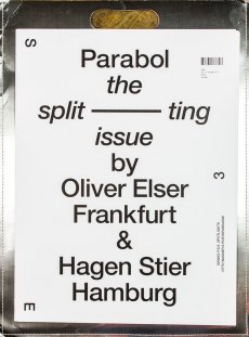
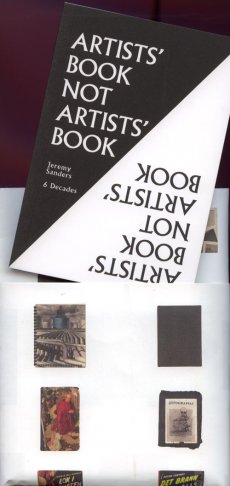
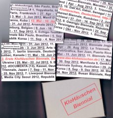
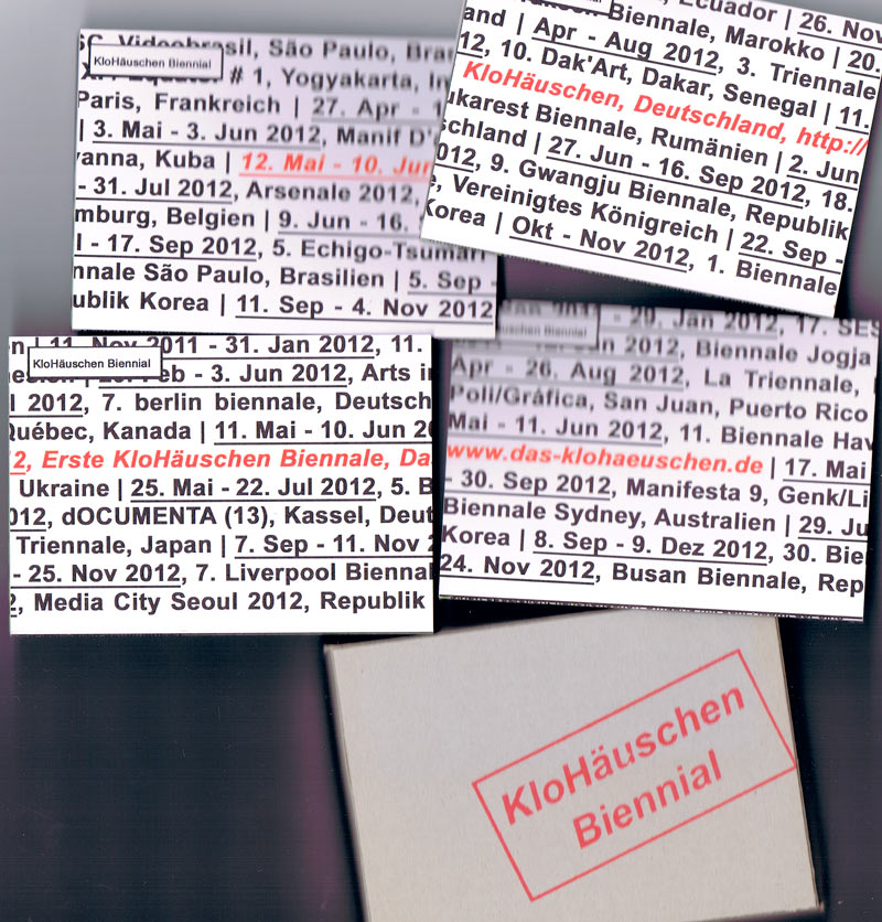
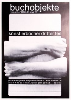
Gesucht wurde Off One\\\'s Rocker Publishing Ltd, Medienart , Sortierung DatensatzNr., aufsteigend. Kein exaktes Ergebnis. Alternative Fundstellen: 500 Treffer
Hinweise zum Copyright und ServiceAAP Archive Artist Publications - Munich - www.artistbooks.de
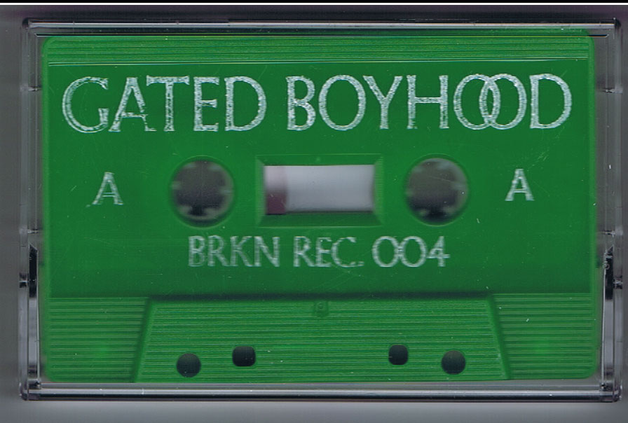
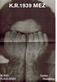
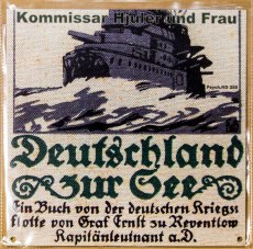
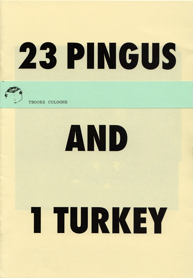
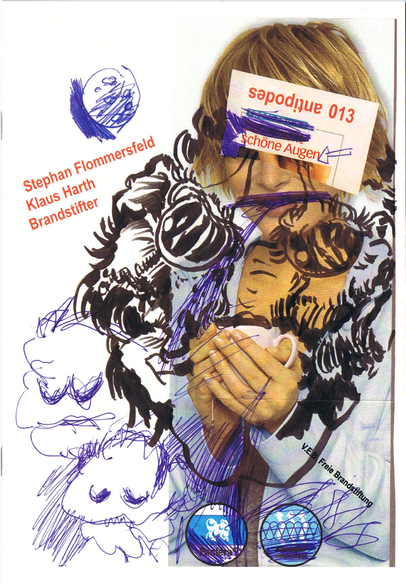
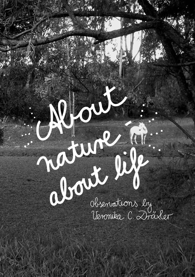
192 S., 28x21 cm, keine weiteren Angaben vorhanden Ringösenheftung
ZusatzInfos
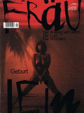
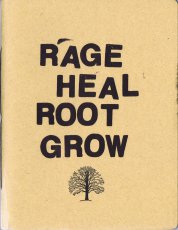
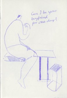
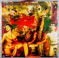
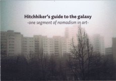
Der Anfang von allem. Die Lust. Der Schmerz. Geburt
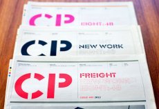
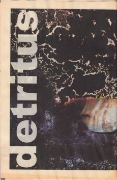
Halbjährlich erscheinendes Magazin, "das sich auf das Detail konzentriert.
Es möchte in unserem immer schneller werdenden Leben wie ein Anker sein. Sich Zeit nehmen für Handarbeit, gründlich recherchierte Geschichten und innovatives Design.
Fräulein bildet die Gegenwart nicht nur ab, Fräulein lebt in ihr und bezieht dabei eine klare Haltung. Dabei gehen wir einen neuen Weg: In Fräulein verbinden wir Fotostrecken, die man sonst nur aus High-Fashion-Magazinen wie „Another Magazine“ oder „Purple“ kennt, mit tief gehenden Interviews und Reportagen aus den Krisengebieten der Welt. Wichtig in Fräulein ist darüber hinaus der serviceorientierte Inhalt. Deshalb informieren wir Sie in Fräulein von Ausgabe zu Ausgabe über die neuesten Trends aus Mode, Kosmetik, Musik, Kultur und Kunst.
Fräulein spricht für starke und selbstbewusste Frauen, die mitten im Leben stehen, verzaubern und niemals langweilig werden. Intelligente, stilvolle und erfahrene Frauen, die wissen, was sie wollen und Wert auf feine Unterschiede legen."
Text von der Webseite
2 S., 29,7x21 cm, keine weiteren Angaben vorhanden Ausdruck einer Email vom 28.2.2015
ZusatzInfos
Independent. Contemporary. Art. 24 April – 31 May 2015. OFF-Biennale Budapest is a series of exhibitions and art events in and beyond the city of Budapest. Its concept is different from traditional biennials as we know them. Not affiliated with any institution, it is a voluntary collaborative initiative of artists, groups of artists, curators, art managers, gallerists and collectors. OFF-Biennale Budapest is a civil initiative, whose aim is to bring a segment of culture, contemporary art, closer to the public at large. OFF proclaims the importance of independent thinking and action, breaking away from clichés and habitual routines. It is meant to demonstrate that contemporary art can foster and catalyse this kind of activity – in other words, that contemporary art is much more than mere luxury and a source of aesthetic pleasure.
Text von der Webseite
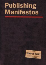
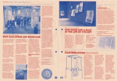
Miss Read: The Berlin Art Book Fair is celebrating the 10th year of its existence by bringing together 263 exhibitors and with the publishing of an anthology called »Publishing Manifestos«. »Publishing Manifestos« features key texts of critical engagement with publishing from protagonists of the field. The book also features a comprehensive WHO IS WHO of publishers, as they showed up in 10 years Miss Read, with 600 separate entries, as well as information about activities of Miss Read since its inception in 2009. Text von der Webseite
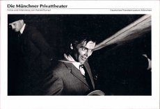
Mit Eintrag Archive Artist Publications, S. 225
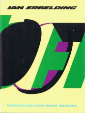
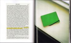
Der Ausgangspunkt für dieses Künstlerbuch war Off, eine textbasierte Performance, die um die Themen Teilhabe oder Verweigerung, politisch sein oder nicht, die Probleme der Verweigerung, Repräsentation, Wut, reproduziertes Verhalten und die Frage, ob dies vermeidbar ist, kreist. Weitere Themen sind Erschöpfung, die Beziehung zwischen mir und den anderen - im Allgemeinen und in der Situation der Aufführung -, das Einnehmen einer Position durch Verweigerung einer einzelnen Position. Innerhalb der Performance verändert sich die Bedeutung des Begriffs Off ständig.
Text von der Website überarbeitet mit Hilfe von DeepL.
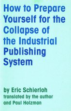
Das Heft besteht ins Englische übersetzte Essay "How to Prepare Yourself for the Collapse of the Industrial Publishing System" des argentinischen Künstlers Eric Schierloh. Der Text wurde zusammen mit Paul Holzman übersetzt.
This publication is the result of a warm exchange between Public Collectors and Eric Schierloh of the press Barba de Abejas, (Beard of Bees).
In 2020 Eric wrote this essay that he translated into English with an American friend, Paul Paul Holzman, who also lives in Buenos Aires. In December 2021, Eric reached out to me to share his enthusiasm for my text “Towards a Self Sustaining Publishing Model.” Eric proposed making a Spanish translation and publishing my writing as a cheap edition in Argentina. He felt my text had similarities to his own words; the two works share a similar spirit of encouraging publishing experimentation outside of typically limiting market constraints.
Though Eric’s text had already been published in English in World Literature Today magazine and translated into French by the cardboard press La Liebre Dorada, we agreed that it could still be worthwhile to make a US edition that stood alone. So, in a celebration of artist publishing exchanges, Public Collectors is happy to share Eric Schierloh’s inspiring writing. It provides many potential creative paths forward for people with access to any form of printing, and any materials that could be used to make a book.
Text von der Webseite
About the series:
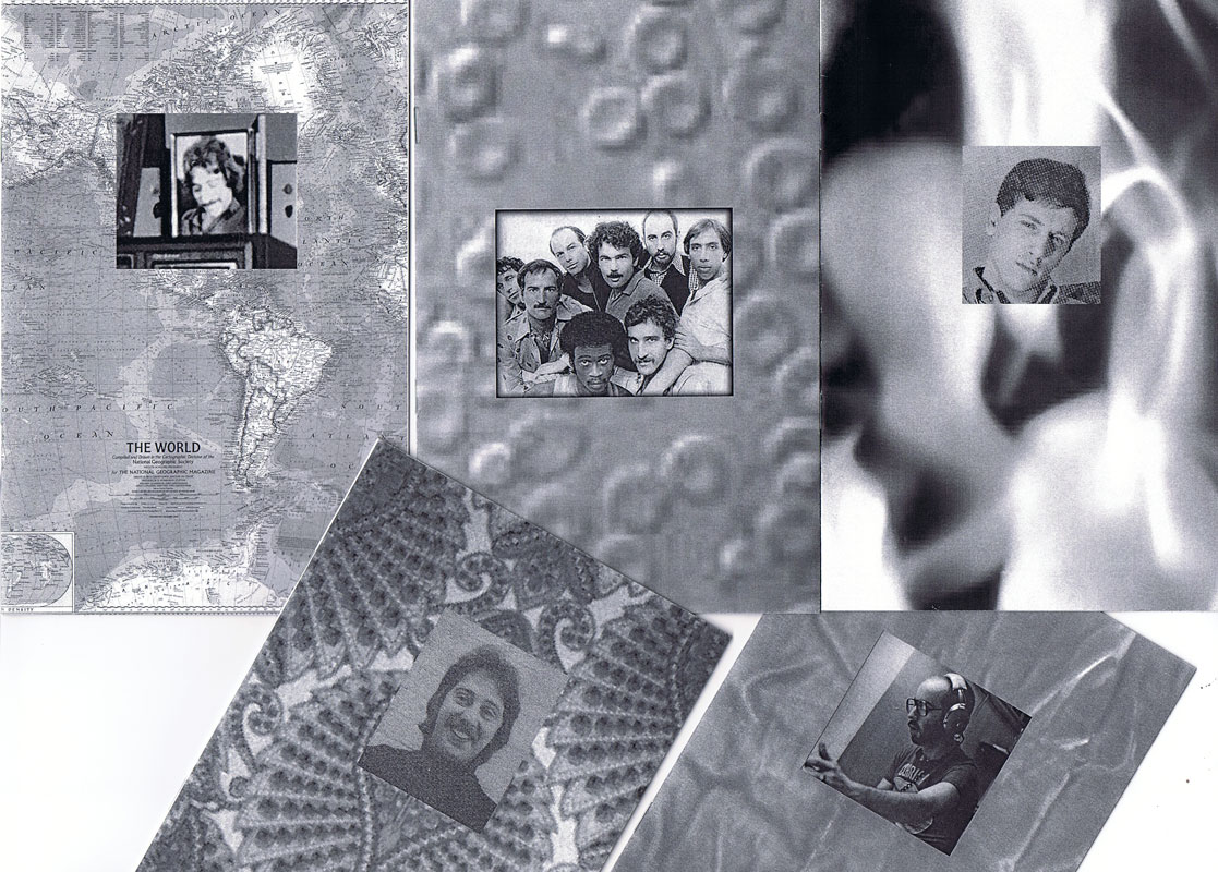
The For Everard zine series chronicles the 1977 fire at New York's Everard Baths, combining archival research with imagined narratives to re-focus attention to obscured histories. The series explores the media coverage of the subsequent investigation of the fire, and the lives of the nine men who perished. The zines bring together photographic images with primary news sources, as well as personal anecdotes collected from eyewitness testimonials.
About the individual zines:
For Everard, Vol. 1, 2013, ed. 100 (nr. 65)
This zine chronicles the May 25, 1977 fire at New York's Everard Baths and the media coverage of the subsequent investigation.
For Everard, Vol. 2 (Bloodbrothers), 2013, ed. 100 (Nr. 81)
In the second volume of his series chronicling the 1977 fire at New York’s Everard Baths, Anthony Malone focuses on Bellevue Hospital’s blood drive for the victims of the great bathhouse tragedy. Malone draws parallels between the 1977 restrictions placed on gay men for donating blood to their “brothers” and current FDA guidelines that indefinitely defer donations from men who have had sex with men since 1977. This black and white photocopied zine (ed 100) juxtaposes archival images, news clippings, and just a touch of fantasy.
For Everard, Vol. 3 (Remembering Jimmy), 2015, ed. 100 (Nr. 94)
Volume 3 of the series, For Everard is dedicated to the memory of Jimmy Stuard, who died in the tragic fire at the Everard Baths in 1977. Stuard was a rising star in the disco music scene. He spun records first at Boston’s 1270 Club, and later at New York’s 12 West, where he inspired an entire generation of musical artists and DJs. In this particular volume, Anthony Malone assembles images and archival texts that serve as a tribute to the great Jimmy Stuard.
For Everard, Vol. 4 (A Lovely Show), 2016, ed. 100 (Nr. 62)
For Everard, Vol. 4 (A Lovely Show) is a tribute to Kenneth Hill, one of the nine men who died in the devastating fire at the Everard Baths in 1977. Kenn played a vital role in the East Village/Lower East side countercultural movement in the late ‘60s and 1970s. He was a hippie, a bar tender at Phebe’s (a watering hole and salon for the experimental theater community in the 1970s), one of the founders of the Old Reliable Theatre Tavern, House Manager at La Mama Experimental Theatre Club, and a photographer. This zine celebrates Kenneth Hill by collaging archival documents with personal artifacts and pictures of Kenn from meaningful moments in his life.
For Everard, Vol. 5 (A Dearly Loved Man), 2017, ed. 100 (Nr. 95)
For Everard, Vol. 5 (A Dearly Loved Man) assembles images and stories from the life of Ira Landau, a gifted and dedicated teacher who died in the tragic fire at the Everard Baths in 1977. Ira left behind a devoted family (his mother, brother, niece, and lover) and is still greatly missed by his loved ones. This zine is a tribute to the life and accomplishments of a remarkable man who served in the Peace Corps and committed himself to educating young minds both abroad (in the Middle East) and at home in the US. It contains family photos and personal images generously contributed by Ira’s niece.
For Everard, Vol. 6 (Yosef’s Song), 2017, ed. 100 (Nr. 94)
Volume 6 of the series For Everard celebrates the life of a remarkable musical prodigy, Yosef Synovec. This zine tells the story of a young man with great aspirations who emigrated to the United States from Czechoslovakia to study classical violin. In 1976, Holly Woodlawn overheard Synovec vocalizing as he was painting the bathroom of his East Village apartment, and determined on the spot that she had discovered an emerging star. As a singer, Synovec used his extreme vocal range to imitate the voice and persona of Peruvian diva Yma Sumac. He performed Sumac’s exotic musical numbers at several New York City cabarets and show venues. Sadly, on May 25, 1977, Yosef perished in the tragic fire at the Everard Baths.
For Everard, Vol. 7 (Tony from the Bronx), 2017, ed. 100 (Nr. 86)
This zine brings together images and stories from the life of Tony Calarco, one of the nine men who died in the fire at the Everard Baths in 1977. Tony was only 26 when he died. He lived with his parents and siblings in a modest house in the Bronx. He had recently graduated from college and was working as a social worker in New York city at the time of his death. Tony had aspirations to become a lawyer and was scheduled to begin law school in September of 1977. This zine celebrates Tony Calarco’s memory through photos of Tony, artifacts from his high school and college years, and recent photographs of his home and final resting place.
For Everard, Vol. 8 (Looking for Amado), 2017, ed. 100 (Nr.84)
Amado Alamo, a young man only 17 years old, lost his life in the fire at the Everard Baths in 1977. In Volume 8 of For Everard, Anthony Malone documents his search for the identity of the youngest victim of the Everard fire. The zine is an abstracted portrait of Alamo that assembles the few extant fragments of his story culled from newspaper articles and documentary sources glued together with the artist’s imagination.
For Everard, Vol. 9 (Last Call), 2017, ed. 100 (Nr.72)
Life was difficult for Hillman Wesley Adams. He was born in Jacksonville FL in 1938. His mother died just a few months after his birth, and by the age of nine, he found himself in an orphanage with his older brother. Fast forward 30 years: Hillman moved to NYC, struggled to make ends meet while working on and off as a bartender, and he met his lover, Ralph, with whom he shared a modest apartment in New Jersey. On May 25, 1977, Hillman died in the fire at the Everard Baths. Vol. 9 of For Everard is an assemblage of newspaper articles and vintage photos chronicling the life and untimely death of Hillman Wesley Adams.
For Everard, Vol. 10 (In Memoriam: Patrick Nott), 2018, ed. 100 (Nr. 64)
Volume 10 of For Everard memorializes the life of Patrick Nott, one of the nine men who died in the fire at the Everard Baths. Nott, a native of Wales with a passion for theater, literature, and music, pursued a successful career in hairdressing. He fell in love with his pen pal (a young woman from Brooklyn) and after their marriage, they moved to New York City, where Nott worked at the Vidal Sassoon Salon. This zine weaves together elements from his story (shared with the artist by Patrick Nott’s wife), with photographs, newspaper clippings, and artifacts. It acts as a humble tribute, an “In Memoriam” for this greatly loved man.
For Everard, Vol. 11 (Thunderbird), 2019, ed. 100 (Nr. 79)
Brian Duffy was an aspiring artist. In 1966 he was accepted to Pratt Institute of Art and although he declined admission to the school, he seized the opportunity to move to NYC and start a new life for himself. In the city, he worked hard at various retail jobs and tried to break into the theater, but everything changed when he met the love of his life, Bradley. The couple moved to a “quieter life” in Boston. They worked in restaurants in the Back Bay area and created a community for themselves amongst their chosen family of friends. Volume 11 of For Everard celebrates the brief life of Brian Duffy, a young man who died in the fire at the Everard Baths in 1977. This zine compiles photographs and stories shared with Malone by Brian’s sister and dear friend.
The pseudonym "Anthony Malone" comes from a novel by Andrew Holleran (Dancer from the Dance). In this novel, Malone is the protagonist and at the end he disappears. Some of his friends believe that he may have committed suicide, others feel that he may have run away from New York, while some say that they saw him at the Everard Baths on the night of the fire. I imagine that Malone survived the fire and he is now making books and zines telling the story of the tragedy.
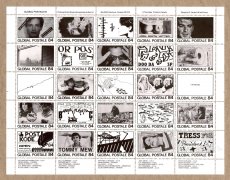
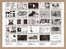
Aus dem Impressum: "Erscheinungsweise 5x jährlich ... Mitarbeit: Der SF versucht eine Mischung aus aktuellen politischen Ereignissen, Internationalismus, Aktualisierung libertärer Theorie, Aufarbeitung freiheitlicher Geschichte und einer Kultur- und Medienkritik von unten ..."
7 S., 29,7x21 cm, keine weiteren Angaben vorhanden Schwarz-Weiß-Laserdruck nach Webseite, Drahtheftung
ZusatzInfos
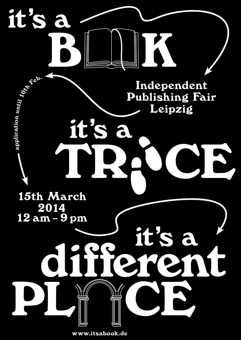
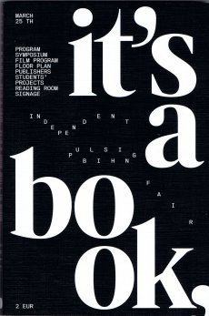
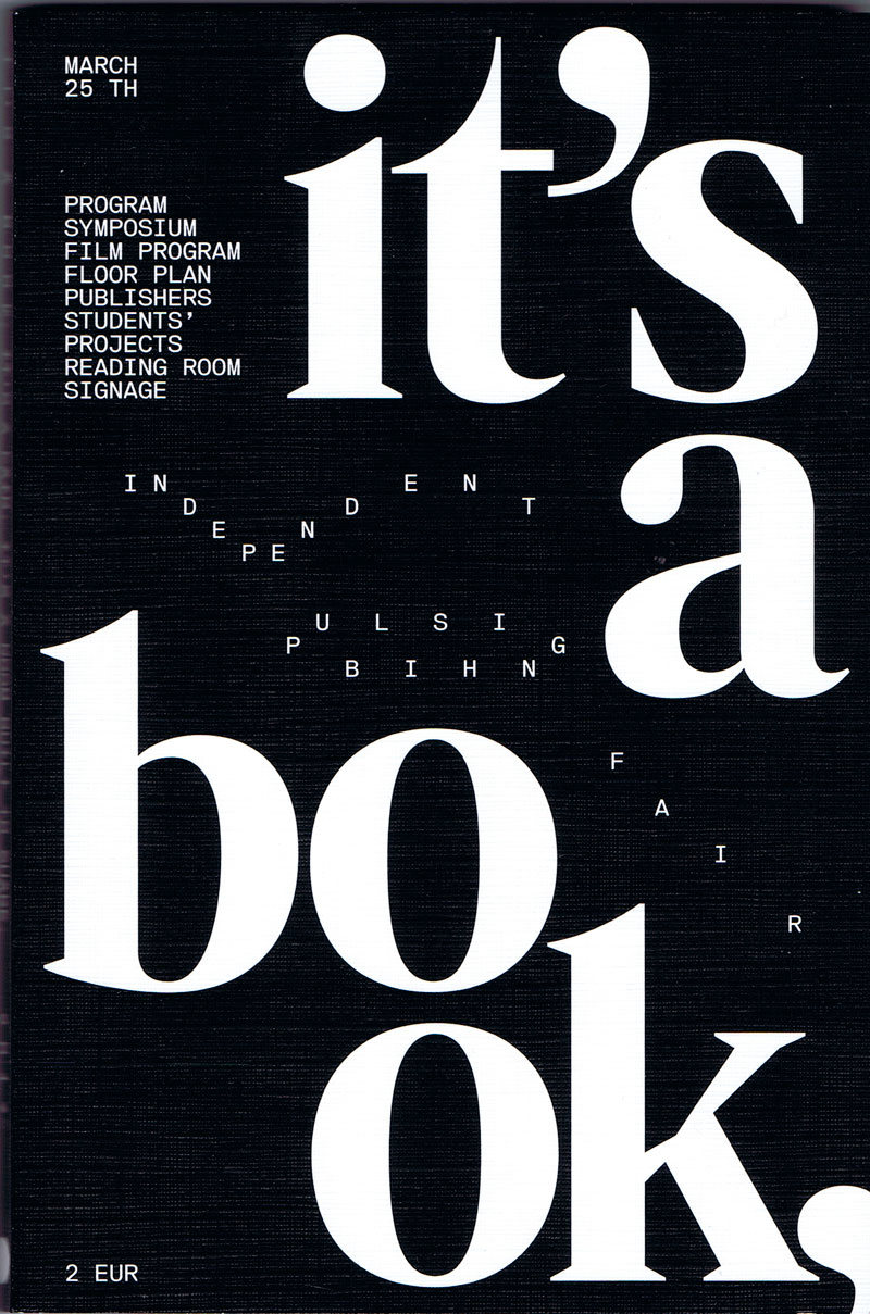
Independent Publishing Fair Leipzig, 15th of March 2014
Event: "It’s a Book…” is an independent publishing fair taking place on 15th of March 2014 at the Academy of Visual Arts Leipzig, in correspondence to the Leipzig Book Fair. Entrepreneurs of the international independent publishing-scene are looking forward to meeting interested visitors and exchanging books and ideas.
Organisation: students of the graphic design department, Academy of Visual Arts, Leipzig.
8 S., 14,8x23 cm, signiert, keine weiteren Angaben vorhanden zu einem Buch gefaltetes Plakat zur Veranstaltung
ZusatzInfos
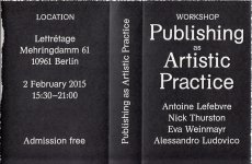
What does it mean to publish today? In the face of a continuously changing media landscape, institutional upheavals and discursive shifts in the legal, artistic and political fields, concepts of ownership, authorship, work, accessibility and publicity are being renegotiated. The field of publishing not only stands at the intersection of these developments but is actively introducing new ruptures.
How the traditional publishing framework of processes, practices, institutions and discourses has been cast adrift will be discussed in the workshop through the examination of recent advancements of publishing concepts emerging from the experimental literature and art scene, where publishing and publicizing are often part of an encompassing artistic practice.
Text von der Webseite
140 S., 25x21,4 cm, ISBN/ISSN 978-1-907840104 Gelochte Seiten mit Musterbeutelklammern zusammen gehalten, in Klappumschlag, mit 18 roten Punkten beklebt. Innen teils andere Papiere
The Piracy Project is an international publishing and exhibition project exploring the philosophical, legal and practical implications of book piracy and creative modes of reproduction. Through research and an international call for submissions, the Project has gathered a collection of more than 150 modified, appropriated and copied books from all over the world. The collection, which is catalogued online, is the starting point for talks and work groups around the concept of originality, the notion of authorship and politics of copyright. The Piracy Project is not about stealing or forgery. It is about creating a platform to innovatively explore the spectrum of copying, re-editing, translating, paraphrasing, imitating, re-organising, manipulating of already existing works. Here creativity and originality sit not in the borrowed material itself, but in the way it is handled. The Piracy Project is an collaboration between AND Publishing and Andrea Francke. The Piracy Project The Piracy Project is an international publishing and exhibition project exploring the philosophical, legal and practical implications of book piracy and creative modes of reproduction. Through research and an international call for submissions, the Project has gathered a collection of more than 150 modified, appropriated and copied books from all over the world. The collection, which is catalogued online, is the starting point for talks and work groups around the concept of originality, the notion of authorship and politics of copyright. The Piracy Project is not about stealing or forgery. It is about creating a platform to innovatively explore the spectrum of copying, re-editing, translating, paraphrasing, imitating, re-organising, manipulating of already existing works. Here creativity and originality sit not in the borrowed material itself, but in the way it is handled. The Piracy Project is an collaboration between AND Publishing and Andrea Francke.
Text von der Webseite
Buch, das eine Sammlung an Manifesten - der letzten Jahrzehnte bis in die Gegenwart - von Künstler*innen, Autor*innen, Redakteur*innen, Verleger*innen, Designer*innen, etc., die das Publizieren als künstlerische Praxis erkunden, darstellt.
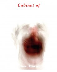
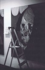
This work is about the phenomena of appearance and disappearance. The book shows 36 head-shots of a clown. If mutability of appearance is integral to the phenomenon of the cloud – since dissolution or erasure is inevitable – the converse is proposed for the clown.
"Cabinet of" announces the imprint steidldangin, a collaboration between Pascal Dangin of Box Ltd, New York, USA and Gerhard Steidl of Steidl Verlag, Göttingen, Germany.
Information von der Webseite und aus dem Buch.
Reproduzierte Illustrationen aus dem Buch "A Key to Better Memory", New York 1959. "One Hundred Things to Remember is based on one book suggesting a visual approach to improving memory. Taken out of context and viewed from a distance of nearly seventy years, the combinations of simple words and drawings turn out to be an absurd selection of random signs, a form of unintentional poetry reminding us of a time when computers with virtually unlimited memory were not even a dream yet."
Text von der Webseite
During Paris lockdown, 16 photograhers shared one roll of film, connecting from neighborhood to neighborhood, in frame of one hour and one kilometer freezing one frame.
Während des Pariser Lockdowns teilen sich 16 Fotografen eine Filmrolle, anschließend von Stadtviertel zu Stadtviertel. Im Rahmen von einer Stunde und einem Kilometer hielten sie jeweils ein Bild fest.
Text von der Webseite, Übersetzung DeepL
2004 winner of I.D. Magazine's Design Distinction award, Absence is the third book to come out of Printed Matter’s Publishing Program for Emerging Artists, a program made possible through the generous support of New York City's Department of Cultural Affairs, The Andy Warhol Foundation for the Visual Arts, the Elizabeth Firestone Graham Foundation, and the Heyday Foundation. The generosity of Whitney trustees Melva Bucksbaum and Raymond J. Learsy was instrumental to the Museum’s participation in the publication of this exciting new work.
Both a book and a sculptural object, Absence is a memorial to the twin towers of the World Trade Center. Yoon, an architect and designer who is currently an Assistant Professor of Architecture at the Massachusetts Institute of Technology, chose not to produce a traditional design proposal for the World Trade Center Memorial Competition. Instead she created a non-architectural, non site-specific space of remembrance: a portable personal memorial in the form of book.
At almost two pounds, Absence has a considerable physical presence, but it is in every way the ghost of a presence, and it is this ghostliness that gives it its particular emotional weight. A solid white block of thick stock cardboard pages, the book’s only "text" consists of one pinhole and two identical squares die-cut into each of its one-hundred-and-twenty pages – one for each story of the towers including the antenna mast. These removed elements lead the reader floor by floor through the missing buildings towards the final page where the footprint of the entire site of the World Trade Center is die-cut into a delicate lattice of absent structures.
Of all of the proposed monuments and grand designs for the twin towers to emerge in the last two years, Absence is remarkable for its employment of an under-used strategy: restraint. The simplicity of Yoon’s materials and her use of repetition speak, without words, about unspeakable loss. Quiet, respectful, mournful, the book does not aim to represent the magnitude of the disaster. Instead it appeals to the vastness of the reader’s imagination and capacity to grieve. The human scale of her memorial operates on a personal level – it delivers the memory of lives lost into the reader’s hands. At the same time, as a scale model of a vanished architectural site, it operates on a larger cultural level by commemorating the site itself.
Text von der Webseite. Fotos Xenia Fumbarev
Atem Books is an independent publishing house based in Catalunya focused on photography & illustration, contemporary drawing and thinking created by emerging artists from around the world. Our aims are: to help emerging artists to get their work more known, create a collection of contemporary works, to gather illustrators, photographers & art lovers. Atem Books has been publishing Carpaccio Magazine since April 2009. Atem Books is a non-profit organization, so all the money earnt is always invested in new publications.
Why ‘Atem’?
‘Atem’ stands for “wind, breath” in german. This word is inspired by an illustrated poetry book published by Paul Celan (poet) and Gisèle Celan (illustrator) called Atemkristall.
Who we are
Atem Books curators are María Cerezo and Emma Llensa. We both do all the works involved with mantaining Atem Books.
What we can do
We’re also offering our services to help you self-publish your book (both digital -pdf, epub, mobipocket-, Ipad and Iphone apps and print). Whether if you need advise on how to start self publishing a book or you need our services as curators, designers, layouters and image retouchers, just ask us what we can do for you.
We’re also offering our services to help you create your own website and, if you need one, how to create an e-commerce to sell your own goods. And, of course, we can give you marketing and self-promotion advises and guidelines.
Atem Books is 100% independent!
We don’t receive any external money. This project survives with the earns we do selling our publications.
Von der Webseite
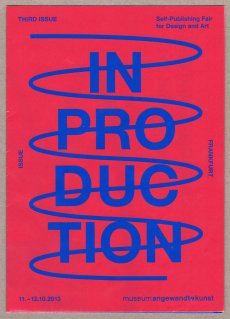
Infobroschüre und Programm zur dritten Self-Publishing Fair for Design and Art, museum für angewandte kunst, Frankfurt am Main, 11.-12.10.2013.
Unter dem Titel „In Production“ untersuchen die Teilnehmer der Third Issue – Self-Publishing Fair for Design and Art am 11. und 12. Oktober im Frankfurter Museum Angewandte Kunst die Grenze zwischen Gestaltung und Druck. Im Rahmen einer Messe zeigen rund 30 junge Verlage ihre gestalterisch anspruchsvollen Bücher, Zeitschriften und Fanzines. Text von Website.
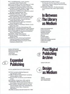
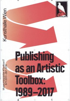
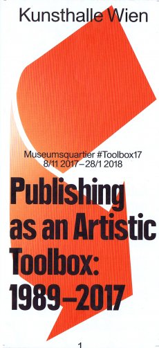
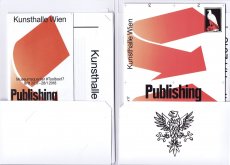
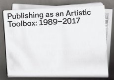
Infoheft zur gleichnamigen Ausstellung, Kunsthalle Wien, 08.11.2017-28.01.2018. Mit Informationen zum Rahmenprogramm und den einzelnen Kapiteln der Ausstellung: Artists' Library, Artist-run Magazines (The Magazine as Medium), The Message as Medium, Autoretrospective, The Bookshop as Medium, In Between The Library as Medium, Expanded Publishing, Post Digital Publishing Archive, Design as Medium, The Artist & The Publishers, Magazines as Publishers
Infoblatt zur gleichnamigen Ausstellung, Kunsthalle Wien, 08.11.2017-28.01.2018. Mit Informationen zum Rahmenprogramm und den einzelnen Kapiteln der Ausstellung: Artists' Library, Artist-run Magazines (The Magazine as Medium), The Message as Medium, Autoretrospective, The Bookshop as Medium, In Between The Library as Medium, Expanded Publishing, Post Digital Publishing Archive, Design as Medium, The Artist & The Publishers, Magazines as Publishers
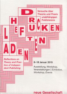
The independent publisher's quarterly by Drucken Heften Laden. Drucken Heften Laden discusses and analyses the conditions and possibilities for independent publishing in the context of art and city (politics). Drucken Heften Laden derives from an eponymous exhibition, workshop and series of events at neue Gesellschaft für bildende Kunst (nGbK) in Berlin which took place in January 2015. Since then a small group of Berlin-based producers and publishers gathers regularly: “We share experiences and resources, and build a discourse around production methods and values as well as the distribution of books and booklets.Publishing is always set in distinct time and space. Today’s diversity of media fosters hybrid formats between the analogue and the digital. We are interested to negotiate and sharpen our idea of what „independent“ and „self“ publishing means today.Drucken Heften Laden filters and disseminates information, and creates a public platform for exchange and discussion, accessible to everyone interested in such practice.”
Text von der Website.
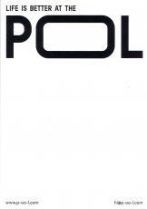
Werbekarte von Cultural Association POOL publishing.
The Vienna-based cultural association „POOL publishing“ is a contemporary publishing house. The association, whose activities are not aimed at profit, pursues exclusively non-profit purposes, Promotion of art and culture, promotion of cultural activity, mediation of culture, enrichment of cultural life.
Text von der Webseite
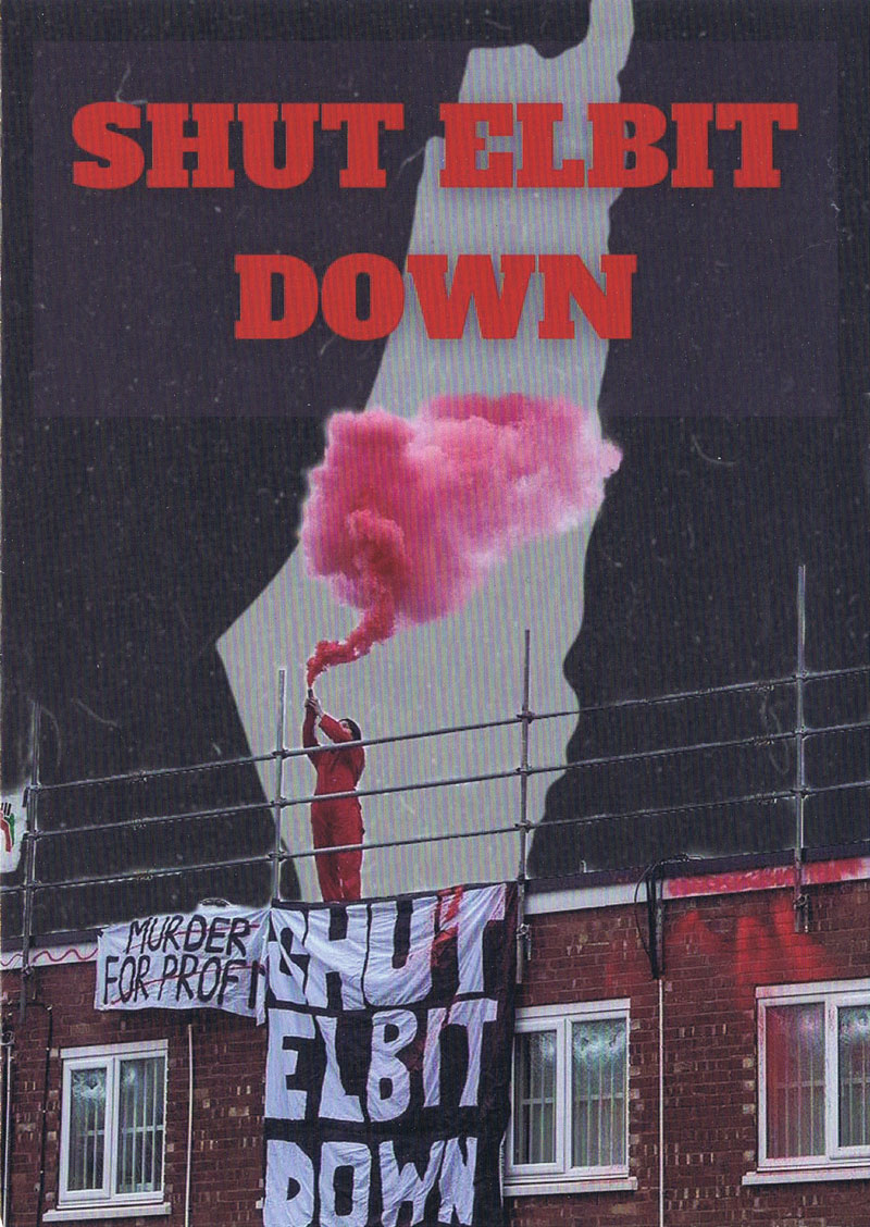
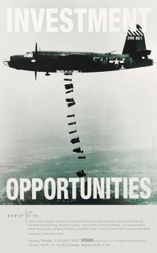
Elbit Systems Ltd. ist ein israelischer Luft- und Raumfahrt- sowie Elektronikkonzern mit Sitz in Haifa. Er ist einer der größten Rüstungskonzerne und -exporteure Israels. Neben Waffenexporte in alle Welt wird Elbit für seine entscheidende Rolle bei den Kriegsverbrechen der israelischen Armee in Gaza und im Westjordanland sowie bei der systematischen Unterdrücking von Palästinenser*innen kritisiert.
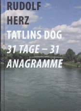
Katalog erschienen im Nachgang des Projektes des Kulturreferates und Stadtplanungsamtes im Rahmen der Kunsträume Bayern 2008: Temporäres Kunstwerk auf dem Donausteg in Ingolstadt vom 06.08.-05.09.2008 - 31 Tage lang. Außerdem Ausstellung der Fotodokumentation in der Reihe Szenenwechsel, Museum für Konkrete Kunst Ingolstadt vom 25.10.-08.11.2009.
An einer Brücke Ingolstadts wurden 31 Tage lang mit jedem neuen Tag ein weiteres Anagramm von "Tatlins Dog", also von Ingolstadt, installiert: GOLD IS TANT, LINDOS TAGT, DONT SLAG IT, TOS GINA LTD, DAS NIL GOTT, ...
In der Literatur ist ein Hund des russischen Avantgarde Künstlers der 1920er Jahre nicht bekannt, doch das Konzept von Rudolf Herz "31 Anagramme von Tatlins Dog" gewann die Ausschreibung "Kunst im Fluss", so entstand der Brückenschlag zur Erinnerung an den Künstler Tatlin.
1913 nahm Tatlin z. B. an einer Ausstellung der Künstlergruppe Karo-Bube teil. Er besuchte als Tänzer Berlin und Paris, wo er Picasso traf und den Kubismus kennenlernte ...
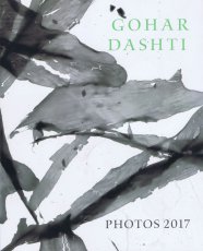
Katalog der zu der Ausstellung "Photos 2017" der iranisch-amerikanischen Künstlerin Gohar Dashti erschienen ist. Die Ausstellung fand vom 08.09.-31.10.2017 in der Robert Klein Gallery in Boston statt. Ausgestellt wurden verschiedene Fotografien der Künstlerin, die vor allem Natur- und Pflanzenmotive zeigen.
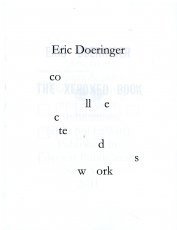
Collected Works compiles eight of my books into one convenient volume. The books are combined together, so that page one of Collected Works is a "sandwich" of the first page of all eight books, page two contains the second page of each book, page three the third page, etc. Collected Works reproduces Squares With Sides And Corners Torn Off, Some Los Angeles Apartments, Real Estate Opportunities, The Location of Lines, and Records in their entirety, plus excerpts from 60 Years Later, Arcs Circles & Grids, and The Xeroxed Book. - Eric Doeringer
Text von der Webseite
Schwarz-Weiß-Drucke
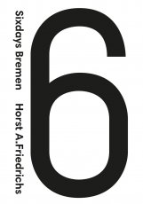
Internationally renowned photographer, Horst A. Friedrichs was born in Frankfurt in 1966. He studied photography in Munich and has worked as a freelance photojournalist for numerous magazines including The New York Times, Geo and Stern. In 2008, he received the prestigious Lead Award for Best Reportage Photography. He has published a number of books including the best-selling I’m One: 21st Century Mods (Prestel). He lives in London. The Six Days of Bremen is a six-day track cycling race held annually in Bremen, Germany. The event was first held in 1910 as a one-off event and as a regular event since 1965. It is held at the ÖVB Arena.
Where can artist publishers, zine makers, librarians, artist book archivists, print activists, and others in this self-organized community hang out when there isn’t a fair, a fest, an event, or gathering to bring us together? Temporary Services, 2019
Temporary Services have created a new online discussion forum for artist book publishing called Artist Publisher. Please tear off a tab, visit the site, spread the word, and join them in multiple discussions around artist book making, zine publishing, printing, distribution, archiving and more.
Text vom Flyer
[2] S., 10,5x14,8 cm, Auflage: 3.000, 50 Teile. keine weiteren Angaben vorhanden Jeweils ein Blatt, verschiedene farbige Papiere, mehrfach gefaltet
ZusatzInfos
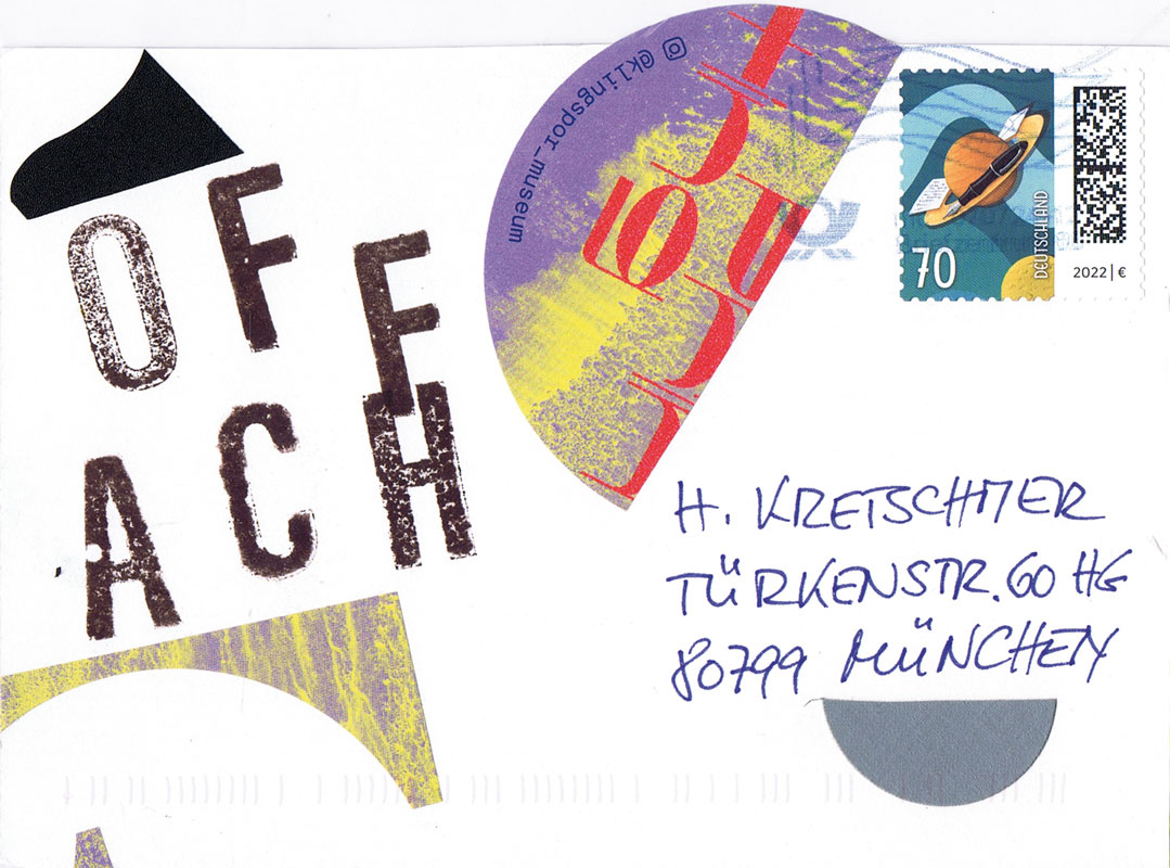
Alle Ausgaben des Zweimonatsprogramms für Projekte und Ausstellungen in München, vorwiegend in Off-Spaces.
Jungen Künstlern und Ausstellern bietet RADAR die Möglichkeit, eigene Projekte unkompliziert in einem Veranstaltungskalender bekannt zu machen, dem Publikum liefert RADAR einen übersichtlichen Plan und eine komprimierte Zusammenstellung aktueller Termine und Ausstellungen vorwiegend junger Kunst. Ein knapper redaktioneller Teil gibt Kommentare und Statements wieder.
Text von der Webseite
96 S., 19x12 cm, ISBN/ISSN 9789086900985 Broschur, von Vitsoe Bookswap München
ZusatzInfos
Same story. 43 versions. Each story told from a person close to the source, claiming the absolute truth.
I Heard They Ripped it Off is a volume from the Hard School Books series, investigating what is original vs. copy, surrounding the “what, where and when” of the stories and gossip of the John, Paul, Ringo & George (Beatles) T-shirt that is made by the Experimental Jetset
2 S., 42x29,7 cm, keine weiteren Angaben vorhanden Plakat, einmal gefaltet
ZusatzInfos
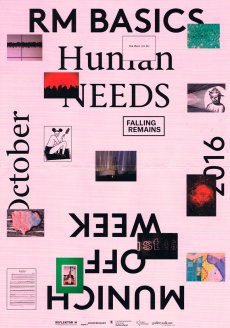
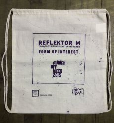
Veranstaltungen in München 21.10.-30.10.2016 an verschiedenen Orten.
REFLEKTOR M informiert über eine bestimmte Auswahl an Projekten und Ausstellungen zeitgenössischer Kunst in München.
REFLEKTOR M funktioniert dementsprechend als Funkfilter für Kunst der Gegenwart in München. Es steht als mobile Webseite, als Ausstellungskalender, als Treffpunkt scharfer Meinungen zu den aktuellen Ereignissen in der Stadt München und als Forum zur Verfügung.
Text von der Facebookseite
Munich Off Week initiiert von Viktoria Tiedeke und Rosali Wiesheu, super+CENTERCOURT, München
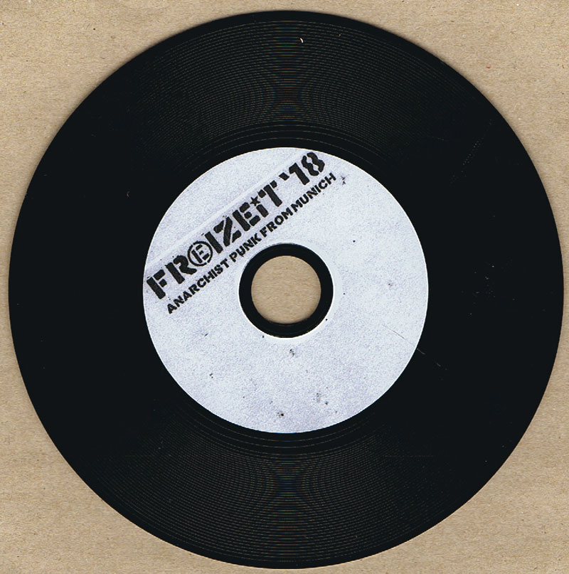
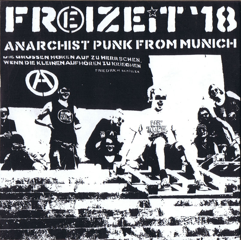
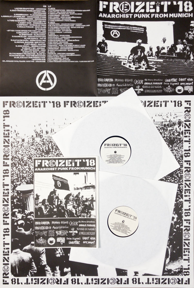
Anarchistischer Punk aus München! 20 Bands aus München haben sich zusammengetan, um den Anarchopunk-Sampler FREIZEIT '18 auf Doppelvinyl + CD als DIY-Eigenproduktion ins Leben zu rufen. Das ganze Projekt wurde von den teilnehmenden Musiker*Innen/Aktivist*Innen realisiert, finanziert und mit zwei Releaseshows, am 9.11.18 im Freiraum Dachau und am 10.11.18 im Feierwerk München, gebührend gefeiert.
Die Bands Absolut Lächerlich, Ämbonker, Black Cat Dub Federation, Caskar, Digitalbox, Disasseln, Disfrost, Einstürzende Musikantenstadl, Gafas De Nada, Kein Signal, the Merry Prankster, Missbrauch, Off.Deaf, Orale Phrase, Per Capita, Rötten Shock, Sabot Noir, Stressbenzin, Umluft 180, Turd Sandwich steuern jeweils 2 – zum Teil unveröffentlichte – Lieder bei.
Freizeit `18 feiert die Zusammenarbeit, die Solidarität, den Widerstand und den Kampf gegen jede Herrschaft.
Freizeit `18 feiert die Ungezwungenheit, die Fröhlichkeit, die Gmiatlichkeit und die Griabigkeit. Prost!
Freizeit `18 feiert das Leben, die Liebe, die Freiheit und die Freundschaft.
Freizeit `18 feiert die Anarchie!
2018 wollen wir daher an die Revolten und Revolutionen von 1848, 1918 und 1968 erinnern. Da hat es nämlich nicht zuletzt auch in München ordentlich gescheppert.
November 1918 Revolution und Proklamation der Münchner Räterepublik, November 2018 Sampler-Release. Freizeit `18 feiert sich selbst.
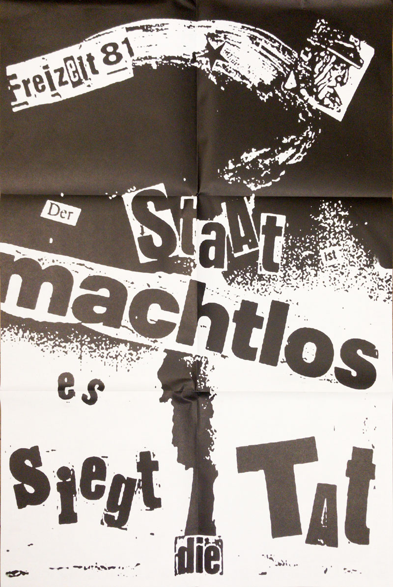
2018 feiert Freizeit `18 außerdem den lustigen Zahlendreher mit Freizeit `81, einem anarchistischen Phänomen, das 1981 aus der Münchner Punkszene hervorging .
Ⓐ Gegen jede Herrschaft und für ein widerständiges München Ⓐ anarchopunkmuc.blogsport.eu/
Text von der Website
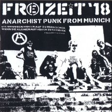
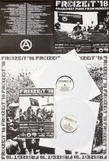
32,5x33,2 cm, 4 Teile. keine weiteren Angaben vorhanden Doppel-LP in weißen Papierhüllen, eingelegt in gefaltetem Din A2 Plakat, in Kunststoffhülle, mit eingelegtem 16-seitigem A4 Heft, Schwarz-Weiß gedruckt
Anarchistischer Punk aus München! 20 Bands aus München haben sich zusammengetan, um den Anarchopunk-Sampler FREIZEIT '18 auf Doppelvinyl + CD als DIY-Eigenproduktion ins Leben zu rufen. Das ganze Projekt wurde von den teilnehmenden Musiker*Innen/Aktivist*Innen realisiert, finanziert und mit zwei Releaseshows, am 9.11.18 im Freiraum Dachau und am 10.11.18 im Feierwerk München, gebührend gefeiert.
Die Bands Absolut Lächerlich, Ämbonker, Black Cat Dub Federation, Caskar, Digitalbox, Disasseln, Disfrost, Einstürzende Musikantenstadl, Gafas De Nada, Kein Signal, the Merry Prankster, Missbrauch, Off.Deaf, Orale Phrase, Per Capita, Rötten Shock, Sabot Noir, Stressbenzin, Umluft 180, Turd Sandwich steuern jeweils 2 – zum Teil unveröffentlichte – Lieder bei.
Freizeit `18 feiert die Zusammenarbeit, die Solidarität, den Widerstand und den Kampf gegen jede Herrschaft.
Freizeit `18 feiert die Ungezwungenheit, die Fröhlichkeit, die Gmiatlichkeit und die Griabigkeit. Prost!
Freizeit `18 feiert das Leben, die Liebe, die Freiheit und die Freundschaft.
Freizeit `18 feiert die Anarchie!
2018 wollen wir daher an die Revolten und Revolutionen von 1848, 1918 und 1968 erinnern. Da hat es nämlich nicht zuletzt auch in München ordentlich gescheppert.
November 1918 Revolution und Proklamation der Münchner Räterepublik, November 2018 Sampler-Release. Freizeit `18 feiert sich selbst.
2018 feiert Freizeit `18 außerdem den lustigen Zahlendreher mit Freizeit `81, einem anarchistischen Phänomen, das 1981 aus der Münchner Punkszene hervorging .
Ⓐ Gegen jede Herrschaft und für ein widerständiges München Ⓐ anarchopunkmuc.blogsport.eu/
Text von der Website
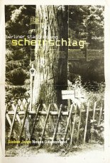
Der Scherenschnitt, der seit dem 17. Jahrhundert in Europa beheimatet ist, erlebte um 1800 eine Blütezeit. Im Biedermeier entstanden aus dem Papier vor allem Porträtsilhouetten sowie dekorative Blumen- und Märchenmotive. Doch künstlerische Beschäftigung mit dem Spiel von Licht und Schatten in Verbindung mit dem Werkstoff Papier setzt sich bis in die Gegenwart fort. Besonders seit den 1990er-Jahren greift eine Vielzahl von zeitgenössischen Künstler*innen diese traditionelle Kunstform wieder auf und interpretiert sie neu. Zwar wurde die Schere als Schneidewerkzeug meist durch feine Klingen ersetzt, aber nach wie vor zeigt sich in der ‚Ausschneidekunst‘ höchste Kunstfertigkeit. Längst jedoch haben die Künstler*innen den traditionellen, oft mit weiblicher Handarbeit konnotierten Papierschnitt vom Staub der biedermeierlichen Idylle befreit. Renommierte Künstler wie Christian Boltanski (»Les Ombres«, 1985), Hans Peter Feldmann (»Schattenspiel«, 2002) oder auch die Afroamerikanerin Kara Walker, die sich in ihrer Scherenschnittarbeit »Darkytown Rebellion« (2001) mit Rassismus in Amerika beschäftigte, beweisen, dass der Papierschnitt heute allen Inhalten offen steht. Gleichermaßen groß ist die gestalterische Vielfalt der zeitgenössischen Papercuts, die längst auch den Raum erobert haben: Neben reinen Schnittzeichnungen gibt es Arbeiten, die durch raffinierte Montage an der Wand zu Reliefs werden, aber auch monumentale Installationen.
Mit Ergül Cengiz, Andreas Kocks, Victoria Martini, Martin Off, Sebastian Pöllmann, Zipora Rafaelov, Madeleine Schollerer und Annette Schröter
Die Ausstellung ist ein Beitrag zur siebten Ausstellungsserie des Museumsverbunds Landpartie – Museen rund um München. In Bezug auf das Motto Hell & Dunkel zeigt sie Arbeiten aus schwarzem und/oder weißem Papier. Die Arbeiten der Künstlern*innen werden dargestellt, sowie je ein kurzer Lebenslauf.
Text von der Website
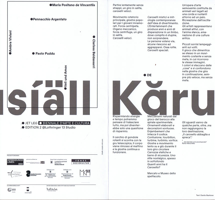
Infokarten zur Ausstellung JET LEG – Biennale d’Arte e Cultura, Edition 2, 09.09-25.09.2022 als Gastprojekt in der Lothringer 13 Studio.
JET LEG initiiert einen Prozess des nachhaltigen künstlerischen Austauschs und der Überwindung kultureller, sozialer und kreativer Grenzen. Als offene Plattform und dynamisches Netzwerk bietet das Projekt vielfältige Möglichkeiten der Reflexion und Erforschung künstlerischer Prozesse sowie der Verhandlung drängender aktueller Themen im direkten Austausch mit der Gesellschaft.
JET LEG, Biennale d’Arte e Cultura – das bilaterale Projekt, initiiert vom neapolitanisch-münchnerischen Künstler Danilo Bastione und erstmalig durchgeführt 2021 in Neapel, kommt am 25. August für seine zweite Ausgabe nach München. Das Projekt basiert auf einem einmonatigen Künstler*innenaufenthalt und weitet sich in ein drei wöchiges Rahmenprogramm mit öffentlichen Aktionen und einer Ausstellung als Höhepunkt, die am 09. September eröffnet wird aus.
Im Rahmen von JET LEG entwickeln die süditalienischen Künstler*innen Pennacchio Argentato, Clarissa Baldassarri, Paolo Puddu, Maria Positano de Vincentiis, Ambra Viviani und Diego Miedo Werke vor Ort, die in verschiedenen Ausstellungsräumen, OFF-Spaces und im öffentlichen Raum gezeigt werden. Die Präsentationen suchen die offene Auseinandersetzung mit der lokalen Kulturszene und der Stadtbevölkerung.
Der partizipative Geist der Biennale wird auch im Vorfeld der Ausstellung in der ganzen Stadt zu spüren sein: In Form von öffentlichen Interventionen, Künstler*innengesprächen, Workshops aber auch Konzerten im Rahmen eines „Museo Mobile“ fordern die Künstler*innen an jedem Ort zur Diskussion und zur Mitgestaltung auf.
Ausstellungs- und Aktionsorte: Lothringer 13 Studio/ lokal, öffentlicher Raum Au-Haidhausen, Bogenhausen, Cafebar Mona (Monacensia München), OFF Space Schumannstraße, uvm.
Die Ausstellung im Lothringer 13 Studio wird im Rahmen von Various Others präsentiert.
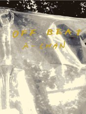
A-CHAN's OFF BEAT zeigt spontane Fotografien, die zwischen 2008 und 2009 in New York entstanden sind. Die Fotografin ließ sich von der Umgebung inspirieren, ohne nach bestimmten Motiven zu suchen, sodass sich die Kompositionen intuitiv in einer Ästhetik des Moments und des Kontexts erschließen.
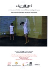
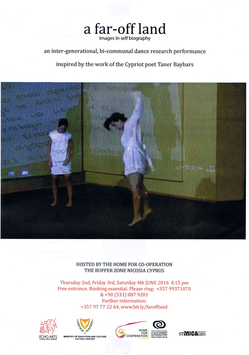
Begleitmaterial zur gleichnamigen Veranstaltung vom 02.-04.06.16.
"A far-off land" ist eine generationenübergreifende, bikommunale Tanzforschungsperformance, inspiriert vom Werk des zyprischen Dichters Taner Baybars. Sie konzentriert sich auf das "ferne Land" der Kindheit und der verkörperten Erinnerung, aber auch auf das "ferne Land" der gemeinsamen Hoffnungen und Träume für die Zukunft.
Text von der Webseite, übersetzt mithilfe von DeepL.
Publikation zur gleichnamigen Ausstellung des zypriotischen Pavillions an der 60. Biennale von Venedig vom 20.04.-24.11.2024.
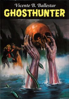
Ausgehend von dieser scheinbar harmlosen Anekdote und durch Schichten parafiktionaler Schemata umgehen Lower Levant Company (Peter Eramian, Emiddio Vasquez), Endrosia Collective (Andreas Andronikou, Marina Ashioti, Niki Charalambous, Doris Mari Demetriadou, Irini Khenkin, Rafailia Tsiridou, Alexandros Xenophontos) und Haig Aivazian die abergläubische Herkunft von Geistern, um über gegenwärtige soziotechnische und materielle Formen des Ghosting zu spekulieren.
Als Agitatoren des sozialen Gedächtnisses beharren die Geister auf ungelösten Missständen und schreiben sie bis zur Vergeltung um. Durch diese Verbindung von Spuk und historischer Erinnerung konzentriert sich der Pavillon auf die Nähe Zyperns zum Nahen Osten, der selbst eine Fabrik der Wiedergänger ist, um die Orientierung der Insel gegenüber der Levante neu zu untersuchen. In vier miteinander verbundenen Räumen öffnet die Ausstellung ein Portal zu den Geschichten, Erzählungen und Mythen, die in neuen Kommunikationsformen, Computerlogiken und Plattformökonomien verweilen, die alle ihre eigenen Gespenster hervorbringen.
Text von der Website, übersetzt mithilfe von DeepL.
28,2x19 cm, signiert, 5 Teile. keine weiteren Angaben vorhanden Konvolut aus aufklappbarem Karton, beschrieben, signiert, gestempelt, datiert und mit drei Objekten beklebt (Kindersocke, Haargummi, schwarzer Plastikdeckel). einer Postkarte mit handschriftlichem Gruß. einem ausgedruckten Buchcover. einer Ausgabe "Pirol" in Plastikhülle. alles in original Versandtasche.
Mail Art Projekt "One Day in Berlin" vom 11. Juni 2018, aus der Serie "Lost and Found", die Elke Grundmann seit 2004 betreibt. In der beigelegten Pirol-Ausgabe Nr. 6, September 2017, ist eine Abbildung von "One Day in Berlin" zu sehen. Mit ausgedrucktem Buchcover "Book for Mail Art", Karuizawa New Art Museum.
[124] S., 18x13,5 cm, ISBN/ISSN 9782954197401 Broschur, Buchrücken aufklappbar, gefaltetes Plakat in eingeklebter Papierhülle, Posterformat 85,4x64cm, in Schutzhülle mit Aufkleber
A journal written at the third person that seeks to depict Antoine d’Agata’s quest – the inexorable course from void to void.A literary and photographic experiment where words, sometimes descriptive, sometimes poetic, intersect with images in a narrative continuity. An example of the photographer’s existential choice and form of resistance which leads toward the subject’s disappearance and the ego’s negation within the neutral spectrum of the image while insisting on an intimate involvement with its matter and a perfect superposition of art and life. The pictures have been treated and reduced to the simple black and white contrast, following the main axis of this editorial project: shaplessness and the sense of fading-out. This flattening to a drawing effect releases the image as a shadow, a border between a recognizable sign and a blurry, ambiguous one, so that the photograph is both “trace” and “other”. The book, whose main language is English, also foresees a separate and folded poster, including texts in French on one side and, for the first time, in Italian on the other printed on a background colour image. The two languages allow to include texts in their original version, but allude as well to the artist’s double origins. In line with the book, the poster also reflects d’Agata’s search direction towards the interlacing of word and image and it finally refers to the idea of a topographic description of passions. Member of the Magnum agency, Antoine d’Agata (1961) is one of the most influential photographers of his generation. He lives in both Paris and Marseilles and he works around the world. He is represented by the gallery Les Filles du Calvaire, Paris.
Text von der Webseite.
Chances are that you will be far more familiar with Brian Eno and his work than you might realise. Whether you know him as a founding member of the gloriously influential 1970s art-rock outfit Roxy Music, or as the inventor of ambient music, in one breathless career Eno has actually released no less than 25 solo albums and contributed to countless projects and collaborations, but also left his fingerprints on dozens of seminal albums as a producer – think U2, Talking Heads or Coldplay, to name but a few – composed several film scores not to mention the start-up theme for Microsoft’s Windows 95. All of which is to say that it is hard to not be in earshot of his musical influence in one way or another. With mono.kultur, Brian Eno talked about the impact of technology on culture, the similarities between producing music and parenting, and why they called Elvis ‘The Pelvis’. Given Brian Eno’s interest in how art can affect moods and emotions, our new issue turned into somewhat of an experiment in chromatics, with the pages gradually traveling the entire colour spectrum from yellow to blue and back again, which not only affects the optical perception of the yellow text, but also how one responds to the content of the interview. Suffice to say: this must certainly rank as the most colourful mono.kultur to date.
Text von der Website.
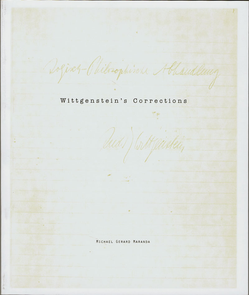
Basiert auf einem Faximile von Ludwig Wittgensteins Manuskript für den Traktacus Logico-Philosophicus mit faksimilierten handschriftlichen Texten.
The book’s point is an ethical one. I once meant to include in the preface a sentence which is not in fact there now but which I will write out for you here. … What I meant to write, then, was this: My work consists of two parts, the one presented here plus all that I have not written. And it is precisely this second part that is the important one. My book draws limits to the sphere of the ethical from the inside as it were, and I am convinced that this is the only rigorous way of drawing those limits.
Text von der Webseite
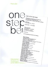
Ausstellung 06.09.-19.10.2024 in den Räumen der ERES-Stiftung.
Ausgezeichnet! Das sind vierzehn Absolventen der Münchner Kunstakademie, die 2024 ihren Abschluss gemacht und von verschiedenen Institutionen Preise und Förderungen erhalten haben. Die als Debütanten-Ausstellung bekannte und beliebte Gruppenshow wird von der Akademie der Bildenden Künste präsentiert. Wir freuen uns sehr, in diesem Jahr mit der Ausstellung one step beyond Gastgeber sein zu können.
Eine Debütanten-Ausstellung ermöglicht das Ausprobieren der eigenen Kräfte, stärkt das Selbstvertrauen und gibt den Teilnehmerinnen und Teilnehmern die Möglichkeit, die Herausforderungen der freien künstlerischen Existenz auszuloten.
Die ERES Stiftung hat die Anfrage der Akademie, in diesem Jahr Austragungsort zu sein, mit Freude und Überzeugung vom Potential dieses Jahrgangs bejaht. Vor allem auch deshalb, weil viele Positionen naturwissenschaftliche und technische Aspekte auf emotional ansprechende Weise verhandeln. Daten, Studien und Archive aus Geophysik, Tiefseeforschung, Astronomie oder Ornithologie schwingen als Resonanzboden mit und fließen in die Formgebung ein. Auffallend häufig setzen die Debütanten Gitterstrukturen (Grids), Laborgestänge und Metallprofile aus Messe- und Maschinenbau ein oder feiern die Retroschönheit des technischen Objekts wie Flugzeuge und Motorräder. Undogmatisch wird die vielfältige Deutung des Konzepts Natur sowie die Komplexität einer Zeit verhandelt, in der die Technisierung des Lebendigen durch die Digitalisierung rasant fortschreitet. Wie in einem Raumschiff können sich die Besucher durch die Räume bewegen, werden angezogen von Tönen aus dem Erdinneren, Düften natürlicher Pflanzenaromen, Vogelrufen ausgestorbener Arten oder surrender Sci-Fi-Maschinen. Daneben gibt es Arbeiten, die sich mit der jüngsten RAF-Geschichte oder der NS-Zeit auseinandersetzen und Parallelen zur Jetztzeit ziehen. So weist diese aufbrechende Generation uns Betrachtern den Weg zurück zur wachen Erfahrung von Natur und Gesellschaft und trägt dazu bei, Sensibilität für Zukünftiges zu entwickeln.
Text von der Webseite
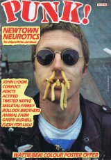
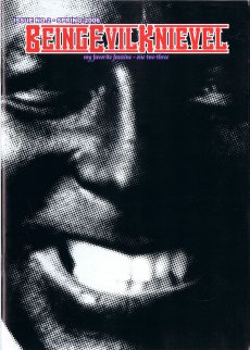
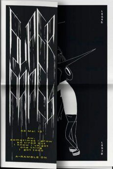
As time doesn't stop, we are proud to devote this second edition of BEK to EVIL's newest project: his alter-ego SUPER A. EVIL will be in Langenhagen (Germany) in March and April to give us guys an insight into his personal well being. SUPER A of course, is just one little facet, but as you will hopefully discover, a more than eye-popping one. Therefore we are especially happy to feature both an extensive interview with EVIL KNIEVEL on his alter-ego and a mind-blowing photo story of SUPER A himself. Also we are introducing a new column at the end of the mag that tries to show a wider perspective of our so beloved EVIL KNIEVEL." (Peter Hush)
Mit Textbeiträgen von Peter Hush und Andy Reid sowie einem Interview mit Evil Knievel von Ken T. Evans.
Text von der Webseite
Katalog zur gleichnamigen Ausstellung in der Fondadtion Cartier pour l'Art Contemporain, Paris, 30.03.-10.06.2018.
In Freeing Architecture, Ishigami elaborates upon his most recent research into function, form, scale and the environment in architecture, thereby revealing his vision for the future of the field. Through over 40 models, as well as numerous films and drawings, the exhibition presents twenty projects from their genesis to the complex process of their realization. Far from being tools prior to construction, the models assembled in the exhibition were made specifically for the occasion. As viewers contemplate these hand-crafted works, assembled in the architect’s studio over the course of one year, one can see the many steps and the painstaking work that led to the development of their final form. All different in terms of their material, size and level of detail, they offer a glimpse of the slow maturation process, necessary for the creation of Ishigami’s architectural works. Works infused by a poetics that is achieved as much through experimentation, as it is by theory, knowledge, and technology.
Text von der Webseite
Workshop im Piracy Reading Room, Kunstverein München, 04.-07. und 25.-28.11.2014, "Join us exploring Munich's independent publishing community." One publishes to find comrades. (A. Breton, 1920)
Schriftliche Abschlussarbeit als Teil der Masterarbeit zur Erlangung des akademischen Grads Master of Arts, in der Abteilung Kulturen des Kuratorischen.
Mit einem Abdruck des Textes von Ulises Carrión: die neue kunst des büchermachens, in der Übersetzung von Hubert Kretschmer
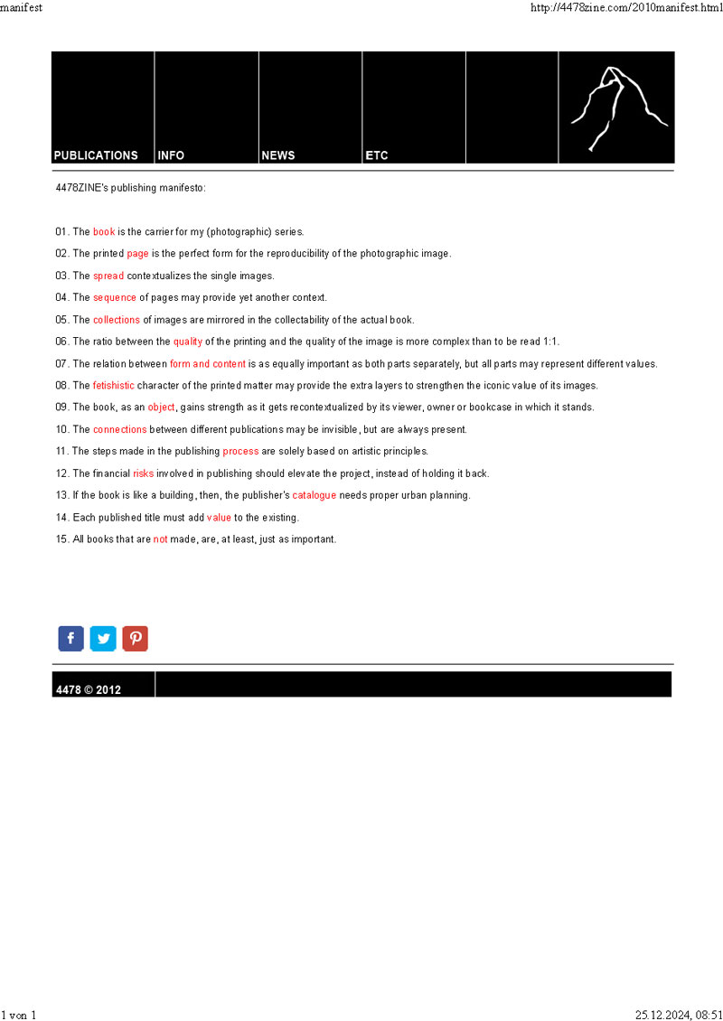
ferner von Erik van der Weijde, 4478Zine's publishing manifesto
und von Cheroux, Fontcuberta, Kessels, Parr und Schmid: From here on... manifesto
[40] S., 26,4x19,2 cm, Auflage: 250, numeriert, keine weiteren Angaben vorhanden Klappumschlag, Heft mit Drahtheftung eingeklebt, gefaltetes Plakat (880×630 mm) in Umschlag eingelegt. Umschlag Handsiebdruck, gerillt
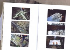
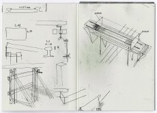
Dokumentation der Montage zweier großer Spiegelflächen auf einer Eisenbahnbrücke eines stellgelegten Bahngleises in der Nähe von München.
On April 2nd 2015, the artist Zedrick Meyer used two opposing mirrors to extend a 30 metres long, abandoned railway track into infinity. The publication is documenting the process, its realization and the result of the intervention.
Text von der Webseite
Broschüre zur gleichnamigen Ausstellung 01.03.-31.03.2019.
Die Ausstellung „Self-Publishing“ präsentiert in der Reihe „Publizieren als Kunst“ Veröffentlichungen in kleinem Format und in kleiner Auflage direkt aus der Hand der etwa 70 Künstlerinnen und Künstler. Die Produzent*innen aus 12 Ländern zeigen ihre aktuellen Arbeiten im Kunsttempel.
Die Autor*innen wählen die Themen ihrer Publikationen und die gestalterischen Mittel selbst, spielen mit originaler Zeichnung, Collage, Text, Fotografie und digitaler Bearbeitung, so dass ein neues künstlerisches Produkt entsteht. Unabhängig vom kommerziellen Kunstbetrieb organisieren die Künstler*innen die Distribution ihrer Werke und schaffen ihre eigene Öffentlichkeit.
Text aus der Broschüre
"Publishing as a Way of Creating Wirklichkeit" (P.A.A.W.O.C.W) is a series of bootlegged text fragments that relate to the practice of publishing.
#02 Marianne Wex, "Weibliche" und "männliche" Körpersprache als Folge patriarchaler Machtverhältnisse, 1979, p.370f
"Publishing as a Way of Creating Wirklichkeit" (P.A.A.W.O.C.W) is a series of bootlegged text fragments that relate to the practice of publishing.
#03 Benedict Anderson, Immagined Communities, Reflections on the Origin and Spread of Nationalism, 1983, p.37-46
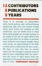
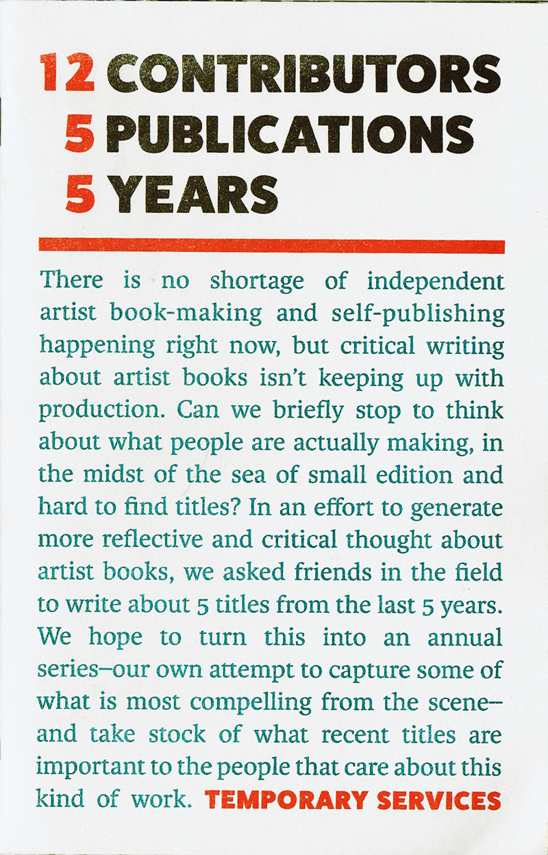
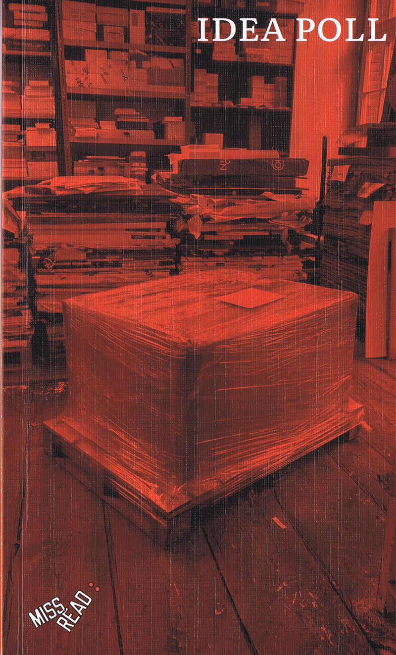
Aus dem Booklyn-Archiv. 115. Publikation von Temporary Services, Bestandsaufnahme der unabhängigen Künstlerbuch- und Self-Publishing Szene weltweit, in der 12 Vertreter die in ihren Augen wichtigsten 5 Titel der letzten 5 Jahre vorstellen.
Buch mit Statements anstelle der wegen Corona 2020 und 2021 ausgefallenen Künstlerbuchmesse Miss Read Berlin.
Editor: Michalis Pichler, Contributing editors: Yaiza Camps, Moritz Grünke, Copy editor: Mark Soo
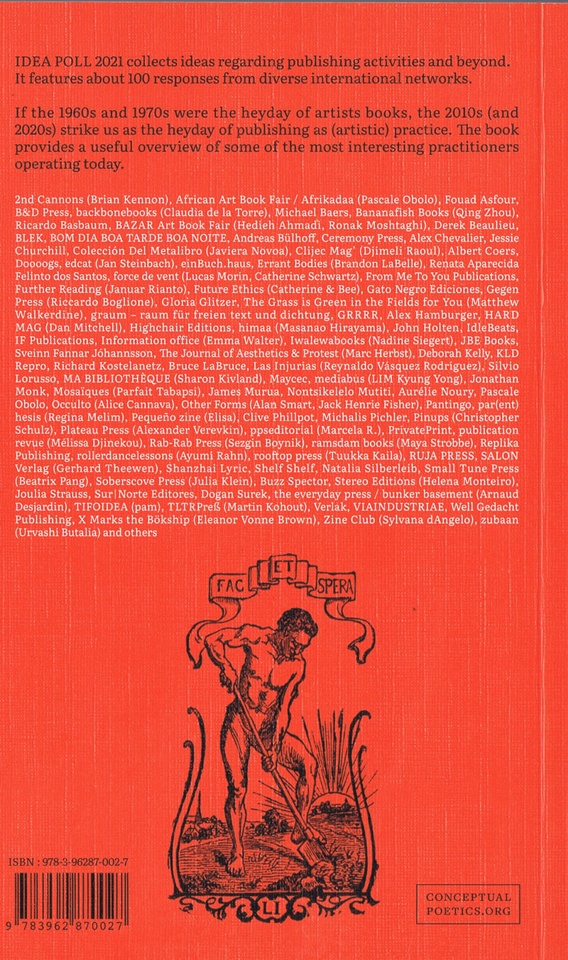
IDEA POLL collected ideas regarding publishing activities and beyond. IDEA POLL 2020/21 was created through an online query and features about 100 responses from diverse international networks. Historical Note: In 1976, the periodical Art-Rite already conducted and published an IDEA POLL, marking a seminal moment in the state of affairs in the field of art and publishing. A collaboration of Miss Read and Conceptual Poetics Day.
The seven questions were:
Name five #hashtags that best describe your activities
What are you reading?
How do you distribute?
Do you collaborate? If so, with whom and how?
Is publishing economically viable? What would make it viable?
What are the best potentials (or difficulties) of publications?
What would be your utopian library? ...
Text von der Webseite
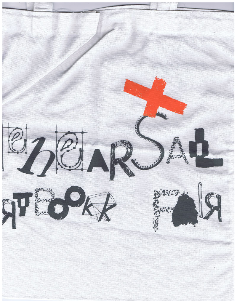
Die Rehearsal Art Book Fair, die am 15. und 16. September 2023 in New York City stattfand, will die Essenz unabhängiger Kunst- und Literaturveröffentlichungen in stark kapitalisierten und/oder zensierten Kontexten erkunden und präsentieren. Abgeleitet vom französischen Wort "rehercier", bedeutet "rehearsal" "üben" oder "wiederholen, neu verstehen". Wir laden unabhängige Verlage, Editionen, Kollektive und Einzelpersonen aus New York und der ganzen Welt zur Teilnahme an dieser Messe ein. Außerdem wird zum ersten Mal eine Sammlung kuratierter Samizdat aus dem chinesischen Festland ausgestellt. Wir schätzen die kontinuierlichen Praktiken des Büchermachens als persönliche Proben und Revolutionen.
Die Buchmesse findet im Theaterraum und in den Klassenzimmern des University Settlement (184 Eldridge Street, Lower East Side) statt, einem historischen Gemeindezentrum, das seit dem 19. Jahrhundert eingewanderte Arbeiter und einkommensschwache Familien unterstützt.
Die Messe wird von Bungee Space (einer auf Fotografie, Bildstudien und Bildkritik spezialisierten Kunstbuchhandlung in New York) und Accent Sisters (einer Speakeasy-Literaturbuchhandlung und einem Verlagsstudio in New Jersey) ehrenamtlich mitorganisiert.
Text von der Webseite, übersetzt mithilfe von DeepL
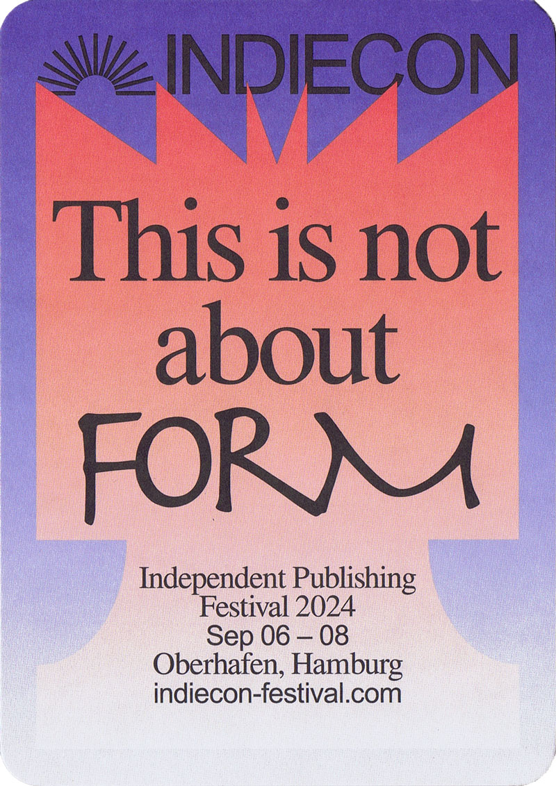
Zum Independent Publishing Festival 2024 06.09.-08.09.2024 im Oberhafen in Hamburg.
Unabhängiges Publizieren hat viele Formen. Ein Hochglanzmagazin oder eine Website mit Tabellenkalkulation. Eine robuste Zeitung oder ein Instagram-Kanal. Ein Podcast, ein Newsletter, ein handgefertigtes Fanzine. Ein Künstlerbuch oder Code-Brocken auf einem Server.
Wir sehen unabhängiges Publizieren als eine Kultur und nicht als einen Markt, der von Zusammenarbeit und nicht von Wettbewerb geprägt ist. Wir sehen Gemeinschaften, die sich um das geschriebene oder gesprochene Wort versammeln und gedeihen. Wir sehen, wie Organisationen, die um eine gemeinsame Verlagspraxis herum aufgebaut sind, in der realen Welt etwas bewirken. In diesem Sinne spielt es keine Rolle, ob Sie auf Papier drucken oder online veröffentlichen, denn unsere Publikationen existieren oft im Reich des Unwahrscheinlichen. Sie sind in hohem Maße von der Gesundheit, der Motivation und den Fähigkeiten ihrer Schöpfer abhängig - ebenso wie von der Infrastruktur in Produktion und Vertrieb. Wir wollen uns über bewährte Praktiken in diesem Bereich austauschen und gemeinsam an neuen Ideen für die Zusammenarbeit arbeiten, um Veröffentlichungen zu unterstützen. Es ist immer einfacher, nicht zu veröffentlichen.
Ausgehend von der Welt der Druckerzeugnisse weiten wir den Wirkungsbereich von Indiecon auf das stille, seltsame und poetische Web aus. Wir wollen von den Verlegern lernen, die es bevölkern, und von denen, die dazwischen liegen. Um die Fähigkeiten der Macher von mehr oder weniger greifbaren Publikationen zu teilen. Und um die gemeinsamen Perspektiven für den Aufbau von Gemeinschaften und die Selbstorganisation für eine gemeinsame Sache zu diskutieren.
Indiecon ist ein Gemeinschaftsprojekt unabhängiger Verleger von Zeitschriften, Büchern, Kunstdrucken, Zines, Newslettern, Podcasts und Websites aus der ganzen Welt. Das dreitägige Verlagsfestival findet im Hamburger Oberhafen statt, einem ehemaligen Güterbahnhof, der heute ein kreatives Viertel mitten in der Stadt ist.
Text von der Webseite, übersetzt mit DeepL
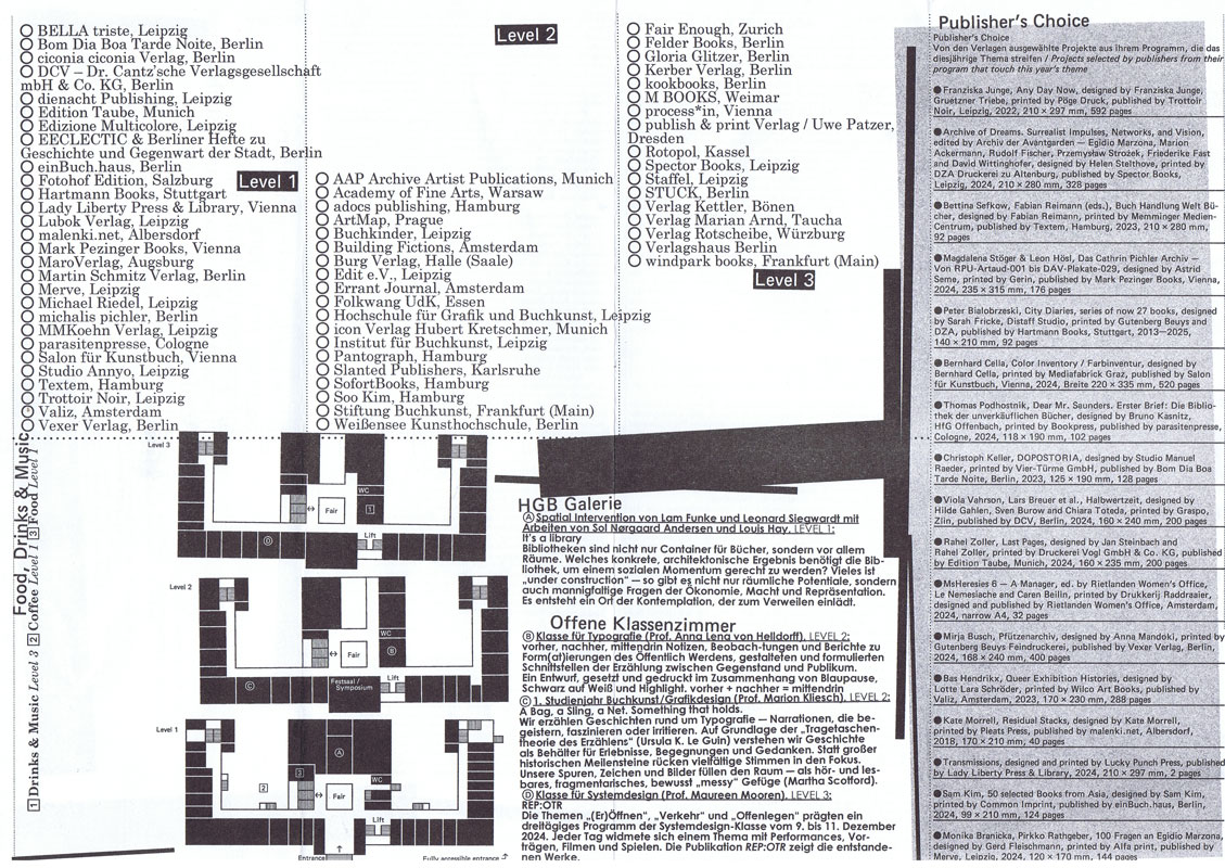
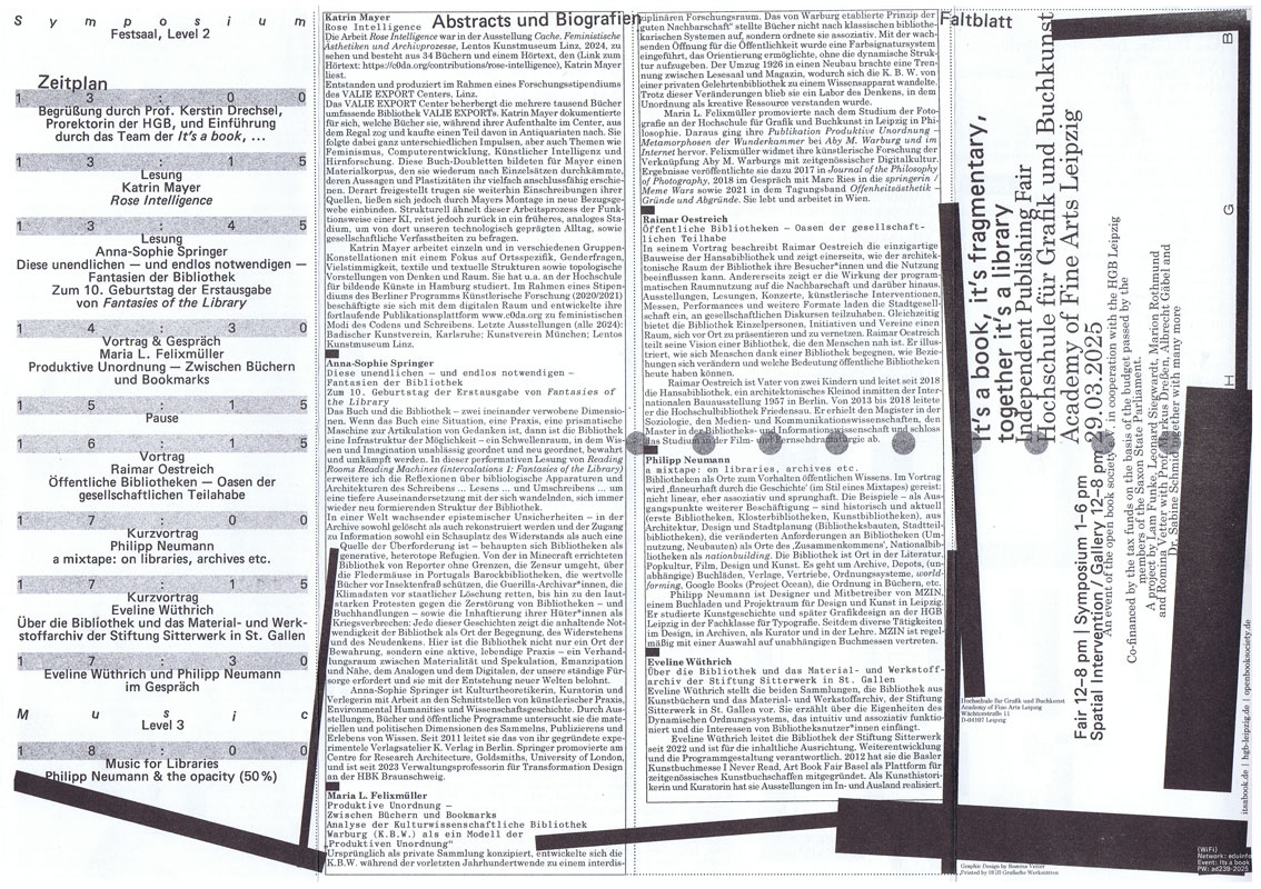
Die Independent Publishing Fair It’s a book, …, das jährliche Zusammenkommen von Publizierenden und unabhängigen Verlagsprojekten, findet 2025 zum fünfzehnten Mal statt. Sie ist Markt- und Tauschplatz von Publikationen verschiedenster Art wie auch von Ideen und Debatten und ist etabliert als ein offener Raum, der alle willkommen heißt.
Die ineinandergreifenden Bereiche der It’s a book, … – Buchmesse, Symposium, eine räumliche Intervention, grafische Gestaltung, Publikation und Website – wurden im Rahmen eines Projektseminars mit Studierenden der Hochschule für Grafik und Buchkunst Leipzig und in Kooperation mit dem Verein open book society e.V. entwickelt, ausgestaltet und organisiert.
Neben zahlreichen Verlagen aus dem In- und Ausland werden zum diesjährigen Symposium Maria L. Felixmüller, Katrin Mayer, Philipp Neumann, Raimar Oestreich, Anna-Sophie Springer und Eveline Wüthrich begrüßt.
Ein umfassender Reader mit Beiträgen von u.a. Gabriela Halac, Alessandro Ludovico, Abigail Reynolds, Yvonne Schürer und Eva Weinmayr lädt zur vertiefenden Lektüre und Nachlese ein.
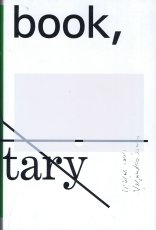
Der Dreiklang It’s a book, it’s fragmentary, together it’s a library spricht das diesjährige Thema sehr konkret an und öffnet zugleich ein weites Feld: Bibliotheken werden als Orte für Bücher und als Räume für Menschen betrachtet.
In Bibliotheken sind Bücher und Menschen aufs Engste verbunden. So sind Architektur, Gestaltung und Ausstattung von Bedeutung, denn sie begrüßen, tragen und beherbergen Menschen wie Bücher gleichermaßen. Dies lässt auf die Formen und Formate von Bibliotheken blicken sowie auf Strukturen, die ihre Agency und den sozialen Raum, den sie bilden, prägen – ideengeschichtlich, als Konstellation und als Denkraum.
Bibliotheken sind vor allem auch Orte des Sammelns und Archivierens, des Organisierens und Teilens. Hier bilden einzelne Publikationen und ihre Inhalte zusammen ein größeres Wissensnetz. Ihre Vielstimmigkeit lässt neue Beziehungen und Assoziationsketten entstehen. Heute werden Bibliotheken zunehmend als dynamische Orte des Wissenstransfers neu gedacht. Denn Bibliotheken sind niemals nur architektonische und physische Räume, sondern immer auch kulturelle Konstrukte, die – historisch betrachtet – eng an hegemoniale Strukturen gekoppelt sind. Sowohl aus wissenschaftlichen wie auch aus künstlerischen Perspektiven wird dies kritisch hinterfragt und in vielen Initiativen und Projekten aufgebrochen.
Diese Entwicklungen sind eng mit Herausforderungen des digitalen Zeitalters verknüpft und digitale Bibliotheken, die Monopolisierung von Wissen und alternative anarchische, oft in den Schatten agierende Modelle bleiben weiterhin viel diskutierte Themen. Festhalten lässt sich, dass das totgesagte Buch seinen eigenen Untergang schon so oft überlebt hat, wie er verkündet wurde.
Text von der Website https://www.itsabook.de/books
Ausdruck nach Datenbank, Titel des icon Verlags, die auf der Messe gezeigt wurden. It's a book It's a library - Independent Publishing Project in der Hochschule für Grafik und Buchkunst, Leipzig am Sa, 29.03.2025 von 12:00-20:00 Uhr.
Addenda: Just between you and me. There was no other. Who does our past belong to tonight? We understand at last. And while we slept, we vanished. The walls of the world fell in on us. We claimed always to abide by terms. Shattered mirrors and sliding panels. Always. Except when we choose not to. One must keep alert to all possibilities. The old Indian pearl diver clambered onto the dock, grinning and shaking the water from our body. At night we could hear our mind ticking like some cheap alarm clock. Radio broadcasts played on tribal feelings. Our voice trailed off. Truth was delay. A heavy splash followed many ripples. Food, batteries and water-purifying chemicals arrived over the week-end.
Text von der Webseite
160 S., 20.5x13 cm, 2 Stück. keine weiteren Angaben vorhanden Broschur, Schwarz-weiß Drucke
ZusatzInfos
Arriving in China, most visitors turn into illiterate fools the moment they step off the airplane. Surrounded by signs written in an incomprehensible code, messages meant to guide, to inform, to convince or to sell become little more than abstract pictures. The photographs in this book were produced by one such illiterate as he wandered through a world of signs oblivious to their meaning. Selected from the thousands of pictures made while traveling through China, these pictures reflect the author’s interest in the transformation of image to text and back again.
Text von der Webseite
44 S., 21x15 cm, Auflage: 100, signiert, keine weiteren Angaben vorhanden Broschur, in farbigem Umschlag aus Karton, mit signiertem und nummeriertem Original von Pezhman Zahed
Eine Ausstellung in einer Tiefgarage von den Künstlern und Kuratoren von easy! upstream. Arbeiten von 16 Künstlern zeigen einen internationalen Kunstparcours auf 3000 .,Quadratmetern Fläche.
Coral North: Park One, Tiefgarage Schwabinger Tor, Eingang Leopoldstraße 182. Bis 19. .Oktober, 11 bis 20 Uhr
1. Ausgabe.
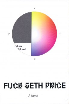
From one of the most influential artists of his generation comes a provocative, moving novella about what it means to be a creative person under today's digital regime. In the course of a gripping, headlong narrative, Price's unnamed protagonist moves in and out of contemporary non-spaces on a confounding and enigmatic quest, all the while meditating on art in the broadest sense: not simply painting and sculpture but also film, architecture, literature, and poetry. From boutique hotels and highway bridges to PC terminals and off-ramps. from Kanye West and Jeff Koons to George Bush and Patricia Highsmith. from the playground to the internet to the mirror, Price's hybrid of fiction, essay, and memoir gets to the central questions not only of art, but of how we live now
Text von Amazon.com
Teil einer Installation, die in der Ausstellung "Marlene McCarty – Mund Verkehr: In die Hose gegangen" in der NGBK Berlin, 6.06.–12.07.1992 gezeigt wurde. Aus der Pressemitteilung zur Ausstellung:
Marlene McCarty’ (1957) Interesse gilt dem Machtgebaren und den patriarchalen Strukturen, der von ihnen geprägten männlichen Umgangssprache. Die alltäglichen Sprüche die ihr, einer Frau, auf den Straßen New Yorks zugerufen werden, die unverstellten oder unverschämten Aufforderungen mit denen sie konfrontiert wird, sind das Ausgangsmaterial für ihre künstlerischen Strategien wie für ihre Kunstobjekte.
Marlene McCarthy zur Installation: “This is a floor sculpture and it’s 15,000 matchbooks. They’re standard matchbooks you can order from a catalog. On one side they have pinup girls on them, and on the other side I had them print, ‘I got a clit so big I don’t need a dick.’ If you’ll notice, clit and dick are handwritten. The company had called me up and were like, ‘Ummm, we have a problem. We can print dick but we can’t print THAT OTHER WORD.’ She wouldn’t even say the word clit. So I said OK, take the mechanical—this was in the olden days—and just slice the dick and the clit off. Then I got some friends together and we wrote them all in by hand. I’m reproducing these for the retrospective, but the curator is worried about whether we can have NYU students writing dick and clit 15,000 times. Maybe the seniors can do it.”
Texte von den Webseiten.
Schwarz-Weiß-Drucke, Nr. 010 aus der Reihe 100for10.
Leo-Leander Namislow, born in 1983 in Essen, lives and works as a freelance artist in Essen. Growing up in a rural environment in Rhineland-Palatinate, he started to creatively engage with his surroundings early on. After his training
as a stonemason, Leo worked for an animation company in Frankfurt. When he moved back to Essen in 2007 he eventually started living off his creative output. Since then he has had several solo exhibitions and took part in
many group shows in a variety of institutions such as the Kunstverein Essen-Werden. His works fascinate by opening up new fantastic worlds to the viewer on the one hand and by proving of a large multiplicity of techniques on the other hand. This book gives an insight into a sample, mainly comprised of black and white works, of a much larger, colourful and ever increasing artistic universe.
Zur Ausstellung 28.02.-02.06.2019. Was beschäftigt junge Künstlerinnen und Künstler, die in Wien leben und arbeiten? Welche Themen liegen in der Luft, welche Strategien setzen sie ein? Die Ausstellung Über das Neue. Junge Szenen in Wien versteht sich als Streifzug durch lokale Kunstszenen: Sie versammelt 18 künstlerische Einzelpositionen sowie 12 unabhängige Ausstellungsräume. Viele eigens neu produzierte Werke stehen speziell konzipierten Ausstellungen in der Ausstellung gegenüber- künstlerische und kuratorische Formate verbinden sich zu einem dynamischen Gefüge, das sich über die Dauer der Schau verändert.
Text von der Karte
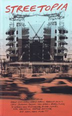
Das Buch erschien im Rahmen der gleichnamigen Ausstellung "Streetopia" (2012) die in der Luggage Store Gallery in San Francisco eröffnet wurde und sich gegen ein geplantes Bauprojekt und damit gegen die Gentrifizierung der Stadt richtete.
After San Francisco’s new mayor announced imminent plans to “clean up” downtown with a new corporate “dot com corridor” and arts district - featuring the new headquarters of Twitter and Burning Man - curators Erick Lyle, Chris Johanson, and Kal Spelletich brought over one hundred artists and activists together with neighbourhood residents fearing displacement to consider Utopian aspirations and to plot alternate futures for the city. Opening in May 2012 at the Luggage Store Gallery, the resulting exhibition Streetopia was a massive anti-gentrification art fair that took place in venues throughout the city. For five weeks, Streetopia featured daily free talks, performances, and skillshares while operating a free community kitchen out of the gallery.
This book brings together all of the art and ephemera from the now-infamous show - featuring work by SWOON, Barry McGee, Emory Douglas, Monica Canilao, Rigo 23, Xara Thustra, Ryder Cooley, and many more. Using the format of an exhibition catalog as a jumping off point, the book also includes essays and interviews with key participants that consider the effectiveness of Streetopia’s projects while offering a deeper rumination on the continuing search for community - and for Utopia - in today’s increasingly homogeneous and gentrified neo-liberal cities in an era of unprecedented wealth disparity.
Text von der Website
184 S., 24x16,5 cm, ISBN/ISSN 978 88 6749 351 7 Broschur mit Klappen; Einband mit aufgeprägtem Foto, Papier Einband mit textilähnlicher Struktur, Vorsatz/Nachsatz bedruckt mit Foto schwarzweiß, innen verschiedene Papiersorten für Fotos, Texte und Zeichnungen. Druck: Tipografia Valdostana
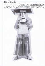
Erscheint zur Ausstellung im S.M.A.K., Gent, Belgien,11.03-04.06.2017.
"Welcome to the world of Dirk Zoete. Because that’s what his work is: a conceived universe. The way someone leaning over a table makes a plan and imagines the world. While technology takes us into several intangible dimensions with virtual reality and other applications, Zoete makes us believe the world is still flat. Everything seems to have only a front and a back. As if we still believed that the earth is just a disk, and we can fall off. Zoete’s drawings are clumsy, intermittent, naive, adventurous, simple. It’s like a child’s imagination, depicting in a heap what you otherwise cannot fit on a piece of paper." Philippe Van Cauteren. Published in occasion of his first major solo exhibition in a Belgian museum, To be determined. According to the situation, held at S.M.A.K. in Gent in 2017, this catalogue explores Dirk Zoete’s peculiar practice. Enriched by essays and texts by Philippe Van Cauteren, Stephan Berg, Koen Peeters and Ann Hoste, the book is a journey through the artist’s process—who, starting from a drawing, generates models, sculptures, architectural constructions, photos, films. An all-encompassing approach that makes the Belgian’s work outstand as a natural successor of the German Bauhaus and Russian Constructivism, but with a more human touch.
The catalogue features a wide selection of images, presenting the many different stages of transformation of a drawing into a three-dimensional piece, and the hybrid nature of the exhibition set-up, a mix of a museum show and an artist’s studio, both essential characteristics of Zoete’s art."
Text von der Webseite
1448 S., 28x27x8,5 cm, Auflage: 100, signiert, ISBN/ISSN 3922760058 Broschur, Softcover, 2 Bücher in Schuber
ZusatzInfos
Volume one contains very many pages with incredibly many dots on each page. We are to understand that each of these dots represents one second of the time it takes the earth to once orbit the sun. The second volume contains again very many pages with each incredibly many parallel lines. The length of all those lines together represents the true distance covered by the earth each second on its way to orbit the sun.
2. Auflage
Produced for following exhibitions at the Archtectural Association PhotoLibrary, London, and the Urbanissue Gallery, Berlin.
Over a period of twenty-eight minutes and thirty-eight seconds, the artists photographed pedestrians with a camera "adapted so that it had an open slot of one millimetre as its aperture. Behind this the film is run in a single exposure over a set time, that is at a set speed, usually about fifteen to forty seconds. the camera is still, only the film moves. How should one describe the results?" asks Mark Cousins in the essay included in this paperback book of unusual black and white photographs. 29 June 2009 (printedmatter.org)
185 Blatt S., 28x21,5 cm, Auflage: 1.000, keine weiteren Angaben vorhanden Offsetdruck nach original Fotokopierarbeiten, je Künstler 25 Seiten, First Edition
Siegelaub in einem Interview: The Xerox book - I now would prefer to call it the Photocopy book, so that no one gets the mistaken impression that the project has something to do with Xerox – was perhaps one of the most interesting because it was the first where I proposed a series of requirements for the project, concerning the use of a standard size paper and the amount of pages the container within which the artist was asked to work.
Das Buch ist/war die Ausstellung
15,5x10,5x3,2 cm, signiert, keine weiteren Angaben vorhanden zwei Bücher in Schuber, Leinengebundene Kartons mit original maschinenengeschriebenen Texten und Stempeln
21x15 cm, ISBN/ISSN 8496540170 Grafic Tourism Since Two Thousand And Three, The Collection of Volumes One Through Five, 5 Hefte zusammengebunden in mehrfach gefalteten farbigen Umschlag mit Dokumentation
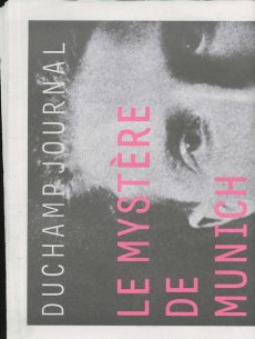
Hundert Jahre nach Marcel Duchamps dreimonatigem Besuch in München (1912) wird ... eine ... Lücke ("le mystère") im kunsthistorischen Wissen zu füllen versucht. ... mit einer Ausstellung, gut organisiert vom Lenbachhaus, zwei beachtlichen Publikationen, einem Duchamp Journal und einem seltsam gekippten Wohnungsmodell neben der Alten Pinakothek, das dem Betrachter mit 'kalten' Wänden in etwa Duchamps ehemalige Wohnsituation in der (später ausgebombten) Barerstr. 65 vorführt. Dieses Modell ist das Werk des Bildhauers und promovierten Kunsthistorikers Rudolf Herz, der auch eines der beiden Veröffentlichungen und das Journal verantwortet ...
Text von der Webseite: www.sehepunkte.de
On June 21, 2012, precisely one hundred years will have passed since Marcel Duchamp arrived in Munich. He spent three months in the city, three months that were to radically change his art and turn him into one of the most influential artist of modernism. He is regarded as pioneer of conceptual art influencing numerous artists from Sol LeWitt to Ai Weiwei and still today continuously inspires new generations of artists.
On the anniversary of the French artist’s arrival, Munich’s Architecture Museum is presenting Rudolf Herz’s latest art project “Marcel Duchamp – Le mystère de Munich”, in which the artist investigates the background story of his predecessor’s stay in the Bavarian capital. The project includes a sculpture as well as a new book.
Text von der Webseite duchamp-munich.org
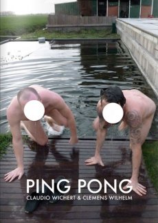
The artists Claudio Wichert & Clemens Wilhelm spend 90 days in a house to make a book. Each day they produce one page. Like in a match of ping-pong, each page is a reaction to the other artist's work from the day before. The two resulting storylines are presented in this book full of duels and duets. The media mix and only one thing is for certain: it's all or nothing.
Text von der Webseite
This publication contains a selection of 60 photographs from the documenta Archive, one of the oldest and most esteemed exhibition of contemporary art in the world. The photographs — belonging to different ages — depict the two elements that make art history possible: artwork and spectator. This amazing journey through time not only concerns the history of one of the most important exhibitions in the world, but also traces the evolution, customs, and traditions of the society that created it. The book portrays a love story between two subjects — a human being and an inanimate element — that are capable of a relationship even if they speak a different language. The photographs capture the moment of these encounters, and this is what their distinctive feature consists in. Of course we are not able to listen to the dialogues, but we can still imagine them.
Text von der Verlagswebseite
[28] S., 30x20 cm, Auflage: 300, 2 Stück. keine weiteren Angaben vorhanden Blätter lose ineinander gelegt, Risographie, in transparenter Kunststoffhülle
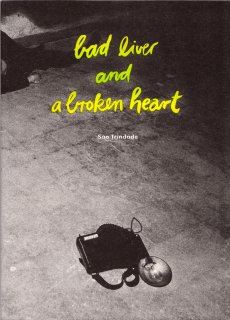
The origin of this work of self-fiction can be found in one of São Trindade’s sketchbooks, this one entirely devoted to the subject of loss or decadence. With references to the aesthetics of crime scenes and nightlife photographed by Weegee in New York in the 1930 and 1940’s, the device is simple: in a "real décor," São Trindade’s body, abandonned and unconscious, is photographed. The body is always the same but differently ‘prepared’ and ‘composed’ with new dresses, new gestures, new signs of a recent activity or a different personality. Each image has its particular story and each space is a sounding board for each of these performative states of body.
Text von der Webseite
45x30,6 cm, Auflage: 15.000, keine weiteren Angaben vorhanden Blätter lose zusammengelegt, farbiger Druck auf Zeitungspapier. Mit der Beilage des Metrolit Magazin Nr. 2
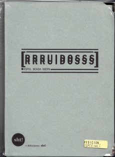
23x18,5 cm, keine weiteren Angaben vorhanden Drahtheftung, Pappumschlag, bestehend aus drei ausklappbaren Teilen, verschiedene Papiere, perforiert, metallverstärkte Ecken, in transparenter Kunststoffhülle, mit angebrachten Aufklebern
ZusatzInfos
"RRRUIDOSSS" is a handmade publication divided in three parts that wants to take in the noises that has been established like the most annoying, noxious including the ultrasonics and infrasonics. This damaging sounds, written in paper using onomatopoeias, are reduced and convert into harmless ones. In addition, this is a very special edition as you can unfold and streap through the micro holes! So you have the possibility to get three books in one or an unfold one.
Text von der Webseite
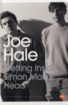
324 S., 19,8x12,8 cm, Auflage: 500, ISBN/ISSN 978-1-907468216 Softcover, Taschenbuch
ZusatzInfos
Getting Inside Simon Morris’ Head is a performative retyping of Simon Morris’ conceptual bookwork Getting Inside Jack Kerouac’s Head. Like Morris’ original performance of retyping the scroll edition of Jack Kerouac’s On the Road, Joe Hale’s project first appeared as a blog. At the rate of one page per day, like Morris retyping Kerouac before him, Hale retyped Morris’ entire book and in doing so re-retraces Kerouac’s famous adventure. Morris gave us all of Kerouac’s pages in reverse order: each blog post presented one page and the default settings of the blog platform organised his posts in reverse order, from the newest to the oldest. Now inverted again, as a double negative, Hale has restored the direction of travel to the story and produced a wholly (un)original new text. This first printed edition takes the imitative gesture to a new extreme. It features an introductory essay by poet Kenneth Goldsmith and reuses Morris’ paratext. From the cover design to the choice of paper, Hale tests the limits of conceptual extension.
Text von der Webseite
720 S., 21x15x4.5 cm, Auflage: Print on demand, keine weiteren Angaben vorhanden Softcover, Schwarz-Druck auf Papiere, Titel und Autor in weißer Schrift auf dem Buchrücken. Gedruckt bei Lulu
Ink used for digital printing is one of the most precious substances in the world. A single gallon of ink costs over four thousand dollars and this is one reason why digitally printed books are so expensive.
However, the price of a book is not calculated according to the amount of ink used in its production. For example, a Lulu book of blank pages costs an artist as much to produce as a book filled with text or large photographs. Furthermore, as the number of pages increases, the price of each page decreases. A book containing the maximum number of pages printed entirely in black ink therefore results in the lowest cost and maximum value for the artist.
Combining these two features, buyers of The Black Book can do so with the guarantee that they are getting the best possible value for their money.
Text von der Webseite
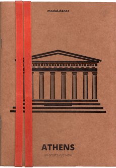
20,8x14,8x4 cm, 2 Stück. keine weiteren Angaben vorhanden 10 Hefte, Broschur und Drahtheftung, Softcover, mit Gummiband zusammen gehalten, Druck auf farbige Papiere
ZusatzInfos
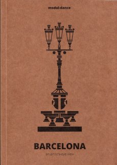
One of the modul-dance project key elements is the promotion of mobility, so that artists receiving its support follow itineraries across Europe to develop their creative work and present it to different audiences.
Modul-dance presents a collection of modul-dance city guides. Each of the guides in this collection shows a city from the viewpoint of a local artist, who proposes his or her own particular route to artists in transit, seeking to put them in connection with their host city. While these city routes share some basic features, each one is different and in their differences lies a wealth of gazes, aesthetics, approximations to the local and much more. In a word, they form a mirror of the diversity that modul-dance has always fostered. Athens, Barcelona, Bassano del Grappa, Dresden, London, Stockholm, Vienna, Toulouse, Paris and Poznań, ready to be discovered.
Text von der Webseite
[20] S., 18x14 cm, Auflage: 3.000, ISBN/ISSN 978-3-868740080 Drahtheftung
ZusatzInfos
Ruscha der Fischotter aka: Printed Matter And Other Visible Things On Paper Not Necessarily Meant To Be Viewed As After Ruscha aka: One Hundred Views Of One Hundred Views Of Mount Fuji, If Someone Says So aka: SIX HANDS AND A CHEESE SANDWICH is a book about books, a catalogue and an art/bookwork in its own right.
Content: By now the appropriation and paraphrasing of Ed Ruscha constitutes a genre of its own. The first were 1968 Bruce Nauman with 'Burning Small Fires' and 1971 'Ed Ruscha' (actually Joel Fisher) with 'Six Hands and a Cheese Sandwich', with further appropriations or hommages over the decades, and in the last years it almost became fashionable, the evidence is massive.
Text von der Webseite
4 S., 21x14,9 cm, 2 Stück. keine weiteren Angaben vorhanden Einladungsflyer, beiliegend ein beidseitig bedrucktes Informationsschreiben zur Ausstellung
ZusatzInfos
zur Ausstellung vom 21.05.-04.06.2016 im Neo Toum - Neoterismoi Toumazou, Nikosia, Zypern.
He was dancing steadily. He could see the backs of people’s heads moving in the darkness and was aware of the shifting spaces between their bodies. He did not register the music except as a sort of vibration. He felt as if he was dancing in perfect silence. He saw the already dim room growing ever darker around him. He became less conscious of his surroundings and more aware of himself. His introspection grew but his body was now moving automatically, softly cycling through a short loop of set motions. He noticed dust under his feet, and soon the realisation reached him that he was slowly wearing a shallow hole in the wooden floor. His body was locked in an efficient cycle. Before too long he was six inches below floor level, his head parallel with some of the shorter dancers. Yet he could not stop. Gradually he sank deeper into the ground until his face was level with people’s waists. No one noticed, below the eye level of the crowd, he was almost invisible. Presently his eyes came level with the soles of dancing shoes. He could see shards of coloured light flashing through a forest of legs casting jagged shapes across the floor. There were points where soft reflected light shone through looming figures like sunlight into a clearing. Eventually he was entirely submerged. He could look up through the hole and see foreshortened bodies moving above him oblivious to his plight. Still his feet moved, wearing away damp, pungent earth. The vibrations from the music lessened until the dull thump of the kick drum was all that he could feel. When it stopped he realised he too was still, and looking up he saw the sphere of light was gone.
Text von der Webseite
3 S., 29,7x21 cm, signiert, 4 Teile. keine weiteren Angaben vorhanden Briefumschlag, beschrieben und beklebt, mit drei Blättern, Inkjetdrucke, handschriftlicher Gruß und ausgedruckter Visitenkarte,
Ausschreibung zum Mail Art Projekt "we history wonderful make (one-man strategy)", Erinnerungsblatt an den 100. Geburtstag von Cavellini am 11. Sept. 2014, 1 Blatt Mail Art
14,5x10,6 cm, 2 Teile. keine weiteren Angaben vorhanden Postkarte, beidseitig bedruckt mit Künstlerbriefmarke, gestempelt und eine lose Künstlerbriefmarke
2000 artist postcards in 2000 days, one by one handmade in a rich variety of themes and techniques by Angela and Peter Netmail, and mailed out during the last 2000 days of this millenium.
Text von Postkarte.
The publication is an attempt to map the local businesses in the area around Victoria Square, and a “meeting point" for the people of the neighborhood where they can narrate their stories. Every issue will host two new stories. Ausgabe vom 21.04.2017
[52] S., 26,2x21,1 cm, Auflage: 500, numeriert, ISBN/ISSN 978-1-590052464 Hardcover mit Leineneinband und transparentem Schutzumschlag, bedruckt. Seiten jeweils linksseitig beklebt
Copied pages from Jean-Paul Sartre’s philosophical main work "Being and Nothingness", are glued into John Divola’s new book, references are highlighted by a marker, their content is respectively visualized by a photography by Divola. The pictures do not seem to add something, they simply show a visual translation of the things described in words – ONE translation. If one only reads, the pink cake can take shapes in diverse forms. Now it has the form, which is visible in the photograph.
Alle Fotografien wurden zwischen 1995 und 1999 angefertigt.
Text von der Webseite.
Patti Smith: Camera Solo, on view at the Wadsworth Atheneum from 21.10.2011-19.02.2012, was the first museum exhibition of Patti Smith’s photography in the United States and included seventy photographs, one multimedia installation, and one video work.
The pioneering artist, musician, and poet, Smith has made her mark on the American cultural landscape throughout her 40-year career, from her earliest explorations of artistic expression with friend and vanguard photographer Robert Mapplethorpe in the 1960s and 70s to her profound influence on the nascent punk rock scene in the late 1970s and 80s.
Text von der Website.
Erschienen zur Ausstellung bei der FOR-SITE Foundation, San Francisco 27.09.2014-26.04.2015.
Internationally renowned Chinese artist and activist Ai Weiwei is one of contemporary art's most newsworthy figures, noted for both his groundbreaking work and his outspoken stance on human rights, which ultimately resulted in his controversial 2011 detainment. In an astonishing new large-scale project, he turns his attention to Alcatraz—a place he could not visit because he was not permitted to leave China, but that stands as a world-famous symbol of both incarceration and protest. This book showcases the major exhibition presented by FOR-SITE Foundation of site-specific, multimedia installations and sculptures Ai Weiwei create for the island, on view from the fall of 2014 through the spring of 2015. Featuring beautiful photographs and thought-provoking text, At Large is the essential document of this remarkable happening from one of today's most celebrated artists.
Text von der Website.
Schwarz-Weiß-Drucke, Nr. 029 aus der Reihe 100for10.
Christoph Vieweg is a drawer and illustrator, based in Berlin. He realizes his art mainly through drawings which focus on everyday observations. Most recently, Vieweg was engaged in the project SOWEIT DIE MELDUNGEN in which he attempts to artistically explore daily news delivered through radio podcasts. The challenge of the project is to keep up the artistic output of at least one drawing per day, each of it representing one received news item. Vieweg’s work presents itself in complex serial blocks which again and again aim to visualize and capture the undertone of the society we live in.
erschienen zur Ausstellung 30.04.-25.07.2010
Mit Essays von Benjamin H.D. Buchloh und Birgit Pelzer sowie einem Text von Herman und Nicole Daled.
The Brussels-based collectors Herman Daled and Nicole Daled refuse to perceive art as decoration and to, thereby, exploit it. They approach art in a fundamentally different way: Basis for their activities are their relationships and conversations with artists.
In keeping with the aim of Conceptual Art that places the intellectual content of a work above its realisation, they consider themselves not collectors but communicators and producers: They provide artists with the opportunity to also realise works outside of established market mechanisms. Their intense engagement with Conceptual Art, one of the most important movements in recent art history, goes far beyond usual collecting practices. This is not only apparent in the actual works, but also in the meticulously archived documents containing actions and works.
One of the most important influences for Herman and Nicole Daled was Marcel Broodthaers, more than 80 of his works are in their collection. Moreover, the collection holds several works by Daniel Buren, Dan Graham, On Kawara, Sol Lewitt, Niele Toroni, Lawrence Weiner, Cy Twombly and many more.
Text von der Webseite
Buch erschien anlässlich der Ausstellung, in der Berlinischen Galerie, 15.04.–22.08.2016.
Der österreichische Künstler Erwin Wurm (*1954) war 1987 als Stipendiat des DAAD-Künstlerprogramms in Berlin. In diese prägende Phase fällt eine grundlegende Veränderung seiner Arbeitsweise: Er beginnt, die Grenzen zwischen Skulptur, Objekt und Performance auszuloten. Erwin Wurm wird nun erstmals in einer monografischen Ausstellung in einem Berliner Museum präsentiert. Die Berlinische Galerie zeigt zentrale Werkbereiche, darunter jüngst entstandene Arbeiten. Im Mittelpunkt steht der menschliche Körper und Wurms partizipatorischer Ansatz, den Betrachter zu einem Teil seines Kunstwerkes werden zu lassen. Ausgangspunkt ist das Narrow House, ein detailgetreuer, begehbarer Nachbau von Wurms Elternhaus, gestaucht auf die Breite von 1,10 Meter. Die Enge der Provinz wird so sprichwörtlich für den Besucher physisch erfahrbar. Ergänzt wird dieses Werk durch die One Minute Sculptures. Mithilfe alltäglicher Objekte soll der Besucher ungewöhnliche Posen einnehmen. Folgt er den Handlungsanweisungen des Künstlers, wird er für eine Minute zur lebenden Skulptur. Die Ausstellung widmet sich mit rund 80 Arbeiten außerdem erstmals ausführlich dem zeichnerischen Werk und zeigt auch jüngst entstandene, skulpturale Arbeiten: Nachgebildete verbeulte Kühlschränke, riesige deformierte Telefone und eingeknickte Sideboards.
Text von der Webseite
Erscheint anlässlich der Ausstellung “Joseph Beuys – Difesa della Natura”, 13.05.-14.08.2011, Kunsthaus Zürich, herausgegeben von der Züricher Kunstgesellschaft/ Kunsthaus Zürich. 3 Ausgaben, italienisch, deutsch, englisch.
12 May 2011 is the 90th anniversary of the birth of Joseph Beuys (1921-1986), one of the key figures in the artistic scenario of the last century. The Kunsthaus in Zurich is paying tribute to the German master by staging an important international event that forms an integral part of the exhibition entitled “Joseph Beuys – Difesa della Natura” (Joseph Beuys – Defense of Nature), curated by Lucrezia De Domizio Durini and Tobia Bezzola. This book marking the birthday of this German painter and sculptor, who was one of the most authoritative and innovative voices of post-war society, is also being published in English and German. The book, about 1,000 pages long, containing more than 200 illustrations from the historical archive of De Domizio Durini, describes the Living Sculpture which made Beuys famous, together with the historical background that is fundamental to comprehending his thinking and work.
Text von der Webseite
Martino Gamper is the kind of product designer we all have been waiting for: Brimming with ideas, energy and humour, his designs are disarmingly irreverent and irresistibly fun, and unlike anything one will see in the puristic galleries of contemporary design. Crossing over from studying sculpture to completing an MA in product design at the prestigious Royal College of Art under Ron Arad, Gamper has had little time to worry over the theoretical do’s and don’t’s of his profession – instead, he has followed a simple rule of learning by doing, meaning: the more you do, the more you learn. With mono.kultur, Martino Gamper talked about his idea of fun, why a chair is the ultimate challenge and what design has in common with cooking. Visually, the issue is bursting with references and ideas, reclaiming image material from left and right, while unveiling the structure of a book with three booklets of different sizes all lovingly assembled into one – and manually at that, which makes for some rough edges or rather what we like to call extra personality.
Text von der Website.
[42] S., 28,9x22,2 cm, Auflage: 200, numeriert, signiert, keine weiteren Angaben vorhanden Fadenheftung, sechsfarbiger Risographie, letzte Seite ausklappbar
Rage, Heal, Root, Grow is a celebration of the chaos and complexity of life and one person’s process of adapting to it. Johnson’s postpartum years were challenging. She was fearful of what she saw happening—that she was disappearing as her male partner was becoming more visible. She struggled to find the time and space necessary to heal her body, and to reconcile the intense inequity of a child-rearing partnership when one partner (her) was nursing. A unique postpartum tale that refuses the female body as its central character. In its place: that body’s voice, and the bespoke flotsam of daily life.
Rage, Heal, Root, Grow was created on a shared Risograph duplicator over many months while Johnson’s child slept in a stroller nearby. She scanned and printed drawings they had made together with markers, watercolors, crayons, pencils, and lots of stamps into symphonic six-color prints. A narrative text describes her experience of raging, healing, rooting herself, and subsequently growing in a new direction.
[50] S., 28x21,5 cm, Auflage: 100 ca., signiert, keine weiteren Angaben vorhanden geklammerte Fotokopien, ein Blatt als Sticker eingebunden. Kopiert im August 2019
... If you know me at all, then you know I like to operate where I see vacuums in the culture. Zine El-Arab came about precisely for that reason. This was 2011, a time of great revolutionary upheaval that started in Tunisia, spilled over into Egypt, and kind of spread from there not just in the region but halfway across the world.
By late 2011, there was really no denying the ripples of change pulsating through Cairo. It was evident on the streets, in music, conversations, at art galleries, on television, it was everywhere. But I was growing frustrated that there didn’t seem to be any regular publication that featured the voices of dissent that were otherwise all around you. It felt like there was a rift between everyday voices and what was being published, and how cool would it be if there were at least one? Especially if it were a crude one. ...
... Die Formel war scheinbar ganz einfach. Das Titelbild (von mir erstellt) wurde auf Social Media veröffentlicht und lud Mitwirkende aus dem arabischsprachigen Raum ein, darauf entweder mit Text oder Bild zu antworten (nur S/W). Entsprechende Einreichungen werden ausgewählt und zu einem digitalen Zine zusammengestellt, der als PDF mit detaillierten Anweisungen für Druck und Montage hochgeladen wird. Die Idee war, nicht nur den Inhalt, sondern auch die physische Produktion des Zine zu dezentralisieren, wodurch Mitwirkende und Leser ihre eigenen Kopien drucken und organisch unter ihren Gemeinschaften verbreiten konnten. In Wirklichkeit hatten beide Ausgaben ihre "Launchparties", Ausgabe eins in Makan in Jordanien und Ausgabe zwei in der Townhouse Gallery in Kairo, was bedeutete, dass für jeden Start etwa 100 Exemplare gedruckt und zusammengestellt werden mussten.
Eine Sache, die ich tun wollte, war, die Tatsache zu nutzen, dass jedes Exemplar technisch individuell gedruckt und gebunden wurde. So gab es beispielsweise für die Ausgabe #1 Anweisungen, den Blutfleck manuell auf das Cover zu malen, und im Inneren befand sich eine Seite (mit mehreren Bildern verziert), die für den Druck auf Klebepapier bestimmt war, auf der die Leser ausschneiden und als Aufkleber verwenden konnten.
Es sollte beachtet werden, dass es im Namen der Zine ein kleines Wortspiel gibt. Das Wort "zine" in arabischer Sprache ist die gleiche genaue Schreibweise wie das Wort "zain", was in etwa "das Beste" bedeutet. So schlägt Zine El-Arab nicht nur "die Zine des Arabers" vor, sondern wird gleichzeitig als "das Beste vom Araber" gelesen. ...
Übersetzt mit DeepL
Text von der Webseite
Foto Innenteil von Ganzeer
We are heading into a future where our choices will be shaped – if not outright determined – by algorithms and artificial intelligence. This coming state has been labelled “the new dark age” (James Bridle, 2018).
It remains to be seen what this brings to photography, and vice versa.
One thing, however, seems clear: photography, which has already changed significantly in the 21st century, is affected by – and in some important ways is part of – this development. This issue of “Fotografija” explores how programmes, apps and AI-related technologies shape and change the discourse of photography, challenging traditional boundaries of the medium.
Various programmes and services – Google, Photoshop, Flickr, Snapchat, visual recognition, etc. – provide new tools to conceive image-making and think photographically. Technological interfaces not only deliver instruments for making work but can become the very logic for creating photographic series.
The presented artists offer perspectives to raise questions and discuss these technological shifts. From dealing with traumatic events (Indrė Šerpytytė) and inaccessible sites (James Bridle) through technological mediation to playing with our expectations of an all-pervasive Photoshop manipulation (Erin E’Keefe). From exploring so-called smart surveillance systems (Esther Hovers) and censoring politically sensitive sites (Mishka Henner) to everyday glitches (Mantas Grigaitis). From playing with the copyrights of such collective websites as Flickr (Penelope Umbrico) to exploring the shared language of being in some of the most photographed places on earth (Thomas Albdorf). And from using Photoshop to create images (Aaron Hegert) to an image that is barely photographic (Zachary Dean Norman). The four essays (Kate Palmer Albers, Roksana Filipowska and Marijana Rayl, Ilaria Speri, Alise Tifentale) map out the works in broader social, historical and art contexts.
In short, the works deal with our technologized world. They talk about being in the middle of changes that few have envisioned. Being so immersed, one can feel it (almost) hurts.
Text von Paul Paper.
[56] S., 33,3x21,5 cm, keine weiteren Angaben vorhanden Klebebindung, Umschlag mit Palästinenser Tuch umbunden, eine Seite mit Ausstanzung in Form einer MP
36 S., 14,5x15 cm, Auflage: 100, keine weiteren Angaben vorhanden Drahtheftung, im Umschlag vorne 3 Booklets und 1 gefaltetes Poster (Klang! Suoni Contemporeani) in Einschubtasche, rückseitig eine selbstgebrannte und -gestempelte Multimedia CD, Heftseiten Schwarz-Weiss Kopien mit 4 eingeklebten Farbbildern, auf dem Cover das Klang! Logo ebenfalls aufgeklebt
ARTE POSTALE! (1979-2009)
One of the best known and probably the most long-live mail art magazine on the planet, Arte Postale! has assembled original works or published materials by hundreds of international networkers. The project is considered concluded with issue n.100 (december 2009).
Text von mailartprojects.blogspot.com
When, just over twenty, I was assembling the first issue of the magazine Arte Postale!, joining with brass rings a dozen of sheets printed in one hundred copies on pink paper, I would never have imagined that thirty years later I would have been still busy putting together with scissors and glue the very same publication. Instead, this issue n. 100, intentionally produced in the homemade cut-and-paste style typical of mail art, even shares the musical theme with that first experiment, in which I already rubberstamped and glued leaflats on the pages or I stapled on them a piece of magnetic tape.
Introduction by Vittore Baroni
Issue no. 100 of Vittore Baroni's Arte Postale! magazine dedicated to the Klang! exhibition/sonic arts festival held in Viareggio, Italy, august 7-9 2009.
36 pp. booklet with attached cd-r, published in 100 copies (standard edition, in the AAP) plus 100 copies with additional plastic pouch including 30 original cd-size works by 30 artists (Joel S. Cohen, David Dellafiora, Mike Dickau, Carol Stetser, Ruggero Maggi, Emilio Morandi, Jan-Willem Doornenbal, Ever Arts, Luc Fierens, Richard Kostelanetz, Jurgen O. Olbrich, Gianni Simone, Rod Summers, Bruno Cassaglia, Ruggero Maggi, Serse Luigetti, etc.
Among them comes a CD mini-album by Jarmo Sermilä: Mechanical Partnership, a complimentary copy of the official Jase 2000 release - see Jarmo Sermilä - Mechanical Partnership.
Text von discogs Webseite
Audio
1. Mike Dickau - Arte Postale!: Pax Vobiscum (2’54”)
2. Günther Ruch - Musica 123456 (2’09”)
3. Reid Wood - Future Sound (0’27”)
4. Krell - Bzzzoing! (5’00”)
5. Franco Piri Focardi - Concerto Per Bozuffo (3’41”)
6. Jan Willem Doornenbal - Lake Crocodile (2’16”)
7. Bruno De Angelis - 100: Game Over! (4’ 30”)
8. Joel Cohen - Last Song Reverse (2’17”)
Tempo Totale | Total Time: 23’54”
Ausgabe Februar 2020. „Arts of the Working Class“ ist eine Straßenzeitung für Armut, Reichtum und Kunst. Sie erscheint alle zwei Monate und enthält Beiträge von Künstlern und Denkern aus verschiedenen Feldern und in verschiedenen Sprachen. Sie richtet sich an die Arbeiterklasse, also an alle, und es geht um alles, das allen gehört. Jeder, der sie verkauft, verdient mit. Jeder Künstler, dessen Arbeit beworben wird, gestaltet mit.
Century-old lore holds fast to the idea that a mirror is not only a reflection but a window from the facade of appearance into one's soul. For the superstitious, breaking a mirror tempts malignant forces, soul-splintering demons and seven years of bad luck. But what of the cracks at the edges of ancient mirrors or the spider web splintering across the screen in your pocket? We have yet to devise a reflection of ourselves that can weather time or violence. For what spills forth from cracks? What use is the time you spend looking in the mirror? For the survival of our souls we need to reflect one another and cultivate solidarity. To turn away from capitalist hegemony we must abandon our reflection and turn towards the other humans, and pull each other up through the cracks.
Text von der Webseite.
aufgenommen am 12.09.2018, ist Teil von Psych.KG 231 von Kommissar Hjuler.
Richard Franecki - guitar, electronics. James Warchol - guitar. Lars Kvam - saxophone. Rusty (7) - drums, percussions. Mitglieder: James Warchol
von Discogs
Erschienen als Nummer 1 der Serie X1 Editions, Mehr als 30 Abbildungen der Werke von Brendan Danielsson.
Der Künstler stellt außerdem seine Werke im Rahmen der Don't Wake Daddy Ausstellungen von Feinkunst Krüger in Hamburg aus. Diese Serie nahm in der Hamburger Galerie 2006 ihren Anfang und präsentiert die sogenannte Lowbrow-Szene.
Feinkunst Krüger beschreibt diese Kunstrichtung auf ihrer Webseite:
Lowbrow (oder auch Pop Surrealism) ist als Kunstrichtung langsam aus den amerikanischen Subkulturen der 50er Jahre bis heute hervorgegangen. Sucht man die Ursprünge von Low Brow, so fängt man am besten bei den mittlerweile altehrwürdigen Surf- und Hot Rod-Bewegungen an und schaut dann was der Stein alles mitgenommen hat, sobald er ins Rollen geraten ist: Science Fiction-Fernsehserien, psychedelische Rockmusik, Softpornos, Animes usw. Wer billige Monsterfilme aus den Sechzigern kennt, Cartoons von Robert Crumb gelesen oder sich einmal mit amerikanischen Werbeplakaten aus den letzten 20-30 Jahren beschäftigt hat, dem dürften die Low Brow-Welten einigermaßen vertraut vorkommen. Das war praktisch der Anfang einer Emanzipation der Illustrative, die dadurch ihren Weg in die Galerien und Museen fand.
... Lock arbeitet meist mit feinen Stiften auf pastellfarbenem Papier in kleinen bis mittleren Formaten. Diese sind gerade groß genug um die aufwendigen Details der Zeichnung zu erkennen. Gerade in letzter Zeit und speziell für diese Ausstellung arbeitet er aber auch an größeren Formaten in denen er mit Acrylfarben und Wasserfarben experimentiert und sich so neue Universen erschafft. Diese sind inspiriert von Science Fiction, postapokalytischen Vorhersagen, Death Metal, ... Der 25 jährige Künstler lebt und arbeitet in Massachusetts. In den letzten Jahren hat er weltweit an vielen großen Gruppenausstellungen teilgenommen und seine Arbeiten sind in unzähligen Publikationen erschienen. ... Angefangen aber hat alles schon in seiner Kindheit, als der junge Matt, fasziniert von jeder Art Comicfiguren und Charakteren aus X-Men und Star Wars, seine Lieblingshelden zu kopieren versuchte. Als Vorlagen dienten Buchcover, Comics, Poster und die Packungen von Actionfiguren. Das Ergebnis war dann eine bunte Mischung aus fantasievollen Comiczeichnungen und eigenen Kreationen. ...
Text von der Webseite
Erschienen als Nummer 3 der Serie X1 Editions.
Erschienen als Nummer 6 der Serie X1 Editions zur Vernissage von 08.06.-29.06.2013. Das Zine X1 #007 Use your Illusions II erschien ebenfalls im Rahmen dieser Ausstellung.
I had been in Cuba for almost a year studying in the Behavior Art School. One night, when my parents and I were having dinner at a tourist restaurant during one of their visits, I observed that most of the tables were occupied by couples made up of middle-aged tourists and Cuban girls. At the time (2008) the only option Cubans had to leave the country legally was to make a tourist man or woman fall in love with them and marry him or her. Love had become a kind of passport to freedom—or to the illusion of freedom, and winning someone’s heart and seducing them allowed Cubans to dream with a new life, a better—or different—life, regardless of it being real or unreal. That very day I decided to marry a Cuban man in order to understand and draw attention to what was happening in the country, that exchange of interests, that market of dreams, sex and company. My plan was to follow the same pattern. I would marry a Cuban man; I would give him the means to obtain the coveted papers and permits to leave the country in exchange of being able to use him in a work of art. I would use love to fool Cuban and Spanish bureaucracy. This is how the project Humanitarian Help was born. With that in mind, I organised a kind of public open call in which I offered to marry the Cuban man who wrote me “the most beautiful love letter in the world”, offering also to pay for the wedding expenses, his ticket to Spain and all the formalities to obtain Spanish nationality. This offer was aimed at those Cuban men who were interested in emigrating. A jury made up of three Cuban prostitutes would pick the winning letter and, therefore, my future husband. Mirroring the interested conditions that are usually applied in humanitarian aid, I required in the terms that the selected man be at my disposal for any request for the duration of the marriage. Once he acquired the Spanish citizenship, we divorced in accordance with the agreed terms and conditions. In the event that the work is sold, the profits will be shared out in equal parts.
Text von der Website
Wir sind begeistert, die Debüt-EP des Schweizer Duos Gated Boyhood, auch bekannt als Mr. Peña und Dizco Joe, zu präsentieren. Die Musik ist eine Hommage an die alten Tage, als wir zusammen in der Rave-Höhle getanzt haben, übertragen auf die Gegenwart und bereit, dieses Gefühl sowohl alten Kennern als auch der neuen Generation zu vermitteln. Wir hoffen, dass es euch gefällt, denn es ist eines der am tiefsten verwurzelten Projekte unseres Labels, an dem viele liebe Menschen beteiligt sind.
We are hyped to present the debut EP of the Swiss duo Gated Boyhood, already known as Mr.Peña and Dizco Joe. The music is a tribute to the old days when we used to dance together down in the rave cave, transferred to the present and ready to provide this feeling to both old connoisseurs as well as the new generation. We hope you enjoy this one, it’s one of the most Deeply rooted projects of our label, involving many lovely people.
Text von der Webseite, Übersetzt mit DeepL
QR-Code zur Wandinstallation mit alten Perry Rhodan Heften in der Galerie Apartment der Kunst in München, in der Ausstellung A Room for One´s Own kuratiert von Hanna Banholzer 22.04.-17.05.2023
Einladungskarte zur Ausstellung "No one is an island", die vom 31.03.-30.06.2023 in der HALLE 6 in München stattfand. Für dieses Projekt wurden Künstler*innen aus China, Guadeloupe, Israel, Kamerun, Senegal, Serbien und der Ukraine für jeweils drei Monate nach München eingeladen, um über globale Abgrenzungstendenzen zu diskutieren, sich zu vernetzen und den Austausch bei Symposien und Residenzen zu vertiefen.
104 Minuten, DVD 9.
Der Film erzählt die Geschichte einer leidenschaftlichen, schönen und talentierten Frau – ein jüdisches Flüchtlingskind aus Hamburg, das sich an die Spitze der Der Film erzählt die Geschichte einer leidenschaftlichen, schönen und talentierten Frau – ein jüdisches Flüchtlingskind aus Hamburg, die sich an die Spitze der US-Kunstszene kämpfte und bis zu ihrem frühen Tod 1970 mit 34 Jahren die Kunstgeschichte verändert hat. Anlässlich der Ausstellung "Eva Hesse - One More than One" in der Hamburger Kunsthalle (29. November 2013 bis 2. März 2014) entstand der Dokumentarfilm über Leben, Werk und Wirkung von Eva Hesse. Die Ausstellung bot einen passenden Rahmen, um erstmals viele ihrer komplexen Werke filmisch dokumentieren zu können. „Eva Hesse ist eine extrem relevante Künstlerin, die für einen Übergang und eine Verwandlung der Kunst der 1960er steht.” Nicholas Serota, Director Tate Museums, 2013 Eva Hesse, die als Kind vor den Nazis in die USA fliehen konnte, hatte ihre künstlerische Erweckung 1964/65 während eines Deutschland-Aufenthaltes. Sie starb 1970 in New York an einem Hirntumor und schuf in dieser kurzen Zeit ein Werk, das die Geschichte der Kunst veränderte.
Text von der Webseite
Begleitpublikation zur Installation in der Rotunde der Pinakothek der Moderne in München, 29.03.-27.08. 2023
Am 28. März wurde „One Million German Passports“, eine Installation des Künstlers Alfredo Jaar in der Rotunde der Pinakothek der Moderne eröffnet. Eine Million deutsche Pässe sind hier dicht an dicht zu einem Kubus von 6m x 6m x 80cm gestapelt, hinter einer gläsernen Hochsicherheitswand zu sehen. Die Zahl referiert, laut Alfredo Jaar, auf die Zahl der Menschen, die die ehemalige Bundeskanzlerin Angela Merkel 2015 in Deutschland willkommen hieß. Sie soll aber auch an die Zahl der Menschen erinnern, die sich später von ihr und ihrer Partei, der CDU, distanzierten und 2017 die rechtsextreme Partei AfD wählten. Alfredo Jaar bezieht sich in diesem polarisierenden Werk über die Situation in Deutschland und Europa hinaus auch ganz allgemein auf die globale Migration und berührt damit grundsätzliche Fragen zu Flucht, Einwanderung und Staatsbürger:innenschaft.
Eine solch politisch und gesellschaftlich herausforderndes Werk kann als engagierte Concept Art verstanden werden und erfordert in seiner minimalistischen Ästhetik nach einer Kontextualisierung. Dazu veröffentlicht das Architekturmuseum der TUM eine 20 Seiten starke Zeitung mit 15 Beiträgen von internationalen Expert:innen, Wissenschaftler:innen und Schriftsteller:innen
Text von der Webseite
Englische Version des Buchs "KRITZEL" der gleichen Autorinnen.
"Doodled is almost everything, always and everywhere. Even horses! Who knows what a great line is? A straight, clean one or a crooked, smeared one? In the picture book DOODLE, Doodle himself is talking. And we listen, look closely, and ask ourselves questions like, “When is a line an arm?” In this book, the arm is the beginning of a story. DOODLE shows kids that you can do quite a lot with just a few quick strokes. And that you should never underestimate Doodle."
(Text übernommen von der Internetseite https://www.felderbooksberlin.de/kritzel_doodle/)
Challenge: Mapping New Relations Between Art, War and Society
Madrid - SdA Innovation Challenge, Spring, 2025
Can you solve it?
How to Differentiate Between Art and Cognitive Warfare?
On the one hand, art is weaponized and securitized; on the other, warfare is producing new models of inescapable reality enhanced in cognitive and artificial ways. What concept of art could be separated from war? Or, if that is not even the purpose anymore, how does one distinguish weaponized art that is friendly from art that is hostile?
Friday, January 17, 2025, 6--9 pm Information event
Saturday, February 22, 2025, 5-9 pm Pilehing event
Herausforderung: Kartierung neuer Beziehungen zwischen Kunst, Krieg und Gesellschaft
Madrid - SdA-Innovationswettbewerb, Frühjahr, 2025
Können Sie die Aufgabe lösen?
Wie kann man zwischen Kunst und und kognitiver Kriegsführung unterscheiden?
Auf der einen Seite wird die Kunst bewaffnet und abgesichert, auf der anderen Seite produziert die Kriegsführung neue Modelle einer unausweichlichen Realität, die auf kognitive und künstliche Weise verbessert werden. Welcher Begriff von Kunst könnte vom Krieg getrennt werden? Oder, wenn das nicht einmal mehr der Zweck ist, wie unterscheidet man dann bewaffnete Kunst, die freundlich ist, von Kunst, die feindlich ist?
Freitag, 17.01.2025, 18 bis 21 Uhr Informationsveranstaltung
Samstag, 22.02.2025, 17-19 Uhr Pitching-Veranstaltung
Übersetzt mit DeepL
752 S., 19,8x12,6 cm, Auflage: 1.000, signiert, 2 Stück. ISBN/ISSN 0953676587 Softcover, Taschenbuch. Translated by a Lingo algorithm, programmed by Christine Morris
ZusatzInfos
For this book work, Re-Writing Freud the artist Simon Morris has re-written Sigmund Freud’s The Interpretation of Dreams. A computer programme (designed by Christine Morris) randomly selects words, one at a time from Freud’s 222,704 word text and begins to reconstruct the entire book, word by word, making a new book with the same words, every time the programme is re-started. This book is one instantiation of that process, scrupulously typeset according to the dimensions, fonts, chapter divisions and paragraph lengths of the 1976 Penguin paperback edition of Freud’s work, and printed on equivalent paper stocks.
Text von der Webseite
Katalog mit den Fotografien des Künstlers Peter Neusser, beginnend mit seinen Multiples "Abbadia" bis hin zu seinen neueren Mehrfachbelichtungen von Berglandschaften.
Seine Multiples sind, obwohl sie das Ergebnis einer strengen, Versuchsanordnung darstellen, alles andere als vorhersehbar....
Was entsteht, könnte man als die Essenz von Landschaft begreifen. Einem Ort, der ausgerechnet qua Überdeterminierung seine Spezifika verliert und zu einer Art Super-Berg oder Gebirgslandschaft an sich mutiert.
Man kann Peter Neussers Multiples auch als Gegenbilder zu den Traumlandschaften der Tourismusindustrie lesen. Den ewigen Reproduktionen des Immergleichen setzt er Überlappungen entgegen, die mit ihren Unschärfen und Verschwommenheiten wie Welten wirken, die uns im Traum oder der Erinnerung aufscheinen. Irritierend und doch auf wundersame Art vertraut.
Text von Gero Günther
ABOUT AFZET'& PALMBANK
This bimonthly publication is edited and mailed by Sonja van der Burg and Margot van Oosten.
Our alm lo to exchange ideas related to the theme of the Issue, or to your interests of the moment, and to supply information on (mainly mail-art) projects.
TABLE OF CONTENTS
As for now each issue can be divided into the following chapters:
- Afzet's contribution (part of the editora)
- Portraitgallery (work related to your portrait)
- 5 х 5 раgе (advertisements and notes)
-VisitorsPalmbank (works related to the theme, or free).
YOUR CONTRIBUTION
So what to do if you would like to participate...
-Portraitgallary : send 60 copleß or
originals that have
something to do with your most recent portrait, max, size A5 (74,5 x 20,5 cm).
-5 x 5 page: send a design for your advertisement
special note, and we copy 1t (black/white).
-VisitorsPalmbank: send 60 copies or originals concerning
the theme, or something you are concerned with, max. size A5/folded A4.
Participants of the PORTRAITGALLERY & VISITORSPALMBANK will receive the edition that contains their contribution automatically.
SUBSCRIPTIONS
If you don't want to participate, but like to receive the publications ...or if you like to support ...:
Please send an International Money Order addressed to :
Sonja van der Burg/Margot Van Oosten (Afzet's Palmbank)
Postbox I4864 , 250I GW the Hague the Netherlands
Subscribera in Holland can transfer directly to our account: Giro 4231869 (addressed as above).
Prize : for one year (6 numbers: Jan-Dec) 60
Dutch Gullders
for one number- I5 Dutch Guilders.
I984-themes and deadlines
Nr. 4a - yellow - Feb. 9
Nr. 4b - green - March 28
Nr. 4c - blue - May 30
Nr. 4d - purple - August I
Nr. 4e - red - Oct.3
Nr.4f - orange - Dec. 5
[24] S., 26,5x26,5 cm, Auflage: 1.000, numeriert, keine weiteren Angaben vorhanden Drahtheftung, in Heft eingelegt eine Schallplatte in Schutzumschlag, in Pappschuber mit Aufkleber. Einseitige 10" Schallplatte "Brian Roettinger w/ No Age", 45 UpM, Katalognr. SSD.10
ZusatzInfos
Edition 10 in the ongoing Artist Music Journals series features the work of the Los Angeles based designer, artist, musician and label owner Brian Roettinger, who operates the creative umbrella Hand Held Heart. Unlike any previous Artist Music Journal, this installment includes Brian's 24-page book as well as a one-sided 10" record, featuring a collaboration between Brian and No Age with three exclusive tracks!
Brian lives and works in Los Angeles primarily as a graphic designer. He received a BFA in graphic design from CalArts in 2004. His work encompasses design, publishing, writing and curating as well as running his own vinyl-only record label Hand Held Heart. In 2009 he was nominated for a Grammy for his design of the No Age Nouns album packaging. In 1999 he was providing bass duties for This Machine Kills. He is a part-time professor in the design department at CalArts, as well as a current designer in residency in the Design | Media Arts program at UCLA
112 S., 24x16,5 cm, keine weiteren Angaben vorhanden Broschur
ZusatzInfos
We Are Dublin is a magazine dedicated to the city. We combine the lo-fi and the high-end - expect long form journalism, poetry, humour and short stories, as well as striking photography. This is immersive publishing at its finest - a long-form postcard from one of the most interesting cities in the world. Published every three months, the magazine is available to buy online and in selected retailers in Dublin and around the world.
Text von der Webseite
This year the Vienna Ringstraße is celebrating the 150th anniversary of its existence. For this occasion the BAWAG P.S.K. is publishing a special edition of the Parabol Art Magazine. Parabol is duly inviting the architecture curator Oliver Elser to analyse via this medium one of the most striking and prominent buildings in the Ringstraße ensemble, Otto Wagners Postsparkasse. Together with the architecture photographer Hagen Stier, Elser pays tribute to this paragon of Viennese Modernism.
Text von der Webseite
[224] S., 23x15,2 cm, ISBN/ISSN 978-1-908452610 Paperback mit Klebebindung, Blätter rückseitig in Spiegelschrift bedruckt, so dass sie durch das dünne Papier lesbar sind.
a non-complete and subjective collection of english weather forecasts- edited out of 28 random newspapers during 4 ifferent London visits betweem october 2012 and september 2013. read in those small excerpts, the english weather appears like poetry. this book is a twin. whereas weather forecast (1) shows the "weather poems" one after another, page by page, black on white, weather forecast (2) uses the book format differently: every "poem" is printed side-inverted on the backside of front page. due to transparency of the paper, the text can be read "through" the page. every "weather poem" also exists as fine hand letterpressed sheet in A4 format.
Text von der Webseite.
Schwarz-Weiß-Drucke
Fabio Bacchini was born in Italy and studies Communication and Design for Publishing at the ISIA Urbino. His main profession is graphic design but he is also passionate about illustration, especially the erotic one. His goal is to convey the sensuality of the female body through the use of lines only.
Monats-Hefte Januar und April - Dezember 2017: Lucky One (6x), Hauptbahnhof, Modern Art, The Prayer, Same old Story, Auf den Spuren Don Quixote, Miki Ridi, bizzare, Michael Ried - Dezember 2017. Sowie die Hefte: Art Machine, Grundlagen der Malerei und Venedig. Dazu 20 Schwarz-Weiß Postkarte von Spanien, zu der Reihe "Auf den SPuren Don Quixote" und sechs Ausstellungseinladungen der gleichnamigen Ausstellung in München-Ramersdorf, 01.08.-28.09.2017.
In collaboration with Naked Punch and Shoppinghour.
An intellectual journal with one intention, to initiate frequent cross-disciplinary dialogue on political, social and cultural issues faced by the island’s inhabitants, as diversely and impartially as possible.
The Cyprus Dossier was founded in 2011 in Nicosia, Cyprus. It was distributed for free across Cyprus at selected locations in print/online and concluded in 2015. In 2012 The Cyprus Dossier hosted Mag Dossier, a celebration of contemporary magazine publishing from across the world curated by Peter Eramian. Special issues have been published for the exhibition Terra Mediterranea: In Crisis (2012) at the Nicosia Municipal Arts Centre, the participation of Cyprus at the 55th Venice Biennale (2013) and International Artist Initiated, a project organised by David Dale Gallery as part of the Glasgow 2014 Culture Programme for the Commonwealth Games, for which Peter Eramian also curated the exhibition Non-Standard Testimonials.
Text von der Webseite
2. Auflage. Ausstellungskatalog. Zentrum für Künstlerpublikationen, Weserburg Bremen, 30.10.2015-14.02.2016, Bremen.
The mid-1960s witnessed a boom in underground and selfpublished works. Hectographs, mimeographs, and offset printing not only allowed for the production of small, lowcost print runs but also promote a unique aesthetic: using wild mock-ups, »messianic amateurs« combined typescript aesthetics, handwriting, scribbled drawings, assemblages of collaged visuals, porn photos, snapshots, and comic
strips. The typography consciously frees itself, in parallel to a liberalization of linguistic and visual forms of expression in the name of a new »sensibility«.
This book (which appears in conjunction with an exhibition at the Weserburg in Bremen) is the first to present the underground and self-published works that came out of West Germany in such depth, while also showing the internationalcontext in which they emerged: not as an anecdotal history but as an attempt to tap into the aesthetic cosmos of a Do-It-Yourself rebellion, one that also challenges us to take a new look at the current boom in »independent publishing«, the risograph aesthetic, and so on.
Text von der Webseite.
Das Design wurde in Zusammenarbeit mit Studenten der HfK Bremen entwickelt
16,5x22,5 cm, Auflage: 20, numeriert, 20 Teile. keine weiteren Angaben vorhanden Kartonbox mit Siebdruck, Konvolut aus 19 Zines mit Drahtheftung, ein Faltblatt
Sammlung von Zines aus Hongkong bezüglich der Proteste 2019/20, zusammengestellt von dem Kollektiv Zine Coop
Thanks to the artist researcher and activist Joanna Wong, I have been well informed of the situation in Hong Kong since the beginning of the movement. So when I saw the Hyperallergic article about the protest zines gathered and distributed by the artist collective Zine Coop, I thought people in Paris should know about this. The exhibition Freedom Hi! happened in many places in the world, I welcomed it at 本 \hon\ books. To cover the cost production of the exhibition, I decided to make a catalogue box set of 19 zines, with an index of all them and an interview of one of ZineCoop founders Forrest Lau.
Dank der Forscherin und Aktivistin Joanna Wong bin ich über die Situation in Hongkong seit dem Beginn der Bewegung gut informiert. Als ich also den Hyperallergic-Artikel über die vom Künstlerkollektiv Zine Coop gesammelten und verteilten Protest-Zines sah, dachte ich, dass die Menschen in Paris davon wissen sollten. Die Ausstellung Freedom Hi! fand an vielen Orten der Welt statt, ich begrüßte sie bei 本 \on\ books. Um die Produktionskosten der Ausstellung zu decken, beschloss ich, einen Katalog mit 19 Zines zu erstellen, mit einem Verzeichnis aller Zines und einem Interview mit Forrest Lau, einem der Gründer von Zine Coop.
[132] S., 28x21 cm, Auflage: 1.000, ISBN/ISSN 978-1-908806017 Drahtheftung, eingelegt ein Werbeflyer
ZusatzInfos
Estate Of is the new publication series from Antenne Publishing. Published twice a year in a magazine-like stapled format, each edition is given to a single artist working with photographs as a space to realise projects. Estate Of aims to become a meeting point between an informal physical object, and a substantial body of work from an individual artist.
Kronos by Victor Boullet is the first publication in the Estate Of series.
Victor Boullet’s title refers to the Greek god Kronos, a deity known for its doublesidedness, a concept closely connected to his project The Institute of Social Hypocrisy. The publication Kronos is a means to carry his work forward into a newer form of expression, whilst maintaining a constant sense of dichotomy.
Text von der Webseite
5 S., 29,7x21 cm, keine weiteren Angaben vorhanden Laserausdruck von der Webseite
ZusatzInfos
mit:
zines - a definition, self publishing culture, historical roots, zines and subcultures, zine and the internet, zines and design, creative research, workshops
2 S., 29,7x21 cm, keine weiteren Angaben vorhanden Flyer, gefaltet
ZusatzInfos
Flyer zur Veranstaltung Drucken Heften Laden der neuen Gesellschaft für Bildende Kunst in Berlin, vom 08.-18.01.2015
Teilnehmer adocs, Hamburg. Architektur in Gebrauch, Berlin. Archive Books, Berlin. Michael J. Baers, Berlin. Books People Places, Berlin. Botopress, Berlin. Edition Bernward Reul, Berlin. ernstundmund, Leipzig. Errant Bodies, Berlin/Los Angeles. form und sinn, Berlin. Fulcrum, London. image-shift, Berlin. Wolfgang Kil, Berlin. Metabook, Amsterdam/Berlin. metroZones, Berlin. nGbK, Berlin. Revolver Publishing, Berlin. Scriptings/Achim Lengerer, Berlin. Spector Books, Leipzig. Temporary Services/Half Letter Press, Chicago/Kopenhagen. The Green Box, Berlin. von hundert, Berlin. ztscrpt, Wien/Berlin
506 S., 18,7x12,1 cm, signiert, ISBN/ISSN 978-3-863358181 Broschur, mit Schutzumschlag, Einwickelpapier, Widmung. Text Deutsch
ZusatzInfos
Ein Buch über Bücher, die aus der Reihe fallen und sich dem internationalen System des Warenaustauschs entziehen. Ein Register, das 1.800 Veröffentlichungen auflistet, sie alle kursieren ohne ISBN-Index, sind auf Papier gedruckt und jüngeren Datums. Ein Verzeichnis von Mikro- und Fanzinemessen aus vier Kontinenten, ein Abriss der Mediengeschichte, Manifeste der zeitgenössischen Avantgarden. Dazwischen Texte zum internationalen Boom an Künstlerbüchern, verfasst von Akteuren des Selbstverlegens. Dieser erste, reich illustrierte Reader wurde von einem Herausgeberteam zusammengestellt, das Konzeptkunst, Medienphilosophie und Kulturwissenschaft auf sich vereint. So bietet es eine Navigationshilfe, um sich ein neues, bislang unbekanntes Terrain zu erschließen. NO-ISBN versammelt eine kurze Mediengeschichte vom Buchdruck bis in die elektronische Gegenwart, ein Register der NO-ISBN, ein Verzeichnis der Kunstbuch- und Fanzinemessen, Manifeste der historischen und aktuellen Avantgarden sowie Texte zu Künstlerbüchern und dem Phänomn des Selbstpublizierens.
Text von der Webseite
1 S., 21x29,7 cm, 2 Stück. keine weiteren Angaben vorhanden Schwarz-Weiß-Laserkopie. Postkarte mit Handschriftlichem Gruß
ZusatzInfos
Infopapier anläßlich der Präsentation des Buches: Lightening Up the Future - The Emergence of OLED, am 2.04.2014 im Museum Angewandte Kunst in Frankfurt
64 S., 28x21 cm, ISBN/ISSN 978-3-981229448 Drahtheftung
ZusatzInfos
Ausgezeichnet mit dem red dot: best of the best 2009.
Sakura, die japanische Kirschblüte, markiert nicht nur den Frühlingsanfang, sondern ist ein wichtiger Teil der japanischen Kultur
48 S., 28x21 cm, ISBN/ISSN 978-3-981229455 Drahtheftung
ZusatzInfos
Der Architekt Sep Ruf war 1963 vom damaligen Wirtschaftsminister und späteren Kanzler Erhard beauftragt worden, das Wohn- und Empfangsgebäude des Bundeskanzlers zu entwerfen
64 S., 28x21 cm, ISBN/ISSN 978-3-981229479 Drahtheftung
ZusatzInfos
... Diese geometrischen Abstraktionen sind Überreste der Propaganda der Mitglieder der Westboro Baptist Church aus Kansas/den Vereinigten Staaten, die durch ihre aggressiven, insbesondere homophoben Parolen Bekanntheit erlangte. Nach der digitalen Retusche der in massiven Grotesken gesetzten Sprüche bleiben diese abstrakten, zuweilen an die Hard Edge bzw. Colourfield Painting und die Farbbäusche eines Rothkos erinnernden Farbkompositionen übrig, die in ihrer prägnanten Einfachheit die sprachliche Hetze unterlaufen und sich augenzwinkernd auf die Seite des erklärten Feindes schlagen.
Text von der Webseite
64 S., 28x21 cm, ISBN/ISSN 978-3-981229480 Drahtheftung
ZusatzInfos
LITHOSTAR belichtet, SPEEDMASTER druckt und STITCHMASTER heftet – die Druckindustrie überrascht uns seit vielen Jahren mit wunderlich kreativen Wortschöpfungen für ihre Produkte. PICNIC #5 präsentiert eine Auswahl an altehrwürdigen bis top-modernen Gerätschaften, die auf dem Druckparkett anzutreffen sind. Fotografiert, illustriert und zerlegt bis in ihre einzelnen Farbkanäle.
Text von der Webseite
Die erste Zusammenarbeit der Fotokünstlerin Sabine Reitmaier und der Grafikdesignerin Antonia Henschel bricht aufgrund der erfrischend anderen Umsetzung mit der Tradition klassischer Fotobücher und hebt sich entschieden von der Masse ab. In ausdrucksstarken Fotografien und außergewöhnlichen Illustrationen widmen sich die Künstlerinnen auf unterschiedliche Art dem Thema Island.
Text von der Webseite
Mit einem Text von Marcel Krenz
Aus dem Netz zu Print. Aus dem Blog „In this age“ wurde eine weitere Ausgabe des Magazins PICNIC. David Giebel und Dimitrios Tsatsas produzieren Bilder. Unbefangen gehen sie zu Werke. Fotografien sind ebenso ihr Material wie Buchstaben und Farben. Sie bearbeiten ihr Material so lange, bis sie zufrieden sind. Die Ergebnisse legen sie – versehen mit Datum und Uhrzeit – einfach oben auf einen elektronischen Stapel. Jeder kann sich die bearbeiteten Notate anschauen. Bis das wache Auge zwischen Motiv, Blau und Rot, zwischen Raster und Rahmen, in Räumen und Landschaften die eigene Wirklichkeit des Bildes entdeckt.
Text von der Webseite
Mit einem Text von Thomas Wagner
Für Kontrapunkt setzt Suzuki zwei Fotoserien in Zusammenhang, die ursprünglich nichts miteinander zu tun hatten, aber in derselben Schaffensperiode entstanden. Die Serie BAU ist ein Spiel mit Formen und Farben und stellt doch nichts weiter dar als Spülschwämme – akribisch fotografiert vor einheitlich schwarzem Hintergrund. Die weitere Serie, sie trägt keinen gesonderten Namen, zeigt architektonische Ausschnitte japanischer Stadtlandschaften. Oftmals dicht hintereinander gestaffelt, gleichsam geschichtet, erkennen wir unterschiedlichste Fassaden und Dächer, Werbe- und Hinweisschilder, Abluftschächte von Klimaanlagen sowie Schatten und Spiegelungen.
Text von der Webseite.
Mit einem Text von Rei Masuda
124 S., 19x14 cm, 2 Stück. ISBN/ISSN 978-3-981684247 Broschur. 2 Bände mit 2 Gummibändern zusammen gehalten
ZusatzInfos
Das Buchprojekt begleitet eine Idee, die Daliah Ziper bereits 2012 anlässlich der Luminale in Frankfurt entwickelt hat. Und zu der im Jahr 2014 noch ein begleitender Kurzfilm entsteht.
Es geht hierbei um einen Gegenstand in unserem Alltag, der uns das Sehen ermöglicht, selbst aber viel zu häufig übersehen wird: die Straßenlaterne. Die Publikation besteht aus zwei Bänden – Tag und Nacht. In jedem Band sind 60 Laternen versammelt. Sorgfältig fotografiert und grob in einer Umgebungskarte erfasst.
Text von der Webseite
Für Carbonated hat die Gestalterin Antonia Henschel Zeichnungen direkt auf Kohlepapier ausgeführt. Einem Material, das im heutigen Alltag fast vergessen ist. Mit dem man jedoch noch vor einigen Jahren arbeiten musste, wenn man seine Gedanken unmissverständlich vervielfältigt wissen wollte.
Text von der Webseite
Marmoreal heißt der erste Band der Buchreihe ISOLA. Auf 64 Seiten entfaltet sich eine Folge von kunstvoll marmorierten Papierbögen. Wie ein gewaltiger Strömungsfi,lm ziehen sich die farbintensiven und kraftvollen Bilder durch das Buch.
Text von der Webseite
Mit dem zweiten Band der Reihe ISOLA werden wir in das trügerische Reich der optischen Täuschungen entführt. Auf 64 Seiten sehen wir immer wieder das gleiche Muster. Durch subtile Farbwahl und das präzise Setzen von Kontrasten herrscht bereits auf dem Umschlag kein bisschen Ruhe. Von Seite zu Seite ändern sich nur die Farben und Kontraste.
Text von der Webseite
Uniformbooks is an imprint for the visual and literary arts, cultural geography and history, music and bibliographic studies. The uniformity of the format and the expansive variety of the list and its subjects, is characteristic of our open approach to publishing. The printed quarterly Uniformagazine gathers contributions by the writers and artists that we work with, sometimes thematically, as well as slighter or singular content.
Mit: Squint David Matless, A Tips Alphabet Stephen Duncalf, The Green Man Ronald Johnson, Beginning and ending with trains on a table Steve Roden, Transmitter Masts Theo Simpson, Field Signals Angus Carlyle & Chiara Caterina, CapitalNY @CaptialNY, In House Publishing @Unpublishedwork, Bridge/Tunnel Colin Sackett
Programmheft mit Aufsätzen, Raumplan u.a. zum gleichnamigen Symposium, das am 25.03.2017 in der HGB Leipzig stattfand. Maike Aden über Ulises Carrion. Erik van der Weijde mit dem 4478Zine's publishing manifesto.
23,1x16,8 cm, 10 Teile. keine weiteren Angaben vorhanden Sammelmappe mit Heft (Drahtheftung), aufklappbarem Flyer, mehrfach gefaltetem Flyer, vier geklammerten Blättern (Pressemitteilungen), einem gefalteten Einzelblatt (Biografien) beidseitig beducktem Flyer und Postkarte mit handschriftlichem Gruß.
Pressematerial zur gleichnamigen Ausstellung, Kunsthalle Wien, 08.11.2017-28.01.2018. Außerdem Material zu Ausstellungen von Florian Hecker und Marlene Maier und Olena Newkryta.
Katalog in Form einer Zeitung zur gleichnamigen Ausstellung, Kunsthalle Wien, 08.11.2017-28.01.2018. Mit Informationen zu den einzelnen Künstlerinnen und Künstlern, Magazinen und wichtigen Schlagworten.
Publikation zur New York Art Book Fair 2017. Printed Matter presents the twelfth annual NY Art Book Fair, from September 22 to 24, 2017, at MoMA PS1, Long Island City, Queens. Free and open to the public, the NY Art Book Fair is the world’s premier event for artists’ books, catalogs, monographs, periodicals, and zines. The 2017 NY Art Book Fair will feature over 370 booksellers, antiquarians, artists, institutions and independent publishers from twenty-eight countries. This year’s NY Art Book Fair will include an ever-growing variety of exhibitors - from zinesters in (XE)ROX & PAPER + SCISSORS and the Small Press Dome representing publishing at its most innovative and affordable, to rare and antiquarian dealers offering out-of-print books and ephemera from art and artist book history, plus the NYABF-classic Friendly Fire, focused on the intersections of art and activism. NYABF17 will host an array of programming and special events, including: The Classroom, a curated engagement of informal conversations, workshops, readings, and other artist-led interventions, for the eighth year running, as well as The Contemporary Artists’ Book Conference (CABC), in its tenth year, featuring two full days of conversation on emerging practices and issues within art-book culture.
Text von der Website.
Published on occasion of the traveling exhibiton Michalis Pichler Greatest Hits, 05.06.-31.06.2015, printed matter, New York, and 22.10.-19.11.2015, Kunstverein Mailand.
This book is the first monograph focused on the practice of artist/author Michalis Pichler. Featuring eleven critical essays, an extensively illustrated catalogue, a conversation with John Stezaker, and selected writings by the artist, the book delivers a solid introduction into conceptual poetics.
Text von der Webseite
Auflage: Broschur 2000, Hardcover 400
Mit Text von Albert Coers: Katalogisch: Satz, Spiegel und fliegendes Blatt, S. I-IV.
In der ersten Monographie von Peter Dobroschke sind wesentliche Ansätze seiner Arbeit versammelt: die Setzung unter sichtbarer Präsenz des Akteurs, sowie das Interesse für Reproduktion und Spiegelung.Ihm geht es dabei weniger um optische Effekte als um das Sehen an sich, um den Sprung zwischen drei- und zweidimensionaler Darstellung. Klassische bildhauerische Fragestellungen werden - oft direkt im Atelier - mit immer wiederkehrenden Situationen und Handlungen aus dem bildschirmfixierten Alltag verbunden. Bewegung und Bildsprünge aus den Videoarbeiten teilen sich dem Betrachter beim Durchblättern des Katalogs in eigener Dynamik mit. Eine große Rolle spielt dabei das Blatt, das im gedruckten Medium stets präsent ist. sei es als Bildträger oder als Motiv. Der Katalog wird begleitet von einem Essay von Albert Coers. Er erscheint anlässlich des Georg-Meistermann-Stipendiums.
Text von der Webseite
Präsentation 10.05.-11.05.2019) im Haus der Kunst, München, mit Rahmenprogramm: Vortrag, Interviews, Musik und permanent dabei radio 80k, das Internetradio.
Super BOOKS wird im Rahmen der aktuellen Ausstellung „Archives in Residence: AAP Archiv Künstlerpublikationen“ veranstaltet und ist ein Kooperationsprojekt zwischen Haus der Kunst (Sabine Brantl), AAP Archiv Künstlerpublikationen (Hubert Kretschmer), Akademie der Bildenden Künste München (Martin Schmidl) und fructa space (Quirin Brunnmeier, Malte Wandel), München.
Super BOOKS versteht sich in der Tradition unabhängiger, individueller Orte, die sich seit den 1960er Jahren im Umfeld der internationalen, postavantgardistischen Kunstszene für Künstlerpublikationen und deren Rezeption gebildet haben. Nicht zufällig sind Künstlerpublikationen auch Ausdruck der emanzipatorischen Absicht, die Kunst und ihren Markt zu demokratisieren und neue Kommunikations- und Distributionsnetze aufzubauen.
VITALWERKEMAXIMIERUNG eröffnet Einblick in Rita Hensens Werk. Klappt man den dicken Pappendeckel auf, ist man schon mitten drin, in Zeichnungen, Bildern und Objekten, Installationen und Fotografien: "Kraft Mut Trost", "Sei Froh!", "Was alles von oben herunterfallen kann", "Kosmischer Teig", die "Venusfalle" und "Anodes", um nur einige Werke zu nennen.
"... Dies ist eine fröhliche Schau, die ihren Ursprung in Hensens persönlichem Leben und Erfahrungen zu haben scheint. Gleichwohl stellt sich auch ein Gefühl der Freude am geschickten Jonglieren mit physischen Formen, Worten und Gegenständen ein. Wenn das Lächeln über uns kommt, liegt es vielleicht daran, dass das Werk zwischen Spielerischem und Ernstem schwebt. Letztendlich allerdings erinnert es uns daran, dass Freude mehr wert ist als Fakten." (John Wood)
Text von der Webseite.
FLORIDA in der Kunsthalle Lothringer13 in München zeigt vom 18.09.2021–10.10.2021 zu Various Others 21 BURNING IXXUES, eine Sammlung von über 100 Zines, entstanden während weltweiter gesellschaftlicher Bewegungen.
2019 begann die Gruppe ZINE COOP Zines zu sammeln, die während der Pro-Demokratie-Proteste in Hongkong entstanden sind. Diese Sammlung wurde 2020 mit Zines aus Indien, Indonesien, Japan, Kuwait, Libanon, Macao, Südkorea, Philippinen, Russland, Singapur, Taiwan, Deutschland, England, Schottland, Frankreich, Chile, Mexiko, Venezuela, Kanada und den USA erweitert. ...
... ZINE COOP (seit 2017) ist ein unabhängiges Publishing-Kollektiv in Hongkong. Es sammelt Zines und vermittelt diese in Workshops und Ausstellungen. ... Aktuelle aktive Mitglieder sind Atom Cheung, Beatrix Pang, Forrest Lau, Jason Li und Ranee Ng.
Zine-Workshop mit Paula Pongratz am 23.09.2021 von 11 bis 16 Uhr.
A.C.A.D.E.M.Y. ist eine internationale Ausstellungs- und Projektreihe, die vom Siemens Arts Program initiiert und in Zusammenarbeit mit dem Kunstverein Hamburg, der Abteilung Visuelle Kulturen am Goldsmiths College London, dem Museum van Hedendaagse Kunst Antwerpen, MuHKA und dem Van Abbemuseum Eindhoven realisiert wird.
In einer Welt, in der die Kritikfähigkeit, wie Irit Rogoff sie definiert, durch die Anforderungen der Produktivität des freien Marktes in gefährlicher Weise geschützt wird, ist es notwendig, dass einige öffentliche Institutionen ein Plädoyer für offene Lernfelder halten. Wie sollen wir neue Fragen formulieren oder inkohärente Unzufriedenheit artikulieren, wenn wir solche Räume in der Gesellschaft nicht nutzen? Wie könnten wir das kennen lernen, was wir noch nicht als mögliches Wissen wahrnehmen, auch wenn wir etwas von seinem Mangel erfahren? Die Idee einer Akademie soll hier in all ihren Möglichkeiten vorgestellt, als eine Quelle begriffen werden, die der Gesellschaft die Chance zur kritischen Reflexion und zur Begegnung mit komplexen Ideen bietet.
Text von der Webseite, übersetzt mit DeepLe
Hefte mit den Titeln FLASH, METAL FIFE, POP-ART, METAL FOUR, POP-ART APRIL, METAL SIX, METAL THREE, COMIC STRIP 2020, ART BOOK
Hefte von Anfang 2020 bis Juli 2020
Dieses Buch erschien im Rahmen der Ausstellung "How to maneuver: Shapeshifting texts and other publising tactics" in Abu Dhabi im Warehouse421 vom 10.12.2019-16.02.2020.
Publizieren ist der Akt des Öffentlichmachens. Es ist nicht auf bestimmte Produzenten, Produktionssprachen, geheiligte Vertriebswege und privilegierte Leser beschränkt. Dies ist kein Verlagswesen, wie wir es kennen. In der arabischen Welt gibt es eine wachsende Zahl von Buchmessen und Kunstbuchmessen. Diese beiden Arten von öffentlichen Plattformen laufen parallel zueinander und repräsentieren unterschiedliche, wenn nicht sogar gegensätzliche Ökonomien des kulturellen Kapitals, Systeme der Repräsentation von Subjekten und Subjektivitäten sowie Strategien der Begegnung und des Gesprächs mit einem Publikum. Diese Ausstellung entstand aus dem Bedürfnis heraus, die Grenzen zu hinterfragen, die das Verlagswesen vom unabhängigen Verlagswesen oder die Mainstream-Kulturproduktion von der alternativen Kulturproduktion trennen. Der Raum, der diese verschiedenen Regime von Autorschaft, Verlagswesen und Leserschaft trennt, ist auch der Raum, in dem diese Unterschiede manövriert werden können - in dem Grenzen kreativ in Frage gestellt und verfestigte Praktiken dazu verleitet werden, in verschiedenen Sprachen zu sprechen. Dies ist der Raum, in dem sich diese Ausstellung bewegt. How to maneuver folgt den Spuren ausgewählter künstlerischer und verlegerischer Praktiken und der Räume, die sie zu schaffen versuchen. Die präsentierten Werke bieten eine reiche Vielfalt an historischen und zeitgenössischen Reflexionen über die Sprachen und Formate, die von der dominanten Verlagsindustrie an den Rand gedrängt werden - die brüskierten Genres, die geächteten Themen, die beunruhigenden Subjektivitäten, das Exzessive, das Minimale, das Unrentable und das Unergründliche. Durch die Ausstellung, ihre Kunstwerke, Publikationen und strukturellen Interventionen erhalten wir einen Einblick in einige der kulturellen Räume und Agenturen, die durch unabhängige künstlerische und verlegerische Praktiken zurückgewonnen werden. (Quelle: salonfürkunstbuch)
Präsentation 11.11.-12.11.2022 im Haus der Kunst, München, mit Rahmenprogramm: Vortrag, Interviews, Musik und permanent dabei Radio 80000
Super BOOKS ist ein Kooperationsprojekt zwischen Haus der Kunst (Sabine Brantl), AAP Archiv Künstlerpublikationen (Hubert Kretschmer), Akademie der Bildenden Künste München (Martin Schmidl) Bayerischer Staatsbibliothek und Kunsthochschule Kassel. Super BOOKS versteht sich in der Tradition unabhängiger, individueller Orte, die sich seit den 1960er Jahren im Umfeld der internationalen, postavantgardistischen Kunstszene für Künstlerpublikationen und deren Rezeption gebildet haben. Nicht zufällig sind Künstlerpublikationen auch Ausdruck der emanzipatorischen Absicht, die Kunst und ihren Markt zu demokratisieren und neue Kommunikations- und Distributionsnetze aufzubauen.
Copy Machine Manifestos: Artists Who Make Zines ist die erste Ausstellung, die sich mit der reichen Geschichte der in Nordamerika produzierten Künstler-Zines aus fünf Jahrzehnten beschäftigt. Seit den 1970er Jahren haben Zines - die Abkürzung für "Fanzines", Magazine oder selbst veröffentlichte Broschüren mit Texten und Bildern, die in der Regel mit einem Kopiergerät hergestellt werden - vielen Künstlern, die außerhalb der Mainstream-Kultur agieren, eine Stimme und Sichtbarkeit verliehen. Künstler haben sich die wichtige Rolle des Mediums für die Kommunikation und den Aufbau von Gemeinschaften zunutze gemacht und es dazu verwendet, materielle und konzeptionelle Ansätze für die Kunstproduktion in allen Medien zu verändern. Diese den Kanon erweiternde Ausstellung dokumentiert die Beziehung von Zines zu verschiedenen Subkulturen und Avantgarde-Praktiken, von Punk und Straßenkultur bis hin zu konzeptueller, queerer und feministischer Kunst. Sie untersucht auch die Überschneidungen von Zines mit anderen Medien wie Collage, Kunsthandwerk, Film, Zeichnung, Malerei, Performance, Fotografie, Skulptur und Video. Mit über eintausend Zines und Kunstwerken von über hundert Künstlern zeigt Copy Machine Manifestos die Bedeutung von Zines für die künstlerische Produktion und deren Rezeption in ganz Nordamerika.
Die Ausstellung wird von der ersten umfassenden Publikation begleitet, die sich mit Zines von Künstlern befasst und gemeinsam mit Phaidon Press herausgegeben wird. Sie enthält über 800 Abbildungen von Zines und Arbeiten in anderen Medien sowie Texte der Kuratoren und speziell in Auftrag gegebene Essays von Gwen Allen, Julia Bryan-Wilson, Tavia Nyong'o, Alexis Salas und Mimi Thi Nguyen sowie einen ausführlichen Abschnitt mit Biografien.
Text von der Website, übersetzt mit DeepL
Am 02. & 03.11.24 richtet das Haus der Kunst die fünfte Ausgabe von Super BOOKS aus. Die jährlich veranstaltete, unabhängige Messe der Künstler*innenbuchszene bringt fast 70 Künstler*innen, Gestalter*innen und alternative Verleger*innen sowie Institutionen und Hochschulen zusammen, um ihre jeweils neuesten Produktionen zu präsentieren.
Der Schwerpunkt von Super BOOKS liegt auf Publikationen, die die Grenzen des Mediums Buch hinterfragen, neu denken und deren Themen, Formate und Techniken sich ständig erweitern. Mit ihrer Ethik der Zugänglichkeit, die in der Preisgestaltung und der Direktheit von Vertriebswegen zum Ausdruck kommt, bilden alternative Publizist*innen ein Gegengewicht zur herkömmlichen Verlagsbranche und ihren gängigen Spielregeln.
Super BOOKS wurde 2019 im Rahmen der Ausstellung „Archives in Residence: AAP Archiv Künstlerpublikationen“ im Haus der Kunst initiiert und hat sich seither zu einem wichtigen Forum für die unabhängige Kunstverlagslandschaft entwickelt. Das große Publikumsinteresse der vergangenen Jahre zeigt, wie sehr die Veranstaltung auch die breite Öffentlichkeit anspricht und zur lebendigen Auseinandersetzung mit Künstler*innenpublikationen inspiriert. Projektleitung: Sabine Brantl (Haus der Kunst)
Text von der Webseite
4478ZINE's publishing manifesto
01. Das Buch ist der Träger meiner (fotografischen) Serien.
02. Die gedruckte Seite ist die perfekte Form für die Reproduzierbarkeit des fotografischen Bildes.
03. Die Doppelseite kontextualisiert die einzelnen Bilder.
04. Die Abfolge der Seiten kann einen zusätzlichen Kontext bieten.
05. Die Bildersammlungen spiegeln sich in der Sammelbarkeit des Buches selbst.
06. Das Verhältnis zwischen der Qualität des Drucks und der Qualität des Bildes ist komplexer als es 1:1 zu lesen.
07. Das Verhältnis zwischen Form und Inhalt ist genauso wichtig wie jeweils beide Teile für sich, aber alle Teile können unterschiedliche Werte darstellen.
08. Der fetischistische Charakter der Drucksachen kann die zusätzlichen Schichten liefern, die den ikonischen Wert ihrer Bilder verstärken.
09. Das Buch als Objekt gewinnt an Stärke, wenn es von seinem Betrachter, seinem Besitzer oder dem Bücherregal, in dem es steht, rekontextualisiert wird.
10. Die Verbindungen zwischen verschiedenen Publikationen können unsichtbar sein, sie sind aber immer vorhanden.
11. Die einzelnen Schritte im Publikationsprozess beruhen ausschließlich auf künstlerischen Prinzipien.
12. Die finanziellen Risiken, die mit einer Veröffentlichung verbunden sind, sollten das Projekt aufwerten, anstatt es zu behindern.
13. Wenn das Buch wie ein Gebäude ist, dann braucht auch der Verlagskatalog eine angemessene Stadtplanung.
14. Jeder veröffentlichte Titel muss einen Mehrwert für das bereits Bestehende darstellen.
15. Alle Bücher, die nicht gemacht werden, sind mindestens genauso wichtig.
Übersetzt mit Hilfe von DeepL
Die Independent Publishing Fair It’s a book, …, das jährliche Zusammenkommen von Publizierenden und unabhängigen Verlagsprojekten, findet 2025 zum fünfzehnten Mal statt. Sie ist Markt- und Tauschplatz von Publikationen verschiedenster Art wie auch von Ideen und Debatten und ist etabliert als ein offener Raum, der alle willkommen heißt.
Die ineinandergreifenden Bereiche der It’s a book, … – Buchmesse, Symposium, eine räumliche Intervention, grafische Gestaltung, Publikation und Website – wurden im Rahmen eines Projektseminars mit Studierenden der Hochschule für Grafik und Buchkunst Leipzig und in Kooperation mit dem Verein open book society e.V. entwickelt, ausgestaltet und organisiert.
Neben zahlreichen Verlagen aus dem In- und Ausland werden zum diesjährigen Symposium Maria L. Felixmüller, Katrin Mayer, Philipp Neumann, Raimar Oestreich, Anna-Sophie Springer und Eveline Wüthrich begrüßt.
Ein umfassender Reader mit Beiträgen von u.a. Gabriela Halac, Alessandro Ludovico, Abigail Reynolds, Yvonne Schürer und Eva Weinmayr lädt zur vertiefenden Lektüre und Nachlese ein.
Der Dreiklang It’s a book, it’s fragmentary, together it’s a library spricht das diesjährige Thema sehr konkret an und öffnet zugleich ein weites Feld: Bibliotheken werden als Orte für Bücher und als Räume für Menschen betrachtet.
In Bibliotheken sind Bücher und Menschen aufs Engste verbunden. So sind Architektur, Gestaltung und Ausstattung von Bedeutung, denn sie begrüßen, tragen und beherbergen Menschen wie Bücher gleichermaßen. Dies lässt auf die Formen und Formate von Bibliotheken blicken sowie auf Strukturen, die ihre Agency und den sozialen Raum, den sie bilden, prägen – ideengeschichtlich, als Konstellation und als Denkraum.
Bibliotheken sind vor allem auch Orte des Sammelns und Archivierens, des Organisierens und Teilens. Hier bilden einzelne Publikationen und ihre Inhalte zusammen ein größeres Wissensnetz. Ihre Vielstimmigkeit lässt neue Beziehungen und Assoziationsketten entstehen. Heute werden Bibliotheken zunehmend als dynamische Orte des Wissenstransfers neu gedacht. Denn Bibliotheken sind niemals nur architektonische und physische Räume, sondern immer auch kulturelle Konstrukte, die – historisch betrachtet – eng an hegemoniale Strukturen gekoppelt sind. Sowohl aus wissenschaftlichen wie auch aus künstlerischen Perspektiven wird dies kritisch hinterfragt und in vielen Initiativen und Projekten aufgebrochen.
Diese Entwicklungen sind eng mit Herausforderungen des digitalen Zeitalters verknüpft und digitale Bibliotheken, die Monopolisierung von Wissen und alternative anarchische, oft in den Schatten agierende Modelle bleiben weiterhin viel diskutierte Themen. Festhalten lässt sich, dass das totgesagte Buch seinen eigenen Untergang schon so oft überlebt hat, wie er verkündet wurde.
Text von der Website.
96 S., 14,8x10,5 cm, Auflage: 400, 2 Stück. keine weiteren Angaben vorhanden Einladungskarte zur Ausstellung, mit Adressaufkleber
ZusatzInfos
Books, Boxes, Catalogues, Editions, Ephemera, Games, Graphics, Mutliples etc.
Abbildung: Cédille Uhr, Armbanduhr, gefüllt mit winzigen Objekten, 3,8 x 4,5 x 0,75 cm, Armband 24 cm, 1973, auf: George Brecht and Robert Filliou: Games at the Cedilla, or the Cedilla Takes Off, Someting Else Press, New York, 1967
von der Webseite
128 S., 28x21 cm, Auflage: 500, keine weiteren Angaben vorhanden Klappumschlag
ZusatzInfos
During the life of an artist countless photos are taken, numerous videos are shot and plenty of text is written. In the case of a performance artist this material is even more extensive and also more important, because it gives us a witness report about a past event. When we noticed that Billy archived all the material about his work very accurately and everything was already there we decided to use only the accumulated images and texts, such as: stills and off-voices from Billy's video documentation, newspaper articles ranging from local press to international art critique, TV-Excerpts, lyrics from Billy's songs …
Text von der Webseite
The first Earth-born creature to enter space was Laika, a stray dog from Moscow that blasted off aboard Sputnik 2 on 3 November 1957, heralding the beginning of the space race and an associated propaganda war between the two superpowers of the era, the Soviet Union and the United States. Edited by the Archive of Modern Conflict together with Christina de Middel and Thomas Mailander, this issue of Amc2 journal contains a cross-section of some of the space-race related images held by the Archive.
Text von der Webseite
Produced to accompany the exhibition To Dust We Will Return by Christine Borland in Galleri Enkehuset, Stockholm as part of the project SAWN-OFF organised by Maria Lind March 9th - April 14th, 1996.
Text aus dem Heft entnommen
Der fabelhafte Fabian Knöbl schreibt: “[…] Der Künstler wird zu einem eingetragenen Markenzeichen. Er ist das Label. Ein Werk von Damien Hirst, Takashi Murakami oder Anselm Reyle funktioniert da genau wie ein Kleid von Chanel oder ein Auto von Porsche. Von wem die Idee und Handarbeit stammt, ist nicht immer entscheidend. Viel wichtiger ist die Signatur an der richtigen Stelle […]” und hat sich mit sehr viel Humor und genialen Zeichnungen diesem aktuellen Thema angenommen.
Text von der Verlagswebseite
In Vivo fokusiert sich auf Performance Kunst und stellt Künstler vor, die in der Sammlung Centre Pompidou vertreten sind.
Grafik: Thomas Redl, Text: Centre Pompidou
Heft zum Film "Black Drop" von Simon Starling. Der Film bildet eine zentrale Arbeit in der Ausstellung "As with all bright constellations" vom 23.06.-18.10.2016 in der Lothringer13 Halle. Off-Kommentar auf deutsch und Englisch im Heft abgedruckt.
Black Drop (2012) verknüpft auf vielschichtige Weise das Ereignis der seltenen Venuspassage und astronomische Historie mit der Entstehung und Ära des analogen Filmbildes, des Kinos
Anlässlich der gleichnamigen Ausstellung im Deutschen Theatermuseum, München, 27.04.-26.08.1984. Interviews mit Jürgen Kolbe (Kulturreferent), Sammy Drechsel (Münchner Lach- und Schießgesellschaft) u.v.a.
Im Vertrieb von Verlag Kretschmer & Großmann
Artikel im Münchner Feuilleton Nr 57, November 2016, Bildende Kunst Seite 25: Mit Nähmaschine und Kamera, Das Künstlerduo Sephanie Müller und Klaus Erich Dietl hat viele Off-Plätze in München bespielt. Ein Atelierbesuch
2 S., 14,8x10,3 cm, 2 Stück. keine weiteren Angaben vorhanden Infokarte
ZusatzInfos
Das KunstKonzept #makesomeart geht in die 2. Runde.
Veränderung, Self-Awareness, Bewusstsein für das Andere – darum geht es in HALF A CENTURY + 10 – THE INTUITION. Am 6.03.1957 erklärte Ghana seine Unabhängigkeit. Was hat sich seitdem verändert zwischen High und Low, Pop, Kunst und Alltag? Fotografien, Filme und Installationen geben Einblicke in kulturelle Off-Spaces in ghanaischen Hinterhöfen, dokumentieren den Alltag heute und machen die Veränderungen der vergangenen 60 Jahren sichtbar. Abends mischen sich die Bilder mit Beats.
Text von der Webseite
Ausstellung vom 03.07.-28.07.2017 in der Halle der PLATFORM. ERÖFFNUNG DER AUSSTELLUNG am Sonntag 02.07.2017 um 12 Uhr, WORKSHOP „SNIFFIN‘ GLUE“ mit dem beißpony Artwork-Team um 14 Uhr. LESUNG am Donnerstag 13.07. um 19 Uhr.
Über 30 Hefte, die sonst nur in Off-Spaces, Clubs oder ‚unter der Hand‘ weitergereicht werden, können durchgeblättert, entdeckt und gelesen werden. Neben aktuellen Magazinen werden alternative, kuriose und hochpolitische Hefte seit den 1970er-Jahren gezeigt, die der Sammler Hubert Kretschmer für sein Archive Artist Publications aufgespürt hat, so wie queere Zines aus dem Archiv des forum homosexualität münchen e.V. und Punkmagazine aus den frühen 80ern aus dem Bestand von Wolfgang Diller.
Text von der Karte
der vierte BMW Art Guide Independent Collectors - BMW Art Guide by Independent Collectors - der globale Führer zu privaten Sammlungen zeitgenössischer Kunst
The fourth edition of the BMW Art Guide by Independent Collectors presents 256 private yet publicly accessible collections of contemporary art — featuring large and small, famous and the relatively unknown. Succinct portraits of the collections with color photographs take the reader to forty-three countries and 180 cities, often to regions that are off the beaten path.
Text von der Webseite
8 S., 42x29,7 cm, 2 Stück. keine weiteren Angaben vorhanden Blätter lose ineinander gelegt, mit zahlreichen farbigen Zeichnungen, Texte in vielen Sprachen
in collaboration with London Fieldworks 2015.
This is a worldwide call by Gustav Metzger to remember nature. This appeal is for the widest possible participation from the world of the arts. The aim is to create a mass movement to ward off extinction.
10,5x14,5 cm, 3 Teile. keine weiteren Angaben vorhanden mehrfach gefaltete und geklammerte Textfahnen in verschließbarem transparenten Kunststoffbeutel mit Aufkleber, Farbpostkarte, Beutel Sprech Perlen von Vitakraft
vermutlich im Zusammenhang mit der Performance vom 20. Juni 2015, Für TABEA BLUMENSCHEIN,. ein Brief von Stephanie Mueller, geschrieben in der Saeulenhalle des ehemaligen Postzentrums beim OFF Festival, eingeworfen unter Aufsicht des Instituts fuer Leistungsabfall & Kontemplation, in der Warteschleife: Sprechperlenverkostung fuer Sittiche
[24] S., 20,9x14,7 cm, keine weiteren Angaben vorhanden Drahtheftung
ZusatzInfos
Der Katalog „So far so good“ zeigt Arbeiten aus 2013/14. Ich wollte sie im Atelier, ihrem Entstehungsort abbilden, das in Form seines alten Holzbodens eine gestalterische Klammer darstellt. Ich dachte an eine Gestaltung im Stil eines „Making – Off“, die an ein Skizzenbuch, Manuskript oder Drehbuch erinnert, um damit die Atelierarbeit zu zitieren. Bei der geht es darum, innerhalb der eigenen Arbeit Zusammenhänge zu finden und zu spinnen, ähnlich einer Erzählung (und sich dabei immer wieder (gedankliche) Notizen zu machen!). Die ausgewählten Arbeiten wollte ich möglichst roh und ehrlich präsentieren, denn das spiegelt ihren Charakter wieder, der durchaus auch einen augenzwinkernden, selbstironischen Aspekt hat. Deswegen – und auch als Homage an den Holzboden – kam ich darauf, dem Katalog eine Western- Romantik zu verleihen, wozu auch die Entscheidung für ein Umweltpapier gehört.
Text von Rebekka Kraft
Wie kann Protest aussehen in einer Zeit, die alles offenlegt und alle zu Komplizen des Fatalismus macht?
Steffen Zilligs Videocollage Pessimismus organisieren beschwö.rt einen zombifizierten Michael Jackson und dessen letzte Weltrettungshalluzinationen im Mausoleum von Neverland. Verschwand mit dem Kö.nig des Pop auch das vereinende Versprechen von Perfektion, Glamour und Verwandlung? Bleibt nur rasender Stillstand? Und wo artikuliert sich die Zukunft, wenn nicht im anonymisierten Tribalismus? In schlafwandelnden Mobs? Die sich überall da zusammenrotten, wo die kollektive Sediertheit brüchig wird – während aus dem Off Anonymous droht: »We do not forgive. We do not forget. Expect us.«
Hans-Christian Dany sucht in seinem Essay nach Wegen raus aus einer Gegenwart, aus der es keine Auswege zu geben scheint.
Text von der Webseite
A version of this book was published in installments on the Internet during 1996 and 1997.
It’s nearly 50 years ago that my book of conceptual instructions Grapefruit was first published. In these pages I’m picking up where I left off. Now it's being published in book form. I'm riding a time machine that's going back to the old ways! Great! I added my dot drawings to give you further brainwork. I’m just planting the seeds. Have fun.
Text aus dem Buch.
Schwarz-Weiß-Drucke, Nr. 014 aus der Reihe 100for10.
After graduating with a degree in Graphic Design (London and Augsburg) Mirko Borsche worked as an art director for advertising agency Springer & Jacoby where he was responsible for several campaigns. From 1999 to 2002 he was art director of jetzt magazine (spin-off of Süddeutsche Zeitung). From 2002 M. Borsche was art director for Mini-International BMW Group for several years. Also in 2002 he launched the youth magazine NEON for Stern/Gruner+Jahr as art director. In 2004, he returned to jetzt for the magazine’s relaunch and stayed until 2007. Since 2007 he is creative director for weekly newspaper DIE ZEIT and every other publication of the Zeit-Verlag such as Zeitmagazin and Zeit Wissen. In 2007 Borsche also founded his design studio Bureau Mirko Borsche in Munich. His clients hail from all fields, from culture and media to business: Bavarian State Opera, Bavarian Radio Symphony Orchestra, Thalia Theater, Harper’s Bazaar, Audi, BMW Group, Saskia Diez, Stefan Diez, Kostas Murkudis, Nike… Mirko Borsche received numerous national and international awards for his work. Amongst many national exhibtions, his work was exhibited in Amsterdam, Barcelona, Florence, Stockholm, Seoul and Tokyo.
Schwarz-Weiß-Drucke, Nr. 042 aus der Reihe 100for10
Yury Ustsinau an artist, designer and illustrator residing in Frankfurt am Main, Germany. Born in 1979 in Vitebsk, Belarus, the hometown of world-known artist Marc Chagall. Graduate from Vitebsk Technological University, with a degree in Product Design. He works as commercial illustrator and continues his passion for art in his private time. Much of his work is found in private collections an various pieces have been represented in galleries and art exhibitions. He has also success-fully participated in many competitions.
Starting off with traditional illustrations, Yury Ustsinau knew that he wanted to create his own special world. His first hands into a dialog. Subsequently special lighting was added, which allowed the forms to become more flexible. Yury has developed an amazing distinguished personal style where surrealism is rendered in black and white a unique glossy feel.
Text von der Webseite.
Politics and the dance floor make for uneasy bedfellows, and it is this uneasiness that drives most of the work of Terre Thaemlitz, confronting head-on issues that are usually off limits in electronic music. Thaemlitz is a producer and DJ, also known under their monikers of DJ Sprinkles, Social Material, and K-S.H.E, among others. But they are also a writer, educator and activist of sorts, with very fluid notions of gender, switching continuously between male and female drag. Born in 1968, Terre Thaemlitz left the rigidly conservative and violently homophobic environment of their home state, Missouri, in the mid-1980s for New York. They became involved in the queer and transgender scenes both socially and musically at a time when house music was not a genre but simply the wide open sound of a specific social and political space. As New York’s underground queer music scenes dissolved under gentrification, Thaemlitz eventually relocated to Tokyo at the beginning of the ’00s. In a challenging interview with mono.kultur, Terre Thaemlitz talked about the politics of sexuality, his disillusion with the music industry, and why roller disco was so amazing. Visually, the issue is a dark affair, steeped in a dirty, gritty black. Printed on no less than six different paper stocks and juxtaposing several grids and graphic systems, it creates its own visual logic – only to disturb our most fundamental habits of reading and navigating a magazine by opening backwards, from right to left.
Text von der Website.
Gestaltet von Ed Fella 2017. innen is an independent publisher promoting Swiss and international contemporary artists, offering unconventional perspectives on art and contemporary trends.
Text von der Website.
Zur Veranstaltung 12.09.-13.10.2019 in München
VARIOUS OTHERS initiates cooperative and international art projects in galleries, off spaces and museums in Munich. While serving as a content-driven forum for contemporary art that takes place each year in September, our mission is to intensify exchange and dialogue between the art scene in Munich and international partners, guests and media.
VARIOUS OTHERS is an event hosted by the association VFAMK e.V. We thank all of the supporting members of the association who make this project possible as well as the active members for their unflagging efforts and dedication.
Text von der Webseite
19x19 cm, Auflage: 200, ISBN/ISSN 978-3-948200022 Schallplatte (7 inch) in Hülle mit Umschlag und Beiheft, geklammert, in Klarsichthülle. Mit beigelegten Zetteln mit aufgedrucktem Downloadlink
”Hhhh Minne, off you go, she’s coming! The deadline is in 5 minuties. If the Mayonnage hears that I’m only just starting. Woah my heart is catching fire. Close the curtain, yes.“ As the mayonnage approaches, the excitement grows. Without ever taking on a tangible form, her presence in Verena Buttmann‘s audio piece „Die Schlantz, die Kured, die Kon” (The Slutch, The Khored, The Quee) lies above everyday events. The mayonnage is many things: the object of fear, the last salvation, the state of oppression, the bridge to a remote world or a dreamlike projection. On her record, the artist Verena Buttmann creates a social cosmos between theatre-like staging and private space. A dialogical poem and a scenic piece of music reveal a narrative that follows a peculiar temporal dimension and linguistic logic. Verena Buttmann takes language to the edge of meaning, where its musical quality unfolds. The publication contains a 7‘ inch vinyl record, a brochure with the original text in German and the English translation, as well as a download link.
Text von der Webseite
Feuer und Flamme für zeitgenössische Kunst? Feiert zusammen mit Münchens künstlerischen Initiativen das Release von HOTSPOTS OF ART.
Die kostenlose Stadtkarte gibt Überblick über die pulsierenden Orte der lokalen Kunstszene. Geht auf Entdeckungstour und lasst euch abseits der Museen zu den kleinen und großen nichtkommerziellen Kunsträumen führen. Begleitet wird das Release von Kurzvorstellungen, bei welchen ihr die Möglichkeit bekommt die Projekträume und deren Macher*innen kennenzulernen.
Text von der Webseite
Von starken Kontrasten und kräftigen Farben geprägt stoßen Leser des Buchs neben zahlreichen Bildern aus Bauers Schaffenszyklen auf leckere Kochrezepte sowie auf abstrakte - teils psychedelische - Motive. Rezepte zum Nachkochen, Aphorismen zum Schmunzeln, Musik zur Kontemplation und Kunst zur Inspiration – wenn all das in einem einzigen Buch zusammenkommt, dann wird jede Seite zum Erlebnis. Und tatsächlich: wer den funkelnden Buchdeckel aufschlägt erfährt über das „Druckwerk” des Künstlers Josef Bauers zuallererst: kein Bildband, kein Kochbuch, keine Sprüchesammlung, kein Musikalbum.
Text von der Webseite
MOFF ist ein Magazin aus der Kunst-Szene im Rheinland mit dem Redaktionssitz in Köln. Im Mittelpunkt stehen neun bis zwölf Gespräche mit Künstler*innen, die durch ein weiteres Gespräch mit Artverwandten, wie Galerist*innen, Kurator*innen, Kunstwissenschaftler*innen, Sammler*innen und Verlagen ergänzt werden. Jede Ausgabe wird von einem neuen Team gestaltet, denn MOFF verzichtet auf ein Branding, ein Logo oder eine Corporate Identity. Das Format, das Layout und der Umfang des Magazins unterliegen einem stetigen Wandel und Entwicklung. Die transdisziplinäre Zusammenarbeit und der Austausch blden die Basis für das Projekt.
Nicht nur das Fachpublikum, sondern Jeder kann MOFF kostenlos erhalten. Es liegt auf der Art Cologne, in Galerien, Off-Spaces, Museen, Archiven, Bibliotheken, Hochschulen, sowie einigen Bars und Cafés im Rheinland aus.
MOFF ist seit 2008 von der Künstlerin Stefanie Klingemann entwickelt worden. Seit 2011 besteht der gemeinnützige Verein MOFF e.V. zur Förderung zeitgenössischer Kunstprojekte. Im MOFF-Team arbeitete von 2010-2014 die in Köln lebende Kunsthistorikerin Anne Schloen als Mitherausgeberin. Seit 2017 arbeitet der Kunsthistoriker Emmanuel Mir aus Düsseldorf im Redaktionsteam.
Redaktionelle Beiträge und Gespräche mit Künstler*innen haben u.a. Barbara Hess, Sabine Elsa Müller, Julia Reich, Barbara Hoffmann-Johnson, Ulrike Jagla-Blankenburg, Andreas Prinzing, Ulrike Grothe, Sabine Maria Schmidt, Johannes Stahl geführt.
Text von der Webseite.
Zur Ausstellung von vier Videoarbeiten, 29.11.2024-02.02.2025 in der Halle von Lothringer 13 in Zusammenarbeit mit dem Habibi Kiosk
Die Videoinstallation NO FUTURE HOPE lässt einen radikalen Widerstand als Antwort auf unsere zunehmend desillusionierte Zeit wieder aufleben. Durch eine einschlägige Bildsprache fokussiert die Arbeit einen Geist der Rebellion und eine Sehnsucht nach Veränderung. Nina E. Schönefelds Ausstellung präsentiert drei Videoarbeiten aus den Jahren 2020 bis 2024. Die Berliner Künstlerin verknüpft in ihren Arbeiten Zukunftsszenarien eng mit aktuellen politischen, ökologischen und sozialen Themen. Sie nutzt die Verfremdung der Kinoästhetik der Postapokalyptik, um ortsspezifische, realfiktive Geschichten zu erzählen und deren Auswirkungen offenzulegen. Nina E. Schönefeld kombiniert in ihrer Praxis Filmprojektionen mit installativen Elementen. Die Videoarbeiten fordern Sehgewohnheiten heraus, verbinden aktuelle und historische Phänomene und setzen sie in visionäre, manchmal dystopische Zusammenhänge. Sie spielt mit skulpturalen Elementen, KI- generiertem Material, verwendet Spiegelarrangements und lenkt so den Blick der Betrachter*in immer wieder auf deren eigene Reflexion. Die stets aus dem „Off“ sprechen- den Protagonist*innen werden zur kontinuierlichen Identifikationsfläche. Die Frage nach der eigenen Positionierung wird unumgänglich. Ganz nach dem Leitmotiv: Es ist nie zu spät, den Kampf aufzunehmen. Es gibt immer noch Licht am Ende des Tunnels.
RIDE OR DIE (2024) thematisiert den Moment der Entscheidung, an dem unerbittliche, radikale Auflehnung beginnt – gegen den politischen Rechtsruck in Europa und die Bedrohung von Gewaltenteilung und Pressefreiheit. Es geht um eine entscheidende Grundsatzfrage im privaten als auch politischen Leben aller Staatsbürger*innen. Ride or die? Wegschauen oder Aufstehen?
Die vierteilige Videoserie THE FOURTH ESTATE (2023) stellt etablierte soziale, politische wirtschaftliche und kulturelle Normen in Frage. Die Serie folgt der Enthüllungsjournalistin Alex Green, die in die Welt der rechtsextremen Politik in einer ländlichen Gegend eintaucht. Alex trifft auf die im Untergrund agierende Jugendgruppe THE FOURTH ESTATE, ein anonymes Kollektiv, das sich dem globalen Rechtspopulismus entgegenstellt.
B. T. R. (BORN TO RUN / 2020) spielt im Jahr 2043 und dreht sich um die zunehmende Stärke autoritärer Autokratien, die Einschränkung von Journalist*innen und der Redefreiheit. Die künstlerische Aufbereitung basiert auf detaillierten Recherchen (z. B. zu Julian Assange & Edward Snowden, zu Cambridge Analytica, zu investigativem Journalismus und rechtsextremen Bewegungen).
Text von der Webseite
[40] S., 29,7x21 cm, keine weiteren Angaben vorhanden Farblaserdruck, gefaltete Einzelblätter, mit Gummiband zusammengehalten. PDF-Download von der Webseite
“We want you to GO INSIDE — your house, and your self. Everything is about interiors now: the interior of your home, your mind, your archive, your hard drive. Mine it all for insight and purpose.
Once that’s done, show off what you find – just because you’re alone doesn’t mean you can’t share from within. There is no such thing as “too much information” now; COVID-19 took out “TMI.” In fact, there is no more “enough” — enough data, enough circulation, enough fodder. Binge on it. Burn out on it. Document it. Post it. Build a website for it. Get turned on by it. Get freaked out by it. Open up your screens, talk about your dreams, slide into those DMs. Get dressed up to go absolutely nowhere. Never go out, but leave nothing “behind the scenes” – there is no “behind,” and no “in front of” either. There is only “now,” and it is Big and Flat. Closeness happens at a distance here, but dialogue has never been this intimate. Your private hygiene is a matter of public health, your personal cloister backdrops community debate. Dualities — east and west, north and south, us and them, out and in — melt into each other and coat the old world like lava, like an act of god. In the New Interior isolation is a commons, the self that inhabits it is a collective. Historical moments stack vertically and occur simultaneously, around the globe. Welcome to the novel sanctum sanctorum, the single-occupant House of We.
Text von der Webseite
[6] S., 46,5x31,1 cm, Auflage: 50.000, keine weiteren Angaben vorhanden 2 Einzelblätter, lose ineinandergelegt und gefaltet
ZusatzInfos
Scheinschlag erscheint zweiwöchentlich und wird kostenlos in der Innenstadt verteilt. 7. Jahrgang, 20. Ausgabe, 25.09.-08.10.1997. Sieben Jahre Neues Deutschland. Mit Beiträgen u.a. zum Mietspiegel, Studienkonditionen, Off-Theater und der Ackerhalle
1 Faltblatt zur "Family Matters" Ausstellung im Dom Museum Wien, 1 Faltblatt zur Ausstellung von Herbert Brandl im Belvedere21, 1 Faltblatt zur Ausstellung "Schow Off" im MAK, 1 Faltblatt zur Ausstellung "Thonet, das moderne Mösbeldesign" im MAK, 1 Faltblatt zum Ausstellungshaus Wiener Secession, 1 Heft zur Wiens Architektur "Vom Jugendstil bis zur Gegenwart", 1 Flyer "Europas beste Bauten" im Architekturzentrum Wien, 1 Faltblatt zur Ausstellung "Wonhhäuser für Kalifornien" von Richard Neutra im Wien Museum Musa, 1 Faltblatt zur Ausstellung "Photography is a language" von Alec Soth im Kunst Haus Wien, 1 Heft zur Ausstellungen von Verena Dengler, Michael E. Smith, Suellen Rocca in der secession
Plakat aus den Zeiten der Francodiktatur in Spanien. "Palabras del pueblo (A.G.) y grabados para el pueblo (J.O.)" ist der Untertitel, wobei man die Initialien A.G. niemandem zuordnen kann. Plakate dieser Art kritisieren das Regime Francisco Francos in Spanien und waren ein wichtiges Medium in den Jahren der Dikatatur (1936-1977).
MOFF ist ein Magazin aus der Kunst-Szene im Rheinland mit dem Redaktionssitz in Köln. Im Mittelpunkt stehen neun bis zwölf Gespräche mit Künstler*innen, die durch ein weiteres Gespräch mit Artverwandten, wie Galerist*innen, Kurator*innen, Kunstwissenschaftler*innen, Sammler*innen und Verlagen ergänzt werden. Jede Ausgabe wird von einem neuen Team gestaltet, denn MOFF verzichtet auf ein Branding, ein Logo oder eine Corporate Identity. Das Format, das Layout und der Umfang des Magazins unterliegen einem stetigen Wandel und Entwicklung. Die transdisziplinäre Zusammenarbeit und der Austausch blden die Basis für das Projekt.
Nicht nur das Fachpublikum, sondern Jeder kann MOFF kostenlos erhalten. Es liegt auf der Art Cologne, in Galerien, Off-Spaces, Museen, Archiven, Bibliotheken, Hochschulen, sowie einigen Bars und Cafés im Rheinland aus.
MOFF ist seit 2008 von der Künstlerin Stefanie Klingemann entwickelt worden. Seit 2011 besteht der gemeinnützige Verein MOFF e.V. zur Förderung zeitgenössischer Kunstprojekte. Im MOFF-Team arbeitete von 2010-2014 die in Köln lebende Kunsthistorikerin Anne Schloen als Mitherausgeberin. Seit 2017 arbeitet der Kunsthistoriker Emmanuel Mir aus Düsseldorf im Redaktionsteam.
Redaktionelle Beiträge und Gespräche mit Künstler*innen haben u.a. Barbara Hess, Sabine Elsa Müller, Julia Reich, Barbara Hoffmann-Johnson, Ulrike Jagla-Blankenburg, Andreas Prinzing, Ulrike Grothe, Sabine Maria Schmidt, Johannes Stahl geführt.
Text von der Webseite.
1. Auflage, erschienen in der Reihe Andreas Züst im Verlag Ricco Bilger
die Motive wiederholen sich zwei mal, Blätter einmal mit blauem Rand als Outlinezeichnung, einmal mit weißem Rand und innerhalb der Konturen schrafffiert.
Zum Aufbau des Buches: Die Seiten 1 bis 64 bilden den ersten Teil des Buches. Sie sind als solche die erste von vier Ebenen. Um die drei weiteren betrachten zu können, d.h. um eine Gesamtübersicht zu erhalten, kann man die Seiten aus dem Buch lösen und sie systematische germäss der vorliegenden Grafik aneinanderreihen. Entsprechend den Seiten eins bis vierundsechzig lassen sich auch die Seiten 1A bis 64A zusammenfügen.
Text aus dem Buch
PICTURE BERLIN is an nonprofit artist run hybrid residency, art academy started in 2009. It encourages an active discourse in contemporary art and photography by creating connections between internationally invited artists and locally based Berlin artists and curators.
Text aus dem Katalog.
25,7x18,1 cm, Auflage: Unikat, signiert, keine weiteren Angaben vorhanden Heft geklammert, mit schwarzem Leinenstreifen, roter Stempeldruck, Innenseiten mit silbernen Klebepunkten, letzte Innenseite mit handschriftlichem Text zum Konzept der Arbeit (vom 11. Juni 1984), rückseitig gestempelt, in zwei verklebten Kartons, Collage und Stempel
Erscheint zur Ausstellung in Ebersberg, 14.06.-18.07.2021.
Das KloHäuschen reist zum Arkadien-Festival nach Ebersberg
Das bestgehütetste Geheimnis arkadischen Daseins ist es, an dem Ort, an dem man ist, glücklich und zufrieden zu sein, das weiß das KloHäuschen sehr wohl. Dennoch: der Festival-Einladung des Botschafters von Arkadien kann es nicht widerstehen: es besteigt den fliegenden Teppich seines Grundrisses, packt befreundete KünstlerInnen mit ihren freien Arbeiten (ja, richtig freien Arbeiten, die einfach Kunst sind und keinem weiteren Ziel dienen müssen - Arkadien halt!) in den Koffer seiner mobilen Kunsthalle, lädt noch arkadische Gäste dazu ein, und reist mit diesen Reisegefährten ins Ebersberger Arkadien.
Und dort landet es an einem Ort, der so ist, wie das KloHäuschen als Stadtpflanze sich "Arkadien" halt vorstellen kann: es ist eine Waldhütte - mitten in der Stadt.
Text von der Webseite
Teilnehmende Offspaces und Schaufenstergalerien: 18,2, apartment der kunst, EYES ONLY, fructa, Galerie FOE, GiG, KloHäuschen, Nicht Verfügbar, NODEPRESSIONROOM, Pinokiothek der Moderne, rosastern, sandkasten, super+CENTERCOURT, VIER8L und WELTRAUM
Als „Offspace“ werden Räume der Kunst bezeichnet in denen selbstorganisiert oft die ersten Präsentationen junger Künstler*innen stattfinden. Sie sind Hotspots für noch nicht Etabliertes, an denen sich Kommendes sehen lässt, Künster*innen und Kurator*innen sich ausprobieren und erste Erfahrungen sammeln. Insgesamt sind 15 Münchner Offspaces exemplarisch ausgewählt und erhalten hier eine Bühne, die die Diversität dieser Räume und ihrer unterschiedlichen Konzepte vermittelt. Eine Reihe von Veranstaltungen begleitet das Projekt. Zudem erscheint die Hotspots of Art-Map in aktualisierter Auflage, und im Rahmen der Kooperation MaximiliansForum + Ö bietet Die Färberei/Köşk verschiedene Werkstätten „how to create an artist-run space“ für jungen Künstler*innen und solche, die es werden wollen, an.
Text von der Webseite
29,7x21 cm, keine weiteren Angaben vorhanden Ausdruck A4, mit handschriftlicher Nummerierung und Markierung per Marker in Neongelb. Mit handschriftlicher Beschriftung mit Bleistift von Albert Coers.
Stadtplan zum Rundgang am 28.2.2021 zur Ausstellung von Albert Coers "Wer ist Albert?", 05.02.-28.02.2021 im KloHäuschen an der Großmarkthalle in München. Der Plan verzeichnet die 7 verschiedenen Stationen im Stadtraum in der Nähe der Großmarkthalle, an denen jeweils Bild-Collagen zu Persönlichkeiten mit dem Namen "Albert" in den Stadtraum eingefügt waren. Rundgang und Audio-Führung konzipiert von Claudia Pescatore.
Die Hotspots of Art-Map erscheint in aktualisierter Auflage, und im Rahmen der Kooperation des MaximiliansForum.
Räume der Kunst in denen oft selbstorganisiert die ersten Präsentationen junger Künstler*innen stattfinden, werden als „Off-Space“ bezeichnet.
Sie sind Hotspots für noch nicht Etabliertes, an denen sich Kommendes sehen lässt, Künster*innen und Kurator*innen sich ausprobieren und erste Erfahrungen sammeln.
Zur Veranstaltung 08.09.-09.10.2022 in München
VARIOUS OTHERS is the international format of the Munich art scene. Its most ambitious players—galleries, artist-run spaces, and institutions—invite you to get to know the city’s most important art venues in all their diversity. In collaboration with international partners, VARIOUS OTHERS offers artists, collectors, curators, gallery owners, and art enthusiasts from all over the world contemporary art of the highest quality and relevance.
With its splendid kick-off during the second weekend of September, VARIOUS OTHERS heralds the start of the fall art season and is a fixed event in the international art calendar. With its up-to-date, varied, and high-quality program of exhibitions and events, VARIOUS OTHERS promotes the visibility of Munich as a vibrant art city.
Through our partnership concept—galleries and artist-run spaces invite partners to jointly realize exhibitions—we strengthen international exchange and collaboration and share those values with our guests and partners. During four rich weeks, we invite our guests and friends to experience great sites of contemporary art in Munich and get to know the artists who work here—and thus discover new things. ...
Text von der Webseite
Flyer zu einer Stadtführung durch das Karoviertel in Hamburg. Der Spaziergang findet im Kontext der Eccentric 80s Ausstellung im Kunsthaus Hamburg statt. Der Fokus der Spaziergangs liegt auf Hilka Nordhausen und ihrer Buchhandlung in der Markststraße 12. Es soll ein Ausflug in das Karoviertel der 70er und 80er Jahre sein, eine Reise in jene Zeit in der Nordhausens "Anschlag auf die Wirklichkeit" noch eine lebendige Buchhandlung mit buntem Konzept war.
06.05.2023, 15:00 - 07.05.2023, 19:00: JET LEG präsentiert: HOME Residency - Spin-off-Space out of the blue - [DOPPELGÄNGERINNEN] im Rahmen der Kulturtagen Bogenhausen
JET LEG - Neologismus: Asynchroner Rhythmus nicht durch Zeitunterschiede,
sondern durch kulturell bedingte Einflüsse.
[Symptome und grundlegende Inhalte in Bezug auf die Definition von Jetlag* »Zeitzonenkater«]
JET LEG ist nicht etwas Lineares, das von einem Punkt zum anderen führt. Sondern eher etwas Rhizomatisches, das auch die Veränderungen im Laufe der Zeit erfasst.
Das heißt, sie wandelt sich durch Moral, persönliche Meinungen, Fähigkeiten und Wissen.
Text von Website
[192] S., 15,8x11,5 cm, Auflage: 500, 2 Stück. keine weiteren Angaben vorhanden Broschur, gefaltetes Papier und Karte eingelegt. Anschreiben auf Din A4 Bogen beigelegt
Neue, neunte Ausgabe des Florida Magazins, das seit 9 Jahren einmal pro Jahr erscheint.
Auf hauchdünnem Material, das normalerweise zum Druck von Gebrauchsanweisungen benutzt wird, präsentieren wir euch die schönsten Reste und Fragmente der Gegenwart von wunderbaren Künstler*innen aus aller Welt: eine poetische Collage, eine Verführung, aber gewiss keine Anleitung. [...] Dementsprechend ist die vorliegende Publikation auch das Ergebnis unserer kollektiven Arbeit, die wir oft genug als fragmentarisch erleben und immer wieder versuchen, die losen Zipfel unserer vielfältigen Beziehungen und Bezüge zusammenzuführen. Aus diesem Grund widmen wir uns in der diesjährigen Ausgabe dem Thema Reste. Wir versammeln Bruchstücke und Fragmente, die in den Untiefen der Speichermedien schweben oder in den Schubladen lose herum liegen, weil sie übrig geblieben sind und nirgend woanders reinpassen. Fetzen, Gedanken, Versatzstücke, die aus dem Off auf uns einwirken, unscheinbar und unsichtbar. Wie Tropfen, die den Stein höhlen oder Funken, die ein Feuer entfachen können. Und vermutlich ist es so, dass die bröckeligen Teile unsere inneren Ruine mehr über die Welt erzählen als wir glauben. Dafür steht unsere kleine Sammlung in diesem Magazin.
Text von der Webseite
ZUCKER ist eine künstlerische und kuratorische Allianz zwischen NEBYULA München und Galerie Mitte Bremen. München 08.11.2024-31.01.2025. Bremen 15.11.2024-15.02.2025.Kuratiert von Rebekka Kronsteiner & Kalas Liebfried
„Geld spricht, also halt die Klappe und hör zu.“ Diese Zeile aus Domo Genesis' Track *Power Ballad* trifft den Kern unserer Erkundung: die unausgesprochene Beziehung zwischen Geld und Macht, die feine Linie zwischen Schweigen und Bekenntnis, die unsere Realität prägt. In einem System, das auf der alten Maxime „Über Geld spricht man nicht“ beruht, kann es nur dann zu Veränderungen kommen, wenn dieses Schweigen gebrochen und das unvermeidliche Zusammenspiel von Kapital und Kultur - sowohl ideologisch als auch materiell - seziert wird. ...
... ZUCKER ist eine Plattform, die sich explizit mit Fragen der Wertschöpfung, des Konsums und des Klassenkampfes beschäftigt - Themen, die im Kunstsystem allgegenwärtig, aber oft tabu sind. Die zehn teilnehmenden Künstler nähern sich diesen Fragen durch ihre Praxis und ihren Hintergrund als Kulturschaffende. Ihre Arbeiten behandeln Themen wie Infrastruktur und Institutionskritik (Renen/g.i.i.c.s), Glücksspiel und Selbstermächtigung (Kira Keune), die (Un-)Materialität der Wertschöpfung (Rosanna Marie Pondorf), Systeme der Partizipation, Verschuldung und Ressourcennutzung (Joseph Maurus Wandinger), die ambivalente Beziehung zwischen Konsumenten und Kunstinstitutionen (The Berg), Zucker als Köder in VR-Welten (Alexander Scharf), Anarchismus und Publikation (Marco Fusinato), die beunruhigenden, entfremdenden Eigenschaften des Geldes (Luise Marchand), Statussymbole als Artefakte der Postmoderne (Lazar Stojić) und die Beziehung zwischen Euro und Ernte (Anna Raczynska). ...
Text von der Webseite, übersetzt mit DeepL
28 S., 14,8x14,8 cm, ISBN/ISSN 978-3-940548-22-1 Drahtheftung, in Transparenthülle
ZusatzInfos
Sketches and Experiments from the artwork:
ALARMA MAN | LOVE FOREVER.
The record was published by sinnbus records in 2010.
In the process of drawing and designing the cover a small book emerged and was meant to be published and shared with the world.
´LOVE´ is a selection of drawings on found footage photographs by the artist Stephane Leonard and those drawings processed and edited by the designer Martin Eichhorn.
The first half of the book is dedicated to all the drawings and the second half to various layout sketches and experiments for the artwork of the swedish band Alarma Man´s 2010 record LOVE FOREVER. The photographs display different stages within relationsships - from childhood to marriage to death. Leonard´s drawings and drawn words react and interact with the photos scratching off the obvious, exposing invisible emotional aspects of the scene
First published as a zine in the wake of the Baltimore Uprising, this small book is packed with tweets from Baltimore teens sounding off on the death of Freddie Gray in police custody and the unrest in the days that followed. These tweets tell a story that the mainstream media chose to ignore; these voices deserve to be heard.
An unfiltered, journalist-free quasi-oral history of the 2015 teenager-led uprising following the killing of Freddie Gray in the back of a Baltimore police van.
Texte von den Webseiten
Ausgesondertes Exemplar aus der BaltimoreCountry Public Library 2016
[92] S., 28,3x22 cm, Auflage: 125, numeriert, signiert, keine weiteren Angaben vorhanden Einzelblätter in Klemmschiene. Originalarbeiten, verschiedene Papiere und Techniken, Blätter signiert, gestempelt bemalt und beklebt
Originating as a conceptual exchange among artists, Art/Life Magazine, was one of the longest continually published artists’ periodicals of the 20th century, presenting a diverse array of art during its 25-year history. Art/Life founder Joe Cardella had asked artists to submit and mail original artworks from all over the world to be compiled into limited edition magazines. As a way to increase accessibility to contemporary art practice, Art/Life documented the lives of the artists, their thoughts, emotions, and creative processes through the transition from industrial to digital art practice. The magazine’s legacy can be seen at MoMa, the Guggenheim, Getty, and LACMA, portraying a global consciousness and collaboration between distanced networks of contemporary artists.
Text von der Webseite
[26] S., 29,6x21 cm, keine weiteren Angaben vorhanden Drahtheftung, Schwarz-Weiß-Fotokopien, zwei Seiten mit original Filz- und Kugelschreiberzeichnungen
Zur Ausstellung Objektbücher in der Produzentengalerie Adelgundenstraße München, Künstlerbücher 2. Teil vom 16.05.-26.07.1980. Prüfexemplar für den Schweizer Zoll, mit Stempel 31.8.1981.
Gezeigt wurden 175 Arbeiten von 94 Künstlern.
Leihgeber: Rolf Dittmar, Wiesbaden. Edition Staeck, Heidelberg. Galerie Am Promenadeplatz, München. Hubert Kretschmer, München. Susann Kretschmer, München. Ulrich Otto, München. Konrad B. Schäuffelen, München. Klaus Staeck, Heidelberg. Galerie Walter Storms, Manchen. Galerie Tanit, München
136 S., 21x23 cm, Auflage: 600, 2 Stück. ISBN/ISSN 3923205031 geschraubt bzw. gelocht, mit Musterbeutelklammern
ZusatzInfos
Zur Ausstellung 07.11.1980-24.01.1981. Ausstellungskatalog zur Ausstellung Buchobjekte in der Produzentengalerie Adelgundenstraße, Künstlerbücher 3. Teil, München, mit Index zu allen drei Katalogen, mit einem Nachtrag zu Künstlerbücher 2. Teil Objektbücher.
Gezeigt wurden 128 Arbeiten von 74 Künstlern.
Es gibt zwei Ausgaben. Die erste von 1973 (Selbstverlag (samizdat)) und die andere von 1974, herausgegeben von Albrecht D. Es sind die gleichen Postkarten. In der ersten Ausgabe sind die Karten Schwarz-Weiß und in der Ausgabe von 1974 haben sie einen violetten Farbton.
Herzliche Grüße Emmanuelle Rapin und Raphaël Levy
29,7x19 cm, keine weiteren Angaben vorhanden Faltprospekt als Zeitungsbeilage in der SZ zum All-In-One PC/Entertainment Center mit Multitouch Full HD Display von Medion
Charley is a contemporary art publication series edited by Maurizio Cattelan, Massimiliano Gioni and Ali Subotnick. A do-it-yourself magazine, Charley is an inclusive publication relying on assimilation, rather than on selection : Charley is a machine for redistribution, a mechanism for spreading and exploiting information, rumors, and communication. Like most information, it is partial, unstable, and untrustworthy. There are no hierarchies and no favorites in Charley : it flirts equally with celebrity and failure. Charley is a multiform creature, bound to transform with each issue. Charley is a pre-digested combine, with pages assembled from catalogues, brochures, press clips, postcards, and other visuals. But what is Charley really? Charley is a new publication on emerging artists. Prominent curators, writers, artists, and other arts professionals from around the world were asked to suggest up to 10 up-and-coming artists and/or submit materials on the artists for inclusion in Charley. 400 art makers from around the globe responded, and each of them is represented by one page of Charley
56 S., keine weiteren Angaben vorhanden Umschlag hinten und vorne mit Teilen eines roten Palästinensertuches (Kufiya) überzogen. Seiten teilweise mit transparentem Lack bedruckt, eine Seite mit cut-out
44 S., 29x22,5 cm, ISBN/ISSN 978-1-935202592 Drahtheftung
ZusatzInfos
Brought to you by the aberrant, animated mind of Italian-born provocateur, mischief-maker, and macabre witness to our times Maurizio Cattelan, Toilet Paper 2 follows closely on the heels of the inaugural issue of Cattelan's most recent print extravaganza. "The magazine springs from a passion/obsession that Maurizio and I have in common," collaborator photographer Pierpaolo Ferrari said in an interview in Vogue Italia. "Each picture springs from an idea, even a simple one, and then becomes a complex orchestration of people who build tableaux vivants. This project is also a sort of mental outburst." Published by Deste, this part magazine, part artist's book blends commercial photography with warped narratives and surrealistic imagery, creating a series of powerful images that are as appropriate for the coffee table as they are for the WC
56 S., 29,7x21 cm, signiert, ISBN/ISSN 978-3-936826814 Drahtheftung, einige Seiten zum Ausklappen, mit Schutzumschlag, eingelegt ein beidseitig bedrucktes Poster, Aus der Reihe A 4 Band 12, mit Widmung
18x9 cm, Auflage: 100, numeriert, keine weiteren Angaben vorhanden gefaltetes Poster in Hardcover Ledereinband mit Goldprägung
ZusatzInfos
Where have you been when you knew that Michael Jackson had died? This book of condolences contains a fold out poster with 100 Tweets from the hour when Michael Jackson's dead was announced. Within 140 characters pop-cultural news overlap with political happenings, trivia and gossip. The pointilistic map allows both revealing interconnections and absurd cross references
32 S., 28,5x19 cm, Auflage: 2.000, 2 Stück. keine weiteren Angaben vorhanden Drahtheftung
ZusatzInfos
This one-issue-magazine released in april 2011 features infographics based on art market data. As an example the data was taken from all 44 galleries taking part at the gallery weekend 2011 in berlin. Combined are comments about the art market by artists, critics and gallerists. 44 galleries was released as part of an exhibition at NOTE ON
Sarah Bodman made her first artist’s book tribute to Kurt Johannessen after Tanya Peixoto introduced her to his books at bookartbookshop.
She produced ‘An Exercise for Kurt Johannessen’ in 2010, in tribute to his book ‘Exercises’. The titles of the 100 short stories she wrote and buried for her exercise, have since been taken up by BookArtObject an international book arts group, founded in Australia by Sara Bowen, with 84 artists currently making a book using one of Sarah’s short story titles.
As it is now the 10th anniversary of bookartbookshop in February 2012, and the celebrations are based on theme of: x or what is to be done? Sarah asked Kurt Johannessen if she could select a further 10 (x) exercises from his artist’s book to carry out.
The result is ‘X Exercises for Kurt Johannessen’ an image only artist’s book, published as a free download, DIY self-assembly book on 21.02.2012. The exercises can be identified through reading the texts in Kurt Johannessen’s ‘Exercises’. Sarah has made her book as a free PDF download for you to print out and assemble yourself, you will need 4 sheets of A4 paper and a stapler
44 S., 29x22,5 cm, ISBN/ISSN 978-1-935202783 Softcover Drahtheftung
ZusatzInfos
Specially created by Maurizio Cattelan in collaboration with fellow countryman Pierpaolo Ferrari for Cattelan's major retrospective at the Guggenheim Museum in New York City, Toilet Paper 4 is a brilliant new creation from the aberrant, animated mind of the Italian-born provocateur, mischief-maker and macabre witness to our times. Published by Deste, this part artist's book, part magazine contains no text. only full spreads of color photographs with imagery that often appropriates the slick production values of commercial photography to deliver dreamlike (or nightmarish) images that are as appropriate for the coffee table as they are for the WC. In an interview with Vogue Italia, Ferrari said that "the magazine springs from a passion/obsession that Maurizio and I have in common. Each picture springs from an idea, even a simple one, and then becomes a complex orchestration of people who build tableaux vivants. This project is also a sort of mental outburst."
44 S., 29x22,5 cm, ISBN/ISSN 978-1-935202608 Drahtheftung
ZusatzInfos
Brought to you by the aberrant, animated mind of Italian-born provocateur, mischief-maker, and macabre witness to our times Maurizio Cattelan, Toilet Paper 2 follows closely on the heels of the inaugural issue of Cattelan's most recent print extravaganza. "The magazine springs from a passion/obsession that Maurizio and I have in common," collaborator photographer Pierpaolo Ferrari said in an interview in Vogue Italia. "Each picture springs from an idea, even a simple one, and then becomes a complex orchestration of people who build tableaux vivants. This project is also a sort of mental outburst." Published by Deste, this part magazine, part artist's book blends commercial photography with warped narratives and surrealistic imagery, creating a series of powerful images that are as appropriate for the coffee table as they are for the WC
44 S., 29x22,5 cm, ISBN/ISSN 978-2-840665311 Softcover Drahtheftung
ZusatzInfos
Made by Maurizio Cattelan in collaboration with fellow countryman Pierpaolo Ferrari, Toilet Paper 5 is a brilliant new creation from the aberrant, animated mind of the Italian-born provocateur, mischief-maker and macabre witness to our times. Published by Le Dictateur, this part artist's book, part magazine contains no text. only full spreads of color photographs with imagery that often appropriates the slick production values of commercial photography to deliver dreamlike (or nightmarish) images that are as appropriate for the coffee table as they are for the WC. In an interview with Vogue Italia, Ferrari said that "the magazine is born of a passion/obsession that Maurizio and I have in common. Each picture springs from an idea, often a simple one, and through a complex orchestration of people becomes the materialization of the artists' mental outburst."
17,6x13,8 cm, Auflage: 500, ISBN/ISSN 9780982969427 Buch zu einer Ausstellung in der Boo-Hooray Gallery New York, eingesteckt in ein mehrfach gefaltetes A2-Format-Blatt mit den Farbabbildungen der im Buch beschriebenen Bücher
ZusatzInfos
"Artists' book" is a troublesome term. There seems to be no single well-understood or generally-accepted working definition. Say "artists' book" in general conversation and you'll likely get a blank look, if not outright confusion. even with a specialized audience of bibliophiles, or art world cognoscenti, it may be necessary to clarify exactly what you mean...
Artists' Book Not Artists' Book is an exhibition co-curated by Johan Kugelberg and Jeremy Sanders. In it are about one hundred books and of course all of them either are, or are not, artists’ books, but whether it is even possible to say which ones fall into which category is a matter that's not entirely clear. And in any case, it's likely no two viewers would draw exactly the same conclusions.
Artists' Book Not Artists' Book.
Von der Webseite des Verlages
The Ecart Group published artists’ books, presented exhibitions and performances, and opened a bookstore/gallery that is considered to be “one of the most important alternative spaces in Europe in the 1970s” (Ken Friedman). Ecart worked with many artists. The exhibition features artworks made by Armleder and Ecart and includes a complete set of Ecart publications, works on paper, mail art projects, films, and sound works created for Paul McCarthy’s Close Radio.
Text von der Webseite
44 S., 29,7x21 cm, keine weiteren Angaben vorhanden Verkaufsprospekt zu einer Sammlung von Zeitschriften, Farbloserkopien nach PDF, Blätter lose ineinander gelegt
ZusatzInfos
This catalogue describes more than 450 graphzines that represents 30 years of «post-punk» graphic movement. The collection gathers major works of most of the artists that were involved in this movement. One or several titles as well as collective works represent them. Many periodicals are included, especially a very important run of Elles sont de Sortie. This emblematic publication directed by Pascal Doury and Bruno Richard also welcomed the most original publishers linked to this movement. Exhibition catalogues and numerous invitation cards completes the collection
Karaoke – spoken not sung!
Speech Karaoke – as the name suggests – works in a similar way as a traditional karaoke. Instead of choosing between songs from a booklet, the user chooses between speeches. Within a relaxed atmosphere one can listen to speeches delivered by other karaoke bar guests – or try out how it feels to interpret someone´s speech.
Speech Karaoke is a constantly expanding project by The Speech Karaoke Action Group. When the Speech Karaoke-project arrives to a new city, local speeches are added to the Karaoke archive.
The project was created in Finland, the promised land of karaoke bars.
Karaoke - gesprochen, nicht gesungen!
Speech Karaoke - wie der Name schon sagt - funktioniert ähnlich wie eine traditionelle Karaoke. Anstatt zwischen Liedern aus einem Booklet zu wählen, wählt der Benutzer zwischen Reden. In entspannter Atmosphäre kann man sich die Reden anderer Karaoke-Bar-Gäste anhören - oder ausprobieren, wie es sich anfühlt, die Rede eines anderen zu interpretieren.
Speech Karaoke ist ein ständig wachsendes Projekt von The Speech Karaoke Action Group. Wenn das Speech Karaoke-Projekt in einer neuen Stadt ankommt, werden die dortigen Reden dem Karaoke-Archiv hinzugefügt.
Das Projekt wurde in Finnland ins Leben gerufen, dem gelobten Land der Karaoke-Bars.
Übersetzt mit DeepL, Text von der Webseite
92 S., 24x17 cm, Auflage: 500, keine weiteren Angaben vorhanden Display Nummer
ZusatzInfos
MOTLEY is a publication created to inspire, to present creative imagery in an innovative and unorthodox way. We have no set production schedule, it is created when the mood feels correct. Each new issue of Motley will be unique in design and feature the work of new and established artists, Worldwide. The premier issue launched in Summer 2010. Graphic Design by Umlaut.
Issue one features the work of nine international photographers and a graphic code, printed on the cover, allows the reader to identify the work of each featured photographer.
Featured photographers: Brendan Austin, Paola De Grenet, Sandra Freij, Anthony Hill, Samuel Hodge, Simon Howell, Lena Modigh, Benn Northover, Danny Schissler
The official monthly student magazine of University College Cork
[16] S., 37x30,2 cm, keine weiteren Angaben vorhanden Blätter lose ineinander gelegt
ZusatzInfos
We promote the work of comic artists and writers in Britain at fairs, festivals, club nights and workshops, alongside our quarterly Paper Science anthology
144 S., 23x17,2 cm, ISBN/ISSN 16474198 Eingelegt ein gefaltetes Blatt von Luisa Alpalhao (Telling of). Eingeklebt ein Leporello von Tiago Patricio (Twenty fingers on a piano)
Cine Qua Non is an arts magazine of the University of ULICES built up by movements in written form that freely crisscross reflections, reviews or essays, movements that relate music to visual arts, dance to theatre, cinema to literature. This publication intends to submit its readers to a unique editorial approach that gathers artists, researchers and teaching staff, Portuguese or foreign, proposing texts of different nature about diverse artistic expressions. Cine Qua Non is, since its first printed issue, an entirely bilingual publication (Portuguese/English) that is presented in both versions: an online edition and a printed one.
Text von der Webseite
12,4x14,52 cm, keine weiteren Angaben vorhanden CD in Jewelcase mit booklet
ZusatzInfos
Overgrown is the second album of British electronic musician James Blake.[2] It is set to be released on 8 April 2013 through ATLAS, Blake's own record label, and Republic Records.[3] It was supported by first single "Retrograde" and a series of concert appearances including one at Coachella. It is being promoted as Blake's most expansive piece of work to date, with guest features from legendary electronic producer Brian Eno and Grammy Award-winning rapper and producer RZA.
Text aus Wikipedia
288 S., 23,6x15,8 cm, ISBN/ISSN 9780262018777 Hardcover Leinen
ZusatzInfos
In the 1960s and 1970s, the artist Ed Ruscha created a series of small photo-conceptual artist’s books, among them Twentysix Gas Stations, Various Small Fires, Every Building on the Sunset Strip, Thirtyfour Parking Lots, Real Estate Opportunities, and A Few Palm Trees. Featuring mundane subjects photographed prosaically, with idiosyncratically deadpan titles, these “small books” were sought after, collected, and loved by Ruscha’s fans and fellow artists. Over the past thirty years, close to 100 other small books that appropriated or paid homage to Ruscha’s have appeared throughout the world. This book collects ninety-one of these projects, showcasing the cover and sample layouts from each along with a description of the work. It also includes selections from Ruscha’s books and an appendix listing all known Ruscha book tributes.
Text von der Webseite
[16] S., 19,9x14,3 cm, Auflage: 20, keine weiteren Angaben vorhanden Drahtheftung, mit Banderole
ZusatzInfos
Park Guell is Gaudi's failed utopia of a peaceful housing site. Now one of the main tourist attraction in Barcelona. The zine collects photos taken during last Winter, when daylight was almost gone and so were all the visitors of the park. This book is a journey through the sunset of a men's dream.
Text von der Webseite
[8] S., 9,7x14,2 cm, Auflage: 150, numeriert, keine weiteren Angaben vorhanden Leporello, zweifarbiger Risographie, Storyzine, in transparenter Kunststoffhülle
[20] S., 14,7x10,3 cm, Auflage: 100, keine weiteren Angaben vorhanden Drahtheftung
ZusatzInfos
Illustrated zine about the russian mathematician Grigori Perelman, who in 2002 solved one of the most difficult problems of our time.
Text von der Webseite
Edited by Gabriele Wix, By Gabriele Wix, graphic design by Lawrence Weiner, Anja Lutz.
Most of his oeuvre, which comprises more than a thousand language-related works, has already been presented in the German-speaking world—some of it either translated by Weiner himself or conceived using German as a basis. Featuring over 350 works, this is the first list of the English/German works. The artist assumed responsibility for the typography and cover design, as if the publication were one of his own works. Accompanying text and visual documents shed light on the creative process, in-situ installations, and Weiner’s way to work with text.
Text von der Webseite
[36] S., 17,6x12,6 cm, Auflage: 250, keine weiteren Angaben vorhanden Drahtheftung
ZusatzInfos
With abstract painting, decisions that lead to a completed work can seem arbitrary or, worst of all, inconsequential. With this project, we've attempted to open up the decision making process, shedding light on both our collaborative approach and the individual choices that lead to the completion of a painting. Two people, two colors, one painting. A painting in 31 marks.
Text von der Webseite
56 S., 40,1x29 cm, ISBN/ISSN 20442726 eine Ausgabe bestehend aus 3 Zeitungen, Blätter lose zusammengelegt in transparenter Kunststoffhülle
ZusatzInfos
Eight:48's ninth issue has been renamed Counter-Print, now consists of three papers and runs to 56 pages.
Paper #01 focuses on the art and design of freight, Paper #02 entitled, new work, offers a snap shot of some of the best work out there and Paper #03 is a brief montage of new and old articles, drawn from issues one to eight offers a timely look back on all eight themes that have shaped the papers so far.
Text von der Webseite
240 S., 29,5x20 cm, ISBN/ISSN 1881616363 Hardcover Leineneinband mit Schutzumschlag, eingelegte Bestellkarte
ZusatzInfos
Book title is drawn from the various genres found in video stores. Many sources list Adult Comedy Action Drama as one of the best books by Richard Prince
DER PFEIL conceives itself as a fictional space, which by means of a series of publications, spreads transportable works and positions. Each issue is devoted to the connotation of a term and accompanying questions as: to what extend are diversified agendas and significances triggered through one word, and how can they later be traced back? As a fragmented, ongoing dictionary, various artistic approaches are gathered in what we call "Edizin", with all the unique contributions released in an edition of 100 - in order to un-tighten the terms from their tasks.
Text von der Webseite
"For me press images are an endless source of material with which to work in one way or another. A long time ago, I realised that, almost unconsciously, I was collecting groups of photographs in a folder without a specific theme. Later on, going through them, I noticed that the female figure was a recurrent subject. I selected them because they caught my attention, they talked to me, or they simply attracted my attention. When I understood that there was that link between them, I felt that maybe there were more images of women than men in the media, so I decided to pick up several newspapers and count their photographs. However, the surprise came when I found that it wasn't like that at all."
Text von der Webseite
2 S., 29,7x21 cm, keine weiteren Angaben vorhanden 2 Blätter aus rotem und blauem Papier, gefaltet
ZusatzInfos
Eine Ausstellung des Instituts für Kunstgeschichte der LMU in Kooperation mit dem Zentralinstitut für Kunstgeschichte, Studienzentrum zur Moderne - Bibliothek Herzog Franz von Bayern.
Die Rezeption US-amerikanischer Künstler in Deutschland nach dem Zweiten Weltkrieg trug wesentlich zur weltweiten Erfolgsgeschichte der amerikanischen Kunst bei. Das Projekt wird exemplarisch untersuchen, wie sich in München einflussreiche Galerien, Verleger und Editeure, aber auch private Sammler und Institutionen früh für die Verbreitung und Bekanntmachung amerikanischer Kunst einsetzten.
Mit Studierenden des Instituts für Kunstgeschichte der LMU wird neben der Studioausstellung eine Tagung zum Thema durchgeführt.
Ausstellung 11.07.-26.09.2014
40 S., 20,3x12,7 cm, keine weiteren Angaben vorhanden Broschur
ZusatzInfos
In April 21012, the French elected a new president. As usual, the election campaigns were highly personalized with portraits of candidates posted everywhere. Many of these were defaced, especially those advertising Marine Le Pen, leader of the ultra right wing party. From the reaction to these posters one would have expected the French to respond to the ambiguous slogan “Oui, la France” with a distinct “Non, merci.” Yet contrary to the seemingly unanimous rejection in the streets, in the polling booths almost 18% of voters said “yes.”
Text von der Webseite
40 S., 20,3x12,7 cm, 2 Stück. keine weiteren Angaben vorhanden Hardcover, Broschur
ZusatzInfos
According to popular belief, there were no urinals in museums and art galleries before 1917. Allegedly, Marcel Duchamp was the first to introduce one of these useful objects into an exhibition space. Nearly a century later they are ubiquitous. Captured during a six month sojourn through Europe, this book presents a selection of the finest art museum urinals on the continent.
Published in 2012 as a contribution to ABCED, an ABC Artists’ Books Cooperative project in celebration of Ed Ruscha’s seventy-fifth birthday. The book was taken out of circulation on the occasion of Ed Ruscha’s seventy-sixth birthday on December 16th, 2013.
Text von der Webseite
One of the most well-known of Ruscha's books from his early period is Every Building on The Sunset Strip, showing a famous stretch of real estate along Sunset Boulevard in Los Angeles, published in 1966. In July, 1973 he followed the same procedure while documenting Hollywood Boulevard.
Loading a continuous strip of 33 feet of Ilford FP-4 black & white 35mm film into his motor-drive Nikon F2 and then mounting it on a tripod in the bed of a pickup truck, he drove back and forth across the 12 miles of the street shooting, frame-by-frame, both the north and south sides of its entire length. The negatives were developed, contact sheets were made, and the materials were placed in storage.
Thirty years later, in 2003, a digital record of Hollywood Boulevard was created and it served as a reference guide for the traditional film/still documentary of 2004. For this shoot, the same type of camera equipment was used to re-photograph the street on 35mm color-negative film.
The resulting material of both shoots — 4500 black & white and 13,000 color images — have been scanned and digitally composed into four panoramics of the complete 12 miles. In THEN & NOW, the original 1973 North side view is shown along the top of the page and juxtaposed with its 2004 version underneath. Along the bottom of the page, you find the original 1973 South side view shown upside down, also juxtaposed with its 2004 version. The panoramics face each other and they are aligned.
Text von der Webseite
352 S., 21x15 cm, ISBN/ISSN 9782915859416 Broschur mit Banderole, eingelegt ein Informationsblatt
ZusatzInfos
Originalausgabe erschienen bei Artists Press, Bern, 1980.
This book is the third and final version of the first artist’s book published in 1960 by herman de vries, who is currently the author of more than one hundred publications.
The story of this book dates back to 1960. Closely associated with the Zero Group, but also drawn to the buddhist concept of emptiness, herman de vries had just produced a series of white monochromes when he self-published a twenty-page booklet in Arnhem. It had no title, its cover was blank and its pages were unprinted. It contained nothing but a short final poem celebrating, in four languages, the superabundance of white: “wit is overdaad”. In 1962, this manifesto appeared in another version, now entitled wit: two hundred blank pages, four white collages by the artist and an introduction, itself completely blank, by the poet J. C. van Schagen, published in arnhem in only five copies by M. J. Israel. It was followed in 1967 by a second “revised” edition, wit weiss: two hundred and fifty blank pages, pocket-sized, in five hundred copies, published by Hansjörg Mayer in Stuttgart. The only printed elements were the artist’s name, the title and the publisher’s name on the cover, the word “introduction” and the name of its author on the very first page and a colophon on the final page. In 1980 the Artists Press in Berne published the “third revised edition”, in a larger format and with more pages. The original title wit was translated into english and japanese and into sanskrit with a word that means “white” in the sense of bright, pure, immaculate. The title itself does not appear on the book, which remains completely blank. It is printed with the paratext on a broad strip of paper in the form of a detachable publicity strip. The inside flap contains a brief statement initially dating back to the 1962 edition, stating that this book incorporates all aspects of reality. Of the five thousand copies advertised, only a hundred were published. It is this last edition, the most radical, which is republished here, the only addition being the french translation of the statement.
On 1 april 2012, herman de vries wrote of his book, insisting on the importance of the final comma:
white is white
0 = 0
no name
no idea
not even emptiness,
Auflage: 100, 5 Teile. keine weiteren Angaben vorhanden transparenter bedruckter Kunststoffschuber mit 3 Heften und 2 gefalteten Plakaten
ZusatzInfos
WHAT THE SHOP is an art project that first took place in Vienna 2012. WHAT THE SHOP was foundet by Mirjam Schweiger in collaboration with Michael Bäckström and Judith Rohrmoser. WHAT THE SHOP does not stay at one place for long. WHAT THE SHOP speaks several languages. WHAT THE SHOP is run by people who have worked with each other before and trust each other. WHAT THE SHOP always ends with a publication. WHAT THE SHOP is an investigation of artistic practice and the city. WHAT THE SHOP is not about selling things but about everything else. WHAT THE SHOP is open for change. WHAT THE SHOP is always up for tasty food. WHAT THE SHOP is a social sculpture and an artwork. WHAT THE SHOP what the fuck haters?!
Text von der Webseite
Morris’ new bookwork, Getting Inside Jack Kerouac’s Head, is a performative retyping of the recently published original scroll edition of Jack Kerouac’s beat classic, On the Road. Morris’ project first appeared as an ongoing journey through the book, read and re-typed on a WordPress blog one page per day. This newly published codex version pours the content of that performative retyping back into the format of the paperback source book. It follows the default logic of a blog archive to put the last post, page at the start and stores the rest of the entries in reverse order. In other words, whereas Kerouac traveled from the East coast to the West coast, Morris crosses America from West to East.
Text von der Webseite
172 S., 25,5x20,5 cm, ISBN/ISSN 9789899776326 Hardcover mit Schutzumschlag, beigelegt als Extraheft die englische Übersetzung, eine Postkarte und eine DVD mit Film
Fábrica, a new book and film by photographer Daniel Blaufuks, is a collection of images composed into an expanded scenery of memory, a walk through the abandoned spaces of one of the largest factories in Europe in an once flourishing industrial region, that never recovered from the loss of the textile market to the Chinese exports. Blaufuks worked the book and the film (which comes with this edition) as a documental piece, collecting different kinds of memories, crossing old photographs, manuscripts and objects with images of the present state of the building interiors and surroundings.
Text von der Webseite
Dark alleys, blocks of cement, tired naked bodies, strings that lead to nowhere, abandoned tubes. Rien, the new André Cepeda book, is an immersive experience. Page after page we are led into a void where all things seem to have lost their name, creating a restless and suspended time. More than looking at physical spaces, we feel as if in an endless present tense. There is Emptiness, but a desired one. Cepeda makes the beautiful more white than black large format photographs look spontaneous and free.
Text von der Webseite
144 S., 30x22 cm, Auflage: 350, ISBN/ISSN 978-1-907468209 Broschur mit Klappeinband
ZusatzInfos
The Nabokov Paper is an experiment in novel-reading. The project takes as its starting point a now famous class taught during the 1950s by Vladimir Nabokov at Cornell University, New York State, entitled Literature 311-312: Masters of European Fiction. Nabokov’s approach to teaching literary reading was notoriously idiosyncratic. Convinced that one must teach the books themselves, not ideas or generalities, Nabokov would make diagrams of the floor plans of fictional buildings, map the routes taken by characters through the spaces of the novel, and draw items of clothing or furniture, he would also propose to track the course of a single letter, offer a visual representation of a stylistic device, and uncover what he called the mysteries of literary structures. His methods are striking for the range of gestures they call for in the name of good reading. The published Lectures on Literature (New York: Harcourt, 1980) concludes with an appendix of sample exam questions. Responding to those questions some sixty years after the fact offers a means to explore what Nabokov’s take on how to read might have to teach us today: about the novel, about how reading works across practices and disciplines, and about the past, present and future forms of literary criticism.
Text von der Webseite
Inhalt: Einzelblatt (Manifest contra el Populisme Pervers), gefaltete Pappe mit Baumwollsocke, 3 Hefte, Leporello, Heft mit Originalnegativ, geschlossener Umschlag, gefaltetes Poster mit Sand, Folder.
In the wake of the worldwide glorification of Barcelona via the 1992 Olympics Games, a group of publishers felt that it was time to revive the creative and critical spirit at a cultural level, in the form of a magazine, in order to demonstrate the prevailing level of creativity - via manifestos and works without intermediaries. As a result, Vicenc Altaió, Claret Serrahima, Manel Guerrero, Joaquim Pibernat and Manel Sala launched the magazine, Cave Canis, (which literally means "beware of the dogs") in Barcelona, in 1996.
Starting with its first edition the magazine announced that it would have a short-lived existence - only 9 issues were published, each corresponding to one letter of the publication’s name. The magazine was constituted by a cardboard box, designed by Claret Serrahima, a manifesto, an artist’s book and sometimes contained CDs with recordings and other artistic objects, all associated with the same monographic topic. Each issue had a letter on the front cover designed by an artist. Cave Canis wasn’t available in the usual retail outlets. Each issue was presented in an unusual place in the city, where the manifesto was read, copies were distributed and the magazine then disappeared from sight. The last issue was published in 1999.
Text von der Website
24 S., 21x14.8 cm, Auflage: 50, keine weiteren Angaben vorhanden Broschur
ZusatzInfos
Twenty-one pixelated and decontextualized portraits of politicians altered in such a way as to test the treshold of recognition.
Text von der Website des Künstlers
17x17 cm, keine weiteren Angaben vorhanden Broschiert
ZusatzInfos
Dark Matter is a dialogue of images between Mishka Henner, Jean Keller, Jonathan Lewis and Andreas Schmidt. Produced over a period of three weeks between late August and early September 2011, the artists took turns to send each other single photographs by email, each one a response to the previous image, creating a continuous and meandering photographic exchange.
Auszug des Klappentexts
23x15.4 cm, keine weiteren Angaben vorhanden Drahtheftung
ZusatzInfos
Oshawa – A History of CAW Local 222 (1982-83) a history of the first major industrial union organized in Canada in 1937, focusing on the role played by women in the union. Oshawa 1938 – 1945 is one section of a large work on the history of Canadian Auto Workers (CAW) Local 222, whose members work at the General Motors plant in Oshawa, Ontario. It covers the history of the union from its founding in 1937 up to the beginning of the ‘post-industrial’ era in the mid 1980′,s. A major focus of the work is the changing role played by women in the workplace and the union.
Text von Website
Katalogheft zur Ausstellung vom 15.04.-29.05.2015 in der Alfred-Kubin-Galerie des Kulturforum im Sudetendeutschen Haus in München. Gestaltung Hubert Kretschmer
The Perfect Picture is a project on CD-ROM. It is an attempt to make a perfect picture of a formerly impassible part of the town of Utrecht: the military barracks The Kromhoutkazerne. The goal of The Perfect Picture is not to formulate a representative photographic vision of the subject. It seeks rather to present a method whereby the subject can be experienced - experienced in a manner that verges on the way we do that in reality: one that is complex, abundant, and not always equally clear and unambiguous.
Text von der Website
Katalog zur Ausstellung 29.03.–08.08.2014.
Die 20 Kunstwerke entstammen vier Münchner Sammlungen: ICC, Lorenz/Amandine Cornette de Saint Cyr, Mackert, Wiese
Aufsatz zum Thema Sammeln und Archiv, Ein Gespräch mit Annette Kelm über den Glamour der Frauenbewegung
31x31 cm, Auflage: 300, keine weiteren Angaben vorhanden Schallplatte, LP, in 2 Hüllen, Infoblatt und gefaltete Grafik
ZusatzInfos
Hans Rudolf Zeller (b. 1934 in Berlin) is best-known for being a music theorist, essayist and writer on contemporary music. His essays on Dieter Schnebel, Iannis Xenakis, microtonality etc., often published in the German journal "Musik-Konzepte", are deemed being among the best ever written on new music. Apart from that, he has since the 1960s maintained his own artistic work, most of which has not been published or only seen the light of day in private micro-editions. Zeller's work often involves combining multiple dimensions (texts, vocals, visual projections) into one cinematological literature.
Text von der Webseite
Side A: 1. Tesa-Klänge, 2. Vokalphantasie, 3. Scriptophonie, 4. Musiktext
Side B: 1. Parallelität, 2. Stimmimprovisation
80 S., 20,8x14,8 cm, keine weiteren Angaben vorhanden Broschur, Softcover, Druck auf hellblauem Papier
ZusatzInfos
Modul-dance was a multi-annual cooperation project with the participation of 20 European dance houses from 16 countries.
Its main aim was to support development, mobility and exchange for dance artists.
Led by Mercat de les Flors in Barcelona, the project operated under the umbrella of the European Dancehouse Network (EDN) and was funded by the European Commission through its Culture Programme.
Modul-dance lasted from June 2010 to December 2014 and it was one of the most important sponsored EU cultural projects.
Text von der Webseite
21x14,9 cm, 2 Stück. keine weiteren Angaben vorhanden Drahtheftung, Softcover mit Prägung
ZusatzInfos
Modul-dance was a multi-annual cooperation project with the participation of 20 European dance houses from 16 countries. Its main aim was to support development, mobility and exchange for dance artists.
Led by Mercat de les Flors in Barcelona, the project operated under the umbrella of the European Dancehouse Network (EDN) and was funded by the European Commission through its Culture Programme. Modul-dance lasted from June 2010 to December 2014 and it was one of the most important sponsored EU cultural projects.
Text von der Webseite
226 S., 23,8x16,7x2 cm, 2 Stück. keine weiteren Angaben vorhanden Broschur, Softcover, schwarzer Rundumfarbschnitt
ZusatzInfos
Modul-dance was a multi-annual cooperation project with the participation of 20 European dance houses from 16 countries.
Its main aim was to support development, mobility and exchange for dance artists. Led by Mercat de les Flors in Barcelona, the project operated under the umbrella of the European Dancehouse Network (EDN) and was funded by the European Commission through its Culture Programme. Modul-dance lasted from June 2010 to December 2014 and it was one of the most important sponsored EU cultural projects.
Text von der Webseite
33,0x33,0 cm, Auflage: 100, numeriert, keine weiteren Angaben vorhanden LP, beidseitig bedruckter Karton mit transparenter Hülle fest vernietet, transparente one-side LP
ZusatzInfos
Beiträge:
Juergen O. Olbrich/Kommissar Hjuler - Von Aepfeln Und Birnen
Ace Farren Ford/Mars Pharoah Ford/Pierre Bamboo Dupuy - Soreshen Sandals
Steve Dalachinsky/Susie Ibarra/Assif Tsahar - For The Dance
Steve Dalachinsky/Matthew Shipp - Slim Slow Swimmer
Evelyn Helbig - Improvisation fuer Klavier
Steve Dalachinsky/Stephanie Stone - Tapping The Reed
Steve Dalachinsky/Vernon Reid - New Jersey
Cecil Touchon - Massurrealist Meditation #3
Kommissar Hjuler und Frau (Mama Baer) - KoRn (unretected) #5
Zum Teil mit kryptischem Nonsense. Finally - after a long break - Munich's Best Underground Magazine Trennlinie Zwischen Gesten is back again with Volume 3. The artwork changed from A5 format to a sexy square-like individual cutting. This time the magazine is even "more arty" and includes several great german product reviews of the super-special kind. Still very obscure Pasing-scene stuff. Forget Berlin - the dead corpses walk around the Pasing Arkaden in Munich's worst district. Surely nothing for industrial listeners or other narrow-minded people. This one is for true aliens.
Text von der Webseite
I wanted to show how cars appear in typical street view, which is rarely the subject of photographs. Cars are usually avoided in photography - one waits until a car has exited a view. The ordinary presence of cars is rarely worthy of representation. It's always the special car, or the extreme traffic jam or, of course, the exciting crash that is being pictured. The Cars pays tribute to the shapes and forms we look at every day. How much time we spend with them, sitting inside them, the endless hours we stare at a dashboard. Even if we don't own a car ourselves, their presence is unavoidable. Cars are everywhere. Their sheer number is the most crazy thing about them. They appear in our lives with excessive omnipresence. In their volume cars intrude upon public space, and the way they occupy streets and open areas is rarely challenged.
Ich wollte zeigen, wie Autos in typischen Straßenansichten erscheinen, die selten Gegenstand von Fotos sind. Autos werden in der Fotografie in der Regel gemieden - man wartet, bis ein Auto die Ansicht verlassen hat. Die gewöhnliche Anwesenheit von Autos ist selten der Darstellung würdig. Es ist immer das besondere Auto, der extreme Verkehrsstau oder natürlich der aufregende Unfall, der abgebildet wird. The Cars ist eine Hommage an die Formen und Gestalten, die wir jeden Tag sehen. Wie viel Zeit wir mit ihnen verbringen, in ihnen sitzen, die endlosen Stunden, die wir auf ein Armaturenbrett starren. Auch wenn wir selbst kein Auto besitzen, ist ihre Anwesenheit unvermeidlich. Autos sind überall. Ihre schiere Anzahl ist das Verrückteste an ihnen. Sie tauchen in unserem Leben mit übermäßiger Allgegenwart auf. In ihrer Masse dringen Autos in den öffentlichen Raum ein, und die Art und Weise, wie sie Straßen und Freiflächen besetzen, wird selten in Frage gestellt.
Text von der Webseite, übersetzt mit DeepL.
Erschienen zur Ausstellung vom 16.01.-15.03.2015 in der Galleri Susanne Ottensen Kobenhagen. (Anm. Im Katalog werden drei verschiedene Daten für die Dauer der Ausstellung angegeben).
Text von Magnus Thorø Clausen. Interviews von Hans Ulrich Obrist.
Per Kirkeby and Lawrence Weiner have known each other for many years. The idea of making a collaborative work and an exhibition together already evolved in the mid eighties, but due to practical reasons the project was not realized back then. Last year during the fall, the idea returned to us in a new form, and we decided together with the artists that now was the time to make it happen. Per Kirkeby shows two brick works built directly within the gallery space. One work is a tall stele with a deep niche, a black line or a "metaphysical shadow" running vertically through it. The other piece is a monumental quadrangular block, an open/closed building or, if you will, a hollow slightly rotten tree. This new installation is made in collaboration with Lawrence Weiner, who has contributed with texts across the inner and outer brick walls, so that words, matter and space overlap and transform the whole. Lawrence Weiner is also showing two other textbased sculptures made site specifically for the gallery space.
Text von der Webseite
31,5x31,5 cm, Auflage: Unikat, signiert, keine weiteren Angaben vorhanden LP, Hülle aus schwarzem Karton mit Collagen, Klebebänder, Stempeldrucke, original Bleistift, Metallfolie (Ritter SPORT), one-side LP (Edition 100)
ZusatzInfos
Beiträge von:
C. Mehrl Bennett - The Spirit of Fluxus
PAAK - Pontonorchester
Danielle Lemaire - LAVA GLOVE
Mama Baer - retect
Emil Siemeister - 1. + 2. Vers
Magnús Pálsson - Loegsoken I-IV
31,5x31,5 cm, Auflage: Unikat, keine weiteren Angaben vorhanden LP, weißer Karton mit transparenter Hülle, transparente one-side LP (Edition 100), farbige Kunstlederstreifen mit Tackernadeln fixiert, rotes Tape, Kunststofftüten mit Druckverschluss mit verschiedensten Materialien gefüllt, Damenbinde
ZusatzInfos
Beiträge von:
Juergen O. Olbrich/Kommissar Hjuler - Von Aepfeln Und Birnen
Ace Farren Ford/Mars Pharoah Ford/Pierre Bamboo Dupuy - Soreshen Sandals
Steve Dalachinsky/Susie Ibarra/Assif Tsahar - For The Dance
Steve Dalachinsky/Matthew Shipp - Slim Slow Swimmer
Evelyn Helbig - Improvisation fuer Klavier
Steve Dalachinsky/Stephanie Stone - Tapping The Reed
Steve Dalachinsky/Vernon Reid - New Jersey
Cecil Touchon - Massurrealist Meditation #3
Kommissar Hjuler und Frau - KoRn (unretected) #5
33,0x33,0 cm, Auflage: 100, numeriert, keine weiteren Angaben vorhanden LP, beidseitig bedruckter Karton in transparenter Hülle fest vernietet, lilafarbene one-side LP
ZusatzInfos
Beiträge von:
Wataru Kasahara - Yume no Naka no Ecstasy
Kommissar Hjuler und Frau - Vandroogenbroeck
cover art: Norbert Futscherndorf und Kommisar Hjuler
33,0x33,0 cm, Auflage: 75, numeriert, keine weiteren Angaben vorhanden LP, beidseitig bedruckter Karton in transparenter Hülle fest vernietet , orange one-side LP
ZusatzInfos
Beiträge von:
Ditterich von Euler-Donnersperg - Pelzwurst
Ditterich von Euler-Donnersperg - Steckspiel
Kommissar Hjuler - Verfall und Verwandlung des Bösen
Kommissar Hjuler - Unter den Linden
33,0x33,0 cm, Auflage: 100, numeriert, signiert, keine weiteren Angaben vorhanden LP, beidseitig bedruckter Karton in transparenter Hülle fest vernietet, blaue one-side LP
ZusatzInfos
Beiträge von: John M. Bennett & Bibiana Padilla Baltos - Benway Institute Report. Texas Patti - Beischlaf. Steve Dalachinsky - Paper Towel Sex. Mischa Badasyan - 22. Kommissar Hjuler und Frau - Cunnilingus
Violet Storm - worthless
Boris Lurie & Dietmar Kirves - The NO!art Statements
33,0x33,0 cm, Auflage: 100, numeriert, keine weiteren Angaben vorhanden LP, beidseitig bedruckter Karton in transparenter Hülle fest vernietet, transparente (mit eingeschmolzenen roten Farbspritzern) one-side LP
ZusatzInfos
Beiträge von: Milan Knizak & komisar jvler i chot - Galama'aa bwaa spolu Zlutej Martan. Petition zur Untersuchung der Entscheidung der Kommission im Auswahlverfahren vom 26.01.2015 für den Posten des leitenden Pädagogen im Atelier für Intermediale Kunst I an der Akademie der bildenden Künste in Prag, Tschechien
33,0x33,0 cm, Auflage: 100, numeriert, keine weiteren Angaben vorhanden LP, beidseitig bedruckter Karton in transparenter Hülle fest vernietet, grüne one-side LP
ZusatzInfos
Beiträge von:
Ditterich von Euler-Donnersperg - Knurrhahn (erste Version)
Wataru Kasahara (GROUP ThERRORPY:2004) - exploded roses
FluxRus Gr. Belka & Strelka (Viktoria Barwenko/Svetlana Pesetskaya) - delusion
Ludo Mich & Kommissar Hjuler und Frau - flowers are growing, people would cry
Family Fodder - organ grinder
Tim Berresheim & Jonathan Meese - for the duck (alternative version)
33,0x33,0 cm, Auflage: 100, numeriert, keine weiteren Angaben vorhanden LP, beidseitig bedruckter Karton in transparenter Hülle fest vernietet, rote mit eingeschmolzenem schwarzen Strahlenkranz one-side LP
ZusatzInfos
Beiträge von:
PVA in Hair & Kommissar Hjuler und Frau - Barette des general blade
33,0x33,0 cm, Auflage: 100, numeriert, keine weiteren Angaben vorhanden LP, vorderseitig bedruckter Karton in transparenter Hülle fest vernietet, weiße one-side LP
ZusatzInfos
Beiträge von: C. Mehrl Bennett - you either get it or you don't. John M. Bennett - Forklint & 4 Poems. Jaan Patterson - Demonstrated Properties & Mechanics. ALBRECHT/d. & Kommissar Hjuler - ... fast ein Telefonat. David Dellafiora - Fluxus Is No Brand Name!
33,0x33,0 cm, Auflage: 100, numeriert, keine weiteren Angaben vorhanden LP, vorderseitig bedruckter Karton in transparenter Hülle fest vernietet, weiße one-side LP
ZusatzInfos
Beiträge von:
FluxRus Gr. Belka & Strelka (Viktoria Barwenko/Svetlana Pesetskaya) - BI
Daniel Spicer - The Diamond Life (for Henry Flynt)
Keith A. Buchholz - sound sample #2
Wolf Vostell - de-coll/age manifesto
DADA Action Group (James Banner/Mark Schomburg) & Kommissar Hjuler und Frau - Die Antizipation des Generalized Other #1
Milan Knizak - Multisong
Paul Ramsey - eTude 23 (Flux Mix)
33,0x33,0 cm, Auflage: 100, numeriert, keine weiteren Angaben vorhanden LP, vorderseitig bedruckter Karton in transparenter Hülle fest vernietet, schwarze one-side LP
ZusatzInfos
Beiträge von:
Brandstifter - I Don't Mind If You Call Me Fluxus But I Don't!
Reed Altemus - Falchspielens
Tooth Kink (Mikhail Salnikov/Alexei Borisov) & Kommissar Hjuler und Frau - to end all life
Wataru Kasahara - Yume eno Nenbutsu (fuer Otto Muehl) Eel d. Retke - Grund Opa's Dust In Denial
Kollektiver VII/Tibo Leone/Wolfgang Sterneck - XrcE
Claus Sterneck - mathe ohne müller
33,0x33,0 cm, Auflage: 25, numeriert, keine weiteren Angaben vorhanden LP, beidseitig bedruckter Karton in transparenter Hülle fest vernietet, rote mit eingeschmolzenem weißen Strahlenkranz one-side LP
ZusatzInfos
Beiträge von:
Mama Baer - kurzes Stueck
Barbara Rapp - Geraeusch konserviert
Kommissar Hjuler - Ein-/Aus-Wehklagen
158 S., 29,3x23 cm, ISBN/ISSN 9780976164197 Broschur, diverse Papiere, teilweise zum Ausklappen, mit eingelegter CD und eingestecktem Heft von Kay Rosen
ZusatzInfos
As usual, the magazine contains a multidisciplinary mix of contemporary artists’ projects, critical writing, creative nonfiction, visual essays, and a themed CD of brand-new music. Some highlights include projects by Kay Rosen, Charlie White, and Sarah Malakoff, and a deconstruction of crossword-puzzle science by New York Times crossword genius David Quarfoot, as well as new installments in the magazine's regular series.
For our 9th CD, “Dreams,” readers submitted transcripts of their dreams, which were then passed along to musicians, each of whom picked one to serve as the basis for a song. The 11 musical acts, including White Whale, Ida, Dirty Projectors, Califone, and Paavoharju, chose from over 100 submissions. Transcripts of the selected dreams appear in Esopus 9 alongside five illustrations by New York–based artist Daniel Gordon.
Text von der Webseite
32x31,5 cm, Auflage: 10, signiert, keine weiteren Angaben vorhanden LP, weißer Pappkarton, Fotocollage mit Heißkleber, Fotodruck, transparentes Klebeband, Fell, one-sided LP (Edition 100)
ZusatzInfos
Beiträge von:
C. Mehrl Bennett - Deport Dada and NoBody's Surprise
Jaap Blonk - Kurt Schwitters' Ursonate: Largo (Amsterdam, 07./08.04.1988)
Karlheinz Essl - non Sequitur (Atelier Johann Feilbach, 26.06.2010)
Steve Dalachinsky/Thurston Moore - Glissandos
gruppe weltAusstellung (Anja Lautermann, Peter Issig, Thilo Schoelpen, Uwe Moellhusen) - Splitter (Duesseldorf, 2011/2012)
Knut Kargel & Kommissar Hjuler und Frau - Mein Bagger brennt ... (Kunstraum B, Muenster, 26.09.2009)
Klaus Rudolf - KUNSTpARTei VOGELFRei, Ausschnitt aus Gruendungshappening (Moritzbastai Leipzig, 1988)
Barbara Rapp - LUFT (Fest der Kaerntner Staatskuenstlerinnen, KE-Theater Klagenfurt, 20.05.2013)
Peter Weibel & Hotel Morphila Orchester - Wir sind Daten (2013)
jede Coverarbeit ist ein Unikat
31,5x31,5 cm, Auflage: Unikat, signiert, keine weiteren Angaben vorhanden LP, weiße Kartonhülle mit Goldfarbe, 4 Kassetten, Styropor, Gips, weiße Farbe, Kleber, schwarze one-sided LP (Edition 100)
ZusatzInfos
Beiträge von:
Barbara Rapp & Kommissar Hjuler und Frau - Brotkatze (D.U.Design Villach, 14.01.12)
Knut Kargel - Water
Jo Kondo - Bonjin (Musica Practica Ensemble, Norio Sato (cond.))
Steve Dalachinsky/Thurston Moore/Tom Surgal - for Mary
Derek Beaulieu - Quartet for Kevin 2 (permormed by Josh Pitre)
Brandstifter - The Tape of Death
31,5x31,5 cm, Auflage: Unikat, keine weiteren Angaben vorhanden LP, originale Verkaufshülle in transparenter Hülle, mit Papier beklebt, transparentes Klebeband, zwei verklebte LPs (LP "Psych.KG 185" Edition 100), 2 original Infoblätter des Labels Opus One
ZusatzInfos
Beiträge von Mama Baer - Fahrradtour in Ehrfurcht
Informationen zur anderen Schallplatte:
Stefan Wolpe, Joelle Wallach, Darrell Handel ,– An die Armee Der Künstler, Of Honey and Vinegar, The Poems of Our Climate, Rondeaux With Oboe
26x26,5 cm, keine weiteren Angaben vorhanden 10 Zoll Single, bedruckte Hülle, kleiner Zettel mit Downloadhinweis, schwarze one-side 10 Zoll Single (25,4 cm/10) Rückseite der Platte mit Prägedruck
ZusatzInfos
Tracks:
Side A Anticipation Generalized Other
Side B Etching
Production, Composition and Works by Toro Misawa: Sentimental Fool
Recorded at Hijack Studio MA, USA in Dez. 2014
Photo-Cover: Sukita (Model: Mika)
31,5x31,5 cm, Auflage: Unikat, signiert, keine weiteren Angaben vorhanden LP, weiße Hülle mit halbrundem Ausschnitt auf der Rückseite, Fotopapier mit transparentem Klebeband, Vorderseite mit 12 Klebestiften in Reihe beklebt, Ast, 2 Kinder-Playmobilfiguren, schwarze one-sided LP (Edition 100)
ZusatzInfos
Beiträge von:
Kommissar Hjuler - Walt Merin/Grrreat Berrleena
Daniel Spicer - Spood
Steve Dalachinsky, Thurston Moore, Tom Surgal - In The Book Of Ice #5
31,5x31,5 cm, Auflage: Unikat, signiert, keine weiteren Angaben vorhanden LP, weiße Hülle, Fotopapier mit transparentem Klebeband, alte Fotografie, floppy disc in einer Hülle zum Herausnehmen, schwarze one-sided LP (Edition 100)
ZusatzInfos
Beiträge von:
Agrare (Maja Solveig Kjelstrup Ratkje/Hild Sofie Tafjord/Lotta Melin) - Seglet Er Vekk
Mama Baer - For the Maincontrol
Natalie Lauchlan - 65.7N20.3W
Hannah Silva - Threshold
Barbara Rapp - Kategorie
31,5x32,8 cm, Auflage: 9, numeriert, keine weiteren Angaben vorhanden LP, weißer Karton mit Collagen als Fotodruck beklebt, schwarze one-sided LP
ZusatzInfos
Beiträge von:
Goh Lee Kwang - The Spirit Of Rashomon
Mama Baer - The Island
Daniel Spicer - Let The Body Attend
Schallplattentitel entsprechen Psych.KG 183
33,0x33,0 cm, Auflage: 100, numeriert, keine weiteren Angaben vorhanden LP, beidseitig bedruckter Karton in transparenter Hülle fest vernietet, schwarze one-side LP
ZusatzInfos
Beiträge von:
Barbara Rapp & Kommissar Hjuler Und Frau - Brotkatze D.U. Design Villach
Knut Kargel - Wasser
Jo Kondo - Bonjin
Steve Dalachinsky, Thurston Moore, Tom Surgal - for Mary
Derek Beaulieu - Quartet for Kevin 2
Brandstifter - the tape of death
Zusatzinformation:
Musica Practica Ensemble
Norio Sato (cond.), Josh Pitre (perf.), Emily Harvey Foundation
NYV, 10.09.09
33,0x33,0 cm, Auflage: 100, numeriert, keine weiteren Angaben vorhanden LP, vorderseitig bedruckter Karton in transparenter Hülle fest vernietet, rosa one-sided LP
ZusatzInfos
Beiträge von:
Mama Baer - Spechtext
Kommissar Hjuler - Sprechtext Zementmischmaschine
Cover Art Frontseite: Alvaro Sanchez & Kommissar Hjuler
Cover Art Rückseite: Phillip Graffham & Kommissar Hjuler
289 S., 27,7x19 cm, ISBN/ISSN 0919616011 Klappbroschur
ZusatzInfos
In Raw Notes, Oldenburg has scrupulously collected all of the material relating to his performances. According to his specifications, the text in the book is typed rather then set and appears on only one side of the page. Examples of the original manuscript are reproduced in sixty-three script plates, including stage plans, scores, sketches for programs, and posters. More than two hundred annotations by the author expand the text
108 S., 13,5x20,4 cm, Auflage: 25, numeriert, keine weiteren Angaben vorhanden Broschur. Offset, Fotokopie, Cover Siebdruck
ZusatzInfos
Accounted For, 2006 collects 54 train receipts in order to document, in chronological order, the trips a railway traveller took in 2006. The blue-and-white pattern found on Belgian Railways tickets is printed offset over photocopies of one year’s worth of travel expenses (the individual receipts record the date and destination of each trip), thus giving the impression of continuous movement. Accounted For, 2006 was printed in downtown Lima, Peru in 2009, some three years after the train trips actually took place.
Text von der Webseite
The Office for Anti-Propaganda was founded by Marina Naprushkina in 2007.
Started as an archive on political propaganda with the focus on Belarus the „The Office for Anti-Propaganda“ drifted to a political platform. In cooperation with activists and cultural makers Office lounges and supports political campaigns, social projects, organizes protest actions, and publishes underground newspapers.
The emphasis lies on projects which work outside the white cube and has social and political relevance. The 16-page newspaper-size novel illustrates the events which happened in Belarus during 2010 Presidential Elections. This is a story about the elections and, in particular, of the day and night of December 19, when the citizens’ peaceful demonstration against falsified elections was brutally suppressed by the police. The novel presents two views on the developments in parallel. The first one shows how the events are interpreted by the state regime and currently widely publicized by state-run newspapers and television. The other version was assembled from information presented by independent media, which for the most part can exist only in the Internet, i.e. blogs, oppositional websites, users’ comments, testimonies of victims and political activists.
Text von der Website
Mit Untzerstützung der Konrad Adenauer Stiftung und der Zeit-Stiftung Ebelin und Gerd Bucerius
zu Ausstellungen und Veranstaltungen mit Beteiligung der Künstlerin von 2003 bis 2016, darunter "Das achte Feld" im Museum Ludwig. "Internationale Individuen der Welt" und "Stollwerck, Bollwerk, Dollwerk" im Kölnischen Stadtmuseum. "Clean - a one night expose of the body pulpit" im Kali-Film, Berlin. "ZEIGE WAS DU WIRKLICH KANNST!!! und "L : I : G : H : T" im Casabaubou, Berlin. "FUCK GENDER" im Schwulen Museum, Berlin. "Deutsche Fotografie im 20. Jahrhundert - Von Körpern und anderen Dingen" im Deutschen Historischen Museum, Berlin. "Darkside - Fotografische Begierde und fotografierte Sexualität" im Fotomuseum Winterthur, Zürich
[12] S., 27,4x10,6 cm, keine weiteren Angaben vorhanden Blätter lose ineinander gelegt, im blauen Pappumschlag mit betitelnden Sticker auf Vorderseite und Blindprägung auf Rückseite, in bedrucktem Briefumschlag
ZusatzInfos
In 1926 Max Ernst published a portfolio of prints entitled 'Histoire Naturelle’ (34 collotypes published by J. Bucher, with an introduction by Hans Arp) which were based on experiments using the technique of frottage (or rubbing) and depict a kind of mysterious, natural world of strange and fantastic landscapes, rocks, or creatures emerge from experimental procedures but give the precision of scientific illustrations.
Arnaud Desjardin purchased one of these very rare portfolios, drawn to it by the fact that it was damaged by a purple fungus which had been eating away at the paper. He saw a strange beauty given by the mould, adding to the original textures in true, surrealist style. He set about creating a 'new' work which is ‘Mouldy Modern’, featuring both the original Ernst plates and mould- in equal measure- to magical effect!
[28] S., 20,6x14,5 cm, ISBN/ISSN 978-3-940907202 Drahtheftung
ZusatzInfos
Katalog zur Ausstellung im In:Surgo!, Berlin. Vicente B. Ballestar, born in Barcelona in 1929, is a Spanish illustrator known worldwide for his genre-defining dark pulp and supernatural realist illustrations. Throughout his long career, he has been beloved by aficionados of the genre worldwide, especially for his cover illustrations for Geisterjäger, John Sinclair (Ghosthunter, John Sinclair). From the beginning of the series in the 70s to his retirement in 2007, Ballestar created almost one thousand striking scenes in his preferred medium watercolour, giving the adventures of John Sinclair their unmistakable graphic character and certainly greatly contributing to its cult status. In the horror detective fiction series, published weekly since 1973, Scotland Yard chief inspector John Sinclair is the eponymous protagonist of the German pulp fiction written by Helmut Rellergerd under the pen name Jason Dark.
Text von der Webseite
[52] S., 13,5x9,5 cm, Auflage: 300, ISBN/ISSN 09620074 Drahtheftung, Rückseite mit Silberprägung, in transparenter Kunststoffhülle mit beigelegtem Blatt, Aufkleber
ZusatzInfos
In our fifth issue of BLAD we asked Ian Stevenson if he would make enough drawings for us to fill a whole magazine. And we can proudly say that he did! The issue is called Enter Ian Stevenson, and it's a very fine and funny tour through Ian's characteristic and very humorous world of drawings. As he says himself "48 pages of drawings, each one created only for you".
Text von der Webseite
[52] S., 13,5x9,5 cm, Auflage: 300, ISBN/ISSN 09640974 Drahtheftung, Rückseite mit Metallfolienprägung, eingelegter Aufkleber, in transparenter Kunststoffhülle mit beigelegtem Blatt, Aufkleber
ZusatzInfos
The man, the myth, the rat! Rat Salad! This issue of BLAD is dedicated to the number one bad attitude rock and roll star out there. We will take you down and in to the dark and stinky obscure world of Rat Salad! Here you can find nice slapstick cartoon drawings made by the man himself, ads about his legendary gigs all around the world, and last but not least a splendid in-depth interview with the Rat talking about his career, band and life on the road in general. This is an absolute must to have for all dedicated fans of this obscure character and for heavy rockers with the right attitude in general. As Rat Salad would say "Eat Shit and Die!".
Text von der Webseite
Alla Carta is a bi-annual international publication that approaches high-end fashion, art and design in a unique Italian way. We truly believe in paper, carta in Italian.
At a time when the web may appear to be the only valid avenue of communication, Alla Carta is an ode to the most precious of mediums and to the most precious moment of the day: our interviews always take place around a table, to celebrate one of the oldest Italian habits, conviviality. Text von Website
Twelve years after the first AIDS issue, an update on the evolution of the problem and its new geography, with a focus on both personal stories and general issues. On the cover the portrait of Nyameka J. Matiayana, one of over three million people who died of AIDS-related causes in 2005. Text von der Website
[100] S., 23x16,7 cm, Auflage: 300, signiert, ISBN/ISSN 9789963228102 Broschur mit aufklappbarem Schutzumschlag aus Papier und eingelegtem Poster. Signiert und datiert
Mit Texten von Peter Eramian und Evagoras Vanezis.
Stelios Kallinikou's Flamingo Theatre is situated across and beyond a 7km stretch of undeveloped flat land on the East coast of the Akrotiri peninsula in Limassol, Cyprus, titled Lady's Mile. The beach is located within the British Western Sovereign Base Area, one of two territories (the other being Dhekelia) controversially retained by the British under the 1960 treaty of independence. A playful nod to the past, it received its name after the first British governor's horse 'Lady', which he would exercise along the coastal stretch.
Text von der Webseite
As a visual artist, Simon Cutts is a poet, and as a poet he is a visual artist. This is no glib turn of phrase, but a lived reality insofar as he conceives how one artistic practice can show the ways of opening the other. For some time now he has insisted that the book is not merely (or simply) a vehicle for poetry, but is itself part of a poem’s form. He extends the idea of a poem being a field of dynamic action beyond the boundaries of the page so as to encompass the book as whole. To read Letterpress is to become a participant in its total and encompassing range. Text von der Webseite
Schorr then draws from professional reportage pictures, so as to describe, literally sketch out, one monumental trip from Queens to Vietnam and back. These drawings are contrasted by reproductions of vintage car magazine articles and Schorr's own photograph portraits. There I Was is a complex and multi-faceted look at escape, culture, dreams and mortality, conjuring up an expressionistic portrait of the dichotomies of the late 1960s in a fractured wartime America. Text von der Webseite
Zur Ausstellung 23.02.-07.04.2012 in Paris. Hello Yellow Glove opens with one of Dine’s most treasured motifs, Pinocchio. Using dense charcoal and dripping washes, Dine depicts the sinister edge to Carlo Collodi’s story and Pinocchio’s isolation in his quest to become a real boy. In addition to these bodies of work, Hello Yellow Glove presents Dine’s portrait of Gerhard Steidl, an ambitious suite of nine drawings made by the artist in his Göttingen studio.
Text von der Webseite
Publikation zur gleichnamigen Ausstellung vom 15.10.2014-02.03.2015.
The exhibition catalogue of republic brings together a broad selection of works by Juan Luis Moraza that explore the museum as a system of conventions and possibilities of citizenship. If one of the problems of contemporary democracy is the dilemma facing each citizen – between passivity and the possibilities of participation in social life – in the museum Moraza finds a space of convergence between the citizen-artist and citizen-spectator. Texts by the artist, in addition to a glossary and conversation, both developed by the show’s curator João Fernandes, are presented. The publication is arranged into two complementary parts: the odd-numbered pages comprise a catalogue of works, documents and literary works selected by the artist, while the even pages make an essay about republic.
Text von Website
Publikation zur gleichnamigen Ausstellung vom 10.11.2015-21.03.2016.
A conversation between Hito Steyerl and João Fernandes, curator of the exhibition, an essay by Carles Guerra and Steyerl herself, introduced us to one of the most relevant contemporary artists in the field of Video art. Steyerl approaches current themes in her work, for instance the impact the proliferation of images and the use of the Internet and technology have on our lives. She uses these issues as a starting point for developing, not just through her video pieces but also through writing and essays, critical work about control, surveillance and militarisation, migration, cultural globalisation, feminism and political imagery, questions she believes have the capacity to create realities.
Text von Website
[88] S., 32,5x21,5 cm, ISBN/ISSN 978-3-869306537 Hardcover, fadengeheftet
ZusatzInfos
The pictures in Ether, Sheikh’s first project in color, were made as a way to honor the experience of death and to try to comprehend its significance. Benares (Varanasi) is one of India’s sacred cities, where many Hindus come to die in the belief that they will find salvation. As he walked its streets by night, Sheikh observed sleeping figures, shrouded in blankets, lost to an oblivion that seemed, in that holy city, to offer a simulacrum of death.
Text von Website
[42] S., 25,5x20,5 cm, ISBN/ISSN 978-3-927533585 Leporello
ZusatzInfos
Seit März 1995 fotografiert Reiner Leist mit einer antiken Großformakamera die tägliche Aussicht aus einem Fenster seines New Yorker Apartments, das im 26. Stock eines Hauses in der 8th Avenue liegt. Er blickte dabei auf bekannte Gebäude wie das One Penn Plaza, Madison Square Garden, das World Trade Center und das ehrwürdige New Yorker Hotel. Der Fall des World Trade Centers markiert eine Zäsur.
Obwohl der Blickwinkel immer gleich ist, variieren Leists Fotos durch die Betriebsamkeit auf der 8th Avenue, veränderte Wetterverhältnisse und Lichtstimmungen. Sie lassen uns am Leben der Metropole teilhaben. Allein bis 2006 entstanden über 2000 Bilder, die als Buch publiziert wurden. Auch danach entstanden weitere Aufnahmen, z.B. jeweils am 14. September eines Jahres, bis hin zur ganz aktuellen Aufnahme aus dem Jahr 2016.
Bei dieser Publikation handelt es sich um ein Extrakt aus "Window fourteen2. In einem langen Leporello entfaltet sich - auf einen Tag im Jahr konzentriert - wiederum die ganze Vielfalt der Fensterbilder über zwei Dekaden.
Text aus mehreren Quellen
Kelli Sims' It's Michael is a collection of drawings and watercolors created by the artist over a span of one week in March 2015. The book offers a glimpse into the artist's unique process of digesting reality. A certain urgency and rawness is evident in depicting a disorienting range of Sims' subject matters. In her works on paper, a pen or a brush cast a net extracting brief moments of clarity from the sea of daily observations, free association, dreams, and the internet. It is the first time Kelli Sims' work is displayed in a form of a book, adding to her diverse practice ranging from video, performance to painting and sculpture.
Kelli Sims (b. 1984, Monroe, Louisiana) received her MFA from the Glasgow School of Art in 2014 after studying at the University of Louisiana and the School of the Museum of Fine Arts in Boston. Recent exhibitions include Prehistoric Loom, Yada Shimin Gallery, Nagoya, Japan, Prehistoric Loom, No Toilet, Soeul, South Korea, Dear Green, ZK/U, Center for Art and Urbanistics, Berlin. How Many Shades Would an Artist Pack for Holidays?, Neoterismoi Toumazou and Aλ,áς, Nicosia, Cyprus.
Supported by the Glasgow School of Art as part of the Glasgow Master Series 2014.
Text von der Webseite
128 S., 29,7x21 cm, Auflage: 150, ISBN/ISSN 9789963225101 Softcover, Klebebindung
ZusatzInfos
Christophoros Kyriakides was born in Nicosia, Cyprus in 1949. He was an architecture draughtsman and considered himself an inventor. In 1988 he self-published “Six Continents Stars Compass”, ‘an entertaining and educational’ board game. He considered the game inventive, recreative and formative for all ages and intended its global distribution. The game received no recognition from the public and now only a few copies exist.
In the board game, Kyriakides draws a journey with impossible objects, invented maps, landscapes and anagrammatic poetry with mathematical diagrams. One comes across an abstracted reflection of 80s locality, world politics, obsession with the American dream, an isolated emotional darkness but also a universal landscape. A chance encounter of Marina Xenofontos with this game catalysed a strong fascination that led to the uncovering of his archive. This publication, a part of Xenofontos’ practice-based research, brings to the fore the rich universe of Kyriakides’ personal symbolism that shecreatively harnesses as a means of an alternative, atypical handling and systematisation of themes and issues that she finds affinities with.
Evagoras Vanezis.
Text von der Webseite
Bast Fooks was one of my new years resolutions for 2016. I haven’t given up smoking yet, but I did end up spending my new years eve in, printing and sewing the first Bast Fook issue. There and then I had decided that it would be a project in 12 parts and that I would produce a book for each month of 2016. Each Bast Fook is a repository of ideas (in the form of notes, thoughts, readings and misreadings, assumptions, aphorisms, contemplations, stories, lists, observations and lost projects). Bast Fooks have evolved into a platform through which, I can organise - in a pretty disorganised way-ideas as they happen and material produced in different ways, under different circumstances, at different places and times and sometimes by totally different versions of myself. Bast Fook is an anagram of Fast Book and in a way each issue is offering a slow consumption of a fastness that often reads a lot like a facebook newsfeed, decentered, fragmented, multivoiced.
Text von der Website
In the context of a continuous and persistent spiritual quest in the field of Greek art and its history, the artist Christos Bokoros appears —through simple themes and earthy, warm materials— to win an important battle. He has silently found a subtle and significant way of stripping bare certain symbols—his own ‘signs’: a way of isolating those symbols from anything unnecessary and superfluous, and of drawing the community’s attention to them by revealing them to be purified, resurrectional and full of fire.
Through the presentation of a series of paintings entitled ‘ODOS ELEFTHERIAS’, Bokoros ventures a direct discourse of these ‘signs’ with buildings and streets that are adjacent to, or end up at, Lefkosia’s Green Line. Many of these buildings have suffered damages and decay. One could say that in their own way they constitute a second crevice near the Green Line that divides the state. It is in these fissures that the artist sets up - plants - his ‘ODOS ELEFTHERIAS’, in the hope of giving the city’s centre new fruits and joyous vibrations—in a silent and honest alliance with all the indigenous revitalizing forces
1 S., 64x42 cm, keine weiteren Angaben vorhanden Plakat,
ZusatzInfos
Ausstellung der Privatsammlung Anastasios Gkekas bei VOLKS 10.09.-13.10.2015.
A key to a potential approach is possibly the innerness, the esoteric and sometimes confessional character of the works, but also the place they occupy in the collective work of the artists - as I am of the opinion that one can find more comprehensible examples within their work. It seems that as if from a recurring tic, I wanted to catch them red-handed, naked I would say, within their own work. To a lesser extend, it is perhaps a sort of innocence.
Text aus der Presseerklärung
Katalog zur Ausstellung der The Morgan Library & Museum, New York, 10.05.- 08.09.2013 und der Bibliothèque Nationale de France, Paris, 08.10.2013-05.01.2014.
Drawing has always been an incredibly important part of Matthew Barney's practice: his first major work completed while still at Yale Art School involved him creating a wall drawing while harnessed to the ceiling of his studio. In this exhibition and accompanying catalogue, one hundred of the artist's most important drawings are presented from his major series of works including "The Cremaster Cycle," "The Drawing Restraint" series, and most notably "Ancient Evenings," the body of work that has occupied the artist in the last few years (and is based on Norman Mailer's ancient Egyptian-inspired novel of the same name).
Text von der Website
Erschienen zu einer Ausstellung von 9 Künstlern im Städtischen Garten in Nikosia 04.02.-02.03.2012, mit Texten der Herausgeberin Elena Parpa. Beteiligt u. a. The infinite Library von Daniel Gustav Cramer und Haris Epaminonda. It is primarily an expanding archive of books, each created out of pages of one or more found books and bound anew. The online catalogue serves as an index.
2 S., 10,5x14,8 cm, keine weiteren Angaben vorhanden Einladungskarte
ZusatzInfos
Zur Präsentation am 17.01.2017 um 19 Uhr, Ludwigskirche 2ter Altar Rechts" 10:05 min, 2016. Flurstraße 2, 12:30 min, 2015, 2016.
FULLSCREEN is a dynamic curated video art program which supports Munich based digital and media artists. Each month Nir Altman Galerie features one significant video during a special event in the gallery space. In addition the video is screened on the gallery's website during the entire month.
Text von der Webseite
[20] S., 21x14,7 cm, Auflage: 24, numeriert, keine weiteren Angaben vorhanden Drahtheftung, Schwarz-Weiß-Fotokopien auf gelben Papier, mit Banderole, mit beiliegendem handschriftlichen Brief,
[48] S., 17,7x20,2 cm, Auflage: 200, signiert, keine weiteren Angaben vorhanden Drahtheftung, von Al Souza signiert
ZusatzInfos
This, the first publication by both artists, juxtaposes their differing approaches to portraying the passage of time with the illusions of the photographic process. Kearns presents 13 newspaper clippings from the "Hampshire Gazette" of 25th wedding anniversary announcements, including photographs and text. Souza using images of his hand, pieces of chalk, and prunes demonstrates his now well-known involvement with time-space-light and photographic illusion.
Text Printed Matter
Whose heritage are we dealing with? With this one-day conference, we want to create an overview of the contemporary discussions on museums dealing with old and new formats of heritage. The morning session has been set up as an informal “World Café”. In this interactive format, the guests are invited to address pertinent topics such as transnationality, transculturality, shared heritage, intellectual property, “Deutungshoheit”, restitution, museological concepts & categorisations and the management of meaning in art and culture. In the afternoon, the conference will bring together honourable guests from the academic and practical museum-fields. The podium is not only dedicated to aspects of how to deal with/handle/encounter so called “other” cultures but also in addressing questions of our own cultural and intellectual heritage. We would like to encourage the audience to participate in the debate.
Text von der Webseite
1. Auflage.
First published in 1956, Allen Ginsbergs Howl is a prophetic masterpiece, an epic raging against dehumanizing society that overcame censorship trials and obscenity charges to become one of the most widely read poems of the century. Now a major motion picture, starring James Franco. Howl was directed by two-time Academy Award-winners Rob Epstein & Jeffrey Friedman, who hired Eric Drooker to animate the poem. Howl: A Graphic Novel visualizes the poem with full color animation art Drooker designed for the film.
Text von der Webseite
The Pepsi Challenge
Oversized ‘promises’ in the form of real estate advertisements are promoting the new city along the lines of global real estate and living standards. ‘The perfect union to all you desire’ and ‘We believe luxury is best served in small quantities’ first seen along Varthur Road in Whitefield, Bangalore, caught my attention. The second one leaves a particularly ironic, tangy, protestant-flavoured impression, seen from the German point of view.
Questions emerged about the Indian caste system, the sense of community, modesty and personal goals.
The design of this urbanity also reminds me of earlier journeys to the United Arab Emirates and Shanghai. The new urbanity becomes exchangeable, custom-tailored and its ‘ultra-luxurious villas’ accessible ‘for the chosen few’ of the Pepsi Generation.
But what happens to the majority of a city’s population and its needs, uncertain ownership and neglect of basic amenities? Can it withstand the pressure flashed on every corner of the city? Do these promises affect social cohesion? ...
Text von der Webseite
In 1961, Robert Watts designed a perforated sheet of fifteen stamps combining popular and erotic imagery. In so doing, he became the first artist to create a sheet of postage stamps within a fine art context. In 1964, Watts published his fourth postage stamp sheet in four years. His former experience with the medium culminated in producing one of the masterpieces of his career, the stampsheet Fluxpost/17-17.
There is a singular border design common to the hundred postage stamps, all with different images, a pleasing mix of the abstract and figurative, from sources as diverse as photography, drawing, and engraving, arranged in a sheet of ten rows each containing ten stamps.
Fluxpost/17-17 was often included, in whole or in part, in the 1966/67 George Maciunas flux-kit multiple, Flux Post Kit 7.
Text von der Website.
Annahme erwünscht! - Die Idee einer offenen Gesellschaft: Künstlerische Netzwerke im Kontext des Archivs Kees Francke. - Acceptance Welcome! - The Idea of an Open Society: Artistic Networks in the Context of the Kees Francke Archive
Einladung zur Eröffnung der Ausstellung am 14.09.2017.
Ausstellung 14.09.2017-06.01.2018
The philosopher Karl Popper called in 1945 for an open society “in which one can breathe and think freely, in which each person has a value, and in which the society exerts no unnecessary pressure on the individual”. In the 1960s and 1970s a new generation of artists began to replicate works of art in the form of artists’ books, magazines, newspapers, small multiple objects, postcards, graphic posters or audio cassettes. These were sold for a small fee or exchanged internationally with artist colleagues, disregarding all political frontiers, from Eastern Europe to Latin America. An international network was thus formed via the post, enabling artists to circumvent the censorship of their work. This was the genesis of so-called Mail Art. Everyone could participate, nobody was excluded. there were no juries and no censorship. A societal vision in accordance with that envisaged by Karl Popper was apparent in the dehierarchisation and the democratisation of art. The exhibition shows works from the archive of the Dutch artist Kees Francke, who would have celebrated his 65th birthday this year, supplemented by works from other archives that help to form a picture of the networks though which these artists were interconnected. A cabinet exhibition in the series "On the Gallery"
Text von der Webseite
Dear Reader,
In your hands is the Athenian issue of Krytyka Polityzcna. The Warsaw-based journal unites polymorphous freedom struggles in geographic Europe. This book is an anarchist, anti-capitalist, anti-fascist artwork. A hypothesis, and yet one that continues to be written actively on the ground. It clashes migration and education of the status quo, the effect and the cause of current violence.
The publication documents an initiative, Universitas*, and accompanies the forthcoming Symposion, The School of Everything.
This book contains the contributions of people who have recently moved to Athens from the Middle East, of Athenians who have lived here a long time, as well as of those who are based in Berlin but frequently visit Athens. brought together, they form a de-elitized and de-colonized remix of knowledge.
The chapters in this book are intertwined and in each part the reader will find contributions relevant to the whole. The authors are all united by their portrayal in anti-phrenological drawings.
In Athens, despite the invention of the State, streams of interlapping cultural influences never stopped pulsating. Such an experience of fluid identity demonstrates that citizenship is an outdated concept of class separation and nationalism. The devastating contradiction: human rights are only valid in the economically privileged zones. The failure to collaborate with the revolution in Syria dispels the last illusions of an occidental civilization and unveils the truth: we all live in the absolute financial dictatorship.
This publication includes several essays and statements on education. These are written by thinkers, philosophers, “activists”, and artists who are affiliated with the Avtonomi Akadimia, a disobedient grassroots university in Athens which claims education as a form of art. These texts, poems, manifestos and sketches of educational models are published in lieu of the abstracts for an upcoming Symposion entitled: “The School of Everything”.
We build an educational system which consists of indignant initiatives for sharing knowledge, and of proposals by thinkers who see education as key. We shift from learning to sharing. We decriminalize sharing because we would like to enjoy the pleasure of giving. We liberate ourselves from the strictures of “Homo Sapiens”, a construct imposed upon life.
We will transform the educational system of Europe.
The clash of migration and education will release a Promethean fire.
Text von der Webseite
In collaboration with aneducation and the Public Programs of documenta 14
On a full Moon there must be thousands, maybe millions of photos of the night sky being sent by smart phones. The busy Moon moves much faster around the world these day. At the end of 19th century, N (a student of English literature, who would become very well known as an author of many great works), found himself in London. Since the 17th century, the Edo government had prohibited international trade and travel except with China and Holland for over 200 years. It was only when Matthew C. Perry came to Uraga in 1853 and succeeded with his negotiations, what Japan's new history of forgeign affairs began. Gradually the English language was introduced into the intellectual elite, and a few members were sent overseas to learn the language in order to respond to the needs of the new age. N was one of them.
Text von der Webseite
a Postal collage and drawing collaboration. A harsh subtile massacre in the world of erotica, junk mail and yellow press fought by three hands and three feet. No one is innocent - so are we!!!
Text aus dem Heft
Einer von fünf Bögen der Global Postale 84 Stamp Edition. The original images were exhibited in Vancouver at the Six of One Gallery and have been reduced 1/3 for this limited edition.
Text von der Lomholt Website.
Einer von fünf Bögen der Global Postale 84 Stamp Edition. The original images were exhibited in Vancouver at the Six of One Gallery and have been reduced 1/3 for this limited edition.
Text von der Lomholt Website.
Einer von fünf Bögen der Global Postale 84 Stamp Edition. The original images were exhibited in Vancouver at the Six of One Gallery and have been reduced 1/3 for this limited edition.
Text von der Lomholt Website.
Einer von fünf Bögen der Global Postale 84 Stamp Edition. The original images were exhibited in Vancouver at the Six of One Gallery and have been reduced 1/3 for this limited edition.
Text von der Lomholt Website.
Einer von fünf Bögen der Global Postale 84 Stamp Edition. The original images were exhibited in Vancouver at the Six of One Gallery and have been reduced 1/3 for this limited edition.
Text von der Lomholt Website.
Ausstellungsprojekt in München, Mostar und Belgrad. Erste Station 12.09.–18.10.2014 "UNDER (DE)CONSRUCTION", Kreativquartier München, kuratiert von Laura Sánchez Serrano. 29.09. - 02.10.2014 "Corovica cuca", Mostar, kuratiert von Anton Bosnjak. 06.10.- 08.10.2014 "ROTONDA", Belgrade Design District, Belgrad, kuratiert von Sandra Filic.
COLLABORATION was a kind of journey of 8 Munich based artists. They made a "tour" from Munich to Mostar and later on to Belgrade and after back again to Munich. In August 2013 and March 2014 they made research in both cities. In May 2015 Iva Kontic and Mihael Milunovic had a one month residdency in Munich and made a project at MaximiliansForum.
Text von der Website
One would like architecture to be a stable ground, a fixed set. It would be reassuring to feel that the bakery of our childhood is still here, that the building we used to pass by everyday will be standing here forever. But behind the certainty of a brick wall or a concrete slab stands the uncertainty of its use, its life, its inhabitation, its domestication. Impossible to predict, this softness invites us to think architecture as a frame, an open structure, a malleable playground.
Paper is a newspaper focusing on Common places in Beijing. Paper investigates the multiple forms of inhabitation at the smallest scale, as accidents within a given structure. Paper focuses on the non-monuments constitutive of the city of Beijing. It unfolds 43 photographs taken in Dong-Cheng District, and a bilingual text in English and Chinese. Paper was firstly launched on the 27th of October during a solo show exhibition 'Common places' at the Institute for Provocation.
Text von der Webseite
[180] S., 24,2x17,5 cm, ISBN/ISSN 9788890981760 Lose Einzelblätter, mit schwarzem Gummiband zusammengehalten, Cover aufklappbar und mit Ausstanzung. Zur Mitte länger werdender Schnitt.
ZusatzInfos
Dritte Auflage.
Initially published in 2014 as a fanzine, PEAK documents the Dolomites, originally known as the pale mountains. The book meditates upon the dualism between apex and nadir and the constant alternation of both. By folding double sided prints, each spread becomes a juxtaposition of two separate peaks, each joining to the next one and forming a cycle, from night to day, from summer to winter, and back. Award: Finalist Lucie Photo Book Prize 2017
Text von der Website.
Dritte Auflage.
Consider these facts. In Italy the right to worship, without discrimination, is enshrined within the constitution. There are 1.35 million Muslims in Italy and yet, officially, only eight mosques in the whole country. One consequence is that the Muslim population have accumulated a huge number of makeshift and temporary places of worship. These are housed in a variety of buildings including lock ups, garages, shops, warehouses and old factories. This shortage of places to worship is particularly acute in north east Italy – where the photographer Nicolò Degiorgis lives – home to many anti-Islamic campaigns headed by the right wing party Lega Nord. The dull images of the many and diverse buildings that house the makeshift mosques are printed on folded pages. You open up the gatefold to reveal the scenes inside the mosques, shot in full colour. The size of the gatherings varies, from large crowds who sometimes pray outside to a small room full to bursting, or to intimate groups of two or three Muslims. Degiorgis provides a fascinating glimpse of hidden world and leaves the conclusions about this project entirely in our own hands.
In 2014 Hidden Islam was awarded the Gold Award - Deutscher Fotobuchpreis, First Book Award - Paris Photo/Aperture Foundation and Author Book Award - Les Rencontres des Arles.
Text aus dem Vorwort von Martin Parr.
[4] S., 15,2x14,4 cm, Auflage: 80, numeriert, keine weiteren Angaben vorhanden Aufklappbares Einzelblatt aus Büttenpapier mit geschöpftem Rand und mit eingeklebter Seite
derek beaulieu’s “a readymade dictionary.” marks fifty years since the publication of Roland Barthes’ La mort de l’auteur by cataloguing the deaths of fifty unidentified authors and artists, one per year. A single page, tipped into folded card. Published in a numbered edition of 80 copies.
Text von der Webseite.
George Maciunas was the founding member and leader of the most radical and experimental art movement of th 1960s: "Fluxus". Associated with artists such as Joseph Bueys and Yoko Ono, Fluxus rejected traditional systems of high art and practised a form of "anti-art" encompassing everything from photography and pavement art to poetry and drama. This biography of one of the key figures in the history of 20th-century art recounts in text and archive photographs the life story of this contradictory and unorthodox man. Emmett Williams provides anecdotes and impressions from former Fluxus colleagues and other friends (and enemies), to produce a portrait of this crusader, whose mission was to change the world - beginning with the world of art. Although tempered with wit and wisdom, his iconoclasm won him few friends amongst the art establishment during his lifetime, but Fluxus prevailed as an acknowledged force behind the upheavals in the art of the 20th century.
Text von der Webseite
From the author of Strapless and Guest of Honor, a book about a little-known road trip Andy Warhol took from New York to LA in 1963, and how that journey—and the numerous artists and celebrities he encountered—profoundly influenced his life and art.
In 1963, up-and-coming artist Andy Warhol took a road trip across America. What began as a madcap, drug-fueled romp became a journey that took Warhol on a kaleidoscopic adventure from New York City, across the vast American heartland, all the way to Hollywood and back.
With locations ranging from a Texas panhandle truck stop to a Beverly Hills mansion, from the beaches of Santa Monica to a Photomat booth in Albuquerque, The Trip captures Warhol’s interactions with Dennis Hopper, Peter Fonda, Marcel Duchamp, Elizabeth Taylor, Elvis Presley, and Frank Sinatra. Along the way he also met rednecks, beach bums, underground filmmakers, artists, poets, socialites, and newly minted hippies, and they each left an indelible mark on his psyche.
In The Trip, Andy Warhol’s speeding Ford Falcon is our time machine, transporting us from the last vestiges of the sleepy Eisenhower epoch to the true beginning of the explosive, exciting ’60s. Through in-depth, original research, Deborah Davis sheds new light on one of the most enduring figures in the art world and captures a fascinating moment in 1960s America—with Warhol at its center.
Text von der Webseite
This fiction, a collaboration between Kasper Andreasen and Louis Lüthi, takes as its starting point the painter Alexander Cozens’s publication A New Method of Assisting the Invention in Drawing Original Compositions of Landscape (1785). Set one morning in an empty gallery and told from the point of view of a young man who installs exhibitions for a living, The Preparator combines text and image in a series of compact, associative tableaus, each revolving around a landscape—or rather, the memory of a landscape: a title page, an eighteenth-century ink drawing, the network of cracks in a ceiling, a walk along the Rhine, a satellite photograph, Thomas Bernhard holding forth in a private garden, and others.
Text von der Website.
30 S., 29,7x21 cm, Auflage: 100, 3 Teile. keine weiteren Angaben vorhanden Drahtheftung, Softcover, Risographie und Fotokopien, beiliegend eine Postkarte Zur Präsentation und eine Karta mit Stanzas or An Index of Alternate Titles
Reflecting upon specific uses of copying, serialisation, and production methods, nine autonomous works have been created by MFA students of KASK in collaboration with Kasper Andreasen.
Text vom Heft.
Reflecting upon specific uses of copying, serialisation, and production methods, nine autonomous works have been created by MFA students of KASK in collaboration with Kasper Andreasen.
Text vom Heft.
Bonjour! en goedemorgen! Having made an indefinite amount of trips from Brussels to Gent every academic year, and while barely having any time to spare whilst hurrying to and from the station, I have time and again managed to stop for an eat on the move. Eat on the Move compiles one year of receipts from the railway station's bakery and includes an original croissant bag as end pages.
Text von der Website.
Reprint der Erstausgabe von 1982. Martin Parr's Bad Weather is the debut book from Britain's most world-renown and prolific photographers. Armed with wry humor (and a water-proof camera), Parr captured the social landscape of the UK during downpours, snow storms and the most challenging elements. Published in 1982, Bad Weather has been long out of print and is one of Parr's most sought after books. Books on Books #17 offers an in-depth study of this important photobook including a new essay by Thomas Weski called Even the Queen Gets Wet.
Text von der Webseite.
Englische Ausgabe. Erschienen anlässlich der Ausstellung "The Line of Fate" im mumok, Wien, 04.03.-29.05.2011.
Seven Books Grey is an updated, expanded version of Tacita Dean’s Seven Books (2003), and is an exploration of Dean’s oeuvre as it straddles film, drawing, photography, writing and book-making. Each book has a different focus and together they are an accurate survey of Dean’s work to date.
Book One: “Complete Works and Filmography 1991–2011”
Book Two: “Selected Writings 1992–2011” (Dean’s writings)
Book Three: “A Panegyric, Gaeta, Edwin Parker” (three projects made with and about Cy Twombly)
Book Four: “Film Works with Merce Cunningham”
Book Five: “Footage” (artist’s book with a text by Marina Warner taking a cultural-historical look at the foot and the significance of limping)
Book Six: “Post-War Germany and ‘Objective Chance’: W.G. Sebald, Joseph Beuys and Tacita Dean” (essay by Christa-Maria Lerm Hayes)
Book Seven: “Essays on the Work of Tacita Dean” (texts by Wolfram Pichler, Peter Bürger, Douglas Crimp and Achim Hochdörfer)
Text von der Webseite
Katalog zur Genese der gleichnamigen Ausstellung im Lousiana Museum of Modern Art, 20.8.2014-11.1.2015.
In the fall of 2014 the internationally acclaimed Danish-Icelandic artist Olafur Eliasson (born 1967) showed the major solo exhibition Riverbed at Louisiana Museum of Modern Art in Denmark. The exhibition included a monumental site-specific intervention—a huge landscape of rocks and streaming water—occupying the main part of Louisiana's exhibition space in what was his first solo show in the renowned museum, located on the outskirts of Copenhagen.
The installation radically transforms the museum and the visitors' journey through this reconstructed space: it comes to life through the visitors' encounters with one another, extending from inside the museum to the world outside.
This book introduces the artist and the ideas behind the exhibition to a broader audience through interviews, dialogues and an introductory essay by Louisiana curator Marie Laurberg.
Text von der Webseite.
Katalog zum visuellen Gang durch die gleichnamigen Ausstellung im Lousiana Museum of Modern Art, 20.8.2014-11.1.2015.
In the fall of 2014 the internationally acclaimed Danish-Icelandic artist Olafur Eliasson (born 1967) showed the major solo exhibition Riverbed at Louisiana Museum of Modern Art in Denmark. The exhibition included a monumental site-specific intervention—a huge landscape of rocks and streaming water—occupying the main part of Louisiana's exhibition space in what was his first solo show in the renowned museum, located on the outskirts of Copenhagen.
The installation radically transforms the museum and the visitors' journey through this reconstructed space: it comes to life through the visitors' encounters with one another, extending from inside the museum to the world outside.
This book introduces the artist and the ideas behind the exhibition to a broader audience through interviews, dialogues and an introductory essay by Louisiana curator Marie Laurberg.
Text von der Webseite.
Katalog erschienen zur Ausstellung in Arts Santa Mònica, Barcelona, 06.04.-28.05.2017
Legible-Visible. Between the Film Frame and the Page explores the relationship between print publications and audio-visual documents, two of the most important media underpinning the social and cultural landscape of our time which also define the evolution of contemporary art in the 20th and 21st centuries.
The emergence of relatively inexpensive home video technologies in the 1970s brought with it an alternative model for the creation and diffusion of artist publications, and a prolific period of exploration, reflected in the work of Baldessari, Gilbert & George, Boltanski, Carrión, Rucha and Rosler, among others. The popularization of digital media at the beginning of the 21st century sparked a revolution in the systems of production of both audio-visuals and books, exemplified by a new generation of artists, such as McGeorge, Kentridge, Cine Quieto or Van Leijsen.
Mela Dávila proposes a theoretical and historical framework for works that the market long dismissed as secondary on account of their serial nature. This characteristic, together with the particular space of experience they generate, and the linearity and temporality common to both media, have opened up a range of new narrative (or anti-narrative) possibilities which have enabled artists to redefine contemporary art.
Starting from a detailed study of 24 double works, Maite Muñoz looks at how different artists have taken advantage of the permeability between publications and audio-visuals, in which ideas and strategies of narration and editing intrinsic to both mutually infect and enrich one another through the play of opposition, complementarity and dialectics.
Text von der Webseite
Teil der Arbeit "Das System" von Hlynur Hallson und Jona Hlif Halldorsdottir in der Ausstellung "(I)NDIPENDENT PEOPLE auf dem Reykjavik Art Festival im Reykjavik Art Museum, 19.05.-02.09.2012.
BLATT BLAÐ was founded in 1994. It is made in the way that “Magazin for everything” by Dieter Roth published for years. Everyone can publish in the paper. Each author gets one example for his contribution.
Text von der Webseite
This is the first in a series of reprint programme of the most representative titles from the TRAX catalogue, one for each letter of the name: T for Traxman, the comics series created for Frigidaire magazine by Massimo Giacon and Vittore Baroni. R for Rednight, a collective homage to the work of William S. Burroughs. A for Anthems, alternative national hymns for real and imaginary countries. X for Xtra, audio works composed at distance through a process of crossed interferences. Each reprint, accompanied with old and new texts, contemplates a digital remastering of the original works with the addition of remixes, remakes or new compositions created in concordance with the peculiar and distinctive "modular" approach of TRAX.
27x28,5 cm, keine weiteren Angaben vorhanden Plattenhülle, gestanzt mit 3 einklappbaren Teilen, beiliegend gestanzte Pappschlaufe mit handbeschrifteter DVD, Infoblatt zur Edition
What do Martin Luther and Pete Townshend, Ozzie Osbourne and Oscar Wilde, Ludwig Van Beethoven and Star Trek’s Dr. Spock have in common? They all painfully suffered from tinnitus, a permanent hiss heard in one or both ears. The condition affects a large percentage of the world population (5-10%) and represents a real “occupational illness” for musicians and rock fans. On the subject, surprisingly, an inexplicable silence is observed by the music press and industry. At the current state of medical research, there is no effective cure for chronic tinnitus and the unpleasant humming can only get worse if you do not protect the ears properly.
In the works for nearly five years, the triple concept album Tinnitus Tales (a 10" vinyl record and two CDs) conceived by Le Forbici di Manitù (i.e. Manitù Rossi and Vittore Baroni, the second long suffering from tinnitus) with the collaboration of over fifty guest musicians, bands and international visual artists, breaks the veil of silence with a series of songs that address the topic blending humor and empathy. The songs are inspired by well-known cases of people suffering from tinnitus, such as Andy Partridge of XTC or Bono and The Edge of U2. To make this "educational audio project" a more collective effort, several old and new friends - many of them with tinnitus problems - were invited to record their own versions of the songs by Le Forbici di Manitù or to contribute original compositions on the subject (included in the CD 1 Songs).
Text von der Webseite
This volume is the lasting legacy of Elvgren’s slide collection. It helps us build a more complete picture of his artistic process and it offers a valuable insight into the development of glamour photography. However, the lasting impression of the collection is of a man who loved and appreciated the female form. Its real beauty and impact lies in the knowledge that one of the greatest masters of the illustrated pin-up took his inspiration from the very real flesh of womanly curves in all of their natural glory.
Text von der Website.
For issue 11, Der Greif has invited Jason Fulford, American photographer, artist and publisher of J&L Books as guest editor. Sourcing from our archive of past submissions, Fulford’s edit takes us on an eclectic tour through diverse visual languages. There are sixty-seven photographers and one writer represented in this volume. The text is an excerpted from a famous 19th century novel. We want to thank everybody who contributed to this issue with their past submission!
Text von der Website.
The title says it all, two hundred little known alternative facts. Count them. They are painstakingly researched and they are true. The full truth about Mr T, all you need to know in this time of fake news and demagogy. This is a great brochure. It’s true. It’s one of the best brochures ever. This very special brochure is only available as long as Mr T is in office.
It's sold at the fantastic price of just € 3 per copy. And things get better: There is a special unlimited quantity discount – just € 25 for a bundle of 10 copies. Get them for your friends.
The day he resigns or gets impeached or assassinated or is replaced by another president, the remaining stock will be sent to hell. Until then a free copy of this great brochure will be included in every book order. And that is a fact.
Text von der Website.
am 08.02.2021 wurde die Restauflage des Heftes vom Autor, wie versprochen, geschreddert
Einladungskarte zur Ausstellung Written Room in der Galerie Karin Sachs vom 15.09.-27.10.2018.
The Persian script is turned into an ornament. Covering the white walls of the museums, the characters serve Forouhar as “paper” for her own text. The room becomes a “written room”. Whereas the white walls of the gallery room are raised to a universal norm and an unmarked instance, the Oriental ornament stands for difference or the deviating.
The writing is also strange, if not alien, because it is illegible for Western visitors – as an “incomprehensible” text it becomes a pure ornament. In defying attempts by Western visitors to assign its meaning, the script remains locked into its irreducible pictorial graphicness and indissoluble representation. The meaning cannot be grasped. at best, the inscribed ping-pong balls, which cover the base of the installation, can be grasped in the tactual sense. The legibility is made even more difficult by the movement of the ping-pong balls, which due to their spherical form also offer no stable vertical or horizontal reading axes. they form new patterns over and over again, are always in motion, and become incoherently disjointed.
Even if one has a command of Persian, the characters prove to be nothing more than word fragments and syllables, which are not subject to a linear order. The script ornamentation covers the whole room. Viewers entering the rooms are surrounded by patterns, forcing them to give up their sovereign, distanced standpoint.
Text von der Website der Künstlerin.
Begleitpublikation zur Ausstellung "Daniel Knorr - Scherben bringen Glück" in der Kunsthalle Fridericianum Kassel, 07.12.2008-04.01.2009, und der Ausstellung "Daniel Knorr - Led R. Nanirok", Kunsthalle Basel, 20.09.–15.11.2009.
The book is the first monograph on Daniel Knorr, one of the most important Romanian artists of the younger generation. Designed by Ludovic Balland in close collaboration with the artist, the publication is produced as an independent project alongside with Knorr's comprehensive survey exhibition at Kunsthalle Basel.
Text von der Webseite
The Bermuda Love-Triangle, from 1988, is Tom Grothus's most elaborate production. The printing is all offset-lithography on quality stock. The black, red, and yellow cover includes some spot varnish highlights. The 24 leaves inside are printed in blue and black ink, for 48 pages of content. Interspersed among the pen-and-ink drawings are several beautiful duotones of pencil and ball-point-pen drawings. Some of the images in this book are like those of a dream that haunts you with an elusive meaning. The common literary thread throughout is a list of various proposed freedoms, such as the "Freedom to Obey Puppets." These may fill in some of the gaps left in the U.S. Constitution by that nation's founding fathers. Editor's Note: Gripping, lovely, haunted, serene, and impeccably surreal, this book of gentle hallucinations defies categorization. You might call them cartoons, but they will make you laugh silently for weeks. This is one of the nicest books we have ever held.
Text von der Website.
A nuclear facility in Iran before and after an explosion, a village in Pakistan before and after a drone attack, a Cambodian river valley before and after a flood. The before-and-after image has become the tool of choice for analysing events.
Satellite photography allows us to scrutinise the impact of war or climate change, from the safe distance of orbit. But one thing is rarely captured: the event itself. All we can read is its effect on a space, and that’s where the architectural expert is required, to fill the gap with a narrative. In this groundbreaking essay, Eyal and Ines Weizman explore the history of the before-and-after image, from its origins in 19th-century Paris to today’s satellite surveillance. State militaries monitor us and humanitarian organisations monitor them. But who can see in higher resolution? Who controls the size of the pixels? Interpreting these images is never straightforward.
Text von der Webseite
European-art.net connects different art archives and their digital databases. Widely ramified information (basic data, texts, images) on individuals, groups and institutions as well as details about exhibitions and literature can be obtained free of charge by means of a central search engine.
As a meta-database, european-art.net does not itself provide any data on artists and other related subjects but refers to the intrinsic data of its institutional partners. The highly professional profile of the partner institutions stands for the reliability of its contents.
Names, groups and institutions are listed alphabetically. You can either search per letter and get all the listed references to artists, groups and institutions, or you can type in a name (minimum 3 letters) and will get the references to the databases, where you can find more material. If you misspell the name or if the artist is listed with more than one name, you will find different entries.
Text von der Webseite
Kenneth Goldsmith wants you to rethink the internet. Many people feel guilty after spending hours watching cat videos or clicking link after link after link. But Goldsmith sees that “wasted” time differently. Unlike old media, the internet demands active engagement—and it’s actually making us more social, more creative, even more productive. When Goldsmith, a renowned conceptual artist and poet, introduced a class at the University of Pennsylvania called “Wasting Time on the Internet”, he nearly broke the internet. The New Yorker, the Atlantic, the Washington Post, Slate, Vice, Time, CNN, the Telegraph, and many more, ran articles expressing their shock, dismay, and, ultimately, their curiosity. Goldsmith’s ideas struck a nerve, because they are brilliantly subversive—and endlessly shareable. In Wasting Time on the Internet, Goldsmith expands upon his provocative insights, contending that our digital lives are remaking human experience. When we’re “wasting time,” we’re actually creating a culture of collaboration. We’re reading and writing more—and quite differently. And we’re turning concepts of authority and authenticity upside-down. The internet puts us in a state between deep focus and subconscious flow, a state that Goldsmith argues is ideal for creativity. Where that creativity takes us will be one of the stories of the twenty-first century. Wide-ranging, counterintuitive, engrossing, unpredictable—like the internet itself—Wasting Time on the Internet is the manifesto you didn’t know you needed.
Text von der Webseite
Schwarz-Weiß-Drucke, Nr. 006 aus der Reihe !00for10
Grady gordon is originally from santa fe, nm. His art is DeepLy influenced by various mythologies from across the world. In each new series he finds a particular myth to re-appropriate into a new version, and of course creates the images solely in black and white. Grady utilizes the most crude mark-making instruments to bring about the characters that inhabit the invisible plane. He works entirely by removing thick black ink from a plexiglass surface. The monotype print is a study of impermanence. Unlike other forms of printmaking the monotype offers only one copy.The original image on the plate is then given back to the ether, back into the fabric.
Text von der Webseite.
Schwarz-Weiß-Drucke, Nr.050 aus der Reihe 100for10
GhalamDAR (“the writer” in Farsi) born in 1994, is an UK based Emerging artist working primarily as a graffiti artist and illustrator since 2006. He is an active member of Calligraffiti ambassadors’ community and one of the artists who’s playing a key role in the graffiti scene of his country, Iran. He is counted between the four major and most recognized Iranian street artists by “Art Radar Journal” in 2015.
Text von der Webseite.
Schwarz-Weiß-Drucke
Veronika tried to become her fathers nightmare of living a never ending student life.
She studied Design in Munich and Ecuador, later on Media Art in Munich and Karlsruhe. Somewhere on the way attending a one year journalistic mentorship with Munichs International PressClub. Some exhibitions, publications, awards, residencies and whatever so called mundane successes later, something happened: A trip to Colombia. Which led to some supernatural insights into why all of this stuff never is going to be the point of anything. So for the moment she enjoys observing nature.
Text von der Webseite
Schwarz-Weiß-Drucke
My name is KID, I’m 28 and I’m based in Lisbon, Portugal.I’m a Rock’n’roll musician, and studied Architecture for 4 years. Around 3 years ago, I became a photographer. Since that, I mainly shoot with film – 35mm, medium format, polaroid and instant film, and others. Photography is one of the most amazing and beautiful ways to express yourself, as diary or editorial. I really like to be able to tell some story with a photo, or to create some emotions with it. With photography, we are able to keep a moment forever.
Schwarz-Weiß-Drucke
Patrick Hartl (*1976) is a German contemporary artist with a passion for handwriting and lettering. As of age 15, he was painting Graffiti and learning the ropes of art within the urban sphere. His graphic studies revealed a love for calligraphy and stylised writing with deep roots in the gothic script of his native Germany. Patrick Hartl connects old craftsmanship with modern street style. On closer inspection, Hartl’s seemingly monochrome works turn out to be the result of a multitude of layers of paint and a colourful diversity. His favourite canvas is a ten-years-old wall, which has been bombed, cleaned, bombed again, crashed, washed, damaged, but which always tells a new and unique story. As a master of handcrafted designs and analogue works, and one of the foremost urban calligraphers, Patrick Hartl has been involved in making art for more than two decades. An avid collaborator, Hartl belongs to the “CALLIGRAFFITI AMBASSADORS” and, in addition to exhibiting in traditional galleries from New York to Buenos Aires to Tokyo, and he has painted murals across Europe and beyond.
1. Auflage, mit eingeklebtem Ex-Libris von Jürgen Wegner, mit Signatur Wegner mit Bleistift, "Melbourne '03". Preisangabe mit Bleistift "$ 15", mit einglegtem Papierstreifen mit Notiz.
"This work, one of the first full-length studies available of artists' books, provides both a critical analysis of the structures themselves and a basis for further reflection on the philosophical and conceptual roles they play. From codex to document, from performance to self-image, the world of artists' books is made available [...]
Text von der Webseite
20,5x13,5 cm, keine weiteren Angaben vorhanden 4 Bände in Schuber. Schuber geprägt in Gold und Schwarz, Rückseite mit Umkehr der Farben. einzelne Cover mit Reliefprägung, geometrische Formen, Farbschnitt schwarz. Einzelne Bände in Schweizer Broschur (Umschlag nur auf Rückseite angeklebt, Rücken mit Gewebestreifen eingefasst). Bd. 1 130 S., letzte Seite mit Kalender als Fold-Out. Bd. 2 160 S., Bd. 3 96 S., Bd. 4 Blindband, (Notizbuch), 72 S.
The Typographic Society Munich is the largest organisation in Europe for typographers and people who are interested in typography and design. Since being founded in 1874 the designers’ club establishes a foundation for sophisticated and interdisciplinary thinking and dialogues among content and form, text and photo, tradition and innovation, design and technology. The tgm represents quality and education for the branch of communication and offers a huge accompanying training program. As Chairwoman of the club I curated several lectures in the last years, inviting design and typography celebrities.Throughout the years designers like Stefan Sagmeister, Mirko Borsche, Eike König, Mario Lombardo, Sascha Lobe, Fons Hickmann, Amir Kassaei or Kurt Weidemann to name a view, followed these invitations and appreciated the warm welcome of our community.
To show the wide range of offerings we traditionally create a yearbook. More over I tried to give the content based complexity of our proposal a clear and neat arrangement. Therefore the new release is a compilation of four different books, which should invite the reader to inform themselves, to browse, to experience and to participate. The first one exposes all the topics, facts and dates for the further education programs. Part two presents all the people and their stories who are involved in the club, who are on stage and behind the scenes. The third book is a journey into the past and also the future of tgm’s conferences, excursions and other specials. And finally there is room for the reader’s own ideas, experiences and criticism as a foundation for a future dialogue with tgm.
Every offer under the roof of tgm is a result of solidarity. It is a result of people and companies who are united by the common interest in typographic quality. This project has only been possible with the support of Kösel Druck GmbH & Co Kg, Geese Paper, mycolorserver and the collaboration with Boah Kim.
Text von der Webseite
Copyrighthinweis: Das Copyright für die abgebildeten Publikationen bleibt bei den jeweiligen Rechteinhabern (Autoren, Künstlern, Fotografen, Gestaltern, Publizisten). Die Abbildungen und Textzitate dienen der künstlerischen und wissenschaftlichen Recherche.
Hier werden Werke dokumentiert, die sonst nur schwer oder gar nicht zugänglich wären. Wer nicht damit einverstanden ist, dass sein Werk auf dieser Webseite gezeigt wird, kann die Abbildung umgehend durch mich löschen lassen.
Für wissenschaftliche Recherchen können die großen Abbildungen auf Antrag freigeschaltet werden.
Wenn Sie als Rechteinhaber möchten, dass Ihre Abbildungen bei Klick größer gezeigt werden (Höhe x Breite = ca. 800 x 1200 Px), dann melden Sie sich bitte bei mir: